
Search results for "Separated couples" in Home Design Ideas

 JRP Design & Remodel
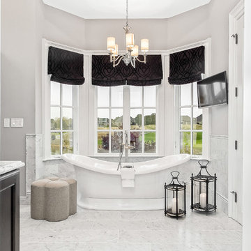
Our clients were living with outdated, dark bathrooms in their newly purchased Falling Star home. The dull palette of warm neutrals did not reflect the couple’s East Coast traditional style. They noticed several renovation projects by JRP in the neighborhood. The professionalism and the process impressed them. After receiving a Pardon Our Dust courtesy letter from JRP, the couple decided to call for a consultation. Their wish list was clear. They wanted the Falling Star design to be light, airy, and white. It had to reflect their East Coast roots. Working with the original footprint, JRP completely transformed the space, creating a tranquil primary suite rich with traditional detail. The result is an effusive celebration of classic style.
Now, the radiant rooms glow. To enlarge the primary closet, the JRP team removed a cluttered storage area. Inside, a separate dressing space is finished with upgraded storage and refined built-in cabinetry with recessed panels. Pops of glam such as Robert Abbey glass chandeliers and brilliant bits of chrome are moored by traditional elements like crown molding, porcelain tiles, and a quartz-clad drop-in soaking tub. Large windows in the primary bath and funnel skylights in the closet harness the natural light to stunning effect, sweeping the rooms with the cool feeling of fresh air. The “Sail Cloth” white paint adds soft depth to the uncomplicated elegance of both rooms.
PROJECT DETAILS:
• Style: Transitional
• Countertops: Vadara Quartz – Calacatta Dorado
• Cabinets: DeWils Recessed-panel, painted white
• Hardware/Plumbing Fixture Finish: Chrome
• Lighting Fixtures:
Master Closet: Skylight Sun Tunnel
Master Bath: Robert Abbey, Glass Chandelier
• Flooring:
Floor: Calacatta Dorado Porcelain Tiles w/Accent
• Tile/Backsplash: Shower Surround: Ceramic Blanc/Crackle
• Paint Colors:
Master Bath & Closet: Dunn Edwards Sail Cloth
Hall Bath: Benjamin Moore Ballet White
• Other Details: Drop-in soaking Tub
Photographer: J.R. Maddox

 Suzanne Zahr, Art & Architecture
Thick slabs of sand-textured granite and quarter-sawn white oak cabinets, equipped with special compartments for things such as cutting boards and plastic container lids, replaced old, sun-exposed cabinetry. A major transformation happened when the the low-height partition, separating the family room and kitchen was knocked down to allow in more light and warmth from the west-facing windows. The placement of the stovetop was adjusted to assist the left-handed couple, and a large 4-foot by 8-foot backing counter was added for the girls.
SZ made 'homes' for everything in the kitchen, from a state-of-the-art Miele integrated coffee station for Cameron to special cabinets for the Dean & Deluca spices that Linda likes to use. To accommodate Linda's petite stature, the countertops were set at a lower height. SZ even designed cereal-box-specific cabinets to ensure that everything would fit just right. Low-voltage strip lighting, operated with dimmers, borders every glass cabinet and spotlights the couple's funky '60s-inspired Jill Rosenwald ceramic serving pieces and a favorite clay sculpture entitled Love Entwined that they bought in Paris.
Today, the kitchen is almost unrecognizable from its former self. A dramatic evolution from stark and imposing to bright and spacious the clean lines and warm tones still give the family-functional space a grown-up edge. "if we're not hosting a charity event or inviting a group of 20 kindergartners over for a party, you'll still find all of us int the kitchen," says Linda. "Except how it feels right. The kitchen has our personalities stamped all over it." Not to mention a few handprints from three little girls.'

 Studioteka Design, LLC
Studioteka was asked to transform a dark, and very dated kitchen and dining area for a professional couple residing in New York’s sought after Riverdale neighborhood, just a stone’s throw from Van Cortlandt Park. The couple like to cook and entertain, and wanted a space where they’d be able to host dinner parties that could also spill onto their beautiful back deck and yard. The design team removed the old kitchen cabinets and the wall which had previously separated both spaces, allowing for the creation of an oversized island that also contained cabinetry and space for a breakfast bar. Old ductwork which had been contained in the wall was rerouted, and cleverly hidden within the new island’s custom drawers and cabinetry. The gas range was relocated to the far wall, and the dishwasher was moved from the window side to the island side of the kitchen, allowing for a better kitchen workflow. New recessed and pendant lighting illuminate the space, and highlight the island. The Brazilian Bajkal Quartzite countertops provide a light contrast to the dark wood of the cabinetry below, while white subway tile and cabinets above provide openness, making the space appear larger and light filled. The kitchen window and French doors leading to the outdoor space in back were replaced, and side lights were added around the door, allowing for the creation of a new and light filled and beautiful entertainment space in the home.
Find the right local pro for your project
 User
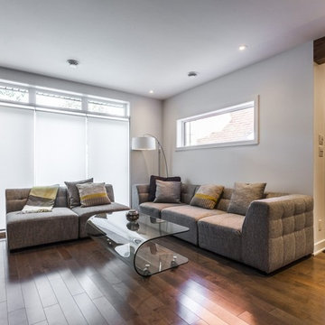
A young couple, owner of this duplex located near the Jean Talon market in Montreal’s little Italy, asked for Agence Imagine’s help and expertise to turn it into a single family home. Big renovations as well as an extension on the backyard have been made in order to offer today a large, comfortable home bathed in a lot of natural light.
The main floor’s layout is based on a linear structure that guides visitors into the living room and separates the kitchen area. A structural beam covered in a walnut veneer allows to maximize and open the living areas and gives a fluid circulation throughout the space.
Noble and raw materials and finishes such as wood, natural stone and quartz embellish this contemporary universe. The addition of a large patio door as well as a couple rectangular windows give a new sight toward the outside and allow natural light to penetrate the open area.
The installation of a 3 sided gas fireplace accentuates the warm hearted aspect of the space.
The kitchen, a mix of walnut and Italian lacquer, includes a spacious kitchen island where the owners like to cook and gather around with friends. Lots of organising spaces as well as a pantry have been thought out in order to optimize the use of space.
The upstairs includes a master’s bedroom with a walk-in and an access to the roof top terrace built on top of the main floor’s extension. On the 2nd floor we also find two bedrooms and a large bathroom. Spacious and functional, the bathroom offers calm and relaxation thanks to its podium bathtub and large Italian shower. The harmonious mix between the porcelain, the mosaic and the walnut veneer inspire serenity and elegance.
Photo Credit: Guillaume Gorini | Point de vue Studio
 Better Builders
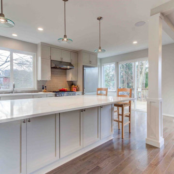
These clients enjoy cooking and entertaining, so their vision was to open and connect three separate rooms—the kitchen, sitting, and formal dining rooms—to create a single open and modern space where everyone could engage and participate in the activities.
Opening these spaces required complex structural engineering. The wall removals required supporting the loads from the second floor and meeting the engineering requirements for shear wall and lateral support. These beams and their connections to the posts they sit on were a challenge to install because of the complex nature of the home's original framed. All these loads had to be carried through the finished basement below and rest on new footings below the basement floor.
The center kitchen island was expansive, with a single slab countertop that would provide both workspace and counter seating. This slab, at 64x120 and 789 lbs., required careful planning for on-site labor, transfer routing, and precision installation. Natural daylight now floods the space from all directions. Recessed can lighting runs throughout the space, all on dimmers for maximum control of ambiance.
The Better Builders design team guided the selection of hardwoods, staircase details, cabinetry, countertops, tile, and color. The muted palette and clean lines work well with our couple’s eclectic furnishings and artworks. Now, traffic and activities flow better, and every inch of the previously divided space is utilized and enjoyed. The outcome is exactly as our homeowners envisioned…and as we intended.
 Better Builders
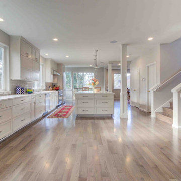
These clients enjoy cooking and entertaining, so their vision was to open and connect three separate rooms—the kitchen, sitting, and formal dining rooms—to create a single open and modern space where everyone could engage and participate in the activities.
Opening these spaces required complex structural engineering. The wall removals required supporting the loads from the second floor and meeting the engineering requirements for shear wall and lateral support. These beams and their connections to the posts they sit on were a challenge to install because of the complex nature of the home's original framed. All these loads had to be carried through the finished basement below and rest on new footings below the basement floor.
The center kitchen island was expansive, with a single slab countertop that would provide both workspace and counter seating. This slab, at 64x120 and 789 lbs., required careful planning for on-site labor, transfer routing, and precision installation. Natural daylight now floods the space from all directions. Recessed can lighting runs throughout the space, all on dimmers for maximum control of ambiance.
The Better Builders design team guided the selection of hardwoods, staircase details, cabinetry, countertops, tile, and color. The muted palette and clean lines work well with our couple’s eclectic furnishings and artworks. Now, traffic and activities flow better, and every inch of the previously divided space is utilized and enjoyed. The outcome is exactly as our homeowners envisioned…and as we intended.
 Suzanne Zahr, Art & Architecture
Thick slabs of sand-textured granite and quarter-sawn white oak cabinets, equipped with special compartments for things such as cutting boards and plastic container lids, replaced old, sun-exposed cabinetry. A major transformation happened when the the low-height partition, separating the family room and kitchen was knocked down to allow in more light and warmth from the west-facing windows. The placement of the stovetop was adjusted to assist the left-handed couple, and a large 4-foot by 8-foot backing counter was added for the girls.
SZ made 'homes' for everything in the kitchen, from a state-of-the-art Miele integrated coffee station for Cameron to special cabinets for the Dean & Deluca spices that Linda likes to use. To accommodate Linda's petite stature, the countertops were set at a lower height. SZ even designed cereal-box-specific cabinets to ensure that everything would fit just right. Low-voltage strip lighting, operated with dimmers, borders every glass cabinet and spotlights the couple's funky '60s-inspired Jill Rosenwald ceramic serving pieces and a favorite clay sculpture entitled Love Entwined that they bought in Paris.
Today, the kitchen is almost unrecognizable from its former self. A dramatic evolution from stark and imposing to bright and spacious the clean lines and warm tones still give the family-functional space a grown-up edge. "if we're not hosting a charity event or inviting a group of 20 kindergartners over for a party, you'll still find all of us int the kitchen," says Linda. "Except how it feels right. The kitchen has our personalities stamped all over it." Not to mention a few handprints from three little girls.'
Sponsored
Sunbury, OH

J.Holderby - Renovations
Franklin County's Leading General Contractors - 2X Best of Houzz!
 Better Builders
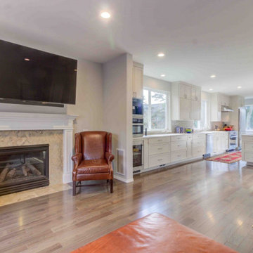
These clients enjoy cooking and entertaining, so their vision was to open and connect three separate rooms—the kitchen, sitting, and formal dining rooms—to create a single open and modern space where everyone could engage and participate in the activities.
Opening these spaces required complex structural engineering. The wall removals required supporting the loads from the second floor and meeting the engineering requirements for shear wall and lateral support. These beams and their connections to the posts they sit on were a challenge to install because of the complex nature of the home's original framed. All these loads had to be carried through the finished basement below and rest on new footings below the basement floor.
The center kitchen island was expansive, with a single slab countertop that would provide both workspace and counter seating. This slab, at 64x120 and 789 lbs., required careful planning for on-site labor, transfer routing, and precision installation. Natural daylight now floods the space from all directions. Recessed can lighting runs throughout the space, all on dimmers for maximum control of ambiance.
The Better Builders design team guided the selection of hardwoods, staircase details, cabinetry, countertops, tile, and color. The muted palette and clean lines work well with our couple’s eclectic furnishings and artworks. Now, traffic and activities flow better, and every inch of the previously divided space is utilized and enjoyed. The outcome is exactly as our homeowners envisioned…and as we intended.
 User
A young couple, owner of this duplex located near the Jean Talon market in Montreal’s little Italy, asked for Agence Imagine’s help and expertise to turn it into a single family home. Big renovations as well as an extension on the backyard have been made in order to offer today a large, comfortable home bathed in a lot of natural light.
The main floor’s layout is based on a linear structure that guides visitors into the living room and separates the kitchen area. A structural beam covered in a walnut veneer allows to maximize and open the living areas and gives a fluid circulation throughout the space.
Noble and raw materials and finishes such as wood, natural stone and quartz embellish this contemporary universe. The addition of a large patio door as well as a couple rectangular windows give a new sight toward the outside and allow natural light to penetrate the open area.
The installation of a 3 sided gas fireplace accentuates the warm hearted aspect of the space.
The kitchen, a mix of walnut and Italian lacquer, includes a spacious kitchen island where the owners like to cook and gather around with friends. Lots of organising spaces as well as a pantry have been thought out in order to optimize the use of space.
The upstairs includes a master’s bedroom with a walk-in and an access to the roof top terrace built on top of the main floor’s extension. On the 2nd floor we also find two bedrooms and a large bathroom. Spacious and functional, the bathroom offers calm and relaxation thanks to its podium bathtub and large Italian shower. The harmonious mix between the porcelain, the mosaic and the walnut veneer inspire serenity and elegance.
Photo Credit: Guillaume Gorini | Point de vue Studio

 CV & Associates, LLC
In this authentic adobe Hacienda-style home, we took out the drab 80s style guest bathroom and opted for a more sumptuous "Old Mexico" style.
We broke into an adjoining closet to create a separate walk-in shower (left) and toilet room and thus significantly enlarge the space. Replacing a standard vanity with pedestal sinks additionally opened up the room and continued the "old world" look.
Authentic tile from across the border (not found in U.S., and much cheaper) was used in the typical Mexican "chair rail" style and the three-color scheme (blue, white and sand) keep it all unified. Local authentic wood furnishings (both new and finds) plus tin and Talavera ceramic accessories complete the look.
In the master bath, we wanted a relaxing retreat for this couple. We used all white tile and continued the Old World style but created a wet room with clawfoot slipper tub and Portuguese tile accent "picture". The tub faces a glass door with stunning mountain views.
We installed a shower spa (instead of jet tub), so that both can enjoy the room at the same time but in different forms.
 Suzanne Zahr, Art & Architecture
Thick slabs of sand-textured granite and quarter-sawn white oak cabinets, equipped with special compartments for things such as cutting boards and plastic container lids, replaced old, sun-exposed cabinetry. A major transformation happened when the the low-height partition, separating the family room and kitchen was knocked down to allow in more light and warmth from the west-facing windows. The placement of the stovetop was adjusted to assist the left-handed couple, and a large 4-foot by 8-foot backing counter was added for the girls.
SZ made 'homes' for everything in the kitchen, from a state-of-the-art Miele integrated coffee station for Cameron to special cabinets for the Dean & Deluca spices that Linda likes to use. To accommodate Linda's petite stature, the countertops were set at a lower height. SZ even designed cereal-box-specific cabinets to ensure that everything would fit just right. Low-voltage strip lighting, operated with dimmers, borders every glass cabinet and spotlights the couple's funky '60s-inspired Jill Rosenwald ceramic serving pieces and a favorite clay sculpture entitled Love Entwined that they bought in Paris.
Today, the kitchen is almost unrecognizable from its former self. A dramatic evolution from stark and imposing to bright and spacious the clean lines and warm tones still give the family-functional space a grown-up edge. "if we're not hosting a charity event or inviting a group of 20 kindergartners over for a party, you'll still find all of us int the kitchen," says Linda. "Except how it feels right. The kitchen has our personalities stamped all over it." Not to mention a few handprints from three little girls.'

 TKS Design Group
Free ebook, Creating the Ideal Kitchen. DOWNLOAD NOW
This project started out as a kitchen remodel but ended up as so much more. As the original plan started to take shape, some water damage provided the impetus to remodel a small upstairs hall bath. Once this bath was complete, the homeowners enjoyed the result so much that they decided to set aside the kitchen and complete a large master bath remodel. Once that was completed, we started planning for the kitchen!
The original kitchen was just large enough to accommodate an island and a separate pantry but felt a little cramped, especially during the weekends when the couple likes to entertain. The primary goal was to maintain the functionality of the current space, but to add some breathing room as well as to provide a view to the homeowner’s side yard and substantial Hosta garden.
The solution was to bump out the space about 10 feet which provided ample room for large pro appliances, a large island for gathering and an upgraded pantry space. It was important to the homeowners to create a space that felt like it belonged in their historic 1866 home. Details such as matching new trim to the existing large custom profiles in the original home and re-purposing an existing door to be used for the new pantry, provided these touches. A large window at the main sink provides that view into the yard and a beautiful focal point for the room.
A mix of painted wood and stained cabinetry gives the new kitchen a sense of belonging in the older home, as do the Super White quartzite that has the look of marble, subway tile backsplash, polished nickel lanterns and glass and mirrored doors. The large pantry, filled with custom shelving built to the homeowner’s specifications, stainless steel appliances and the two Galley Workstations – sinks that do double duty as prep space – ensure that not only does the kitchen look great, but also functions in a personalized manner that works perfectly for the occupants.
Doing the bump out also allowed the opportunity for a small mudroom and powder room right off the kitchen as well as re-arranging some openings to allow for better traffic flow throughout the entire first floor. The result is a comfortable up-to-date home that feels both steeped in history yet allows for today’s style of living.
Designed by: Susan Klimala, CKD, CBD
Photography by: Michael Alan Kaskel
For more information on kitchen and bath design ideas go to: www.kitchenstudio-ge.com
 Better Builders
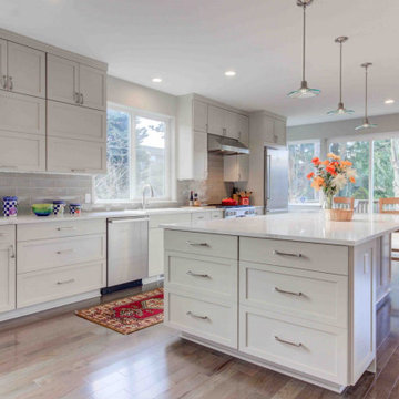
These clients enjoy cooking and entertaining, so their vision was to open and connect three separate rooms—the kitchen, sitting, and formal dining rooms—to create a single open and modern space where everyone could engage and participate in the activities.
Opening these spaces required complex structural engineering. The wall removals required supporting the loads from the second floor and meeting the engineering requirements for shear wall and lateral support. These beams and their connections to the posts they sit on were a challenge to install because of the complex nature of the home's original framed. All these loads had to be carried through the finished basement below and rest on new footings below the basement floor.
The center kitchen island was expansive, with a single slab countertop that would provide both workspace and counter seating. This slab, at 64x120 and 789 lbs., required careful planning for on-site labor, transfer routing, and precision installation. Natural daylight now floods the space from all directions. Recessed can lighting runs throughout the space, all on dimmers for maximum control of ambiance.
The Better Builders design team guided the selection of hardwoods, staircase details, cabinetry, countertops, tile, and color. The muted palette and clean lines work well with our couple’s eclectic furnishings and artworks. Now, traffic and activities flow better, and every inch of the previously divided space is utilized and enjoyed. The outcome is exactly as our homeowners envisioned…and as we intended.
Sponsored
Plain City, OH

The Creative Kitchen Company
Columbus Area Kitchen Remodeling and Refacing Professional

 Innovative Design Build
Our clients wanted to utilize this particular area of their home and really give it a function. It has been many things over the years: bonus room, dining area, etc. The kitchen is the natural gathering spot. They wanted to create a space that was an extension of the kitchen for entertaining and serving family and friends.
Architect, Cynthia Karegeannes was hired to draw up plans for a mudroom to corral the couple’s two dogs and stash the pet’s leashes, treats, etc. A large butler pantry was imagined with a full size refrigerator, prep sink, dishwasher and custom cabinetry to have items handy for entertaining. Innovative Construction, helped finalize the details and implemented the plans for the new addition. Interior Designer, Beth Weltlich with The House Dressing worked with homeowners, to select materials and finishes to unify the areas of the existing kitchen and the new spaces. A custom banquette was created with room under the staircase so that all of the space could be utilized. Furniture and accessories are still in the works as the homeowners let the area evolve to see exactly what their needs are. A collaborative effort-for sure!
The challenges included creating three separate areas (mudroom, banquette and butler pantry) with storage and versatility in one existing space. Having this additional space that was not always utilized, the homeowners feel the new addition will become an integral part of the families' living area.
 Amiano & Son Construction, LLC
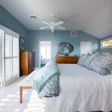
A coastal oasis in New Jersey. This project was for a house with no master bathroom. The couple thought how great it would be to have a master suite that encompassed a luxury bath, walk-in closet, laundry room, and breakfast bar area. We did it. Coastal themed master suite starting with a luxury bathroom adorned in shiplap and wood-plank tile floor. The vanity offers lots of storage with drawers and countertop cabinets. Freestanding bathtub overlooks the bay. The large walkin tile shower is beautiful. Separate toilet area offers privacy which is nice to have in a bedroom suite concept.
 Better Builders
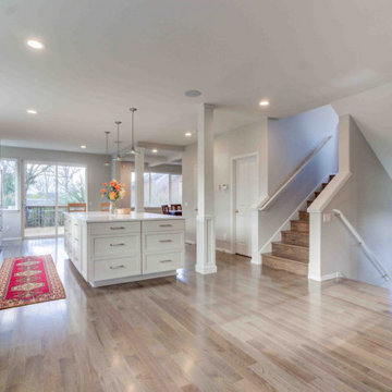
These clients enjoy cooking and entertaining, so their vision was to open and connect three separate rooms—the kitchen, sitting, and formal dining rooms—to create a single open and modern space where everyone could engage and participate in the activities.
Opening these spaces required complex structural engineering. The wall removals required supporting the loads from the second floor and meeting the engineering requirements for shear wall and lateral support. These beams and their connections to the posts they sit on were a challenge to install because of the complex nature of the home's original framed. All these loads had to be carried through the finished basement below and rest on new footings below the basement floor.
The center kitchen island was expansive, with a single slab countertop that would provide both workspace and counter seating. This slab, at 64x120 and 789 lbs., required careful planning for on-site labor, transfer routing, and precision installation. Natural daylight now floods the space from all directions. Recessed can lighting runs throughout the space, all on dimmers for maximum control of ambiance.
The Better Builders design team guided the selection of hardwoods, staircase details, cabinetry, countertops, tile, and color. The muted palette and clean lines work well with our couple’s eclectic furnishings and artworks. Now, traffic and activities flow better, and every inch of the previously divided space is utilized and enjoyed. The outcome is exactly as our homeowners envisioned…and as we intended.
 Studioteka Design, LLC
Studioteka was asked to transform a dark, and very dated kitchen and dining area for a professional couple residing in New York’s sought after Riverdale neighborhood, just a stone’s throw from Van Cortlandt Park. The couple like to cook and entertain, and wanted a space where they’d be able to host dinner parties that could also spill onto their beautiful back deck and yard. The design team removed the old kitchen cabinets and the wall which had previously separated both spaces, allowing for the creation of an oversized island that also contained cabinetry and space for a breakfast bar. Old ductwork which had been contained in the wall was rerouted, and cleverly hidden within the new island’s custom drawers and cabinetry. The gas range was relocated to the far wall, and the dishwasher was moved from the window side to the island side of the kitchen, allowing for a better kitchen workflow. New recessed and pendant lighting illuminate the space, and highlight the island. The Brazilian Bajkal Quartzite countertops provide a light contrast to the dark wood of the cabinetry below, while white subway tile and cabinets above provide openness, making the space appear larger and light filled. The kitchen window and French doors leading to the outdoor space in back were replaced, and side lights were added around the door, allowing for the creation of a new and light filled and beautiful entertainment space in the home.
Sponsored
Sunbury, OH
J.Holderby - Renovations
Franklin County's Leading General Contractors - 2X Best of Houzz!

 Olamar Interiors
This condo in Sterling, VA belongs to a couple about to enter into retirement. They own this home in Sterling, along with a weekend home in West Virginia, a vacation home on Emerald Isle in North Carolina and a vacation home in St. John. They want to use this home as their "home-base" during their retirement, when they need to be in the metro area for business or to see family. The condo is small and they felt it was too "choppy," it didn't have good flow and the rooms were too separated and confined. They wondered if it could have more of an open concept feel but were doubtful due to the size and layout of the home. The furnishings they owned from their previous home were very traditional and heavy. They wanted a much lighter, more open and more contemporary feel to this home. They wanted it to feel clean, light, airy and much bigger then it is.
The first thing we tackled was an unsightly, and very heavy stone veneered fireplace wall that separated the family room from the office space. It made both rooms look heavy and dark. We took down the stone and opened up parts of the wall so that the two spaces would flow into each other.
We added a view thru fireplace and gave the fireplace wall a faux marble finish to lighten it and make it much more contemporary. Glass shelves bounce light and keep the wall feeling light and streamlined. Custom built ins add hidden storage and make great use of space in these small rooms.
Our strategy was to open as much as possible and to lighten the space through the use of color, fabric and glass. New furnishings in lighter colors and soft textures help keep the feeling light and modernize the space. Sheer linen draperies soften the hard lines and add to the light, airy feel. Tinius Photography

 BB&R Design-Build
This expansive, walk in shower with two different and customized shower heads and separate thermostatic valves for each user is quite the spa like retreat this couple requested. While this is a family bathroom, we wanted to give them a retreat away from the kids and the world whenever they could find the time.
With two wall mounted shower heads, a large shower bench seat, three niches for products and a hand held shower, it's a place to linger and enjoy with a loved one! The long, grey, wood plank floor tiles begin on the floor and carry up into the shower walls to create a clean, rustic, beach chic feel to the space.
Heated floors and anti fog mirrors complete the experience and gets one started off on the right foot for any day of the week!
 Simply Home Decorating
This beautiful North Vancouver home belongs to a nature-loving and health-conscious couple, Emma and Vince (names changed), their two young children, and their dog, Jasper. When they contacted us about renovating and furnishing their kitchen and family room, we walked in and saw a world of potential waiting to be uncovered.
Before: Larkhall Crescent Home:
Like many original North Vancouver homes, the interior was definitely dated. We encountered late ‘80s finishes in powder pink and teal green, old carpet, and a kitchen that wasn’t maximized to suit this family’s modern-day lifestyle. However, the size of the rooms offered us a ton of space with which to get creative.
Knowing our clients’ love of cooking, need for work spaces (Emma and Vince both work remotely), and growing family, we developed a design concept that would increase usable space, optimize storage, and create intimacy in this large area. As for the style, we were inspired by their European roots, inventing a new and modern take on “Belgian Farmhouse” style. Now, the home is truly one-of-a-kind.
After: Warm & Cozy Family Room:
Fresh, bright, and comfortable, this living area has been transformed! We started with the fireplace as a focal point, selecting aged brick tiles for added texture and a crisp wood mantle. The taupe-coloured sectional infuses the room with visual warmth and serves the added purpose of separating the family room from the kitchen.
Emma and Vince were also keen on using non-toxic materials in their home, and we were happy to oblige. To meet their needs, we sourced natural wood elements and sought out Canadian-made products - that adhere to high health standards - whenever possible.
Look closer at the elements of this space, and you will find this stunning, honeycomb-patterned rug in earthy gold, beige, and charcoal tones. It’s plush to the touch and full of visual texture that brings this room’s colour palette together. We sourced these two-tone chairs with caning, petrified wood side table, black sconces, and botanical prints in greyscale from local artist, Heather Johnston.
We topped off the space with this dark wood and rattan console that offers storage facing the kitchen and presents an opportunity to display cherished items. The result is a cozy lounging space brimming with comfort and functionality. It’s perfect for enjoying quality family time, or Emma can simply slide the coffee table away to make room for her morning yoga practice.
Now, let’s turn around and give some attention to the kitchen. Do you remember what the original kitchen looked like? If not, scroll back up, because the transformation is shocking…
Moody & Welcoming Kitchen for Healthy Living:
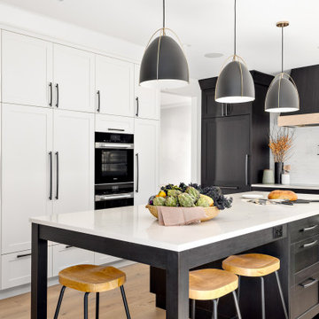
This kitchen looks very different from how it started, right? Though we didn’t touch any walls, the kitchen has almost doubled in usable space! We created a long, extended island with storage, an outlet for small appliances, and seating for comfortable prep, after-school snacking, or mingling among friends.
On the other side of the island, the family has even more storage and an integrated dishwasher within easy reach of the sink, perfect for quick clean-up. From this angle, you can also see the expansive custom Shaker cabinetry in white and the integrated double ovens. These facilitate their cooking experience and gave us the opportunity to add an additional surprise…
A coffee garage station and more hidden storage! Keeping these items located along the perimeter allows them to be accessed by the family or their guests without someone getting under the cook’s feet. These are the little details that make everyday life easier and more enjoyable.
Moving deeper into the kitchen, the seamless induction cooktop topped with a freestanding concealed hood fan commands attention in a soft yet prominent way. The natural wood accent mirrors the fireplace mantle, and the choice of off-black wood-grain cabinets not only continues our black-and-white colour palette but adds a sense of depth and contrast. The corner sink is located to the right and perfectly positioned with a view of their thriving backyard.
To invite more of this family’s character into the space, we mixed metals for interest — matte black, dark pewter, and warm brass — and created open shelves in white oak for their plants and decor. You can also glimpse the tumbled edge of the backsplash tile, which echoes the rustic brick of the fireplace. It adds that farmhouse charm while still feeling timeless and sophisticated.
Last but not least, we designed this dining banquette in the bay window (with integrated bench storage, of course), where the family can share a meal together, the kids can do homework, or Emma and Vince can work and enjoy a change of scenery from their offices. Like the other spaces in the home, it was designed to be beautiful, multi-functional, and long-lasting.
Praise from Our Clients:
It is clear that we love this home, but what did our clients have to say?
“Lori is a visionary and masters execution to the finest detail all at the same time. When she first met us to know more about who we are and how we live, she could right away envision how we could use the space in our kitchen and living room…The results exceeded our expectations.
Lori and her team were also a delight to work with — coordination with all the trades, fast problem-solving, regular updates, professional and friendly attitude of her entire team — made it the dream team. Thank you SHD for making our space so beautiful!”
In turn, we are so grateful for this family’s trust, their open communication, and for being wonderful people with whom to work. (So, thank you!)
87