
Search results for "Shared spaces" in Home Design Ideas
 Emerson Grey Designs
Taylor Cole Photography
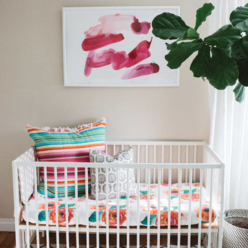
Mid-sized eclectic girl medium tone wood floor nursery photo in Orange County with beige walls
Mid-sized eclectic girl medium tone wood floor nursery photo in Orange County with beige walls

 Horn & Co. (Previously JHLA)
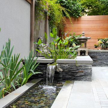
Our clients on this project were inspired by their travels to Asia and wanted to mimic this aesthetic at their DC property. We designed a water feature that effectively masks adjacent traffic noise and maintains a small footprint.
Find the right local pro for your project
 Signature Designs Kitchen | Bath | Interiors
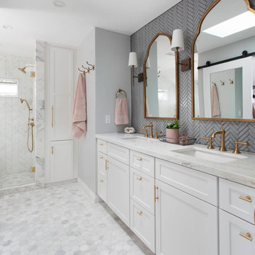
This remodel went from a tiny corner bathroom, to a charming full master bathroom with a large walk in closet. The Master Bathroom was over sized so we took space from the bedroom and closets to create a double vanity space with herringbone glass tile backsplash.
We were able to fit in a linen cabinet with the new master shower layout for plenty of built-in storage. The bathroom are tiled with hex marble tile on the floor and herringbone marble tiles in the shower. Paired with the brass plumbing fixtures and hardware this master bathroom is a show stopper and will be cherished for years to come.
Space Plans & Design, Interior Finishes by Signature Designs Kitchen Bath.
Photography Gail Owens
 Lands End Development - Designers & Builders
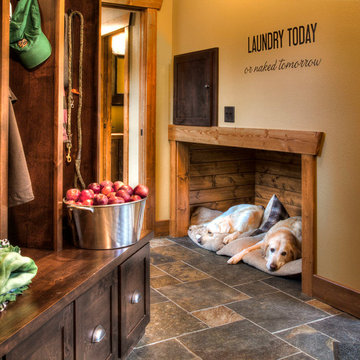
Mountain style mudroom photo in Minneapolis with beige walls
 The Brooklyn Studio
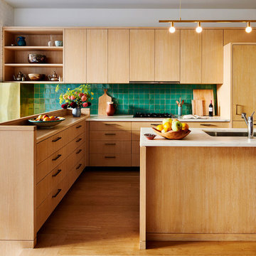
This residence was a complete gut renovation of a 4-story row house in Park Slope, and included a new rear extension and penthouse addition. The owners wished to create a warm, family home using a modern language that would act as a clean canvas to feature rich textiles and items from their world travels. As with most Brooklyn row houses, the existing house suffered from a lack of natural light and connection to exterior spaces, an issue that Principal Brendan Coburn is acutely aware of from his experience re-imagining historic structures in the New York area. The resulting architecture is designed around moments featuring natural light and views to the exterior, of both the private garden and the sky, throughout the house, and a stripped-down language of detailing and finishes allows for the concept of the modern-natural to shine.
Upon entering the home, the kitchen and dining space draw you in with views beyond through the large glazed opening at the rear of the house. An extension was built to allow for a large sunken living room that provides a family gathering space connected to the kitchen and dining room, but remains distinctly separate, with a strong visual connection to the rear garden. The open sculptural stair tower was designed to function like that of a traditional row house stair, but with a smaller footprint. By extending it up past the original roof level into the new penthouse, the stair becomes an atmospheric shaft for the spaces surrounding the core. All types of weather – sunshine, rain, lightning, can be sensed throughout the home through this unifying vertical environment. The stair space also strives to foster family communication, making open living spaces visible between floors. At the upper-most level, a free-form bench sits suspended over the stair, just by the new roof deck, which provides at-ease entertaining. Oak was used throughout the home as a unifying material element. As one travels upwards within the house, the oak finishes are bleached to further degrees as a nod to how light enters the home.
The owners worked with CWB to add their own personality to the project. The meter of a white oak and blackened steel stair screen was designed by the family to read “I love you” in Morse Code, and tile was selected throughout to reference places that hold special significance to the family. To support the owners’ comfort, the architectural design engages passive house technologies to reduce energy use, while increasing air quality within the home – a strategy which aims to respect the environment while providing a refuge from the harsh elements of urban living.
This project was published by Wendy Goodman as her Space of the Week, part of New York Magazine’s Design Hunting on The Cut.
Photography by Kevin Kunstadt
 Interiors by Natasha
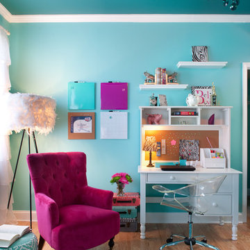
I was hired by the parents of a soon-to-be teenage girl turning 13 years-old. They wanted to remodel her bedroom from a young girls room to a teenage room. This project was a joy and a dream to work on! I got the opportunity to channel my inner child. I wanted to design a space that she would love to sleep in, entertain, hangout, do homework, and lounge in.
The first step was to interview her so that she would feel like she was a part of the process and the decision making. I asked her what was her favorite color, what was her favorite print, her favorite hobbies, if there was anything in her room she wanted to keep, and her style.
The second step was to go shopping with her and once that process started she was thrilled. One of the challenges for me was making sure I was able to give her everything she wanted. The other challenge was incorporating her favorite pattern-- zebra print. I decided to bring it into the room in small accent pieces where it was previously the dominant pattern throughout her room. The color palette went from light pink to her favorite color teal with pops of fuchsia. I wanted to make the ceiling a part of the design so I painted it a deep teal and added a beautiful teal glass and crystal chandelier to highlight it. Her room became a private oasis away from her parents where she could escape to. In the end we gave her everything she wanted.
Photography by Haigwood Studios


 Advance Design Studio, Ltd.
Jennifer and Dan have lived in their Deer Park Illinois home for 15 years, slowly making minor fixes like painting and decorating; but they had a new plan for their kitchen the entire time. An awkwardly placed garage door, and an island cooktop with a terrible downdraft made a full-scale kitchen remodel an absolute must. Jennifer had many ideas in mind and wanted to work with a company that could provide high-end work, while partnering with a designer that would tailor the kitchen to her ideas.
She was intrigued by the phrase “Common Sense Remodeling” in Advance Design’s feature she discovered while perusing an issue of the community’s Quintessential Barrington Magazine. Doing further research on the company’s website, as she looked through project profiles and read about Advance Design’s “Common Sense Remodeling” philosophy, she promptly scheduled an appointment to see if the people and ideas she read about were truly who they said they were. The more she read, the more she knew that the “Common Sense” approach to remodeling they described was exactly the type of company she was looking for.
The partnership was sealed after an initial consultation with Owner Todd Jurs and Project Designer Michelle Lecinski. They displayed a combination of friendliness, professionalism and respect that was unmatched by any of the other companies Jennifer talked to. She knew that with Advance Design, she would be able to retain the vision that she had in mind with high-quality craftsmanship.
“I reached out to Advance Design because of the ‘Common Sense Remodeling’ tagline,” Jennifer said. “That’s what lingered for me”. “Advance Design was the most respectful- of the house and of my design ideas, and the most professional of the handful of companies that looked at my project”.
Soon after the meeting Jennifer began working with Michelle on the project design. They quickly developed chemistry. Jennifer loved how Michelle researched and located every detail that Jennifer wanted for the kitchen. Between the two of them, every concept and idea was worked through and perfected. “Jennifer had definite ideas about what she wanted the new kitchen to look like, she just didn’t know how to bring it all together. We worked together really well to make her ideas into the practical reality necessary for a well-functioning kitchen, with the look and feel that she had envisioned”, says Michelle.
“Michelle was wonderful in using the CAD system she would show me new drawings every time we changed the layout while working through the design,” Jennifer said. “She was a really wonderful partner in execution, she made sure everything happened quickly and easily.”
The finished design drew out elements of Jennifer’s style and personality. The pair call the look “sophisticated farmhouse” to describe the kitchen renovation to family and friends. The result was a beautifully crafted, authentic-feeling space that satisfied Jennifer’s dreams 15 years in the making. The whole project consisted of a kitchen remodel, mudroom upgrade with powder room, and garage entry relocation. “The projects I personally like the best, are the ones that put the client’s dreams on display,” Project Designer Michelle said. “And this is one of those projects.”
The main focal point of the kitchen is custom zinc and brass ventilation hood with a vintage sheen, which was hand made to order by a small company in Indiana named Vogler Metalworking. “It’s like sculpture, a true work of art”, says Jennifer. Your eye is immediately drawn towards this elegant yet practical hood that eliminated the home’s downdraft problem and added a striking conversation piece at the same time. The carpenters had to use special gloves when transporting and installing it, so they didn’t smudge it with fingerprints. The beautiful hood centers proudly over the stunning black enamel and brass LaCornue Range. “I had a friend who had a LaCornue range and after learning how easy it was to cook perfect meals, I was convinced I wanted to have one”, says Jennifer. This unique, breathtaking combination anchors the entire kitchen and is apparent immediately as you walk into the great room the surrounds the space.
DuraSupreme Crestwood cabinets with a Kendall Panel add function and sophistication. A custom gray paint color paired with a storm blue was developed so that the new kitchen looked like it belonged to the existing space. Unlacquered brass faucets and hardware were important to Jennifer because she wanted the living finishes to age over time. Remarkable brass diamond mesh cabinet door inserts imported from the UK continue to add this one-of-a-kind kitchen renovation; giving it a “you won’t see this everywhere” quality. The use of old railcar flooring for the coffee bar countertop and reclaimed oak for the open shelving gives an authenticity to the space uncommon in kitchens today.
Jennifer and Michelle fell in love with the Limestone Grey Stone while they were investigating unique island countertop ideas. They liked the fact that the limestone as a living finish will age and change over time. Calcutta Miel Quartz countertops made for an excellent pairing around the perimeter, as it’s durable and perfect for cooking preparations. A textured white subway tile backsplash that runs to the ceiling keeps your eye moving towards the open shelving, and to the main focal point of the stunning range hood combination.
“The kitchen functions beautifully, and it’s gorgeous,” beams Jennifer as she gestures with both hands while smiling ear to ear. “The most important thing was I wanted a kitchen that had a wonderful flow, cooked beautiful meals and was a great gathering place for family and friends, and this space does that perfectly! Beauty wise, it turned out exactly how I had envisioned. I felt the function part was the hardest part, and that was nailed”!
Relocating the garage entry to the new mudroom was a huge priority and has finally separated the family’s arriving home functions from their kitchen. Now coats and shoes and bags have their own area for dropping once members arrive home. Matching gray DuraSupreme cabinetry helped create gorgeous, purposeful lockers for the family. A reclaimed vintage sink and custom wall paper were added to the tiny powder room to beautify the once previously only functional space. Advance Design was even able to create a custom space for their dog to sleep while the family is away.
“It was unbelievable that a project of this size was completed in such a short time, and I think that’s because of the large amount of planning and preparation that went into it,” Jennifer marveled, “When we started, we were ready, and everything was prepared”.
When it came to execution, Project Manager Justin Davis and his crew were quick, accessible, and organized. Projects like this kitchen are typically completed in as little as 8-10 weeks. Jennifer’s kitchen however despite the relocation of some challenging HVAC in a soffit and moving of an exterior door was completed remarkably fast in part because the team was working with an existing tile floor that ran throughout the first floor that the client really loved.
“You get to know these people really well because they’re living in your house while you’re living in your house. They were so fast and really good, it didn’t take as long as even planned” reported Jennifer. “I would text Justin and he always responded almost immediately. I got to know all the guys who were working in our house and they were all wonderful people”.
Details in a customized kitchen like this one require skill and care from the people who install it. “All the guys on the job were skilled at what the did. I wanted small details like little feet to look like furniture, that is where their carpentry skill came in to make these all perfect”, said Jennifer. “The tile guys were wonderful. They even let me determine how I wanted the texture with the grout to appear for a salt and pepper look; now that is a very skilled trade person making it custom”.
In Jennifer’s interview, she continued to reference Advance Design’s “Common Sense Remodeling”, so I took a minute to ask her exactly what that phrase meant to her and how it played out in her experience with her project and the Advance Design team. Here is what she said: “I was intrigued about Common Sense Remodeling and in my head that there would be clear costs and prices, great communication between the design team, the execution team and me”, said Jennifer. They did deliver on that, it was so clear about the cost breakdown, what I could expect from everyone who came to my house, and everything that we had ordered. That to me is the Common Sense”!
It’s great to see a client take literally our assertion that a well-planned remodeling project is simply “Common Sense”! She anticipated each step of the way would be clear, concise, and predictable, all the while protecting the outcome due to the careful upfront planning. “Advance Design delivered on their ‘Common Sense Remodeling’ promise,” Jennifer said. “From the design team, to the execution team - everything was straight forward like I imagined. The project turned out exactly how I envisioned, I enjoyed this process and absolutely would recommend Advance Design Studio to anyone.”

 ZeroEnergy Design
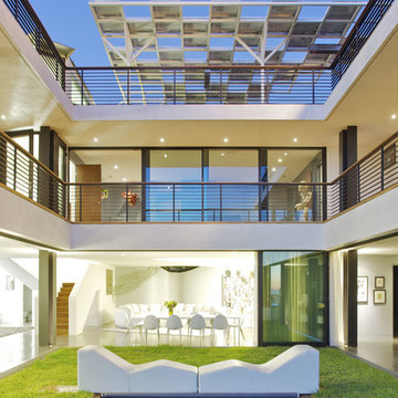
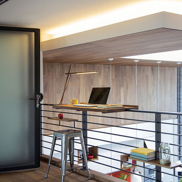
Modern loft. Surfaces built into the new railing atop the stair create a functional work area with a fantastic view and clear shot to the play space below. A wall separating the master bedroom from the double height living space was replaced with a folding glass door to open the bedroom to the living space while still allowing for both visual and acoustical privacy.
Photos by Eric Roth.
Construction by Ralph S. Osmond Company.
Green architecture by ZeroEnergy Design. http://www.zeroenergy.com
 Fivedot
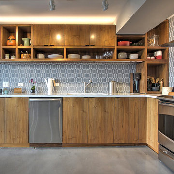
Remodel of a 1960's condominium to modernize and open up the space to the view.
Ambrose Construction.
Michael Dickter photography.
Inspiration for a small contemporary l-shaped concrete floor kitchen remodel in Seattle with flat-panel cabinets, dark wood cabinets, quartz countertops, blue backsplash, ceramic backsplash and stainless steel appliances
Inspiration for a small contemporary l-shaped concrete floor kitchen remodel in Seattle with flat-panel cabinets, dark wood cabinets, quartz countertops, blue backsplash, ceramic backsplash and stainless steel appliances
 Eminent Interior Design
Troy Thies Photography
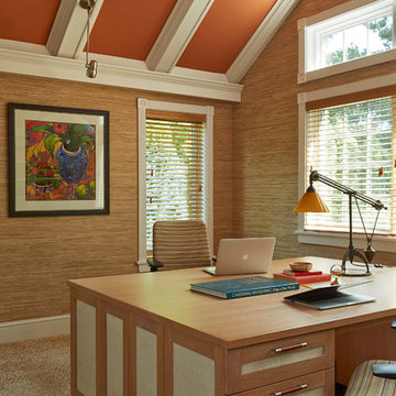
Transitional freestanding desk home office photo in Minneapolis
Transitional freestanding desk home office photo in Minneapolis
 Blackfish Homes Ltd.
www.emapeter.com
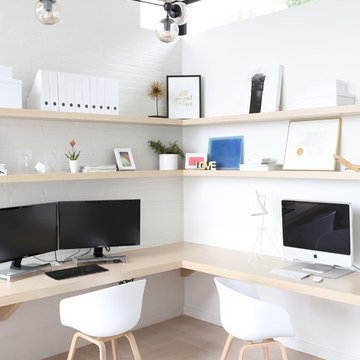
Example of a mid-sized trendy built-in desk light wood floor and beige floor study room design in Vancouver with white walls
Example of a mid-sized trendy built-in desk light wood floor and beige floor study room design in Vancouver with white walls

Sponsored
Columbus, OH

Structural Remodeling
Franklin County's Heavy Timber Specialists | Best of Houzz 2020!
 Susan Yeley Homes
This gem of a house was built in the 1950s, when its neighborhood undoubtedly felt remote. The university footprint has expanded in the 70 years since, however, and today this home sits on prime real estate—easy biking and reasonable walking distance to campus.
When it went up for sale in 2017, it was largely unaltered. Our clients purchased it to renovate and resell, and while we all knew we'd need to add square footage to make it profitable, we also wanted to respect the neighborhood and the house’s own history. Swedes have a word that means “just the right amount”: lagom. It is a guiding philosophy for us at SYH, and especially applied in this renovation. Part of the soul of this house was about living in just the right amount of space. Super sizing wasn’t a thing in 1950s America. So, the solution emerged: keep the original rectangle, but add an L off the back.
With no owner to design with and for, SYH created a layout to appeal to the masses. All public spaces are the back of the home--the new addition that extends into the property’s expansive backyard. A den and four smallish bedrooms are atypically located in the front of the house, in the original 1500 square feet. Lagom is behind that choice: conserve space in the rooms where you spend most of your time with your eyes shut. Put money and square footage toward the spaces in which you mostly have your eyes open.
In the studio, we started calling this project the Mullet Ranch—business up front, party in the back. The front has a sleek but quiet effect, mimicking its original low-profile architecture street-side. It’s very Hoosier of us to keep appearances modest, we think. But get around to the back, and surprise! lofted ceilings and walls of windows. Gorgeous.
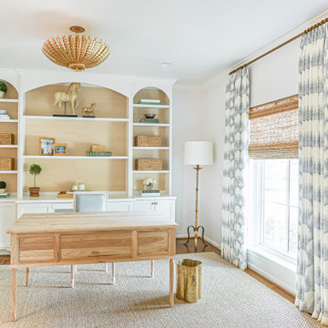
Study room - mid-sized transitional freestanding desk medium tone wood floor and brown floor study room idea in Houston with white walls
 Jeff Walker Photography
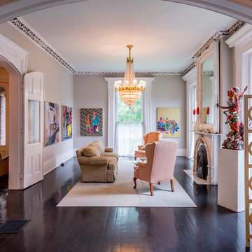
Living room - traditional formal and enclosed dark wood floor living room idea in Other with beige walls, a standard fireplace, a stone fireplace and no tv
 Fowlkes Studio
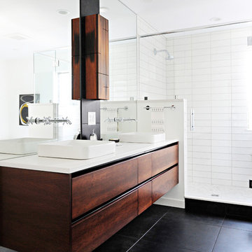
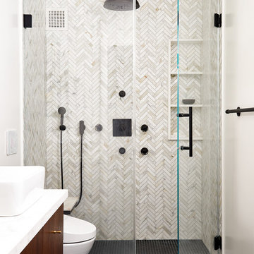
Small trendy 3/4 marble tile mosaic tile floor and black floor alcove shower photo in New York with flat-panel cabinets, medium tone wood cabinets, white walls, a vessel sink, a hinged shower door and white countertops
Sponsored
Columbus, OH
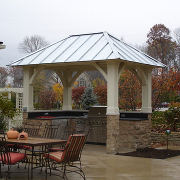
Free consultation for landscape design!

Peabody Landscape Group
Franklin County's Reliable Landscape Design & Contracting
 Fautt Homes
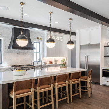
Amazing open kitchen with white shaker cabinets and stained center island with matching floating shelves. Bronze and brass lighting and marble subway backsplash.
 Monika Hibbs
Tracey Ayton Photography
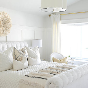
Transitional master carpeted bedroom photo in Vancouver with white walls
Transitional master carpeted bedroom photo in Vancouver with white walls
 Peridot Interiors Inc.
Rick Ricozzi Photography
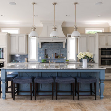
Inspiration for a coastal l-shaped beige floor kitchen remodel in Other with blue cabinets, blue backsplash, subway tile backsplash, an island and recessed-panel cabinets
Inspiration for a coastal l-shaped beige floor kitchen remodel in Other with blue cabinets, blue backsplash, subway tile backsplash, an island and recessed-panel cabinets
26