
Search results for "Simple short" in Home Design Ideas

 Upland Homes
Located in the coveted West End of downtown Greenville, SC, Park Place on Hudson St. brings new living to old Greenville. Just a half-mile from Flour Field, a short walk to the Swamp Rabbit Trail, and steps away from the future Unity Park, this community is ideal for families young and old. The craftsman style town home community consists of twenty-three units, thirteen with 3 beds/2.5 baths and ten with 2 beds/2.5baths.
The design concept they came up with was simple – three separate buildings with two basic floors plans that were fully customizable. Each unit came standard with an elevator, hardwood floors, high-end Kitchen Aid appliances, Moen plumbing fixtures, tile showers, granite countertops, wood shelving in all closets, LED recessed lighting in all rooms, private balconies with built-in grill stations and large sliding glass doors. While the outside craftsman design with large front and back porches was set by the city, the interiors were fully customizable. The homeowners would meet with a designer at the Park Place on Hudson Showroom to pick from a selection of standard options, all items that would go in their home. From cabinets to door handles, from tile to paint colors, there was virtually no interior feature that the owners did not have the option to choose. They also had the ability to fully customize their unit with upgrades by meeting with each vendor individually and selecting the products for their home – some of the owners even choose to re-design the floor plans to better fit their lifestyle.

 Charlie Allen Renovations, Inc.
For a small family in the Boston suburbs, their modest sized home was just the right size. But with some smart changes, they wondered if it could be more enjoyable. Working with architect Joseph S. Artley, we came up with a number of solutions:
• To make the kitchen a more comfortable work and gathering space, a bay window was removed and the kitchen itself bumped out slightly to allow for the introduction of an expansive island, as well as additional countertop and cabinetry.
• The first floor half-bathroom was relocated to the end of the entry hall. This allowed us to connect the kitchen with what had been a three-season porch.
• That three-season porch was properly heated and remodeled as a sunny breakfast nook: the perfect spot for the family to gather in the mornings.
• Near the entry to the breakfast nook, an existing electrical box could not be moved. To conceal it, we suggested an oversized family bulletin board, which we provided as a gift to the homeowners. Now, it offers a great spot to catch up on the day’s activities and enjoy some family artwork while heading in for breakfast.
• This family loves to read and they asked for custom built in bookshelves in the living room that would look original to the home and match existing shelving on the other side of the room.
• The den is a favorite spot for the family to watch movies and play games, but the room, which had also been a three season porch prior to an earlier renovation, was drafty in the winter and hot in the summer. We introduced new, energy efficient windows and insulation throughout, resulting in a much more inviting and cozy room.
Today, after barely increasing the footprint of the home, the family has a new breakfast room, a usable den, a larger and more inviting kitchen, and a better-situated first-floor bath. Lots of simple fixes = a much happier space for the whole family.
Photos by Shelly Harrison

 Bianchi Design
A complete metamorphosis was needed to bring out the buried treasure hidden beneath this yard, and a family of five rattlesnakes had to find a new home!
Here’s the short list of the awkward elements that had to be remedied:
First, the neighbors’ living room window peered perpetually (like, all the time) and directly into the yard with no privacy whatsoever. None.
Second, the vast deep end swallowed up the patio and provided no place for furniture, or walking. Only tripping and treading water was allowed.
Third, the sunken lawn must have been an arena of some sort! Intentionally excavated from natural grade a full -42″ from the patio, for no good reason.
Fourth, the not-worth-a-visit ramada was the focal point for the entire yard. See it up close! It’s gone.
Fifth, the spa was shoved against the farthest wall and provided no invitation. It was so bad, it never had a photo taken! See the statue peeing between the two short columns? It’s over there. Peeing in the corner as all little boys are want to do.
Sixth, the bbq and fire place were non-functional and equally uninviting, and here’s a better view of just how crowded the furniture is. Don’t fall in!
Last, we will not mention the boulder pile droppings distributed around the yard. Oops! Sorry.
The first order of business was to spend several weeks tearing out everything but the pool shell. Then another few weeks were spent wheelbarrowing in a few hundred yards of top soil (there was no access) to fill the matador pit flush to a more relatable -18″. The large gaping trough was then discretely hidden with large removable stones, so it was out of sight but still serviceable.
Second, the neighbor was screened instantly with a row of mature Texas Ebony trees in a raised planter, that also housed a sculptural ironwood tree as the focal point of the property, soon to be reflected in the pool’s richer Midnight Blue pebble tec finish.
A hundred or so yards of shotcrete filled not only the reclaimed deep end, but also created a sun shelf and spa ledge, now the focal jewel in the foreground as a 360 overflow vanishing edge spa clad in Pewter glass tile from Oceanside Glass, and viewed from all the interior living spaces.
The BBQ was tucked around the corner out of sight but still easy access. The fireplace for two gave way to a large inviting built in banco, with a splashes of colorful fabrics to draw one out. The fire pit serves about 10 people easily, for hours at a time.
Last but not least, the foreground of the pool became a sweeping entry shelf extending the full length of the pool, bedecked with fiberoptic starlights and six glowing bubblers set low, to just barely break the surface of the water, giving a lovely and tranquil sound while sleeping away with all retractable doors wide open.
Simple. Serene. Self-evident. That is the remedy.
If your project needs a similar touch, more or less, drop me a line and we’ll figure out a plan.
Find the right local pro for your project
 Rhodes Architecture + Light
The water and shoreline environment and the 42-foot wide site drove the simple shingled “beach cottage” forms and natural weathered material pallet. The design of the house resulted too from a desire for an understated contemporary home that takes full advantage of its marine and island domain yet also folds private spaces around interior courts and opens to multiple levels of landscaped outdoor terraces.

 Sierra Living Concepts Inc
Dimension:
Overall: 55" L X 15.5" D X 18" H
Cabinet: 14" L X 14" D X 10" H
Cabinet Shelves: 18" L X 13" D X 4.5" H
Drawer: 11.5" L X 11.5" D X 3" H
If you’re looking for relaxed and light colored accent furniture, check out our Appalachian Winter White Reclaimed Wood TV Console Media Cabinet. This 55” long entertainment island stands off the floor on short legs. Your storage options include a single door side cupboard, two open middle shelves, and two drawers on the side. The media console top extends slightly beyond the edge.
This simple and rustic TV cabinet is built with reclaimed wood. Old wood is usually denser than new wood and is naturally seasoned over time. We honor this natural process and refrain from adding any new stains or paints to the exterior.
Special Features:
• 100% Handcrafted
• Reclaimed solid wood craftsmanship
• Authentically distressed
• Contrasting dark interior
• 1 cabinet, 2 open shelves, 2 drawers
• Iron ring pulls and wooden latches
• Distressed colors on the side panels
• Heirloom quality
Note: Real wood is a product of nature, and as such, no two pieces are alike. Variations in solid wood grain patterns are to be expected and make each furniture uniquely beautiful, just like us humans.
 Native Edge Landscape
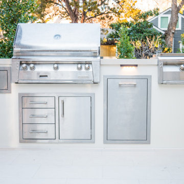
This young family came to us looking to transform their yard into an area where they could easily entertain their guests. They were looking to add a seamless wraparound patio that meshed with the look of their existing home and garage. Concrete was chosen as the base of the patio, and was then topped with limestone slabs. A short retaining wall was added along the edge of the patio in the back to give the space more definition. Raised planters along the garage and a custom outdoor kitchen extend their living space to the outdoors. The designer chose to add lighting along the edge of the retaining wall giving the space a low, warm blanket of light. Bougainvillea was planted along the garage climbing upwards, providing a pop of color against the light coloring of the home. Holly trees were chosen to line the backyard fence, as well as the side yard along the street. This helped to provide a green wall of privacy and soften the stone facade.
 Bianchi Design
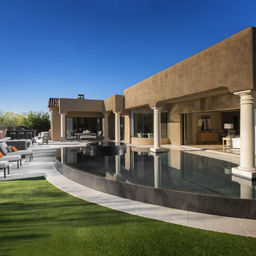
A complete metamorphosis was needed to bring out the buried treasure hidden beneath this yard, and a family of five rattlesnakes had to find a new home!
Here’s the short list of the awkward elements that had to be remedied:
First, the neighbors’ living room window peered perpetually (like, all the time) and directly into the yard with no privacy whatsoever. None.
Second, the vast deep end swallowed up the patio and provided no place for furniture, or walking. Only tripping and treading water was allowed.
Third, the sunken lawn must have been an arena of some sort! Intentionally excavated from natural grade a full -42″ from the patio, for no good reason.
Fourth, the not-worth-a-visit ramada was the focal point for the entire yard. See it up close! It’s gone.
Fifth, the spa was shoved against the farthest wall and provided no invitation. It was so bad, it never had a photo taken! See the statue peeing between the two short columns? It’s over there. Peeing in the corner as all little boys are want to do.
Sixth, the bbq and fire place were non-functional and equally uninviting, and here’s a better view of just how crowded the furniture is. Don’t fall in!
Last, we will not mention the boulder pile droppings distributed around the yard. Oops! Sorry.
The first order of business was to spend several weeks tearing out everything but the pool shell. Then another few weeks were spent wheelbarrowing in a few hundred yards of top soil (there was no access) to fill the matador pit flush to a more relatable -18″. The large gaping trough was then discretely hidden with large removable stones, so it was out of sight but still serviceable.
Second, the neighbor was screened instantly with a row of mature Texas Ebony trees in a raised planter, that also housed a sculptural ironwood tree as the focal point of the property, soon to be reflected in the pool’s richer Midnight Blue pebble tec finish.
A hundred or so yards of shotcrete filled not only the reclaimed deep end, but also created a sun shelf and spa ledge, now the focal jewel in the foreground as a 360 overflow vanishing edge spa clad in Pewter glass tile from Oceanside Glass, and viewed from all the interior living spaces.
The BBQ was tucked around the corner out of sight but still easy access. The fireplace for two gave way to a large inviting built in banco, with a splashes of colorful fabrics to draw one out. The fire pit serves about 10 people easily, for hours at a time.
Last but not least, the foreground of the pool became a sweeping entry shelf extending the full length of the pool, bedecked with fiberoptic starlights and six glowing bubblers set low, to just barely break the surface of the water, giving a lovely and tranquil sound while sleeping away with all retractable doors wide open.
Simple. Serene. Self-evident. That is the remedy.
If your project needs a similar touch, more or less, drop me a line and we’ll figure out a plan.
Sponsored
Delaware, OH

Buckeye Basements, Inc.
Central Ohio's Basement Finishing ExpertsBest Of Houzz '13-'21

 Randy Angell Designs
This project is proof that the challenges posed by limited space and accessibility can always be overcome in order to deliver stunning results. The space itself was rather small and also very close to the neighboring residence. Not only was the neighboring wall imposing, it was also of a completely different design style.
The goal here was to create a layering effect with numerous features of varying heights. Not only would this add depth and dimension to the overall design, but it would cause the viewer to shift their focus from the encroaching wall to the beauty of the pool space.
Instead of trying to maximize the water area by squaring off the pool, I decided to instead maximize the visual interest by gracefully rounding off the back wall of the pool. This was accomplished by implementing a raised stucco wall, and also a shorter, matching curved wall, featuring a "Sheer Descent" waterfall.
Inside the taller, deep-plum stucco wall, I created three vertical windows which are all highlighted by LED uplighting. To give depth, dimension and some natural beauty, I implemented a simple bed of Horse Tail Reeds behind the short wall, and chose to place Banana Trees behind the taller wall.
The main seating area is just outside the home's master suite, and is separated by a "Leuder" limestone fire pit. Aside from being a striking design feature, the floating stepper pads accomplish a number of things; they serve triple-duty as a walkway, a seating area adjacent to the fire pit, and also as a poolside rest for beverages.
After discovering that the narrow courtyard acted as a sort of wind tunnel between the two houses, we opted to install tempered glass in order to better control the behavior of the flames. This solved the problem while remaining visually pleasing to the client as well.
You'll notice in some of the leading photos for this project that I had originally intended to implement stepper pads on both sides of the pool closest to the house. And despite a thorough understanding of what would be necessary on an engineering and structural-design basis, we were eventually forced to turn this into a solid deck due to unrelenting city-required setbacks. However the client remained very understanding due to encountering a number of similar issues in their home-build process.
In the end, they were delivered an outstanding pool design that had come to fruition only after coming up with numerous solutions to a number of challenges that only a unique space like this could provide.

 The Gall Group: Design | Build | Remodel
Located in Old Seagrove, FL, this 1980's beach house was is steps away from the beach and a short walk from Seaside Square. Working with local general contractor, Corestruction, the existing 3 bedroom and 3 bath house was completely remodeled. Additionally, 3 more bedrooms and bathrooms were constructed over the existing garage and kitchen, staying within the original footprint. This modern coastal design focused on maximizing light and creating a comfortable and inviting home to accommodate large families vacationing at the beach. The large backyard was completely overhauled, adding a pool, limestone pavers and turf, to create a relaxing outdoor living space.

 TVL Creative Ltd.
This remodel took a dated and cramped bathroom and transformed it into a classy oasis for our Lowry clients. The clients had a limited budget and wanted to leave the space as in-place as possible. However, the large drop in tub ate valuable floor space and a half wall between the shower and tub had become a holding place for random items without a home. The thick frame on the shower glass made the shower feel extremely small, and the dated lighting and fixtures further depressed the space. We proposed a traditional and elegant design that consider the client's budgetary and spatial constraints. We removed the existing drop-in tub and replaced it with a lovely free-standing soaker. The length of this tub is short, but the depth is exaggerated, making it an ideal replacement in this tiny footprint. The shower glass was swapped for framless glass that boldly expands space. We tore out the existing carpet and installed gorgeous wood-look tile that adds depth and warmth to the room. The clients opted to keep their existing vanity to save cost, so a new top was added to bring the aesthetic up to the level of the new additions. The wall paint was taken from a buttery yellow to a soft gray-green, accented by a darker version of this same color on the siding barn door and toilet room door. New vanity lights, faucets, and storage shelves were installed to help our clients organize and keep things off the counter tops. Finally, new custom up-down window shades were curated for the bathroom to add to the final touch. This space is a simple scope with a dramatic transformation that introduces a timeless look for years to come.
 J. Stephens Interiors
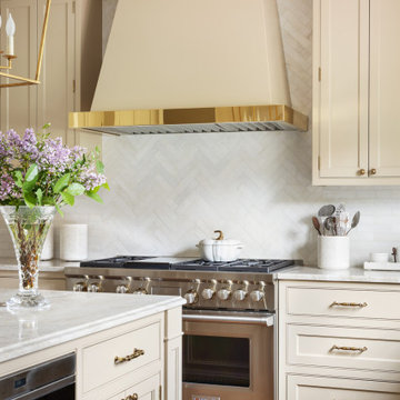
Hamptons-Inspired Kitchen
One cannot help but feel a distinct sense of serenity and timeless beauty when entering this Hamptons-style kitchen. Bathed in natural light and shimmering with inspired accents and details, this complete kitchen transformation is at once elegant and inviting. Plans and elevations were conceived to create balance and function without sacrificing harmony and visual intrigue.
A metal custom hood, with an eye-catching brass band and impeccably balanced cabinets on either side, provides a strong focal point for the kitchen, which can be viewed from the adjacent living room. Brass faucets, hardware and light fixtures complement and draw further attention to this anchoring element. A wall of glass cabinetry enhances the existing windows and pleasantly expands the sense of openness in the space.
Taj Mahal quartzite blends gracefully with the cabinet finishes. Cream-tone, herringbone tiles are custom-cut into different patterns to create a sense of visual movement as the eyes move across the room. An elegant, marble-top island paired with sumptuous, leather-covered stools, not only offers extra counterspace, but also an ideal gathering place for loved ones to enjoy.
This unforgettable kitchen gem shines even brighter with the addition of glass cabinets, designed to display the client’s collection of Portmeirion china. Careful consideration was given to the selection of stone for the countertops, as well as the color of paint for the cabinets, to highlight this inspiring collection.
Breakfast room
A thoughtfully blended mix of furniture styles introduces a splash of European charm to this Hamptons-style kitchen, with French, cane-back chairs providing a sense of airy elegance and delight.
A performance velvet adorns the banquette, which is piled high with lush cushions for optimal comfort while lounging in the room. Another layer of texture is achieved with a wool area rug that defines and accentuates this gorgeous breakfast nook with sprawling views of the outdoors.
Finishing features include drapery fabric and Brunschwig and Fils Bird and Thistle paper, whose natural, botanic pattern combines with the beautiful vistas of the backyard to inspire a sense of being in a botanical, outdoor wonderland.
 Native Edge Landscape
What a fantastic couple to work with! We were presented with the challenges of needing more outdoor living space, a place to rinse after long bike rides, and an area for the young couples newest addition to play. We did it! We doubled the outdoor living space, added an outdoor shower just off the new patio, and managed to use the shape of the yard to our advantage to create an easy flow and accessibility to the yard! We were left with a new landscape that fit this young couples awesome style of a modern-craftsman infusion!
Native Edge Landscape, LLC
 Urbanology Designs
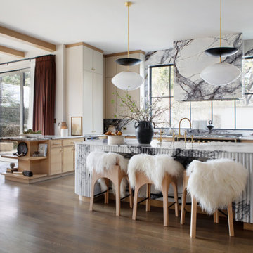
A captivating transformation in the coveted neighborhood of University Park, Dallas
The heart of this home lies in the kitchen, where we embarked on a design endeavor that would leave anyone speechless. By opening up the main kitchen wall, we created a magnificent window system that floods the space with natural light and offers a breathtaking view of the picturesque surroundings. Suspended from the ceiling, a steel-framed marble vent hood floats a few inches from the window, showcasing a mesmerizing Lilac Marble. The same marble is skillfully applied to the backsplash and island, featuring a bold combination of color and pattern that exudes elegance.
Adding to the kitchen's allure is the Italian range, which not only serves as a showstopper but offers robust culinary features for even the savviest of cooks. However, the true masterpiece of the kitchen lies in the honed reeded marble-faced island. Each marble strip was meticulously cut and crafted by artisans to achieve a half-rounded profile, resulting in an island that is nothing short of breathtaking. This intricate process took several months, but the end result speaks for itself.
To complement the grandeur of the kitchen, we designed a combination of stain-grade and paint-grade cabinets in a thin raised panel door style. This choice adds an elegant yet simple look to the overall design. Inside each cabinet and drawer, custom interiors were meticulously designed to provide maximum functionality and organization for the day-to-day cooking activities. A vintage Turkish runner dating back to the 1960s, evokes a sense of history and character.
The breakfast nook boasts a stunning, vivid, and colorful artwork created by one of Dallas' top artist, Kyle Steed, who is revered for his mastery of his craft. Some of our favorite art pieces from the inspiring Haylee Yale grace the coffee station and media console, adding the perfect moment to pause and loose yourself in the story of her art.
The project extends beyond the kitchen into the living room, where the family's changing needs and growing children demanded a new design approach. Accommodating their new lifestyle, we incorporated a large sectional for family bonding moments while watching TV. The living room now boasts bolder colors, striking artwork a coffered accent wall, and cayenne velvet curtains that create an inviting atmosphere. Completing the room is a custom 22' x 15' rug, adding warmth and comfort to the space. A hidden coat closet door integrated into the feature wall adds an element of surprise and functionality.
This project is not just about aesthetics; it's about pushing the boundaries of design and showcasing the possibilities. By curating an out-of-the-box approach, we bring texture and depth to the space, employing different materials and original applications. The layered design achieved through repeated use of the same material in various forms, shapes, and locations demonstrates that unexpected elements can create breathtaking results.
The reason behind this redesign and remodel was the homeowners' desire to have a kitchen that not only provided functionality but also served as a beautiful backdrop to their cherished family moments. The previous kitchen lacked the "wow" factor they desired, prompting them to seek our expertise in creating a space that would be a source of joy and inspiration.
Inspired by well-curated European vignettes, sculptural elements, clean lines, and a natural color scheme with pops of color, this design reflects an elegant organic modern style. Mixing metals, contrasting textures, and utilizing clean lines were key elements in achieving the desired aesthetic. The living room introduces bolder moments and a carefully chosen color scheme that adds character and personality.
The client's must-haves were clear: they wanted a show stopping centerpiece for their home, enhanced natural light in the kitchen, and a design that reflected their family's dynamic. With the transformation of the range wall into a wall of windows, we fulfilled their desire for abundant natural light and breathtaking views of the surrounding landscape.
Our favorite rooms and design elements are numerous, but the kitchen remains a standout feature. The painstaking process of hand-cutting and crafting each reeded panel in the island to match the marble's veining resulted in a labor of love that emanates warmth and hospitality to all who enter.
In conclusion, this tastefully lux project in University Park, Dallas is an extraordinary example of a full gut remodel that has surpassed all expectations. The meticulous attention to detail, the masterful use of materials, and the seamless blend of functionality and aesthetics create an unforgettable space. It serves as a testament to the power of design and the transformative impact it can have on a home and its inhabitants.
Project by Texas' Urbanology Designs. Their North Richland Hills-based interior design studio serves Dallas, Highland Park, University Park, Fort Worth, and upscale clients nationwide.


 Décor Aid
Having an eye for great interior design yet no clue on where to start or how to narrow down their aesthetic vision, a young family turned to Décor Aid to bring their drab pre-war Upper West Side apartment to life. With two young daughters in tow, our clients were looking for high style décor grounded in practicality and function – namely for their foyer, living room, dining room, and den.
Armed with a variety of inspiration from traditional to ultra-modern, they knew that they wanted their apartment’s interior design to look put together and thought through, but were short on a concise design direction.
In comes Décor Aid interior designer Gabrielle G. to revive their stark home with inspired design. After their initial in-home consultation, Gabrielle honed in on key decorative touchstones the couple had interest in and compiled a list of must-haves as an aesthetic foundation for the home.
Starting with fresh coats of pure white paint to liven up and brighten each room, Gabrielle took advantage of the apartments closed floor plan and gave each room it’s own design signature rather than having to ensure that everything flowed together – in turn, giving her more freedom.
Save for a china cabinet and formal dining table, Gabrielle was tasked with sourcing furnishings and accessories and went for clean simplicity as the couple also expressed that they’d like to have pieces that can move with them as their family grows while also being conducive for family life.
As you can see, the space is grounded with soothing neutrals so Gabrielle brought in pops of color and texture through accessories and abstract art for a sophisticated yet casual vibe.
The end result boasts concise design and pulled together everyday glamor for this modern family home that our clients adore, and so do we.
 Randy Angell Designs
This project is proof that the challenges posed by limited space and accessibility can always be overcome in order to deliver stunning results. The space itself was rather small and also very close to the neighboring residence. Not only was the neighboring wall imposing, it was also of a completely different design style.
The goal here was to create a layering effect with numerous features of varying heights. Not only would this add depth and dimension to the overall design, but it would cause the viewer to shift their focus from the encroaching wall to the beauty of the pool space.
Instead of trying to maximize the water area by squaring off the pool, I decided to instead maximize the visual interest by gracefully rounding off the back wall of the pool. This was accomplished by implementing a raised stucco wall, and also a shorter, matching curved wall, featuring a "Sheer Descent" waterfall.
Inside the taller, deep-plum stucco wall, I created three vertical windows which are all highlighted by LED uplighting. To give depth, dimension and some natural beauty, I implemented a simple bed of Horse Tail Reeds behind the short wall, and chose to place Banana Trees behind the taller wall.
The main seating area is just outside the home's master suite, and is separated by a "Leuder" limestone fire pit. Aside from being a striking design feature, the floating stepper pads accomplish a number of things; they serve triple-duty as a walkway, a seating area adjacent to the fire pit, and also as a poolside rest for beverages.
After discovering that the narrow courtyard acted as a sort of wind tunnel between the two houses, we opted to install tempered glass in order to better control the behavior of the flames. This solved the problem while remaining visually pleasing to the client as well.
You'll notice in some of the leading photos for this project that I had originally intended to implement stepper pads on both sides of the pool closest to the house. And despite a thorough understanding of what would be necessary on an engineering and structural-design basis, we were eventually forced to turn this into a solid deck due to unrelenting city-required setbacks. However the client remained very understanding due to encountering a number of similar issues in their home-build process.
In the end, they were delivered an outstanding pool design that had come to fruition only after coming up with numerous solutions to a number of challenges that only a unique space like this could provide.

 Lanson B. Jones & Co, Inc.
Weighted hedging mirrors the architecture of this traditional English Tudor cottage. The garden entrance lines up with a bay window whose dimensions are replicated in the brick-banded landings on either side of the lawn ellipse. Chiseled boxwood hedges respond to the graduated steps and English Ivy banding. The purity of the lawn ellipse is juxtaposed by irregular stepping pads while an elliptical holly mirrors the timbering present in the home's façade. Handmade ironwork features custom designed flanking shields while a perennial garden gives soft contrast to the rigid hedging, offering a perfect balance between the formal and informal elements in the English cottage garden.
 TVL Creative Ltd.
This remodel took a dated and cramped bathroom and transformed it into a classy oasis for our Lowry clients. The clients had a limited budget and wanted to leave the space as in-place as possible. However, the large drop in tub ate valuable floor space and a half wall between the shower and tub had become a holding place for random items without a home. The thick frame on the shower glass made the shower feel extremely small, and the dated lighting and fixtures further depressed the space. We proposed a traditional and elegant design that consider the client's budgetary and spatial constraints. We removed the existing drop-in tub and replaced it with a lovely free-standing soaker. The length of this tub is short, but the depth is exaggerated, making it an ideal replacement in this tiny footprint. The shower glass was swapped for framless glass that boldly expands space. We tore out the existing carpet and installed gorgeous wood-look tile that adds depth and warmth to the room. The clients opted to keep their existing vanity to save cost, so a new top was added to bring the aesthetic up to the level of the new additions. The wall paint was taken from a buttery yellow to a soft gray-green, accented by a darker version of this same color on the siding barn door and toilet room door. New vanity lights, faucets, and storage shelves were installed to help our clients organize and keep things off the counter tops. Finally, new custom up-down window shades were curated for the bathroom to add to the final touch. This space is a simple scope with a dramatic transformation that introduces a timeless look for years to come.
Sponsored
Columbus, OH

Hope Restoration & General Contracting
Columbus Design-Build, Kitchen & Bath Remodeling, Historic Renovations

 ALVAREZ-DIAZ & VILLALON
Photography by Carlos Esteva.
When this private client, a married couple, first approached Álvarez-Díaz & Villalón to build ‘the house of their dreams’ on the grounds of their sprawling family estate, the first challenge was to identify the exact location that would maximize the positive aspects of the topography while affording the most gracious views. Propped up on scaffolding, juggling digital cameras and folding ladders, the design team photographed the property from hundreds of angles before the ideal site was selected.
Once the site was selected, construction could begin.
The building’s foundation was raised slightly off the ground to disperse geothermal heat. In addition, the designers studied daily sunlight patterns and positioned the structure accordingly in order to warm the swimming pool during the cooler morning hours and illuminate the principal living quarters during the late afternoon. Finally, the main house was designed with functional balconies on all sides: each balcony meticulously planned ~ and precisely positioned ~ to
both optimize wind flow and frame the property’s most breath-taking views.
Stylistically, the goal was to create an authentic Spanish hacienda. Following Old World tradition, the house was anchored around a centralized interior patio
in the Moorish style: enclosed on three sides ~ yet
open on the fourth (similar to the Alcázar of Seville) ~ to reveal a reflecting pool ~ and mirror the water motif of the home’s magnificent marble fountain. A bell tower, horseshoe arches, a colonnaded,vineyard-style patio, and
ornamental Moorish mosaic tilework (“azulejos”) completed this picturesque portrait of a faraway fantasy world of castles, chivalry, and swordsplay, reminiscent of Medieval Spain.
Shortly after completion, this showcase home was showcased on the TVE Spanish television series Spaniards Around The World (Españoles Alrededor
Del Mundo) as a prime example of authentic Spanish architecture designed outside the peninsula. Not surprising. After all, the story of a fairy-tale retreat as
magical as this one deserves a happy ending.

 TKS Design Group
Free ebook, Creating the Ideal Kitchen. DOWNLOAD NOW
The Klimala’s and their three kids are no strangers to moving, this being their fifth house in the same town over the 20-year period they have lived there. “It must be the 7-year itch, because every seven years, we seem to find ourselves antsy for a new project or a new environment. I think part of it is being a designer, I see my own taste evolve and I want my environment to reflect that. Having easy access to wonderful tradesmen and a knowledge of the process makes it that much easier”.
This time, Klimala’s fell in love with a somewhat unlikely candidate. The 1950’s ranch turned cape cod was a bit of a mutt, but it’s location 5 minutes from their design studio and backing up to the high school where their kids can roll out of bed and walk to school, coupled with the charm of its location on a private road and lush landscaping made it an appealing choice for them.
“The bones of the house were really charming. It was typical 1,500 square foot ranch that at some point someone added a second floor to. Its sloped roofline and dormered bedrooms gave it some charm.” With the help of architect Maureen McHugh, Klimala’s gutted and reworked the layout to make the house work for them. An open concept kitchen and dining room allows for more frequent casual family dinners and dinner parties that linger. A dingy 3-season room off the back of the original house was insulated, given a vaulted ceiling with skylights and now opens up to the kitchen. This room now houses an 8’ raw edge white oak dining table and functions as an informal dining room. “One of the challenges with these mid-century homes is the 8’ ceilings. I had to have at least one room that had a higher ceiling so that’s how we did it” states Klimala.
The kitchen features a 10’ island which houses a 5’0” Galley Sink. The Galley features two faucets, and double tiered rail system to which accessories such as cutting boards and stainless steel bowls can be added for ease of cooking. Across from the large sink is an induction cooktop. “My two teen daughters and I enjoy cooking, and the Galley and induction cooktop make it so easy.” A wall of tall cabinets features a full size refrigerator, freezer, double oven and built in coffeemaker. The area on the opposite end of the kitchen features a pantry with mirrored glass doors and a beverage center below.
The rest of the first floor features an entry way, a living room with views to the front yard’s lush landscaping, a family room where the family hangs out to watch TV, a back entry from the garage with a laundry room and mudroom area, one of the home’s four bedrooms and a full bath. There is a double sided fireplace between the family room and living room. The home features pops of color from the living room’s peach grass cloth to purple painted wall in the family room. “I’m definitely a traditionalist at heart but because of the home’s Midcentury roots, I wanted to incorporate some of those elements into the furniture, lighting and accessories which also ended up being really fun. We are not formal people so I wanted a house that my kids would enjoy, have their friends over and feel comfortable.”
The second floor houses the master bedroom suite, two of the kids’ bedrooms and a back room nicknamed “the library” because it has turned into a quiet get away area where the girls can study or take a break from the rest of the family. The area was originally unfinished attic, and because the home was short on closet space, this Jack and Jill area off the girls’ bedrooms houses two large walk-in closets and a small sitting area with a makeup vanity. “The girls really wanted to keep the exposed brick of the fireplace that runs up the through the space, so that’s what we did, and I think they feel like they are in their own little loft space in the city when they are up there” says Klimala.
Designed by: Susan Klimala, CKD, CBD
Photography by: Carlos Vergara
For more information on kitchen and bath design ideas go to: www.kitchenstudio-ge.com
 TVL Creative Ltd.
This remodel took a dated and cramped bathroom and transformed it into a classy oasis for our Lowry clients. The clients had a limited budget and wanted to leave the space as in-place as possible. However, the large drop in tub ate valuable floor space and a half wall between the shower and tub had become a holding place for random items without a home. The thick frame on the shower glass made the shower feel extremely small, and the dated lighting and fixtures further depressed the space. We proposed a traditional and elegant design that consider the client's budgetary and spatial constraints. We removed the existing drop-in tub and replaced it with a lovely free-standing soaker. The length of this tub is short, but the depth is exaggerated, making it an ideal replacement in this tiny footprint. The shower glass was swapped for framless glass that boldly expands space. We tore out the existing carpet and installed gorgeous wood-look tile that adds depth and warmth to the room. The clients opted to keep their existing vanity to save cost, so a new top was added to bring the aesthetic up to the level of the new additions. The wall paint was taken from a buttery yellow to a soft gray-green, accented by a darker version of this same color on the siding barn door and toilet room door. New vanity lights, faucets, and storage shelves were installed to help our clients organize and keep things off the counter tops. Finally, new custom up-down window shades were curated for the bathroom to add to the final touch. This space is a simple scope with a dramatic transformation that introduces a timeless look for years to come.
225