
Search results for "Simple tasks" in Home Design Ideas
 TKS Design Group
Free ebook, Creating the Ideal Kitchen. DOWNLOAD NOW
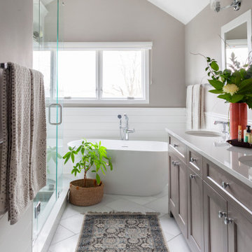
This client came to us wanting some help with updating the master bath in their home. Their primary goals were to increase the size of the shower, add a rain head, add a freestanding tub and overall freshen the feel of the space.
The existing layout of the bath worked well, so we left the basic footprint the same, but increased the size of the shower and added a freestanding tub on a bit of an angle which allowed for some additional storage.
One of the most important things on the wish list was adding a rainhead in the shower, but this was not an easy task with the angled ceiling. We came up with the solution of using an extra long wall-mounted shower arm that was reinforced with a meal bracket attached the ceiling. This did the trick, and no extra framing or insulation was required to make it work.
The materials selected for the space are classic and fresh. Large format white oriental marble is used throughout the bath, on the floor in a herrinbone pattern and in a staggered brick pattern on the walls. Alder cabinets with a gray stain contrast nicely with the white marble, while shiplap detail helps unify the space and gives it a casual and cozy vibe. Storage solutions include an area for towels and other necessities at the foot of the tub, roll out shelves and out storage in the vanities and a custom niche and shaving ledge in the shower. We love how just a few simple changes can make such a great impact!
Designed by: Susan Klimala, CKBD
Photography by: LOMA Studios
For more information on kitchen and bath design ideas go to: www.kitchenstudio-ge.com
 Cure Design Group
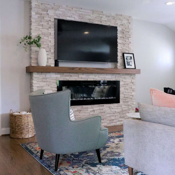
a classic city home, built in the 50’s. Her family moved in August of ’18, and in less than a year, she’s already completed a number of remodel projects including additions to the master bedroom and 2-bedroom + bath “kids’ wing.” She’s opened walls from the kitchen to the living and dining rooms creating a massive open floor plan and refinished all the original hardwood floors. After seeing her beautifully furnished space and hearing her listing everything she’s done to get her house the way it looks today, I had so many exciting ideas to help her add the finishing touches she was needing and to give her the look she was going for.
Referencing her inspiration pics saved to Houzz and Pinterest, the first item on the list was to add window treatments. These were presented in a soft, crisp white fabric which maintains the brightness for each room, diffusing the sunlight throughout, keeping each space light and airy. The simple functional panels give her the privacy she wanted from all the passersby walking the park, which are lined to help regulate the temperature differences she needed. The hardware for these panels is something to mention –simple, modern, matte black rods and brackets, highlighted with acrylic finials and gold rings. This combination is an exclamation point showcasing what custom window treatments can really do for a room. The main dining room window boasts a striking contrast of rich black wide leather tape, drawing your eye right to the beautiful picture window, which in and of itself is a perfect accent to this space.
From there, adding the right wall hangings and artwork, task lighting, accessories, and accents layered throughout, mixing lots of textures, metal finishes, and varying shades of color synchronizes one room to the next buttoning up the entire design concept she was striving to achieve.
 Edgewater Design Group
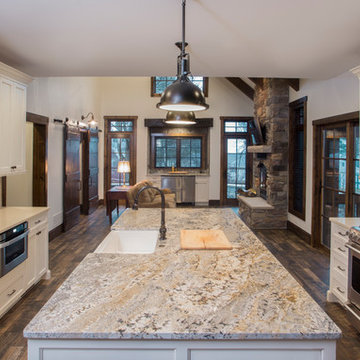
The family purchased the 1950s ranch on Mullet Lake because their daughter dreamed of being married on its shores. The home would be used for the wedding venue and then as a wedding gift to the young couple. We were originally hired in August 2014 to help with a simple renovation of the home that was to be completed well in advance of the August 2015 wedding date. However, thorough investigation revealed significant issues with the original foundation, floor framing and other critical elements of the home’s structure that made that impossible. Based on this information, the family decided to tear down and build again. So now we were tasked with designing a new home that would embody their daughter’s vision of a storybook home – a vision inspired by another one of our projects that she had toured. To capture this aesthetic, traditional cottage materials such as stone and cedar shakes are accentuated by more materials such as reclaimed barn wood siding and corrugated CORTEN steel accent roofs. Inside, interior finishes include hand-hewn timber accents that frame openings and highlight features like the entrance reading nook. Natural materials shine against white walls and simply furnished rooms. While the house has nods to vintage style throughout, the open-plan kitchen and living area allows for both contemporary living and entertaining. We were able to capture their daughter’s vision and the home was completed on time for her big day.
- Jacqueline Southby Photography
Find the right local pro for your project

 Chester County Kitchen & Bath
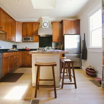
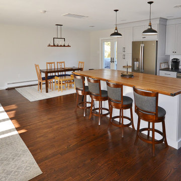
The first floor of this Bi-level home had 3 rooms; a family room, a dining room, and a 10x10 kitchen. The clients wanted a more open floor plan and an expanded kitchen area. Nothing a 23’ beam couldn’t solve and like a magic trick; no walls. The original kitchen window was left untouched and now it seems like it was meant to have the new kitchen around it. A back entry door into the kitchen was removed and the dining room’s window was turned into a sliding door to the patio. The newly expanded kitchen was designed in Fabuwood cabinetry in the Galaxy Nickle door style. The new large butcher block island top becomes center stage. The houses original hardwood floors were repaired, refinished and added to. A simple subway tile backsplash with focal above the cooktop pops with the contrasting grout. New LED recessed lighting throughout and LED under cabinet task lighting will make sure this new space is never dark and dreary. Now the clients have a fantastic new place to live and entertain.
 Chester County Kitchen & Bath
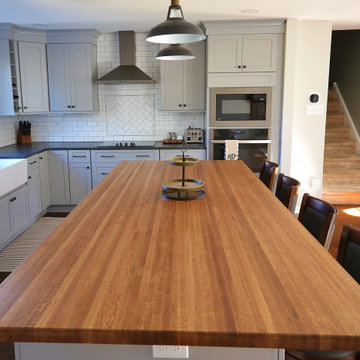
The first floor of this Bi-level home had 3 rooms; a family room, a dining room, and a 10x10 kitchen. The clients wanted a more open floor plan and an expanded kitchen area. Nothing a 23’ beam couldn’t solve and like a magic trick; no walls. The original kitchen window was left untouched and now it seems like it was meant to have the new kitchen around it. A back entry door into the kitchen was removed and the dining room’s window was turned into a sliding door to the patio. The newly expanded kitchen was designed in Fabuwood cabinetry in the Galaxy Nickle door style. The new large butcher block island top becomes center stage. The houses original hardwood floors were repaired, refinished and added to. A simple subway tile backsplash with focal above the cooktop pops with the contrasting grout. New LED recessed lighting throughout and LED under cabinet task lighting will make sure this new space is never dark and dreary. Now the clients have a fantastic new place to live and entertain.
 Coco Maison Design
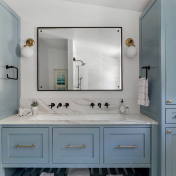
We planned a thoughtful redesign of this beautiful home while retaining many of the existing features. We wanted this house to feel the immediacy of its environment. So we carried the exterior front entry style into the interiors, too, as a way to bring the beautiful outdoors in. In addition, we added patios to all the bedrooms to make them feel much bigger. Luckily for us, our temperate California climate makes it possible for the patios to be used consistently throughout the year.
The original kitchen design did not have exposed beams, but we decided to replicate the motif of the 30" living room beams in the kitchen as well, making it one of our favorite details of the house. To make the kitchen more functional, we added a second island allowing us to separate kitchen tasks. The sink island works as a food prep area, and the bar island is for mail, crafts, and quick snacks.
We designed the primary bedroom as a relaxation sanctuary – something we highly recommend to all parents. It features some of our favorite things: a cognac leather reading chair next to a fireplace, Scottish plaid fabrics, a vegetable dye rug, art from our favorite cities, and goofy portraits of the kids.
---
Project designed by Courtney Thomas Design in La Cañada. Serving Pasadena, Glendale, Monrovia, San Marino, Sierra Madre, South Pasadena, and Altadena.
For more about Courtney Thomas Design, see here: https://www.courtneythomasdesign.com/
To learn more about this project, see here:
https://www.courtneythomasdesign.com/portfolio/functional-ranch-house-design/
Sponsored
Columbus, OH

Hope Restoration & General Contracting
Columbus Design-Build, Kitchen & Bath Remodeling, Historic Renovations
 Renovisions
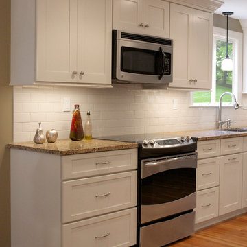
Our client was ready for a re-do and approached Renovisions for help to design and build a beautiful and durable space that will last as well as add value to her home.
The challenge was to design the new kitchen to allow for better traffic, flow and functionalize this space for much needed storage. Moving the refrigerator to the other side of the kitchen and opening up a section of the wall between the dining room and kitchen was a great design solution. We increased the flow to the dining room and created a spacious feel with better access from the dining area.
Warm hues from the granite countertops provided a rich contrast to the Ivory colored cabinetry that brightened up the room. Under-cabinet lighting was added over all countertop areas and is controlled by a dimmer switch for both task and ambient lighting.
The brushed nickel hardware compliments the stainless steel appliances and Jado pull-down single lever faucet.
The walls are a warm and inviting earthy green tone and ties in well with the soft linen hue of the beautiful subway tile backsplash.
Simple, clean lines and earthy materials like granite and stainless steel worked together to soften the whole look.
Renovisions turned this outdated kitchen into a magnificent space where this homeowner plans on spending a lot of time.
 MC Design LLC
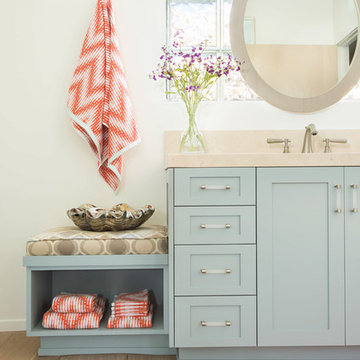
A second vanity replaced a bathtub in this Jack-and-Jill bathroom. A custom wood framed oval mirror hangs from the ceiling in front of the glass block window, creating the ideal lighting conditions to apply makeup in the daylight.
 nancekivell home planning & design
Eastview Before & After Exterior Renovation
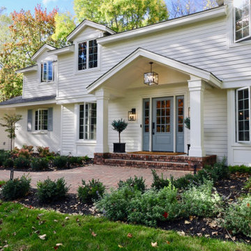
Enhancing a home’s exterior curb appeal doesn’t need to be a daunting task. With some simple design refinements and creative use of materials we transformed this tired 1950’s style colonial with second floor overhang into a classic east coast inspired gem. Design enhancements include the following:
• Replaced damaged vinyl siding with new LP SmartSide, lap siding and trim
• Added additional layers of trim board to give windows and trim additional dimension
• Applied a multi-layered banding treatment to the base of the second-floor overhang to create better balance and separation between the two levels of the house
• Extended the lower-level window boxes for visual interest and mass
• Refined the entry porch by replacing the round columns with square appropriately scaled columns and trim detailing, removed the arched ceiling and increased the ceiling height to create a more expansive feel
• Painted the exterior brick façade in the same exterior white to connect architectural components. A soft blue-green was used to accent the front entry and shutters
• Carriage style doors replaced bland windowless aluminum doors
• Larger scale lantern style lighting was used throughout the exterior
 Edgewater Design Group
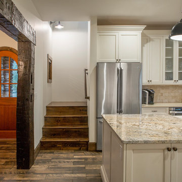
The family purchased the 1950s ranch on Mullet Lake because their daughter dreamed of being married on its shores. The home would be used for the wedding venue and then as a wedding gift to the young couple. We were originally hired in August 2014 to help with a simple renovation of the home that was to be completed well in advance of the August 2015 wedding date. However, thorough investigation revealed significant issues with the original foundation, floor framing and other critical elements of the home’s structure that made that impossible. Based on this information, the family decided to tear down and build again. So now we were tasked with designing a new home that would embody their daughter’s vision of a storybook home – a vision inspired by another one of our projects that she had toured. To capture this aesthetic, traditional cottage materials such as stone and cedar shakes are accentuated by more materials such as reclaimed barn wood siding and corrugated CORTEN steel accent roofs. Inside, interior finishes include hand-hewn timber accents that frame openings and highlight features like the entrance reading nook. Natural materials shine against white walls and simply furnished rooms. While the house has nods to vintage style throughout, the open-plan kitchen and living area allows for both contemporary living and entertaining. We were able to capture their daughter’s vision and the home was completed on time for her big day.
- Jacqueline Southby Photography
 Decorations Lucullus
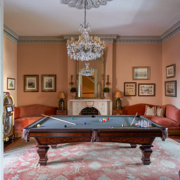
This venerable 1840’s townhouse has a youthful owner who loves vibrant color and the folds of fabric. Part whimsy and part serious, these rooms are filled weekend after weekend with family and friends. Out of town guests love the simple old dependency rooms, once intended for servants and rowdy 19th century boys. The trick was to use every alcove and passageway to create places for gathering. No question the billiard table conjures up fabled Southern habits of idling. Just in case that sounds too serious, throw in a jukebox stocked with vintage country and rock. High style doesn’t mean the good times don’t roll.

Sponsored
Columbus, OH
Hope Restoration & General Contracting
Columbus Design-Build, Kitchen & Bath Remodeling, Historic Renovations
 Renovisions
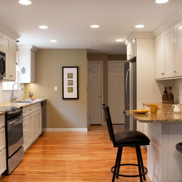
Our client was ready for a re-do and approached Renovisions for help to design and build a beautiful and durable space that will last as well as add value to her home.
The challenge was to design the new kitchen to allow for better traffic, flow and functionalize this space for much needed storage. Moving the refrigerator to the other side of the kitchen and opening up a section of the wall between the dining room and kitchen was a great design solution. We increased the flow to the dining room and created a spacious feel with better access from the dining area.
Warm hues from the granite countertops provided a rich contrast to the Ivory colored cabinetry that brightened up the room. Under-cabinet lighting was added over all countertop areas and is controlled by a dimmer switch for both task and ambient lighting.
The brushed nickel hardware compliments the stainless steel appliances and Jado pull-down single lever faucet.
The walls are a warm and inviting earthy green tone and ties in well with the soft linen hue of the beautiful subway tile backsplash.
Simple, clean lines and earthy materials like granite and stainless steel worked together to soften the whole look.
Renovisions turned this outdated kitchen into a magnificent space where this homeowner plans on spending a lot of time.

 Talie Jane Interiors & Construction
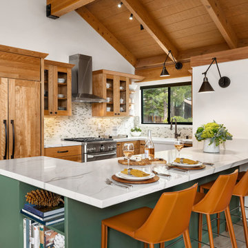
Full kitchen remodel. Main goal = open the space (removed overhead wooden structure). New configuration, cabinetry, countertops, backsplash, panel-ready appliances (GE Monogram), farmhouse sink, faucet, oil-rubbed bronze hardware, track and sconce lighting, paint, bar stools, accessories.
 Lori Ramsay Design
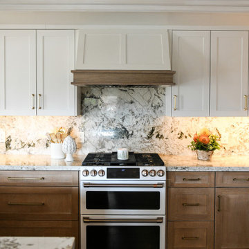
This kitchen was transformed to a highly functional and beautiful space while keeping the original footprint primarily intact. White oak cabinets with white uppers are classic and timeless. The GE Cafe white appliances with rose gold finishes add a simple elegance. White granite countertops with forrest green crystals create a brightl and grounded beauty.
Sponsored
Columbus, OH
Hope Restoration & General Contracting
Columbus Design-Build, Kitchen & Bath Remodeling, Historic Renovations
 Cure Design Group
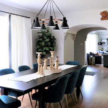
a classic city home, built in the 50’s. Her family moved in August of ’18, and in less than a year, she’s already completed a number of remodel projects including additions to the master bedroom and 2-bedroom + bath “kids’ wing.” She’s opened walls from the kitchen to the living and dining rooms creating a massive open floor plan and refinished all the original hardwood floors. After seeing her beautifully furnished space and hearing her listing everything she’s done to get her house the way it looks today, I had so many exciting ideas to help her add the finishing touches she was needing and to give her the look she was going for.
Referencing her inspiration pics saved to Houzz and Pinterest, the first item on the list was to add window treatments. These were presented in a soft, crisp white fabric which maintains the brightness for each room, diffusing the sunlight throughout, keeping each space light and airy. The simple functional panels give her the privacy she wanted from all the passersby walking the park, which are lined to help regulate the temperature differences she needed. The hardware for these panels is something to mention –simple, modern, matte black rods and brackets, highlighted with acrylic finials and gold rings. This combination is an exclamation point showcasing what custom window treatments can really do for a room. The main dining room window boasts a striking contrast of rich black wide leather tape, drawing your eye right to the beautiful picture window, which in and of itself is a perfect accent to this space.
From there, adding the right wall hangings and artwork, task lighting, accessories, and accents layered throughout, mixing lots of textures, metal finishes, and varying shades of color synchronizes one room to the next buttoning up the entire design concept she was striving to achieve.
 Renovisions
Our client was ready for a re-do and approached Renovisions for help to design and build a beautiful and durable space that will last as well as add value to her home.
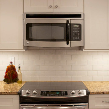
The challenge was to design the new kitchen to allow for better traffic, flow and functionalize this space for much needed storage. Moving the refrigerator to the other side of the kitchen and opening up a section of the wall between the dining room and kitchen was a great design solution. We increased the flow to the dining room and created a spacious feel with better access from the dining area.
Warm hues from the granite countertops provided a rich contrast to the Ivory colored cabinetry that brightened up the room. Under-cabinet lighting was added over all countertop areas and is controlled by a dimmer switch for both task and ambient lighting.
The brushed nickel hardware compliments the stainless steel appliances and Jado pull-down single lever faucet.
The walls are a warm and inviting earthy green tone and ties in well with the soft linen hue of the beautiful subway tile backsplash.
Simple, clean lines and earthy materials like granite and stainless steel worked together to soften the whole look.
Renovisions turned this outdated kitchen into a magnificent space where this homeowner plans on spending a lot of time.
 GPH Services
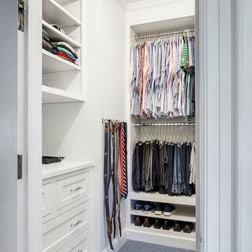
Small elegant women's carpeted and blue floor walk-in closet photo in Detroit with recessed-panel cabinets and white cabinets
59