
Search results for "Simply remove" in Home Design Ideas
 Armitage Interiors - Home Design & Renovation
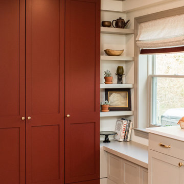
When we arrived at this kitchen in Solebury it was dated and closed in. A center peninsula divided the space and a wall at the end separated a tiny dining room. We completely redesigned the layout by removing the wall between the kitchen and dining room and adding a window to gain some natural light.
The homeowners loved the rich cranberry color but struggled to integrate it without overwhelming the space with red. The window treatments and floor to ceiling pantry gave us the perfect opportunity to accent the color palette throughout the room. Some open shelving and a chair rail along the top of the backsplash allow for decoration and keep the counters clutter free.
This quickly became one of our favorite kitchen renovations simply because of the dramatic changes we were able to make
 Classic Kitchens Designs & Renovations Ltd.
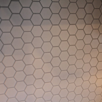
This charming century home is steeped in Oshawa's history, but it needed a facelift that would bring it up to speed for todays living. We removed the tired cabinets and corrected the sagging legacy beam, in order pave the way for a new and fresh look in the kitchen, which was more in keeping with the homeowners lifestyle. New porcilain floors were laid and new shaker style cabinetry was installed, finished with custom Benjamin Moore "Oxford white" paint. Cambria "Brittanica" quartz countertops were used complete with a matching waterfall quartz end to make the look much more contemporary. Mosaic tile was used for the backsplash and open shelving in walnut added to tie in some of the history of the home with the great new look of the kitchen. The end result is simply stunning!

 Specialty Air Inc
Always make sure that the air ducts for your air conditioner are checked periodically to clean out the dirt that builds up as the dirty vents can strain the HVAC system and affect the indoor air quality. Read the blog for detailed information.
Find the right local pro for your project
 THE Remodel Group
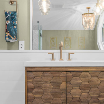
A luxurious en suite bath was created within this classic 1925 Portland bungalow by reconfiguring the second story’s original small bedrooms and tiny half bath. In this welcoming new urban boho space, eclectic finishes mingle harmoniously, integrated through subtle repetition of shapes and materials.
A furniture-style vanity sets the tone for this luxurious space, introducing materials, colors, shapes, and textures that repeat throughout. Individual walnut hexagons join to create distinctive vanity doors, offset beautifully by horizontal-grain drawers. Topping the cabinetry is a simple concrete countertop with integral sinks. An expansive framed mirror above enlarges and brightens the room. Within the mirror, sconces float, their globes a nod to the hexagons below. Champagne bronze fixtures reflect the warm walnut glow. Nestled into the back corner, a stunning shower features waterjet tiles in a double herringbone pattern, each precisely cut and laid to maintain design integrity at every surface transition. Teak floor tiles and a pebbled niche hint at the classic spa experience. Across from the shower, a large hexagonal window provides a treetop view from the free-standing tub below. The gentle oval of the tub and the beaded chandelier above provide a pleasing contrast to the strong lines surrounding it, as do the softly-shaded pebbles in the full-length niche. Shiplap wainscotting wraps the room, creating an illusion of height in the compact space. Subtle flooring and soft green walls create an understated backdrop for the bold mix of materials, unifying them into a serene oasis.
Asking a century-old home to accommodate a modern luxury bath is a tall order. Asbestos-laden plaster and flooring had to be abated. The subfloor had to be leveled and reinforced to increase strength and prevent deflection. Water lines and multiple electrical circuits had to be brought across and up without disturbing a beautifully-paneled ceiling, something we accomplished by firring out stair walls to hide the chases. Our client had visions of a leafy view from her tub, but the new layout eliminated existing windows. Placing a new window was complicated by deep eaves and flat soffits. By pushing the header into the roofline, however, we were able to accommodate a picture window. The flat soffit was replaced by an inverse hip lined with stained tongue and groove cedar, tying it to the bathroom finishes. Bringing materials up a narrow staircase became truly challenging when it was time to install the big items. However, strategic removal of drywall around the landing got the job done. Our attention to detail is showcased in the shower tile, where precise cuts were required at surface transitions to maintain the integrity of a complex double herringbone lay. The project was delivered on time.
Savvy layout choices minimized spending on structural changes. Because we were dealing with dormer space, head height was an issue. Raising the ceiling would have been complex and expensive so our design accommodated the constraints – tub on the low outside wall, shower on the full-height interior wall. The vanity spanned the spread, accommodating our petite client on the exterior side and her taller husband on the interior side. An under-eave closet was closed off to create room for both a freestanding tub and a separate shower. Rather than building replacement storage elsewhere, we simply added a new door into the closet from the primary bedroom. This was made possible by absorbing the short hallway separating the existing bed and bathroom into the primary bedroom. This new layout also created an en suite relationship between the primary bedroom and the new bath. We saved additional dollars by selecting a furniture-style vanity rather than using custom cabinetry, and the countertop with integral sinks provided a cost savings over a more traditional quartz countertop with undermount sinks. Affordable shower tiles allowed us to put more money into a dynamic tile layout. The project was delivered within budget.
 Drury Design
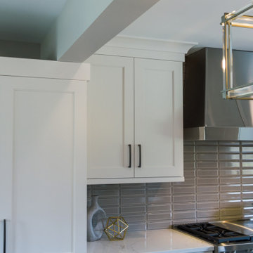
Design objectives for the remodel were aimed at giving the kitchen a larger feel, more room for cooking and extra seating for entertaining:
-Island with seating
-Space for a larger range/cooking area
-More storage with cabinets to the ceiling
-Making the original dining room blend with the kitchen so it all feels like one space
Design challenges to be solved:
-Making the header between the kitchen and the old dining room make sense as we combined the two spaces
-Avoid feeling crammed – a large island with seating still needed space for people walking around the space
-Refrigerator location – the header and window placements needed to stay, so finding a new and functional place for the fridge was a priority
-Add a large hood for wow-factor appeal
Design solutions fell into place as the overall layout came together:
-A large island to seat their four-person family comfortably. -Seating on two sides of the island improves conversation and has a great look.
-Knocking out a dining room wall gave us more room for the island. The leftover part of the dining was perfect for a dry bar/beverage area.
-The refrigerator needed to blend in and also be easily accessible. We removed the built-in pantry and used this space to house the refrigerator/freezer. Then we added tall pantry cabinets throughout the kitchen to make up for the loss of space.
-A large metal hood broke up the space and made for a fun statement piece
The new space is perfect for family time when the kids are back. It’s more conducive for being together, hanging out together, and entertaining with different friend groups together… the family simply spends more time together when they’re together in their new space.
“It’s the design and the openness,” the mom says. “Everybody loves it and gathers around the island all the time. It’s the lighting, too – it’s brighter in here. It’s just more open. We love it!”

 Crystal Kitchen + Bath
Infusing this once, drab 80’s kitchen with light and color was one goal in this extensive remodel. By removing the wall separating the dining room from the kitchen, the space doubled in size and allowed natural light to flood it.
Creating a design that filled the space yet remained very functional to the homeowner was extremely important. By implementing the two working triangles, one homeowner can be using the sink, cooktop and refrigerator while the other uses the secondary island for food prep as it has an additional sink.
A large soffit housing HVAC runs through the middle of the townhome and seemed intrusive to the space at first. After embracing it in the design, it’s as if it were meant to be. Three aluminum framed cabinets hang below, one directly underneath the soffit to create an asymmetrical design.
On a budget but still wanting a beautiful design, Crystal’s semi-custom line of cabinetry came into play. Simply White and Light Grey provide the perfect backdrop for natural maple, brushed gold hardware and accessories that infuse the space with color. Inside the cabinetry, the best storage solutions make for an extremely functional kitchen!
What a dream it is to have a kitchen that boasts quality, functionality and makes a person feel inspired within it.
Photography: Paige Kilgore
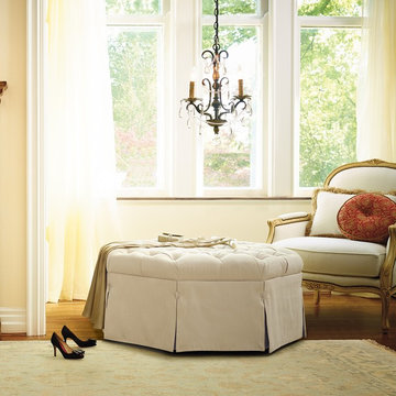
 FRONTGATE
You're sure to fall head-over-heels for our Serena Shoe Ottoman. Exquisitely tailored and masterfully crafted, Serena elegantly keeps your shoes organized and easy to find. Simply open the hinged top to reveal 15 removable pockets along the perimeter and ample room in the middle for boots, belts or handbags. With its button-tufted upholstered seating, dressmaker's skirting and fleur-de-lis medallions, Serena is a beautiful way to declutter.


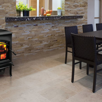
 Quadra-Fire Wood & Pellet Stoves
The Explorer II delivers beautiful, powerful performance you can see. Get maximum heat and a clean burn with the Quadra-Fire four point burn system delivering up to 65,800 BTU's. Save time with Quadra-Fire's exclusive Automatic Combustion Control (ACC). Simply load the wood, light the fire and walk away. Quadra-Fire's ash removal system (ARS) makes cleaning quick and easy. Enjoy the looks and performance of cast iron with a solid steel welded firebox - proving it's built to last.
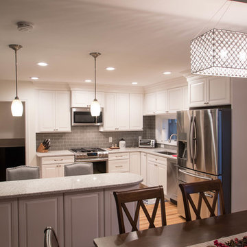
 LBK Design Build
This was a fun project because the original kitchen was so small even though the house is approximately 2000 square ft. By simply opening the space by removing a non load bearing wall sperating the dining room, we made a dramatic change in the way the home owners can use the space. Aside from having the use and conveniences of a modern day kitchen, they are now able to effectively entertain their guests, which they now do more often.
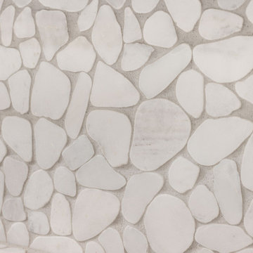 THE Remodel Group
A luxurious en suite bath was created within this classic 1925 Portland bungalow by reconfiguring the second story’s original small bedrooms and tiny half bath. In this welcoming new urban boho space, eclectic finishes mingle harmoniously, integrated through subtle repetition of shapes and materials.
A furniture-style vanity sets the tone for this luxurious space, introducing materials, colors, shapes, and textures that repeat throughout. Individual walnut hexagons join to create distinctive vanity doors, offset beautifully by horizontal-grain drawers. Topping the cabinetry is a simple concrete countertop with integral sinks. An expansive framed mirror above enlarges and brightens the room. Within the mirror, sconces float, their globes a nod to the hexagons below. Champagne bronze fixtures reflect the warm walnut glow. Nestled into the back corner, a stunning shower features waterjet tiles in a double herringbone pattern, each precisely cut and laid to maintain design integrity at every surface transition. Teak floor tiles and a pebbled niche hint at the classic spa experience. Across from the shower, a large hexagonal window provides a treetop view from the free-standing tub below. The gentle oval of the tub and the beaded chandelier above provide a pleasing contrast to the strong lines surrounding it, as do the softly-shaded pebbles in the full-length niche. Shiplap wainscotting wraps the room, creating an illusion of height in the compact space. Subtle flooring and soft green walls create an understated backdrop for the bold mix of materials, unifying them into a serene oasis.
Asking a century-old home to accommodate a modern luxury bath is a tall order. Asbestos-laden plaster and flooring had to be abated. The subfloor had to be leveled and reinforced to increase strength and prevent deflection. Water lines and multiple electrical circuits had to be brought across and up without disturbing a beautifully-paneled ceiling, something we accomplished by firring out stair walls to hide the chases. Our client had visions of a leafy view from her tub, but the new layout eliminated existing windows. Placing a new window was complicated by deep eaves and flat soffits. By pushing the header into the roofline, however, we were able to accommodate a picture window. The flat soffit was replaced by an inverse hip lined with stained tongue and groove cedar, tying it to the bathroom finishes. Bringing materials up a narrow staircase became truly challenging when it was time to install the big items. However, strategic removal of drywall around the landing got the job done. Our attention to detail is showcased in the shower tile, where precise cuts were required at surface transitions to maintain the integrity of a complex double herringbone lay. The project was delivered on time.
Savvy layout choices minimized spending on structural changes. Because we were dealing with dormer space, head height was an issue. Raising the ceiling would have been complex and expensive so our design accommodated the constraints – tub on the low outside wall, shower on the full-height interior wall. The vanity spanned the spread, accommodating our petite client on the exterior side and her taller husband on the interior side. An under-eave closet was closed off to create room for both a freestanding tub and a separate shower. Rather than building replacement storage elsewhere, we simply added a new door into the closet from the primary bedroom. This was made possible by absorbing the short hallway separating the existing bed and bathroom into the primary bedroom. This new layout also created an en suite relationship between the primary bedroom and the new bath. We saved additional dollars by selecting a furniture-style vanity rather than using custom cabinetry, and the countertop with integral sinks provided a cost savings over a more traditional quartz countertop with undermount sinks. Affordable shower tiles allowed us to put more money into a dynamic tile layout. The project was delivered within budget.
 RAJ Kitchen and Bath, LLC
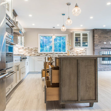
There were a few difficulties in making this kitchen any better than how it was. There was a separate staircase that had access to the second floor which was located in the kitchen. This left just enough room to push the dining room to one side. Then, there was the porch. A really nice panoramic view of the back, but was somehow under-used by the family during the summer months. Then, it was the size of the kitchen. It simply was way too small for a growing family, and while it had a peninsular in place, the flow just didn’t work. I remember watching them one day demonstrating how awkward it was using the kitchen. We got it! We had our marching orders to go and figure out how to make this kitchen work for this family.
Everything in the room was fair play. The design was done to make the kitchen very open. For a few ideas, we incorporated the porch in the kitchen by using the nana wall idea but it ended up being too cost prohibitive to do so. We then decided to do a permanent fix by using a commercial glass wall application. Once we figured that out, we moved back inside and removed the staircase. This gave us two added benefits. One allowed us to really reconfigure the kitchen and the other opened up the second floor for a huge built in closet system.
We relocated the windows, added a fire place with a built In TV above. From there, it was onto the kitchen itself which contained a huge Island with seating, large kitchen sink and built in appliances which was set up in a way to take advantage of the new layout. We re-positioned the kitchen facing the beautiful views outside rather than looking towards a wall. Now, when you enter the house up the entry stairs, the kitchen now draws you into the magnificent new open space. This is now setup for entertaining, relaxation, hanging out and most of all, preparing meals in a room where you only have to leave if you want to.
This one was all about the design. Design was what made this space. Setting this space up for success was crucial, and this kitchen is a great example of how design can cover a multitude of sins in Kitchen designs.
… Just close your eyes for a second and imagine waking up one winter morning and having a cup of coffee and watching the snow fall through those huge windows, leaning up against those 3D feature walls while watching the kids sitting around the table enjoying those warm radiant heated floors in this spacious kitchen…..
 Sierra Living Concepts Inc
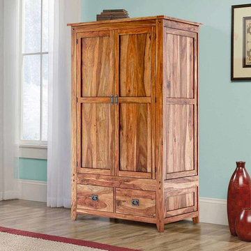
Dimension: 42" L X 24" D X 72" H
Wardrobes and armoires are simply a more compact and pragmatic form of walk-in closets, and allow you to complement your room interiors with their unique styles. Now you can keep things handy while adding an extra oomph to your space with our Delaware Solid Hardwood 2 Drawer Rustic Wardrobe Armoire.
This solid Rosewood wardrobe features a distinctly rustic style design. The double-doors sit snugly atop the 2 adjacent deep-storage drawers. The door leafs have been crafted in the rustic ‘barn door’ style with a smart wooden trim and are complemented by stylized hand-wrought metal handles – a sure win when you’re working with an interior design theme.
The inside is just as impressive. Upon opening the wardrobe, you’ll be immediately greeted by an ample amount of hanging space outfitted by a hanging rod where you can hang your clothes. Right below it are 2 open shelves where you can assemble all your accessories including jewelry, cosmetics, purses and more.
Handcrafted from solid Rosewood, this wardrobe warrants a strong, sturdy and resilient heirloom quality. Coupled with its beautiful striations, organic finish, even the stain of this piece is applied by hand. The versatile aesthetic of this solid hardwood armoire wardrobe also ensures that it can be paired with a number of interior design styles. Want something to complement your rustic or country-chic interiors? This is your piece! Want something shabby chic to complete your bedroom aesthetic? This armoire is the best there is!
Special Features:
• 100% Handcrafted
• Solid Rosewood craftsmanship
• Rustic style design
• Barn-door inspired door leafs
• Stylish door & drawer handles
• Metal rod to hang clothes
• 2 drawers at the bottom
• 2 open shelves inside
• Can be custom-made to have adjustable/removable shelves upon request
• Heirloom quality
• Easy to clean and maintain
Note: Real wood is a product of nature, and as such, no two pieces are alike. Variations in solid wood grain patterns are to be expected and make each furniture uniquely beautiful, just like us humans.
 Kitchen Tune-Up Franchise System
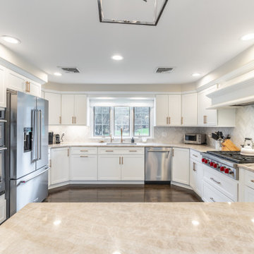
Your kitchen is the heart of your home, but if it's outdated and in desperate need of a makeover, it can be difficult to enjoy spending time in it. Fortunately, a kitchen reface update can completely transform your space and give it a fresh, modern look without the need for a full remodel. And if you're looking for a timeless and elegant design, a white shaker reface may be just what you need.
Why Choose a White Shaker Reface?
The white shaker style is a classic design that has been popular for decades. It features clean, simple lines and a versatile color that can be easily paired with a wide range of decor styles. White shaker cabinets are also a great choice for those who want a bright and airy kitchen, as the light color reflects natural light and makes the space feel larger.
When it comes to a reface update, choosing a white shaker design can help to modernize your kitchen and make it feel more up-to-date. Whether your existing cabinets are dark and dated, or simply in need of a refresh, a white shaker reface can give them a fresh new look that will stand the test of time.
The Refacing Process
One of the benefits of a reface update is that it is a much quicker and less invasive process than a full remodel. Instead of tearing out your existing cabinets and starting from scratch, a reface involves removing the doors and drawers and replacing them with new ones that are custom-made to fit your existing cabinets.
In the case of a white shaker reface, your new doors and drawers will feature the classic shaker style, with clean lines and a fresh white finish. You may also choose to update other elements of your kitchen, such as the hardware or countertops, to complete the look.

 Fabco Sanctuary
The architect and designer Guy Derwent was approached by his client with a clear and compelling brief: to completely transform a grand Victorian terrace house they were planning to renovate. The client envisioned something far beyond a standard renovation – this was to be a bold and dramatic reimagining of a family home that could grow with them over time.
With the property having remained largely untouched for more than fifty years, the architects saw an opportunity to unlock its potential and deliver a contemporary design that would contrast beautifully with its Victorian heritage.
The existing layout consisted of a series of small, disconnected rooms to the rear of the house. To respond to the client’s need for openness and flexibility, the architect proposed a radical restructuring of the ground floor:
The rear rooms were completely removed
Suspended timber floors were lowered by up to two metres to align with the garden
Two bold extensions were added
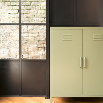
The first extension filled in the side return with a London stock brick facade and a glazed roof, while the second – a striking black steel and glass pavilion was glazed on three sides and placed along the garden elevation.
This new pavilion redefined the building’s relationship with the garden. Its steel-framed glazing created a seamless dialogue between interior and exterior, offering a sense of immersion in the surrounding landscape.
At the heart of the plan sits a dramatic, five-metre-tall dining space that acts as a transition from the original entrance hall into the new addition. A large, circular cast-glass window, framed in steel, provides a visual and spatial link between old and new, allowing light and movement to travel through the depth of the home.
Throughout the project, a series of black metal elements were introduced as sculptural interventions – each marking moments of transformation within the house. These included the bespoke steel framed circular window, a custom metal staircase, a cylindrical support column, and the striking steel and glass garden pavilion. Together, they formed a coherent architectural language that underscored the project’s bold intent.
Our steel windows and doors played a vital role in delivering the project’s vision. The architects chose steel for its refined sight lines and distinctive material character, which helped bridge the gap between the historical context of the building and the bold new additions.
The black steel frames provided a crisp contrast to the pale London stock brick and added definition to the glazed pavilion, reinforcing the sense of architectural precision. In particular, the fine steel profiles of the garden room allowed the extension to feel both lightweight and immersive, blurring the boundary between the house and its garden.
The architect drew inspiration from the Bauhaus Movement, particularly the work of Walter Gropius, whose approach to functional beauty and industrial materials informed the design of the garden pavilion.
Here, our glazing system was used not just for transparency, but as an expressive architectural element. The carefully proportioned panels help to conceal the roof thickness and reinforce the pavilion’s industrial yet abstract character – a deliberate nod to product design and modernist detailing.
Sustainability was an important factor in the selection of materials. Our steel systems, made from 99% recycled content and 100% recyclable, aligned with the project’s broader environmental goals.
The architects noted that this commitment to material longevity and circularity was central to their decision to use steel. The durability and recyclability of the windows and doors ensured the project met both aesthetic and ethical criteria.
This London terrace house now stands as a celebration of contrast – between heritage and innovation, solidity and transparency, tradition and transformation. Our steel windows and doors were not simply components; they were essential tools in crafting a home that is as bold and expressive as it is functional.
The result is a home designed for modern family life, where light, space, and materiality come together in perfect harmony.
 THE Remodel Group
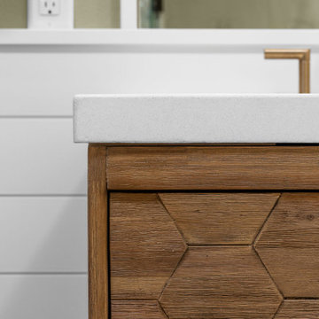
A luxurious en suite bath was created within this classic 1925 Portland bungalow by reconfiguring the second story’s original small bedrooms and tiny half bath. In this welcoming new urban boho space, eclectic finishes mingle harmoniously, integrated through subtle repetition of shapes and materials.
A furniture-style vanity sets the tone for this luxurious space, introducing materials, colors, shapes, and textures that repeat throughout. Individual walnut hexagons join to create distinctive vanity doors, offset beautifully by horizontal-grain drawers. Topping the cabinetry is a simple concrete countertop with integral sinks. An expansive framed mirror above enlarges and brightens the room. Within the mirror, sconces float, their globes a nod to the hexagons below. Champagne bronze fixtures reflect the warm walnut glow. Nestled into the back corner, a stunning shower features waterjet tiles in a double herringbone pattern, each precisely cut and laid to maintain design integrity at every surface transition. Teak floor tiles and a pebbled niche hint at the classic spa experience. Across from the shower, a large hexagonal window provides a treetop view from the free-standing tub below. The gentle oval of the tub and the beaded chandelier above provide a pleasing contrast to the strong lines surrounding it, as do the softly-shaded pebbles in the full-length niche. Shiplap wainscotting wraps the room, creating an illusion of height in the compact space. Subtle flooring and soft green walls create an understated backdrop for the bold mix of materials, unifying them into a serene oasis.
Asking a century-old home to accommodate a modern luxury bath is a tall order. Asbestos-laden plaster and flooring had to be abated. The subfloor had to be leveled and reinforced to increase strength and prevent deflection. Water lines and multiple electrical circuits had to be brought across and up without disturbing a beautifully-paneled ceiling, something we accomplished by firring out stair walls to hide the chases. Our client had visions of a leafy view from her tub, but the new layout eliminated existing windows. Placing a new window was complicated by deep eaves and flat soffits. By pushing the header into the roofline, however, we were able to accommodate a picture window. The flat soffit was replaced by an inverse hip lined with stained tongue and groove cedar, tying it to the bathroom finishes. Bringing materials up a narrow staircase became truly challenging when it was time to install the big items. However, strategic removal of drywall around the landing got the job done. Our attention to detail is showcased in the shower tile, where precise cuts were required at surface transitions to maintain the integrity of a complex double herringbone lay. The project was delivered on time.
Savvy layout choices minimized spending on structural changes. Because we were dealing with dormer space, head height was an issue. Raising the ceiling would have been complex and expensive so our design accommodated the constraints – tub on the low outside wall, shower on the full-height interior wall. The vanity spanned the spread, accommodating our petite client on the exterior side and her taller husband on the interior side. An under-eave closet was closed off to create room for both a freestanding tub and a separate shower. Rather than building replacement storage elsewhere, we simply added a new door into the closet from the primary bedroom. This was made possible by absorbing the short hallway separating the existing bed and bathroom into the primary bedroom. This new layout also created an en suite relationship between the primary bedroom and the new bath. We saved additional dollars by selecting a furniture-style vanity rather than using custom cabinetry, and the countertop with integral sinks provided a cost savings over a more traditional quartz countertop with undermount sinks. Affordable shower tiles allowed us to put more money into a dynamic tile layout. The project was delivered within budget.
 Total Home
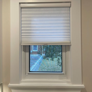
We are very proud of this kitchen renovation, for an older home in Kemptville. The house as you can see from the before photos, was quite dated, to the original kitchen, so it was time for an upgrade.
We removed a wall, separating the dining area to the kitchen, and had to install a beam above the island. We simply clad it in drywall for a clean aesthetic.
You would not know that these two spaces were one and the same.
The quality and care Gilbert executed in this renovation is top notch!
Another quality project by Total Home.
 SH interiors
Amy Williams Photo
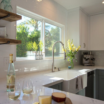
Kitchen remodel that was featured on HGTV's House Hunters Renovation. The original kitchen had a soffit and dated finishes. We removed the soffits to open up the space. We also re-designed the pantry space so we could open the kitchen to the dining room. the new cabinetry features Shaker style doors and a split finish of white uppers and gray lowers. We modified the window so that we could incorporate floating shelves on the left. The shelves are reclaimed wood on iron brackets. The shelves add warmth the the white and bright kitchen. Details include deep farmhouse sink with apron and Carrara look quartz counters.
 Rev-A-Shelf
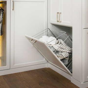
Now you can conceal and access laundry in one easy motion with the CTOHB Tilt-Out Hamper. Simply door mount the basket rest to a bottom hinged cabinet for easy one step "Slide-In/Slide-Out" basket removal. The series is available in two sizes and three finishes, stylish chrome, satin nickel and oil rubbed bronze. Each is constructed with durable 6.6 mm wire and feature capacities of 1.7 bushels (55 Quarts) for the 16" wide unit, and 2.3 bushels (74 Quarts) for the large 21" unit. Liners and Tilt-out hardware sold separately.
 RAJ Kitchen and Bath, LLC
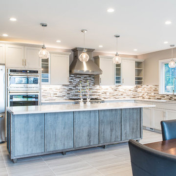
There were a few difficulties in making this kitchen any better than how it was. There was a separate staircase that had access to the second floor which was located in the kitchen. This left just enough room to push the dining room to one side. Then, there was the porch. A really nice panoramic view of the back, but was somehow under-used by the family during the summer months. Then, it was the size of the kitchen. It simply was way too small for a growing family, and while it had a peninsular in place, the flow just didn’t work. I remember watching them one day demonstrating how awkward it was using the kitchen. We got it! We had our marching orders to go and figure out how to make this kitchen work for this family.
Everything in the room was fair play. The design was done to make the kitchen very open. For a few ideas, we incorporated the porch in the kitchen by using the nana wall idea but it ended up being too cost prohibitive to do so. We then decided to do a permanent fix by using a commercial glass wall application. Once we figured that out, we moved back inside and removed the staircase. This gave us two added benefits. One allowed us to really reconfigure the kitchen and the other opened up the second floor for a huge built in closet system.
We relocated the windows, added a fire place with a built In TV above. From there, it was onto the kitchen itself which contained a huge Island with seating, large kitchen sink and built in appliances which was set up in a way to take advantage of the new layout. We re-positioned the kitchen facing the beautiful views outside rather than looking towards a wall. Now, when you enter the house up the entry stairs, the kitchen now draws you into the magnificent new open space. This is now setup for entertaining, relaxation, hanging out and most of all, preparing meals in a room where you only have to leave if you want to.
This one was all about the design. Design was what made this space. Setting this space up for success was crucial, and this kitchen is a great example of how design can cover a multitude of sins in Kitchen designs.
… Just close your eyes for a second and imagine waking up one winter morning and having a cup of coffee and watching the snow fall through those huge windows, leaning up against those 3D feature walls while watching the kids sitting around the table enjoying those warm radiant heated floors in this spacious kitchen…..
 Fabco Sanctuary
The architect and designer Guy Derwent was approached by his client with a clear and compelling brief: to completely transform a grand Victorian terrace house they were planning to renovate. The client envisioned something far beyond a standard renovation – this was to be a bold and dramatic reimagining of a family home that could grow with them over time.
With the property having remained largely untouched for more than fifty years, the architects saw an opportunity to unlock its potential and deliver a contemporary design that would contrast beautifully with its Victorian heritage.
The existing layout consisted of a series of small, disconnected rooms to the rear of the house. To respond to the client’s need for openness and flexibility, the architect proposed a radical restructuring of the ground floor:
The rear rooms were completely removed
Suspended timber floors were lowered by up to two metres to align with the garden
Two bold extensions were added
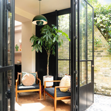
The first extension filled in the side return with a London stock brick facade and a glazed roof, while the second – a striking black steel and glass pavilion was glazed on three sides and placed along the garden elevation.
This new pavilion redefined the building’s relationship with the garden. Its steel-framed glazing created a seamless dialogue between interior and exterior, offering a sense of immersion in the surrounding landscape.
At the heart of the plan sits a dramatic, five-metre-tall dining space that acts as a transition from the original entrance hall into the new addition. A large, circular cast-glass window, framed in steel, provides a visual and spatial link between old and new, allowing light and movement to travel through the depth of the home.
Throughout the project, a series of black metal elements were introduced as sculptural interventions – each marking moments of transformation within the house. These included the bespoke steel framed circular window, a custom metal staircase, a cylindrical support column, and the striking steel and glass garden pavilion. Together, they formed a coherent architectural language that underscored the project’s bold intent.
Our steel windows and doors played a vital role in delivering the project’s vision. The architects chose steel for its refined sight lines and distinctive material character, which helped bridge the gap between the historical context of the building and the bold new additions.
The black steel frames provided a crisp contrast to the pale London stock brick and added definition to the glazed pavilion, reinforcing the sense of architectural precision. In particular, the fine steel profiles of the garden room allowed the extension to feel both lightweight and immersive, blurring the boundary between the house and its garden.
The architect drew inspiration from the Bauhaus Movement, particularly the work of Walter Gropius, whose approach to functional beauty and industrial materials informed the design of the garden pavilion.
Here, our glazing system was used not just for transparency, but as an expressive architectural element. The carefully proportioned panels help to conceal the roof thickness and reinforce the pavilion’s industrial yet abstract character – a deliberate nod to product design and modernist detailing.
Sustainability was an important factor in the selection of materials. Our steel systems, made from 99% recycled content and 100% recyclable, aligned with the project’s broader environmental goals.
The architects noted that this commitment to material longevity and circularity was central to their decision to use steel. The durability and recyclability of the windows and doors ensured the project met both aesthetic and ethical criteria.
This London terrace house now stands as a celebration of contrast – between heritage and innovation, solidity and transparency, tradition and transformation. Our steel windows and doors were not simply components; they were essential tools in crafting a home that is as bold and expressive as it is functional.
The result is a home designed for modern family life, where light, space, and materiality come together in perfect harmony.
57