
Search results for "Singles connection" in Home Design Ideas
 Glenview Haus – Custom Doors & Wine Cellars
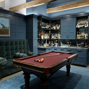
On this ultra-custom pool hall design, we had the pleasure of working with Lonnie Unger, currently with Stones Throw Interiors. Our team worked closely with Lonnie to come up with the custom design for the wall paneling, custom cabinetry, as well as the wine cellar door. This project allowed us to showcase our many different design skills and expertise. Our collaborative design work created this beautiful speak-easy style pool room and lounge. From sleek and classic shaker style paneling, to dramatic 3-step crown molding, this project makes a theatrical statement that is sure to impress all guests.
Custom Design Application
A modern design element that we utilized, was carrying over the wall paneling design to the cabinetry. This design element creates a continuous appearance that ties together the entire room, making the pool table and accessories stand out. The same paint for the walls and cabinets was also used for the custom wine cellar door. One special feature that is important to notice, is the wood threshold at the bottom of the wine cellar door. This piece is crucial for maintaining a temperature-controlled wine cellar. Without this piece, there would be a dramatic increase in temperature within the wine cellar. Wine cellars are recommended to be kept at a strict 55 degrees to ensure wine preservation. The threshold stops the air from escaping.
Collaboration with Designers
With a showroom in River North, Chicago, we pride ourselves on being in the middle of the River North Design District. We are lucky to have the opportunity to collaborate with top Designers and Professional Individuals in Downtown Chicago. We cherish our connections and are always pleased to combine efforts to create a beautiful outcome. Working together on projects in high rises, or in single family homes, we can provide a solution for any request.
 STUDIO TASHIMA
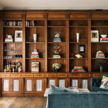
Keyes Road is a two-storey, semi-detached red brick house dating to around 1890-1910. The focus of our work was on the ground floor where we were asked to improve the layout and use of the main living areas of the house, for an active family of four. Important to the design was to maximise the quality and amount of light as well as connection to the garden and flow to the rest of the house.
Our proposal introduces three single storey extensions, comprising a central, large space that extends the main outrigger of the house. To each side are smaller volumes, affording a full width kitchen. While defining a series of discrete volumes, it was important for us to ensure that the kitchen, living, family and dining rooms that are interconnecting and continuous. The result is a big space punctuated by a series of differently sized arches, defining spaces to ensure their intimacy.
It was important for our client to have a sense of warmth and comfort - perhaps not dissimilar to the qualities of a hotel lobby. The colour scheme of the rooms are warm white painted plaster, natural wood flooring with black, bronze and brass accents. Indirect and carefully placed light fittings pulls together the atmosphere of the rooms - particularly in the evenings.
Externally, we felt it important to differentiate the extensions from the main house by using a dark, charcoal grey brick. This sets up a contrasting yet complimentary relationship to the rich red coloured brick house. The facets of the brick play with light and depth as do the graduated brick arches.
During the design process, we grappled with floor levels, the direction of sunlight, and care to not encroach on the neighbouring properties. As the house is in a conservation area, we worked closely with our trusted planning advisor. Throughout, we pursued a sensitive design strategy, using pitched roofs, matching materials and careful detailing. Internally, many of the original details are intact. This has enabled us to create an eclectic ensemble of elements, colours and materials varying in age and period.

 Bilotta Kitchen & Home
Nestled atop a wooded ridge in the Hudson Highlands, the architect-owner envisioned a reinterpretation of renowned mid-century experimental “Case Study Homes”. An authentic representation of the materials and a clear outdoor-indoor connection were priorities for the design. Heart pine on the ceiling references the forested surroundings. All cabinets are Bilotta’s private Bilotta Collection cabinetry. The island and wall cabinets are distinctive: natural walnut quarter-sawn veneer trimmed with thin strips of natural walnut solid stock. Matte black on the paneled refrigerator, tall pantry and rear base cabinets frame the area and merge into the black structural columns. Balancing the darker finishes is a single slab of Carrera marble on the backsplash, with Caesarstone in “Concrete” topping the cabinetry. Surrounded by walls of glass, the kitchen is flanked by oversized impressive roof overhangs with exposed joists. Inside, a header was placed to align with the outermost joist and delineate the prep area. Within that footprint, natural heart pine planks line the ceiling, parallel to the outdoor joists. This creates the illusion that the overhang enters the kitchen at one end and exits out the other, further obscuring the line between indoors and out. As a counterpoint to strong vertical cabinet lines and horizontal ceiling lines, a unique bronze scissor-armed light fixture creates a diamond pattern across the length of the kitchen. At the intersection of each arm is an individual half-gold exposed light bulb, resulting in pools of illumination that highlight the beautiful grain pattern and coloration of the wood ceiling – a stunning alternative to ubiquitous recessed lighting. Although it’s not large, this kitchen offers an abundance of storage and countertop space for meal prep and serving. The refrigerator and tall pantry bookend the space; making them equal in size imparts pleasing symmetry. With the sink centered along the back wall and the range centered in the island, there’s plenty of elbow room on each side of the appliances. Everything is within arms’ reach for easy use and fast cleanup. The gray hues of the “Concrete” colored quartz tops and the veining of the Carrera backsplash echo the stone outcroppings in the landscape and provide contrast to the variety of wood tones throughout the room.
Find the right local pro for your project

 City Homes, LLC
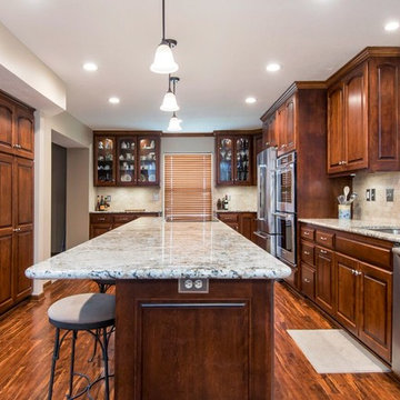
The work zone makes good use of the island, in which the sink and dishwasher are installed. It is across from the range and within easy reach of the refrigerator. The more social area of the kitchen is on the other side of the island, which has easy access to a drinks station. Placing the island extension and beverage station out of the way of the work zone was deliberate.
French cafe stools and a tiered coconut shell chandelier keep things laid-back and coastal. The shells on the chandelier bring in an earthy element. Brass hardware pops against the green cabinets.
 STUDIO TASHIMA
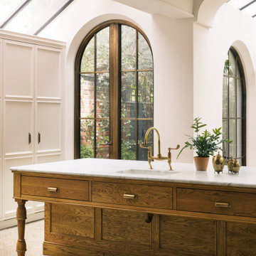
Keyes Road is a two-storey, semi-detached red brick house dating to around 1890-1910. The focus of our work was on the ground floor where we were asked to improve the layout and use of the main living areas of the house, for an active family of four. Important to the design was to maximise the quality and amount of light as well as connection to the garden and flow to the rest of the house.
Our proposal introduces three single storey extensions, comprising a central, large space that extends the main outrigger of the house. To each side are smaller volumes, affording a full width kitchen. While defining a series of discrete volumes, it was important for us to ensure that the kitchen, living, family and dining rooms that are interconnecting and continuous. The result is a big space punctuated by a series of differently sized arches, defining spaces to ensure their intimacy.
It was important for our client to have a sense of warmth and comfort - perhaps not dissimilar to the qualities of a hotel lobby. The colour scheme of the rooms are warm white painted plaster, natural wood flooring with black, bronze and brass accents. Indirect and carefully placed light fittings pulls together the atmosphere of the rooms - particularly in the evenings.
Externally, we felt it important to differentiate the extensions from the main house by using a dark, charcoal grey brick. This sets up a contrasting yet complimentary relationship to the rich red coloured brick house. The facets of the brick play with light and depth as do the graduated brick arches.
During the design process, we grappled with floor levels, the direction of sunlight, and care to not encroach on the neighbouring properties. As the house is in a conservation area, we worked closely with our trusted planning advisor. Throughout, we pursued a sensitive design strategy, using pitched roofs, matching materials and careful detailing. Internally, many of the original details are intact. This has enabled us to create an eclectic ensemble of elements, colours and materials varying in age and period.
 STUDIO TASHIMA
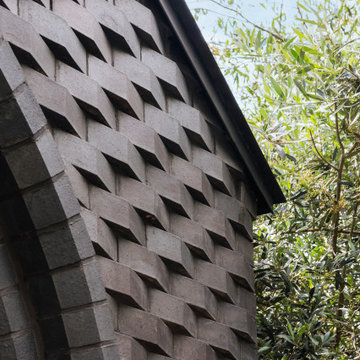
Keyes Road is a two-storey, semi-detached red brick house dating to around 1890-1910. The focus of our work was on the ground floor where we were asked to improve the layout and use of the main living areas of the house, for an active family of four. Important to the design was to maximise the quality and amount of light as well as connection to the garden and flow to the rest of the house.
Our proposal introduces three single storey extensions, comprising a central, large space that extends the main outrigger of the house. To each side are smaller volumes, affording a full width kitchen. While defining a series of discrete volumes, it was important for us to ensure that the kitchen, living, family and dining rooms that are interconnecting and continuous. The result is a big space punctuated by a series of differently sized arches, defining spaces to ensure their intimacy.
It was important for our client to have a sense of warmth and comfort - perhaps not dissimilar to the qualities of a hotel lobby. The colour scheme of the rooms are warm white painted plaster, natural wood flooring with black, bronze and brass accents. Indirect and carefully placed light fittings pulls together the atmosphere of the rooms - particularly in the evenings.
Externally, we felt it important to differentiate the extensions from the main house by using a dark, charcoal grey brick. This sets up a contrasting yet complimentary relationship to the rich red coloured brick house. The facets of the brick play with light and depth as do the graduated brick arches.
During the design process, we grappled with floor levels, the direction of sunlight, and care to not encroach on the neighbouring properties. As the house is in a conservation area, we worked closely with our trusted planning advisor. Throughout, we pursued a sensitive design strategy, using pitched roofs, matching materials and careful detailing. Internally, many of the original details are intact. This has enabled us to create an eclectic ensemble of elements, colours and materials varying in age and period.

 User
The 5,000 square foot private residence is located in the community of Horseshoe Bay, above the shores of Lake LBJ, and responds to the Texas Hill Country vernacular prescribed by the community: shallow metal roofs, regional materials, sensitive scale massing and water-wise landscaping. The house opens to the scenic north and north-west views and fractures and shifts in order to keep significant oak, mesquite, elm, cedar and persimmon trees, in the process creating lush private patios and limestone terraces.
The Owners desired an accessible residence built for flexibility as they age. This led to a single level home, and the challenge to nestle the step-less house into the sloping landscape.
Full height glazing opens the house to the very beautiful arid landscape, while porches and overhangs protect interior spaces from the harsh Texas sun. Expansive walls of industrial insulated glazing panels allow soft modulated light to penetrate the interior while providing visual privacy. An integral lap pool with adjacent low fenestration reflects dappled light deep into the house.
Chaste stained concrete floors and blackened steel focal elements contrast with islands of mesquite flooring, cherry casework and fir ceilings. Selective areas of exposed limestone walls, some incorporating salvaged timber lintels, and cor-ten steel components further the contrast within the uncomplicated framework.
The Owner’s object and art collection is incorporated into the residence’s sequence of connecting galleries creating a choreography of passage that alternates between the lucid expression of simple ranch house architecture and the rich accumulation of their heritage.
The general contractor for the project is local custom homebuilder Dauphine Homes. Structural Engineering is provided by Structures Inc. of Austin, Texas, and Landscape Architecture is provided by Prado Design LLC in conjunction with Jill Nokes, also of Austin.
Cecil Baker + Partners Photography


 Rudloff Custom Builders
"His" master bedroom Dressing room /closet has ample space and room for clothing, shoes, luggage and more.
The island holds additional storage. The granite stone top adds elegance to the room
The custom designed closet system with crown molding is beautifully planned and installed.
This home was featured in Philadelphia Magazine August 2014 issue to showcase its beauty and excellence.
Photo by Alicia's Art, LLC
RUDLOFF Custom Builders, is a residential construction company that connects with clients early in the design phase to ensure every detail of your project is captured just as you imagined. RUDLOFF Custom Builders will create the project of your dreams that is executed by on-site project managers and skilled craftsman, while creating lifetime client relationships that are build on trust and integrity.
We are a full service, certified remodeling company that covers all of the Philadelphia suburban area including West Chester, Gladwynne, Malvern, Wayne, Haverford and more.
As a 6 time Best of Houzz winner, we look forward to working with you on your next project.

 Cabinet-S-Top
This was a major remodel where the kitchen was completely gutted, flooring and soffits were removed and all the electrical in the kitchen had to be reworked and brought up to code. We used Waypoint Living Spaces for the perimeter cabinets and used a riser and crown molding to connect the cabinets to the ceiling. We chose Medallion Cabinetry for the island because the customer had her heart set on a green painted island. The hardware we used is from the Mulholland collection by Amerock. The customers have large family gathers and it was very important for them to have an island that was moveable. We used casters from Richelieu to create and island that could move easily, as well as having brakes to keep the island in place when they wanted.
Giallo Traversella granite was used on the perimeter countertops to tie together the greens and beige tones of the cabinetry and we used John Boos, walnut butcher block countertop for the island to compliment wood tones from the existing millwork in the home. The customer provided me with an inspiration picture for a backsplash, she knew she wanted a glass patterned backsplash. Ceramic Tiles International had released their Debut Petal mosaic tile and the customer loved it.
Prior to the remodel, the kitchen was very dark and very crowded, it did not function in a way that worked for my customer. We added under cabinet LED lights, one general ceiling fixture and LED Brio Disc lights with dimming capabilities so the customers could adjust the lighting to their specific needs.
Light fixtures were updated in the hallways as well as the kitchen.
My customer didn’t know exactly what they wanted as far as plumbing was concerned. They wanted products that were durable and easy to maintain. I chose the Blanco Performa undermount sink in the Truffle color due to is durability and the color complimented the other materials. We used Moen’s Arbor single handle pull down spray faucet and transitional soap dispenser due to its simplistic design, functionality and warranty. We used a ¾ horsepower Insinkerator disposal and a deluxe Steamball strainer basket.
The customer originally had Parquet flooring and they liked the look of real hardwood. Madeira 5” planks in Dark Gunstock oak was chosen for its color and durability. The flooring brought in warm neutral tones to compliment other materials. My customer wanted a larger window, but they had some safety concerns. We addressed their concerns by providing a larger Awning style window, using tempered glass and double locks.

 ARCLIGHT INTERNATIONAL
A glowing villa would set the tone for what is housed within. The entire project was illuminated with a single custom uplight from Hydrel. Each uplight was manufactured with the junction box on the bottom so not add any additional visual clutter to the floor. They were recessed into a floor covered in 1/2"x1/2" taupe colored tile.
The cover plate was cast aluminum 12"x12" in a square with an eight inch diameter opening to coddle a heavy molded piece of borosilicate made to fit flush with plate and floor tile. The glass was selected for its excellent thermal properties and extremely low expansion. It also has exceptional crystal clear clarity.
The fixtures housed a krypton gas filled PAR 38 SPOT from GE Lamps on an adjustable swing arm. GE Lamps were chosen because of the single rolled bullnose edge design the lens has were it connects to the parabolic glass sides. Others fix the lens to the edge creating two rolled edges and a crease. These edges capture and project the light and create more than one artifact prarabola caused by the lens edge and the way it is attached. This creates distracting and multiple visual parabolas being projected on the the walls and ceilings. A single one is problematic, having multiple ones with so many fixture being used becomes overwhelmingly distracting.
The fixture housing was also designed to be 12" deep keeping the top of the lamp recess 4" below the glass. The swing arm also contained a custom gimbal ring that allowed for both a lens and an internal louver to be mounted just above the lamp face. The louver was a custom black color in a custom large cell egg crate design of 1/2"x1/2"x1/2" size. The entire interior of this uplight was custom painted so that all parts were powder coated with Paxton Matte Black, named for the client who helped perfect the exact black color.
The color was tested and fabricated multiple times before the results were finally achieved. It was to be an exceptionally matte black that did not reflect in the slightst way any light or light source. It was supposed to be void of reflectance. The larger size of the uplight was selected over other choices because the lighting designer wanted to illuminate the 24" wide columns and pilasters through out the project. Smaller lamps and fixtures came out of the floor with a steep reverse parabola grazing the architecture. The depth of the custom fixture was dictated by the desire to have the narrow portion of the parabola effect occur inside the fixture before it even was viewable. The beam emitted from the fixture came out almost as fat as the columns were wide. The fixture was positioned a half inch from the vertical walls to keep the center beam six inches away. This helped perfectly graze the wall surface as well as control up light glare. The louvers were exactly the size of the floor tile so there was a consistency to the floor grid even within the light fixtures.
The position of the lamp and the 45° cutoff of the louver kept the visual cutoff at around 20° where people would be standing. You really have to hold your head near the wall and look down into the fixtures in order to see the source.
Everything was also dimmed with multiple presets for the clients command and a preprogrammed fade that started at dusk and continually reduced itself as the night progressed into early morning. The entire building would be bathed in a soft candle like glow of 10% from 2 am until sunrise with on the hour 2 minute fades from 80% brightness.
Photo: Robert Cook

 Nakamoto Forestry
Project Overview:
The project was a highly designed energy efficient residential new build in Colchester, Vermont by Red HouseBuilding and architect Elizabeth Herrmann using our Shou Sugi Ban – Gendai that was oiled with a Light Gray prefinish.
“Nestled into a steep Vermont hillside, this home was carefully designed and positioned to efficiently and thoughtfully take advantage of the challenging terrain and stunning mountain views. The house is characterized by a series of connected wedge-shaped volumes. Roof lines lift toward views and sunlight and provide airy, varied-height spaces within. Designed to make single-floor living possible, the home has all major living spaces including a bedroom suite and garage on the main level, with a dual-purpose guest room/office, bathroom, and dual-purpose art studio/exercise room below. Totaling just 2,200 square feet of finished area (with additional mechanical space and an unfinished garage), the house is small, though expansive in feel. A dramatically angled porch juts out over the hillside, expanding the living space by over 200 square feet in the warmer months.
This home is also a high-performance, energy-efficient home that takes advantage of solar exposure. Solar panels located just above the house generate power. The home is heated and cooled by just two air source heat pumps.
A natural, low-maintenance palette extends from interior to exterior including Shou Sugi Ban siding charred and stained a light gray, local maple wood flooring and cabinetry, and stone accents.”
Product: Gendai 1×6 select grade shiplap
Prefinish: Light Gray
Application: Residential – Exterior
SF: 2400SF
Designer: Elizabeth Herrmann Architecture + Design
Builder: Red House Building
Date: November 2018
Location: Colchester, VT
 STUDIO TASHIMA
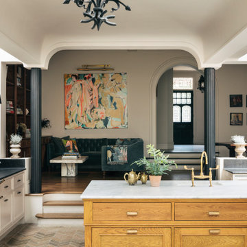
Keyes Road is a two-storey, semi-detached red brick house dating to around 1890-1910. The focus of our work was on the ground floor where we were asked to improve the layout and use of the main living areas of the house, for an active family of four. Important to the design was to maximise the quality and amount of light as well as connection to the garden and flow to the rest of the house.
Our proposal introduces three single storey extensions, comprising a central, large space that extends the main outrigger of the house. To each side are smaller volumes, affording a full width kitchen. While defining a series of discrete volumes, it was important for us to ensure that the kitchen, living, family and dining rooms that are interconnecting and continuous. The result is a big space punctuated by a series of differently sized arches, defining spaces to ensure their intimacy.
It was important for our client to have a sense of warmth and comfort - perhaps not dissimilar to the qualities of a hotel lobby. The colour scheme of the rooms are warm white painted plaster, natural wood flooring with black, bronze and brass accents. Indirect and carefully placed light fittings pulls together the atmosphere of the rooms - particularly in the evenings.
Externally, we felt it important to differentiate the extensions from the main house by using a dark, charcoal grey brick. This sets up a contrasting yet complimentary relationship to the rich red coloured brick house. The facets of the brick play with light and depth as do the graduated brick arches.
During the design process, we grappled with floor levels, the direction of sunlight, and care to not encroach on the neighbouring properties. As the house is in a conservation area, we worked closely with our trusted planning advisor. Throughout, we pursued a sensitive design strategy, using pitched roofs, matching materials and careful detailing. Internally, many of the original details are intact. This has enabled us to create an eclectic ensemble of elements, colours and materials varying in age and period.

 William Hoffman Architect
The Poinciana House was the renovation of a 1937 Colonial house located in the Idelwyld Neighborhood of Fort Lauderdale. The objective of the renovation was taking this internally oriented home and opening up the interior spaces to the exterior making the outdoors an extension of the living space. The addition of a new master bathroom was also a part of the program
An enclosed exterior entry courtyard was created using a newly built privacy wall. Interior spaces that bordered the entry courtyard were connected through French doors which open to an adjoining veranda. A lily pond was added as a point of interest in the courtyard.
An existing asphalt single roof was replaced with a new standing seam metal roof to giving the house a touch of the tropics and a modern “Cracker” aesthetic. Other exterior improvements included a new swimming pool in the back yard surrounded by a concrete paver deck with new landscaping. A new roof deck was also placed adjoining the second floor master bedroom.
The living room was reworked using a short glass block wall to define an entry just to the inside of the newly placed French doors. These French doors were built with pocketed sliding screen doors so the living room could be opened up to the prevailing breeze and naturally ventilated. A polished concrete floor was placed in the living room along with a new lighting system. Biedermeir furniture was selected to create an eclectic aesthetic in contrast to the polished concrete floor. French doors were also installed at the rear of the house opening to the backyard.
In the dining room in addition to the newly installed French doors the original “Ketchum” tile floor was excavated from under an existing parquet wood floor, were restored.
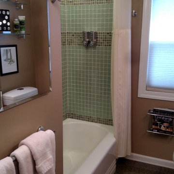
An existing garage was demolished and replaced with a new second level master bathroom with a new carport below. Features of note in the bathroom are the hanging double sided mirrors over double wide granite vanities with the lighting fixture “The Beverly” above, designed for and named after the client. The claw foot cast iron tub was sourced from a salvage yard. This bathroom was also featured in Interior Design Magazine and a number newspaper articles and other periodicals.
Photos: Bill sanders Photography

 STUDIO TASHIMA
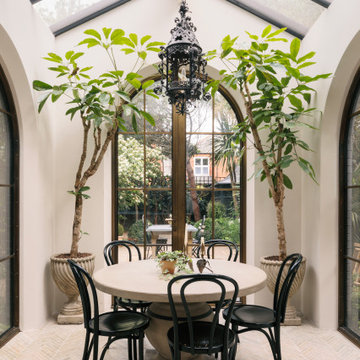
Keyes Road is a two-storey, semi-detached red brick house dating to around 1890-1910. The focus of our work was on the ground floor where we were asked to improve the layout and use of the main living areas of the house, for an active family of four. Important to the design was to maximise the quality and amount of light as well as connection to the garden and flow to the rest of the house.
Our proposal introduces three single storey extensions, comprising a central, large space that extends the main outrigger of the house. To each side are smaller volumes, affording a full width kitchen. While defining a series of discrete volumes, it was important for us to ensure that the kitchen, living, family and dining rooms that are interconnecting and continuous. The result is a big space punctuated by a series of differently sized arches, defining spaces to ensure their intimacy.
It was important for our client to have a sense of warmth and comfort - perhaps not dissimilar to the qualities of a hotel lobby. The colour scheme of the rooms are warm white painted plaster, natural wood flooring with black, bronze and brass accents. Indirect and carefully placed light fittings pulls together the atmosphere of the rooms - particularly in the evenings.
Externally, we felt it important to differentiate the extensions from the main house by using a dark, charcoal grey brick. This sets up a contrasting yet complimentary relationship to the rich red coloured brick house. The facets of the brick play with light and depth as do the graduated brick arches.
During the design process, we grappled with floor levels, the direction of sunlight, and care to not encroach on the neighbouring properties. As the house is in a conservation area, we worked closely with our trusted planning advisor. Throughout, we pursued a sensitive design strategy, using pitched roofs, matching materials and careful detailing. Internally, many of the original details are intact. This has enabled us to create an eclectic ensemble of elements, colours and materials varying in age and period.

 Zola European Windows
This Boulder, Colorado remodel by fuentesdesign demonstrates the possibility of renewal in American suburbs, and Passive House design principles. Once an inefficient single story 1,000 square-foot ranch house with a forced air furnace, has been transformed into a two-story, solar powered 2500 square-foot three bedroom home ready for the next generation.
The new design for the home is modern with a sustainable theme, incorporating a palette of natural materials including; reclaimed wood finishes, FSC-certified pine Zola windows and doors, and natural earth and lime plasters that soften the interior and crisp contemporary exterior with a flavor of the west. A Ninety-percent efficient energy recovery fresh air ventilation system provides constant filtered fresh air to every room. The existing interior brick was removed and replaced with insulation. The remaining heating and cooling loads are easily met with the highest degree of comfort via a mini-split heat pump, the peak heat load has been cut by a factor of 4, despite the house doubling in size. During the coldest part of the Colorado winter, a wood stove for ambiance and low carbon back up heat creates a special place in both the living and kitchen area, and upstairs loft.
This ultra energy efficient home relies on extremely high levels of insulation, air-tight detailing and construction, and the implementation of high performance, custom made European windows and doors by Zola Windows. Zola’s ThermoPlus Clad line, which boasts R-11 triple glazing and is thermally broken with a layer of patented German Purenit®, was selected for the project. These windows also provide a seamless indoor/outdoor connection, with 9′ wide folding doors from the dining area and a matching 9′ wide custom countertop folding window that opens the kitchen up to a grassy court where mature trees provide shade and extend the living space during the summer months.
With air-tight construction, this home meets the Passive House Retrofit (EnerPHit) air-tightness standard of



 Spaces Renewed
This San Diego remodel masterfully blends the aesthetic style of this home with the necessities of a functional lifestyle. This standard builder grade kitchen was in need of a modern update which was accomplished with thoughtful accents, color selections and more.
Replacing the outdated cabinets with a classic white and black pallet made the pairing feel modern or traditional, depending on the use of accessories and surrounding materials. Stacking cabinets took advantage of gorgeous, high ceilings and brought volume to the space, while delivering multiple storage options with a custom feel. For this particular client, we added touches of grey marble and dramatic blue glass to bring a contemporary edge to this kitchen.
In addition, the wood look porcelain tile throughout the space brings kitchen, dining, and family room together to create an open concept with connection and flow and virtually zero maintenance for a busy family.
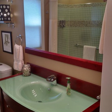
 Nakamoto Forestry
Project Overview:
The project was a highly designed energy efficient residential new build in Colchester, Vermont by Red HouseBuilding and architect Elizabeth Herrmann using our Shou Sugi Ban – Gendai that was oiled with a Light Gray prefinish.
“Nestled into a steep Vermont hillside, this home was carefully designed and positioned to efficiently and thoughtfully take advantage of the challenging terrain and stunning mountain views. The house is characterized by a series of connected wedge-shaped volumes. Roof lines lift toward views and sunlight and provide airy, varied-height spaces within. Designed to make single-floor living possible, the home has all major living spaces including a bedroom suite and garage on the main level, with a dual-purpose guest room/office, bathroom, and dual-purpose art studio/exercise room below. Totaling just 2,200 square feet of finished area (with additional mechanical space and an unfinished garage), the house is small, though expansive in feel. A dramatically angled porch juts out over the hillside, expanding the living space by over 200 square feet in the warmer months.
This home is also a high-performance, energy-efficient home that takes advantage of solar exposure. Solar panels located just above the house generate power. The home is heated and cooled by just two air source heat pumps.
A natural, low-maintenance palette extends from interior to exterior including Shou Sugi Ban siding charred and stained a light gray, local maple wood flooring and cabinetry, and stone accents.”
Product: Gendai 1×6 select grade shiplap
Prefinish: Light Gray
Application: Residential – Exterior
SF: 2400SF
Designer: Elizabeth Herrmann Architecture + Design
Builder: Red House Building
Date: November 2018
Location: Colchester, VT

 JRP Design & Remodel
Our client’s large family of five was shrinking through the years, so they decided it was time for a downsize and a move from Westlake Village to Oak Park. They found the ideal single-story home on a large flag lot, but it needed a major overhaul, starting with the awkward spatial floorplan.
These clients knew the home needed much work. They were looking for a firm that could handle the necessary architectural spatial redesign, interior design details, and finishes as well as deliver a high-quality remodeling experience.
JRP’s design team got right to work on reconfiguring the entry by adding a new foyer and hallway leading to the enlarged kitchen while removing walls to open up the family room. The kitchen now boasts a 6’ x 10’ center island with natural quartz countertops. Stacked cabinetry was added for both storage and aesthetic to maximize the 10’ ceiling heights. Thanks to the large multi-slide doors in the family room, the kitchen area now flows naturally toward the outdoors, maximizing its connection to the backyard patio and entertaining space.
Light-filled and serene, the gracious master suite is a haven of peace with its ethereal color palette and curated amenities. The vanity, with its expanse of Sunstone Celestial countertops and the large curbless shower, add elements of luxury to this master retreat. Classy, simple, and clean, this remodel’s open-space design with its neutral palette and clean look adds traditional flair to the transitional-style our clients desired.
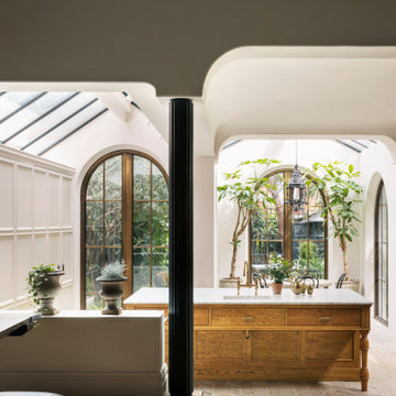 STUDIO TASHIMA
Keyes Road is a two-storey, semi-detached red brick house dating to around 1890-1910. The focus of our work was on the ground floor where we were asked to improve the layout and use of the main living areas of the house, for an active family of four. Important to the design was to maximise the quality and amount of light as well as connection to the garden and flow to the rest of the house.
Our proposal introduces three single storey extensions, comprising a central, large space that extends the main outrigger of the house. To each side are smaller volumes, affording a full width kitchen. While defining a series of discrete volumes, it was important for us to ensure that the kitchen, living, family and dining rooms that are interconnecting and continuous. The result is a big space punctuated by a series of differently sized arches, defining spaces to ensure their intimacy.
It was important for our client to have a sense of warmth and comfort - perhaps not dissimilar to the qualities of a hotel lobby. The colour scheme of the rooms are warm white painted plaster, natural wood flooring with black, bronze and brass accents. Indirect and carefully placed light fittings pulls together the atmosphere of the rooms - particularly in the evenings.
Externally, we felt it important to differentiate the extensions from the main house by using a dark, charcoal grey brick. This sets up a contrasting yet complimentary relationship to the rich red coloured brick house. The facets of the brick play with light and depth as do the graduated brick arches.
During the design process, we grappled with floor levels, the direction of sunlight, and care to not encroach on the neighbouring properties. As the house is in a conservation area, we worked closely with our trusted planning advisor. Throughout, we pursued a sensitive design strategy, using pitched roofs, matching materials and careful detailing. Internally, many of the original details are intact. This has enabled us to create an eclectic ensemble of elements, colours and materials varying in age and period.
233