
Search results for "Singles connection" in Home Design Ideas

 Bilotta Kitchen & Home
Nestled atop a wooded ridge in the Hudson Highlands, the architect-owner envisioned a reinterpretation of renowned mid-century experimental “Case Study Homes”. An authentic representation of the materials and a clear outdoor-indoor connection were priorities for the design. Heart pine on the ceiling references the forested surroundings. All cabinets are Bilotta’s private Bilotta Collection cabinetry. The island and wall cabinets are distinctive: natural walnut quarter-sawn veneer trimmed with thin strips of natural walnut solid stock. Matte black on the paneled refrigerator, tall pantry and rear base cabinets frame the area and merge into the black structural columns. Balancing the darker finishes is a single slab of Carrera marble on the backsplash, with Caesarstone in “Concrete” topping the cabinetry. Surrounded by walls of glass, the kitchen is flanked by oversized impressive roof overhangs with exposed joists. Inside, a header was placed to align with the outermost joist and delineate the prep area. Within that footprint, natural heart pine planks line the ceiling, parallel to the outdoor joists. This creates the illusion that the overhang enters the kitchen at one end and exits out the other, further obscuring the line between indoors and out. As a counterpoint to strong vertical cabinet lines and horizontal ceiling lines, a unique bronze scissor-armed light fixture creates a diamond pattern across the length of the kitchen. At the intersection of each arm is an individual half-gold exposed light bulb, resulting in pools of illumination that highlight the beautiful grain pattern and coloration of the wood ceiling – a stunning alternative to ubiquitous recessed lighting. Although it’s not large, this kitchen offers an abundance of storage and countertop space for meal prep and serving. The refrigerator and tall pantry bookend the space; making them equal in size imparts pleasing symmetry. With the sink centered along the back wall and the range centered in the island, there’s plenty of elbow room on each side of the appliances. Everything is within arms’ reach for easy use and fast cleanup. The gray hues of the “Concrete” colored quartz tops and the veining of the Carrera backsplash echo the stone outcroppings in the landscape and provide contrast to the variety of wood tones throughout the room.
 JWH Design and Cabinetry LLC
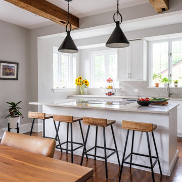
Mid-sized country galley medium tone wood floor and exposed beam eat-in kitchen photo in New York with an undermount sink, white cabinets, quartzite countertops, beige backsplash, ceramic backsplash, stainless steel appliances, an island and beige countertops

 Vetter Architects
The owners requested a Private Resort that catered to their love for entertaining friends and family, a place where 2 people would feel just as comfortable as 42. Located on the western edge of a Wisconsin lake, the site provides a range of natural ecosystems from forest to prairie to water, allowing the building to have a more complex relationship with the lake - not merely creating large unencumbered views in that direction. The gently sloping site to the lake is atypical in many ways to most lakeside lots - as its main trajectory is not directly to the lake views - allowing for focus to be pushed in other directions such as a courtyard and into a nearby forest.
The biggest challenge was accommodating the large scale gathering spaces, while not overwhelming the natural setting with a single massive structure. Our solution was found in breaking down the scale of the project into digestible pieces and organizing them in a Camp-like collection of elements:
- Main Lodge: Providing the proper entry to the Camp and a Mess Hall
- Bunk House: A communal sleeping area and social space.
- Party Barn: An entertainment facility that opens directly on to a swimming pool & outdoor room.
- Guest Cottages: A series of smaller guest quarters.
- Private Quarters: The owners private space that directly links to the Main Lodge.
These elements are joined by a series green roof connectors, that merge with the landscape and allow the out buildings to retain their own identity. This Camp feel was further magnified through the materiality - specifically the use of Doug Fir, creating a modern Northwoods setting that is warm and inviting. The use of local limestone and poured concrete walls ground the buildings to the sloping site and serve as a cradle for the wood volumes that rest gently on them. The connections between these materials provided an opportunity to add a delicate reading to the spaces and re-enforce the camp aesthetic.
The oscillation between large communal spaces and private, intimate zones is explored on the interior and in the outdoor rooms. From the large courtyard to the private balcony - accommodating a variety of opportunities to engage the landscape was at the heart of the concept.
Overview
Chenequa, WI
Size
Total Finished Area: 9,543 sf
Completion Date
May 2013
Services
Architecture, Landscape Architecture, Interior Design
Find the right local pro for your project
 Twelve Stones Designs, LLC
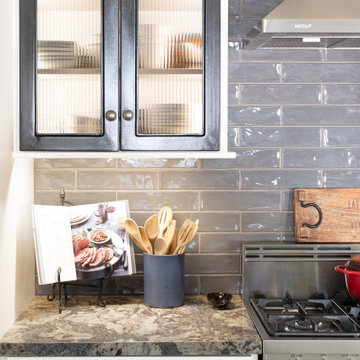
The owners of this kitchen had spent the money to upgrade the finishes in their kitchen upon building the home 12 years ago, but after living in the space for several years they realized how nonfunctional the layout really was. The (then) two preschool aged children had grown into busy, hungry teenagers with many friends who also liked to hang out at the house. So the family needed a more functional kitchen with better traffic flow, space for daily activities revolving around the kitchen at different times of day, and a kitchen that could accommodate cooking for and serving large groups. Furthermore, the dark, traditional finishes no longer reflected the homeowners’ style. They requested a brighter, more relaxed, coastal style that reflected their love of the seaside cities they like to visit.
Originally, the kitchen was U-shaped with a narrow island in the middle. The island created narrow aisles that bottle-necked at the dishwasher, refrigerator, and cooktop areas. There was a pass-through from the foyer into the kitchen, but the owners never liked that the pass-through was also located so close to the powder room. The awkward proximity was unappealing and made guests feel uncomfortable.
The kitchen’s storage was made up of lots of narrow cabinets, apothecary drawers, clipped corner units, and very few drawers. It lacked useful storage for the larger items the family used on a daily basis. And the kitchen’s only pantry was small closet that had only builder-grade, narrow shelving with no illumination to be able to see the contents inside.
Overall, the kitchen’s lighting plan was poorly executed. Only six recessed cans illuminated the entire kitchen and nook areas. The under cabinet lighting was not evenly distributed either. In fact, the builder had mis-placed the under cabinet lighting around the decorative pilasters which made for choppy, dark cubbies. Further, the builder didn’t include any lighting over the sink or the bar area, which meant whoever was doing the dishes was always in their own shadow. That, coupled with the steep overhang of the game room above made the bar area feel like a dim, cavernous space that wasn’t inviting or task oriented. The kitchen looked out into the main living space, but the raised bar and a narrow wall (which held the only large cabinet in the kitchen) created more of a barrier than a relationship to the living room or breakfast nook. In fact, one couldn’t even see the breakfast nook from the cooktop or sink areas due to its orientation. The raised bar top was too narrow to comfortably sit to either dine at or chat from due to the lack of knee space. The the homeowners confided that the kitchen felt more like a dark, dirty prison than place where the family, or their guests, wanted to gather and commune.
The clients' needs and desires were:
➢ to create a kitchen that would be a space the family loved to be in; to relate to the adjacent spaces all around, and to have better flow for entertaining large groups
➢ to remove the walls between the breakfast nook and living area and to be able to utilize the natural light from the windows in both those areas
➢ to incorporate a functional chopping block for prepping fresh food for home cooked meals, an island with a large sink and drain board, 2 pull out trash cans, and seating for at least the 2 teens to eat or do homework
➢ to design a kitchen and breakfast nook with an airy, coastal, relaxed vibe that blended with the rest of the house's coastal theme
➢ to integrate a layered lighting plan which would include ample general illumination, specific task lighting, decorative lighting, and lots of illuminated storage
➢ to design a kitchen with not only more storage for all the husband’s kitchen gadgets and collection of oils and spices, but smart storage, including a coffee/breakfast bar and a place to store and conceal the toaster oven and microwave
➢ to find a way to utilize the large open space between the kitchen, pantry area, and breakfast nook
Twelve Stones Designs achieved the owner's goals by:
➢ removing the walls between the kitchen and living room to allow the natural light to filter in from the adjacent rooms and to create a connection between the kitchen, nook, and living spaces for a sense of unity and communion
➢ removing the existing pantry and designing 3 large pantry style cabinets with LED tape lights and rollout drawers to house lots of kitchen appliances, gadgets, and tons of groceries. We also took the cabinets all the way up to the 9’ ceiling for additional storage for seasonal items and bulk storage.
➢ designing 2 islands - 1 with a gorgeous black walnut chopping block that houses a drawer for chopping and carving knives and a custom double pull out trash unit for point of use utilization - and 1 that houses the dishwasher, a large Blanco Gourmet sink with integrated drain board, woven baskets for fresh root vegetables and kitchen towels, plenty of drawer storage for kitchen items, and bar seating for up to 4 diners.
➢ closing off the space between the kitchen and the powder room to create a beautiful new private alcove for the powder room as well as adding some decorative storage. This also gave us space to include more tall storage near the new range for precision placement of the husband’s extensive oil and spice collection as well as a location for a combo-steam oven the wife wanted for baking and cooking healthy meals.
The project is enhanced functionally by:
➢ incorporated USB and standard receptacles for the kids’ laptops and phone charging in the large island
➢ designing the small island to include additional open shelving for items used on a daily basis such as a variety of bowls, plates, and colanders. This set up also works well for the husband who prefers to “plate” his dinners in restaurant-style fashion before presenting them to the table.
➢ the integration of specific storage units, such as double stacked cutlery drawers, a custom spice pull-out, a Kuerig coffee and tea pod drawer, and custom double stacked utensil drawers
➢ moving the refrigerator to the old oven location - this eliminated the bottle neck as well as created a better relationship to the eating table. It also utilizes the floor space between the pantry, nook, and kitchen
➢ creating a banquet style breakfast nook - this banquette seating not only doubles the amount of seating for large gatherings but it better utilizes the odd space between the kitchen and the previous nook area. It also helps to create a distinct pathway from the mudroom room through the pantry area, kitchen, nook, and living room.
➢ the coffee/breakfast bar area which includes the perfect location for the concealed microwave and toaster oven, convenient storage for the coffee pods and tea accoutrements. Roll-out drawers below also house the smoothie maker, hot water kettle, and a plethora of smoothie-making ingredients such as protein powders, smoothie additives, etc. Furthermore, the drawers below the Keurig house measuring utensil, cutlery, baking supplies and tupperware storage.
➢ incorporating lots of wide drawers and pullouts to accommodate large cookware.
➢ utilizing as much vertical space as possible by building storage to the ceiling which accommodates the family’s abundant amount of serving platters, baking sheets, bakeware, casserole dishes, and additional cutting boards.
The project is enhanced aesthetically by:
➢ new 5-piece Versailles pattern porcelain tile that now seamlessly joins the entire down stairs area together creating a bright, cohesiveness feeling instead of choppy separated spaces - it also adds a coastal feeling
➢ designing a cabinet to conceal the microwave and toaster oven
➢ the coastal influenced light fixtures over the nook table and island
➢ the sandy colors of the Langdon Cambria countertops. The swirling pattern and sparkling quartz pieces remind the homeowner of black-and-tan sandy beaches
➢ the striped banquet seating whose creamy white background and blue-green stripes were the inspiration for the cabinet and wall colors.
➢ All the interior doors were painted black to coordinate with the blacks and grays in the backsplash tile and countertop. This also adds a hint of tailored formality to an otherwise casual space.
➢ the use of WAC's Oculux small aperture LED units for the overhead lighting complimented with Diode LED strips for task lighting under the cabinets and inside the pantry and glass wall cabinets. All of the lighting applications are on separate dimmer switches.
Innovative uses of materials or construction methods by Realty Restoration LLC:
➢ Each 1-1/2” x 3” block of reclaimed end-grain black walnut that makes up the center island chopping block was hand milled and built in the shop. It was designed to look substantial and proportional to the surrounding elements, executed by creating the 4 inch tall top with a solid wood chamfered edge band.
➢ The metal doors on either side of the vent hood were also custom designed for this project and built in the Realty Restoration LLC shop. They are made 1x2, 11-gauge mild steel with ribbed glass. Weighing 60 lbs a piece, heavy duty cabinet hinges were added to support the weight of the door and keep them from sagging.
➢ Under-cabinet receptacles were added along the range wall in order to have a clean, uninterrupted backsplash.
Design obstacles to overcome:
➢ Because we were removing the demising walls between the kitchen and living room, we had to find a way to plumb and vent the new island. We did this by tunneling through the slab (the slab had post tension cables which prevented us from just trenching) to run a new wet vent through a nearby structural wall. We pulled the existing hot and cold lines between upper floor joists and ran them down the structural wall as well and up through a conduit in the tunnel.
➢ Since we were converting from wall overs to a gas range it allowed us to utilize the 220 feed for the wall ovens to provide a new sub panel for all the new kitchen circuits
➢ Due to framing deficiencies inherited from the original build there was a 1-1/2” differential in the floor-to-ceiling height over a 20 foot span; by utilizing the process of cutting and furring coupled with the crown moulding details on the cabinet elevations we were able to mask the problem and provide seamless transitions between the cabinet components.
Evidence of superior craftsmanship:
➢ uniquely designed, one-of-a-kind metal “X” end panels on the large island. The end panels were custom made in the Realty Restoration LLC shop and fitted to the exact dimensions of the island. The welding seams are completely indistinguishable - the posts look like they are cut from a single sheet of metal
➢ square metal posts on the small island were also custom made and designed to compliment and carry through the metal element s throughout the kitchen
➢ the beautiful, oversized end panels on the pantry cabinets which give the breakfast nook a tailored look
➢ integrating a large format 5 piece Versailles tile pattern to seamlessly flow from the existing spaces into the new kitchen space
➢ By constructing a custom cabinet that jogged around a corner we could not remodel (housing the entry way coat closet) we were able to camouflage the adjacent wall offset within the upper and lower cabinets. By designing around the existing jog in the structural walls we accomplished a few things: we were able to find the space to house, and hide, the microwave and toaster oven yet still have a clean cohesive appearance from the kitchen side. Additionally, the owners were able to keep their much needed coat closet and we didn’t have to increase the budget with unnecessary structural work.

 R.S. Walsh Landscaping, Inc.
One feature palm was salvaged when this seven year old Mediterranean style residence on the Caloosahatchee River underwent a complete landscape and hardscape remodel in the beginning of 2015. The landscape had not been properly maintained for a few years prior to when the new owners purchased in 2014, was overgrown and unhealthy and therefore was in need of a complete evaluation and landscape overhall.
The original red brick concrete pavers were removed and replaced with a gold travertine blend with ivory travertine border for accent. The front entry stair was expanded and redesigned for a more significant and welcoming front door. The side yard had a significant slope from the foundation of the house to the seawall and had significant erosion damage. This space was re-graded, grading and drainage was repaired and re-routed and a 70 foot long retaining wall was installed. The retaining wall not only solved the stormwater washout problem, but also provided a level space for a private side yard tropical palm garden and pathway to access both the pool deck and the walk along the seawall. The stairs to the pool deck, dock and landing were all completely modified for ease of use.
Aside from the tropical and beautiful landscape that was installed, the most significant visual and aesthetic improvement to this property was the addition of three 9 foot tall by 5 foot wide natural stone water walls with stone basins that were designed to fit within the archways at the driveway entry and designed to complement the architecture of the residence. These water walls offer ambient noise, visual interest and have completely improved the use and entry experience for the homeowner and visitors. Tropical shade bromeliads, alocasias, cordylines and ferns dress up the new landscape beds at the entry and along the front foundation where previously red brick intersected the foundation walls for a mundane solution.
Other elements of interest include the cable wire espalier that was installed in front of the archway on both sides of the entry way for colorful bougainvillea trellis vine to climb and soften the tall walls and eventually connect over the arch. Confederate jasmine vine will soften the garage corner on the cable wire trellis installed and there is also a 4 foot wide by 18 foot tall cable wire espalier on a tall, once stark, wall on the pool deck. Three pool planters were reconfigured and planted with large triple princess palms and bold blue-tone pottery was selected to add interest and color to the pool deck. Micro-drip irrigation was connected to the pool planters and pottery for a low maintenance solution.
This project was a collaborative effort with an ideal client who was open to all design ideas, who worked closely with the design team, and was a great success for both the client and R.S. Walsh Landscaping.

 Orren Pickell Building Group
**Project Overview**
This new construction home built next to a serene lake features a gorgeous, large-scale kitchen that also connects to a bar, home office, breakfast room and great room. The homeowners sought the warmth of traditional styling, updated for today. In addition, they wanted to incorporate unexpected touches that would add personality. Strategic use of furniture details combined with clean lines brings the traditional style forward, making the kitchen feel fresh, new and timeless.
**What Makes This Project Unique?*
Three finishes, including vintage white paint, stained cherry and textured painted gray oak cabinetry, work together beautifully to create a varied, unique space. Above the wall cabinets, glass cabinets with X mullions add interest and decorative storage. Single ovens are tucked in cabinets under a window, and a warming drawer under one perfectly matches the cabinet drawer under the other. Matching furniture-style armoires flank the wall ovens, housing the freezer and a pantry in one and custom designed large scale appliance garage with retractable doors in the other. Other furniture touches can be found on the sink cabinet and range top cabinet that help complete the look. The variety of colors and textures of the stained and painted cabinetry, custom dark finish copper hood, wood ceiling beams, glass cabinets, wood floors and sleek backsplash bring the whole look together.
**Design Challenges*
Even though the space is large, we were challenged by having to work around the two doorways, two windows and many traffic patterns that run through the kitchen. Wall space for large appliances was quickly in short supply. Because we were involved early in the project, we were able to work with the architect to expanded the kitchen footprint in order to make the layout work and get appliance placement just right. We had other architectural elements to work with that we wanted to compliment the kitchen design but also dictated what we could do with the cabinetry. The wall cabinet height was determined based on the beams in the space. The oven wall with furniture armoires was designed around the window with the lake view. The height of the oven cabinets was determined by the window. We were able to use these obstacles and challenges to design creatively and make this kitchen one of a kind.
Photo by MIke Kaskel
 STUDIO TASHIMA
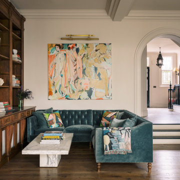
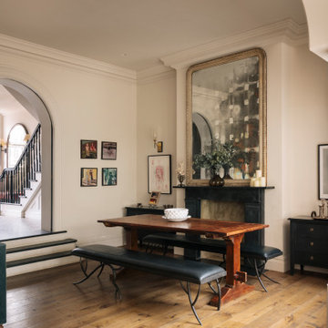
Keyes Road is a two-storey, semi-detached red brick house dating to around 1890-1910. The focus of our work was on the ground floor where we were asked to improve the layout and use of the main living areas of the house, for an active family of four. Important to the design was to maximise the quality and amount of light as well as connection to the garden and flow to the rest of the house.
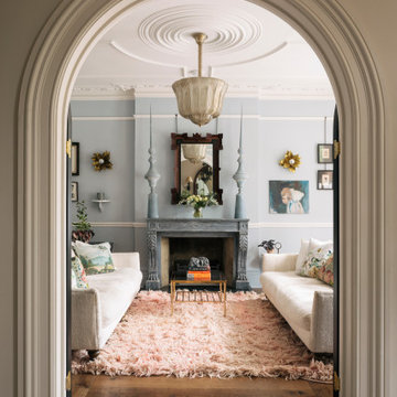
Our proposal introduces three single storey extensions, comprising a central, large space that extends the main outrigger of the house. To each side are smaller volumes, affording a full width kitchen. While defining a series of discrete volumes, it was important for us to ensure that the kitchen, living, family and dining rooms that are interconnecting and continuous. The result is a big space punctuated by a series of differently sized arches, defining spaces to ensure their intimacy.
It was important for our client to have a sense of warmth and comfort - perhaps not dissimilar to the qualities of a hotel lobby. The colour scheme of the rooms are warm white painted plaster, natural wood flooring with black, bronze and brass accents. Indirect and carefully placed light fittings pulls together the atmosphere of the rooms - particularly in the evenings.
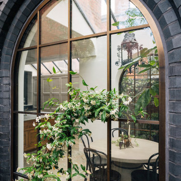
Externally, we felt it important to differentiate the extensions from the main house by using a dark, charcoal grey brick. This sets up a contrasting yet complimentary relationship to the rich red coloured brick house. The facets of the brick play with light and depth as do the graduated brick arches.
During the design process, we grappled with floor levels, the direction of sunlight, and care to not encroach on the neighbouring properties. As the house is in a conservation area, we worked closely with our trusted planning advisor. Throughout, we pursued a sensitive design strategy, using pitched roofs, matching materials and careful detailing. Internally, many of the original details are intact. This has enabled us to create an eclectic ensemble of elements, colours and materials varying in age and period.

 STUDIO TASHIMA
Keyes Road is a two-storey, semi-detached red brick house dating to around 1890-1910. The focus of our work was on the ground floor where we were asked to improve the layout and use of the main living areas of the house, for an active family of four. Important to the design was to maximise the quality and amount of light as well as connection to the garden and flow to the rest of the house.
Our proposal introduces three single storey extensions, comprising a central, large space that extends the main outrigger of the house. To each side are smaller volumes, affording a full width kitchen. While defining a series of discrete volumes, it was important for us to ensure that the kitchen, living, family and dining rooms that are interconnecting and continuous. The result is a big space punctuated by a series of differently sized arches, defining spaces to ensure their intimacy.
It was important for our client to have a sense of warmth and comfort - perhaps not dissimilar to the qualities of a hotel lobby. The colour scheme of the rooms are warm white painted plaster, natural wood flooring with black, bronze and brass accents. Indirect and carefully placed light fittings pulls together the atmosphere of the rooms - particularly in the evenings.
Externally, we felt it important to differentiate the extensions from the main house by using a dark, charcoal grey brick. This sets up a contrasting yet complimentary relationship to the rich red coloured brick house. The facets of the brick play with light and depth as do the graduated brick arches.
During the design process, we grappled with floor levels, the direction of sunlight, and care to not encroach on the neighbouring properties. As the house is in a conservation area, we worked closely with our trusted planning advisor. Throughout, we pursued a sensitive design strategy, using pitched roofs, matching materials and careful detailing. Internally, many of the original details are intact. This has enabled us to create an eclectic ensemble of elements, colours and materials varying in age and period.


 Zola European Windows
This Boulder, Colorado remodel by fuentesdesign demonstrates the possibility of renewal in American suburbs, and Passive House design principles. Once an inefficient single story 1,000 square-foot ranch house with a forced air furnace, has been transformed into a two-story, solar powered 2500 square-foot three bedroom home ready for the next generation.
The new design for the home is modern with a sustainable theme, incorporating a palette of natural materials including; reclaimed wood finishes, FSC-certified pine Zola windows and doors, and natural earth and lime plasters that soften the interior and crisp contemporary exterior with a flavor of the west. A Ninety-percent efficient energy recovery fresh air ventilation system provides constant filtered fresh air to every room. The existing interior brick was removed and replaced with insulation. The remaining heating and cooling loads are easily met with the highest degree of comfort via a mini-split heat pump, the peak heat load has been cut by a factor of 4, despite the house doubling in size. During the coldest part of the Colorado winter, a wood stove for ambiance and low carbon back up heat creates a special place in both the living and kitchen area, and upstairs loft.
This ultra energy efficient home relies on extremely high levels of insulation, air-tight detailing and construction, and the implementation of high performance, custom made European windows and doors by Zola Windows. Zola’s ThermoPlus Clad line, which boasts R-11 triple glazing and is thermally broken with a layer of patented German Purenit®, was selected for the project. These windows also provide a seamless indoor/outdoor connection, with 9′ wide folding doors from the dining area and a matching 9′ wide custom countertop folding window that opens the kitchen up to a grassy court where mature trees provide shade and extend the living space during the summer months.
With air-tight construction, this home meets the Passive House Retrofit (EnerPHit) air-tightness standard of

 Nakamoto Forestry
Project Overview:
The project was a highly designed energy efficient residential new build in Colchester, Vermont by Red HouseBuilding and architect Elizabeth Herrmann using our Shou Sugi Ban – Gendai that was oiled with a Light Gray prefinish.
“Nestled into a steep Vermont hillside, this home was carefully designed and positioned to efficiently and thoughtfully take advantage of the challenging terrain and stunning mountain views. The house is characterized by a series of connected wedge-shaped volumes. Roof lines lift toward views and sunlight and provide airy, varied-height spaces within. Designed to make single-floor living possible, the home has all major living spaces including a bedroom suite and garage on the main level, with a dual-purpose guest room/office, bathroom, and dual-purpose art studio/exercise room below. Totaling just 2,200 square feet of finished area (with additional mechanical space and an unfinished garage), the house is small, though expansive in feel. A dramatically angled porch juts out over the hillside, expanding the living space by over 200 square feet in the warmer months.
This home is also a high-performance, energy-efficient home that takes advantage of solar exposure. Solar panels located just above the house generate power. The home is heated and cooled by just two air source heat pumps.
A natural, low-maintenance palette extends from interior to exterior including Shou Sugi Ban siding charred and stained a light gray, local maple wood flooring and cabinetry, and stone accents.”
Product: Gendai 1×6 select grade shiplap
Prefinish: Light Gray
Application: Residential – Exterior
SF: 2400SF
Designer: Elizabeth Herrmann Architecture + Design
Builder: Red House Building
Date: November 2018
Location: Colchester, VT
 Johanna G Seldes, ASID Interior Design Consulting
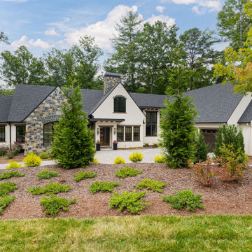
Set in the rolling hills of Asheville, NC, the Avant-Garde Manor is a masterpiece of custom home design. Honored with the NC Stars Award for Best Single Family Custom Home (4501–5500 square feet), this stunning collaboration with Buchanan Construction LLC reflects a balance of natural elements, modern sophistication, and warm, welcoming design.
Every detail of this 5,296-square-foot home was thoughtfully crafted by our interior design team to create a luxurious modern farmhouse that feels at home in its scenic surroundings.
A Blend of Warmth and Sophistication
Step into the living room, where light wood beams stretch across the vaulted ceilings and natural light streams in through the unique, expansive windows. The interplay of textures—light wood flooring, warm-toned cabinetry, and natural stone countertops—sets the tone for a home that is both refined and inviting.
Touches like elegant accent lighting and carefully chosen fixtures elevate the space, creating an atmosphere of understated luxury. These details, paired with the white walls and warm wood tones, make every room feel cohesive and timeless.
Designed for Everyday Functionality
The Avant-Garde Manor balances elegance with practicality, especially in its thoughtfully designed mudroom and laundry spaces. The mudroom features a built-in bench with hidden storage and plenty of hooks for coats and bags, leading into a laundry room outfitted with cabinetry, shelving, and hanging racks. It’s a setup that keeps your home organized, no matter how hectic the day gets.
These spaces were designed with busy lives in mind, proving that function and beauty can coexist effortlessly.
A Wine Cellar That Steals the Show
One of the home’s standout features is the wine cellar, a space that combines functionality with artistry. Floor-to-ceiling glass doors reveal warm wood shelving, while a custom bar area with natural stone countertops, a beverage fridge, and glass-front cabinets adds sophistication. Built-in lighting completes the ambiance, making it a perfect spot for hosting guests or unwinding after a long day.
Located just outside the wine cellar, a cozy bar area ties the space into the rest of the home, providing a seamless transition between entertaining and relaxation.
Natural Light and Scenic Views
Large windows throughout the home ensure that natural light is a constant presence, brightening every room while framing the breathtaking views of Asheville’s landscape. This thoughtful use of light not only enhances the interiors but also creates a sense of harmony between the home and its surroundings.
From the living areas to the bedrooms, this connection to nature helps define the Avant-Garde Manor’s unique charm—a luxurious retreat that feels effortlessly connected to the outdoors.
A Patio That Blends Luxury and Nature
Just outside the living room, the large patio deck extends the living space into the outdoors, offering a seamless connection to nature. Perfectly framed by large glass panels that showcase the lush greenery surrounding the property, the patio’s open-concept design creates a serene, retreat-like atmosphere.
The deck features a striking geometric wood-look pattern in rich natural tones, adding a unique and elegant touch. We chose this contemporary, cream-colored seating to brighten up the space and bring some modern luxury to the deck. The grand, stacked stone fireplace, with earthy hues brings texture and rustic charm to the space.
Built for Every Moment
The Avant-Garde Manor was designed to adapt to every kind of moment, from quiet evenings by the double-sided fireplace to lively gatherings in the open-concept kitchen. Custom details like accent walls, built-in desks, and elegant light fixtures make this home as functional as it is beautiful.
Whether entertaining guests or enjoying the peace and quiet of Asheville’s natural beauty, this award-winning modern farmhouse is a true reflection of comfortable luxury.


 Crystal Kitchen + Bath
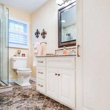
When Lisa told me she loved midcentury modern design, we instantly connected! I love bringing homes up-to-date while keeping a sense of midcentury style. This kitchen needed an improved layout and, by simply moving the refrigerator, we achieved a more open space with added storage, including a banquette for sipping morning coffee. Warm wood tones are true to the style. The cabinetry, paired with creamy Cambria countertops and gold hardware, creates a warm and inviting space.
 STUDIO TASHIMA
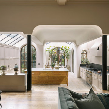
Keyes Road is a two-storey, semi-detached red brick house dating to around 1890-1910. The focus of our work was on the ground floor where we were asked to improve the layout and use of the main living areas of the house, for an active family of four. Important to the design was to maximise the quality and amount of light as well as connection to the garden and flow to the rest of the house.
Our proposal introduces three single storey extensions, comprising a central, large space that extends the main outrigger of the house. To each side are smaller volumes, affording a full width kitchen. While defining a series of discrete volumes, it was important for us to ensure that the kitchen, living, family and dining rooms that are interconnecting and continuous. The result is a big space punctuated by a series of differently sized arches, defining spaces to ensure their intimacy.
It was important for our client to have a sense of warmth and comfort - perhaps not dissimilar to the qualities of a hotel lobby. The colour scheme of the rooms are warm white painted plaster, natural wood flooring with black, bronze and brass accents. Indirect and carefully placed light fittings pulls together the atmosphere of the rooms - particularly in the evenings.
Externally, we felt it important to differentiate the extensions from the main house by using a dark, charcoal grey brick. This sets up a contrasting yet complimentary relationship to the rich red coloured brick house. The facets of the brick play with light and depth as do the graduated brick arches.
During the design process, we grappled with floor levels, the direction of sunlight, and care to not encroach on the neighbouring properties. As the house is in a conservation area, we worked closely with our trusted planning advisor. Throughout, we pursued a sensitive design strategy, using pitched roofs, matching materials and careful detailing. Internally, many of the original details are intact. This has enabled us to create an eclectic ensemble of elements, colours and materials varying in age and period.

 Orange County Deck Co.
This project was full outdoor living environment, what some would call a “staycation” backyard. A hybrid pool had been installed the previous year but now the living and entertaining spaces needed to be constructed. Consisting of a deck, two patio spaces with walkways connecting all, a couple retaining walls, fencing, landscaping and a new sliding door. The retaining walls were needed to allow for the patio space around to pool. The patio space was divided into two sections, one the wet zone by the pool and the second being the handout zone. This also allowed for a smaller area of fence with a clean transition. The deck constructed using Azek building products provided the style they wanted without having to worry about maintenance. With the elevation being over 8 feet off the ground, the staircase was given careful consideration. It was put on the side that had the grade in its favor to cut down on the size and to not impede on the usable living areas. Traffic flow and usable space should always be considered when designing your space. Now to get a better view of their beautiful backyard we changed their existing single 3 ft. hinged door for a new 6 ft sliding unit. This type of change does involve some structural modification but well worth it. It gave them the sight line they wanted, allows more natural light and has less impact on the living space as the door now slides.
We had a great time constructing this space and love knowing they will be enjoying their home life with family and friends. What could we build in your backyard?

 Ehrlich Yanai Rhee Chaney Architects
The ground floor volumes wrapped in an elongated hand-fired brick, emphasizing the horizontality of the architecture that lays solidly on the land.
(Photography by: Matthew Millman)
 STUDIO TASHIMA
Keyes Road is a two-storey, semi-detached red brick house dating to around 1890-1910. The focus of our work was on the ground floor where we were asked to improve the layout and use of the main living areas of the house, for an active family of four. Important to the design was to maximise the quality and amount of light as well as connection to the garden and flow to the rest of the house.
Our proposal introduces three single storey extensions, comprising a central, large space that extends the main outrigger of the house. To each side are smaller volumes, affording a full width kitchen. While defining a series of discrete volumes, it was important for us to ensure that the kitchen, living, family and dining rooms that are interconnecting and continuous. The result is a big space punctuated by a series of differently sized arches, defining spaces to ensure their intimacy.
It was important for our client to have a sense of warmth and comfort - perhaps not dissimilar to the qualities of a hotel lobby. The colour scheme of the rooms are warm white painted plaster, natural wood flooring with black, bronze and brass accents. Indirect and carefully placed light fittings pulls together the atmosphere of the rooms - particularly in the evenings.
Externally, we felt it important to differentiate the extensions from the main house by using a dark, charcoal grey brick. This sets up a contrasting yet complimentary relationship to the rich red coloured brick house. The facets of the brick play with light and depth as do the graduated brick arches.
During the design process, we grappled with floor levels, the direction of sunlight, and care to not encroach on the neighbouring properties. As the house is in a conservation area, we worked closely with our trusted planning advisor. Throughout, we pursued a sensitive design strategy, using pitched roofs, matching materials and careful detailing. Internally, many of the original details are intact. This has enabled us to create an eclectic ensemble of elements, colours and materials varying in age and period.

 Viewrail
Cable Railing on Ash Floating Stairs
These Vermont homeowners were looking for a custom stair and railing system that saved space and kept their space open. For the materials, they chose to order two FLIGHT Systems. Their design decisions included a black stringer, colonial gray posts, and Ash treads with a Storm Gray finish. This finished project looks amazing when paired with the white interior and gray stone flooring, and pulls together the open views of the surrounding bay.
 STUDIO TASHIMA
Keyes Road is a two-storey, semi-detached red brick house dating to around 1890-1910. The focus of our work was on the ground floor where we were asked to improve the layout and use of the main living areas of the house, for an active family of four. Important to the design was to maximise the quality and amount of light as well as connection to the garden and flow to the rest of the house.
Our proposal introduces three single storey extensions, comprising a central, large space that extends the main outrigger of the house. To each side are smaller volumes, affording a full width kitchen. While defining a series of discrete volumes, it was important for us to ensure that the kitchen, living, family and dining rooms that are interconnecting and continuous. The result is a big space punctuated by a series of differently sized arches, defining spaces to ensure their intimacy.
It was important for our client to have a sense of warmth and comfort - perhaps not dissimilar to the qualities of a hotel lobby. The colour scheme of the rooms are warm white painted plaster, natural wood flooring with black, bronze and brass accents. Indirect and carefully placed light fittings pulls together the atmosphere of the rooms - particularly in the evenings.
Externally, we felt it important to differentiate the extensions from the main house by using a dark, charcoal grey brick. This sets up a contrasting yet complimentary relationship to the rich red coloured brick house. The facets of the brick play with light and depth as do the graduated brick arches.
During the design process, we grappled with floor levels, the direction of sunlight, and care to not encroach on the neighbouring properties. As the house is in a conservation area, we worked closely with our trusted planning advisor. Throughout, we pursued a sensitive design strategy, using pitched roofs, matching materials and careful detailing. Internally, many of the original details are intact. This has enabled us to create an eclectic ensemble of elements, colours and materials varying in age and period.
232