
Search results for "Slight adjustment" in Home Design Ideas
 Tom Bassett-Dilley Architect, Ltd.
Photography by Natalie Marotta
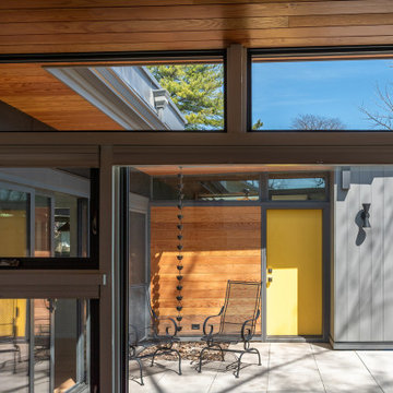
This special project is an extensive renovation of Better Homes And Gardens’ “The House You Asked For” of 1953. While the California Case Study-inspired architecture was an interesting break from 1950’s boxes, its extensive single-pane glass, internal roof drains, and slab construction were leading to structural deterioration through condensation and leaks, and a massive carbon footprint. The renovation took the form of slight plan adjustments–giving the kitchen more space, combining two entry doors into one entry space, adjusting the bedroom-bathroom area–and reworking the roof. We added a raised portion to carry ducts for conditioning and ventilation, which was also an opportunity to create spatial interest and bring in light from above, and we re-sloped the roof to drain to the perimeter instead of the middle of the house. Carbon-sequestering wood fiberboard insulation was added to the walls, and the windows were replaced with triple-glazed units. With new heat pump heating, cooling, and water heating, the operational carbon footprint was reduced by 93%.
 Rockledge Design + Architecture
Part of a major renovation that touched all corners of a 120-year-old Bloomfield home, this project is full of style and charming Victorian details.
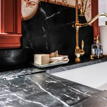
As an avid home cook, one of our client’s top priorities was maximizing storage throughout the space. To make the compact kitchen more functional, we removed a small peninsula containing the sink and dishwasher which was splitting the space in half. We also adjusted the size of the windows, bringing them above countertop height which allowed for a new “U-shaped” layout. What this room lacked in useable wall space was made up for in height — we took advantage of the generous 9-foot tall space, bringing the custom cabinetry all the way to the ceiling. Our client also opted for a slightly smaller Euro-style refrigerator, allowing for even more storage along that wall.
Central to the refrigerator, eco-friendly induction range, and farmhouse style sink, a hand carved antique Spanish work table provides the perfect prep zone, complete with an adjustable high-low fluted ceramic pendant above. A few other places where form meets function: a brass hanging rail along the range wall, a custom integral drainboard in the soapstone countertop, under cabinet lighting and hidden outlets, cushioned anti-fatigue Marmoleum sheet flooring, and a show-stopping gantry style faucet in a living unlacquered brass finish.
 Bluworld HOMelements
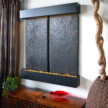
With a double panel of multi-colored Indian Rajah slate, the Nojoqui Falls Double fountain creates a display that is irresistible to the eye and combines a sound that is soothing to the ear. Capturing the raw beauty of its namesake, the beautiful 164 foot Nojoqui Falls near Solvang, California, our fountain combines natural elements with modern technology to bring nature's majesty to your living room. Nearly five feet tall and over four feet wide, this wall mounted fountain makes its presence felt in your home or office.
These water fountains feature your choice of four contemporary finishes framing double panels of Rajah slate layered onto lightweight composite material. The fountain is made with a splash-free design and features LED lighting to bring even more attention to the water falling past the slate. An adjustable flow valve allows you to adjust the rate of the falling water based on your mood, from a tranquil, calming curtain to a torrential cascade. Even with these features, installation is still a breeze, with no special tools. For truly unique and functional decorations, our indoor water fountains are beyond compare.
This water fountain can be customized with your logo.
NSI Slate™ – Water fountains made with our NSI™ Slate use our patent pending technology which sheers a layer of genuine Indian Raja Slate and fuses it to composite material with the same chipped edge technique as slab slate. They are indistinguishable from a thick slab of slate. All the beauty is retained and the weight is reduced by over 90% making it easier to hang a wall fountain.
*Please note that these units are handmade and measurements may vary slightly. Texture and color of the copper and slate may also vary slightly with each fountain.
Find the right local pro for your project
 Pro Dunk Hoops
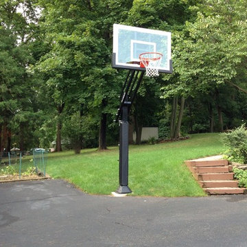
The driveway and front yard are on a slight hill. Does anyone mind? I don't think so. The play area is roughly 28 x 28. This is a Pro Dunk Silver Basketball System that was purchased in May of 2013. It was installed on a 28 ft wide by a 28 ft deep playing area in Clinton, NJ. Browse all of John S's photos navigate to: http://www.produnkhoops.com/photos/albums/john-28x28-pro-dunk-silver-basketball-system-193/
 Proto Homes, LLC
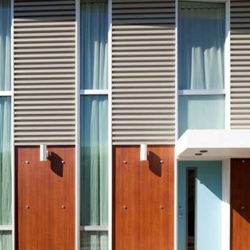
On average, a Proto Home™ can be constructed within four months, thanks to our new building methods that save time and money, while increasing accuracy. Proto Homes™ are built through a hybrid construction system: factory produced + site built elements. By prefabricating the shell and core features of the home off-site, construction can essentially begin before permitting has, thus saving you time and money.
Foundation/Slab Detailing: The foundation is detailed to serve two primary purposes. The foundation curb is formed in such a way that it acts as a measuring "rubric" for the house, first in providing a horizontal registration point for finish floors inside the house, and grading and landscape for outside. Secondly, it serves as a vertical indexing margin for all exterior finishes including panel systems and metal cladding. In addition, the delineation provided by the curb provides a clean aesthetic for the foundation itself and waterproofs the home.
Roofing construction is made more efficient in a Proto Home™. By doing away with the traditional attic, we've utilized every last square inch – which in this case provides higher ceilings. Every Proto Home™ features a "zero-penetration" roof that is uninterrupted by plumbing vents or ducts thanks to the Proto Core™ design, which moves traditional roof vents to the side wall of the core. The all-steel roof assembly provides structural stability and resists damage from weather and pests, giving it longevity not typical in today's roofs.
With Proto Home's™, it's all about the details. From the garage to the bathrooms, the amenities we use everyday have been slightly adjusted to make our lives easier.
The Proto Home™ garage is carefully designed to function as efficiently as the rest of the home. The floor is perfectly level, and outfitted with the same concrete as the rest of the first floor, which makes fitting the space with shelves and furniture much easier.
Bathtubs are reworked into "Soak In Showers," which are easy to enter and exit, yet deep enough to bathe in.
In keeping with sleek lines and uninterrupted design, we have developed "Zero Jam," a patented interior door jam made of solid aluminum. When closed, the door blends with the adjoining wall to create the appearance of one continuous unit.
Proto Home's™ also work with the seasons to compensate for changes in weather. The climate control can be adjusted so that during the summer air-conditioned cold air flows in from the top and descends to cool the space below. During the winter, the hot air is forced in from the ground level and ascends heating the entire house.
Photo Credit: Lisa Romerein, Proto Homes, LLC
 Tom Bassett-Dilley Architect, Ltd.
Photography by Natalie Marotta
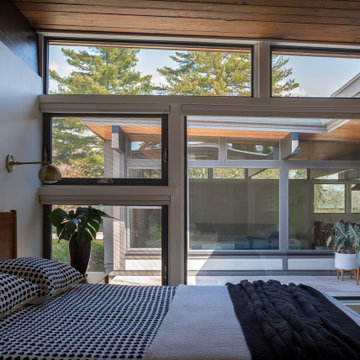
This special project is an extensive renovation of Better Homes And Gardens’ “The House You Asked For” of 1953. While the California Case Study-inspired architecture was an interesting break from 1950’s boxes, its extensive single-pane glass, internal roof drains, and slab construction were leading to structural deterioration through condensation and leaks, and a massive carbon footprint. The renovation took the form of slight plan adjustments–giving the kitchen more space, combining two entry doors into one entry space, adjusting the bedroom-bathroom area–and reworking the roof. We added a raised portion to carry ducts for conditioning and ventilation, which was also an opportunity to create spatial interest and bring in light from above, and we re-sloped the roof to drain to the perimeter instead of the middle of the house. Carbon-sequestering wood fiberboard insulation was added to the walls, and the windows were replaced with triple-glazed units. With new heat pump heating, cooling, and water heating, the operational carbon footprint was reduced by 93%.
 Elaina Blazei Interior Design
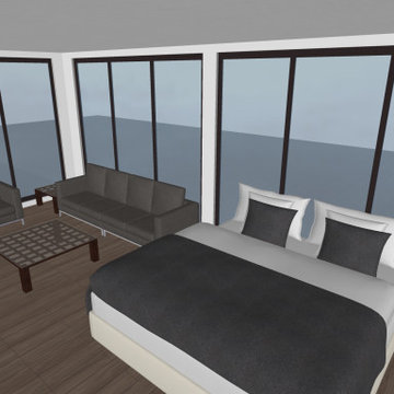
This house was a project that I had started over a year ago. I was not sold with my original design and left this project to sit for a while. Recently I came across the floor plan and was once again inspired. I adjusted the floor plan slightly to fit the space better and was once again excited to work on this project. The second floor had originally taken up the same amount of space as the main floor, but there was too much unusable open space and long hallways. I adjusted the space to be more accessible and open.
Sponsored
Columbus, OH

Structural Remodeling
Franklin County's Heavy Timber Specialists | Best of Houzz 2020!
 Tom Bassett-Dilley Architect, Ltd.
Photography by Natalie Marotta
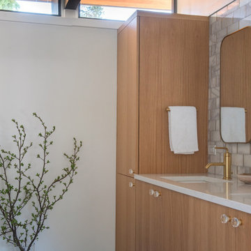
This special project is an extensive renovation of Better Homes And Gardens’ “The House You Asked For” of 1953. While the California Case Study-inspired architecture was an interesting break from 1950’s boxes, its extensive single-pane glass, internal roof drains, and slab construction were leading to structural deterioration through condensation and leaks, and a massive carbon footprint. The renovation took the form of slight plan adjustments–giving the kitchen more space, combining two entry doors into one entry space, adjusting the bedroom-bathroom area–and reworking the roof. We added a raised portion to carry ducts for conditioning and ventilation, which was also an opportunity to create spatial interest and bring in light from above, and we re-sloped the roof to drain to the perimeter instead of the middle of the house. Carbon-sequestering wood fiberboard insulation was added to the walls, and the windows were replaced with triple-glazed units. With new heat pump heating, cooling, and water heating, the operational carbon footprint was reduced by 93%.
 Rockledge Design + Architecture
Part of a major renovation that touched all corners of a 120-year-old Bloomfield home, this project is full of style and charming Victorian details.
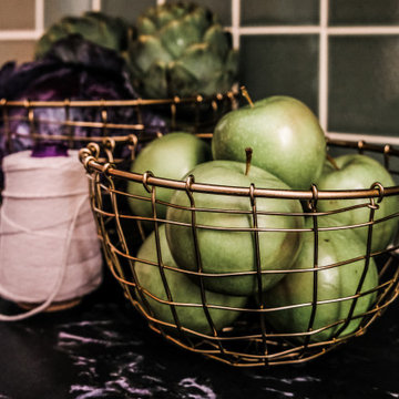
As an avid home cook, one of our client’s top priorities was maximizing storage throughout the space. To make the compact kitchen more functional, we removed a small peninsula containing the sink and dishwasher which was splitting the space in half. We also adjusted the size of the windows, bringing them above countertop height which allowed for a new “U-shaped” layout. What this room lacked in useable wall space was made up for in height — we took advantage of the generous 9-foot tall space, bringing the custom cabinetry all the way to the ceiling. Our client also opted for a slightly smaller Euro-style refrigerator, allowing for even more storage along that wall.
Central to the refrigerator, eco-friendly induction range, and farmhouse style sink, a hand carved antique Spanish work table provides the perfect prep zone, complete with an adjustable high-low fluted ceramic pendant above. A few other places where form meets function: a brass hanging rail along the range wall, a custom integral drainboard in the soapstone countertop, under cabinet lighting and hidden outlets, cushioned anti-fatigue Marmoleum sheet flooring, and a show-stopping gantry style faucet in a living unlacquered brass finish.
 Tom Bassett-Dilley Architect, Ltd.
Photography by Natalie Marotta
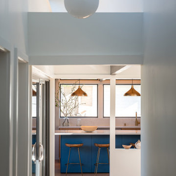
This special project is an extensive renovation of Better Homes And Gardens’ “The House You Asked For” of 1953. While the California Case Study-inspired architecture was an interesting break from 1950’s boxes, its extensive single-pane glass, internal roof drains, and slab construction were leading to structural deterioration through condensation and leaks, and a massive carbon footprint. The renovation took the form of slight plan adjustments–giving the kitchen more space, combining two entry doors into one entry space, adjusting the bedroom-bathroom area–and reworking the roof. We added a raised portion to carry ducts for conditioning and ventilation, which was also an opportunity to create spatial interest and bring in light from above, and we re-sloped the roof to drain to the perimeter instead of the middle of the house. Carbon-sequestering wood fiberboard insulation was added to the walls, and the windows were replaced with triple-glazed units. With new heat pump heating, cooling, and water heating, the operational carbon footprint was reduced by 93%.
 Tom Bassett-Dilley Architect, Ltd.
Photography by Natalie Marotta
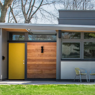
This special project is an extensive renovation of Better Homes And Gardens’ “The House You Asked For” of 1953. While the California Case Study-inspired architecture was an interesting break from 1950’s boxes, its extensive single-pane glass, internal roof drains, and slab construction were leading to structural deterioration through condensation and leaks, and a massive carbon footprint. The renovation took the form of slight plan adjustments–giving the kitchen more space, combining two entry doors into one entry space, adjusting the bedroom-bathroom area–and reworking the roof. We added a raised portion to carry ducts for conditioning and ventilation, which was also an opportunity to create spatial interest and bring in light from above, and we re-sloped the roof to drain to the perimeter instead of the middle of the house. Carbon-sequestering wood fiberboard insulation was added to the walls, and the windows were replaced with triple-glazed units. With new heat pump heating, cooling, and water heating, the operational carbon footprint was reduced by 93%.
 Elaina Blazei Interior Design
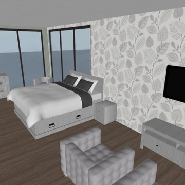
This house was a project that I had started over a year ago. I was not sold with my original design and left this project to sit for a while. Recently I came across the floor plan and was once again inspired. I adjusted the floor plan slightly to fit the space better and was once again excited to work on this project. The second floor had originally taken up the same amount of space as the main floor, but there was too much unusable open space and long hallways. I adjusted the space to be more accessible and open.
 Tom Bassett-Dilley Architect, Ltd.
Photography by Natalie Marotta
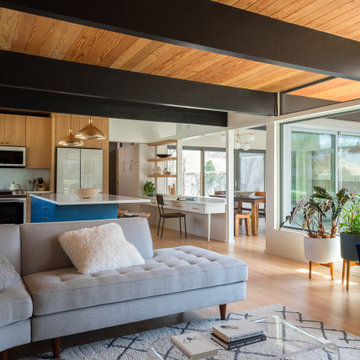
This special project is an extensive renovation of Better Homes And Gardens’ “The House You Asked For” of 1953. While the California Case Study-inspired architecture was an interesting break from 1950’s boxes, its extensive single-pane glass, internal roof drains, and slab construction were leading to structural deterioration through condensation and leaks, and a massive carbon footprint. The renovation took the form of slight plan adjustments–giving the kitchen more space, combining two entry doors into one entry space, adjusting the bedroom-bathroom area–and reworking the roof. We added a raised portion to carry ducts for conditioning and ventilation, which was also an opportunity to create spatial interest and bring in light from above, and we re-sloped the roof to drain to the perimeter instead of the middle of the house. Carbon-sequestering wood fiberboard insulation was added to the walls, and the windows were replaced with triple-glazed units. With new heat pump heating, cooling, and water heating, the operational carbon footprint was reduced by 93%.
 Eastview Homes
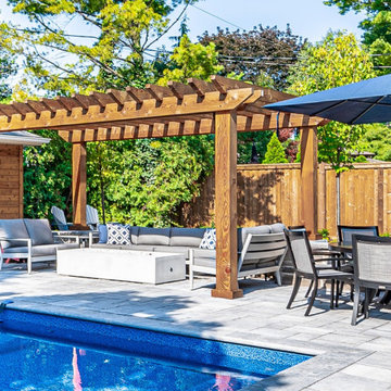
These are the exterior pictures of a whole-house renovation in Burlington Ontario that was completed in 2021. Mature trees were removed from around the pool and the house was expanded in two places - the rear corners. Additions were done in to expand the basement and main floor with only slight adjustments to the second story. The kitchen was moved to the east corner and the house was remodeled to allow a better flow through the domicile. Its now more spacious, convenient and easier to heat. Outside the place looks terrific with Cape Cod all natural wood siding above a stone skirt.
 Eastview Homes
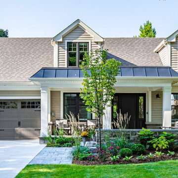
These are the exterior angles on a whole-house renovation in Burlington completed in 2021. Trees were removed from around the pool and the house was expanded in two places - the rear corners. Additions were done in to expand the basement and main floor with only slight adjustments to the second story. The kitchen was moved to the east corner and the house was remodeled to allow a better flow through the domicile. Its now more spacious, convenient and easier to heat. Outside the place looks terrific with Cape Cod all natural wood siding above a stone skirt.
 Eastview Homes
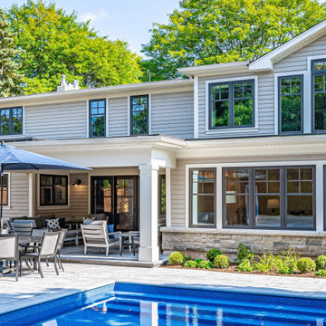
These are the exterior angles on a whole-house renovation in Burlington completed in 2021. Trees were removed from around the pool and the house was expanded in two places - the rear corners. Additions were done in to expand the basement and main floor with only slight adjustments to the second story. The kitchen was moved to the east corner and the house was remodeled to allow a better flow through the domicile. Its now more spacious, convenient and easier to heat. Outside the place looks terrific with Cape Cod all natural wood siding above a stone skirt.
 Eastview Homes
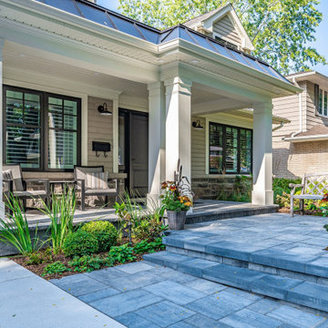
These are the exterior angles on a whole-house renovation in Burlington completed in 2021. Trees were removed from around the pool and the house was expanded in two places - the rear corners. Additions were done in to expand the basement and main floor with only slight adjustments to the second story. The kitchen was moved to the east corner and the house was remodeled to allow a better flow through the domicile. Its now more spacious, convenient and easier to heat. Outside the place looks terrific with Cape Cod all natural wood siding above a stone skirt.
 JUMA architects
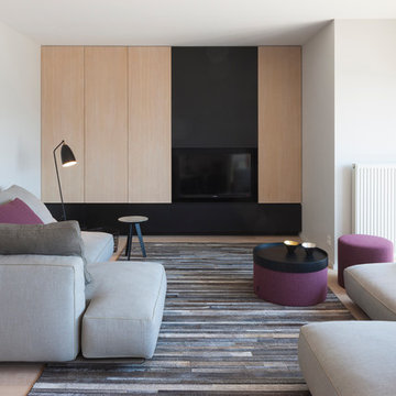
JUMA architects were contacted for the interior design of a shell-state apartment on the coast. The structural construction, the plastering, the floor screed and the technical fittings (heating ducts, plumbing, electricity and ventilation) of the apartment had already been realised.
It soon became apparent, however, that the assignment could not be limited to the interior decoration only, as the placement of kitchen, bathroom and dressing room in the existing plan turned out to be entirely impractical. More extensive renovation work was needed to meet the needs of the customer. The structure of the unit was therefore slightly adjusted to make the bathroom and dressing larger and more functional.
Also, the living room was dominated by a huge radiator that drew all the attention. To solve this problem, new pipes were laid to accommodate an integrated heating element in the sideboard. Gas pipes were fitted in the kitchen for the gas cooker which JUMA included in the design as a real eye-catcher. The sinks, in contrast, were given a more discreet placement.
Light oak parquet was selected for the floors throughout the apartment. The natural appearance of the wood gives all the rooms a warm feel. The built-in furniture was custom made and is finished in black satin lacquer to contrast the light-coloured wood. The dominant colour palette is deliberately kept very simple and neutral and is complemented with light grey tones and colour accents. The colour choice was in fact inspired by a beautiful picture of the coast.
The freestanding furniture and overall decorations were also selected or designed by JUMA architects. The arrangement of the seating area is very playful and atypical. JUMA did not want to put in a couch that would divide the space in two. The composition is meant to create a very open ambiance. A round table was chosen for the same reason. The round shape does not divide the space but allows fluid circulation.
Pictures © Liesbet Goetschalckx
 JUMA architects
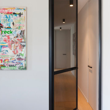
JUMA architects were contacted for the interior design of a shell-state apartment on the coast. The structural construction, the plastering, the floor screed and the technical fittings (heating ducts, plumbing, electricity and ventilation) of the apartment had already been realised.
It soon became apparent, however, that the assignment could not be limited to the interior decoration only, as the placement of kitchen, bathroom and dressing room in the existing plan turned out to be entirely impractical. More extensive renovation work was needed to meet the needs of the customer. The structure of the unit was therefore slightly adjusted to make the bathroom and dressing larger and more functional.
Also, the living room was dominated by a huge radiator that drew all the attention. To solve this problem, new pipes were laid to accommodate an integrated heating element in the sideboard. Gas pipes were fitted in the kitchen for the gas cooker which JUMA included in the design as a real eye-catcher. The sinks, in contrast, were given a more discreet placement.
Light oak parquet was selected for the floors throughout the apartment. The natural appearance of the wood gives all the rooms a warm feel. The built-in furniture was custom made and is finished in black satin lacquer to contrast the light-coloured wood. The dominant colour palette is deliberately kept very simple and neutral and is complemented with light grey tones and colour accents. The colour choice was in fact inspired by a beautiful picture of the coast.
The freestanding furniture and overall decorations were also selected or designed by JUMA architects. The arrangement of the seating area is very playful and atypical. JUMA did not want to put in a couch that would divide the space in two. The composition is meant to create a very open ambiance. A round table was chosen for the same reason. The round shape does not divide the space but allows fluid circulation.
Pictures © Liesbet Goetschalckx
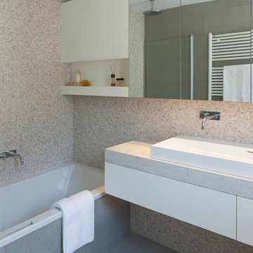 JUMA architects
JUMA architects were contacted for the interior design of a shell-state apartment on the coast. The structural construction, the plastering, the floor screed and the technical fittings (heating ducts, plumbing, electricity and ventilation) of the apartment had already been realised.
It soon became apparent, however, that the assignment could not be limited to the interior decoration only, as the placement of kitchen, bathroom and dressing room in the existing plan turned out to be entirely impractical. More extensive renovation work was needed to meet the needs of the customer. The structure of the unit was therefore slightly adjusted to make the bathroom and dressing larger and more functional.
Also, the living room was dominated by a huge radiator that drew all the attention. To solve this problem, new pipes were laid to accommodate an integrated heating element in the sideboard. Gas pipes were fitted in the kitchen for the gas cooker which JUMA included in the design as a real eye-catcher. The sinks, in contrast, were given a more discreet placement.
Light oak parquet was selected for the floors throughout the apartment. The natural appearance of the wood gives all the rooms a warm feel. The built-in furniture was custom made and is finished in black satin lacquer to contrast the light-coloured wood. The dominant colour palette is deliberately kept very simple and neutral and is complemented with light grey tones and colour accents. The colour choice was in fact inspired by a beautiful picture of the coast.
The freestanding furniture and overall decorations were also selected or designed by JUMA architects. The arrangement of the seating area is very playful and atypical. JUMA did not want to put in a couch that would divide the space in two. The composition is meant to create a very open ambiance. A round table was chosen for the same reason. The round shape does not divide the space but allows fluid circulation.
Pictures © Liesbet Goetschalckx
8