
Search results for "Slight adjustment" in Home Design Ideas
 Eastview Homes
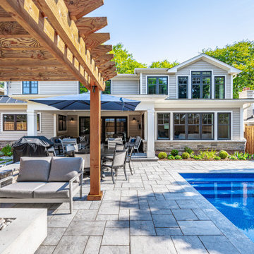
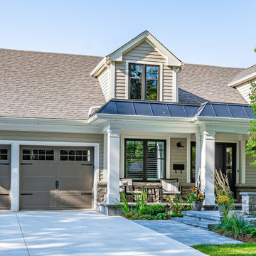
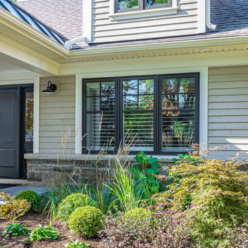
These are the exterior angles on a whole-house renovation in Burlington completed in 2021. Trees were removed from around the pool and the house was expanded in two places - the rear corners. Additions were done in to expand the basement and main floor with only slight adjustments to the second story. The kitchen was moved to the east corner and the house was remodeled to allow a better flow through the domicile. Its now more spacious, convenient and easier to heat. Outside the place looks terrific with Cape Cod all natural wood siding above a stone skirt.
 JUMA architects
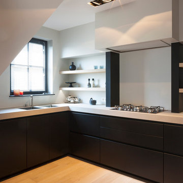
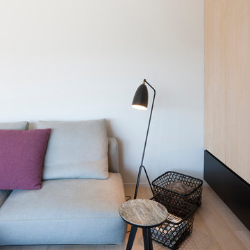
JUMA architects were contacted for the interior design of a shell-state apartment on the coast. The structural construction, the plastering, the floor screed and the technical fittings (heating ducts, plumbing, electricity and ventilation) of the apartment had already been realised.
It soon became apparent, however, that the assignment could not be limited to the interior decoration only, as the placement of kitchen, bathroom and dressing room in the existing plan turned out to be entirely impractical. More extensive renovation work was needed to meet the needs of the customer. The structure of the unit was therefore slightly adjusted to make the bathroom and dressing larger and more functional.
Also, the living room was dominated by a huge radiator that drew all the attention. To solve this problem, new pipes were laid to accommodate an integrated heating element in the sideboard. Gas pipes were fitted in the kitchen for the gas cooker which JUMA included in the design as a real eye-catcher. The sinks, in contrast, were given a more discreet placement.
Light oak parquet was selected for the floors throughout the apartment. The natural appearance of the wood gives all the rooms a warm feel. The built-in furniture was custom made and is finished in black satin lacquer to contrast the light-coloured wood. The dominant colour palette is deliberately kept very simple and neutral and is complemented with light grey tones and colour accents. The colour choice was in fact inspired by a beautiful picture of the coast.
The freestanding furniture and overall decorations were also selected or designed by JUMA architects. The arrangement of the seating area is very playful and atypical. JUMA did not want to put in a couch that would divide the space in two. The composition is meant to create a very open ambiance. A round table was chosen for the same reason. The round shape does not divide the space but allows fluid circulation.
Pictures © Liesbet Goetschalckx
 Eastview Homes
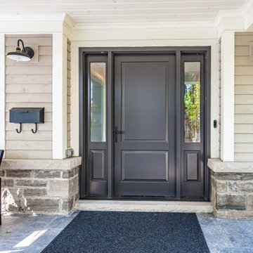
These are the exterior angles on a whole-house renovation in Burlington completed in 2021. Trees were removed from around the pool and the house was expanded in two places - the rear corners. Additions were done in to expand the basement and main floor with only slight adjustments to the second story. The kitchen was moved to the east corner and the house was remodeled to allow a better flow through the domicile. Its now more spacious, convenient and easier to heat. Outside the place looks terrific with Cape Cod all natural wood siding above a stone skirt.
Find the right local pro for your project
 Eastview Homes
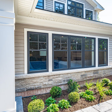
These are the exterior angles on a whole-house renovation in Burlington completed in 2021. Trees were removed from around the pool and the house was expanded in two places - the rear corners. Additions were done in to expand the basement and main floor with only slight adjustments to the second story. The kitchen was moved to the east corner and the house was remodeled to allow a better flow through the domicile. Its now more spacious, convenient and easier to heat. Outside the place looks terrific with Cape Cod all natural wood siding above a stone skirt.
 Eastview Homes
These are the exterior angles on a whole-house renovation in Burlington completed in 2021. Trees were removed from around the pool and the house was expanded in two places - the rear corners. Additions were done in to expand the basement and main floor with only slight adjustments to the second story. The kitchen was moved to the east corner and the house was remodeled to allow a better flow through the domicile. Its now more spacious, convenient and easier to heat. Outside the place looks terrific with Cape Cod all natural wood siding above a stone skirt.
 Eastview Homes
These are the exterior angles on a whole-house renovation in Burlington completed in 2021. Trees were removed from around the pool and the house was expanded in two places - the rear corners. Additions were done in to expand the basement and main floor with only slight adjustments to the second story. The kitchen was moved to the east corner and the house was remodeled to allow a better flow through the domicile. Its now more spacious, convenient and easier to heat. Outside the place looks terrific with Cape Cod all natural wood siding above a stone skirt.
 JUMA architects
JUMA architects were contacted for the interior design of a shell-state apartment on the coast. The structural construction, the plastering, the floor screed and the technical fittings (heating ducts, plumbing, electricity and ventilation) of the apartment had already been realised.
It soon became apparent, however, that the assignment could not be limited to the interior decoration only, as the placement of kitchen, bathroom and dressing room in the existing plan turned out to be entirely impractical. More extensive renovation work was needed to meet the needs of the customer. The structure of the unit was therefore slightly adjusted to make the bathroom and dressing larger and more functional.
Also, the living room was dominated by a huge radiator that drew all the attention. To solve this problem, new pipes were laid to accommodate an integrated heating element in the sideboard. Gas pipes were fitted in the kitchen for the gas cooker which JUMA included in the design as a real eye-catcher. The sinks, in contrast, were given a more discreet placement.
Light oak parquet was selected for the floors throughout the apartment. The natural appearance of the wood gives all the rooms a warm feel. The built-in furniture was custom made and is finished in black satin lacquer to contrast the light-coloured wood. The dominant colour palette is deliberately kept very simple and neutral and is complemented with light grey tones and colour accents. The colour choice was in fact inspired by a beautiful picture of the coast.
The freestanding furniture and overall decorations were also selected or designed by JUMA architects. The arrangement of the seating area is very playful and atypical. JUMA did not want to put in a couch that would divide the space in two. The composition is meant to create a very open ambiance. A round table was chosen for the same reason. The round shape does not divide the space but allows fluid circulation.
Pictures © Liesbet Goetschalckx
Sponsored
Columbus, OH

Structural Remodeling
Franklin County's Heavy Timber Specialists | Best of Houzz 2020!
 JUMA architects
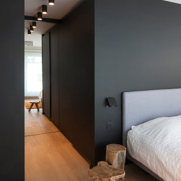
JUMA architects were contacted for the interior design of a shell-state apartment on the coast. The structural construction, the plastering, the floor screed and the technical fittings (heating ducts, plumbing, electricity and ventilation) of the apartment had already been realised.
It soon became apparent, however, that the assignment could not be limited to the interior decoration only, as the placement of kitchen, bathroom and dressing room in the existing plan turned out to be entirely impractical. More extensive renovation work was needed to meet the needs of the customer. The structure of the unit was therefore slightly adjusted to make the bathroom and dressing larger and more functional.
Also, the living room was dominated by a huge radiator that drew all the attention. To solve this problem, new pipes were laid to accommodate an integrated heating element in the sideboard. Gas pipes were fitted in the kitchen for the gas cooker which JUMA included in the design as a real eye-catcher. The sinks, in contrast, were given a more discreet placement.
Light oak parquet was selected for the floors throughout the apartment. The natural appearance of the wood gives all the rooms a warm feel. The built-in furniture was custom made and is finished in black satin lacquer to contrast the light-coloured wood. The dominant colour palette is deliberately kept very simple and neutral and is complemented with light grey tones and colour accents. The colour choice was in fact inspired by a beautiful picture of the coast.
The freestanding furniture and overall decorations were also selected or designed by JUMA architects. The arrangement of the seating area is very playful and atypical. JUMA did not want to put in a couch that would divide the space in two. The composition is meant to create a very open ambiance. A round table was chosen for the same reason. The round shape does not divide the space but allows fluid circulation.
Pictures © Liesbet Goetschalckx
 Architect
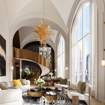
Not all architectural imagery is created equal. Some renderings look obviously computer-generated, with flat lighting and plastic-looking materials that fail to convince viewers. Others are so precise that they are indistinguishable from photographs. That second category, realistic architectural visualization rendering, has become the standard expectation for architects, developers, and marketers who need imagery capable of withstanding close scrutiny from investors, buyers, and planning authorities. As audiences grow more visually literate, the tolerance for obviously artificial, video-game-like imagery in professional presentations continues to shrink.
What Sets Realistic Visualization Apart
Realistic architectural visualization goes beyond simply modeling a building in three dimensions. It requires physically accurate lighting simulation, true-to-life material properties, and careful attention to the small imperfections that make real-world photography convincing, such as subtle reflections, ambient occlusion in corners, and natural depth of field. The goal is an image that a viewer would believe was captured by a camera on-site rather than generated by software. Achieving that level of believability typically means dozens of small adjustments layered on top of one another rather than any single dramatic setting.
Realistic Versus Stylized Rendering Approaches
Stylized or conceptual renderings still have their place, particularly in early design phases when a looser, more artistic representation helps convey mood without locking in every detail. But once a project moves toward marketing, investment, or permitting, stakeholders need to see exactly what they are getting. Realistic visualization removes ambiguity, showing true material colors, accurate proportions, and honest lighting conditions rather than idealized abstractions. Understanding which approach a project actually needs at each stage helps clients avoid paying for a level of polish that a given milestone does not yet require.
Why Realism Builds Client and Buyer Confidence
Buyers and investors are understandably skeptical of overly polished or unrealistic marketing images. When a rendering looks convincingly real, it builds trust rather than raising doubts about what the finished project will actually look like. This is especially important in real estate presales, where buyers are committing significant sums based largely on visual material rather than a finished physical space. A rendering that later turns out to have misrepresented the finished product can also create legal and reputational exposure for developers, making accuracy a genuine business risk rather than just an aesthetic preference.
The Technical Pillars Behind Every Realistic Scene
Achieving true realism depends on several technical disciplines working together: physically based rendering engines that simulate how light actually behaves, high-resolution texture libraries that replicate real materials like stone, wood, and glass, and careful camera work that mimics real photographic lenses and exposure. Post-production adds a final layer of color grading and atmospheric effects that ties everything together into a cohesive, believable image. Each of these pillars depends on the others; even flawless material work can be undermined by lighting that behaves in a physically implausible way.
Applications Across Residential, Commercial, and Institutional Projects
Realistic visualization serves a wide range of building types, from single-family homes and luxury condominiums to office towers, hotels, schools, and healthcare facilities. Each typology has its own material palette and lighting expectations, and an experienced studio adjusts its approach accordingly, whether that means warm, inviting tones for a residential lobby or crisp, professional lighting for a corporate headquarters. Institutional clients such as universities and hospitals often have additional requirements around accessibility signage and wayfinding, which need to be represented accurately alongside the architecture itself.
How AIMIR CG Delivers Photorealistic Accuracy
Our studio specializes in realistic architectural visualization rendering that holds up under close inspection. Every project moves through a disciplined pipeline of modeling, texturing, lighting, and post-production review, with artists cross-checking material references and lighting studies against real-world photography. This attention to detail is why clients consistently describe our end product as impressive and our process as easy to work with. A dedicated quality review stage before delivery catches inconsistencies that might otherwise slip through a faster, less structured pipeline.
Common Challenges in Achieving True Realism
Realistic rendering is technically demanding. Common obstacles include accurately simulating how light bounces between surfaces, matching material reflectivity to real product specifications, and avoiding the uncanny, slightly artificial look that comes from over-processed images. Overcoming these challenges requires experienced artists who understand both the science of light and the craft of photography, not just software proficiency. Rushed production schedules are often the real culprit behind unconvincing renderings, since realism typically requires several iterative passes rather than a single render.
What to Look for in a Realism-Focused Rendering Studio
When evaluating a rendering partner, review their portfolio critically. Do the images include convincing shadow detail and material variation, or do surfaces look uniformly smooth and artificial? Ask about their revision process and how closely they work with architects to source accurate material and lighting references, since realism is ultimately the product of disciplined collaboration, not a single software setting. It also helps to ask for examples of past projects in a similar building type, since a studio's strengths can vary across typologies.
Ready for Renderings That Look Real
If your project deserves imagery that can stand up to the scrutiny of investors, buyers, and planning boards, AIMIR CG is ready to help. Our team combines technical precision with artistic judgment to deliver visualization that looks and feels genuinely real. Contact us to discuss how photorealistic rendering can strengthen your next presentation or marketing campaign, and let us show you examples from projects similar to your own.
 Rockledge Design + Architecture
Part of a major renovation that touched all corners of a 120-year-old Bloomfield home, this project is full of style and charming Victorian details.
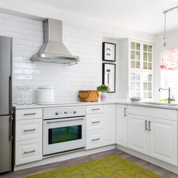
As an avid home cook, one of our client’s top priorities was maximizing storage throughout the space. To make the compact kitchen more functional, we removed a small peninsula containing the sink and dishwasher which was splitting the space in half. We also adjusted the size of the windows, bringing them above countertop height which allowed for a new “U-shaped” layout. What this room lacked in useable wall space was made up for in height — we took advantage of the generous 9-foot tall space, bringing the custom cabinetry all the way to the ceiling. Our client also opted for a slightly smaller Euro-style refrigerator, allowing for even more storage along that wall.
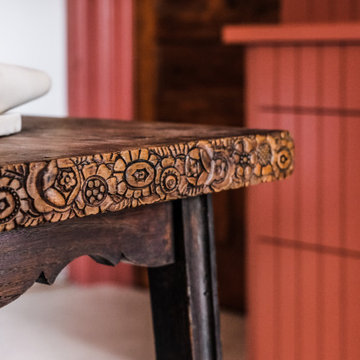
Central to the refrigerator, eco-friendly induction range, and farmhouse style sink, a hand carved antique Spanish work table provides the perfect prep zone, complete with an adjustable high-low fluted ceramic pendant above. A few other places where form meets function: a brass hanging rail along the range wall, a custom integral drainboard in the soapstone countertop, under cabinet lighting and hidden outlets, cushioned anti-fatigue Marmoleum sheet flooring, and a show-stopping gantry style faucet in a living unlacquered brass finish.
 Elaina Blazei Interior Design
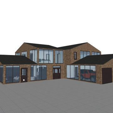
This house was a project that I had started over a year ago. I was not sold with my original design and left this project to sit for a while. Recently I came across the floor plan and was once again inspired. I adjusted the floor plan slightly to fit the space better and was once again excited to work on this project. The second floor had originally taken up the same amount of space as the main floor, but there was too much unusable open space and long hallways. I adjusted the space to be more accessible and open.
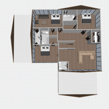 Elaina Blazei Interior Design
This house was a project that I had started over a year ago. I was not sold with my original design and left this project to sit for a while. Recently I came across the floor plan and was once again inspired. I adjusted the floor plan slightly to fit the space better and was once again excited to work on this project. The second floor had originally taken up the same amount of space as the main floor, but there was too much unusable open space and long hallways. I adjusted the space to be more accessible and open.
 Theakston Phipps Interiors
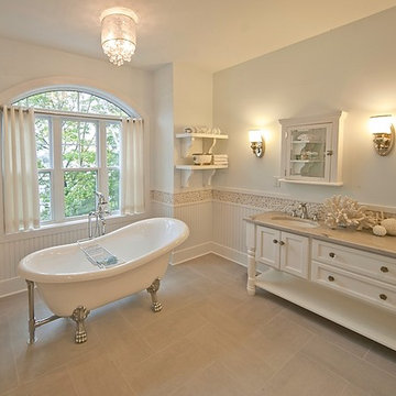
Large beach style master gray tile and stone tile porcelain tile bathroom photo in Other with an undermount sink, shaker cabinets, white cabinets, granite countertops, a one-piece toilet and green walls
 upinteriors.com
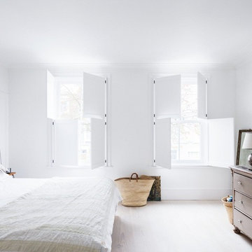
Example of a mid-sized danish master light wood floor bedroom design in London with white walls and no fireplace

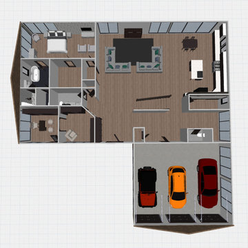
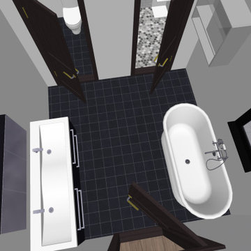 Elaina Blazei Interior Design
This house was a project that I had started over a year ago. I was not sold with my original design and left this project to sit for a while. Recently I came across the floor plan and was once again inspired. I adjusted the floor plan slightly to fit the space better and was once again excited to work on this project. The second floor had originally taken up the same amount of space as the main floor, but there was too much unusable open space and long hallways. I adjusted the space to be more accessible and open.
 Elaina Blazei Interior Design
This house was a project that I had started over a year ago. I was not sold with my original design and left this project to sit for a while. Recently I came across the floor plan and was once again inspired. I adjusted the floor plan slightly to fit the space better and was once again excited to work on this project. The second floor had originally taken up the same amount of space as the main floor, but there was too much unusable open space and long hallways. I adjusted the space to be more accessible and open.
 Tom Bassett-Dilley Architect, Ltd.
Photography by Natalie Marotta
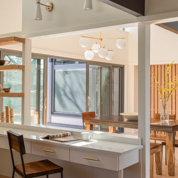
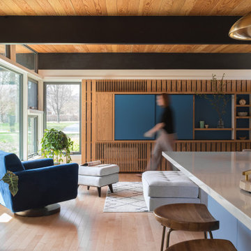
This special project is an extensive renovation of Better Homes And Gardens’ “The House You Asked For” of 1953. While the California Case Study-inspired architecture was an interesting break from 1950’s boxes, its extensive single-pane glass, internal roof drains, and slab construction were leading to structural deterioration through condensation and leaks, and a massive carbon footprint. The renovation took the form of slight plan adjustments–giving the kitchen more space, combining two entry doors into one entry space, adjusting the bedroom-bathroom area–and reworking the roof. We added a raised portion to carry ducts for conditioning and ventilation, which was also an opportunity to create spatial interest and bring in light from above, and we re-sloped the roof to drain to the perimeter instead of the middle of the house. Carbon-sequestering wood fiberboard insulation was added to the walls, and the windows were replaced with triple-glazed units. With new heat pump heating, cooling, and water heating, the operational carbon footprint was reduced by 93%.
 Tom Bassett-Dilley Architect, Ltd.
Photography by Natalie Marotta
This special project is an extensive renovation of Better Homes And Gardens’ “The House You Asked For” of 1953. While the California Case Study-inspired architecture was an interesting break from 1950’s boxes, its extensive single-pane glass, internal roof drains, and slab construction were leading to structural deterioration through condensation and leaks, and a massive carbon footprint. The renovation took the form of slight plan adjustments–giving the kitchen more space, combining two entry doors into one entry space, adjusting the bedroom-bathroom area–and reworking the roof. We added a raised portion to carry ducts for conditioning and ventilation, which was also an opportunity to create spatial interest and bring in light from above, and we re-sloped the roof to drain to the perimeter instead of the middle of the house. Carbon-sequestering wood fiberboard insulation was added to the walls, and the windows were replaced with triple-glazed units. With new heat pump heating, cooling, and water heating, the operational carbon footprint was reduced by 93%.
9