
Search results for "Small open plan kitchen living room" in Home Design Ideas
 User
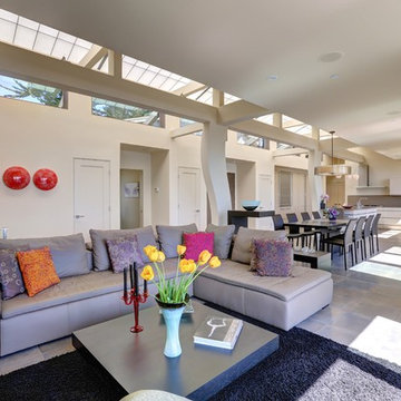
UserIn our busy lives, creating a peaceful and rejuvenating home environment is essential to a healthy lifestyle. Built less than five years ago, this Stinson Beach Modern home is your own private oasis. Surrounded by a butterfly preserve and unparalleled ocean views, the home will lead you to a sense of connection with nature. As you enter an open living room space that encompasses a kitchen, dining area, and living room, the inspiring contemporary interior invokes a sense of relaxation, that stimulates the senses. The open floor plan and modern finishes create a soothing, tranquil, and uplifting atmosphere. The house is approximately 2900 square feet, has three (to possibly five) bedrooms, four bathrooms, an outdoor shower and spa, a full office, and a media room. Its two levels blend into the hillside, creating privacy and quiet spaces within an open floor plan and feature spectacular views from every room. The expansive home, decks and patios presents the most beautiful sunsets as well as the most private and panoramic setting in all of Stinson Beach. One of the home's noteworthy design features is a peaked roof that uses Kalwall's translucent day-lighting system, the most highly insulating, diffuse light-transmitting, structural panel technology. This protected area on the hill provides a dramatic roar from the ocean waves but without any of the threats of oceanfront living. Built on one of the last remaining one-acre coastline lots on the west side of the hill at Stinson Beach, the design of the residence is site friendly, using materials and finishes that meld into the hillside. The landscaping features low-maintenance succulents and butterfly friendly plantings appropriate for the adjacent Monarch Butterfly Preserve. Recalibrate your dreams in this natural environment, and make the choice to live in complete privacy on this one acre retreat. This home includes Miele appliances, Thermadore refrigerator and freezer, an entire home water filtration system, kitchen and bathroom cabinetry by SieMatic, Ceasarstone kitchen counter tops, hardwood and Italian ceramic radiant tile floors using Warmboard technology, Electric blinds, Dornbracht faucets, Kalwall skylights throughout livingroom and garage, Jeldwen windows and sliding doors. Located 5-8 minute walk to the ocean, downtown Stinson and the community center. It is less than a five minute walk away from the trail heads such as Steep Ravine and Willow Camp.
 User
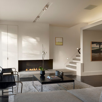
UserA 1980's townhouse located in the Fitler Square neighborhood of Philadelphia was in need of an upgrade. The project that resulted included substantial interior renovation to the four-story townhome overlooking the Schuylkill River.
The Owners desired a fresh interpretation of their existing space, more suited for entertaining and uncluttered modern living. This led to a reinvention of the modern master suite and a refocusing of architectural elements and materials throughout the home.
Originally comprised of a divided master bedroom, bathroom and office, the fourth floor was entirely redesigned to create a contemporary, open-plan master suite. The bedroom, now located in the center of the floor plan, is composed with custom built-in furniture and includes a glass terrarium and a wet bar. It is flanked by a dressing room on one side and a luxurious bathroom on the other, all open to one another both visually and by circulation. The bathroom includes a free-standing tub, glass shower, custom wood vanity, eco-conscious fireplace, and an outdoor terrace. The open plan allows for great breadth and a wealth of natural light, atypical of townhouse living.
The main entertaining floor houses the kitchen, dining area and living room. A sculptural ceiling defines the open dining area, while a long, low concrete hearth connects the new modern fireplace with the concrete stair treads leading up. The bright, neutral color palette of the walls and finishes contrasts against the blackened wood floors. Sleek but comfortable furnishing, dramatic recessed lighting, and a full-home speaker system complete the entertaining space.
Barry Halkin and Todd Mason Photography
 Advance Design Studio, Ltd.
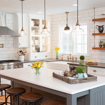
When this suburban family decided to renovate their kitchen, they knew that they wanted a little more space. Advance Design worked together with the homeowner to design a kitchen that would work for a large family who loved to gather regularly and always ended up in the kitchen! So the project began with extending out an exterior wall to accommodate a larger island and more moving-around space between the island and the perimeter cabinetry.
Style was important to the cook, who began collecting accessories and photos of the look she loved for months prior to the project design. She was drawn to the brightness of whites and grays, and the design accentuated this color palette brilliantly with the incorporation of a warm shade of brown woods that originated from a dining room table that was a family favorite. Classic gray and white cabinetry from Dura Supreme hits the mark creating a perfect balance between bright and subdued. Hints of gray appear in the bead board detail peeking just behind glass doors, and in the application of the handsome floating wood shelves between cabinets. White subway tile is made extra interesting with the application of dark gray grout lines causing it to be a subtle but noticeable detail worthy of attention.
Suede quartz Silestone graces the countertops with a soft matte hint of color that contrasts nicely with the presence of white painted cabinetry finished smartly with the brightness of a milky white farm sink. Old melds nicely with new, as antique bronze accents are sprinkled throughout hardware and fixtures, and work together unassumingly with the sleekness of stainless steel appliances.
The grace and timelessness of this sparkling new kitchen maintains the charm and character of a space that has seen generations past. And now this family will enjoy this new space for many more generations to come in the future with the help of the team at Advance Design Studio.
Photographer: Joe Nowak
Dura Supreme Cabinetry
Find the right local pro for your project
 InnovationLand
This Houston kitchen remodel turned an outdated bachelor pad into a contemporary dream fit for newlyweds.
The client wanted a contemporary, somewhat commercial look, but also something homey with a comfy, family feel. And they couldn't go too contemporary, since the style of the home is so traditional.
The clean, contemporary, white-black-and-grey color scheme is just the beginning of this transformation from the previous kitchen,
The revamped 20-by-15-foot kitchen and adjoining dining area also features new stainless steel appliances by Maytag, lighting and furnishings by Restoration Hardware and countertops in white Carrara marble and Absolute Black honed granite.
The paneled oak cabinets are now painted a crisp, bright white and finished off with polished nickel pulls. The center island is now a cool grey a few shades darker than the warm grey on the walls. On top of the grey on the new sheetrock, previously covered in a camel-colored textured paint, is Sherwin Williams' Faux Impressions sparkly "Striae Quartz Stone."
Ho-hum 12-inch ceramic floor tiles with a western motif border have been replaced with grey tile "planks" resembling distressed wood. An oak-paneled flush-mount light fixture has given way to recessed lights and barn pendant lamps in oil rubbed bronze from Restoration Hardware. And the section housing clunky upper and lower banks of cabinets between the kitchen an dining area now has a sleek counter-turned-table with custom-milled legs.
At first, the client wanted to open up that section altogether, but then realized they needed more counter space. The table - a continuation of the granite countertop - was the perfect solution. Plus, it offered space for extra seating.
The black, high-back and low-back bar stools are also from Restoration Hardware - as is the new round chandelier and the dining table over which it hangs.
Outdoor Homescapes of Houston also took out a wall between the kitchen and living room and remodeled the adjoining living room as well. A decorative cedar beam stained Minwax Jacobean now spans the ceiling where the wall once stood.
The oak paneling and stairway railings in the living room, meanwhile, also got a coat of white paint and new window treatments and light fixtures from Restoration Hardware. Staining the top handrailing with the same Jacobean dark stain, however, boosted the new contemporary look even more.
The outdoor living space also got a revamp, with a new patio ceiling also stained Jacobean and new outdoor furniture and outdoor area rug from Restoration Hardware. The furniture is from the Klismos collection, in weathered zinc, with Sunbrella fabric in the color "Smoke."
 Advance Design Studio, Ltd.
Jennifer and Dan have lived in their Deer Park Illinois home for 15 years, slowly making minor fixes like painting and decorating; but they had a new plan for their kitchen the entire time. An awkwardly placed garage door, and an island cooktop with a terrible downdraft made a full-scale kitchen remodel an absolute must. Jennifer had many ideas in mind and wanted to work with a company that could provide high-end work, while partnering with a designer that would tailor the kitchen to her ideas.
She was intrigued by the phrase “Common Sense Remodeling” in Advance Design’s feature she discovered while perusing an issue of the community’s Quintessential Barrington Magazine. Doing further research on the company’s website, as she looked through project profiles and read about Advance Design’s “Common Sense Remodeling” philosophy, she promptly scheduled an appointment to see if the people and ideas she read about were truly who they said they were. The more she read, the more she knew that the “Common Sense” approach to remodeling they described was exactly the type of company she was looking for.
The partnership was sealed after an initial consultation with Owner Todd Jurs and Project Designer Michelle Lecinski. They displayed a combination of friendliness, professionalism and respect that was unmatched by any of the other companies Jennifer talked to. She knew that with Advance Design, she would be able to retain the vision that she had in mind with high-quality craftsmanship.
“I reached out to Advance Design because of the ‘Common Sense Remodeling’ tagline,” Jennifer said. “That’s what lingered for me”. “Advance Design was the most respectful- of the house and of my design ideas, and the most professional of the handful of companies that looked at my project”.
Soon after the meeting Jennifer began working with Michelle on the project design. They quickly developed chemistry. Jennifer loved how Michelle researched and located every detail that Jennifer wanted for the kitchen. Between the two of them, every concept and idea was worked through and perfected. “Jennifer had definite ideas about what she wanted the new kitchen to look like, she just didn’t know how to bring it all together. We worked together really well to make her ideas into the practical reality necessary for a well-functioning kitchen, with the look and feel that she had envisioned”, says Michelle.
“Michelle was wonderful in using the CAD system she would show me new drawings every time we changed the layout while working through the design,” Jennifer said. “She was a really wonderful partner in execution, she made sure everything happened quickly and easily.”
The finished design drew out elements of Jennifer’s style and personality. The pair call the look “sophisticated farmhouse” to describe the kitchen renovation to family and friends. The result was a beautifully crafted, authentic-feeling space that satisfied Jennifer’s dreams 15 years in the making. The whole project consisted of a kitchen remodel, mudroom upgrade with powder room, and garage entry relocation. “The projects I personally like the best, are the ones that put the client’s dreams on display,” Project Designer Michelle said. “And this is one of those projects.”
The main focal point of the kitchen is custom zinc and brass ventilation hood with a vintage sheen, which was hand made to order by a small company in Indiana named Vogler Metalworking. “It’s like sculpture, a true work of art”, says Jennifer. Your eye is immediately drawn towards this elegant yet practical hood that eliminated the home’s downdraft problem and added a striking conversation piece at the same time. The carpenters had to use special gloves when transporting and installing it, so they didn’t smudge it with fingerprints. The beautiful hood centers proudly over the stunning black enamel and brass LaCornue Range. “I had a friend who had a LaCornue range and after learning how easy it was to cook perfect meals, I was convinced I wanted to have one”, says Jennifer. This unique, breathtaking combination anchors the entire kitchen and is apparent immediately as you walk into the great room the surrounds the space.
DuraSupreme Crestwood cabinets with a Kendall Panel add function and sophistication. A custom gray paint color paired with a storm blue was developed so that the new kitchen looked like it belonged to the existing space. Unlacquered brass faucets and hardware were important to Jennifer because she wanted the living finishes to age over time. Remarkable brass diamond mesh cabinet door inserts imported from the UK continue to add this one-of-a-kind kitchen renovation; giving it a “you won’t see this everywhere” quality. The use of old railcar flooring for the coffee bar countertop and reclaimed oak for the open shelving gives an authenticity to the space uncommon in kitchens today.
Jennifer and Michelle fell in love with the Limestone Grey Stone while they were investigating unique island countertop ideas. They liked the fact that the limestone as a living finish will age and change over time. Calcutta Miel Quartz countertops made for an excellent pairing around the perimeter, as it’s durable and perfect for cooking preparations. A textured white subway tile backsplash that runs to the ceiling keeps your eye moving towards the open shelving, and to the main focal point of the stunning range hood combination.
“The kitchen functions beautifully, and it’s gorgeous,” beams Jennifer as she gestures with both hands while smiling ear to ear. “The most important thing was I wanted a kitchen that had a wonderful flow, cooked beautiful meals and was a great gathering place for family and friends, and this space does that perfectly! Beauty wise, it turned out exactly how I had envisioned. I felt the function part was the hardest part, and that was nailed”!
Relocating the garage entry to the new mudroom was a huge priority and has finally separated the family’s arriving home functions from their kitchen. Now coats and shoes and bags have their own area for dropping once members arrive home. Matching gray DuraSupreme cabinetry helped create gorgeous, purposeful lockers for the family. A reclaimed vintage sink and custom wall paper were added to the tiny powder room to beautify the once previously only functional space. Advance Design was even able to create a custom space for their dog to sleep while the family is away.
“It was unbelievable that a project of this size was completed in such a short time, and I think that’s because of the large amount of planning and preparation that went into it,” Jennifer marveled, “When we started, we were ready, and everything was prepared”.
When it came to execution, Project Manager Justin Davis and his crew were quick, accessible, and organized. Projects like this kitchen are typically completed in as little as 8-10 weeks. Jennifer’s kitchen however despite the relocation of some challenging HVAC in a soffit and moving of an exterior door was completed remarkably fast in part because the team was working with an existing tile floor that ran throughout the first floor that the client really loved.
“You get to know these people really well because they’re living in your house while you’re living in your house. They were so fast and really good, it didn’t take as long as even planned” reported Jennifer. “I would text Justin and he always responded almost immediately. I got to know all the guys who were working in our house and they were all wonderful people”.
Details in a customized kitchen like this one require skill and care from the people who install it. “All the guys on the job were skilled at what the did. I wanted small details like little feet to look like furniture, that is where their carpentry skill came in to make these all perfect”, said Jennifer. “The tile guys were wonderful. They even let me determine how I wanted the texture with the grout to appear for a salt and pepper look; now that is a very skilled trade person making it custom”.
In Jennifer’s interview, she continued to reference Advance Design’s “Common Sense Remodeling”, so I took a minute to ask her exactly what that phrase meant to her and how it played out in her experience with her project and the Advance Design team. Here is what she said: “I was intrigued about Common Sense Remodeling and in my head that there would be clear costs and prices, great communication between the design team, the execution team and me”, said Jennifer. They did deliver on that, it was so clear about the cost breakdown, what I could expect from everyone who came to my house, and everything that we had ordered. That to me is the Common Sense”!
It’s great to see a client take literally our assertion that a well-planned remodeling project is simply “Common Sense”! She anticipated each step of the way would be clear, concise, and predictable, all the while protecting the outcome due to the careful upfront planning. “Advance Design delivered on their ‘Common Sense Remodeling’ promise,” Jennifer said. “From the design team, to the execution team - everything was straight forward like I imagined. The project turned out exactly how I envisioned, I enjoyed this process and absolutely would recommend Advance Design Studio to anyone.”
 LABLstudio
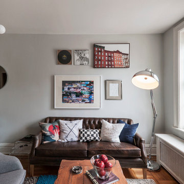
A pre-war West Village bachelor pad inspired by classic mid-century modern designs, mixed with some industrial, traveled, and street style influences. Our client took inspiration from both his travels as well as his city (NY!), and we really wanted to incorporate that into the design. For the living room we painted the walls a warm but light grey, and we mixed some more rustic furniture elements, (like the reclaimed wood coffee table) with some classic mid-century pieces (like the womb chair) to create a multi-functional kitchen/living/dining space. Using a versatile kitchen cart with a mirror above it, we created a small bar area, which was definitely on our client's wish list!
Photos by Matthew Williams
 Wellborn + Wright
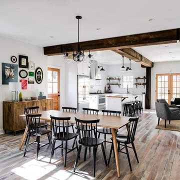
Wellborn + Wright has teamed up with Richmond native Cobblestone Development Group again for this incredible renovation. What was originally a constricting, one story brick ranch house from the mid 20th century is now a bright, soaring, three story home with a much more open and inviting floor plan. Be sure to flip through the slideshow above to the last 3 pictures which show the “before and after” versions of the kitchen and entryway.
Wellborn + Wright was happy to provide the smooth surface box beams that ran along the ceiling and “sectioned off” the individual living spaces on the first floor – kitchen, living room, dining room – without actually dividing the space itself. A mantle (not shown) and kitchen island counter top made from reclaimed white oak can be found in the kitchen and living room respectively. It should be noted that, while W+ didn’t provide the flooring for this project, what you see here is an exact match to our South Hampton oak flooring – so if you like what you see on the floors just as much as the ceiling, we can definitely help you there!
Sponsored
Columbus, OH

Hope Restoration & General Contracting
Columbus Design-Build, Kitchen & Bath Remodeling, Historic Renovations
 TVL Creative Ltd.
Our clients had just recently closed on their new house in Stapleton and were excited to transform it into their perfect forever home. They wanted to remodel the entire first floor to create a more open floor plan and develop a smoother flow through the house that better fit the needs of their family. The original layout consisted of several small rooms that just weren’t very functional, so we decided to remove the walls that were breaking up the space and restructure the first floor to create a wonderfully open feel.
After removing the existing walls, we rearranged their spaces to give them an office at the front of the house, a large living room, and a large dining room that connects seamlessly with the kitchen. We also wanted to center the foyer in the home and allow more light to travel through the first floor, so we replaced their existing doors with beautiful custom sliding doors to the back yard and a gorgeous walnut door with side lights to greet guests at the front of their home.
Living Room
Our clients wanted a living room that could accommodate an inviting sectional, a baby grand piano, and plenty of space for family game nights. So, we transformed what had been a small office and sitting room into a large open living room with custom wood columns. We wanted to avoid making the home feel too vast and monumental, so we designed custom beams and columns to define spaces and to make the house feel like a home. Aesthetically we wanted their home to be soft and inviting, so we utilized a neutral color palette with occasional accents of muted blues and greens.
Dining Room
Our clients were also looking for a large dining room that was open to the rest of the home and perfect for big family gatherings. So, we removed what had been a small family room and eat-in dining area to create a spacious dining room with a fireplace and bar. We added custom cabinetry to the bar area with open shelving for displaying and designed a custom surround for their fireplace that ties in with the wood work we designed for their living room. We brought in the tones and materiality from the kitchen to unite the spaces and added a mixed metal light fixture to bring the space together
Kitchen
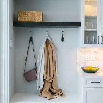
We wanted the kitchen to be a real show stopper and carry through the calm muted tones we were utilizing throughout their home. We reoriented the kitchen to allow for a big beautiful custom island and to give us the opportunity for a focal wall with cooktop and range hood. Their custom island was perfectly complimented with a dramatic quartz counter top and oversized pendants making it the real center of their home. Since they enter the kitchen first when coming from their detached garage, we included a small mud-room area right by the back door to catch everyone’s coats and shoes as they come in. We also created a new walk-in pantry with plenty of open storage and a fun chalkboard door for writing notes, recipes, and grocery lists.
Office
We transformed the original dining room into a handsome office at the front of the house. We designed custom walnut built-ins to house all of their books, and added glass french doors to give them a bit of privacy without making the space too closed off. We painted the room a deep muted blue to create a glimpse of rich color through the french doors
Powder Room
The powder room is a wonderful play on textures. We used a neutral palette with contrasting tones to create dramatic moments in this little space with accents of brushed gold.
Master Bathroom
The existing master bathroom had an awkward layout and outdated finishes, so we redesigned the space to create a clean layout with a dream worthy shower. We continued to use neutral tones that tie in with the rest of the home, but had fun playing with tile textures and patterns to create an eye-catching vanity. The wood-look tile planks along the floor provide a soft backdrop for their new free-standing bathtub and contrast beautifully with the deep ash finish on the cabinetry.
 ABK Today
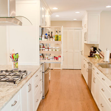
This open kitchen and living design meets the lifestyle needs of an active household and encourages guests to hang out or join in the food prep when entertaining. The bright, open transitional style strikes the perfect balance between traditional and modern design schemes.
 Soko Design
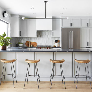
Danish u-shaped light wood floor and beige floor kitchen photo in Los Angeles with shaker cabinets, gray cabinets, gray backsplash, stainless steel appliances, a peninsula and black countertops
 Darci Hether
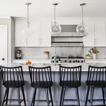
This three-story Westhampton Beach home designed for family get-togethers features a large entry and open-plan kitchen, dining, and living room. The kitchen was gut-renovated to merge seamlessly with the living room. For worry-free entertaining and clean-up, we used lots of performance fabrics and refinished the existing hardwood floors with a custom greige stain. A palette of blues, creams, and grays, with a touch of yellow, is complemented by natural materials like wicker and wood. The elegant furniture, striking decor, and statement lighting create a light and airy interior that is both sophisticated and welcoming, for beach living at its best, without the fuss!
 Saikley Architects
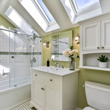
We updated this 1907 two-story family home for re-sale. We added modern design elements and amenities while retaining the home’s original charm in the layout and key details. The aim was to optimize the value of the property for a prospective buyer, within a reasonable budget.
New French doors from kitchen and a rear bedroom open out to a new bi-level deck that allows good sight lines, functional outdoor living space, and easy access to a garden full of mature fruit trees. French doors from an upstairs bedroom open out to a private high deck overlooking the garden. The garage has been converted to a family room that opens to the garden.
The bathrooms and kitchen were remodeled the kitchen with simple, light, classic materials and contemporary lighting fixtures. New windows and skylights flood the spaces with light. Stained wood windows and doors at the kitchen pick up on the original stained wood of the other living spaces.
New redwood picture molding was created for the living room where traces in the plaster suggested that picture molding has originally been. A sweet corner window seat at the living room was restored. At a downstairs bedroom we created a new plate rail and other redwood trim matching the original at the dining room. The original dining room hutch and woodwork were restored and a new mantel built for the fireplace.
We built deep shelves into space carved out of the attic next to upstairs bedrooms and added other built-ins for character and usefulness. Storage was created in nooks throughout the house. A small room off the kitchen was set up for efficient laundry and pantry space.
We provided the future owner of the house with plans showing design possibilities for expanding the house and creating a master suite with upstairs roof dormers and a small addition downstairs. The proposed design would optimize the house for current use while respecting the original integrity of the house.
Photography: John Hayes, Open Homes Photography
https://saikleyarchitects.com/portfolio/classic-craftsman-update/
 StudioLAB
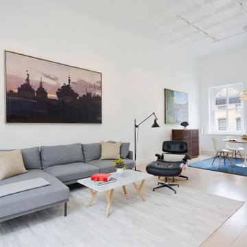
A young couple with three small children purchased this full floor loft in Tribeca in need of a gut renovation. The existing apartment was plagued with awkward spaces, limited natural light and an outdated décor. It was also lacking the required third child’s bedroom desperately needed for their newly expanded family. StudioLAB aimed for a fluid open-plan layout in the larger public spaces while creating smaller, tighter quarters in the rear private spaces to satisfy the family’s programmatic wishes. 3 small children’s bedrooms were carved out of the rear lower level connected by a communal playroom and a shared kid’s bathroom. Upstairs, the master bedroom and master bathroom float above the kid’s rooms on a mezzanine accessed by a newly built staircase. Ample new storage was built underneath the staircase as an extension of the open kitchen and dining areas. A custom pull out drawer containing the food and water bowls was installed for the family’s two dogs to be hidden away out of site when not in use. All wall surfaces, existing and new, were limited to a bright but warm white finish to create a seamless integration in the ceiling and wall structures allowing the spatial progression of the space and sculptural quality of the midcentury modern furniture pieces and colorful original artwork, painted by the wife’s brother, to enhance the space. The existing tin ceiling was left in the living room to maximize ceiling heights and remain a reminder of the historical details of the original construction. A new central AC system was added with an exposed cylindrical duct running along the long living room wall. A small office nook was built next to the elevator tucked away to be out of site.

 De Mattei Construction
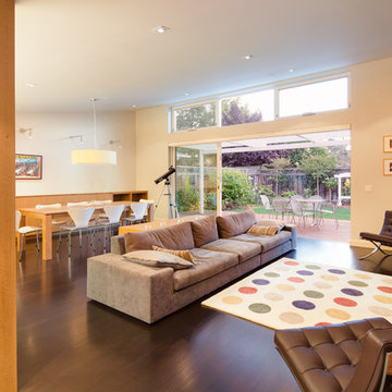
Large sliding glass door opens onto an attached deck to maximize indoor-outdoor living.
Photographer: Tyler Chartier
Example of a mid-sized 1950s open concept dark wood floor living room design in San Francisco with white walls, a ribbon fireplace, a tile fireplace and a media wall
Example of a mid-sized 1950s open concept dark wood floor living room design in San Francisco with white walls, a ribbon fireplace, a tile fireplace and a media wall

 Twelve Stones Designs, LLC
The owners of this kitchen had spent the money to upgrade the finishes in their kitchen upon building the home 12 years ago, but after living in the space for several years they realized how nonfunctional the layout really was. The (then) two preschool aged children had grown into busy, hungry teenagers with many friends who also liked to hang out at the house. So the family needed a more functional kitchen with better traffic flow, space for daily activities revolving around the kitchen at different times of day, and a kitchen that could accommodate cooking for and serving large groups. Furthermore, the dark, traditional finishes no longer reflected the homeowners’ style. They requested a brighter, more relaxed, coastal style that reflected their love of the seaside cities they like to visit.
Originally, the kitchen was U-shaped with a narrow island in the middle. The island created narrow aisles that bottle-necked at the dishwasher, refrigerator, and cooktop areas. There was a pass-through from the foyer into the kitchen, but the owners never liked that the pass-through was also located so close to the powder room. The awkward proximity was unappealing and made guests feel uncomfortable.
The kitchen’s storage was made up of lots of narrow cabinets, apothecary drawers, clipped corner units, and very few drawers. It lacked useful storage for the larger items the family used on a daily basis. And the kitchen’s only pantry was small closet that had only builder-grade, narrow shelving with no illumination to be able to see the contents inside.
Overall, the kitchen’s lighting plan was poorly executed. Only six recessed cans illuminated the entire kitchen and nook areas. The under cabinet lighting was not evenly distributed either. In fact, the builder had mis-placed the under cabinet lighting around the decorative pilasters which made for choppy, dark cubbies. Further, the builder didn’t include any lighting over the sink or the bar area, which meant whoever was doing the dishes was always in their own shadow. That, coupled with the steep overhang of the game room above made the bar area feel like a dim, cavernous space that wasn’t inviting or task oriented. The kitchen looked out into the main living space, but the raised bar and a narrow wall (which held the only large cabinet in the kitchen) created more of a barrier than a relationship to the living room or breakfast nook. In fact, one couldn’t even see the breakfast nook from the cooktop or sink areas due to its orientation. The raised bar top was too narrow to comfortably sit to either dine at or chat from due to the lack of knee space. The the homeowners confided that the kitchen felt more like a dark, dirty prison than place where the family, or their guests, wanted to gather and commune.
The clients' needs and desires were:
➢ to create a kitchen that would be a space the family loved to be in; to relate to the adjacent spaces all around, and to have better flow for entertaining large groups
➢ to remove the walls between the breakfast nook and living area and to be able to utilize the natural light from the windows in both those areas
➢ to incorporate a functional chopping block for prepping fresh food for home cooked meals, an island with a large sink and drain board, 2 pull out trash cans, and seating for at least the 2 teens to eat or do homework
➢ to design a kitchen and breakfast nook with an airy, coastal, relaxed vibe that blended with the rest of the house's coastal theme
➢ to integrate a layered lighting plan which would include ample general illumination, specific task lighting, decorative lighting, and lots of illuminated storage
➢ to design a kitchen with not only more storage for all the husband’s kitchen gadgets and collection of oils and spices, but smart storage, including a coffee/breakfast bar and a place to store and conceal the toaster oven and microwave
➢ to find a way to utilize the large open space between the kitchen, pantry area, and breakfast nook
Twelve Stones Designs achieved the owner's goals by:
➢ removing the walls between the kitchen and living room to allow the natural light to filter in from the adjacent rooms and to create a connection between the kitchen, nook, and living spaces for a sense of unity and communion
➢ removing the existing pantry and designing 3 large pantry style cabinets with LED tape lights and rollout drawers to house lots of kitchen appliances, gadgets, and tons of groceries. We also took the cabinets all the way up to the 9’ ceiling for additional storage for seasonal items and bulk storage.
➢ designing 2 islands - 1 with a gorgeous black walnut chopping block that houses a drawer for chopping and carving knives and a custom double pull out trash unit for point of use utilization - and 1 that houses the dishwasher, a large Blanco Gourmet sink with integrated drain board, woven baskets for fresh root vegetables and kitchen towels, plenty of drawer storage for kitchen items, and bar seating for up to 4 diners.
➢ closing off the space between the kitchen and the powder room to create a beautiful new private alcove for the powder room as well as adding some decorative storage. This also gave us space to include more tall storage near the new range for precision placement of the husband’s extensive oil and spice collection as well as a location for a combo-steam oven the wife wanted for baking and cooking healthy meals.
The project is enhanced functionally by:
➢ incorporated USB and standard receptacles for the kids’ laptops and phone charging in the large island
➢ designing the small island to include additional open shelving for items used on a daily basis such as a variety of bowls, plates, and colanders. This set up also works well for the husband who prefers to “plate” his dinners in restaurant-style fashion before presenting them to the table.
➢ the integration of specific storage units, such as double stacked cutlery drawers, a custom spice pull-out, a Kuerig coffee and tea pod drawer, and custom double stacked utensil drawers
➢ moving the refrigerator to the old oven location - this eliminated the bottle neck as well as created a better relationship to the eating table. It also utilizes the floor space between the pantry, nook, and kitchen
➢ creating a banquet style breakfast nook - this banquette seating not only doubles the amount of seating for large gatherings but it better utilizes the odd space between the kitchen and the previous nook area. It also helps to create a distinct pathway from the mudroom room through the pantry area, kitchen, nook, and living room.
➢ the coffee/breakfast bar area which includes the perfect location for the concealed microwave and toaster oven, convenient storage for the coffee pods and tea accoutrements. Roll-out drawers below also house the smoothie maker, hot water kettle, and a plethora of smoothie-making ingredients such as protein powders, smoothie additives, etc. Furthermore, the drawers below the Keurig house measuring utensil, cutlery, baking supplies and tupperware storage.
➢ incorporating lots of wide drawers and pullouts to accommodate large cookware.
➢ utilizing as much vertical space as possible by building storage to the ceiling which accommodates the family’s abundant amount of serving platters, baking sheets, bakeware, casserole dishes, and additional cutting boards.
The project is enhanced aesthetically by:
➢ new 5-piece Versailles pattern porcelain tile that now seamlessly joins the entire down stairs area together creating a bright, cohesiveness feeling instead of choppy separated spaces - it also adds a coastal feeling
➢ designing a cabinet to conceal the microwave and toaster oven
➢ the coastal influenced light fixtures over the nook table and island
➢ the sandy colors of the Langdon Cambria countertops. The swirling pattern and sparkling quartz pieces remind the homeowner of black-and-tan sandy beaches
➢ the striped banquet seating whose creamy white background and blue-green stripes were the inspiration for the cabinet and wall colors.
➢ All the interior doors were painted black to coordinate with the blacks and grays in the backsplash tile and countertop. This also adds a hint of tailored formality to an otherwise casual space.
➢ the use of WAC's Oculux small aperture LED units for the overhead lighting complimented with Diode LED strips for task lighting under the cabinets and inside the pantry and glass wall cabinets. All of the lighting applications are on separate dimmer switches.
Innovative uses of materials or construction methods by Realty Restoration LLC:
➢ Each 1-1/2” x 3” block of reclaimed end-grain black walnut that makes up the center island chopping block was hand milled and built in the shop. It was designed to look substantial and proportional to the surrounding elements, executed by creating the 4 inch tall top with a solid wood chamfered edge band.
➢ The metal doors on either side of the vent hood were also custom designed for this project and built in the Realty Restoration LLC shop. They are made 1x2, 11-gauge mild steel with ribbed glass. Weighing 60 lbs a piece, heavy duty cabinet hinges were added to support the weight of the door and keep them from sagging.
➢ Under-cabinet receptacles were added along the range wall in order to have a clean, uninterrupted backsplash.
Design obstacles to overcome:
➢ Because we were removing the demising walls between the kitchen and living room, we had to find a way to plumb and vent the new island. We did this by tunneling through the slab (the slab had post tension cables which prevented us from just trenching) to run a new wet vent through a nearby structural wall. We pulled the existing hot and cold lines between upper floor joists and ran them down the structural wall as well and up through a conduit in the tunnel.
➢ Since we were converting from wall overs to a gas range it allowed us to utilize the 220 feed for the wall ovens to provide a new sub panel for all the new kitchen circuits
➢ Due to framing deficiencies inherited from the original build there was a 1-1/2” differential in the floor-to-ceiling height over a 20 foot span; by utilizing the process of cutting and furring coupled with the crown moulding details on the cabinet elevations we were able to mask the problem and provide seamless transitions between the cabinet components.
Evidence of superior craftsmanship:
➢ uniquely designed, one-of-a-kind metal “X” end panels on the large island. The end panels were custom made in the Realty Restoration LLC shop and fitted to the exact dimensions of the island. The welding seams are completely indistinguishable - the posts look like they are cut from a single sheet of metal
➢ square metal posts on the small island were also custom made and designed to compliment and carry through the metal element s throughout the kitchen
➢ the beautiful, oversized end panels on the pantry cabinets which give the breakfast nook a tailored look
➢ integrating a large format 5 piece Versailles tile pattern to seamlessly flow from the existing spaces into the new kitchen space
➢ By constructing a custom cabinet that jogged around a corner we could not remodel (housing the entry way coat closet) we were able to camouflage the adjacent wall offset within the upper and lower cabinets. By designing around the existing jog in the structural walls we accomplished a few things: we were able to find the space to house, and hide, the microwave and toaster oven yet still have a clean cohesive appearance from the kitchen side. Additionally, the owners were able to keep their much needed coat closet and we didn’t have to increase the budget with unnecessary structural work.
 SV Design
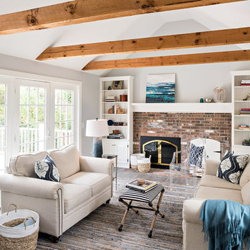
The layout of this colonial-style house lacked the open, coastal feel the homeowners wanted for their summer retreat. Siemasko + Verbridge worked with the homeowners to understand their goals and priorities: gourmet kitchen; open first floor with casual, connected lounging and entertaining spaces; an out-of-the-way area for laundry and a powder room; a home office; and overall, give the home a lighter and more “airy” feel. SV’s design team reprogrammed the first floor to successfully achieve these goals.
SV relocated the kitchen to what had been an underutilized family room and moved the dining room to the location of the existing kitchen. This shift allowed for better alignment with the existing living spaces and improved flow through the rooms. The existing powder room and laundry closet, which opened directly into the dining room, were moved and are now tucked in a lower traffic area that connects the garage entrance to the kitchen. A new entry closet and home office were incorporated into the front of the house to define a well-proportioned entry space with a view of the new kitchen.
By making use of the existing cathedral ceilings, adding windows in key locations, removing very few walls, and introducing a lighter color palette with contemporary materials, this summer cottage now exudes the light and airiness this home was meant to have.
© Dan Cutrona Photography
 J Design Group - Interior Designers Miami - Modern
Ocean front, Luxury home in Miami Beach
Projects by J Design Group, Your friendly Interior designers firm in Miami, FL. at your service.
AVENTURA MAGAZINE selected our client’s luxury 5000 Sf ocean front apartment in Miami Beach, to publish it in their issue and they Said:
Story by Linda Marx, Photography by Daniel Newcomb
Light & Bright
New York snowbirds redesigned their Miami Beach apartment to take advantage of the tropical lifestyle.
New York snowbirds redesigned their Miami Beach apartment to take advantage of the tropical lifestyle.
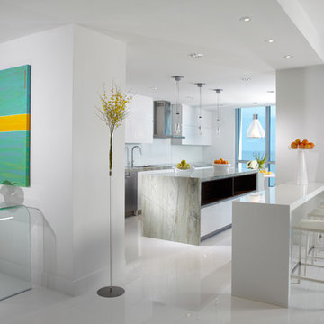
WHEN INTERIOR DESIGNER JENNIFER CORREDOR was asked to recreate a four-bedroom, six-bath condominium at The Bath Club in Miami Beach, she seized the opportunity to open the rooms and better utilize the vast ocean views.
In five months last year, the designer transformed a dark and closed 5,000-square-foot unit located on a high floor into a series of sweeping waterfront spaces and updated the well located apartment into a light and airy retreat for a sports-loving family of five.
“They come down from New York every other weekend and wanted to make their waterfront home a series of grand open spaces,” says Jennifer Corrredor, of the J. Design Group in Miami, a firm specializing in modern and contemporary interiors. “Since many of the rooms face the ocean, it made sense to open and lighten up the home, taking advantage of the awesome views of the sea and the bay.”
The designer used 40 x 40 all white tile throughout the apartment as a clean base. This way, her sophisticated use of color would stand out and bring the outdoors in.
The close-knit family members—two parents and three boys in college—like to do things together. But there were situations to overcome in the process of modernizing and opening the space. When Jennifer Corredor was briefed on their desires, nothing seemed too daunting. The confident designer was ready to delve in. For example, she fixed an area at the front door
that was curved. “The wood was concave so I straightened it out,” she explains of a request from the clients. “It was an obstacle that I overcame as part of what I do in a redesign. I don’t consider it a difficult challenge. Improving what I see is part of the process.”
She also tackled the kitchen with gusto by demolishing a wall. The kitchen had formerly been enclosed, which was a waste of space and poor use of available waterfront ambience. To create a grand space linking the kitchen to the living room and dining room area, something had to go. Once the wall was yesterday’s news, she relocated the refrigerator and freezer (two separate appliances) to the other side of the room. This change was a natural functionality in the new open space. “By tearing out the wall, the family has a better view of the kitchen from the living and dining rooms,” says Jennifer Corredor, who also made it easier to walk in and out of one area and into the other. “The views of the larger public space and the surrounding water are breathtaking.
Opening it up changed everything.”
They clients can now see the kitchen from the living and dining areas, and at the same time, dwell in an airy and open space instead of feeling stuck in a dark enclosed series of rooms. In fact, the high-top bar stools that Jennifer Corredor selected for the kitchen can be twirled around to use for watching TV in the living room.
In keeping with the theme of moving seamlessly from one room to the other, Corredor designed a subtle wall of glass in the living room along with lots of comfortable seating. This way, all family members feel at ease while relaxing, talking, or watching sporting events on the large flat screen television. “For this room, I wanted more open space, light and a supreme airy feeling,” she says. “With the glass design making a statement, it quickly became the star of the show.”…….
….. To add texture and depth, Jennifer Corredor custom created wood doors here, and in other areas of the home. They provide a nice contrast to the open Florida tropical feel. “I added character to the openness by using exotic cherry wood,” she says. “I repeated this throughout the home and it works well.”
Known for capturing the client’s vision while adding her own innovative twists, Jennifer Corredor lightened the family room, giving it a contemporary and modern edge with colorful art and matching throw pillows on the sofas. She added a large beige leather ottoman as the center coffee table in the room. This round piece was punctuated with a bold-toned flowering plant atop. It effortlessly matches the pillows and colors of the contemporary canvas.
Jennifer Corredor also gutted all of the bathrooms, resulting in a major redesign of the master. She jettisoned the whirlpool and created the dazzling illusion of a floating tub. From an area where there were two toilets, she eliminated one to make a grand rectangular shower, which became an overall showpiece. The master bath went from being just a functional water closet to a sophisticated spa-like space. “The client said I was ‘delicious’ after seeing the change,” laughed Jennifer Corredor, who emphasized that her clients love their part-time life in South Florida more each time they come down. Even when the husband has to work from their Miami Beach digs, he is surrounded by tropical beauty. For instance, there are times when the master bedroom must double as the husband’s home office.
The room had to be large enough to accommodate a working space for this purpose. So Jennifer Corredor placed an appropriate table near the window and across from the king-size bed. “No blocking of the amazing water view was necessary,” she says. “I kept an open space with a lot of white so It functions well and the work space fits right in.” She repeated the bold modern art in the room as well as in the guest bedroom, which also has a workspace for the sons when they are home from school and need to study.
The designer is still happy and glowing with the results of her toil in this apartment. She gets a “spiritual feeling” when she walks inside. “It is so peaceful and serene, with subtle hints of explosive statements,” she says. “The entire space is open, yet anchored by the warmth of the exotic woods.” The client wrote Jennifer Corredor a letter at the end of the project congratulating her on a
job well done. She revealed that owning a Miami Beach home was her husband’s dream 30 years ago. “Now we have a quality perfect yet practical home,” she wrote to the designer. “You solved the challenges, and the end
result far exceeds our expectations. We love it.”
Thanks for your interest in our Contemporary Interior Design projects and if you have any question please do not hesitate to ask us.
http://www.JDesignGroup.com
305.444.4611
Modern Interior designer Miami. Contemporary
Miami
Miami Interior Designers
Miami Interior Designer
Interior Designers Miami
Interior Designer Miami
Modern Interior Designers
Modern Interior Designer
Modern interior decorators
Modern interior decorator
Contemporary Interior Designers
Contemporary Interior Designer
Interior design decorators
Interior design decorator
Interior Decoration and Design
Black Interior Designers
Black Interior Designer
Interior designer
Interior designers
Interior design decorators
Interior design decorator
Home interior designers
Home interior designer
Interior design companies
Interior decorators
Interior decorator
Decorators
Decorator
Miami Decorators
Miami Decorator
Decorators Miami
Decorator Miami
Interior Design Firm
Interior Design Firms
Interior Designer Firm
Interior Designer Firms
Interior design
Interior designs
home decorators
Interior decorating Miami
Best Interior Designers.
225 Malaga Ave.
Coral Gable, FL 33134
http://www.JDesignGroup.com
305.444.4611

 Flavin Architects
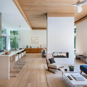
Our clients wanted to replace an existing suburban home with a modern house at the same Lexington address where they had lived for years. The structure the clients envisioned would complement their lives and integrate the interior of the home with the natural environment of their generous property. The sleek, angular home is still a respectful neighbor, especially in the evening, when warm light emanates from the expansive transparencies used to open the house to its surroundings. The home re-envisions the suburban neighborhood in which it stands, balancing relationship to the neighborhood with an updated aesthetic.
The floor plan is arranged in a “T” shape which includes a two-story wing consisting of individual studies and bedrooms and a single-story common area. The two-story section is arranged with great fluidity between interior and exterior spaces and features generous exterior balconies. A staircase beautifully encased in glass stands as the linchpin between the two areas. The spacious, single-story common area extends from the stairwell and includes a living room and kitchen. A recessed wooden ceiling defines the living room area within the open plan space.
Separating common from private spaces has served our clients well. As luck would have it, construction on the house was just finishing up as we entered the Covid lockdown of 2020. Since the studies in the two-story wing were physically and acoustically separate, zoom calls for work could carry on uninterrupted while life happened in the kitchen and living room spaces. The expansive panes of glass, outdoor balconies, and a broad deck along the living room provided our clients with a structured sense of continuity in their lives without compromising their commitment to aesthetically smart and beautiful design.
 Cape Associates, Inc.
This home, set at the end of a long, private driveway, is far more than meets the eye. Built in three sections and connected by two breezeways, the home’s setting takes full advantage of the clean ocean air. Set back from the water on an open plot, its lush lawn is bordered by fieldstone walls that lead to an ocean cove.
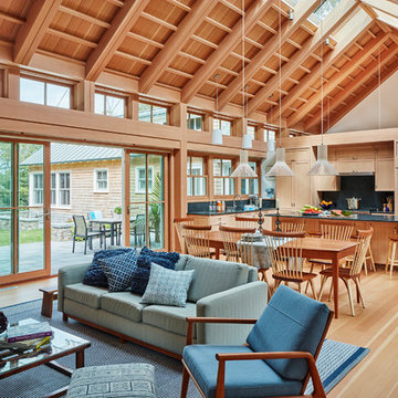
The hideaway calms the mind and spirit, not only by its privacy from the noise of daily life, but through well-chosen elements, clean lines, and a bright, cheerful feel throughout. The interior is show-stopping, covered almost entirely in clear, vertical-grain fir—most of which was source from the same place. From the flooring to the walls, columns, staircases and ceiling beams, this special, tight-grain wood brightens every room in the home.
At just over 3,000 feet of living area, storage and smart use of space was a huge consideration in the creation of this home. For example, the mudroom and living room were both built with expansive window seating with storage beneath. Built-in drawers and cabinets can also be found throughout, yet never interfere with the distinctly uncluttered feel of the rooms.
The homeowners wanted the home to fit in as naturally as possible with the Cape Cod landscape, and also desired a feeling of virtual seamlessness between the indoors and out, resulting in an abundance of windows and doors throughout.
This home has high performance windows, which are rated to withstand hurricane-force winds and impact rated against wind-borne debris. The 24-foot skylight, which was installed by crane, consists of six independently mechanized shades operating in unison.
The open kitchen blends in with the home’s great room, and includes a Sub Zero refrigerator and a Wolf stove. Eco-friendly features in the home include low-flow faucets, dual-flush toilets in the bathrooms, and an energy recovery ventilation system, which conditions and improves indoor air quality.
Other natural materials incorporated for the home included a variety of stone, including bluestone and boulders. Hand-made ceramic tiles were used for the bathroom showers, and the kitchen counters are covered in granite – eye-catching and long-lasting.
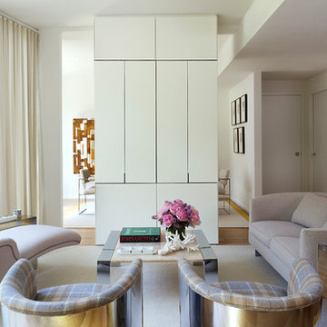
 Luca Andrisani Architect
In this renovation, a spare bedroom was removed to expand the living and dining space. A central built in separates the living from the dining area and provides ample storage while serving as a media center.
Featured in Interior Design, Sept. 2014, p. 216 and Serendipity, Oct. 2014, p. 30.
Renovation, Interior Design, and Furnishing: Luca Andrisani Architect.
Photo: Peter Murdock
6