
Search results for "Small space storage ideas" in Home Design Ideas
 Thyme & Place Design LLC
When my client had to move from her company office to work at home, she set up in the dining room. Despite her best efforts, this was not the long-term solution she was looking for. My client realized she needed a dedicated space not on the main floor of the home. On one hand, having your office space right next to the kitchen is handy. On the other hand, it made separating work and home life was not that easy.
The house was a ranch. In essence, the basement would run entire length of the home. As we came down the steps, we entered a time capsule. The house was built in the 1950’s. The walls were covered with original knotty pine paneling. There was a wood burning fireplace and considering this was a basement, high ceilings. In addition, there was everything her family could not store at their own homes. As we wound though the space, I though “wow this has potential”, Eventually, after walking through the laundry room we came to a small nicely lit room. This would be the office.
My client looked at me and asked what I thought. Undoubtedly, I said, this can be a great workspace, but do you really want to walk through this basement and laundry to get here? Without reservation, my client said where do we start?
Once the design was in place, we started the renovation. The knotty pine paneling had to go. Specifically, to add some insulation and control the dampness and humidity. The laundry room wall was relocated to create a hallway to the office.
At the far end of the room, we designated a workout zone. Weights, mats, exercise bike and television are at the ready for morning or afternoon workouts. The space can be concealed by a folding screen for party time. Doors to an old closet under the stairs were relocated to the workout area for hidden storage. Now we had nice wall for a beautiful console and mirror for storage and serving during parties.
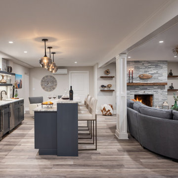
In order to add architectural details, we covered the old ugly support columns with simple recessed millwork panels. This detail created a visual division between the bar area and the seating area in front of the fireplace. The old red brick on the fireplace surround was replaced with stack stone. A mantle was made from reclaimed wood. Additional reclaimed wood floating shelves left and right of the fireplace provides decorative display while maintaining a rustic element balancing the copper end table and leather swivel rocker.
We found an amazing rug which tied all of the colors together further defining the gathering space. Russet and burnt orange became the accent color unifying each space. With a bit of whimsy, a rather unusual light fixture which looks like roots from a tree growing through the ceiling is a conversation piece.
The office space is quite and removed from the main part of the basement. There is a desk large enough for multiple screens, a small bookcase holding office supplies and a comfortable chair for conference calls. Because working from home requires many online meetings, we added a shiplap wall painted in Hale Navy to contrast with the orange fabric on the chair. We finished the décor with a painting from my client’s father. This is the background online visitors will see.
The last and best part of the renovation is the beautiful bar. My client is an avid collector of wine. She already had the EuroCave refrigerator, so I incorporated it into the design. The cabinets are painted Temptation Grey from Benjamin Moore. The counter tops are my favorite hard working quartzite Brown Fantasy. The backsplash is a combination of rustic wood and old tin ceiling like porcelain tiles. Together with the textures of the reclaimed wood and hide poofs balanced against the smooth finish of the cabinets, we created a comfortable luxury for relaxing.
There is ample storage for bottles, cans, glasses, and anything else you can think of for a great party. In addition to the wine storage, we incorporated a beverage refrigerator, an ice maker, and a sink. Floating shelves with integrated lighting illuminate the back bar. The raised height of the front bar provides the perfect wine tasting and paring spot. I especially love the pendant lights which look like wine glasses.
Finally, I selected carpet for the stairs and office. It is perfect for noise reduction. Meanwhile for the overall flooring, I specifically selected a high-performance vinyl plank floor. We often use this product as it is perfect to install on a concrete floor. It is soft to walk on, easy to clean and does not reduce the overall height of the space.
 Thyme & Place Design LLC
The clients, a young professional couple had lived with this bathroom in their townhome for 6 years. They finally could not take it any longer. The designer was tasked with turning this ugly duckling into a beautiful swan without relocating walls, doors, fittings, or fixtures in this principal bathroom. The client wish list included, better storage, improved lighting, replacing the tub with a shower, and creating a sparkling personality for this uninspired space using any color way except white.
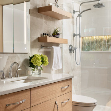
The designer began the transformation with the wall tile. Large format rectangular tiles were installed floor to ceiling on the vanity wall and continued behind the toilet and into the shower. The soft variation in tile pattern is very soothing and added to the Zen feeling of the room. One partner is an avid gardener and wanted to bring natural colors into the space. The same tile is used on the floor in a matte finish for slip resistance and in a 2” mosaic of the same tile is used on the shower floor. A lighted tile recess was created across the entire back wall of the shower beautifully illuminating the wall. Recycled glass tiles used in the niche represent the color and shape of leaves. A single glass panel was used in place of a traditional shower door.
Continuing the serene colorway of the bath, natural rift cut white oak was chosen for the vanity and the floating shelves above the toilet. A white quartz for the countertop, has a small reflective pattern like the polished chrome of the fittings and hardware. Natural curved shapes are repeated in the arch of the faucet, the hardware, the front of the toilet and shower column. The rectangular shape of the tile is repeated in the drawer fronts of the cabinets, the sink, the medicine cabinet, and the floating shelves.
The shower column was selected to maintain the simple lines of the fittings while providing a temperature, pressure balance shower experience with a multi-function main shower head and handheld head. The dual flush toilet and low flow shower are a water saving consideration. The floating shelves provide decorative and functional storage. The asymmetric design of the medicine cabinet allows for a full view in the mirror with the added function of a tri view mirror when open. Built in LED lighting is controllable from 2500K to 4000K. The interior of the medicine cabinet is also mirrored and electrified to keep the countertop clear of necessities. Additional lighting is provided with recessed LED fixtures for the vanity area as well as in the shower. A motion sensor light installed under the vanity illuminates the room with a soft glow at night.
The transformation is now complete. No longer an ugly duckling and source of unhappiness, the new bathroom provides a much-needed respite from the couples’ busy lives. It has created a retreat to recharge and replenish, two very important components of wellness.
 Sophia Designs
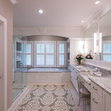
Master Bathroom with soaking tub, rain shower, custom designed arch, cabinets, crown molding, and built ins,
Custom designed countertops, flooring shower tile.
Built in refrigerator, coffee maker, TV, hidden appliances, mobile device station. Separate space plan for custom design and built amour and furnishings. Photo Credit:
Michael Hunter
Find the right local pro for your project
 Milgard Windows & Doors
The Kiguchi family moved into their Austin, Texas home in 1994. Built in the 1980’s as part of a neighborhood development, they happily raised their family here but longed for something more contemporary. Once they became empty nesters, they decided it was time for a major remodel. After spending many years visiting Austin AIA Home Tours that highlight contemporary residential architecture, they had a lot of ideas and in 2013 were ready to interview architects and get their renovation underway.
The project turned into a major remodel due to an unstable foundation. Architects Ben Arbib and Ed Hughey, of Arbib Hughey Design were hired to solve the structural issue and look for inspiration in the bones of the house, which sat on top of a hillside and was surrounded by great views.
Unfortunately, with the old floor plan, the beautiful views were hidden by small windows that were poorly placed. In order to bring more natural light into the house the window sizes and configurations had to be addressed, all while keeping in mind the homeowners desire for a modern look and feel.
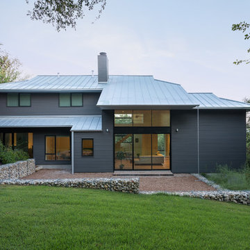
To achieve a more contemporary and sophisticated front of house, a new entry was designed that included removing a two-story bay window and porch. The entrance of the home also became more integrated with the landscape creating a template for new foliage to be planted. Older exterior materials were updated to incorporate a more muted palette of colors with a metal roof, dark grey siding in the back and white stucco in the front. Deep eaves were added over many of the new large windows for clean lines and sun protection.
“Inside it was about opening up the floor plan, expanding the views throughout the house, and updating the material palette to get a modern look that was also warm and inviting,” said Ben from Arbib Hughey Design. “Prior to the remodel, the house had the typical separation of rooms. We removed the walls between them and changed all of the windows to Milgard Thermally Improved Aluminum to connect the inside with the outside. No matter where you are you get nice views and natural light.”
The architects wanted to create some drama, which they accomplished with the window placement and opening up the interior floor plan to an open concept approach. Cabinetry was used to help delineate intimate spaces. To add warmth to an all-white living room, white-washed oak wood floors were installed and pine planks were used around the fireplace. The large windows served as artwork bringing the color of nature into the space.
An octagon shaped, elevated dining room, (named “the turret”), had a big impact on the design of the house. They architects rounded the corners and added larger window openings overlooking a new sunken garden. The great room was also softened by rounding out the corners and that circular theme continued throughout the house, being picked up in skylight wells and kitchen cabinetry. A staircase leading to a catwalk was added and the result was a two-story window wall that flooded the home with natural light.
When asked why Milgard® Thermally Improved Aluminum windows were selected, the architectural team listed many reasons:
1) Aesthetics: “We liked the slim profiles and narrow sightlines. The window frames never get in the way of the view and that was important to us. They also have a very contemporary look that went well with our design.”
2) Options: “We liked that we could get large sliding doors that matched the windows, giving us a very cohesive look and feel throughout the project.”
3) Cost Effective: “Milgard windows are affordable. You get a good product at a good price.”
4) Custom Sizes: “Milgard windows are customizable, which allowed us to get the right window for each location.”
Ready to take on your own traditional to modern home remodeling project? Arbib Hughey Design advises, “Work with a good architect. That means picking a team that is creative, communicative, listens well and is responsive. We think it’s important for an architect to listen to their clients and give them something they want, not something the architect thinks they should have. At the same time you want an architect who is willing and able to think outside the box and offer up design options that you may not have considered. Design is about a lot of back and forth, trying out ideas, getting feedback and trying again.”
The home was completely transformed into a unique, contemporary house perfectly integrated with its site. Internally the home has a natural flow for the occupants and externally it is integrated with the surroundings taking advantage of great natural light. As a side note, it was highly praised as part of the Austin AIA homes tour.

 Klopf Architecture
From Mid-Century Classic to the Present
An iconic design updated with comfort, function, and flow for today.
A Remodel That Balances Past and Present
What started as a desire to update a classic Eichler soon became an exploration of how Mid-Century Modern design can successfully evolve for today. The client, a tech professional with a passion for scuba diving and underwater photography, wanted a home that would both honor its original character and feel tailored to his daily life. A lifelong technology enthusiast, he still owns the very first Mac desktop he saved up for as a teenager working at Radio Shack, a detail that underscores his appreciation for design that melds function and form.
Honoring Separation While Expanding Possibility
Unlike many contemporary remodels where walls are opened up to create expansive living spaces, this project took a more restrained approach. The client valued the defined rooms of the original plan and wanted to preserve as much wall space as possible for displaying his large-format underwater photography. The emphasis was not on dramatic spatial reinvention, but on thoughtful refinements. Klopf Architecture shaped a gallery-like backdrop while also expanding the primary suite, modernizing materials and fixtures throughout the home, and improving the functionality and layout of the kitchen. The finished home feels at once timeless and renewed, an Eichler that continues to inspire while fully supporting the lifestyle of its present-day owner.
A major turning point came mid-design. The original project brief had not included an addition, but as the reconfiguration of the primary bedroom and bath unfolded, it became clear that an expansion was the best approach to achieve the client’s vision of a more spacious suite. Fortunately, the adjustment came at a stage when revisions were still manageable and was integrated seamlessly, showing how thoughtful course corrections can strengthen a project rather than hinder it.
Navigating Challenges With Precision
The design development included multiple conceptual rounds, balancing preservation with subtle expansion. During construction, an existing post previously thought to be load-bearing turned out not to be. The structural engineer was able to pivot quickly, and both the post and the cross beam that had been intended to replace it could be omitted, allowing the original rhythm of the Eichler beam bays to be preserved.
Sustainability was not just a checklist item, but a way to align the home with the client’s values of simplicity, efficiency, and long-term functionality. R-38 roof insulation reduced energy usage, solar panels with battery storage provided independence and resilience, and passive comfort strategies eliminated the need forenergy-intensive air conditioning. An electric vehicle charger and an on-demand hot water recirculation system (with call buttons as opposed to having constant circulation) add to the home’s long-term efficiency factors. Together, these moves created a home that is quieter, more comfortable, and better equipped for the future, qualities that supported the client’s pragmatic approach to design and living lightly.
Details That Respect the Eichler DNA
The remodel carries forward the Eichler’s original spirit while introducing new layers of modern livability. Originally, the house was approached along a deep, narrow walk, with the garage on one side and the house on the other, leaving the front door tucked far back within this chasm-like space. By pulling the entry forward, the design reshaped the arrival experience, creating a clearer threshold and a natural drop-off zone for bags, shoes, and keys. This shift also made room for a custom bench at the entry that extends seamlessly through the glass sidelight. The bench and drop-off zone now work together as a single, integrated sequence that supports everyday living while offering a tactile reminder of Eichler’s philosophy of connectedness.
At the client’s request, Klopf reintroduced a classic Eichler gesture by extending the exterior siding into the entry and living room. The detail reinforces a sense of indoor/outdoor continuity while providing a subtle architectural surface that allows the client’s photography to take visual precedence.
The signature concrete masonry wall at the front was reconstructed using blocks sourced to match the originals, now strengthened with rebar for seismic resilience while maintaining a private outdoor courtyard, visually extending the kitchen outward. A decorative trellis element, a detail borrowed from a neighboring Eichler, restores a familiar mid-century modern architectural motif. At the courtyard entry door, a custom etched glass sidelight with an ocean-themed design featuring kelp and jellyfish serves as a subtle homage to the client’s passion for deep-sea diving.
Landscaping became an integral part of the overall transformation. The homeowner engaged landscape architect Randi Johnsen of Third Nature Studio to shape a series of calm, inviting outdoor rooms that read as a natural extension of the interiors. While technically outside of the core construction scope, the landscape design proved central to achieving a sense of completeness and connectedness across the property. Such whole-property considerations often emerge as design ideas take shape, underscoring the importance of flexibility in planning and budgeting, as well as close collaboration among the design team starting early in the process.
The Value of Evolving Scope
As with many custom residential projects, the scope evolved during the design process. What began as a targeted remodel grew to include a new/expanded primary suite, a rebuilt CMU patio wall for strength and longevity, and a solar panel array and battery storage for energy resilience and carbon-reduction. Each thoughtful decision represented a conscious investment in the home’s performance and character, rather than a cost overrun.
The result was a project delivered on schedule, tailored precisely to the client’s lifestyle, and positioned to add long-term value both functionally and aesthetically. By embracing scope evolution as an opportunity rather than a challenge, and relying on good design paired with transparent communication, this remodel demonstrates how Eichler homes can be adapted for contemporary living without erasing their DNA.
Klopf Architecture project team: John Klopf, AIA, and Klara Kevane, Elise Webb and Nicholas LaNasa.
Contractor: Golden Cove Construction
Landscape Design: Third Nature Studio
Structural Engineer: Daniel Bastiao Design
Photography: ©2025 Mariko Reed
Year Completed: 2024
Location: Sunnyvale, CA
 Jamaica Cottage Shop Inc
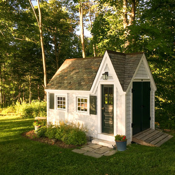
8' x 12' playhouse with an overall height of ten feet. It can be converted to a very attractive storage shed when the kids out grow it. Reminiscent of old Victorian houses, the steep rooflines and graceful dormer add a fresh style to boring backyard sheds. The two 2×2 opening windows fill the 96 square feet with lots of light making this quaint little cottage irresistible for the kid inside us all. The single door in the dormer is complemented with large double doors on the gable end allowing bulky items to fit in the shelter.
 Alair Homes Plano
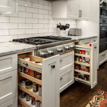
Our clients were living in a Northwood Hills home in Dallas that was built in 1968. Some updates had been done but none really to the main living areas in the front of the house. They love to entertain and do so frequently but the layout of their house wasn’t very functional. There was a galley kitchen, which was mostly shut off to the rest of the home. They were not using the formal living and dining room in front of your house, so they wanted to see how this space could be better utilized. They wanted to create a more open and updated kitchen space that fits their lifestyle. One idea was to turn part of this space into an office, utilizing the bay window with the view out of the front of the house. Storage was also a necessity, as they entertain often and need space for storing those items they use for entertaining. They would also like to incorporate a wet bar somewhere!
We demoed the brick and paneling from all of the existing walls and put up drywall. The openings on either side of the fireplace and through the entryway were widened and the kitchen was completely opened up. The fireplace surround is changed to a modern Emser Esplanade Trail tile, versus the chunky rock it was previously. The ceiling was raised and leveled out and the beams were removed throughout the entire area. Beautiful Olympus quartzite countertops were installed throughout the kitchen and butler’s pantry with white Chandler cabinets and Grace 4”x12” Bianco tile backsplash. A large two level island with bar seating for guests was built to create a little separation between the kitchen and dining room. Contrasting black Chandler cabinets were used for the island, as well as for the bar area, all with the same 6” Emtek Alexander pulls. A Blanco low divide metallic gray kitchen sink was placed in the center of the island with a Kohler Bellera kitchen faucet in vibrant stainless. To finish off the look three Iconic Classic Globe Small Pendants in Antiqued Nickel pendant lights were hung above the island. Black Supreme granite countertops with a cool leathered finish were installed in the wet bar, The backsplash is Choice Fawn gloss 4x12” tile, which created a little different look than in the kitchen. A hammered copper Hayden square sink was installed in the bar, giving it that cool bar feel with the black Chandler cabinets. Off the kitchen was a laundry room and powder bath that were also updated. They wanted to have a little fun with these spaces, so the clients chose a geometric black and white Bella Mori 9x9” porcelain tile. Coordinating black and white polka dot wallpaper was installed in the laundry room and a fun floral black and white wallpaper in the powder bath. A dark bronze Metal Mirror with a shelf was installed above the porcelain pedestal sink with simple floating black shelves for storage.
Their butlers pantry, the added storage space, and the overall functionality has made entertaining so much easier and keeps unwanted things out of sight, whether the guests are sitting at the island or at the wet bar! The clients absolutely love their new space and the way in which has transformed their lives and really love entertaining even more now!

Sponsored
Columbus, OH

Hope Restoration & General Contracting
Columbus Design-Build, Kitchen & Bath Remodeling, Historic Renovations
 TVL Creative Ltd.
Our clients had just recently closed on their new house in Stapleton and were excited to transform it into their perfect forever home. They wanted to remodel the entire first floor to create a more open floor plan and develop a smoother flow through the house that better fit the needs of their family. The original layout consisted of several small rooms that just weren’t very functional, so we decided to remove the walls that were breaking up the space and restructure the first floor to create a wonderfully open feel.
After removing the existing walls, we rearranged their spaces to give them an office at the front of the house, a large living room, and a large dining room that connects seamlessly with the kitchen. We also wanted to center the foyer in the home and allow more light to travel through the first floor, so we replaced their existing doors with beautiful custom sliding doors to the back yard and a gorgeous walnut door with side lights to greet guests at the front of their home.
Living Room
Our clients wanted a living room that could accommodate an inviting sectional, a baby grand piano, and plenty of space for family game nights. So, we transformed what had been a small office and sitting room into a large open living room with custom wood columns. We wanted to avoid making the home feel too vast and monumental, so we designed custom beams and columns to define spaces and to make the house feel like a home. Aesthetically we wanted their home to be soft and inviting, so we utilized a neutral color palette with occasional accents of muted blues and greens.
Dining Room
Our clients were also looking for a large dining room that was open to the rest of the home and perfect for big family gatherings. So, we removed what had been a small family room and eat-in dining area to create a spacious dining room with a fireplace and bar. We added custom cabinetry to the bar area with open shelving for displaying and designed a custom surround for their fireplace that ties in with the wood work we designed for their living room. We brought in the tones and materiality from the kitchen to unite the spaces and added a mixed metal light fixture to bring the space together
Kitchen
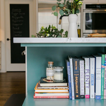
We wanted the kitchen to be a real show stopper and carry through the calm muted tones we were utilizing throughout their home. We reoriented the kitchen to allow for a big beautiful custom island and to give us the opportunity for a focal wall with cooktop and range hood. Their custom island was perfectly complimented with a dramatic quartz counter top and oversized pendants making it the real center of their home. Since they enter the kitchen first when coming from their detached garage, we included a small mud-room area right by the back door to catch everyone’s coats and shoes as they come in. We also created a new walk-in pantry with plenty of open storage and a fun chalkboard door for writing notes, recipes, and grocery lists.
Office
We transformed the original dining room into a handsome office at the front of the house. We designed custom walnut built-ins to house all of their books, and added glass french doors to give them a bit of privacy without making the space too closed off. We painted the room a deep muted blue to create a glimpse of rich color through the french doors
Powder Room
The powder room is a wonderful play on textures. We used a neutral palette with contrasting tones to create dramatic moments in this little space with accents of brushed gold.
Master Bathroom
The existing master bathroom had an awkward layout and outdated finishes, so we redesigned the space to create a clean layout with a dream worthy shower. We continued to use neutral tones that tie in with the rest of the home, but had fun playing with tile textures and patterns to create an eye-catching vanity. The wood-look tile planks along the floor provide a soft backdrop for their new free-standing bathtub and contrast beautifully with the deep ash finish on the cabinetry.
 Vintage Cellars - Luxury Custom Wine Cellars LA
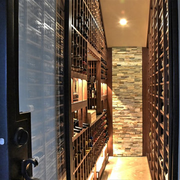
This project is more than meets the eye! In a gorgeous neighborhood in Del Mar, San Diego, California, This unique small custom wine cellar truly acts as a showstopper. Originally within this house, the door which now faces outward used to be around the corner in a small hallway, virtually eliminating any visibility into this contemporary walk in custom wine cellar. Upon seeing the location of this space within the house, Gene Walder and the knowledgeable team at Vintage Cellars knew that to really take advantage of the room provided, (which is actually below the stairs), they needed to get rid of the original door and add a brand new one facing the main living space.
Just a small feat in a series of unique custom features within this cellar!
Here at Vintage Cellars, before any design takes shape, it is vital to understand what the clients wants and needs are based on their growing collection of wine. With a good idea of bottle sizes, shapes (some pinot noir bottles, for example have a wider bottom than a typical cabernet sauvignon bottle) and unique features desired, the team of wine cellar designers and wine cellar builders at Vintage Cellars are able to create a very special and desirable wine cellar for each client.
The owners of this beautiful home collaborated heavily with the Vintage Cellars team in the design process of this rustic custom wine cellar - something that we aim to do with every project. The homeowners wanted to showcase some of their favorite Magnum sized bottles in a high reveal horizontal display row, directly on top of another area highlighting the best 750 ml's in their collection.
This small custom wine room fills most of the left wall with single deep, individual bottle storage. Directly below this wine racking is room for wine case / wine bin storage. Centered within this wall is a nice space for opening and decanting wines with a gorgeous dark stone countertop and room for hanging wine glasses above.
The opposite wall is filled floor to ceiling with label revealing horizontal display rows. Again, this type of feature is very desirable in recent years. Homeowners want to be able to showcase the best bottles they own within their custom wine cellars in the most stunning and beautiful ways possible. Additionally, this feature is commonly replicated with metal bars for a more contemporary and modern look and feel.
Within Beach Cities such as Del Mar, La Jolla, Cardiff, Coronado, Rancho Santa Fe, Encinitas, Solana Beach, Newport Beach and Orange County alike, small walk wine cellars are all the rage. Custom Wine Closet s and Under the Stairs Custom Wine Room s are quickly becoming a commonplace feature within modern luxury homes.
Funny enough, because San Diego has become such a hub and mecca for craft beer breweries, luxury homes within communities such as La Jolla, Del Mar, Encinitas, Coronado, Cardiff, Rancho Santa Fe, Solana Beach, Carlsbad, La Costa and Torrey Pines have taken notice and began including space for unique beer storage within their custom wine cellars as well.
This right side wall horizontal display racking does just that. If you look closely, those intricately labeled bottles are craft brews kept at a chill and refreshing 55 Degrees- just waiting to be opened and enjoyed immediately.
Just when you thought the custom wine cellar tour was over, another unique feature catches your eye. You see the back stone wall? Press ever so gently in the top left corner two thirds of the way up and - Voila! - a secret door appears and slowly reveals more room under the stairway for case storage and the like.
The homeowner also decided to add interesting lighting to this cellar. The Custom wine room can turn any color of the rainbow - allowing you to focus on all lights or just one a time, creating that perfect mood lighting for the holidays, springtime, or summer.
This entire custom wine cellar and all wine racking were done in raw black walnut.
Vintage Cellars has built gorgeous custom wine cellars and wine storage rooms across the United States and World for over 25 years. We are your go-to business for anything wine cellar and wine storage related! Whether you're interested in a wine closet, wine racking, custom wine racks, a custom wine cellar door, or a cooling system for your existing space, Vintage Cellars has you covered!
We carry all kinds of wine cellar cooling and refrigeration systems, incuding: Breezaire, CellarCool, WhisperKool, Wine Guardian, CellarPro and Commercial systems.
We also carry many types of Wine Refrigerators, Wine Cabinets, and wine racking types, including La Cache, Marvel, N'Finity, Transtherm, Vinotheque, Vintage Series, Credenza, Walk in wine rooms, Climadiff, Riedel, Fontenay, and VintageView.
Vintage Cellars also does work in many styles, including Contemporary and Modern, Rustic, Farmhouse, Traditional, Craftsman, Industrial, Mediterranean, Mid-Century, Industrial and Eclectic.
Some locations we cover often include: San Diego, Rancho Santa Fe, Corona Del Mar, Del Mar, La Jolla, Newport Beach, Newport Coast, Huntington Beach, Del Mar, Solana Beach, Carlsbad, Orange County, Beverly Hills, Malibu, Pacific Palisades, Santa Monica, Bel Air, Los Angeles, Encinitas, Cardiff, Coronado, Manhattan Beach, Palos Verdes, San Marino, Ladera Heights, Santa Monica, Brentwood, Westwood, Hancock Park, Laguna Beach, Crystal Cove, Laguna Niguel, Torrey Pines, Thousand Oaks, Coto De Caza, Coronado Island, San Francisco, Danville, Walnut Creek, Marin, Tiburon, Hillsborough, Berkeley, Oakland, Napa, Sonoma, Agoura Hills, Hollywood Hills, Laurel Canyon, Sausalito, Mill Valley, San Rafael, Piedmont, Paso Robles, Carmel, Pebble Beach
Contact Vintage Cellars today with any of your Wine Cellar needs!
(800) 876-8789
Vintage Cellars
904 Rancheros Drive
San Marcos, California 92069
(800) 876-8789

 Robeson Design
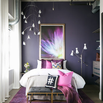
Small Bedroom decorating ideas! Interior Designer Rebecca Robeson began this Bedroom remodel with Benjamin Moore's 2017 color of the year… “Shadow” 2117-30
Rebecca wanted a bold statement color for this small Bedroom. Something that would say WOW. Her next step was to find a bold statement piece of art to create the color palette for the rest of the room. From the art piece came bedding choices, a fabulous over-died antique area rug (Aja Rugs) randomly collected throw pillows and furniture pieces that would provide a comfortable Bedroom but not fill the space unnecessarily. Rebecca had white linen, custom window treatments made and chose white bedding to ground the space, keeping it light and airy. Playing up the 13' concrete ceilings, Rebecca used modern light fixtures with white shades to pop off the purple wall creating an exciting first... and lasting, impression!
Black Whale Lighting
Photos by Ryan Garvin Photography
 Meadowlark Design+Build
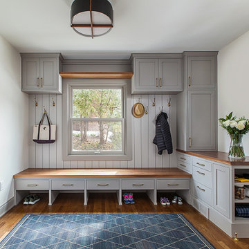
Front entry of the home has been converted to a mudroom and provides organization and storage for the family.
Mid-sized transitional medium tone wood floor, brown floor and shiplap wall mudroom photo in Detroit with white walls
Mid-sized transitional medium tone wood floor, brown floor and shiplap wall mudroom photo in Detroit with white walls
 TVL Creative Ltd.
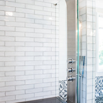
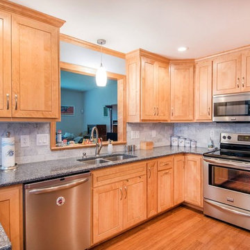
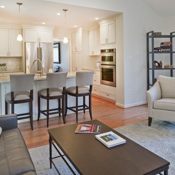
This project is an incredible transformation and the perfect example of successful style mixing! This client, and now a good friend of TVL (as they all become), is a wonderfully eclectic and adventurous one with immense interest in texture play, pops of color, and unique applications. Our scope in this home included a full kitchen renovation, main level powder room renovation, and a master bathroom overhaul. Taking just over a year to complete from the first design phases to final photos, this project was so insanely fun and packs an amazing amount of fun details and lively surprises. The original kitchen was large and fairly functional. However, the cabinetry was dated, the lighting was inefficient and frankly ugly, and the space was lacking personality in general. Our client desired maximized storage and a more personalized aesthetic. The existing cabinets were short and left the nice height of the space under-utilized. We integrated new gray shaker cabinets from Waypoint Living Spaces and ran them to the ceiling to really exaggerate the height of the space and to maximize usable storage as much as possible. The upper cabinets are glass and lit from within, offering display space or functional storage as the client needs. The central feature of this space is the large cobalt blue range from Viking as well as the custom made reclaimed wood range hood floating above. The backsplash along this entire wall is vertical slab of marble look quartz from Pental Surfaces. This matches the expanse of the same countertop that wraps the room. Flanking the range, we installed cobalt blue lantern penny tile from Merola Tile for a playful texture that adds visual interest and class to the entire room. We upgraded the lighting in the ceiling, under the cabinets, and within cabinets--we also installed accent sconces over each window on the sink wall to create cozy and functional illumination. The deep, textured front Whitehaven apron sink is a dramatic nod to the farmhouse aesthetic from KOHLER, and it's paired with the bold and industrial inspired Tournant faucet, also from Kohler. We finalized this space with other gorgeous appliances, a super sexy dining table and chair set from Room & Board, the Paxton dining light from Pottery Barn and a small bar area and pantry on the far end of the space. In the small powder room on the main level, we converted a drab builder-grade space into a super cute, rustic-inspired washroom. We utilized the Bonner vanity from Signature Hardware and paired this with the cute Ashfield faucet from Pfister. The most unique statements in this room include the water-drop light over the vanity from Shades Of Light, the copper-look porcelain floor tile from Pental Surfaces and the gorgeous Cashmere colored Tresham toilet from Kohler. Up in the master bathroom, elegance abounds. Using the same footprint, we upgraded everything in this space to reflect the client's desire for a more bright, patterned and pretty space. Starting at the entry, we installed a custom reclaimed plank barn door with bold large format hardware from Rustica Hardware. In the bathroom, the custom slate blue vanity from Tharp Cabinet Company is an eye catching statement piece. This is paired with gorgeous hardware from Amerock, vessel sinks from Kohler, and Purist faucets also from Kohler. We replaced the old built-in bathtub with a new freestanding soaker from Signature Hardware. The floor tile is a bold, graphic porcelain tile with a classic color scheme. The shower was upgraded with new tile and fixtures throughout: new clear glass, gorgeous distressed subway tile from the Castle line from TileBar, and a sophisticated shower panel from Vigo. We finalized the space with a small crystal chandelier and soft gray paint. This project is a stunning conversion and we are so thrilled that our client can enjoy these personalized spaces for years to come. Special thanks to the amazing Ian Burks of Burks Wurks Construction for bringing this to life!

 Michael Nash Design, Build & Homes
For this couple, planning to move back to their rambler home in Arlington after living overseas for few years, they were ready to get rid of clutter, clean up their grown-up kids’ boxes, and transform their home into their dream home for their golden years.
The old home included a box-like 8 feet x 10 feet kitchen, no family room, three small bedrooms and two back to back small bathrooms. The laundry room was located in a small dark space of the unfinished basement.
This home is located in a cul-de-sac, on an uphill lot, of a very secluded neighborhood with lots of new homes just being built around them.
The couple consulted an architectural firm in past but never were satisfied with the final plans. They approached Michael Nash Custom Kitchens hoping for fresh ideas.
The backyard and side yard are wooded and the existing structure was too close to building restriction lines. We developed design plans and applied for special permits to achieve our client’s goals.
The remodel includes a family room, sunroom, breakfast area, home office, large master bedroom suite, large walk-in closet, main level laundry room, lots of windows, front porch, back deck, and most important than all an elevator from lower to upper level given them and their close relative a necessary easier access.
The new plan added extra dimensions to this rambler on all four sides. Starting from the front, we excavated to allow a first level entrance, storage, and elevator room. Building just above it, is a 12 feet x 30 feet covered porch with a leading brick staircase. A contemporary cedar rail with horizontal stainless steel cable rail system on both the front porch and the back deck sets off this project from any others in area. A new foyer with double frosted stainless-steel door was added which contains the elevator.
The garage door was widened and a solid cedar door was installed to compliment the cedar siding.
The left side of this rambler was excavated to allow a storage off the garage and extension of one of the old bedrooms to be converted to a large master bedroom suite, master bathroom suite and walk-in closet.
We installed matching brick for a seam-less exterior look.
The entire house was furnished with new Italian imported highly custom stainless-steel windows and doors. We removed several brick and block structure walls to put doors and floor to ceiling windows.
A full walk in shower with barn style frameless glass doors, double vanities covered with selective stone, floor to ceiling porcelain tile make the master bathroom highly accessible.
The other two bedrooms were reconfigured with new closets, wider doorways, new wood floors and wider windows. Just outside of the bedroom, a new laundry room closet was a major upgrade.
A second HVAC system was added in the attic for all new areas.
The back side of the master bedroom was covered with floor to ceiling windows and a door to step into a new deck covered in trex and cable railing. This addition provides a view to wooded area of the home.
By excavating and leveling the backyard, we constructed a two story 15’x 40’ addition that provided the tall ceiling for the family room just adjacent to new deck, a breakfast area a few steps away from the remodeled kitchen. Upscale stainless-steel appliances, floor to ceiling white custom cabinetry and quartz counter top, and fun lighting improved this back section of the house with its increased lighting and available work space. Just below this addition, there is extra space for exercise and storage room. This room has a pair of sliding doors allowing more light inside.
The right elevation has a trapezoid shape addition with floor to ceiling windows and space used as a sunroom/in-home office. Wide plank wood floors were installed throughout the main level for continuity.
The hall bathroom was gutted and expanded to allow a new soaking tub and large vanity. The basement half bathroom was converted to a full bathroom, new flooring and lighting in the entire basement changed the purpose of the basement for entertainment and spending time with grandkids.
Off white and soft tone were used inside and out as the color schemes to make this rambler spacious and illuminated.
Final grade and landscaping, by adding a few trees, trimming the old cherry and walnut trees in backyard, saddling the yard, and a new concrete driveway and walkway made this home a unique and charming gem in the neighborhood.
 Fiorito Interior Design
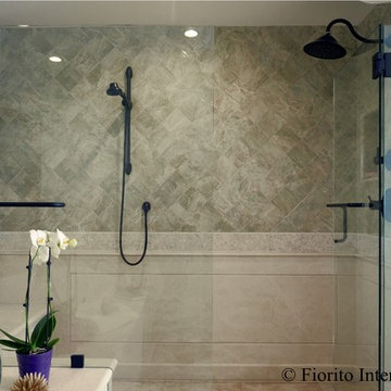
Like many California ranch homes built in the 1950s, this original master bathroom was not really a "master bath." My clients, who only three years ago purchased the home from the family of the original owner, were saddled with a small, dysfunctional space. Chief among the dysfunctions: a vanity only 30" high, and an inconveniently placed window that forced the too-low vanity mirror to reflect only the waist and partial torso--not the face--of anyone standing in front of it. They wanted not only a more spacious bathroom but a bedroom as well, so we worked in tandem with an architect and contractor to come up with a fantastic new space: a true Master Suite. In order to refine a design concept for the soon-to-be larger space, and thereby narrow down material choices, my clients and I had a brainstorming session: we spoke of an elegant Old World/ European bedroom and bathroom, a luxurious bath that would reference a Roman spa, and finally the idea of a Hammam was brought into the mix. We blended these ideas together in oil-rubbed bronze fixtures, and a tiny tile mosaic in beautiful Bursa Beige marble from Turkey and white Thassos marble from Greece. The new generously sized bathroom boasts a jetted soaking tub, a very large walk-in shower, a double-sided fireplace (facing the tub on the bath side), and a luxurious 8' long vanity with double sinks and a storage tower.
The vanity wall is covered with a mosaic vine pattern in a beautiful Bursa Beige marble from Turkey and white Thassos marble from Greece,. The custom Larson Juhl framed mirrors are flanked by gorgeous hand-wrought scones from Hubbardton Forge which echo the vine and leaf pattern in the mosaic. And the vanity itself features an LED strip in the toe-kick which allows one to see in the middle of the night without having to turn on a shockingly bright overhead fixture. At the other end of the master bath, a luxurious jetted tub nestles by a fireplace in the bay window area. Views of my clients' garden can be seen while soaking in bubbles. The over-sized walk-in shower features a paneled wainscoting effect which I designed in Crema Marfil marble. The vine mosaic continues in the shower, topped by green onyx squares. A rainshower head and a hand-held spray on a bar provides showering options. The shower floor slopes gently in one direction toward a hidden linear drain; this allows the floor to be read as a continuation of the main space, without being interrupted by a center drain.
photo by Bernardo Grijalva
 Techo-Bloc
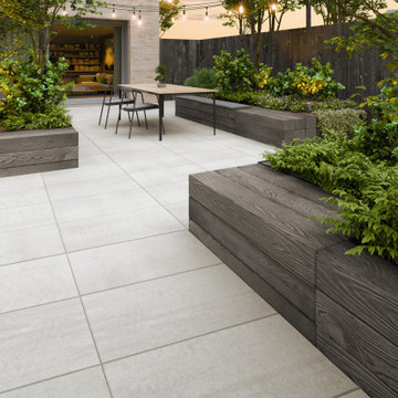
This small patio idea was inspired by our Blu Grande Smooth slab. Its smooth texture is sleek to the eye but rougher to the touch which avoids it from getting slippery when wet. The large rectangular shape works as an easy add-on into Blu 60 regular modular patterns but can also work as a stand-alone to create a very linear look. Check out the HD2 Blu Grande Smooth which is all about seamless looks with a tighter/poreless texture and anti-aging technology.
 Kowalske Kitchen & Bath
This 1933 Wauwatosa basement was dark, dingy and lacked functionality. The basement was unfinished with concrete walls and floors. A small office was enclosed but the rest of the space was open and cluttered.
The homeowners wanted a warm, organized space for their family. A recent job change meant they needed a dedicated home office. They also wanted a place where their kids could hang out with friends.
Their wish list for this basement remodel included: a home office where the couple could both work, a full bathroom, a cozy living room and a dedicated storage room.
This basement renovation resulted in a warm and bright space that is used by the whole family.
Highlights of this basement:
- Home Office: A new office gives the couple a dedicated space for work. There’s plenty of desk space, storage cabinets, under-shelf lighting and storage for their home library.
- Living Room: An old office area was expanded into a cozy living room. It’s the perfect place for their kids to hang out when they host friends and family.
- Laundry Room: The new laundry room is a total upgrade. It now includes fun laminate flooring, storage cabinets and counter space for folding laundry.
- Full Bathroom: A new bathroom gives the family an additional shower in the home. Highlights of the bathroom include a navy vanity, quartz counters, brass finishes, a Dreamline shower door and Kohler Choreograph wall panels.
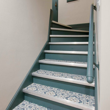
- Staircase: We spruced up the staircase leading down to the lower level with patterned vinyl flooring and a matching trim color.
- Storage: We gave them a separate storage space, with custom shelving for organizing their camping gear, sports equipment and holiday decorations.
CUSTOMER REVIEW
“We had been talking about remodeling our basement for a long time, but decided to make it happen when my husband was offered a job working remotely. It felt like the right time for us to have a real home office where we could separate our work lives from our home lives.
We wanted the area to feel open, light-filled, and modern – not an easy task for a previously dark and cold basement! One of our favorite parts was when our designer took us on a 3D computer design tour of our basement. I remember thinking, ‘Oh my gosh, this could be our basement!?!’ It was so fun to see how our designer was able to take our wish list and ideas from my Pinterest board, and turn it into a practical design.
We were sold after seeing the design, and were pleasantly surprised to see that Kowalske was less costly than another estimate.” – Stephanie, homeowner
 Twelve Stones Designs, LLC
The owners of this kitchen had spent the money to upgrade the finishes in their kitchen upon building the home 12 years ago, but after living in the space for several years they realized how nonfunctional the layout really was. The (then) two preschool aged children had grown into busy, hungry teenagers with many friends who also liked to hang out at the house. So the family needed a more functional kitchen with better traffic flow, space for daily activities revolving around the kitchen at different times of day, and a kitchen that could accommodate cooking for and serving large groups. Furthermore, the dark, traditional finishes no longer reflected the homeowners’ style. They requested a brighter, more relaxed, coastal style that reflected their love of the seaside cities they like to visit.
Originally, the kitchen was U-shaped with a narrow island in the middle. The island created narrow aisles that bottle-necked at the dishwasher, refrigerator, and cooktop areas. There was a pass-through from the foyer into the kitchen, but the owners never liked that the pass-through was also located so close to the powder room. The awkward proximity was unappealing and made guests feel uncomfortable.
The kitchen’s storage was made up of lots of narrow cabinets, apothecary drawers, clipped corner units, and very few drawers. It lacked useful storage for the larger items the family used on a daily basis. And the kitchen’s only pantry was small closet that had only builder-grade, narrow shelving with no illumination to be able to see the contents inside.
Overall, the kitchen’s lighting plan was poorly executed. Only six recessed cans illuminated the entire kitchen and nook areas. The under cabinet lighting was not evenly distributed either. In fact, the builder had mis-placed the under cabinet lighting around the decorative pilasters which made for choppy, dark cubbies. Further, the builder didn’t include any lighting over the sink or the bar area, which meant whoever was doing the dishes was always in their own shadow. That, coupled with the steep overhang of the game room above made the bar area feel like a dim, cavernous space that wasn’t inviting or task oriented. The kitchen looked out into the main living space, but the raised bar and a narrow wall (which held the only large cabinet in the kitchen) created more of a barrier than a relationship to the living room or breakfast nook. In fact, one couldn’t even see the breakfast nook from the cooktop or sink areas due to its orientation. The raised bar top was too narrow to comfortably sit to either dine at or chat from due to the lack of knee space. The the homeowners confided that the kitchen felt more like a dark, dirty prison than place where the family, or their guests, wanted to gather and commune.
The clients' needs and desires were:
➢ to create a kitchen that would be a space the family loved to be in; to relate to the adjacent spaces all around, and to have better flow for entertaining large groups
➢ to remove the walls between the breakfast nook and living area and to be able to utilize the natural light from the windows in both those areas
➢ to incorporate a functional chopping block for prepping fresh food for home cooked meals, an island with a large sink and drain board, 2 pull out trash cans, and seating for at least the 2 teens to eat or do homework
➢ to design a kitchen and breakfast nook with an airy, coastal, relaxed vibe that blended with the rest of the house's coastal theme
➢ to integrate a layered lighting plan which would include ample general illumination, specific task lighting, decorative lighting, and lots of illuminated storage
➢ to design a kitchen with not only more storage for all the husband’s kitchen gadgets and collection of oils and spices, but smart storage, including a coffee/breakfast bar and a place to store and conceal the toaster oven and microwave
➢ to find a way to utilize the large open space between the kitchen, pantry area, and breakfast nook
Twelve Stones Designs achieved the owner's goals by:
➢ removing the walls between the kitchen and living room to allow the natural light to filter in from the adjacent rooms and to create a connection between the kitchen, nook, and living spaces for a sense of unity and communion
➢ removing the existing pantry and designing 3 large pantry style cabinets with LED tape lights and rollout drawers to house lots of kitchen appliances, gadgets, and tons of groceries. We also took the cabinets all the way up to the 9’ ceiling for additional storage for seasonal items and bulk storage.
➢ designing 2 islands - 1 with a gorgeous black walnut chopping block that houses a drawer for chopping and carving knives and a custom double pull out trash unit for point of use utilization - and 1 that houses the dishwasher, a large Blanco Gourmet sink with integrated drain board, woven baskets for fresh root vegetables and kitchen towels, plenty of drawer storage for kitchen items, and bar seating for up to 4 diners.
➢ closing off the space between the kitchen and the powder room to create a beautiful new private alcove for the powder room as well as adding some decorative storage. This also gave us space to include more tall storage near the new range for precision placement of the husband’s extensive oil and spice collection as well as a location for a combo-steam oven the wife wanted for baking and cooking healthy meals.
The project is enhanced functionally by:
➢ incorporated USB and standard receptacles for the kids’ laptops and phone charging in the large island
➢ designing the small island to include additional open shelving for items used on a daily basis such as a variety of bowls, plates, and colanders. This set up also works well for the husband who prefers to “plate” his dinners in restaurant-style fashion before presenting them to the table.
➢ the integration of specific storage units, such as double stacked cutlery drawers, a custom spice pull-out, a Kuerig coffee and tea pod drawer, and custom double stacked utensil drawers
➢ moving the refrigerator to the old oven location - this eliminated the bottle neck as well as created a better relationship to the eating table. It also utilizes the floor space between the pantry, nook, and kitchen
➢ creating a banquet style breakfast nook - this banquette seating not only doubles the amount of seating for large gatherings but it better utilizes the odd space between the kitchen and the previous nook area. It also helps to create a distinct pathway from the mudroom room through the pantry area, kitchen, nook, and living room.
➢ the coffee/breakfast bar area which includes the perfect location for the concealed microwave and toaster oven, convenient storage for the coffee pods and tea accoutrements. Roll-out drawers below also house the smoothie maker, hot water kettle, and a plethora of smoothie-making ingredients such as protein powders, smoothie additives, etc. Furthermore, the drawers below the Keurig house measuring utensil, cutlery, baking supplies and tupperware storage.
➢ incorporating lots of wide drawers and pullouts to accommodate large cookware.
➢ utilizing as much vertical space as possible by building storage to the ceiling which accommodates the family’s abundant amount of serving platters, baking sheets, bakeware, casserole dishes, and additional cutting boards.
The project is enhanced aesthetically by:
➢ new 5-piece Versailles pattern porcelain tile that now seamlessly joins the entire down stairs area together creating a bright, cohesiveness feeling instead of choppy separated spaces - it also adds a coastal feeling
➢ designing a cabinet to conceal the microwave and toaster oven
➢ the coastal influenced light fixtures over the nook table and island
➢ the sandy colors of the Langdon Cambria countertops. The swirling pattern and sparkling quartz pieces remind the homeowner of black-and-tan sandy beaches
➢ the striped banquet seating whose creamy white background and blue-green stripes were the inspiration for the cabinet and wall colors.
➢ All the interior doors were painted black to coordinate with the blacks and grays in the backsplash tile and countertop. This also adds a hint of tailored formality to an otherwise casual space.
➢ the use of WAC's Oculux small aperture LED units for the overhead lighting complimented with Diode LED strips for task lighting under the cabinets and inside the pantry and glass wall cabinets. All of the lighting applications are on separate dimmer switches.
Innovative uses of materials or construction methods by Realty Restoration LLC:
➢ Each 1-1/2” x 3” block of reclaimed end-grain black walnut that makes up the center island chopping block was hand milled and built in the shop. It was designed to look substantial and proportional to the surrounding elements, executed by creating the 4 inch tall top with a solid wood chamfered edge band.
➢ The metal doors on either side of the vent hood were also custom designed for this project and built in the Realty Restoration LLC shop. They are made 1x2, 11-gauge mild steel with ribbed glass. Weighing 60 lbs a piece, heavy duty cabinet hinges were added to support the weight of the door and keep them from sagging.
➢ Under-cabinet receptacles were added along the range wall in order to have a clean, uninterrupted backsplash.
Design obstacles to overcome:
➢ Because we were removing the demising walls between the kitchen and living room, we had to find a way to plumb and vent the new island. We did this by tunneling through the slab (the slab had post tension cables which prevented us from just trenching) to run a new wet vent through a nearby structural wall. We pulled the existing hot and cold lines between upper floor joists and ran them down the structural wall as well and up through a conduit in the tunnel.
➢ Since we were converting from wall overs to a gas range it allowed us to utilize the 220 feed for the wall ovens to provide a new sub panel for all the new kitchen circuits
➢ Due to framing deficiencies inherited from the original build there was a 1-1/2” differential in the floor-to-ceiling height over a 20 foot span; by utilizing the process of cutting and furring coupled with the crown moulding details on the cabinet elevations we were able to mask the problem and provide seamless transitions between the cabinet components.
Evidence of superior craftsmanship:
➢ uniquely designed, one-of-a-kind metal “X” end panels on the large island. The end panels were custom made in the Realty Restoration LLC shop and fitted to the exact dimensions of the island. The welding seams are completely indistinguishable - the posts look like they are cut from a single sheet of metal
➢ square metal posts on the small island were also custom made and designed to compliment and carry through the metal element s throughout the kitchen
➢ the beautiful, oversized end panels on the pantry cabinets which give the breakfast nook a tailored look
➢ integrating a large format 5 piece Versailles tile pattern to seamlessly flow from the existing spaces into the new kitchen space
➢ By constructing a custom cabinet that jogged around a corner we could not remodel (housing the entry way coat closet) we were able to camouflage the adjacent wall offset within the upper and lower cabinets. By designing around the existing jog in the structural walls we accomplished a few things: we were able to find the space to house, and hide, the microwave and toaster oven yet still have a clean cohesive appearance from the kitchen side. Additionally, the owners were able to keep their much needed coat closet and we didn’t have to increase the budget with unnecessary structural work.
 Mattson & Company
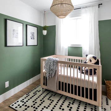
This nursery was a low-budget, DIY job. The idea was to create a space that both baby and momma could be comfortable in, and enjoy spending a lot of hours in (particularly in the first few months!). The theme started as "sophisticated gender neutral with subtle elements of whimsy and nature" - and I think we achieved that! The space was only 8' x 10', so storage solutions were key. The closet drawers and side table were both (very worn) antique pieces that were given a new life!
33