
Search results for "Solutions continue" in Home Design Ideas
 Inspired Remodels
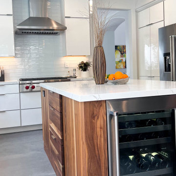
This contemporary kitchen and bath renovation in Tustin celebrates the essence of modern living with clean lines, minimalist finishes, ad nature-inspired details that create a harmonious, elevated atmosphere. In the kitchen, high-gloss white cabinetry offers a crisp, seamless aesthetic that reflects light and enhances the feeling of openness. The richly grained walnut island adds warmth and a textural contrast - a perfect nod to the rising trend of organic modern design. The modern organic theme is continued throughout the home, including the primary and guest bathrooms. With slab front vanities, wood-tone vanities, clean lines and sleek fixtures, get the spa feeling right at home. Drawn to the clean lines and modern warmth of this design? Let Inspired Remodels help you bring your vision to life with thoughtful design, high-end materials, and trend-forward solutions tailored to your lifestyle!
 Schumacher Homes
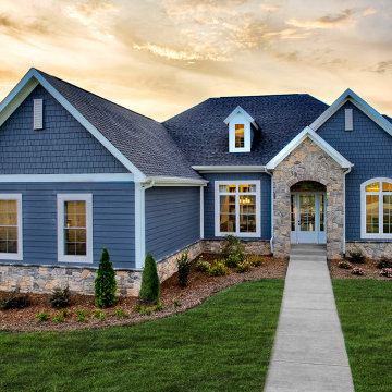
Built by Schumacher Homes, America's Largest Custom Home Builder, this stunning Charleston II American Tradition in Greenville, South Carolina, effortlessly balances traditional architectural details with modern elements. Based on one of our most popular floor plans, the Charleston II offers increased square footage and abundant storage solutions tailored for modern living. The heart of the home is an expansive, open-concept great room defined by classic wall paneling details and a custom iron railing that perfectly completes the home’s refined traditional style. This grand living space flows seamlessly into a chef-ready kitchen equipped with generous counter space, a large central island to gather around, and a giant walk-in pantry. To manage busy family schedules, an oversized laundry and mudroom zone has been upgraded with dramatic floor-to-ceiling tile, a custom bench locker, and integrated coat hooks to keep the home perfectly organized.
The thoughtful layout continues with a perfectly placed pocket office, offering a quiet, dedicated space to organize daily tasks or work from home. This pocket office leads gracefully into the luxurious owner’s retreat, a private main-level sanctuary showcasing an expansive primary bath and two large walk-in closets. To elevate the primary suite's design aesthetic, the bedroom features a show-stopping beamed cathedral ceiling that adds striking verticality and architectural detail. A smart split-bedroom layout ensures ultimate privacy for the entire family, keeping the additional secondary bedrooms situated on the completely opposite side of the residence so everyone can enjoy their own independent space.
 UpperKey
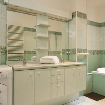
In many Parisian apartments, the bathroom may not have a window or a ventilation system. This can lead to issues with humidity and mold growth, which can be harmful to both the occupants of the apartment and the building itself. To combat this issue, some Parisians have installed dehumidifiers or air purifiers in their bathrooms, while others may leave the door open or use natural remedies such as vinegar or essential oils to combat moisture and odor. Despite these challenges, Parisians continue to make the most of their bathroom facilities, finding creative and practical solutions to the unique issues posed by their apartments' design and layout.
Find the right local pro for your project
 Chicagoland Home Products
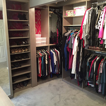
Way out west in the Chicago suburbs, Chicagoland Home Products digs into their bag of custom organization tricks and uses them to integrate unique storage solutions into this closet and dressing area. Nearly everywhere you look, think customization.
Look first at the flip up bench, flanked by triangular shelving on each end. If all that space for storage and display is not enough then check out where it is located, squarely in front of the window, with all that natural light to enjoy, while you slip on shoes from the glass shelves right next to it.
Continuity comes from the see-through shelving which keeps the design theme of the wall paper alive. The adjacent cubby-style shelving provides more room to house folding clothing or other items.
The glass shelf theme is reprised, at the end of the cubbies, where it is tucked in neatly, at an angle that keeps it out of the way as the door opens.
There is ample room for hanging clothes, illuminated by LED in-system lighting, and shoe shelving flanked on the left by mirrors and inset drawers.
All of this surrounds free standing drawers with a perfect top for folding.
It’s enough to make you dizzy with delight at how all the Aria finish materials spin together under the creative baton of Chicagoland Home Products to design a practical and attractive space.
 kimberly peck architect
photo by Pedro Marti
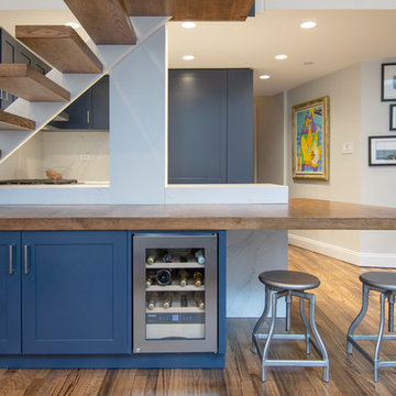
The goal of this renovation was to create a stair with a minimal footprint in order to maximize the usable space in this small apartment. The existing living room was divided in two and contained a steep ladder to access the second floor sleeping loft. The client wanted to create a single living space with a true staircase and to open up and preferably expand the old galley kitchen without taking away too much space from the living area. Our solution was to create a new stair that integrated with the kitchen cabinetry and dining area In order to not use up valuable floor area. The fourth tread of the stair continues to create a counter above additional kitchen storage and then cantilevers and wraps around the kitchen’s stone counters to create a dining area. The stair was custom fabricated in two parts. First a steel structure was created, this was then clad by a wood worker who constructed the kitchen cabinetry and made sure the stair integrated seamlessly with the rest of the kitchen. The treads have a floating appearance when looking from the living room, that along with the open rail helps to visually connect the kitchen to the rest of the space. The angle of the dining area table is informed by the existing angled wall at the entry hall, the line of the table is picked up on the other side of the kitchen by new floor to ceiling cabinetry that folds around the rear wall of the kitchen into the hallway creating additional storage within the hall.
 Klopf Architecture
Built for the Bluff, A Sea Ranch Home is Remade from the Inside Out
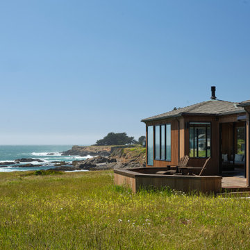
The house had always been grounded, on an ocean bluff at The Sea Ranch. It sits unencumbered, adjacent to one of the most dramatic stretches of the Sonoma coast with protected commons meadow to the east, uninterrupted Pacific views to the west, and a bluff trail running alongside. What it lacked was the feeling of home, one that could hold up its own against the natural landscape.
The owners are entrepreneurs with deep involvement across tech, real estate, and development and they know how things are built. The Sea Ranch house had been in their lives for years, a second residence and a place for family to gather. Built for a different time, it felt more compromising than comfortable. Sitting in a closed off nook, the kitchen fit one cook at a time and turned its back on the rest of the house. The entry was dim and compressed, divided by a structural column that presented itself at exactly the wrong moment. The primary suite was small relative to the view outside it. A large rear bedroom sat behind a lowered ceiling with a bathroom that had never been added. The house was certainly worth the trouble of doing it right.
What followed was not one project but four, each with its own design challenge, each addressed over a period of time.
Where the House Meets the Ocean
The most complex piece of the project, in both structural and spatial terms, was the kitchen expansion. The existing room was a single-person galley squeezed in as an afterthought with no meaningful connection to the dining room, the living space, or the deck outside. To make it useful for a family that cooks and gathers, it needed to grow outward into an existing patio and flow into the rooms around it.
A big challenge was the roofline. Several planes at different pitches and angles converged directly where additional volume was needed. A new form had to join that geometry without reading as a correction. The solution found the simplest possible connection between the existing angles, a roofline that from outside the structure, appears entirely original. From the bluff trail where the addition is visible, there is no discernible seam.
Inside, the kitchen is now open to the living and dining rooms without interruption. A large sliding glass door connects the space onto the rear deck. The deck itself was expanded and oriented so that the body of the house shields it from the coastal wind which is a common consideration that determines whether outdoor space at The Sea Ranch actually gets used. The result is a room that works for large family gatherings where no one feels cutoff, and one that makes the boundary between being inside and outside easy to ignore.
Welcoming Light
A structural column stood at the convergence of eight distinct roof planes in the entry. It was load-bearing, but it was also the reason the entry had always felt like a hallway rather than a welcoming arrival.
With the structural engineer, a custom steel connector was designed to receive beams from six separate directions, redistributing the load through a single new continuous beam. The column was surgically removed. Three triangular skylights were then cut into the roof above, their shapes drawn from the
existing geometry of the planes around them. The entry is now bright and open. The skylights feel native to the structure because they follow the logic already present in the roof.
Two Suites, Two Views
At opposite ends of the house, the two bedroom suites were each reconfigured, and each found a different way to introduce more of the landscape into the room.
An addition to the primary suite extended the structure outward to create a wraparound plan with a loop from the bedroom through bath and closet that had not been possible before. The expansion opened a slot view from the tub and shower toward the ocean. The view is precise and private. The ocean view is present and deliberate.
The rear bedroom absorbed an adjacent storage room to transform it into a full second suite with a vaulted ceiling, a large bathroom with a tub, a shower, and a sauna. A private fenced garden courtyard sits just beyond the glass bringing the outdoors inside. The tub was placed so that, looking past the courtyard and through the bedroom beyond, the ocean is visible at the far end. It is a long view and it makes the room feel larger and more settled than its footprint would suggest.
Glass on Four Sides, Fire at the Center
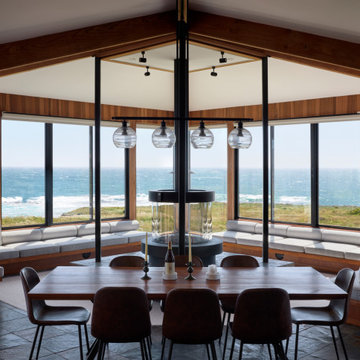
The main living and gathering room had always been caught between two competing facts: glass on four sides meant exceptional views but at The Sea Ranch, it also meant a cold room. A 360-degree cylindrical fireplace was added at the center on a raised stone base, providing radiant heat in every direction and giving the room a focal point around which a group naturally orients itself, whether that means two people at the end of the day or the whole family after dinner.
Owners Who Picked Up the Tools
The owner was not a passive client. they came with construction knowledge, specific ideas, and the desire to be an active part of the process, a dynamic that other architects may had found difficult, which Klopf Architecture accepted as an asset. They took it upon themselves to complete some of the work during construction, including the installation of a new radiant heating system beneath the floors.
The radiant system added to the older and less-desirable forced-air setup. At The Sea Ranch, that change matters as the house sits close enough to the ocean and moving air competes with the sound of it, where radiant heat does not. Solar panels were added to the roof as part of the new system. Insulation was upgraded throughout the walls, roof, and crawl space. The house that had always had the right setting now holds warmth the way a house on the bluff should.
They were also deeply involved in the design and selections throughout, and the finished house reflects both of them in ways that are specific rather than generic. The process took longer and moved through more iterations than a more arms-length relationship might have allowed. The result is more defined and personal because of it.
The Landscape Holds Priority
Every exterior decision was shaped by The Sea Ranch Design Standards, which require that buildings defer to the landscape around them rather than compete with it. Because this house sits on the bluff and is visible from the public trail, the additions faced a close review. Existing materials were matched. Geometries were resolved. The additions had to become indistinguishable from the original building.
From the trail, the house reads exactly as it always has — low, cedar-clad, secondary to the meadow and the water. The setting holds priority. Inside, the house has been remade.
Klopf Architecture Project Team: Geoff Campen and Trenton Jewett
Contractor: Shawn Bettega Construction
Photography: ©2025 Mariko Reed
Year Completed: 2023
Location: The Sea Ranch, CA
 K&D Wallcovering
Wallpaper Installation – Ceiling in Northbrook
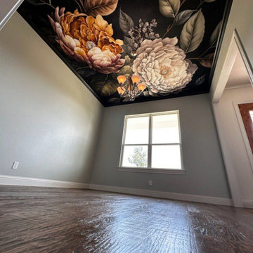
Elevate your fifth wall with stunning ceiling wallpaper installation in Northbrook. As your local wallpaper specialist, I create breathtaking overhead statements that transform ordinary rooms into extraordinary spaces with:
✔ Ceiling-Specific Expertise
Lightweight vinyl wallpaper designed for overhead application
Specialized adhesives for secure, long-lasting holds
Precise pattern alignment for visual continuity
✔ Northbrook-Approved Solutions
Architectural-grade materials for Chicagoland homes
Fade-resistant finishes for sunlit rooms
Low-VOC options for family-safe installations
✔ Signature Ceiling Services
Tray ceiling treatments with dimensional effects
Coffered ceiling enhancements
Wallpaper repair for existing installations
Why Northbrook Homeowners Choose Us:
✔ Scaffold-Free Installation – Specialized equipment for minimal disruption
✔ Free Design Consultation – Digital previews of your ceiling design
✔ HOA Compliance Knowledge – Understanding local community standards
✔ 1-Day Transformations – Most projects completed same-day
Popular Northbrook Ceiling Styles:
• Classic Elegance – Subtle damask or metallic patterns
• Modern Drama – Bold geometrics or oversized florals
• Nature Inspired – Cloudscapes or celestial designs
• Architectural Enhancement – Faux tin tile or wood beam effects
Serving All of Northbrook – From Techny to Downtown high-rises.
Sponsored
Columbus, OH

Wannemacher Interiors
Customized Award-Winning Interior Design Solutions in Franklin Cnty OH
 George Ocampo
Upper Valley Estate Curb Appeal – El Paso, Texas
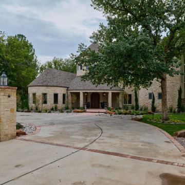
This curb appeal transformation was conceived as a deliberate sequence—an arrival experience where architecture, landscape, and lighting work together as one. Every element was designed to honor the home’s stone construction, turreted forms, and Old World character while responding precisely to the Upper Valley climate and lifestyle.
By day, the experience is grounded and composed. Brick-edged concrete drives establish order and permanence, guiding movement through the property with clarity and intention. Natural stone walls and columns anchor the architecture, while layered gravel beds, drought-tolerant plantings, and manicured turf soften transitions and connect the home to its desert setting. Mature trees were preserved and carefully integrated, providing scale, shade, and a sense of continuity.
As afternoon shifts toward sunset, the materials begin to speak differently. Stone warms, textures deepen, and sightlines subtly draw the eye toward the front entry. The landscape narrows the focus, creating a moment of pause before arrival—calm, quiet, and refined.
At night, the design reveals its final layer. Low-voltage lighting is integrated with precision, washing stone surfaces, tracing architectural curves, and uplighting specimen trees to create depth without glare. The drive, walkways, and entry feel safe, legible, and inviting, while the home itself glows with a restrained elegance. Coming home after dark feels intentional—protected, welcoming, and unmistakably yours.
What was created is more than curb appeal. It is a cohesive design-build solution where nothing is ornamental without purpose and nothing is built without intention. A daily experience of arrival that reflects craftsmanship, care, and the enduring character of the Upper Valley.
 (r)evolution architecture, llc
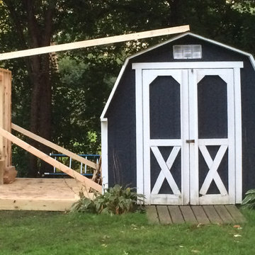
transformation of backyard shed
c.frye
Inspiration for a shed remodel in Chicago
Inspiration for a shed remodel in Chicago
 Hamilton Snowber Architects
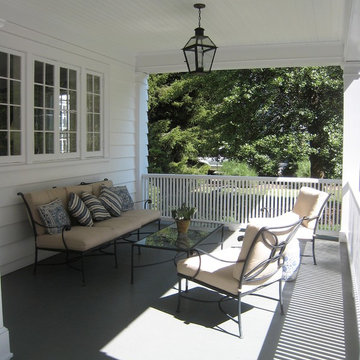
The Village of Chevy Chase is an eclectic mix of early-20th century homes, set within a heavily-treed romantic landscape. The Zantzinger Residence reflects the spirit of the period: it is a center-hall dwelling, but not quite symmetrical, and is covered with large-scale siding and heavy roof overhangs. The delicately-columned front porch sports a Chippendale railing.
The family needed to update the home to meet its needs: new gathering spaces, an enlarged kitchen, and a Master Bedroom suite. The solution includes a two story addition to one side, balancing an existing addition on the other. To the rear, a new one story addition with one continuous roof shelters an outdoor porch and the kitchen.
The kitchen itself is wrapped in glass on three sides, and is centered upon a counter-height table, used for both food preparation and eating. For daily living and entertaining, it has become an important center to the house.

 Miller Landscape Architecture
Julie is passionate about creating living, regenerative spaces for people, plants, and animals. She loves connecting people’s unique stories with the story of their particular space, and bringing this all to life. With years of experience in design-build, Julie also values what it takes to artfully carry the initial glimmer of an idea through to the last stone placed – just as you envisioned it.
Her pioneering involvement with converting pools to rainwater reservoirs landed her in Better Homes & Gardens. She continues to be inspired by opportunities to restore our watersheds, helping clients to integrate both water-wise and fire-wise design solutions.
Within each garden beautifully re-imagined, she invites people to stewardship. Your own piece of the world can actively weave together biodiverse native habitats, build healthy soil, and create a legacy for healthy living beyond your own fence.
Among Julie’ wide array of talents, she’s been known to catch grapes at distances beyond 100 feet. She and her wife, Alice, live with LeoLili the Lion near Alvarado Park in Richmond.
 Century Stair Company
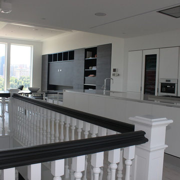
This spectacular straight staircase bridges past and present in an award-winning Georgetown townhouse transformation. Designed to preserve a sense of history within a sleek modern space, it features a striking contrast between stark white balusters, newels, and risers and a bold black handrail. This dramatic interplay of light and dark echoes throughout the rest of the townhouse, creating visual continuity across multiple levels. Natural wood treads ground the design, adding warmth and an organic element that softens the contemporary palette while honoring the home's historical roots.
1976-2026 © Century Stair Company
 Klopf Architecture
Built for the Bluff, A Sea Ranch Home is Remade from the Inside Out
The house had always been grounded, on an ocean bluff at The Sea Ranch. It sits unencumbered, adjacent to one of the most dramatic stretches of the Sonoma coast with protected commons meadow to the east, uninterrupted Pacific views to the west, and a bluff trail running alongside. What it lacked was the feeling of home, one that could hold up its own against the natural landscape.
The owners are entrepreneurs with deep involvement across tech, real estate, and development and they know how things are built. The Sea Ranch house had been in their lives for years, a second residence and a place for family to gather. Built for a different time, it felt more compromising than comfortable. Sitting in a closed off nook, the kitchen fit one cook at a time and turned its back on the rest of the house. The entry was dim and compressed, divided by a structural column that presented itself at exactly the wrong moment. The primary suite was small relative to the view outside it. A large rear bedroom sat behind a lowered ceiling with a bathroom that had never been added. The house was certainly worth the trouble of doing it right.
What followed was not one project but four, each with its own design challenge, each addressed over a period of time.
Where the House Meets the Ocean
The most complex piece of the project, in both structural and spatial terms, was the kitchen expansion. The existing room was a single-person galley squeezed in as an afterthought with no meaningful connection to the dining room, the living space, or the deck outside. To make it useful for a family that cooks and gathers, it needed to grow outward into an existing patio and flow into the rooms around it.
A big challenge was the roofline. Several planes at different pitches and angles converged directly where additional volume was needed. A new form had to join that geometry without reading as a correction. The solution found the simplest possible connection between the existing angles, a roofline that from outside the structure, appears entirely original. From the bluff trail where the addition is visible, there is no discernible seam.
Inside, the kitchen is now open to the living and dining rooms without interruption. A large sliding glass door connects the space onto the rear deck. The deck itself was expanded and oriented so that the body of the house shields it from the coastal wind which is a common consideration that determines whether outdoor space at The Sea Ranch actually gets used. The result is a room that works for large family gatherings where no one feels cutoff, and one that makes the boundary between being inside and outside easy to ignore.
Welcoming Light
A structural column stood at the convergence of eight distinct roof planes in the entry. It was load-bearing, but it was also the reason the entry had always felt like a hallway rather than a welcoming arrival.
With the structural engineer, a custom steel connector was designed to receive beams from six separate directions, redistributing the load through a single new continuous beam. The column was surgically removed. Three triangular skylights were then cut into the roof above, their shapes drawn from the
existing geometry of the planes around them. The entry is now bright and open. The skylights feel native to the structure because they follow the logic already present in the roof.
Two Suites, Two Views
At opposite ends of the house, the two bedroom suites were each reconfigured, and each found a different way to introduce more of the landscape into the room.
An addition to the primary suite extended the structure outward to create a wraparound plan with a loop from the bedroom through bath and closet that had not been possible before. The expansion opened a slot view from the tub and shower toward the ocean. The view is precise and private. The ocean view is present and deliberate.
The rear bedroom absorbed an adjacent storage room to transform it into a full second suite with a vaulted ceiling, a large bathroom with a tub, a shower, and a sauna. A private fenced garden courtyard sits just beyond the glass bringing the outdoors inside. The tub was placed so that, looking past the courtyard and through the bedroom beyond, the ocean is visible at the far end. It is a long view and it makes the room feel larger and more settled than its footprint would suggest.
Glass on Four Sides, Fire at the Center
The main living and gathering room had always been caught between two competing facts: glass on four sides meant exceptional views but at The Sea Ranch, it also meant a cold room. A 360-degree cylindrical fireplace was added at the center on a raised stone base, providing radiant heat in every direction and giving the room a focal point around which a group naturally orients itself, whether that means two people at the end of the day or the whole family after dinner.
Owners Who Picked Up the Tools
The owner was not a passive client. they came with construction knowledge, specific ideas, and the desire to be an active part of the process, a dynamic that other architects may had found difficult, which Klopf Architecture accepted as an asset. They took it upon themselves to complete some of the work during construction, including the installation of a new radiant heating system beneath the floors.
The radiant system added to the older and less-desirable forced-air setup. At The Sea Ranch, that change matters as the house sits close enough to the ocean and moving air competes with the sound of it, where radiant heat does not. Solar panels were added to the roof as part of the new system. Insulation was upgraded throughout the walls, roof, and crawl space. The house that had always had the right setting now holds warmth the way a house on the bluff should.
They were also deeply involved in the design and selections throughout, and the finished house reflects both of them in ways that are specific rather than generic. The process took longer and moved through more iterations than a more arms-length relationship might have allowed. The result is more defined and personal because of it.
The Landscape Holds Priority
Every exterior decision was shaped by The Sea Ranch Design Standards, which require that buildings defer to the landscape around them rather than compete with it. Because this house sits on the bluff and is visible from the public trail, the additions faced a close review. Existing materials were matched. Geometries were resolved. The additions had to become indistinguishable from the original building.
From the trail, the house reads exactly as it always has — low, cedar-clad, secondary to the meadow and the water. The setting holds priority. Inside, the house has been remade.
Klopf Architecture Project Team: Geoff Campen and Trenton Jewett
Contractor: Shawn Bettega Construction
Photography: ©2025 Mariko Reed
Year Completed: 2023
Location: The Sea Ranch, CA
 Advance Design Studio, Ltd.
Jackie and Sean loved the Algonquin neighborhood they lived in with the peaceful neighborhood and the close proximity to work and school. What they didn’t love was how outdated their home had become. With a cramped kitchen and an unused dining room, they decided a remodel was the perfect solution to their problem. They would be able to continue to live in the area they loved, while at the same time they could have the dream home they envisioned.
After a thorough search, Jackie came across Advance Design Studio. She was impressed by all of the positive reviews she saw on the internet and saw herself identifying with all of the project stories she saw on the website. Once they met with designer Scott Christensen and owner Todd Jurs, they knew Advance Design was the right company to make their dreams a reality.
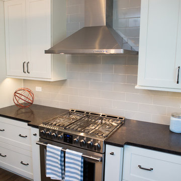
The project consisted of four main areas: the kitchen/dining/powder room, the laundry room, the master bathroom, and the kid’s bathroom. They wanted to expand the kitchen into the seldom used dining room and add a large island for hosting parties and family gatherings. They also wanted new hardwood flooring throughout the first level. The laundry room needed to be more functional, and all three bathrooms were in dire need of updating.
The closed off kitchen was opened up to create a sweeping space between the new eating area and the much larger kitchen. A handsome dry bar complete with a beverage refrigerator and lighted glass door cabinetry makes an elegant transition across from a peninsula area filled with storage. An additional decorative cabinet lighting up elegant dishware through the mullioned glass sits directly across from the drybar.
An expansive island was critical to the kitchen plans. Jackie, Sean and Scott worked closely together to create just the right details for their design. They wanted the island to be functional in addition to being the centerpiece of the room. Added storage for the kid’s school supplies was hidden behind cabinet doors so the children could do their schoolwork right at the island, and a microwave drawer glides open with the touch of a finger hidden inconspicuously within the island space. The easy to care for Cambria Britannica Quartz island top with its sweeping grey and white marble look perched atop hand-carved Craftsman corbels was absolutely what they were hoping for, blending both beauty and function perfectly.
Adding a nice contrast to the brightness of the quartz and the white cabinetry, Kodiak - Leather granite countertops were used to balance the light and dark tones of the space. Dura Supreme Classic White painted cabinets grace the perimeter, while Maple Poppy Seed stained cabinets with a beautiful soft grey woodgrain were used in the beverage center and island. The two tones compliment the large space balancing it out nicely creating interest and elegance with the simple Craftsman style full overlay doors.
A deep warm Barnwood White Oak flooring was added throughout the lower level. The new floor brings additional contrast to the bright kitchen and provides unity with the now open floorplan as it rolls in to the foyer and family room. Final details like the show-stopping lunar like duo light fixtures complete the space and intermix expertly with crisscross details of the glass door mullions, the island bar seating and even accessories in the space.
The small cluttered laundry room needed more space and more storage. With a busy family it seemed to overflow daily and did not have anywhere to hide the families “in and out stuff.” Scott designed the new space with a stackable washer and dryer and much more efficiently organized cabinetry. Doing laundry is now (almost!) a pleasure and keeping everyone’s “stuff” hidden, but readily accessible is now a snap.
The master bath was not a place where the couple enjoyed spending time getting ready for their day. The tub almost never was used, so removing it made it possible to build an extra-large shower, replacing the small cramped cube of the previous shower they hated. Clean, horizontal lines softly draw your eye around the space with porcelain tile called Driftwood Sea spray. Full overlay cabinetry in a soft white vanity with double sinks makes getting ready for the day much more convenient for the busy couple.
Long floor planks made of porcelain tile mimic real hardwood floors in a soft grey to compliment the shower, but with the ease and care of a tile surface. Cambrian Black Granite counters with a matte finish and under mount porcelain sinks with handsome brushed chrome hardware complete the handsome space. A real bonus in any master bath; a custom built in storage nook was tucked in the corner of the space for linens and heavenly storage.
The kid’s bath was in sad shape because it was original to the house. To keep the budget in control, the tub which was in great condition was retained, but focus was on the new large brick style porcelain charcoal tile on the floor, crisp white new Craftsman style cabinetry with pretty furniture details on the corner base, a striking granite top with white under mount porcelain sinks and fresh hardware and faucets. Some beautiful soft grey wood mirrors to match mom and dads were custom sized and placed under new lighting, and 4 hooks were smartly arranged down the wall for kids’ towels.
This couple was determined not to move, and made their house their dream home. Not only does their home function greatly now, but Jackie says, “When the neighbors come to visit, they’re asking if they can “steal” the design”! The added functionality, elegance, and open floor plan were exactly what this family needed in order to stay.
Advance Design Studio, Joe Nowak
 Inspired Remodels
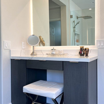
This contemporary kitchen and bath renovation in Tustin celebrates the essence of modern living with clean lines, minimalist finishes, ad nature-inspired details that create a harmonious, elevated atmosphere. In the kitchen, high-gloss white cabinetry offers a crisp, seamless aesthetic that reflects light and enhances the feeling of openness. The richly grained walnut island adds warmth and a textural contrast - a perfect nod to the rising trend of organic modern design. The modern organic theme is continued throughout the home, including the primary and guest bathrooms. With slab front vanities, wood-tone vanities, clean lines and sleek fixtures, get the spa feeling right at home. Drawn to the clean lines and modern warmth of this design? Let Inspired Remodels help you bring your vision to life with thoughtful design, high-end materials, and trend-forward solutions tailored to your lifestyle!
 Drury Design
The existing kitchen wasn’t cutting it anymore. The homeowners designed and built this home about 20 years ago, but since then, their taste and needs changed. The outdated finishes felt outdated. There weren’t enough work areas. Some counterspace stations were just awkward due to the layout. Adjoining spaces around the kitchen were also in need of an update, but it was decided that the kitchen would undergo a transformation first.
Design Objectives
-Rework the overall layout (kitchen, laundry and butler’s pantry) to have a better flow and utilize the space better
-Incorporate materials with wow and pizzazz to reflect the homeowner’s style
-Design large work areas for cooking with two or more people at a time
-Provide seating at an island in addition to table seating
-Update surrounding spaces since the kitchen is open to the rest of the home
Design Challenges:
-Include a vast array of cooking appliances while having enough of cabinet storage
-Adjacent rooms need to feel updated and flow with new Kitchen
-Having multiple focal points with different materials but not have the space feel like a hodge podge
-Provide different task, accent and overall lighting to brighten up space
Design Solutions:
-The homeowner loves to cook and wanted to maximize her abilities. We incorporated a 48” rangetop with a griddle, a single oven, steam oven, microwave drawer and 15” induction cooktop next to a 48” Galley Ideal Workstation with two faucets. In order to have room for all of these appliances, the floor plan needed to accommodate more cabinetry. Both dining room entrances were closed off and the laundry room entrance were moved to the opposite end of the wall to allow two long walls for additional cabinets.
-The existing round columns throughout the first floor were outdated. To keep the architectural element of the columns, we wrapped the new columns to have a square shape with a flat panel on all four sides. Then, we painted them black (to tie in with the kitchen tops and curved hood surround) and added simple crown molding. For the flow of the space, closing up the odd corner that connected the laundry and dining room and relocating both room entrances allowed the space to actually feel larger and more continuous. --Adding the same square columns to the main dining room entrance, by the front door, also tied in the front of the house with the kitchen.
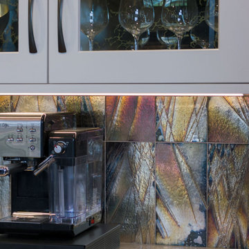
-The homeowner loves unique and bold materials. The main focal point of the kitchen is definitely the custom metal hood that incorporates two finishes and is set on a Lumix quartzite full-high back and side splashes. To make this area even more pronounced, a hearth-like drywall arch encloses the space. Once your eye moves off the hood, you start to notice the mirrored refrigerator panels, high gloss island cabinets, mirrored metal backsplash tile, delicate pendant island lights and the stunning island countertop material! There is a good mix of materials that make every space shine. The blacks, golds and pewter finishes help tie everything together.
-Lighting in a large kitchen is important. This space, besides getting a lot of natural light, needed lots of additional lighting due to the dark finishes. For overall lighting we have plenty of can lights in addition to lighting at the tops of the wall cabinets (that shine on the ceiling), undercabinet task lighting to make the tops sparkle and provide abundant lighting while prepping, pendant accent lighting over the island and a fandolier to add a little sparkle over the pub table. Voila!
 Jennifer Gardner Design
Step into a space that seamlessly blends functional organization, relaxation, and a touch of fun. The renovation journey unfolded with a meticulous focus on the home's architecture, the client's design preferences, and the need for a practical yet stylish family environment.
The primary bathroom takes center stage in promoting relaxation, featuring a spa-like ambiance with soothing colors, heated floors, a beautiful soaking tub, and gentle under-counter lighting creating a tranquil atmosphere. A cleverly integrated cabinet space is also available, providing a discreet storage solution for the less aesthetically pleasing litter box while ensuring easy access for our feline friends.
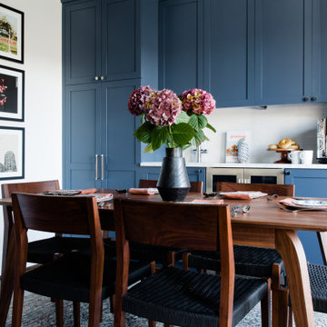
In the kitchen, attention to detail shines through with a stunning wood-trimmed vent hood and wooden pulls that punctuate the Indigo Blue cabinets, introducing natural elements and a touch of warmth. Ample storage was a crucial requirement for this kitchen. Featuring expansive pull-out drawers, a concealed lazy Susan, impressive spice storage, and a discreet power source for the cordless vacuum, every detail has been considered for optimal functionality.
Connected to the kitchen, you'll discover a dining area designed for versatility. This multipurpose zone seamlessly integrates wine storage, pantry space, a dedicated baking center, cocktail preparation area, and a convenient coffee zone.
The main level's powder room pays homage to the homeowners' roots, boasting a vibrant wallpaper by Chasing Paper that adds a playful touch.
The harmonious blend of aesthetics and functionality continues with an additional mixed-use space that serves as a delightful getaway, complete with outdoor access and ample countertop space for both utility and enjoyment. This home is a testament to the artful fusion of design, comfort, and entertainment.
Interior Design by: Jennifer Gardner Design
Photography by: Emily Keeney
 TVL Creative Ltd.
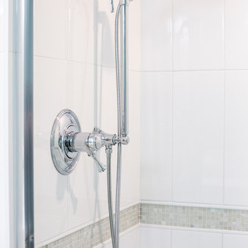
Words cannot describe the level of transformation this beautiful 60’s ranch has undergone. The home was blessed with a ton of natural light, however the sectioned rooms made for large awkward spaces without much functionality. By removing the dividing walls and reworking a few key functioning walls, this home is ready to entertain friends and family for all occasions. The large island has dual ovens for serious bake-off competitions accompanied with an inset induction cooktop equipped with a pop-up ventilation system. Plenty of storage surrounds the cooking stations providing large countertop space and seating nook for two. The beautiful natural quartzite is a show stopper throughout with it’s honed finish and serene blue/green hue providing a touch of color. Mother-of-Pearl backsplash tiles compliment the quartzite countertops and soft linen cabinets. The level of functionality has been elevated by moving the washer & dryer to a newly created closet situated behind the refrigerator and keeps hidden by a ceiling mounted barn-door. The new laundry room and storage closet opposite provide a functional solution for maintaining easy access to both areas without door swings restricting the path to the family room. Full height pantry cabinet make up the rest of the wall providing plenty of storage space and a natural division between casual dining to formal dining. Built-in cabinetry with glass doors provides the opportunity to showcase family dishes and heirlooms accented with in-cabinet lighting. With the wall partitions removed, the dining room easily flows into the rest of the home while maintaining its special moment. A large peninsula divides the kitchen space from the seating room providing plentiful storage including countertop cabinets for hidden storage, a charging nook, and a custom doggy station for the beloved dog with an elevated bowl deck and shallow drawer for leashes and treats! Beautiful large format tiles with a touch of modern flair bring all these spaces together providing a texture and color unlike any other with spots of iridescence, brushed concrete, and hues of blue and green. The original master bath and closet was divided into two parts separated by a hallway and door leading to the outside. This created an itty-bitty bathroom and plenty of untapped floor space with potential! By removing the interior walls and bringing the new bathroom space into the bedroom, we created a functional bathroom and walk-in closet space. By reconfiguration the bathroom layout to accommodate a walk-in shower and dual vanity, we took advantage of every square inch and made it functional and beautiful! A pocket door leads into the bathroom suite and a large full-length mirror on a mosaic accent wall greets you upon entering. To the left is a pocket door leading into the walk-in closet, and to the right is the new master bath. A natural marble floor mosaic in a basket weave pattern is warm to the touch thanks to the heating system underneath. Large format white wall tiles with glass mosaic accent in the shower and continues as a wainscot throughout the bathroom providing a modern touch and compliment the classic marble floor. A crisp white double vanity furniture piece completes the space. The journey of the Yosemite project is one we will never forget. Not only were we given the opportunity to transform this beautiful home into a more functional and beautiful space, we were blessed with such amazing clients who were endlessly appreciative of TVL – and for that we are grateful!
 Schumacher Homes
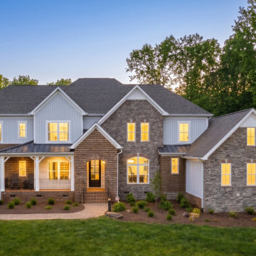
Built by Schumacher Homes, America's Largest Custom Home Builder, this stunning Vinemont American Tradition in Charlotte, North Carolina, effortlessly balances classic architectural details with modern elements. The home commands immediate attention with dramatic, two-story soaring ceilings that bridge the high-end kitchen and great room into a breath-taking central living space. This open layout flows into a bright morning room, creating the perfect transitional space to start your day. Designed for high-performance entertaining and seamless home organization, a secondary "messy kitchen" sits directly off the main living area, serving as the ultimate prep and storage solution complete with built-in shelving to keep cooking clutter entirely out of sight. Off the foyer, organization is made effortless in a custom home office featuring premium flush-mount shelving and built-in cabinets. This dedicated work-from-home space is beautifully separated from the main living areas by a striking sliding barn door, ensuring absolute privacy.
The thoughtful architecture continues into a luxurious main-level primary sanctuary. The deluxe owner’s bath serves as a private, spa-like retreat anchored by a bold black subway tile accent wall and a freestanding soaking tub. Intelligently designed on either side of this central focal point are a spacious glass-enclosed tile shower, dual vanities, expansive independent walk-in closets, and a discrete, enclosed water closet. Upstairs, the home transitions into a dedicated family zone. A huge second-story loft and bonus room offers kids plenty of room to roam, serving as an ideal home for toys, media, and video games. This upper level accommodates three secondary bedrooms, where two bedrooms share a highly practical Jack-and-Jill bath layout while the fourth bedroom features its own independent, private en-suite bathroom.

 Gothic Cabinet Craft
 has made custom furniture for over 40 years. Whether you need a custom fit built-in wall unit of cabinets or a unique piece that until now has only been in your imagination, Gothic can make it for you.
With the American Dream and a lot of hard work. Gothic Cabinet Craft was started in 1969 in NYC by a Greek immigrant Theodore Zaharopoulos, who was determined to make it. With a focus on quality and affordability, our founder's designs evolved into practical storage solutions for urban areas.
The Original ™ Storage, Original ™ Platform, and Original ™ Captains beds were all developed by him and are now a common staple in all furniture stores. A family operated business, Gothic continues to offer high quality affordable furniture for every home. To back this up, Gothic is one of the only furniture companies anywhere in the world to provide a lifetime warranty. Now serving the entire US, Gothic is the largest manufacturer of unfinished furniture on the East Coast.
Gothic Cabinet Craft is a family operated business that manufacturers affordable real wood furniture for every room in your home. Stop into our stores today and experience the Gothic difference.
136