
Search results for "Solving" in Home Design Ideas
 Sosna Inc
ouble the bathroom trouble in this 1990’s home … solved with this Sosna renovation!
Our clients, empty-nesters desiring the peace and ease of retirement, were instead frustrated and exhausted with leaky bathroom plumbing from a previous renovation that would just not go away.
Their Shared Bathroom, renovated by their friend years ago, was not done correctly, causing repetitive leaking with damage to their Kitchen ceiling below. They had had enough of trying to fix it themselves. To say this couple was leery of hiring another renovator was an understatement.
But they also knew it was time to fix this problem and decided to update their Master Bathroom while they were at it.
Our initial plan included minimal demolition by re-organizing the walls between the 2 Bathrooms and keeping the existing plumbing rough-ins in place, while updating the fixtures.
However, unwelcome surprises are sometimes inevitable in renovations. Even though we conducted a thorough investigation during the planning stage, we were faced with plumbing in the Shared Bathroom that was not done correctly and may even have been illegal.
Because of this, relocating the rough-ins in the Shared Bathroom were necessary after all, which then meant re-planning the walls in between the 2 Bathrooms.
These are exactly the kinds of problems we love to solve. Why? Because we know that we’re not just fixing the physical problems that can be seen; we know we are also restoring this family’s faith in quality craftsmanship and good service, and that it’s possible to enjoy the renovation process.
This is why we don’t vary from our tried and true Renovating the Sosna Way™ process.
Because it works. For everyone.
For the Masons, we ended up renovating two bathrooms and completing a number of smaller projects that were causing them great pain to find a renovator for.
At the end of the day, we have another happy client. The Masons have two new bathrooms that better fit their life stage and style, and the “Honey-Do” list is empty!
When you and your home are ready for an upgrade, we're the Renovator You Can Count On™. It's our promise. Contact us to get started!
 Murphy Bros. Design | Build | Remodel
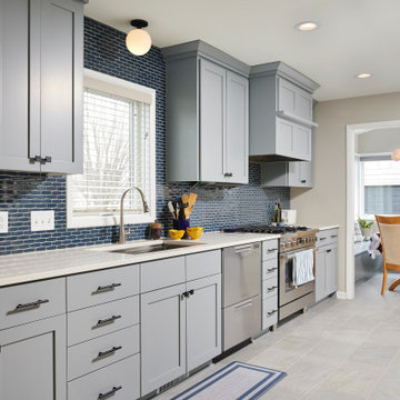
Most people remodel to gain much needed space or for long-ignored aesthetics. In the case of this family, the scope included those traditional pain points as well as the special mobility needs of an aging grandmother.
The core of the project involved tearing down an existing 3-season porch and adding a 10 x 22 4-season porch in its place. This new structure solved the dining area problem and gave them a much-needed mud room space to boot (no pun intended).
The homeowner’s aging parent had difficulty moving through the narrow doorways to and from the kitchen while using her walker. We solved that problem by enlarging those access points and eliminating any thresholds between rooms to make travel even safer for mom.
We also re-sided the home and finished up the project with new front and back doors.
 Sosna Inc
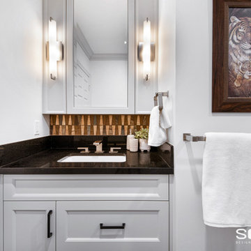
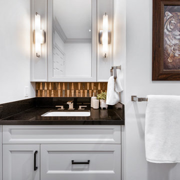
This exciting renovation improved both the look and functionality of our client’s Master Ensuite and Shared Bathroom. Both rooms had both dated aesthetics and dysfunctional layouts, but more importantly, they required updated plumbing due to an old renovation where the plumbing had been done incorrectly and had caused leaking and ceiling damage below.
To solve the leaks, and provide better function in both Bathrooms, fixtures in the Shared Bathroom were relocated, and the previously installed plumbing connections were corrected. This solved the leak issues and provided improved function in both Bathrooms.
A rarely used large corner tub in the Master Ensuite was eliminated to accommodate a spacious walk-in shower with a bench, and a custom wall-to-wall double vanity provided a nice aesthetic and lots of useful storage.
The tub and toilet in the Shared Bathroom were switched and new custom vanity and linen cabinets were installed.
Each Bathroom was given its own distinct look. Porcelain tiles made to look like marble, and mosaics accentuated with patterned floor tiles, luxurious marble knobs and handles, and beautiful jewel faucets gave the Master Ensuite a Transitional charm.
The Shared Bathroom was completed with large format black porcelain tiles with a marble look, glass accent mosaics, and modern plumbing fixtures gave the room an eclectic flair.
The project was finished on time, and our clients couldn’t be happier! They can now enjoy their personalized Shared Bathroom and Master Ensuite, with the comfort of knowing the plumbing is installed correctly.
Find the right local pro for your project
 Advance Design Studio, Ltd.
After six years of living in their Huntley IL home, Chris and Meghan were tired of their dark, dingy, outdated kitchen and it was finally time for a long-anticipated change. “The kitchen is the place where we live, it’s where we do everything,” Meghan said. “It was important that it be a space where we wanted to be.” Meghan loves cooking and enjoys including their girls in healthy meal prepping, this led them to want a brighter, more enjoyable kitchen with increased functionality and improved storage.
For Chris especially, the laundry room was an entirely dysfunctional eyesore. “We had a washer and a dryer, but it was all kind-of cobbled together!” Chris said. “There were always laundry piles everywhere, we weren’t really sure what we wanted to do in there, but it was time for us to make a change.” The mess of the space was stressful every time they walked in the door from the garage each day. Kids’ backpacks and shoes piled up haphazardly in the makeshift boot-bench closet left the family feeling disorganized and stressed. They needed space for folding clothes and locker cubbies to help keep the family organized.
Having known Christine and Todd in the Huntley community for years, Chris and Meghan were familiar with their work. “We already trusted them personally and having seen their projects for years we knew they did top notch work. After we reviewed the initial round of designs, we knew that hiring them was definitely the right choice,” Meghan and Chris said. Although Chris had done a lot of work in their home himself, the kitchen and laundry room renovation was such a large undertaking that he didn’t want to steal time away from his family to spend what would surely be many long weekends doing the job himself. “That would not have been a wise choice for us,” Chris laughed.
“Our designer, Michelle was very, very, easy to work with; anything we wanted to see or weren’t sure about, she went above and beyond to make this easy for us. She was easy to get hold of and always quick to respond,” the couple said. Michelle pulled ideas that mirrored the couple’s taste and style and was adept at directing the couple to limited choices that didn’t overwhelm them and kept the process moving. “I have a hard time making decisions. Michelle made the decision-making process so easy. I loved how she listened to what I liked and then presented three great options for me to choose from,” Meghan said.
The main objectives for the kitchen were better storage solutions, they wanted the space to reflect their lifestyle and taste, and they wanted it to last for years with low maintenance. One of the first steps in creating a more functional kitchen was relocating the refrigerator, creating an improved workflow for the busy family.
“We didn’t know that we could even move the refrigerator to a new location where it is now, that was something that we never would have thought of,” Chris said. “The new refrigerator location makes the kitchen feel so much bigger. We didn’t add any space, but our whole kitchen with the new design just seems like it’s so much larger than before!” Meghan said.
The perimeter mist colored cabinets helped warm and brighten the entire room, while the graphite colored cabinets on the island added contrast. Using this fresh, clean color palette satisfied the couple’s desire for a bright space that was the exact opposite of what they had before. Organization accessories were also added to the cabinets such as a spice drawer tray and roll outs to create hidden convenience.
“I absolutely love the hidden spices – it makes cooking so much more enjoyable!” Chris said. “And all the pull outs, and the double trash bin, who would think you could get so excited about organization!” the couple said in unison.
One thing they hated in their original kitchen was how dark the space felt. Added lighting on the ceiling with the new light fixtures combined with the lighter cabinetry colors throughout solved this problem. “Our new kitchen has this warm, almost cozy feeling that our old kitchen never had, it’s just a space that I love spending my time in now,” Meghan said. The light airy feeling was accentuated with the use of floating white shelves on either side of the decorative range hood. “We have so much cabinetry space, the new design is amazing we actually have more storage space than we will ever need,” Meghan said.
The island was extended to create more work surface and added space for stool seating. “The new island changes how we live. Now the kids can be in the kitchen with us, doing homework, eating breakfast, and the three of us have special dinners there when Chris is working late,” Meghan said.
The Carrara Marmi Quartz countertops were chosen because they are, not only beautiful, but are made from hard-working material that doesn’t require maintenance. The white subway tile backsplash that wraps to the ceiling behind the focal point cooktop range/hood compliments the crisp white countertops perfectly, while brushed brass hardware and light fixtures keep the design fresh and new.
The couple had a few fears at the beginning of the project, as most homeowners do. Their biggest fear was being out of their kitchen and laundry room for an extended time. The crew made it very easy for the family to work in a limited space keeping the washer and dryer hooked up the majority of the time, and also getting appliances working with minimal downtime.
“They above and beyond accommodated us to get us through the process,” Meghan said. “They did a great job making sure we were as comfortable as possible throughout the process,” Chris added.
“Our project manager DJ did a great job. He was very good at updating us on schedule changes, getting guys in as quickly as possible. Everyone that stepped in the house was nice and did great work,” said Chris. They thought Advance’s carpenter was phenomenal and were impressed when he took a conceptual idea from a photograph and worked with designer Michelle to create a one of a kind range/hood that has become the topic of conversation with friends and family who visit the new kitchen. “He was in our house literally every day for several weeks. He was easy to work with and good at what he did,” Meghan and Chris said.
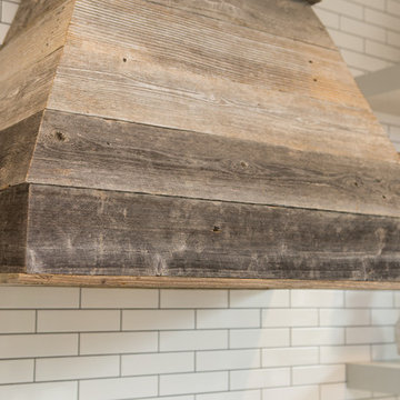
The focal point of the kitchen; a hand-crafted, custom-built ventilation hood was clad with handpicked reclaimed barnwood. Advance Design’s carpenter built the framework and the cladding to create a one-of-a-kind design element that the couple loves.
“I think it was especially fun for him to create something unique from scratch, showcasing his talent in this area,” Meghan said. “I love that my kitchen is not like everyone else’s. I got to pick out the wood on my hood and watch it being built and was able to choose what pieces of wood went where on it. It’s totally unique.”
Red Oak flooring was toothed-in throughout the kitchen and the rest of the first floor anywhere changes were made. Then the whole floor was refinished to tone down the orange undertones in the existing floor stain, ultimately changing the color complexion of the entire first floor. The result is a completely new feeling to the entire home.
Renovating the laundry room was extremely important to Meghan and Chris, but they had trouble visualizing what the possibilities were for the seemingly small space. Michelle produced beautiful 3D illustrations that helped them envision the space in a whole new way.
“I must have told Michelle 100 times that I am a visual person, seeing the designs in 3D made it so easy to make decisions and see what we could really do with our space,” Meghan said.
A dividing wall and doorway were removed between the existing laundry room and hallway formerly containing a coat closet, providing space to design specialized graphite colored cabinetry matching the kitchen island to house custom storage cubbies for each family member. Adding the tall utility cabinetry in the new laundry area helped solve the storage issue, tucking away cleaning supplies, household items, and even the cat got its own cubby.
“I love how everything is now hidden in its own space. I can’t tell you how much I hated coming home and seeing everything sitting around on counters,” Chris said.
Electrical outlets were planned for the inside of utility cabinets, so devices could charge in hidden locations. Stacking the washer and dryer allowed for wider countertop space to provide a folding area and a special space for clothes to hang. “The way I do laundry has been completely transformed! I can actually fold clothes and hang them now right out of the washer and dryer,” Meghan said.
“The end result in the kitchen and the laundry/mud room was an updated light and bright space, with a smarter work flow that better meets the needs of this family,” Michelle said.
“I would totally recommend Advance Design,” Meghan said. “Sometimes I sit and just look at my kitchen and laundry room and think ‘Wow, I can’t believe I get to live here!’ It’s an understatement to say we love our new space.”
 Schulte Design Build
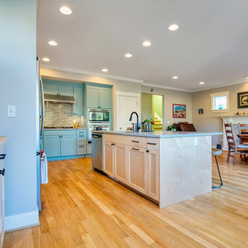
This kitchen project is in a newer build home (2007). The family liked everything about the space except for the island layout and location. Both ends of it were pinch points which made it cumbersome for multiple people to be in the space at a time. They liked the granite countertops but the one on the island was damaged and needed to be replaced to accommodate the new island configuration. Due to this, it made sense to replace all the countertops with quartz. The perimeter cabinets were in good shape but were a dark color which made the space dark and uninviting. We solved this by painting them a bright green/blue color with a two-part water-based paint. We added a couple of other cabinets in the adjacent spaces to provide them with more needed storage which did not impact the kitchen space. We relocated the existing 3 recessed lights over the island which saved them from the landfill. We replaced the old under cabinet fluorescent light fixtures with new energy efficient LED channel fixtures that provide much better counter task lighting. We painted both the ceiling and walls to freshen up the space. As you can see, we were able to solve this family’s kitchen problems in both an environmentally and budget conscious way with creative solutions.
 Drury Design
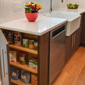
The owners of this true mid-century ranch in Wheaton were ready for a kitchen update. The home’s main living room area is decorated in a very cool, sparse way with plenty of nods to mid-century design. A new kitchen would need to bridge classic and modern notions of Mid-Century expression through the style’s characteristic clean lines and artistic notions of simplicity and straightforward functionality.
The idea was to keep a hint of mid-century influence in a modern design that could somehow be more open while accommodating more storage
The objectives were:
• Stay within the existing space while creating an open feel and winning more storage room
• Make the space brighter while using a darker cabinet finish
• Create proper ventilation for the range
Design challenges we solved for:
• Open the kitchen to the adjacent dining room without sacrificing storage
• Remove multiple layers of flooring to make the kitchen floor level with the rest of the house
• Match the new kitchen flooring to the flooring in nearby dining and living spaces
Problems solved. Here’s what we did:
• Took out soffits around the kitchen to allow for taller cabinets with more storage
• Added cabinet pull-outs that maximize under-cabinet storage space
• Used large cabinets in standard sizes
• Skipped cabinets on the window wall, opting for space- and light-friendly floating shelves
• Enhanced overall brightness with bright, white counters and textured white tile that offered a connecting contrast to the darker woodgrain cabinets
• Took out a post between the kitchen and dining room to make the space feel more open
• Added under-cabinet lights – unobtrusive and handy for task lighting
The owners love the look, feel and functionality of their new kitchen. Its sleek, modern character and notions of mid-century spirit add new excitement to the home’s original 1958 personality.
 Bloomin Blinds of North Charlotte
Discover how premium light-filtering materials and smart-home automation can secure street-level entryway glass without losing natural daylight.
Choosing the right window treatments for a home's front entrance is one of the most challenging design decisions a homeowner can face. The front door is the focal point of a home's curb appeal, often featuring expansive glass panels or side-by-side double doors designed to make a grand architectural statement.
During the day, these large glass features are an asset, flooding entryways and foyers with beautiful natural daylight. However, for homes situated on busy local roads or highly trafficked street-level lots, the dynamic completely changes once the sun goes down.
The moment interior lights are switched on in the evening, a stark contrast is created with the dark outdoors. This creates a severe privacy issue, leaving the entire foyer completely exposed to passing traffic and pedestrians. Finding a solution that delivers absolute evening privacy without permanently plunging the front entrance into darkness during the day requires understanding how modern window treatment materials and operating systems interact.
Light-Filtering vs. Blackout Fabrics
The first step in solving street-level privacy is selecting the correct fabric type. Many homeowners mistakenly assume they need heavy, opaque blackout shades to secure their home from outside eyes at night. While blackout fabrics certainly block 100% of the view, they also block 100% of the natural daylight during the day, forcing you to constantly raise and lower the shades just to see inside your own foyer.
A more effective approach for entryways utilizes premium light-filtering materials. These specialized fabrics are engineered with a precise, tight weave that operates on the principles of directional light and optical density.
Daytime Functionality: When the sun is shining outside, the exterior light levels are significantly higher than the interior light levels. The light-filtering fabric diffuses the intense, direct sunlight into a soft, ambient glow throughout the entryway. This keeps the home bright, eliminates harsh glares, and protects interior hardwood flooring, paint, and trim from damaging UV rays.
Night-Time Functionality: At night, the lighting dynamic reverses. The interior foyer lights make the inside bright, while the outside is dark. Because of the specialized tight weave, the fabric blocks the transmission of clear shapes and details. To a person standing out on the street or driving by on a busy road, the view inside is completely obstructed, delivering total privacy when the family is home for the evening.
Challenges of Front Door Installations
Securing privacy for a double wide front entrance introduces unique structural hurdles that standard windows do not face. Traditional blinds with hanging cords or manual pull chains are poorly suited for front doors. They disrupt the clean architectural lines of a grand foyer, create a safety hazard, and can easily get tangled or damaged when the doors are opened and closed.
The window treatments must be mounted high and wide enough above the door trim to ensure that the front doors can swing open and close freely without ever catching on the fabric or the lower hem bar.
How We Applied These Principles in Sherrills Ford, NC
Applying these exact educational principles to real-world homes is what Cole and I do every day at Bloomin' Blinds of North Charlotte. We recently worked with a homeowner in Sherrills Ford whose beautiful new construction property sat on a highly trafficked road. They loved their double wide front door entrance but felt entirely too exposed to the street at night.
We brought our mobile showroom directly to their driveway. This allowed us to hold up premium light-filtering fabric samples directly against their entryway glass, matching the materials perfectly to their home's natural lighting, interior paint, and trim before making a single cut.
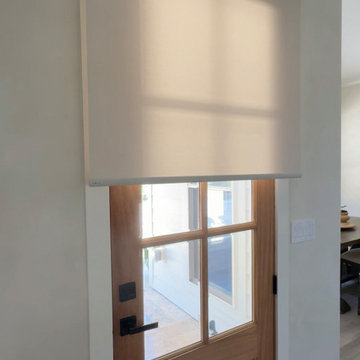
To solve their street-level privacy issue, we custom-built and installed two matching light-filtering roller shades, mounting them flawlessly side-by-side above the front door frame. To keep the home’s interior design completely cohesive, we carried the exact same style to the back of the house, installing a matching single roller shade on the rear door.
Smart Home Window Automation at Your Fingertips
Because entryway windows can be tall and awkward to reach manually, our family team integrated advanced smart-home motorization into this Sherrills Ford project.
Beyond the convenience of a handheld remote control, these automated roller shades feature seamless Wi-Fi integration. The homeowners can control their privacy through a dedicated smartphone app or link the system directly to their existing voice-activated smart home networks, including Amazon Alexa, Google Assistant, and Apple HomeKit.
This allows for complete hands-free window automation. The clients can program custom daily routines—such as setting the front entry shades to automatically lower exactly at sunset—or simply use a voice command to secure the foyer instantly from the comfort of the couch.
 Sosna Inc
ouble the bathroom trouble in this 1990’s home … solved with this Sosna renovation!
Our clients, empty-nesters desiring the peace and ease of retirement, were instead frustrated and exhausted with leaky bathroom plumbing from a previous renovation that would just not go away.
Their Shared Bathroom, renovated by their friend years ago, was not done correctly, causing repetitive leaking with damage to their Kitchen ceiling below. They had had enough of trying to fix it themselves. To say this couple was leery of hiring another renovator was an understatement.
But they also knew it was time to fix this problem and decided to update their Master Bathroom while they were at it.
Our initial plan included minimal demolition by re-organizing the walls between the 2 Bathrooms and keeping the existing plumbing rough-ins in place, while updating the fixtures.
However, unwelcome surprises are sometimes inevitable in renovations. Even though we conducted a thorough investigation during the planning stage, we were faced with plumbing in the Shared Bathroom that was not done correctly and may even have been illegal.
Because of this, relocating the rough-ins in the Shared Bathroom were necessary after all, which then meant re-planning the walls in between the 2 Bathrooms.
These are exactly the kinds of problems we love to solve. Why? Because we know that we’re not just fixing the physical problems that can be seen; we know we are also restoring this family’s faith in quality craftsmanship and good service, and that it’s possible to enjoy the renovation process.
This is why we don’t vary from our tried and true Renovating the Sosna Way™ process.
Because it works. For everyone.
For the Masons, we ended up renovating two bathrooms and completing a number of smaller projects that were causing them great pain to find a renovator for.
At the end of the day, we have another happy client. The Masons have two new bathrooms that better fit their life stage and style, and the “Honey-Do” list is empty!
When you and your home are ready for an upgrade, we're the Renovator You Can Count On™. It's our promise. Contact us to get started!
 Drury Design
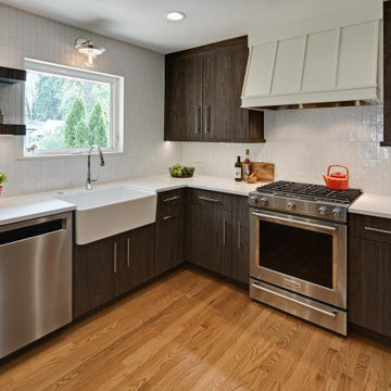
The owners of this true mid-century ranch in Wheaton were ready for a kitchen update. The home’s main living room area is decorated in a very cool, sparse way with plenty of nods to mid-century design. A new kitchen would need to bridge classic and modern notions of Mid-Century expression through the style’s characteristic clean lines and artistic notions of simplicity and straightforward functionality.
The idea was to keep a hint of mid-century influence in a modern design that could somehow be more open while accommodating more storage
The objectives were:
• Stay within the existing space while creating an open feel and winning more storage room
• Make the space brighter while using a darker cabinet finish
• Create proper ventilation for the range
Design challenges we solved for:
• Open the kitchen to the adjacent dining room without sacrificing storage
• Remove multiple layers of flooring to make the kitchen floor level with the rest of the house
• Match the new kitchen flooring to the flooring in nearby dining and living spaces
Problems solved. Here’s what we did:
• Took out soffits around the kitchen to allow for taller cabinets with more storage
• Added cabinet pull-outs that maximize under-cabinet storage space
• Used large cabinets in standard sizes
• Skipped cabinets on the window wall, opting for space- and light-friendly floating shelves
• Enhanced overall brightness with bright, white counters and textured white tile that offered a connecting contrast to the darker woodgrain cabinets
• Took out a post between the kitchen and dining room to make the space feel more open
• Added under-cabinet lights – unobtrusive and handy for task lighting
The owners love the look, feel and functionality of their new kitchen. Its sleek, modern character and notions of mid-century spirit add new excitement to the home’s original 1958 personality.
 Advance Design Studio, Ltd.
After six years of living in their Huntley IL home, Chris and Meghan were tired of their dark, dingy, outdated kitchen and it was finally time for a long-anticipated change. “The kitchen is the place where we live, it’s where we do everything,” Meghan said. “It was important that it be a space where we wanted to be.” Meghan loves cooking and enjoys including their girls in healthy meal prepping, this led them to want a brighter, more enjoyable kitchen with increased functionality and improved storage.
For Chris especially, the laundry room was an entirely dysfunctional eyesore. “We had a washer and a dryer, but it was all kind-of cobbled together!” Chris said. “There were always laundry piles everywhere, we weren’t really sure what we wanted to do in there, but it was time for us to make a change.” The mess of the space was stressful every time they walked in the door from the garage each day. Kids’ backpacks and shoes piled up haphazardly in the makeshift boot-bench closet left the family feeling disorganized and stressed. They needed space for folding clothes and locker cubbies to help keep the family organized.
Having known Christine and Todd in the Huntley community for years, Chris and Meghan were familiar with their work. “We already trusted them personally and having seen their projects for years we knew they did top notch work. After we reviewed the initial round of designs, we knew that hiring them was definitely the right choice,” Meghan and Chris said. Although Chris had done a lot of work in their home himself, the kitchen and laundry room renovation was such a large undertaking that he didn’t want to steal time away from his family to spend what would surely be many long weekends doing the job himself. “That would not have been a wise choice for us,” Chris laughed.
“Our designer, Michelle was very, very, easy to work with; anything we wanted to see or weren’t sure about, she went above and beyond to make this easy for us. She was easy to get hold of and always quick to respond,” the couple said. Michelle pulled ideas that mirrored the couple’s taste and style and was adept at directing the couple to limited choices that didn’t overwhelm them and kept the process moving. “I have a hard time making decisions. Michelle made the decision-making process so easy. I loved how she listened to what I liked and then presented three great options for me to choose from,” Meghan said.
The main objectives for the kitchen were better storage solutions, they wanted the space to reflect their lifestyle and taste, and they wanted it to last for years with low maintenance. One of the first steps in creating a more functional kitchen was relocating the refrigerator, creating an improved workflow for the busy family.
“We didn’t know that we could even move the refrigerator to a new location where it is now, that was something that we never would have thought of,” Chris said. “The new refrigerator location makes the kitchen feel so much bigger. We didn’t add any space, but our whole kitchen with the new design just seems like it’s so much larger than before!” Meghan said.
The perimeter mist colored cabinets helped warm and brighten the entire room, while the graphite colored cabinets on the island added contrast. Using this fresh, clean color palette satisfied the couple’s desire for a bright space that was the exact opposite of what they had before. Organization accessories were also added to the cabinets such as a spice drawer tray and roll outs to create hidden convenience.
“I absolutely love the hidden spices – it makes cooking so much more enjoyable!” Chris said. “And all the pull outs, and the double trash bin, who would think you could get so excited about organization!” the couple said in unison.
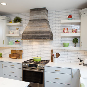
One thing they hated in their original kitchen was how dark the space felt. Added lighting on the ceiling with the new light fixtures combined with the lighter cabinetry colors throughout solved this problem. “Our new kitchen has this warm, almost cozy feeling that our old kitchen never had, it’s just a space that I love spending my time in now,” Meghan said. The light airy feeling was accentuated with the use of floating white shelves on either side of the decorative range hood. “We have so much cabinetry space, the new design is amazing we actually have more storage space than we will ever need,” Meghan said.
The island was extended to create more work surface and added space for stool seating. “The new island changes how we live. Now the kids can be in the kitchen with us, doing homework, eating breakfast, and the three of us have special dinners there when Chris is working late,” Meghan said.
The Carrara Marmi Quartz countertops were chosen because they are, not only beautiful, but are made from hard-working material that doesn’t require maintenance. The white subway tile backsplash that wraps to the ceiling behind the focal point cooktop range/hood compliments the crisp white countertops perfectly, while brushed brass hardware and light fixtures keep the design fresh and new.
The couple had a few fears at the beginning of the project, as most homeowners do. Their biggest fear was being out of their kitchen and laundry room for an extended time. The crew made it very easy for the family to work in a limited space keeping the washer and dryer hooked up the majority of the time, and also getting appliances working with minimal downtime.
“They above and beyond accommodated us to get us through the process,” Meghan said. “They did a great job making sure we were as comfortable as possible throughout the process,” Chris added.
“Our project manager DJ did a great job. He was very good at updating us on schedule changes, getting guys in as quickly as possible. Everyone that stepped in the house was nice and did great work,” said Chris. They thought Advance’s carpenter was phenomenal and were impressed when he took a conceptual idea from a photograph and worked with designer Michelle to create a one of a kind range/hood that has become the topic of conversation with friends and family who visit the new kitchen. “He was in our house literally every day for several weeks. He was easy to work with and good at what he did,” Meghan and Chris said.
The focal point of the kitchen; a hand-crafted, custom-built ventilation hood was clad with handpicked reclaimed barnwood. Advance Design’s carpenter built the framework and the cladding to create a one-of-a-kind design element that the couple loves.
“I think it was especially fun for him to create something unique from scratch, showcasing his talent in this area,” Meghan said. “I love that my kitchen is not like everyone else’s. I got to pick out the wood on my hood and watch it being built and was able to choose what pieces of wood went where on it. It’s totally unique.”
Red Oak flooring was toothed-in throughout the kitchen and the rest of the first floor anywhere changes were made. Then the whole floor was refinished to tone down the orange undertones in the existing floor stain, ultimately changing the color complexion of the entire first floor. The result is a completely new feeling to the entire home.
Renovating the laundry room was extremely important to Meghan and Chris, but they had trouble visualizing what the possibilities were for the seemingly small space. Michelle produced beautiful 3D illustrations that helped them envision the space in a whole new way.
“I must have told Michelle 100 times that I am a visual person, seeing the designs in 3D made it so easy to make decisions and see what we could really do with our space,” Meghan said.
A dividing wall and doorway were removed between the existing laundry room and hallway formerly containing a coat closet, providing space to design specialized graphite colored cabinetry matching the kitchen island to house custom storage cubbies for each family member. Adding the tall utility cabinetry in the new laundry area helped solve the storage issue, tucking away cleaning supplies, household items, and even the cat got its own cubby.
“I love how everything is now hidden in its own space. I can’t tell you how much I hated coming home and seeing everything sitting around on counters,” Chris said.
Electrical outlets were planned for the inside of utility cabinets, so devices could charge in hidden locations. Stacking the washer and dryer allowed for wider countertop space to provide a folding area and a special space for clothes to hang. “The way I do laundry has been completely transformed! I can actually fold clothes and hang them now right out of the washer and dryer,” Meghan said.
“The end result in the kitchen and the laundry/mud room was an updated light and bright space, with a smarter work flow that better meets the needs of this family,” Michelle said.
“I would totally recommend Advance Design,” Meghan said. “Sometimes I sit and just look at my kitchen and laundry room and think ‘Wow, I can’t believe I get to live here!’ It’s an understatement to say we love our new space.”
 Mottram Architecture
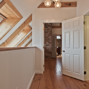
The builder laid custom wide plank flooring in the upstairs hall and flex space stained to match the existing woodwork of the timber frame construction.
Timber frame homes offer unique challenges during a remodel. What often makes them beautiful and attractive to most homeowners, also makes them challenging for space requirements.
Context: The lovely couple that owned this home were struggling with some interesting floor plan challenges that just didn't work for their family. The loved the beautiful timbers and woodwork of their home, but the dramatically sloping ceilings on the second floor, particularly in the bathroom, just didn't work for this 1 1/2 bath home. Needing to use the skylight to approach the toilet was a less then ideal scenario. Although the bathroom footprint was more then adequate, the sloped ceiling only made half of the space useable. Check out the Before/After post on our blog to see the photos of the house pre-renovation. As much as they loved all the wood features in their home, another challenge they had was light. The wood ceiling made everything inside the house darker, even with a fantastic array of south facing windows, there were spaces in the home that felt dark and small. When they contacted us they wanted to know how could they make their brighter and more inviting, were there solutions to the 2nd floor sloped ceiling issues, and if they were going to do all of this work, how could they make their home more comfortable and efficient. A nagging water leak in the upstairs bathroom spurred them into action and here is how we solved their dilemma.
Conclusion: First, we added a little dormer to the rear of the house so we could get full headroom in nearly all of the upstairs bathroom! Then we decided to extend that dormer one more timber bay over to create a walk in closet with natural light and plenty of space. Since we were contemplating energy efficiency, we resolved a nagging issue that is present in a lot of timber frame construction, air tightness. Commonly found in timber frame construction, fiberglass insulation is installed in the rafter bays and board ceilings are installed over top. Unfortunately, board ceilings are anything but air tight, and fiberglass insulation needs to be in an airtight cavity for maximum effectiveness. So we were able to solve two issues at the same time for this homeowner. We removed the board ceiling and fiberglass insulation, we dense packed the rafter bays with cellulose insulation, and installed sheetrock in place of the boards. The boards were salvaged for re-use by the homeowner, and the space and light quality was dramatically improved. Some may think that losing the board ceiling took something away from the space, but what you'll see in the pictures is that it highly accentuates the heavy timbers and really makes them stand out in a beautiful way. Now with this added airtightness, better insulation, and brighter space, the homeowner hardly runs their wood stove, and it's so quiet in the space, an added bonus from changing the insulation. It became necessary to also add a sheetrock ceiling to the living room to hide the plumbing from the new bathroom layout above. Changing this ceiling gave the homeowner some real quality lighting that was lacking in the living room before. The brighter ceiling and new lighting layout completely transforms the living room into a space you want to hang out, even though the layout didn't change at all. When the homeowner saw the finished spaces she said "I can't believe this is my house, I want to live in this house"
Energy Efficiency: I touched a little on the efficiency above, but like all projects done with Mottram Architecture, we always want to leave you with a little extra. Timber frame construction with board ceilings and fiberglass insulation are notoriously leaky! If you want to know what we think about fiberglass insulation, check our our blog post on Why Fiberglass Insulation Sucks. By installing cellulose insulation and covering it with sheetrock we were able to greatly reduce the heat flowing out of this home. It not only improves cashflow it improves the comfort level in the space. Who wants to sit in their living room and feel a draft? Let us remind you, we are not saying cellulose insulation is an air barrier, we use the sheetrock to help with that, but it does significantly reduce the air flow over fiberglass insulation. And when we reduce the airflow, we reduce the heat flow. And when we reduce the heat flow, we reduce the need to re-heat that drafty air from outside. When it comes to energy efficiency the first and best place to start is air infiltration. We greatly reduced the air infiltration with the new insulation, but we also added a hat and warm boots. What I mean by that is, we improved the insulation in the roof, and we installed insulation in the basement. Maybe it's a silly analogy, but when you think about keeping warm, we always start with the hat and boots! With sustainability in mind, the next project will be to add a deck to the front of this house with rain catchment barrels from the metal roof. They are planning to plant a garden in the spring and the rain catchment system will help to irrigate the new garden.
Builder: East Shore Builders
Photographer: Michael Eric Berube
 East Spruce design / build
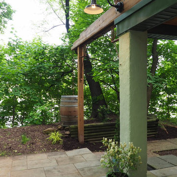
Our client asked for a more functional and visually pleasing backdrop to his outdoor patio space. The result incorporates lighting, fresh paint, and touches of aged wood trim, to give an old-world European feel. The feature of the design solves a problem our client did not realize he had. A broken and leaking downspout led to deterioration of the home’s stucco finish. To solve this problem and route the water away from the outdoor entertaining space, we constructed a large scupper which also serves as a gateway/arbor. Rainwater harvesting and use of thermally modified wood add points for sustainability.
 Sosna Inc
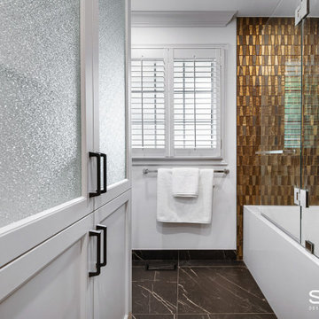
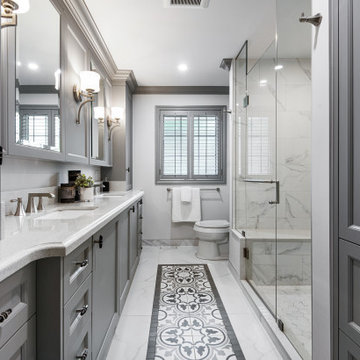
This exciting renovation improved both the look and functionality of our client’s Master Ensuite and Shared Bathroom. Both rooms had both dated aesthetics and dysfunctional layouts, but more importantly, they required updated plumbing due to an old renovation where the plumbing had been done incorrectly and had caused leaking and ceiling damage below.
To solve the leaks, and provide better function in both Bathrooms, fixtures in the Shared Bathroom were relocated, and the previously installed plumbing connections were corrected. This solved the leak issues and provided improved function in both Bathrooms.
A rarely used large corner tub in the Master Ensuite was eliminated to accommodate a spacious walk-in shower with a bench, and a custom wall-to-wall double vanity provided a nice aesthetic and lots of useful storage.
The tub and toilet in the Shared Bathroom were switched and new custom vanity and linen cabinets were installed.
Each Bathroom was given its own distinct look. Porcelain tiles made to look like marble, and mosaics accentuated with patterned floor tiles, luxurious marble knobs and handles, and beautiful jewel faucets gave the Master Ensuite a Transitional charm.
The Shared Bathroom was completed with large format black porcelain tiles with a marble look, glass accent mosaics, and modern plumbing fixtures gave the room an eclectic flair.
The project was finished on time, and our clients couldn’t be happier! They can now enjoy their personalized Shared Bathroom and Master Ensuite, with the comfort of knowing the plumbing is installed correctly.
 Garden Gate Landscaping
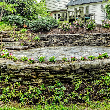
Irregular flagstone patio with stone seat wall and drainage issues solved. New, updated plantings. Renovated upper patio with added lower patio.
Charles W. Bowers/Garden Gate Landscaping, Inc.
 Sosna Inc
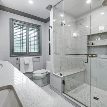
This exciting renovation improved both the look and functionality of our client’s Master Ensuite and Shared Bathroom. Both rooms had both dated aesthetics and dysfunctional layouts, but more importantly, they required updated plumbing due to an old renovation where the plumbing had been done incorrectly and had caused leaking and ceiling damage below.
To solve the leaks, and provide better function in both Bathrooms, fixtures in the Shared Bathroom were relocated, and the previously installed plumbing connections were corrected. This solved the leak issues and provided improved function in both Bathrooms.
A rarely used large corner tub in the Master Ensuite was eliminated to accommodate a spacious walk-in shower with a bench, and a custom wall-to-wall double vanity provided a nice aesthetic and lots of useful storage.
The tub and toilet in the Shared Bathroom were switched and new custom vanity and linen cabinets were installed.
Each Bathroom was given its own distinct look. Porcelain tiles made to look like marble, and mosaics accentuated with patterned floor tiles, luxurious marble knobs and handles, and beautiful jewel faucets gave the Master Ensuite a Transitional charm.
The Shared Bathroom was completed with large format black porcelain tiles with a marble look, glass accent mosaics, and modern plumbing fixtures gave the room an eclectic flair.
The project was finished on time, and our clients couldn’t be happier! They can now enjoy their personalized Shared Bathroom and Master Ensuite, with the comfort of knowing the plumbing is installed correctly.
 F9 Productions Inc.
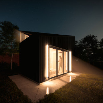
In an era when housing is becoming increasingly scarce, small structures are making a big difference. The Crystal ADU is one of them — a compact, beautifully detailed dwelling designed by F9 Productions to deliver both function and artistry within just 160 square feet.
The Idea
The client came to F9 with their own sketches — early ideas drawn from the fractured symmetry of natural crystals. They envisioned a minimalist refuge that was as expressive as it was efficient.
We took that spark and shaped it into a refined architectural statement: a simple rectangle capped by a striking, asymmetrical roof that catches the light like a cut gem.
Design and Craft
The defining detail — a roof so thin it appears almost weightless — demanded careful problem-solving. Standard framing would have compromised the delicate profile. Instead, our team engineered a custom edge detail that maintains the sleek form while ensuring structural integrity and energy performance.
This kind of precision is what transforms a small project into a showcase of design craft.
Inside the Space
Step inside, and the attention to detail continues.
Every square inch is intentional. Built-in cabinetry wraps the walls, and a fold-down Murphy bed disappears to reveal open living space. In the bathroom, clever storage niches and a tankless water heater make the most of every inch. A skylight above the shower floods the space with natural light — warm, private, and bright.
Efficiency in Every Sense
Compact living comes with natural advantages. The small volume of the Crystal ADU reduces energy use, while a ductless mini-split system maintains comfort year-round.
This simplicity makes the building both efficient and elegant — a perfect reflection of F9’s design philosophy: functional minimalism with a human touch.
The Result
The Crystal ADU shows that size doesn’t define quality — design does.
It’s a small footprint with a big message: that thoughtful architecture can solve real housing challenges while creating spaces people love to inhabit.
The future of housing may be smaller, but with projects like this, it’s infinitely brighter.
 Mottram Architecture
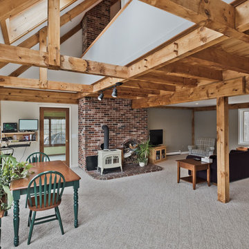
Timber frame homes offer unique challenges during a remodel. What often makes them beautiful and attractive to most homeowners, also makes them challenging for space requirements.
Context: The lovely couple that owned this home were struggling with some interesting floor plan challenges that just didn't work for their family. The loved the beautiful timbers and woodwork of their home, but the dramatically sloping ceilings on the second floor, particularly in the bathroom, just didn't work for this 1 1/2 bath home. Needing to use the skylight to approach the toilet was a less then ideal scenario. Although the bathroom footprint was more then adequate, the sloped ceiling only made half of the space useable. Check out the Before/After post on our blog to see the photos of the house pre-renovation. As much as they loved all the wood features in their home, another challenge they had was light. The wood ceiling made everything inside the house darker, even with a fantastic array of south facing windows, there were spaces in the home that felt dark and small. When they contacted us they wanted to know how could they make their brighter and more inviting, were there solutions to the 2nd floor sloped ceiling issues, and if they were going to do all of this work, how could they make their home more comfortable and efficient. A nagging water leak in the upstairs bathroom spurred them into action and here is how we solved their dilemma.
Conclusion: First, we added a little dormer to the rear of the house so we could get full headroom in nearly all of the upstairs bathroom! Then we decided to extend that dormer one more timber bay over to create a walk in closet with natural light and plenty of space. Since we were contemplating energy efficiency, we resolved a nagging issue that is present in a lot of timber frame construction, air tightness. Commonly found in timber frame construction, fiberglass insulation is installed in the rafter bays and board ceilings are installed over top. Unfortunately, board ceilings are anything but air tight, and fiberglass insulation needs to be in an airtight cavity for maximum effectiveness. So we were able to solve two issues at the same time for this homeowner. We removed the board ceiling and fiberglass insulation, we dense packed the rafter bays with cellulose insulation, and installed sheetrock in place of the boards. The boards were salvaged for re-use by the homeowner, and the space and light quality was dramatically improved. Some may think that losing the board ceiling took something away from the space, but what you'll see in the pictures is that it highly accentuates the heavy timbers and really makes them stand out in a beautiful way. Now with this added airtightness, better insulation, and brighter space, the homeowner hardly runs their wood stove, and it's so quiet in the space, an added bonus from changing the insulation. It became necessary to also add a sheetrock ceiling to the living room to hide the plumbing from the new bathroom layout above. Changing this ceiling gave the homeowner some real quality lighting that was lacking in the living room before. The brighter ceiling and new lighting layout completely transforms the living room into a space you want to hang out, even though the layout didn't change at all. When the homeowner saw the finished spaces she said "I can't believe this is my house, I want to live in this house"
Energy Efficiency: I touched a little on the efficiency above, but like all projects done with Mottram Architecture, we always want to leave you with a little extra. Timber frame construction with board ceilings and fiberglass insulation are notoriously leaky! If you want to know what we think about fiberglass insulation, check our our blog post on Why Fiberglass Insulation Sucks. By installing cellulose insulation and covering it with sheetrock we were able to greatly reduce the heat flowing out of this home. It not only improves cashflow it improves the comfort level in the space. Who wants to sit in their living room and feel a draft? Let us remind you, we are not saying cellulose insulation is an air barrier, we use the sheetrock to help with that, but it does significantly reduce the air flow over fiberglass insulation. And when we reduce the airflow, we reduce the heat flow. And when we reduce the heat flow, we reduce the need to re-heat that drafty air from outside. When it comes to energy efficiency the first and best place to start is air infiltration. We greatly reduced the air infiltration with the new insulation, but we also added a hat and warm boots. What I mean by that is, we improved the insulation in the roof, and we installed insulation in the basement. Maybe it's a silly analogy, but when you think about keeping warm, we always start with the hat and boots! With sustainability in mind, the next project will be to add a deck to the front of this house with rain catchment barrels from the metal roof. They are planning to plant a garden in the spring and the rain catchment system will help to irrigate the new garden.
Builder: East Shore Builders
Photographer: Michael Eric Berube
 Anthony J. Vallée
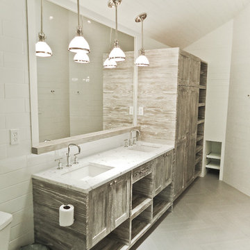
The client was excited to purchase a home in the beautiful resort of Sandestin, but was not pleased with the dark interiors, heavy mouldings, tile floors, dated fixtures and heavy feel of the interior of the home. We solved their problems by completely renovating the interiors. Ceilings were raised, floors were replaced, cabinetry and fixtures were replaced and a problem area in the living room was solved. They now have the open, clean, airy beach home of their dreams and I couldn't be more pleased with how this home turned out for them.
anthony vallee
 Anthony J. Vallée
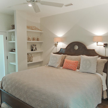
The client was excited to purchase a home in the beautiful resort of Sandestin, but was not pleased with the dark interiors, heavy mouldings, tile floors, dated fixtures and heavy feel of the interior of the home. We solved their problems by completely renovating the interiors. Ceilings were raised, floors were replaced, cabinetry and fixtures were replaced and a problem area in the living room was solved. They now have the open, clean, airy beach home of their dreams and I couldn't be more pleased with how this home turned out for them.
anthony vallee
 Anthony J. Vallée
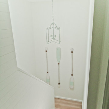
The client was excited to purchase a home in the beautiful resort of Sandestin, but was not pleased with the dark interiors, heavy mouldings, tile floors, dated fixtures and heavy feel of the interior of the home. We solved their problems by completely renovating the interiors. Ceilings were raised, floors were replaced, cabinetry and fixtures were replaced and a problem area in the living room was solved. They now have the open, clean, airy beach home of their dreams and I couldn't be more pleased with how this home turned out for them.
anthony vallee
29