
Search results for "Sound processes" in Home Design Ideas
 Klopf Architecture
Built for the Bluff, A Sea Ranch Home is Remade from the Inside Out
The house had always been grounded, on an ocean bluff at The Sea Ranch. It sits unencumbered, adjacent to one of the most dramatic stretches of the Sonoma coast with protected commons meadow to the east, uninterrupted Pacific views to the west, and a bluff trail running alongside. What it lacked was the feeling of home, one that could hold up its own against the natural landscape.
The owners are entrepreneurs with deep involvement across tech, real estate, and development and they know how things are built. The Sea Ranch house had been in their lives for years, a second residence and a place for family to gather. Built for a different time, it felt more compromising than comfortable. Sitting in a closed off nook, the kitchen fit one cook at a time and turned its back on the rest of the house. The entry was dim and compressed, divided by a structural column that presented itself at exactly the wrong moment. The primary suite was small relative to the view outside it. A large rear bedroom sat behind a lowered ceiling with a bathroom that had never been added. The house was certainly worth the trouble of doing it right.
What followed was not one project but four, each with its own design challenge, each addressed over a period of time.
Where the House Meets the Ocean
The most complex piece of the project, in both structural and spatial terms, was the kitchen expansion. The existing room was a single-person galley squeezed in as an afterthought with no meaningful connection to the dining room, the living space, or the deck outside. To make it useful for a family that cooks and gathers, it needed to grow outward into an existing patio and flow into the rooms around it.
A big challenge was the roofline. Several planes at different pitches and angles converged directly where additional volume was needed. A new form had to join that geometry without reading as a correction. The solution found the simplest possible connection between the existing angles, a roofline that from outside the structure, appears entirely original. From the bluff trail where the addition is visible, there is no discernible seam.
Inside, the kitchen is now open to the living and dining rooms without interruption. A large sliding glass door connects the space onto the rear deck. The deck itself was expanded and oriented so that the body of the house shields it from the coastal wind which is a common consideration that determines whether outdoor space at The Sea Ranch actually gets used. The result is a room that works for large family gatherings where no one feels cutoff, and one that makes the boundary between being inside and outside easy to ignore.
Welcoming Light
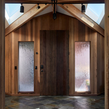
A structural column stood at the convergence of eight distinct roof planes in the entry. It was load-bearing, but it was also the reason the entry had always felt like a hallway rather than a welcoming arrival.
With the structural engineer, a custom steel connector was designed to receive beams from six separate directions, redistributing the load through a single new continuous beam. The column was surgically removed. Three triangular skylights were then cut into the roof above, their shapes drawn from the
existing geometry of the planes around them. The entry is now bright and open. The skylights feel native to the structure because they follow the logic already present in the roof.
Two Suites, Two Views
At opposite ends of the house, the two bedroom suites were each reconfigured, and each found a different way to introduce more of the landscape into the room.
An addition to the primary suite extended the structure outward to create a wraparound plan with a loop from the bedroom through bath and closet that had not been possible before. The expansion opened a slot view from the tub and shower toward the ocean. The view is precise and private. The ocean view is present and deliberate.
The rear bedroom absorbed an adjacent storage room to transform it into a full second suite with a vaulted ceiling, a large bathroom with a tub, a shower, and a sauna. A private fenced garden courtyard sits just beyond the glass bringing the outdoors inside. The tub was placed so that, looking past the courtyard and through the bedroom beyond, the ocean is visible at the far end. It is a long view and it makes the room feel larger and more settled than its footprint would suggest.
Glass on Four Sides, Fire at the Center
The main living and gathering room had always been caught between two competing facts: glass on four sides meant exceptional views but at The Sea Ranch, it also meant a cold room. A 360-degree cylindrical fireplace was added at the center on a raised stone base, providing radiant heat in every direction and giving the room a focal point around which a group naturally orients itself, whether that means two people at the end of the day or the whole family after dinner.
Owners Who Picked Up the Tools
The owner was not a passive client. they came with construction knowledge, specific ideas, and the desire to be an active part of the process, a dynamic that other architects may had found difficult, which Klopf Architecture accepted as an asset. They took it upon themselves to complete some of the work during construction, including the installation of a new radiant heating system beneath the floors.
The radiant system added to the older and less-desirable forced-air setup. At The Sea Ranch, that change matters as the house sits close enough to the ocean and moving air competes with the sound of it, where radiant heat does not. Solar panels were added to the roof as part of the new system. Insulation was upgraded throughout the walls, roof, and crawl space. The house that had always had the right setting now holds warmth the way a house on the bluff should.
They were also deeply involved in the design and selections throughout, and the finished house reflects both of them in ways that are specific rather than generic. The process took longer and moved through more iterations than a more arms-length relationship might have allowed. The result is more defined and personal because of it.
The Landscape Holds Priority
Every exterior decision was shaped by The Sea Ranch Design Standards, which require that buildings defer to the landscape around them rather than compete with it. Because this house sits on the bluff and is visible from the public trail, the additions faced a close review. Existing materials were matched. Geometries were resolved. The additions had to become indistinguishable from the original building.
From the trail, the house reads exactly as it always has — low, cedar-clad, secondary to the meadow and the water. The setting holds priority. Inside, the house has been remade.
Klopf Architecture Project Team: Geoff Campen and Trenton Jewett
Contractor: Shawn Bettega Construction
Photography: ©2025 Mariko Reed
Year Completed: 2023
Location: The Sea Ranch, CA
 Klopf Architecture
Built for the Bluff, A Sea Ranch Home is Remade from the Inside Out
The house had always been grounded, on an ocean bluff at The Sea Ranch. It sits unencumbered, adjacent to one of the most dramatic stretches of the Sonoma coast with protected commons meadow to the east, uninterrupted Pacific views to the west, and a bluff trail running alongside. What it lacked was the feeling of home, one that could hold up its own against the natural landscape.
The owners are entrepreneurs with deep involvement across tech, real estate, and development and they know how things are built. The Sea Ranch house had been in their lives for years, a second residence and a place for family to gather. Built for a different time, it felt more compromising than comfortable. Sitting in a closed off nook, the kitchen fit one cook at a time and turned its back on the rest of the house. The entry was dim and compressed, divided by a structural column that presented itself at exactly the wrong moment. The primary suite was small relative to the view outside it. A large rear bedroom sat behind a lowered ceiling with a bathroom that had never been added. The house was certainly worth the trouble of doing it right.
What followed was not one project but four, each with its own design challenge, each addressed over a period of time.
Where the House Meets the Ocean
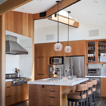
The most complex piece of the project, in both structural and spatial terms, was the kitchen expansion. The existing room was a single-person galley squeezed in as an afterthought with no meaningful connection to the dining room, the living space, or the deck outside. To make it useful for a family that cooks and gathers, it needed to grow outward into an existing patio and flow into the rooms around it.
A big challenge was the roofline. Several planes at different pitches and angles converged directly where additional volume was needed. A new form had to join that geometry without reading as a correction. The solution found the simplest possible connection between the existing angles, a roofline that from outside the structure, appears entirely original. From the bluff trail where the addition is visible, there is no discernible seam.
Inside, the kitchen is now open to the living and dining rooms without interruption. A large sliding glass door connects the space onto the rear deck. The deck itself was expanded and oriented so that the body of the house shields it from the coastal wind which is a common consideration that determines whether outdoor space at The Sea Ranch actually gets used. The result is a room that works for large family gatherings where no one feels cutoff, and one that makes the boundary between being inside and outside easy to ignore.
Welcoming Light
A structural column stood at the convergence of eight distinct roof planes in the entry. It was load-bearing, but it was also the reason the entry had always felt like a hallway rather than a welcoming arrival.
With the structural engineer, a custom steel connector was designed to receive beams from six separate directions, redistributing the load through a single new continuous beam. The column was surgically removed. Three triangular skylights were then cut into the roof above, their shapes drawn from the
existing geometry of the planes around them. The entry is now bright and open. The skylights feel native to the structure because they follow the logic already present in the roof.
Two Suites, Two Views
At opposite ends of the house, the two bedroom suites were each reconfigured, and each found a different way to introduce more of the landscape into the room.
An addition to the primary suite extended the structure outward to create a wraparound plan with a loop from the bedroom through bath and closet that had not been possible before. The expansion opened a slot view from the tub and shower toward the ocean. The view is precise and private. The ocean view is present and deliberate.
The rear bedroom absorbed an adjacent storage room to transform it into a full second suite with a vaulted ceiling, a large bathroom with a tub, a shower, and a sauna. A private fenced garden courtyard sits just beyond the glass bringing the outdoors inside. The tub was placed so that, looking past the courtyard and through the bedroom beyond, the ocean is visible at the far end. It is a long view and it makes the room feel larger and more settled than its footprint would suggest.
Glass on Four Sides, Fire at the Center
The main living and gathering room had always been caught between two competing facts: glass on four sides meant exceptional views but at The Sea Ranch, it also meant a cold room. A 360-degree cylindrical fireplace was added at the center on a raised stone base, providing radiant heat in every direction and giving the room a focal point around which a group naturally orients itself, whether that means two people at the end of the day or the whole family after dinner.
Owners Who Picked Up the Tools
The owner was not a passive client. they came with construction knowledge, specific ideas, and the desire to be an active part of the process, a dynamic that other architects may had found difficult, which Klopf Architecture accepted as an asset. They took it upon themselves to complete some of the work during construction, including the installation of a new radiant heating system beneath the floors.
The radiant system added to the older and less-desirable forced-air setup. At The Sea Ranch, that change matters as the house sits close enough to the ocean and moving air competes with the sound of it, where radiant heat does not. Solar panels were added to the roof as part of the new system. Insulation was upgraded throughout the walls, roof, and crawl space. The house that had always had the right setting now holds warmth the way a house on the bluff should.
They were also deeply involved in the design and selections throughout, and the finished house reflects both of them in ways that are specific rather than generic. The process took longer and moved through more iterations than a more arms-length relationship might have allowed. The result is more defined and personal because of it.
The Landscape Holds Priority
Every exterior decision was shaped by The Sea Ranch Design Standards, which require that buildings defer to the landscape around them rather than compete with it. Because this house sits on the bluff and is visible from the public trail, the additions faced a close review. Existing materials were matched. Geometries were resolved. The additions had to become indistinguishable from the original building.
From the trail, the house reads exactly as it always has — low, cedar-clad, secondary to the meadow and the water. The setting holds priority. Inside, the house has been remade.
Klopf Architecture Project Team: Geoff Campen and Trenton Jewett
Contractor: Shawn Bettega Construction
Photography: ©2025 Mariko Reed
Year Completed: 2023
Location: The Sea Ranch, CA
 Vetter Architects
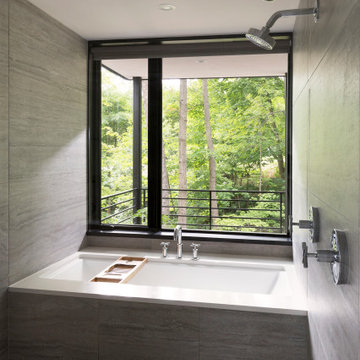
The client’s request was quite common - a typical 2800 sf builder home with 3 bedrooms, 2 baths, living space, and den. However, their desire was for this to be “anything but common.” The result is an innovative update on the production home for the modern era, and serves as a direct counterpoint to the neighborhood and its more conventional suburban housing stock, which focus views to the backyard and seeks to nullify the unique qualities and challenges of topography and the natural environment.
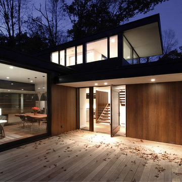
The Terraced House cautiously steps down the site’s steep topography, resulting in a more nuanced approach to site development than cutting and filling that is so common in the builder homes of the area. The compact house opens up in very focused views that capture the natural wooded setting, while masking the sounds and views of the directly adjacent roadway. The main living spaces face this major roadway, effectively flipping the typical orientation of a suburban home, and the main entrance pulls visitors up to the second floor and halfway through the site, providing a sense of procession and privacy absent in the typical suburban home.
Clad in a custom rain screen that reflects the wood of the surrounding landscape - while providing a glimpse into the interior tones that are used. The stepping “wood boxes” rest on a series of concrete walls that organize the site, retain the earth, and - in conjunction with the wood veneer panels - provide a subtle organic texture to the composition.
The interior spaces wrap around an interior knuckle that houses public zones and vertical circulation - allowing more private spaces to exist at the edges of the building. The windows get larger and more frequent as they ascend the building, culminating in the upstairs bedrooms that occupy the site like a tree house - giving views in all directions.
The Terraced House imports urban qualities to the suburban neighborhood and seeks to elevate the typical approach to production home construction, while being more in tune with modern family living patterns.
Overview
Elm Grove
Size
2,800 sf
3 bedrooms, 2 bathrooms
Completion Date
September 2014
Services
Architecture, Landscape Architecture
Interior Consultants: Amy Carman Design
Steve Gotter
Find the right local pro for your project
 Simply Home Decorating
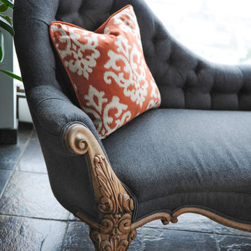
The homeowners of this condo sought our assistance when downsizing from a large family home on Howe Sound to a small urban condo in Lower Lonsdale, North Vancouver. They asked us to incorporate many of their precious antiques and art pieces into the new design. Our challenges here were twofold; first, how to deal with the unconventional curved floor plan with vast South facing windows that provide a 180 degree view of downtown Vancouver, and second, how to successfully merge an eclectic collection of antique pieces into a modern setting. We began by updating most of their artwork with new matting and framing. We created a gallery effect by grouping like artwork together and displaying larger pieces on the sections of wall between the windows, lighting them with black wall sconces for a graphic effect. We re-upholstered their antique seating with more contemporary fabrics choices - a gray flannel on their Victorian fainting couch and a fun orange chenille animal print on their Louis style chairs. We selected black as an accent colour for many of the accessories as well as the dining room wall to give the space a sophisticated modern edge. The new pieces that we added, including the sofa, coffee table and dining light fixture are mid century inspired, bridging the gap between old and new. White walls and understated wallpaper provide the perfect backdrop for the colourful mix of antique pieces. Interior Design by Lori Steeves, Simply Home Decorating. Photos by Tracey Ayton Photography
 Vetter Architects
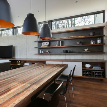
The client’s request was quite common - a typical 2800 sf builder home with 3 bedrooms, 2 baths, living space, and den. However, their desire was for this to be “anything but common.” The result is an innovative update on the production home for the modern era, and serves as a direct counterpoint to the neighborhood and its more conventional suburban housing stock, which focus views to the backyard and seeks to nullify the unique qualities and challenges of topography and the natural environment.
The Terraced House cautiously steps down the site’s steep topography, resulting in a more nuanced approach to site development than cutting and filling that is so common in the builder homes of the area. The compact house opens up in very focused views that capture the natural wooded setting, while masking the sounds and views of the directly adjacent roadway. The main living spaces face this major roadway, effectively flipping the typical orientation of a suburban home, and the main entrance pulls visitors up to the second floor and halfway through the site, providing a sense of procession and privacy absent in the typical suburban home.
Clad in a custom rain screen that reflects the wood of the surrounding landscape - while providing a glimpse into the interior tones that are used. The stepping “wood boxes” rest on a series of concrete walls that organize the site, retain the earth, and - in conjunction with the wood veneer panels - provide a subtle organic texture to the composition.
The interior spaces wrap around an interior knuckle that houses public zones and vertical circulation - allowing more private spaces to exist at the edges of the building. The windows get larger and more frequent as they ascend the building, culminating in the upstairs bedrooms that occupy the site like a tree house - giving views in all directions.
The Terraced House imports urban qualities to the suburban neighborhood and seeks to elevate the typical approach to production home construction, while being more in tune with modern family living patterns.
Overview:
Elm Grove
Size:
2,800 sf,
3 bedrooms, 2 bathrooms
Completion Date:
September 2014
Services:
Architecture, Landscape Architecture
Interior Consultants: Amy Carman Design
 Vetter Architects
The client’s request was quite common - a typical 2800 sf builder home with 3 bedrooms, 2 baths, living space, and den. However, their desire was for this to be “anything but common.” The result is an innovative update on the production home for the modern era, and serves as a direct counterpoint to the neighborhood and its more conventional suburban housing stock, which focus views to the backyard and seeks to nullify the unique qualities and challenges of topography and the natural environment.
The Terraced House cautiously steps down the site’s steep topography, resulting in a more nuanced approach to site development than cutting and filling that is so common in the builder homes of the area. The compact house opens up in very focused views that capture the natural wooded setting, while masking the sounds and views of the directly adjacent roadway. The main living spaces face this major roadway, effectively flipping the typical orientation of a suburban home, and the main entrance pulls visitors up to the second floor and halfway through the site, providing a sense of procession and privacy absent in the typical suburban home.
Clad in a custom rain screen that reflects the wood of the surrounding landscape - while providing a glimpse into the interior tones that are used. The stepping “wood boxes” rest on a series of concrete walls that organize the site, retain the earth, and - in conjunction with the wood veneer panels - provide a subtle organic texture to the composition.
The interior spaces wrap around an interior knuckle that houses public zones and vertical circulation - allowing more private spaces to exist at the edges of the building. The windows get larger and more frequent as they ascend the building, culminating in the upstairs bedrooms that occupy the site like a tree house - giving views in all directions.
The Terraced House imports urban qualities to the suburban neighborhood and seeks to elevate the typical approach to production home construction, while being more in tune with modern family living patterns.
Overview:
Elm Grove
Size:
2,800 sf,
3 bedrooms, 2 bathrooms
Completion Date:
September 2014
Services:
Architecture, Landscape Architecture
Interior Consultants: Amy Carman Design
 River Valley Landscapes
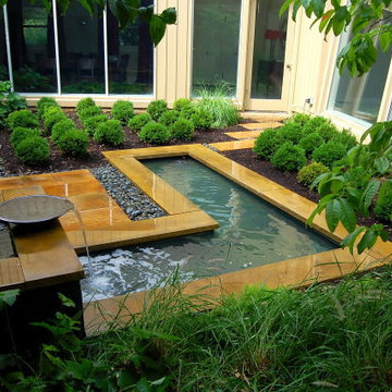
Blending contemporary forms and lush plantings, this Garden maximizes the sensory experience of the materials and planting from inside and outside the home. The garden occupies an interior courtyard framed by four interior walls. The home, designed by Architect Cliff May was built in 1948 and the following year was featured in House Beautiful Magazine. The clients list of needs and desires was brief. They wanted a space that would complement the mid century modern home and provide visual interest from inside the home. Some form of water was also requested. They had a budget of $30,000. In order to stay within their budget the clients performed the demolition of the old garden. The designer’s intent was to create a garden that would possess a clear sculptural quality and would be as visually striking from inside the home as it would be from inside the courtyard. The strategy behind the design was to use hardscape materials characterized by simple geometric forms and a planting palette that would emphasize form over color, and then to arrange the materials to achieve an interpretation of modern aesthetic.
The views from inside the homes three main living rooms present the garden as a graphic composition of space, hardscape materials and planting. Inside the courtyard the edges are defined by stone and planting. The floor is composed of rectangular slabs of Teakwood flagstone with a counterpoint of Mexican beach pebbles set within the joints and around the edges. Concrete along the edges of the Teakwood pads reduces migration of the modified stone and sand base. The contrast of the Mexican beach pebbles accentuates the pattern of the flagstone. The outside perimeter of the pebbles is contained with low profile edging. An existing catch drain was utilized for storm water runoff. A concrete block pier set on a concrete footing is covered with black stucco and provides a perch for a custom made copper bowl that circulates water into the L shaped water feature. The water features subterranean basin is constructed of pressure treated wood with a custom box liner insert. Since the Teakwood flagstone was unavailable as coping for the water feature, the designer chose Shawnee Buff stone to complement the Teakwood flagstone. The subtle sound of water spilling from the copper bowl and the reflective qualities of the water help to create an atmosphere of relaxation. The planting is composed of shades of green with white flowers in order to accentuate the graphic design. ‘Justin Brouwer’ Boxwood, ‘Sum and Substance’ Hosta, white Anemones, black bamboo and ornamental grasses contrast dramatically with the clean lines of the hardscape elements. The black bamboo is set in 30” diameter concrete containers to control the vigorous plant from spreading.
The construction of the interior courtyard space challenged the building team. They set up baffles between the front door and the door to the courtyard as well as temporary protection over the floor to allow the process to move forward without too much disturbance to the client’s lives. All of the materials were shuffled through the temporary portal.
The clients love the space and recently said that “the design is so well thought out and simple that they would never get tired of it.” The designs sculptural quality compliments the modern feel of the home and creates a sublime yet dramatic view from within the house or within the courtyard. The clients plan to purchase two black Bertoia Diamond chairs with red cushions which should perfectly integrate with the space.
 The Buckingham Group
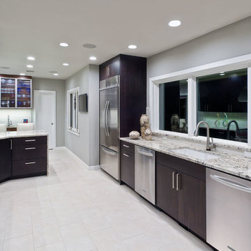
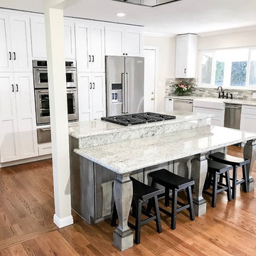
Brazilian Mahogany Euro Style cabinets, twin Bosch dishwashers, a Wolf dual fuel range & hood & abundant countertop surfaces create the perfect kitchen for entertaining.
 New Vista Renovation
Congratulations to the family that allowed us to transform their kitchen space! We managed to complete this remodel - just in time for them to bring a beautiful baby girl into this world!
It was quite an amazing experience to design and remodel this home with our new Medallion Cabinetry product line. The main area of cabinetry features our Gold Line in Park Place door style, in the color Sea Salt with Pewter Highlight. Their new 7ft island is our Appaloosa Peppercorn with matching island legs.
New Vista managed this project from start to finish, including all permits required by the local building department.
The previous 20ft wall had been located from the area of the remaining post to the window to the right of the sink, shown in these photos. Proper removal of this wall did require a structurally sound weight load transfer in the attic. Safety comes first!
Also included: Granite counters, new appliances, brick style backsplash, flooring, gas line/plumbing/electrical relocation, can lighting and new plumbing fixtures.
Our CAD drawings are proving to be incredibly helpful in the design process of our remodels, allowing customers to really SEE what they can do with the space they have!
This project had closed without any change orders and the total time encompassed exactly 8wks - from demolition to final inspection!
 Stephanie Kratz Interiors
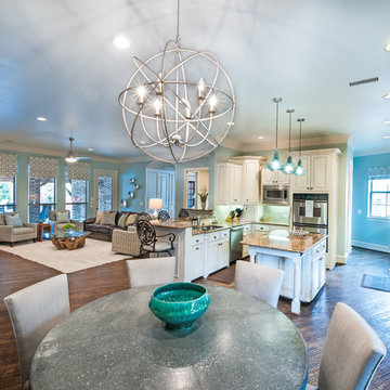
Breakfast Nook
Custom Zink Table Top with Custom Dining Chairs
Eat-in kitchen - large transitional galley medium tone wood floor eat-in kitchen idea in Dallas with an undermount sink, raised-panel cabinets, white cabinets, granite countertops, beige backsplash, stone tile backsplash, stainless steel appliances and an island
Eat-in kitchen - large transitional galley medium tone wood floor eat-in kitchen idea in Dallas with an undermount sink, raised-panel cabinets, white cabinets, granite countertops, beige backsplash, stone tile backsplash, stainless steel appliances and an island
 Vetter Architects
Steve Gotter
The client’s request was quite common - a typical 2800 sf builder home with 3 bedrooms, 2 baths, living space, and den. However, their desire was for this to be “anything but common.” The result is an innovative update on the production home for the modern era, and serves as a direct counterpoint to the neighborhood and its more conventional suburban housing stock, which focus views to the backyard and seeks to nullify the unique qualities and challenges of topography and the natural environment.
The Terraced House cautiously steps down the site’s steep topography, resulting in a more nuanced approach to site development than cutting and filling that is so common in the builder homes of the area. The compact house opens up in very focused views that capture the natural wooded setting, while masking the sounds and views of the directly adjacent roadway. The main living spaces face this major roadway, effectively flipping the typical orientation of a suburban home, and the main entrance pulls visitors up to the second floor and halfway through the site, providing a sense of procession and privacy absent in the typical suburban home.
Clad in a custom rain screen that reflects the wood of the surrounding landscape - while providing a glimpse into the interior tones that are used. The stepping “wood boxes” rest on a series of concrete walls that organize the site, retain the earth, and - in conjunction with the wood veneer panels - provide a subtle organic texture to the composition.
The interior spaces wrap around an interior knuckle that houses public zones and vertical circulation - allowing more private spaces to exist at the edges of the building. The windows get larger and more frequent as they ascend the building, culminating in the upstairs bedrooms that occupy the site like a tree house - giving views in all directions.
The Terraced House imports urban qualities to the suburban neighborhood and seeks to elevate the typical approach to production home construction, while being more in tune with modern family living patterns.
Overview:
Elm Grove
Size:
2,800 sf,
3 bedrooms, 2 bathrooms
Completion Date:
September 2014
Services:
Architecture, Landscape Architecture
Interior Consultants: Amy Carman Design

 Turbo Beds
Designed to look like a real life race car, this sporty black car bed will have your child racing to bed. This highly durable twin bed comes with LED headlights, detailed gold rims and realistic racing stickers. Plus, the bed makes real car sounds and has a Knight Rider strobe light—all triggered by a wireless remote control.
 River Valley Landscapes
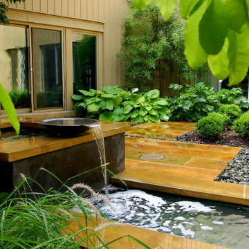
Blending contemporary forms and lush plantings, this Garden maximizes the sensory experience of the materials and planting from inside and outside the home. The garden occupies an interior courtyard framed by four interior walls. The home, designed by Architect Cliff May was built in 1948 and the following year was featured in House Beautiful Magazine. The clients list of needs and desires was brief. They wanted a space that would complement the mid century modern home and provide visual interest from inside the home. Some form of water was also requested. They had a budget of $30,000. In order to stay within their budget the clients performed the demolition of the old garden. The designer’s intent was to create a garden that would possess a clear sculptural quality and would be as visually striking from inside the home as it would be from inside the courtyard. The strategy behind the design was to use hardscape materials characterized by simple geometric forms and a planting palette that would emphasize form over color, and then to arrange the materials to achieve an interpretation of modern aesthetic.
The views from inside the homes three main living rooms present the garden as a graphic composition of space, hardscape materials and planting. Inside the courtyard the edges are defined by stone and planting. The floor is composed of rectangular slabs of Teakwood flagstone with a counterpoint of Mexican beach pebbles set within the joints and around the edges. Concrete along the edges of the Teakwood pads reduces migration of the modified stone and sand base. The contrast of the Mexican beach pebbles accentuates the pattern of the flagstone. The outside perimeter of the pebbles is contained with low profile edging. An existing catch drain was utilized for storm water runoff. A concrete block pier set on a concrete footing is covered with black stucco and provides a perch for a custom made copper bowl that circulates water into the L shaped water feature. The water features subterranean basin is constructed of pressure treated wood with a custom box liner insert. Since the Teakwood flagstone was unavailable as coping for the water feature, the designer chose Shawnee Buff stone to complement the Teakwood flagstone. The subtle sound of water spilling from the copper bowl and the reflective qualities of the water help to create an atmosphere of relaxation. The planting is composed of shades of green with white flowers in order to accentuate the graphic design. ‘Justin Brouwer’ Boxwood, ‘Sum and Substance’ Hosta, white Anemones, black bamboo and ornamental grasses contrast dramatically with the clean lines of the hardscape elements. The black bamboo is set in 30” diameter concrete containers to control the vigorous plant from spreading.
The construction of the interior courtyard space challenged the building team. They set up baffles between the front door and the door to the courtyard as well as temporary protection over the floor to allow the process to move forward without too much disturbance to the client’s lives. All of the materials were shuffled through the temporary portal.
The clients love the space and recently said that “the design is so well thought out and simple that they would never get tired of it.” The designs sculptural quality compliments the modern feel of the home and creates a sublime yet dramatic view from within the house or within the courtyard. The clients plan to purchase two black Bertoia Diamond chairs with red cushions which should perfectly integrate with the space.
 Urbanology Designs
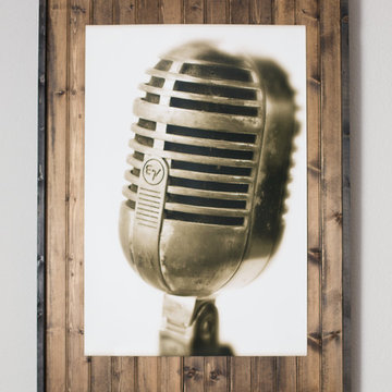
The vintage microphone print was enlarged and mounted on a custom made frame.
Inspiration for an industrial bedroom remodel in Dallas
Inspiration for an industrial bedroom remodel in Dallas
 ORCO Block & Hardscape
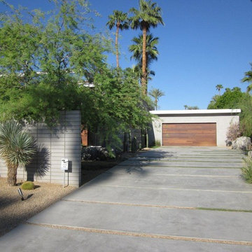
ORCO Block & Hardscape’s Gray Precision CMU was an aesthetic choice for this modern designed home.
Contemporary gray one-story concrete exterior home idea in Orange County
Contemporary gray one-story concrete exterior home idea in Orange County
 John R. Schroeder, AIA
Photography by Caryn B. Davis
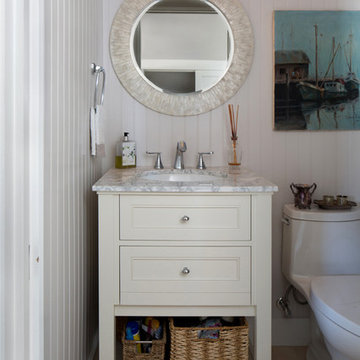
Located in the Cornfield Point area of Old Saybrook along Long Island Sound, this project brought a classic, yet forgotten beach house back to life. Through a little detective work and some creative ingenuity, we restored and enhanced the exterior to it’s former glory and transformed the interior to a highly efficient and functional home all the while uplifting its quaint cottage charm. On the exterior, we recreated a wonderful, airy front porch with cozy bench seats that look out to the water. The white cedar shingle siding is pre-bleached with a subtle flair at the bottom and a delicate break at mid-elevation. The asphalt shingles are not only beautifully matched with the siding, but offer superior reflective qualities to dissipate the heat of the summer sun. On the interior, we joined the front seasonal porch with the family room to form a larger, open living and dining space with paneled walls and ceilings anchored by the original round stone fireplace. In the rear, we carefully crafted a galley kitchen and laundry space with an adjacent first floor master suite. The diminutive house and property posed multiple practical and regulatory challenges which were overcome by a strong team effort, due diligence, and a commitment to the process.
John R. Schroeder, AIA is a professional design firm specializing in architecture, interiors, and planning. We have over 30 years experience with projects of all types, sizes, and levels of complexity. Because we love what we do, we approach our work with enthusiasm and dedication. We are committed to the highest level of design and service on each and every project. We engage our clients in positive and rewarding collaborations. We strive to exceed expectations through our attention to detail, our understanding of the “big picture”, and our ability to effectively manage a team of design professionals, industry representatives, and building contractors. We carefully analyze budgets and project objectives to assist clients with wise fund allocation.
We continually monitor and research advances in technology, materials, and construction methods, both sustainable and otherwise, to provide a responsible, well-suited, and cost effective product. Our design solutions are highly functional using both innovative and traditional approaches. Our aesthetic style is flexible and open, blending cues from client desires, building function, site context, and material properties, making each project unique, personalized, and enduring.
 Vetter Architects
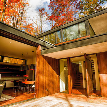
The client’s request was quite common - a typical 2800 sf builder home with 3 bedrooms, 2 baths, living space, and den. However, their desire was for this to be “anything but common.” The result is an innovative update on the production home for the modern era, and serves as a direct counterpoint to the neighborhood and its more conventional suburban housing stock, which focus views to the backyard and seeks to nullify the unique qualities and challenges of topography and the natural environment.
The Terraced House cautiously steps down the site’s steep topography, resulting in a more nuanced approach to site development than cutting and filling that is so common in the builder homes of the area. The compact house opens up in very focused views that capture the natural wooded setting, while masking the sounds and views of the directly adjacent roadway. The main living spaces face this major roadway, effectively flipping the typical orientation of a suburban home, and the main entrance pulls visitors up to the second floor and halfway through the site, providing a sense of procession and privacy absent in the typical suburban home.
Clad in a custom rain screen that reflects the wood of the surrounding landscape - while providing a glimpse into the interior tones that are used. The stepping “wood boxes” rest on a series of concrete walls that organize the site, retain the earth, and - in conjunction with the wood veneer panels - provide a subtle organic texture to the composition.
The interior spaces wrap around an interior knuckle that houses public zones and vertical circulation - allowing more private spaces to exist at the edges of the building. The windows get larger and more frequent as they ascend the building, culminating in the upstairs bedrooms that occupy the site like a tree house - giving views in all directions.
The Terraced House imports urban qualities to the suburban neighborhood and seeks to elevate the typical approach to production home construction, while being more in tune with modern family living patterns.
Overview:
Elm Grove
Size:
2,800 sf,
3 bedrooms, 2 bathrooms
Completion Date:
September 2014
Services:
Architecture, Landscape Architecture
Interior Consultants: Amy Carman Design
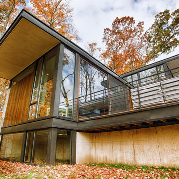 Vetter Architects
The client’s request was quite common - a typical 2800 sf builder home with 3 bedrooms, 2 baths, living space, and den. However, their desire was for this to be “anything but common.” The result is an innovative update on the production home for the modern era, and serves as a direct counterpoint to the neighborhood and its more conventional suburban housing stock, which focus views to the backyard and seeks to nullify the unique qualities and challenges of topography and the natural environment.
The Terraced House cautiously steps down the site’s steep topography, resulting in a more nuanced approach to site development than cutting and filling that is so common in the builder homes of the area. The compact house opens up in very focused views that capture the natural wooded setting, while masking the sounds and views of the directly adjacent roadway. The main living spaces face this major roadway, effectively flipping the typical orientation of a suburban home, and the main entrance pulls visitors up to the second floor and halfway through the site, providing a sense of procession and privacy absent in the typical suburban home.
Clad in a custom rain screen that reflects the wood of the surrounding landscape - while providing a glimpse into the interior tones that are used. The stepping “wood boxes” rest on a series of concrete walls that organize the site, retain the earth, and - in conjunction with the wood veneer panels - provide a subtle organic texture to the composition.
The interior spaces wrap around an interior knuckle that houses public zones and vertical circulation - allowing more private spaces to exist at the edges of the building. The windows get larger and more frequent as they ascend the building, culminating in the upstairs bedrooms that occupy the site like a tree house - giving views in all directions.
The Terraced House imports urban qualities to the suburban neighborhood and seeks to elevate the typical approach to production home construction, while being more in tune with modern family living patterns.
Overview:
Elm Grove
Size:
2,800 sf,
3 bedrooms, 2 bathrooms
Completion Date:
September 2014
Services:
Architecture, Landscape Architecture
Interior Consultants: Amy Carman Design
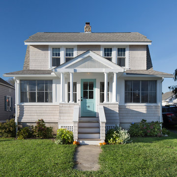 John R. Schroeder, AIA
Photography by Caryn B. Davis
Located in the Cornfield Point area of Old Saybrook along Long Island Sound, this project brought a classic, yet forgotten beach house back to life. Through a little detective work and some creative ingenuity, we restored and enhanced the exterior to it’s former glory and transformed the interior to a highly efficient and functional home all the while uplifting its quaint cottage charm. On the exterior, we recreated a wonderful, airy front porch with cozy bench seats that look out to the water. The white cedar shingle siding is pre-bleached with a subtle flair at the bottom and a delicate break at mid-elevation. The asphalt shingles are not only beautifully matched with the siding, but offer superior reflective qualities to dissipate the heat of the summer sun. On the interior, we joined the front seasonal porch with the family room to form a larger, open living and dining space with paneled walls and ceilings anchored by the original round stone fireplace. In the rear, we carefully crafted a galley kitchen and laundry space with an adjacent first floor master suite. The diminutive house and property posed multiple practical and regulatory challenges which were overcome by a strong team effort, due diligence, and a commitment to the process.
John R. Schroeder, AIA is a professional design firm specializing in architecture, interiors, and planning. We have over 30 years experience with projects of all types, sizes, and levels of complexity. Because we love what we do, we approach our work with enthusiasm and dedication. We are committed to the highest level of design and service on each and every project. We engage our clients in positive and rewarding collaborations. We strive to exceed expectations through our attention to detail, our understanding of the “big picture”, and our ability to effectively manage a team of design professionals, industry representatives, and building contractors. We carefully analyze budgets and project objectives to assist clients with wise fund allocation.
We continually monitor and research advances in technology, materials, and construction methods, both sustainable and otherwise, to provide a responsible, well-suited, and cost effective product. Our design solutions are highly functional using both innovative and traditional approaches. Our aesthetic style is flexible and open, blending cues from client desires, building function, site context, and material properties, making each project unique, personalized, and enduring.
 Vetter Architects
The client’s request was quite common - a typical 2800 sf builder home with 3 bedrooms, 2 baths, living space, and den. However, their desire was for this to be “anything but common.” The result is an innovative update on the production home for the modern era, and serves as a direct counterpoint to the neighborhood and its more conventional suburban housing stock, which focus views to the backyard and seeks to nullify the unique qualities and challenges of topography and the natural environment.
The Terraced House cautiously steps down the site’s steep topography, resulting in a more nuanced approach to site development than cutting and filling that is so common in the builder homes of the area. The compact house opens up in very focused views that capture the natural wooded setting, while masking the sounds and views of the directly adjacent roadway. The main living spaces face this major roadway, effectively flipping the typical orientation of a suburban home, and the main entrance pulls visitors up to the second floor and halfway through the site, providing a sense of procession and privacy absent in the typical suburban home.
Clad in a custom rain screen that reflects the wood of the surrounding landscape - while providing a glimpse into the interior tones that are used. The stepping “wood boxes” rest on a series of concrete walls that organize the site, retain the earth, and - in conjunction with the wood veneer panels - provide a subtle organic texture to the composition.
The interior spaces wrap around an interior knuckle that houses public zones and vertical circulation - allowing more private spaces to exist at the edges of the building. The windows get larger and more frequent as they ascend the building, culminating in the upstairs bedrooms that occupy the site like a tree house - giving views in all directions.
The Terraced House imports urban qualities to the suburban neighborhood and seeks to elevate the typical approach to production home construction, while being more in tune with modern family living patterns.
Overview:
Elm Grove
Size:
2,800 sf,
3 bedrooms, 2 bathrooms
Completion Date:
September 2014
Services:
Architecture, Landscape Architecture
Interior Consultants: Amy Carman Design
10