
Search results for "Space related challenges" in Home Design Ideas
 Wiedemann Architects LLC
courtyard, dignified, elegantly decorated, entertaining space, family home, majestic,
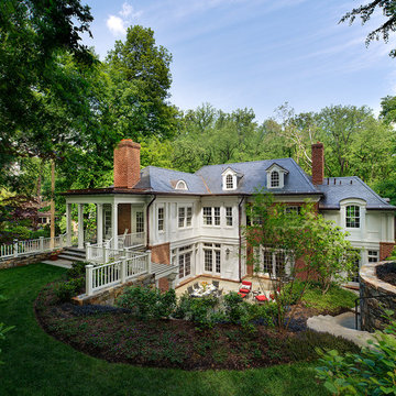
Our client was drawn to the property in Wesley Heights as it was in an established neighborhood of stately homes, on a quiet street with views of park. They wanted a traditional home for their young family with great entertaining spaces that took full advantage of the site.
The site was the challenge. The natural grade of the site was far from traditional. The natural grade at the rear of the property was about thirty feet above the street level. Large mature trees provided shade and needed to be preserved.
The solution was sectional. The first floor level was elevated from the street by 12 feet, with French doors facing the park. We created a courtyard at the first floor level that provide an outdoor entertaining space, with French doors that open the home to the courtyard.. By elevating the first floor level, we were able to allow on-grade parking and a private direct entrance to the lower level pub "Mulligans". An arched passage affords access to the courtyard from a shared driveway with the neighboring homes, while the stone fountain provides a focus.
A sweeping stone stair anchors one of the existing mature trees that was preserved and leads to the elevated rear garden. The second floor master suite opens to a sitting porch at the level of the upper garden, providing the third level of outdoor space that can be used for the children to play.
The home's traditional language is in context with its neighbors, while the design allows each of the three primary levels of the home to relate directly to the outside.
Builder: Peterson & Collins, Inc
Photos © Anice Hoachlander
 SkB Architects
Originally built in 1955, this modest penthouse apartment typified the small, separated living spaces of its era. The design challenge was how to create a home that reflected contemporary taste and the client’s desire for an environment rich in materials and textures. The keys to updating the space were threefold: break down the existing divisions between rooms; emphasize the connection to the adjoining 850-square-foot terrace; and establish an overarching visual harmony for the home through the use of simple, elegant materials.
The renovation preserves and enhances the home’s mid-century roots while bringing the design into the 21st century—appropriate given the apartment’s location just a few blocks from the fairgrounds of the 1962 World’s Fair.

 Klopf Architecture
From Mid-Century Classic to the Present
An iconic design updated with comfort, function, and flow for today.
A Remodel That Balances Past and Present
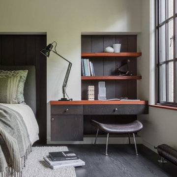
What started as a desire to update a classic Eichler soon became an exploration of how Mid-Century Modern design can successfully evolve for today. The client, a tech professional with a passion for scuba diving and underwater photography, wanted a home that would both honor its original character and feel tailored to his daily life. A lifelong technology enthusiast, he still owns the very first Mac desktop he saved up for as a teenager working at Radio Shack, a detail that underscores his appreciation for design that melds function and form.
Honoring Separation While Expanding Possibility
Unlike many contemporary remodels where walls are opened up to create expansive living spaces, this project took a more restrained approach. The client valued the defined rooms of the original plan and wanted to preserve as much wall space as possible for displaying his large-format underwater photography. The emphasis was not on dramatic spatial reinvention, but on thoughtful refinements. Klopf Architecture shaped a gallery-like backdrop while also expanding the primary suite, modernizing materials and fixtures throughout the home, and improving the functionality and layout of the kitchen. The finished home feels at once timeless and renewed, an Eichler that continues to inspire while fully supporting the lifestyle of its present-day owner.
A major turning point came mid-design. The original project brief had not included an addition, but as the reconfiguration of the primary bedroom and bath unfolded, it became clear that an expansion was the best approach to achieve the client’s vision of a more spacious suite. Fortunately, the adjustment came at a stage when revisions were still manageable and was integrated seamlessly, showing how thoughtful course corrections can strengthen a project rather than hinder it.
Navigating Challenges With Precision
The design development included multiple conceptual rounds, balancing preservation with subtle expansion. During construction, an existing post previously thought to be load-bearing turned out not to be. The structural engineer was able to pivot quickly, and both the post and the cross beam that had been intended to replace it could be omitted, allowing the original rhythm of the Eichler beam bays to be preserved.
Sustainability was not just a checklist item, but a way to align the home with the client’s values of simplicity, efficiency, and long-term functionality. R-38 roof insulation reduced energy usage, solar panels with battery storage provided independence and resilience, and passive comfort strategies eliminated the need forenergy-intensive air conditioning. An electric vehicle charger and an on-demand hot water recirculation system (with call buttons as opposed to having constant circulation) add to the home’s long-term efficiency factors. Together, these moves created a home that is quieter, more comfortable, and better equipped for the future, qualities that supported the client’s pragmatic approach to design and living lightly.
Details That Respect the Eichler DNA
The remodel carries forward the Eichler’s original spirit while introducing new layers of modern livability. Originally, the house was approached along a deep, narrow walk, with the garage on one side and the house on the other, leaving the front door tucked far back within this chasm-like space. By pulling the entry forward, the design reshaped the arrival experience, creating a clearer threshold and a natural drop-off zone for bags, shoes, and keys. This shift also made room for a custom bench at the entry that extends seamlessly through the glass sidelight. The bench and drop-off zone now work together as a single, integrated sequence that supports everyday living while offering a tactile reminder of Eichler’s philosophy of connectedness.
At the client’s request, Klopf reintroduced a classic Eichler gesture by extending the exterior siding into the entry and living room. The detail reinforces a sense of indoor/outdoor continuity while providing a subtle architectural surface that allows the client’s photography to take visual precedence.
The signature concrete masonry wall at the front was reconstructed using blocks sourced to match the originals, now strengthened with rebar for seismic resilience while maintaining a private outdoor courtyard, visually extending the kitchen outward. A decorative trellis element, a detail borrowed from a neighboring Eichler, restores a familiar mid-century modern architectural motif. At the courtyard entry door, a custom etched glass sidelight with an ocean-themed design featuring kelp and jellyfish serves as a subtle homage to the client’s passion for deep-sea diving.
Landscaping became an integral part of the overall transformation. The homeowner engaged landscape architect Randi Johnsen of Third Nature Studio to shape a series of calm, inviting outdoor rooms that read as a natural extension of the interiors. While technically outside of the core construction scope, the landscape design proved central to achieving a sense of completeness and connectedness across the property. Such whole-property considerations often emerge as design ideas take shape, underscoring the importance of flexibility in planning and budgeting, as well as close collaboration among the design team starting early in the process.
The Value of Evolving Scope
As with many custom residential projects, the scope evolved during the design process. What began as a targeted remodel grew to include a new/expanded primary suite, a rebuilt CMU patio wall for strength and longevity, and a solar panel array and battery storage for energy resilience and carbon-reduction. Each thoughtful decision represented a conscious investment in the home’s performance and character, rather than a cost overrun.
The result was a project delivered on schedule, tailored precisely to the client’s lifestyle, and positioned to add long-term value both functionally and aesthetically. By embracing scope evolution as an opportunity rather than a challenge, and relying on good design paired with transparent communication, this remodel demonstrates how Eichler homes can be adapted for contemporary living without erasing their DNA.
Klopf Architecture project team: John Klopf, AIA, and Klara Kevane, Elise Webb and Nicholas LaNasa.
Contractor: Golden Cove Construction
Landscape Design: Third Nature Studio
Structural Engineer: Daniel Bastiao Design
Photography: ©2025 Mariko Reed
Year Completed: 2024
Location: Sunnyvale, CA
Find the right local pro for your project
 TVL Creative Ltd.
[Our Clients]
We were so excited to help these new homeowners re-envision their split-level diamond in the rough. There was so much potential in those walls, and we couldn’t wait to delve in and start transforming spaces. Our primary goal was to re-imagine the main level of the home and create an open flow between the space. So, we started by converting the existing single car garage into their living room (complete with a new fireplace) and opening up the kitchen to the rest of the level.
[Kitchen]
The original kitchen had been on the small side and cut-off from the rest of the home, but after we removed the coat closet, this kitchen opened up beautifully. Our plan was to create an open and light filled kitchen with a design that translated well to the other spaces in this home, and a layout that offered plenty of space for multiple cooks. We utilized clean white cabinets around the perimeter of the kitchen and popped the island with a spunky shade of blue. To add a real element of fun, we jazzed it up with the colorful escher tile at the backsplash and brought in accents of brass in the hardware and light fixtures to tie it all together. Through out this home we brought in warm wood accents and the kitchen was no exception, with its custom floating shelves and graceful waterfall butcher block counter at the island.
[Dining Room]
The dining room had once been the home’s living room, but we had other plans in mind. With its dramatic vaulted ceiling and new custom steel railing, this room was just screaming for a dramatic light fixture and a large table to welcome one-and-all.
[Living Room]
We converted the original garage into a lovely little living room with a cozy fireplace. There is plenty of new storage in this space (that ties in with the kitchen finishes), but the real gem is the reading nook with two of the most comfortable armchairs you’ve ever sat in.
[Master Suite]
This home didn’t originally have a master suite, so we decided to convert one of the bedrooms and create a charming suite that you’d never want to leave. The master bathroom aesthetic quickly became all about the textures. With a sultry black hex on the floor and a dimensional geometric tile on the walls we set the stage for a calm space. The warm walnut vanity and touches of brass cozy up the space and relate with the feel of the rest of the home. We continued the warm wood touches into the master bedroom, but went for a rich accent wall that elevated the sophistication level and sets this space apart.
[Hall Bathroom]
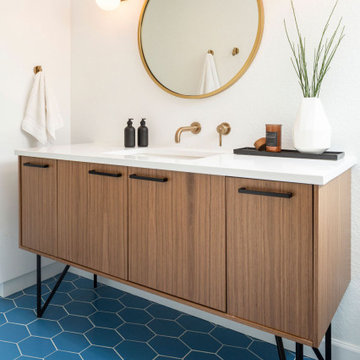
The floor tile in this bathroom still makes our hearts skip a beat. We designed the rest of the space to be a clean and bright white, and really let the lovely blue of the floor tile pop. The walnut vanity cabinet (complete with hairpin legs) adds a lovely level of warmth to this bathroom, and the black and brass accents add the sophisticated touch we were looking for.
[Office]
We loved the original built-ins in this space, and knew they needed to always be a part of this house, but these 60-year-old beauties definitely needed a little help. We cleaned up the cabinets and brass hardware, switched out the formica counter for a new quartz top, and painted wall a cheery accent color to liven it up a bit. And voila! We have an office that is the envy of the neighborhood.
 Décor Aid
Everyone deserves to end the day in a comfortable, tranquil home. And for those with children, it can seem impossible to reconcile the challenges of family life with the need to have a well-designed space. Our client—a financial executive and her family of four—had not considered a design makeover since moving into their apartment, which was more than ten years ago. So when she reached out to Decor Aid, she asked us to modernize and brighten her home, in addition to creating a space for her family to hang out and relax.
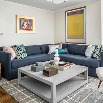
The apartment originally featured sunflower-yellow walls and a set of brown suede living room furniture, all of which significantly darkened the space. The living room also did not have sufficient seating options, so the client was improvising seating arrangements when guests would come over.
With no outward facing windows, the living room received little natural light, and so we began the redesign by painting the walls a classic grey, and adding white crown molding.
As a pathway from the front door to the kitchen, the living room functions as a high-traffic area of the home. So we sourced a geometric indoor-outdoor area rug, and established a layout that’s easy to walk through. We also sourced a coffee table from Serena & Lily. Our client has teenage twins, and so we sourced a sturdy sectional couch from Restoration Hardware, and placed it in a corner which was previously being underused.
We hired an electrician to hide all of the cables leading to the media console, and added custom window treatments. In the kitchen, we painted the cabinets a semi-gloss white, and added slate flooring, for a clean, crisp, modern look to match the living room.
The finishing touches included a set of geometric table objects, comfortable throw rugs, and plush high-shine pillows. The final result is a fully functional living room for this family of four.
 Orren Pickell Building Group
**Project Overview**
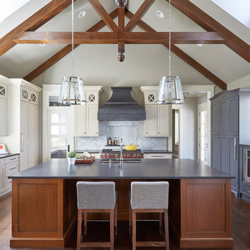
This new construction home built next to a serene lake features a gorgeous, large-scale kitchen that also connects to a bar, home office, breakfast room and great room. The homeowners sought the warmth of traditional styling, updated for today. In addition, they wanted to incorporate unexpected touches that would add personality. Strategic use of furniture details combined with clean lines brings the traditional style forward, making the kitchen feel fresh, new and timeless.
**What Makes This Project Unique?*
Three finishes, including vintage white paint, stained cherry and textured painted gray oak cabinetry, work together beautifully to create a varied, unique space. Above the wall cabinets, glass cabinets with X mullions add interest and decorative storage. Single ovens are tucked in cabinets under a window, and a warming drawer under one perfectly matches the cabinet drawer under the other. Matching furniture-style armoires flank the wall ovens, housing the freezer and a pantry in one and custom designed large scale appliance garage with retractable doors in the other. Other furniture touches can be found on the sink cabinet and range top cabinet that help complete the look. The variety of colors and textures of the stained and painted cabinetry, custom dark finish copper hood, wood ceiling beams, glass cabinets, wood floors and sleek backsplash bring the whole look together.
**Design Challenges*
Even though the space is large, we were challenged by having to work around the two doorways, two windows and many traffic patterns that run through the kitchen. Wall space for large appliances was quickly in short supply. Because we were involved early in the project, we were able to work with the architect to expanded the kitchen footprint in order to make the layout work and get appliance placement just right. We had other architectural elements to work with that we wanted to compliment the kitchen design but also dictated what we could do with the cabinetry. The wall cabinet height was determined based on the beams in the space. The oven wall with furniture armoires was designed around the window with the lake view. The height of the oven cabinets was determined by the window. We were able to use these obstacles and challenges to design creatively and make this kitchen one of a kind.
Photo by MIke Kaskel
 Elza B. Design, Inc.
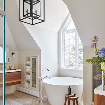
Upon moving to a new home, this couple chose to convert two small guest baths into one large luxurious space including a Japanese soaking tub and custom glass shower with rainfall spout. Two floating vanities in a walnut finish topped with composite countertops and integrated sinks flank each wall. Due to the pitched walls, Barbara worked with both an industrial designer and mirror manufacturer to design special clips to mount the vanity mirrors, creating a unique and modern solution in a challenging space.
The mix of travertine floor tiles with glossy cream wainscotting tiles creates a warm and inviting feel in this bathroom. Glass fronted shelving built into the eaves offers extra storage for towels and accessories. A oil-rubbed bronze finish lantern hangs from the dramatic ceiling while matching finish sconces add task lighting to the vanity areas.
This project was featured in Boston Magazine Home Design section entitiled "Spaces: Bathing Beauty" in the March 2018 issue. Click here for a link to the article:
https://www.bostonmagazine.com/property/2018/03/27/elza-b-design-bathroom-transformation/
Photography: Jared Kuzia

 The Brooklyn Studio
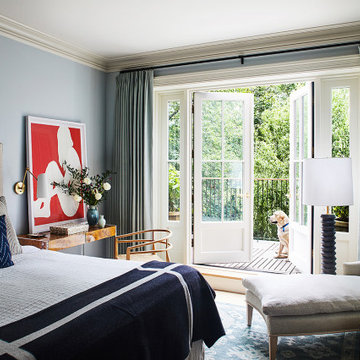
This Cobble Hill Brownstone for a family of five is a fun and captivating design, the perfect blend of the wife’s love of English country style and the husband’s preference for modern. The young power couple, her the co-founder of Maisonette and him an investor, have three children and a dog, requiring that all the surfaces, finishes and, materials used throughout the home are both beautiful and durable to make every room a carefree space the whole family can enjoy.
The primary design challenge for this project was creating both distinct places for the family to live their day to day lives and also a whole floor dedicated to formal entertainment. The clients entertain large dinners on a monthly basis as part of their profession. We solved this by adding an extension on the Garden and Parlor levels. This allowed the Garden level to function as the daily family operations center and the Parlor level to be party central. The kitchen on the garden level is large enough to dine in and accommodate a large catering crew.
On the parlor level, we created a large double parlor in the front of the house; this space is dedicated to cocktail hour and after-dinner drinks. The rear of the parlor is a spacious formal dining room that can seat up to 14 guests. The middle "library" space contains a bar and facilitates access to both the front and rear rooms; in this way, it can double as a staging area for the parties.
The remaining three floors are sleeping quarters for the family and frequent out of town guests. Designing a row house for private and public functions programmatically returns the building to a configuration in line with its original design.
This project was published in Architectural Digest.
Photography by Sam Frost
 Drewett Works
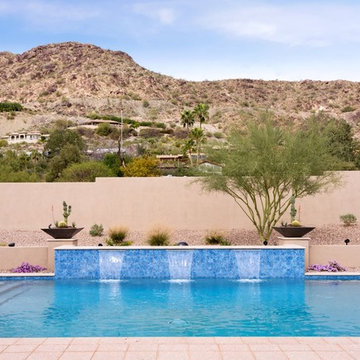
The unique opportunity and challenge for the Joshua Tree project was to enable the architecture to prioritize views. Set in the valley between Mummy and Camelback mountains, two iconic landforms located in Paradise Valley, Arizona, this lot “has it all” regarding views. The challenge was answered with what we refer to as the desert pavilion.
This highly penetrated piece of architecture carefully maintains a one-room deep composition. This allows each space to leverage the majestic mountain views. The material palette is executed in a panelized massing composition. The home, spawned from mid-century modern DNA, opens seamlessly to exterior living spaces providing for the ultimate in indoor/outdoor living.
Project Details:
Architecture: Drewett Works, Scottsdale, AZ // C.P. Drewett, AIA, NCARB // www.drewettworks.com
Builder: Bedbrock Developers, Paradise Valley, AZ // http://www.bedbrock.com
Interior Designer: Est Est, Scottsdale, AZ // http://www.estestinc.com
Photographer: Michael Duerinckx, Phoenix, AZ // www.inckx.com

 CHRISTOPHER STROM ARCHITECTS
Eye-Land: Named for the expansive white oak savanna views, this beautiful 5,200-square foot family home offers seamless indoor/outdoor living with five bedrooms and three baths, and space for two more bedrooms and a bathroom.
The site posed unique design challenges. The home was ultimately nestled into the hillside, instead of placed on top of the hill, so that it didn’t dominate the dramatic landscape. The openness of the savanna exposes all sides of the house to the public, which required creative use of form and materials. The home’s one-and-a-half story form pays tribute to the site’s farming history. The simplicity of the gable roof puts a modern edge on a traditional form, and the exterior color palette is limited to black tones to strike a stunning contrast to the golden savanna.
The main public spaces have oversized south-facing windows and easy access to an outdoor terrace with views overlooking a protected wetland. The connection to the land is further strengthened by strategically placed windows that allow for views from the kitchen to the driveway and auto court to see visitors approach and children play. There is a formal living room adjacent to the front entry for entertaining and a separate family room that opens to the kitchen for immediate family to gather before and after mealtime.
 Howell Custom Building Group
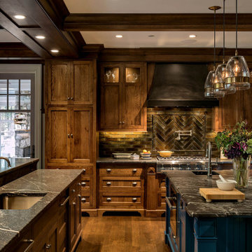
The homeowners of this wanted to create an informal year-round residence for their active family that reflected their love of the outdoors and time spent in ski and camping lodges. The result is a luxurious, yet understated, comfortable kitchen/dining area that exudes a feeling of warmth and relaxation. The open floor plan offers views throughout the first floor, while large picture windows integrate the outdoors and fill the space with light. A door to the three-season room offers easy access to an outdoor kitchen and living area. The dark wood floors, cabinets with natural wood grain, leathered stone counters, and coffered ceilings offer the ambiance of a 19th century mountain lodge, yet this is combined with painted wainscoting and woodwork to brighten and modernize the space. A blue center island in the kitchen adds a fun splash of color, while a gas fireplace and lit upper cabinets adds a cozy feeling. A separate butler’s pantry contains additional refrigeration, storage, and a wine cooler. Challenges included integrating the perimeter cabinetry into the crown moldings and coffered ceilings, so the lines of millwork are aligned through multiple living spaces. In particular, there is a structural steel column on the corner of the raised island around which oak millwork was wrapped to match the living room columns. Another challenge was concealing second floor plumbing in the beams of the coffered ceiling.
 Metropolis Drafting and Construction Inc
Who said that a Burbank bungalow home needs to be doll and old fashioned.
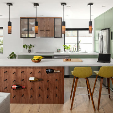
In this Burbank remodeling project we took this 1200sq. bungalow home and turned it to a wonderful mixture of European modern kitchen space and calm transitional modern farmhouse furniture and flooring.
The kitchen was a true challenge since space was a rare commodity, but with the right layout storage and work space became abundant.
A floating 5' long sitting area was constructed and even the back face of the cabinets was used for wine racks.
Exterior was updated as well with new black windows, new stucco over layer and new light fixtures all around.
both bedrooms were fitted with huge 10' sliding doors overlooking the green backyard.
 AZL interiors
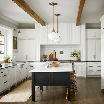
With tall ceilings, an impressive stone fireplace, and original wooden beams, this home in Glen Ellyn, a suburb of Chicago, had plenty of character and a style that felt coastal. Six months into the purchase of their home, this family of six contacted Alessia Loffredo and Sarah Coscarelli of ReDesign Home to complete their home’s renovation by tackling the kitchen.
“Surprisingly, the kitchen was the one room in the home that lacked interest due to a challenging layout between kitchen, butler pantry, and pantry,” the designer shared, “the cabinetry was not proportionate to the space’s large footprint and height. None of the house’s architectural features were introduced into kitchen aside from the wooden beams crossing the room throughout the main floor including the family room.” She moved the pantry door closer to the prepping and cooking area while converting the former butler pantry a bar. Alessia designed an oversized hood around the stove to counterbalance the impressive stone fireplace located at the opposite side of the living space.
She then wanted to include functionality, using Trim Tech‘s cabinets, featuring a pair with retractable doors, for easy access, flanking both sides of the range. The client had asked for an island that would be larger than the original in their space – Alessia made the smart decision that if it was to increase in size it shouldn’t increase in visual weight and designed it with legs, raised above the floor. Made out of steel, by Wayward Machine Co., along with a marble-replicating porcelain countertop, it was designed with durability in mind to withstand anything that her client’s four children would throw at it. Finally, she added finishing touches to the space in the form of brass hardware from Katonah Chicago, with similar toned wall lighting and faucet.
Sponsored
Columbus, OH

Structural Remodeling
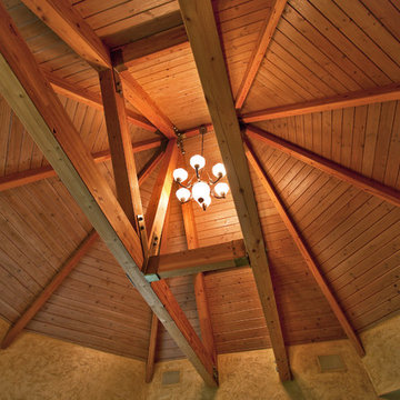
Franklin County's Heavy Timber Specialists | Best of Houzz 2020!
 TVL Creative Ltd.
[Our Clients]
We were so excited to help these new homeowners re-envision their split-level diamond in the rough. There was so much potential in those walls, and we couldn’t wait to delve in and start transforming spaces. Our primary goal was to re-imagine the main level of the home and create an open flow between the space. So, we started by converting the existing single car garage into their living room (complete with a new fireplace) and opening up the kitchen to the rest of the level.
[Kitchen]
The original kitchen had been on the small side and cut-off from the rest of the home, but after we removed the coat closet, this kitchen opened up beautifully. Our plan was to create an open and light filled kitchen with a design that translated well to the other spaces in this home, and a layout that offered plenty of space for multiple cooks. We utilized clean white cabinets around the perimeter of the kitchen and popped the island with a spunky shade of blue. To add a real element of fun, we jazzed it up with the colorful escher tile at the backsplash and brought in accents of brass in the hardware and light fixtures to tie it all together. Through out this home we brought in warm wood accents and the kitchen was no exception, with its custom floating shelves and graceful waterfall butcher block counter at the island.
[Dining Room]
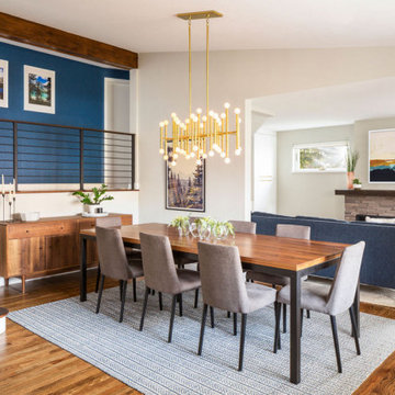
The dining room had once been the home’s living room, but we had other plans in mind. With its dramatic vaulted ceiling and new custom steel railing, this room was just screaming for a dramatic light fixture and a large table to welcome one-and-all.
[Living Room]
We converted the original garage into a lovely little living room with a cozy fireplace. There is plenty of new storage in this space (that ties in with the kitchen finishes), but the real gem is the reading nook with two of the most comfortable armchairs you’ve ever sat in.
[Master Suite]
This home didn’t originally have a master suite, so we decided to convert one of the bedrooms and create a charming suite that you’d never want to leave. The master bathroom aesthetic quickly became all about the textures. With a sultry black hex on the floor and a dimensional geometric tile on the walls we set the stage for a calm space. The warm walnut vanity and touches of brass cozy up the space and relate with the feel of the rest of the home. We continued the warm wood touches into the master bedroom, but went for a rich accent wall that elevated the sophistication level and sets this space apart.
[Hall Bathroom]
The floor tile in this bathroom still makes our hearts skip a beat. We designed the rest of the space to be a clean and bright white, and really let the lovely blue of the floor tile pop. The walnut vanity cabinet (complete with hairpin legs) adds a lovely level of warmth to this bathroom, and the black and brass accents add the sophisticated touch we were looking for.
[Office]
We loved the original built-ins in this space, and knew they needed to always be a part of this house, but these 60-year-old beauties definitely needed a little help. We cleaned up the cabinets and brass hardware, switched out the formica counter for a new quartz top, and painted wall a cheery accent color to liven it up a bit. And voila! We have an office that is the envy of the neighborhood.
 Stalburg Design
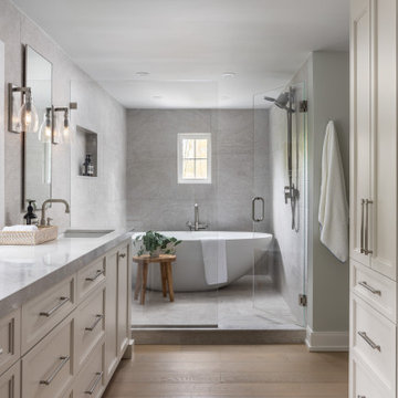
Relocating from their home in Brisbane, Australia with ocean views to the Pacific, our clients envisioned a refresh for their new lakefront cottage on Pine Lake in West Bloomfield, Michigan. Completed in July 2024, we created new spaces, reimagined old ones, and even swapped places for a primary bedroom and its en suite bath.
Our goal was to create a serene and soothing spa- like experience for the bathroom, all while maintaining gorgeous lake views. But this reconfiguration presented some challenges. The primary bedroom was oversized, while its adjacent bath was tiny and crowded. We completely flipped the locations of the bedroom and bathroom, even rerouting plumbing over the bar in the lower level to accommodate the freestanding tub.
To maximize space, we designed large, walk-in dressing pantries that are as functional as they are beautiful, and lead to the large dual custom vanity. The vanity itself is freestanding to provide access for hand towel bath hardware on its sides. The his-and-hers unit contains built-in dividers, laundry hampers and trash pullouts to maximize its function. An enclosed water closet allows for privacy in the open concept bathroom, and is placed beyond the cabinetry.
The star of this space is the large enclosed wet room. As the focal point of the bathroom, its oversized tiled walls and deep built-in bench allow for a steam or soaking in the tub while enjoying stunning lake views. The wet room is spacious and serene, and perfect for an end to a Michigan winter day.

 ZeroEnergy Design
This LEED Platinum certified house reflects the homeowner's desire for an exceptionally healthy and comfortable living environment, within a traditional neighborhood.
INFILL SITE. The family, who moved from another area of Wellesley, sought out this property to be within walking distance of the high school and downtown area. An existing structure on the tight lot was removed to make way for the new home. 84% of the construction waste, from both the previous structure and the new home, was diverted from a landfill. ZED designed to preserve the existing mature trees on the perimeter of the property to minimize site impacts, and to maintain the character of the neighborhood as well as privacy on the site.
EXTERIOR EXPRESSION. The street facade of the home relates to the local New England vernacular. The rear uses contemporary language, a nod to the family’s Californian roots, to incorporate a roof deck, solar panels, outdoor living space, and the backyard swimming pool. ZED’s careful planning avoided to the need to face the garage doors towards the street, a common syndrome of a narrow lot.
THOUGHTFUL SPACE. Homes with dual entries can often result in duplicate and unused spaces. In this home, the everyday and formal entry areas are one and the same; the front and garage doors share the entry program of coat closets, mudroom storage with bench for removing your shoes, and a laundry room with generous closets for the children's sporting equipment. The entry area leads directly to the living space, encompassing the kitchen, dining and sitting area areas in an L-shaped open plan arrangement. The kitchen is placed at the south-west corner of the space to allow for a strong connection to the dining, sitting and outdoor living spaces. A fire pit on the deck satisfies the family’s desire for an open flame while a sealed gas fireplace is used indoors - ZED’s preference after omitting gas burning appliances completely from an airtight home. A small study, with a window seat, is conveniently located just off of the living space. A first floor guest bedroom includes an accessible bathroom for aging visitors and can be used as a master suite to accommodate aging in place.
HEALTHY LIVING. The client requested a home that was easy to clean and would provide a respite from seasonal allergies and common contaminants that are found in many indoor spaces. ZED selected easy to clean solid surface flooring throughout, provided ample space for cleaning supplies on each floor, and designed a mechanical system with ventilation that provides a constant supply of fresh outdoor air. ZED selected durable materials, finishes, cabinetry, and casework with low or no volatile organic compounds (VOCs) and no added urea formaldehyde.
YEAR-ROUND COMFORT. The home is super insulated and air-tight, paired with high performance triple-paned windows, to ensure it is draft-free throughout the winter (even when in front of the large windows and doors). ZED designed a right-sized heating and cooling system to pair with the thermally improved building enclosure to ensure year-round comfort. The glazing on the home maximizes passive solar gains, and facilitates cross ventilation and daylighting.
ENERGY EFFICIENT. As one of the most energy efficient houses built to date in Wellesley, the home highlights a practical solution for Massachusetts. First, the building enclosure reduces the largest energy requirement for typical houses (heating). Super-insulation, exceptional air sealing, a thermally broken wall assembly, triple pane windows, and passive solar gain combine for a sizable heating load reduction. Second, within the house only efficient systems consume energy. These include an air source heat pump for heating & cooling, a heat pump hot water heater, LED lighting, energy recovery ventilation, and high efficiency appliances. Lastly, photovoltaics provide renewable energy help offset energy consumption. The result is an 89% reduction in energy use compared to a similar brand new home built to code requirements.
RESILIENT. The home will fare well in extreme weather events. During a winter power outage, heat loss will be very slow due to the super-insulated and airtight envelope– taking multiple days to drop to 60 degrees even with no heat source. An engineered drainage system, paired with careful the detailing of the foundation, will help to keep the finished basement dry. A generator will provide full operation of the all-electric house during a power outage.
OVERALL. The home is a reflection of the family goals and an expression of their values, beautifully enabling health, comfort, safety, resilience, and utility, all while respecting the planet.
ZED - Architect & Mechanical Designer
Bevilacqua Builders Inc - Contractor
Creative Land & Water Engineering - Civil Engineering
Barbara Peterson Landscape - Landscape Design
Nest & Company - Interior Furnishings
Eric Roth Photography - Photography
 Wiedemann Architects LLC
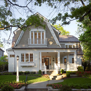
This project is a new 5,900 sf. primary residence for a couple with three children. The site is slightly elevated above the residential street and enjoys winter views of the Potomac River.
The family’s requirements included five bedrooms, five full baths, a powder room, family room, dining room, eat-in kitchen, walk-in pantry, mudroom, lower level recreation room, exercise room, media room and numerous storage spaces. Also included was the request for an outdoor terrace and adequate outdoor storage, including provision for the storage of bikes and kayaks. The family needed a home that would have two entrances, the primary entrance, and a mudroom entry that would provide generous storage spaces for the family’s active lifestyle. Due to the small lot size, the challenge was to accommodate the family’s requirements, while remaining sympathetic to the scale of neighboring homes.
The residence employs a “T” shaped plan to aid in minimizing the massing visible from the street, while organizing interior spaces around a private outdoor terrace space accessible from the living and dining spaces. A generous front porch and a gambrel roof diminish the home’s scale, providing a welcoming view along the street front. A path along the right side of the residence leads to the family entrance and a small outbuilding that provides ready access to the bikes and kayaks while shielding the rear terrace from view of neighboring homes.
The two entrances join a central stair hall that leads to the eat-in kitchen overlooking the great room. Window seats and a custom built banquette provide gathering spaces, while the French doors connect the great room to the terrace where the arbor transitions to the garden. A first floor guest suite, separate from the family areas of the home, affords privacy for both guests and hosts alike. The second floor Master Suite enjoys views of the Potomac River through a second floor arched balcony visible from the front.
The exterior is composed of a board and batten first floor with a cedar shingled second floor and gambrel roof. These two contrasting materials and the inclusion of a partially recessed front porch contribute to the perceived diminution of the home’s scale relative to its smaller neighbors. The overall intention was to create a close fit between the residence and the neighboring context, both built and natural.
Builder: E.H. Johnstone Builders
Anice Hoachlander Photography

 KD Landscape
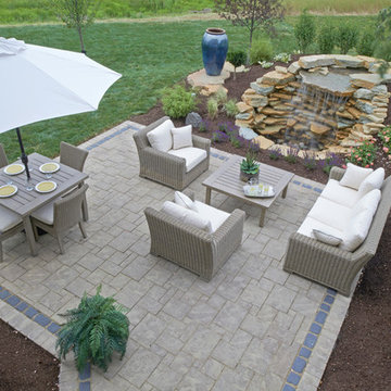
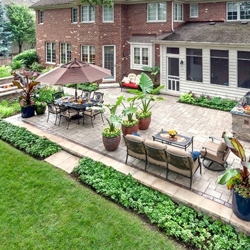
The distinct spaces can be seen from this overhead view. The dining area is separated from the social space by three large containers on one side and from the fire pit by a low profile planting bed on the other side. A small grill with counter is conveniently located near the three season room. Landscape design by John Algozzini. Photo courtesy of Mike Crews Photography.

 TKS Design Group
Download our free ebook, Creating the Ideal Kitchen. DOWNLOAD NOW
For many, extra time at home during COVID left them wanting more from their homes. Whether you realized the shortcomings of your space or simply wanted to combat boredom, a well-designed and functional home was no longer a want, it became a need. Tina found herself wanting more from her Old Irving Park home and reached out to The Kitchen Studio about adding function to her kitchen to make the most of the available real estate.
At the end of the day, there is nothing better than returning home to a bright and happy space you love. And this kitchen wasn’t that for Tina. Dark and dated, with a palette from the past and features that didn’t make the most of the available square footage, this remodel required vision and a fresh approach to the space. Lead designer, Stephanie Cole’s main design goal was better flow, while adding greater functionality with organized storage, accessible open shelving, and an overall sense of cohesion with the adjoining family room.
The original kitchen featured a large pizza oven, which was rarely used, yet its footprint limited storage space. The nearby pantry had become a catch-all, lacking the organization needed in the home. The initial plan was to keep the pizza oven, but eventually Tina realized she preferred the design possibilities that came from removing this cumbersome feature, with the goal of adding function throughout the upgraded and elevated space. Eliminating the pantry added square footage and length to the kitchen for greater function and more storage. This redesigned space reflects how she lives and uses her home, as well as her love for entertaining.
The kitchen features a classic, clean, and timeless palette. White cabinetry, with brass and bronze finishes, contrasts with rich wood flooring, and lets the large, deep blue island in Woodland’s custom color Harbor – a neutral, yet statement color – draw your eye.
The kitchen was the main priority. In addition to updating and elevating this space, Tina wanted to maximize what her home had to offer. From moving the location of the patio door and eliminating a window to removing an existing closet in the mudroom and the cluttered pantry, the kitchen footprint grew. Once the floorplan was set, it was time to bring cohesion to her home, creating connection between the kitchen and surrounding spaces.
The color palette carries into the mudroom, where we added beautiful new cabinetry, practical bench seating, and accessible hooks, perfect for guests and everyday living. The nearby bar continues the aesthetic, with stunning Carrara marble subway tile, hints of brass and bronze, and a design that further captures the vibe of the kitchen.
Every home has its unique design challenges. But with a fresh perspective and a bit of creativity, there is always a way to give the client exactly what they want [and need]. In this particular kitchen, the existing soffits and high slanted ceilings added a layer of complexity to the lighting layout and upper perimeter cabinets.
While a space needs to look good, it also needs to function well. This meant making the most of the height of the room and accounting for the varied ceiling features, while also giving Tina everything she wanted and more. Pendants and task lighting paired with an abundance of natural light amplify the bright aesthetic. The cabinetry layout and design compliments the soffits with subtle profile details that bring everything together. The tile selections add visual interest, drawing the eye to the focal area above the range. Glass-doored cabinets further customize the space and give the illusion of even more height within the room.
While her family may be grown and out of the house, Tina was focused on adding function without sacrificing a stunning aesthetic and dreamy finishes that make the kitchen the gathering place of any home. It was time to love her kitchen again, and if you’re wondering what she loves most, it’s the niche with glass door cabinetry and open shelving for display paired with the marble mosaic backsplash over the range and complimenting hood. Each of these features is a stunning point of interest within the kitchen – both brag-worthy additions to a perimeter layout that previously felt limited and lacking.
Whether your remodel is the result of special needs in your home or simply the excitement of focusing your energy on creating a fun new aesthetic, we are here for it. We love a good challenge because there is always a way to make a space better – adding function and beauty simultaneously.
 SkB Architects
Originally built in 1955, this modest penthouse apartment typified the small, separated living spaces of its era. The design challenge was how to create a home that reflected contemporary taste and the client’s desire for an environment rich in materials and textures. The keys to updating the space were threefold: break down the existing divisions between rooms; emphasize the connection to the adjoining 850-square-foot terrace; and establish an overarching visual harmony for the home through the use of simple, elegant materials.
The renovation preserves and enhances the home’s mid-century roots while bringing the design into the 21st century—appropriate given the apartment’s location just a few blocks from the fairgrounds of the 1962 World’s Fair.
1