
Search results for "Space related challenges" in Home Design Ideas
 Saikley Architects
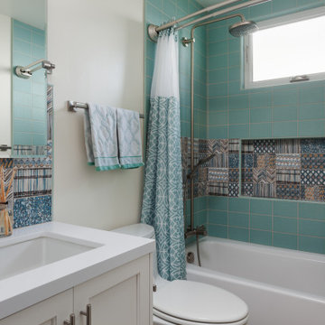
Our busy Silicon Valley clients asked us to convert their tight-quartered 1960’s ranch house to a gracious family home that would meet their long term needs. Ease of living was paramount, both in functionality and in ordered design.
The project was completed on a moderate budget.While retaining most of the structure of the existing house to avoid costly structural changes, we opened walls to improve the sight lines and flow of the house and bring in more light. We made small additions at the front and back bedrooms to gain space for the family and relatives. An existing underused patio area was improved with a simple outdoor kitchen and overhang to extend the living space to the outside. Costs were kept down with choices of modest materials.
Everything was made to be functional. Ample storage has been built into the right places. The details of the kitchen were carefully worked out to accommodate all the wishes of the various cooks in the family. The house is set up to be easy to keep clean. Acoustic walls separate living from bedroom spaces so adults can enjoy time together while children sleep. The outdoor kitchen has easy access to the indoor kitchen and the garage, and its setup promotes socializing while cooking outdoors.
A large part of the narrow back yard was previously unusable space due to a steep slope up to a neighbor’s higher fence. With a new retaining wall and some re-grading we took back more of the yard for the patio and play space on a new lawn.
The remodeled house is a mix of contemporary and traditional elements. Cool colors have a calming effect. Traditional items such as prairie style windows, trellis, mosaic tiles, and Shaker style cabinets, break down the scale in an otherwise streamlined, contemporary design. A new gabled roof with a broad arch at the front of the house marks the entry and resolves a challenging form where the central entry is set back from walls on both sides.
Photography: Kurt Manley
https://saikleyarchitects.com/portfolio/modern-ranch/
 Studio 1200
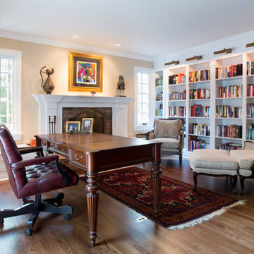
After having lived in 22 different places all around the world, this family decided to settle in a Dutch colonial home in Harding Township. The house sits on a wonderful piece of property that is only challenged by the wetlands that surround it. For this reason, we had to work within the existing footprint and not consider any additions. The homeowners wanted to be able to host the holidays in their new home which meant we had an aggressive design and construction schedule. We started the design work in the Spring of 2012 and construction took place over the Summer and into the Fall. By Thanksgiving, the project was complete, with no meaningful cost overruns.
Renovations included a new kitchen, mudroom, and office/library on the first floor and a new master suite, hall bath, home office, and laundry room upstairs. The challenge was creating comfortable space with clean lines that would accommodate the homeowner’s casual and worldly lifestyle, but would not feel out of place with the character of the existing house.
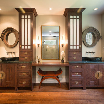
The kitchen is a glorious hard-working space with lots of counter space, space for a giant farmer’s table, and symmetrical views through oversized double hung-windows out to the expansive yard. The master bath is outfitted with wood, stone, and metal, and also includes artifacts from some of their world travels. In a second phase of work, we designed some outbuilding to further enhance the character of the property. Currently we are working with the family to design a memorial to honor their child who died of Leukemia.
 Studio 1200
After having lived in 22 different places all around the world, this family decided to settle in a Dutch colonial home in Harding Township. The house sits on a wonderful piece of property that is only challenged by the wetlands that surround it. For this reason, we had to work within the existing footprint and not consider any additions. The homeowners wanted to be able to host the holidays in their new home which meant we had an aggressive design and construction schedule. We started the design work in the Spring of 2012 and construction took place over the Summer and into the Fall. By Thanksgiving, the project was complete, with no meaningful cost overruns.
Renovations included a new kitchen, mudroom, and office/library on the first floor and a new master suite, hall bath, home office, and laundry room upstairs. The challenge was creating comfortable space with clean lines that would accommodate the homeowner’s casual and worldly lifestyle, but would not feel out of place with the character of the existing house.
The kitchen is a glorious hard-working space with lots of counter space, space for a giant farmer’s table, and symmetrical views through oversized double hung-windows out to the expansive yard. The master bath is outfitted with wood, stone, and metal, and also includes artifacts from some of their world travels. In a second phase of work, we designed some outbuilding to further enhance the character of the property. Currently we are working with the family to design a memorial to honor their child who died of Leukemia.
Find the right local pro for your project
 Kelly Peloza Photo LLC
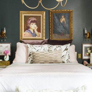
Interior photography of EM Interiors Chicago's spring 2015 One Room Challenge.
Calling It Home's One Room Challenge is a biannual design event that challenges 20 design bloggers to transform a space over the course of the month.
Photography ©2015 by Kelly Peloza Photo
 Living with Lolo
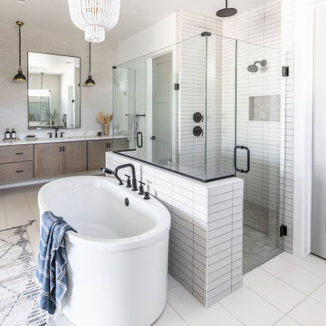
Bathroom in Monte Lindo | Room Type:
Full Home Furnishing – 4,368 sq ft | 6 Bedrooms | 5 Baths- Living Room, Dining Room, Kitchen Nook, Family Room, Office, Primary Bedroom + Bath.
Project Name:
Monte Lindo |
Key Feature:
A Modern Transitional new build transformed from builder-grade into a unique, personality-driven home through curated furnishings, lighting, art, and mirrors.
Challenge:
COVID-related supply and delivery delays, along with limitations of working within a builder-grade home that restricted creativity in certain areas.
Solution:
The team elevated the space with thoughtfully selected furnishings, lighting, wallpaper, art, and mirrors, pushing the clients slightly outside their comfort zone to create a home that felt both comfortable and impressive.
Materials:
Lighting: Arteriors, Palecek, Circa, Memoky.
Rugs: Loloi, Surya.
Mirrors: Four Hands, Ferguson, Arteriors.
Wallpaper: Savannah Hayes.
Furniture: Classic Home, Four Hands, Moss Home, Dovetail, Union Home.
Budget:
$50k-$75K |
Timeline:
11 months, completed September 2021.
 Gramophone
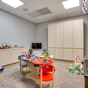
Our client wanted the Gramophone team to recreate an existing finished section of their basement, as well as some unfinished areas, into a multifunctional open floor plan design. Challenges included several lally columns as well as varying ceiling heights, but with teamwork and communication, we made this project a streamlined, clean, contemporary success. The art in the space was selected by none other than the client and his family members to give the space a personal touch!
Maryland Photography, Inc.
 TKS Design Group
Download our free ebook, Creating the Ideal Kitchen. DOWNLOAD NOW
A tired primary bathroom, with varying ceiling heights and a beige-on-beige color scheme, was screaming for love. Squaring the room and adding natural materials erased the memory of the lack luster space and converted it to a bright and welcoming spa oasis. The home was a new build in 2005 and it looked like all the builder’s material choices remained. The client was clear on their design direction but were challenged by the differing ceiling heights and were looking to hire a design-build firm that could resolve that issue.
This local Glen Ellyn couple found us on Instagram (@kitchenstudioge, follow us ?). They loved our designs and felt like we fit their style. They requested a full primary bath renovation to include a large shower, soaking tub, double vanity with storage options, and heated floors. The wife also really wanted a separate make-up vanity. The biggest challenge presented to us was to architecturally marry the various ceiling heights and deliver a streamlined design.
The existing layout worked well for the couple, so we kept everything in place, except we enlarged the shower and replaced the built-in tub with a lovely free-standing model. We also added a sitting make-up vanity. We were able to eliminate the awkward ceiling lines by extending all the walls to the highest level. Then, to accommodate the sprinklers and HVAC, lowered the ceiling height over the entrance and shower area which then opens to the 2-story vanity and tub area. Very dramatic!
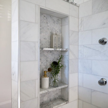
This high-end home deserved high-end fixtures. The homeowners also quickly realized they loved the look of natural marble and wanted to use as much of it as possible in their new bath. They chose a marble slab from the stone yard for the countertops and back splash, and we found complimentary marble tile for the shower. The homeowners also liked the idea of mixing metals in their new posh bathroom and loved the look of black, gold, and chrome.
Although our clients were very clear on their style, they were having a difficult time pulling it all together and envisioning the final product. As interior designers it is our job to translate and elevate our clients’ ideas into a deliverable design. We presented the homeowners with mood boards and 3D renderings of our modern, clean, white marble design. Since the color scheme was relatively neutral, at the homeowner’s request, we decided to add of interest with the patterns and shapes in the room.
We were first inspired by the shower floor tile with its circular/linear motif. We designed the cabinetry, floor and wall tiles, mirrors, cabinet pulls, and wainscoting to have a square or rectangular shape, and then to create interest we added perfectly placed circles to contrast with the rectangular shapes. The globe shaped chandelier against the square wall trim is a delightful yet subtle juxtaposition.
The clients were overjoyed with our interpretation of their vision and impressed with the level of detail we brought to the project. It’s one thing to know how you want a space to look, but it takes a special set of skills to create the design and see it thorough to implementation. Could hiring The Kitchen Studio be the first step to making your home dreams come to life?


 Living with Lolo
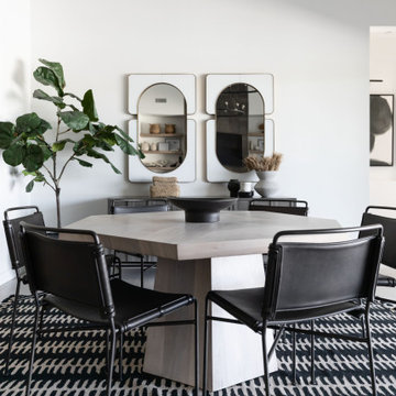
Dining Room in Monte Lindo | Room Type:
Full Home Furnishing – 4,368 sq ft | 6 Bedrooms | 5 Baths- Living Room, Dining Room, Kitchen Nook, Family Room, Office, Primary Bedroom + Bath.
Project Name:
Monte Lindo |
Key Feature:
A Modern Transitional new build transformed from builder-grade into a unique, personality-driven home through curated furnishings, lighting, art, and mirrors.
Challenge:
COVID-related supply and delivery delays, along with limitations of working within a builder-grade home that restricted creativity in certain areas.
Solution:
The team elevated the space with thoughtfully selected furnishings, lighting, wallpaper, art, and mirrors, pushing the clients slightly outside their comfort zone to create a home that felt both comfortable and impressive.
Materials:
Lighting: Arteriors, Palecek, Circa, Memoky.
Rugs: Loloi, Surya.
Mirrors: Four Hands, Ferguson, Arteriors.
Wallpaper: Savannah Hayes.
Furniture: Classic Home, Four Hands, Moss Home, Dovetail, Union Home.
Budget:
$50k-$75K |
Timeline:
11 months, completed September 2021.
 Klopf Architecture
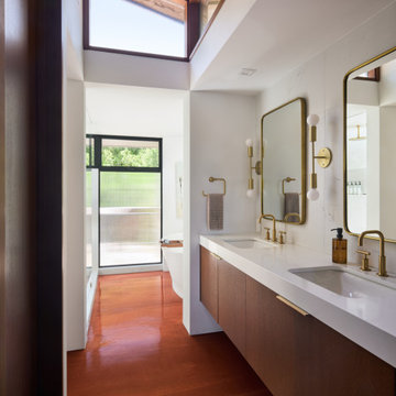
Nestled in the hills of Orinda, California, this 1951 residence is one of only seven extant homes, now known as “The Magnificent Seven”, designed by architect Olof Dahlstrand, a protégé of Frank Lloyd Wright. With its low-slung rooflines, natural materials, and deep integration with the sloping landscape, the home is a pristine example of mid-century modern design inspired by Wright’s organic principles. Over the years, prior homeowners have emphasized preservation, ensuring that the house remained relatively untouched. Each owner has respected the original architecture and stayed true to Dahlstrand’s intent. When a family of five—two college-aged sons and a middle school-aged daughter—acquired the property, they were captivated by its history, legacy of care, and architectural significance. While they appreciated Dahlstrand’s original vision, they also recognized the need to adapt the home for contemporary living while preserving its design integrity.
The remodel was conceived as a thoughtful response to the past—an effort to bring the house into the 21st century without compromising its soul. The primary mandate was to maintain architectural continuity while improving the functionality, comfort, and livability for a modern family. The design team—architects and contractor alike—worked with a shared reverence for the original architecture, allowing that mindset to guide even the most technical or pragmatic decisions.
A key objective was to increase natural light in the kitchen—a departure from Wrightian principles of enclosed, intimate cooking spaces—while maintaining the home’s architectural language. The kitchen was reconfigured to foster a stronger connection to adjacent living spaces while retaining the underlying concept of spatial separation. One of the most transformative architectural changes was the removal of a ridge beam that was originally planned to remain visible through the kitchen. During construction, the team collaborated on a better solution: a wide-flanged steel beam concealed within the roof envelope. This subtle move preserved the clean lines and ceiling continuity, a modern update carried out with utmost respect for the existing framework.
The home’s original powder room, previously accessible only through the kitchen, was relocated for better flow and privacy. A new powder room was carved out of former kitchen cabinetry—a narrow, interior space that could have felt dark and enclosed. To avoid this, the design extended the line of original transom windows into the new powder room and added a skylight above the vanity. The result is a bright and airy space that feels consistent with the rest of the home. Other updates included the installation of new solid-core interior doors with veneers carefully matched to the original mahogany, enhancing the continuity of the interiors. Even smaller decisions, such as placing the door knobs at 42 inches high, mirrored the original proportions. Every choice reflected a shared belief between the architect, contractor, and client: that new work should serve the integrity of the old.
The home’s extensive interior redwood millwork and paneling was meticulously restored. Where new materials were introduced—such as the replacement redwood soffit paneling—the contractor took pains to find finish nails that matched the original, rather than using modern equivalents. This level of craftsmanship and collaboration defined the project. It extended even to the detailing of a blind door to the new powder room, which had to disappear into the existing redwood board-and-batten wall. It was a team effort: the owner found a suitable handle, the architects devised the custom in-swing mechanism, and the contractor executed it so the door aligned precisely with the battens. Throughout, the homeowners were deeply engaged in the design process. One, a meticulous design enthusiast, focused on aesthetic integrity and historic detail. The other brought a practical and function-driven perspective, ensuring that new fixtures and materials would be durable and require minimal maintenance.
While the home’s location posed no major site challenges, sustainability was a key concern. The team upgraded the roof insulation, installed solar panels with battery storage, and added ductless mini-split cooling systems. Lighting was another area where modern technology was woven into a historic framework: new square LED fixtures echo the original custom perimeter soffit lights, maintaining the design language while offering advanced performance.
A planned expansion of a bedroom into suite with a bathroom had to be shelved due to budget constraints and the high cost of below-grade foundation work. Still, the team focused their efforts on making the most of the existing footprint, resolving constraints through design ingenuity rather than adding square footage. This renovation represents a collaborative achievement in preserving and evolving a historically significant home. Every decision was shaped by a shared ethos among clients, architects, and contractor: to maintain the home’s architectural soul while updating it for contemporary life. The result is a timeless modernist residence that continues Olof Dahlstrand’s legacy, remaining grounded in nature, craftsmanship, and human-scale design.
Klopf Architecture Team: John Klopf, AIA, Klara Kevane, Fernanda Bernardes
Interior Architectural Design: Klopf Architecture
Structural Engineer: Daniel Bastiao
Contractor: Don Larwood, Larwood Construction
Photography: Mariko Reed
Year Completed: 2022

 TEW Design Studio
This home is a true gem in the heart of MacGregor Downs community in Cary, NC. Built in the 1980's in true Modernist design and architecture, the new owners wanted to keep the integrity of the original design. We redesigned the Half Bath, created floor plan layouts for new furniture, spec'd out furniture, accessories, flooring material, lighting, and artwork, as well as worked on brightening the wall and ceiling paint colors. One challenge we faced during the design process were the very tall ceilings, the very wide walls, and unusual angles. We chose interesting , engaging, and minimalistic artwork for the walls, which proved a successful solution. Another challenge was having a large open angled living room space; we created the perfect layout with separate functional gathering areas and eliminated unused corners.
Photo credit: Bob Fortner
 TKS Design Group
WATCH the time lapse video of this kitchen remodel: https://youtu.be/caemXXlauLU
Free ebook, Creating the Ideal Kitchen. DOWNLOAD NOW
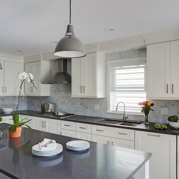
This Glen Ellyn homeowner came to us, frustrated with the layout and size of their current kitchen, looking for help generating ideas for how to maximize functionality within the constraints of the space. After visiting with them and seeing the home’s layout, I realized that looking at the bigger picture of how they used the entire first floor might bring us some dramatic solutions. We ended up flipping the kitchen and family room and taking down the wall separating the two creating one big open floor plan for the family to enjoy. There is still a visual separation between the rooms because of their different lengths and the overall space now relates nicely to the dining room which was also opened up to both rooms.
The new kitchen is an L-shaped space that is no longer cramped and small and is truly a cook’s dream. The fridge is on one end, a large cooktop and sink are located along the main perimeter and double ovens located at the end of the “L” complete the layout. Ample work surface along the perimeter and on the large island makes entertaining a breeze. An existing door to the patio remains, floods the room with light and provides easy access to the existing outdoor deck for entertaining and grilling.
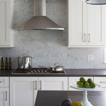
White cabinetry with quartz countertops, Carrera marble backsplash tile and a contrasting gray island give the space a clean and modern feel. The gray pendant lights and stainless appliances bring a slight industrial feel to the space letting you know that some serious cooking will take place here.
Once we had their Dream Kitchen design completed, the homeowners decided to tackle another project at the same time. We made plans to create a master suite upstairs by combining two existing bedrooms into a larger bedroom, bathroom and walk-in closet. The existing spaces were not overly large so getting everything on the wish list into the design was a challenge. In the end, we came up with a design that works. The two bedrooms were adjoined, one wall moved back slightly to make for a slightly larger bedroom, and the remaining space was allotted to the new bathroom and a walk in closet.
The bathroom consists of a double vanity and a large shower with a barn door shower door. A skylight brings light into the space and helps make it feel larger and more open. The new walk-in closet is accessible through the bathroom, and we even managed to fit in a small entry vestibule that houses some additional storage and makes a nice transition from the hallway. A white vanity, Carrera tops and gray floor tile make for a serene space that feels just right for this home.
Designed by: Susan Klimala, CKD, CBD
Photography by: Mike Kaskel
For more information on kitchen and bath design ideas go to: www.kitchenstudio-ge.com
 Drewett Works
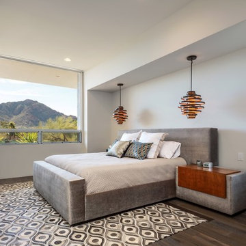
The unique opportunity and challenge for the Joshua Tree project was to enable the architecture to prioritize views. Set in the valley between Mummy and Camelback mountains, two iconic landforms located in Paradise Valley, Arizona, this lot “has it all” regarding views. The challenge was answered with what we refer to as the desert pavilion.
This highly penetrated piece of architecture carefully maintains a one-room deep composition. This allows each space to leverage the majestic mountain views. The material palette is executed in a panelized massing composition. The home, spawned from mid-century modern DNA, opens seamlessly to exterior living spaces providing for the ultimate in indoor/outdoor living.
Project Details:
Architecture: Drewett Works, Scottsdale, AZ // C.P. Drewett, AIA, NCARB // www.drewettworks.com
Builder: Bedbrock Developers, Paradise Valley, AZ // http://www.bedbrock.com
Interior Designer: Est Est, Scottsdale, AZ // http://www.estestinc.com
Photographer: Michael Duerinckx, Phoenix, AZ // www.inckx.com
 TKS Design Group
WATCH the time lapse video of this kitchen remodel: https://youtu.be/caemXXlauLU
Free ebook, Creating the Ideal Kitchen. DOWNLOAD NOW
This Glen Ellyn homeowner came to us, frustrated with the layout and size of their current kitchen, looking for help generating ideas for how to maximize functionality within the constraints of the space. After visiting with them and seeing the home’s layout, I realized that looking at the bigger picture of how they used the entire first floor might bring us some dramatic solutions. We ended up flipping the kitchen and family room and taking down the wall separating the two creating one big open floor plan for the family to enjoy. There is still a visual separation between the rooms because of their different lengths and the overall space now relates nicely to the dining room which was also opened up to both rooms.
The new kitchen is an L-shaped space that is no longer cramped and small and is truly a cook’s dream. The fridge is on one end, a large cooktop and sink are located along the main perimeter and double ovens located at the end of the “L” complete the layout. Ample work surface along the perimeter and on the large island makes entertaining a breeze. An existing door to the patio remains, floods the room with light and provides easy access to the existing outdoor deck for entertaining and grilling.
White cabinetry with quartz countertops, Carrera marble backsplash tile and a contrasting gray island give the space a clean and modern feel. The gray pendant lights and stainless appliances bring a slight industrial feel to the space letting you know that some serious cooking will take place here.
Once we had their Dream Kitchen design completed, the homeowners decided to tackle another project at the same time. We made plans to create a master suite upstairs by combining two existing bedrooms into a larger bedroom, bathroom and walk-in closet. The existing spaces were not overly large so getting everything on the wish list into the design was a challenge. In the end, we came up with a design that works. The two bedrooms were adjoined, one wall moved back slightly to make for a slightly larger bedroom, and the remaining space was allotted to the new bathroom and a walk in closet.
The bathroom consists of a double vanity and a large shower with a barn door shower door. A skylight brings light into the space and helps make it feel larger and more open. The new walk-in closet is accessible through the bathroom, and we even managed to fit in a small entry vestibule that houses some additional storage and makes a nice transition from the hallway. A white vanity, Carrera tops and gray floor tile make for a serene space that feels just right for this home.
Designed by: Susan Klimala, CKD, CBD
Photography by: Mike Kaskel
For more information on kitchen and bath design ideas go to: www.kitchenstudio-ge.com

Sponsored
Columbus, OH

Hope Restoration & General Contracting
Columbus Design-Build, Kitchen & Bath Remodeling, Historic Renovations
 TKS Design Group
WATCH the time lapse video of this kitchen remodel: https://youtu.be/caemXXlauLU
Free ebook, Creating the Ideal Kitchen. DOWNLOAD NOW
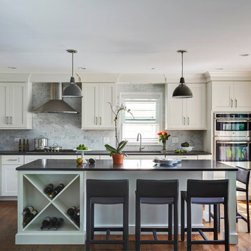
This Glen Ellyn homeowner came to us, frustrated with the layout and size of their current kitchen, looking for help generating ideas for how to maximize functionality within the constraints of the space. After visiting with them and seeing the home’s layout, I realized that looking at the bigger picture of how they used the entire first floor might bring us some dramatic solutions. We ended up flipping the kitchen and family room and taking down the wall separating the two creating one big open floor plan for the family to enjoy. There is still a visual separation between the rooms because of their different lengths and the overall space now relates nicely to the dining room which was also opened up to both rooms.
The new kitchen is an L-shaped space that is no longer cramped and small and is truly a cook’s dream. The fridge is on one end, a large cooktop and sink are located along the main perimeter and double ovens located at the end of the “L” complete the layout. Ample work surface along the perimeter and on the large island makes entertaining a breeze. An existing door to the patio remains, floods the room with light and provides easy access to the existing outdoor deck for entertaining and grilling.
White cabinetry with quartz countertops, Carrera marble backsplash tile and a contrasting gray island give the space a clean and modern feel. The gray pendant lights and stainless appliances bring a slight industrial feel to the space letting you know that some serious cooking will take place here.
Once we had their Dream Kitchen design completed, the homeowners decided to tackle another project at the same time. We made plans to create a master suite upstairs by combining two existing bedrooms into a larger bedroom, bathroom and walk-in closet. The existing spaces were not overly large so getting everything on the wish list into the design was a challenge. In the end, we came up with a design that works. The two bedrooms were adjoined, one wall moved back slightly to make for a slightly larger bedroom, and the remaining space was allotted to the new bathroom and a walk in closet.
The bathroom consists of a double vanity and a large shower with a barn door shower door. A skylight brings light into the space and helps make it feel larger and more open. The new walk-in closet is accessible through the bathroom, and we even managed to fit in a small entry vestibule that houses some additional storage and makes a nice transition from the hallway. A white vanity, Carrera tops and gray floor tile make for a serene space that feels just right for this home.
Designed by: Susan Klimala, CKD, CBD
Photography by: Mike Kaskel
For more information on kitchen and bath design ideas go to: www.kitchenstudio-ge.com
 Drury Design
The Setup:
After purchasing this home, the homeowners faced a unique opportunity to reimagine their kitchen and nearby spaces. Water damage from a burst pipe had left much of the home’s interior in need of repair, and while the existing kitchen was functional and in relatively good shape, it didn’t align with the family’s vision for their new home. The layout included a peninsula that wasn’t ideal, and there were some druthers with the nearby pantry.
Since the space needed to be rebuilt anyway, the homeowners saw this as a chance to create a kitchen that was both highly functional for their four young children and timeless in its design. The project also included a refresh of the adjacent message center and dining room — spaces that play key roles in the family’s daily life. The goal was to create a cohesive flow between these areas, balancing modern functionality with the craftsman-inspired character of the rest of the home.
Design Objectives:
- Replace the outdated peninsula with a large island to maximize counter space and create new seating options.
- Open up the space visually by removing soffits and rethinking the cabinetry layout.
Incorporate concealed refrigeration and freezer units to provide significant storage for the family while maintaining a streamlined aesthetic.
- Integrate black cabinetry into the design without making the space feel harsh or heavy.
- Ensure the lighting plan balances functional task lighting with ambient accent lighting.
- Avoid visual clutter in the cabinetry design while still giving a nod to the craftsman aesthetic.
- Incorporate a slab backsplash as a key design feature.
Design Challenges:
- The outdated peninsula left dead space in the kitchen and lacked sufficient seating for the family.
- The cooktop wall was cramped, with small cabinets flanking the hood, limited storage, and soffits that made the space feel closed-in.
- The family needed significant refrigeration space (two refrigerators and a freezer) but wanted to avoid a cluttered look with visible stainless steel appliances.
- Adding black cabinetry risked making the space feel too dark or heavy.
- The original lighting plan was insufficient, particularly over the dining table where a decorative fixture proved too dim.
- The family wanted shaker-style drawer fronts to match the home’s arts-and-crafts design but worried that too much shaker cabinetry might look overly busy.
- Prioritizing a slab backsplash in the wish list priority planning.
The Renewed Space
Design Solutions:
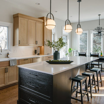
- A functional island: The peninsula was replaced with a large island that provides continuous countertop space for prepping and serving. The island also features seating for four people, creating a central hub for informal meals and activities.
- Streamlined cooktop wall: The soffits were removed, and the upper cabinets on the cooktop wall were eliminated to create a more open, streamlined design. A custom oversized hood became the focal point of the wall, with the blower unit offset inside it to align with the cooktop while maintaining exterior visual symmetry.
- Concealed refrigeration: Two column refrigerators and one freezer were integrated into the cabinetry, concealing them behind wood paneling that blends seamlessly with the overall design.
- Warm black cabinetry: The black cabinetry was crafted from hickory with a visible grain, softening its appearance and adding warmth. The grain detail gives the cabinetry a rich, textured look that avoids feeling stark or overpowering.
- Additional lighting: In the dining area, recessed can lights were added during an additional installation phase to supplement the gorgeous decorative fixture’s dim output. The new lighting plan creates a layered effect, combining functional task lighting with softer ambient lighting.
- Simplified cabinetry details: Slab drawer fronts were used on the upper drawers, while five-piece shaker fronts (with slightly less prominent rail and stile pieces) were reserved for the middle and lower drawers. This approach simplified the overall look while maintaining the craftsman-inspired aesthetic.
- Slab backsplash priority: The slab backsplash was prioritized by making thoughtful adjustments elsewhere, like opting not to extend cabinetry to the ceiling, which also helped visually prioritize the gorgeous slab backsplash. This decision also enhanced the kitchen’s furniture-like feel, aligning with the home’s craftsman character.
- This kitchen perfectly balances practicality with timeless style. By addressing the family’s functional needs — ample seating, smart storage, and effective lighting — while incorporating thoughtful design elements like warm black cabinetry and a striking slab backsplash, Alicia created a space that works beautifully for a busy household. The result is a cohesive, inviting kitchen that honors the home’s craftsman roots and will serve the family well for years to come.
 TKS Design Group
WATCH the time lapse video of this kitchen remodel: https://youtu.be/caemXXlauLU
Free ebook, Creating the Ideal Kitchen. DOWNLOAD NOW
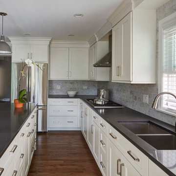
This Glen Ellyn homeowner came to us, frustrated with the layout and size of their current kitchen, looking for help generating ideas for how to maximize functionality within the constraints of the space. After visiting with them and seeing the home’s layout, I realized that looking at the bigger picture of how they used the entire first floor might bring us some dramatic solutions. We ended up flipping the kitchen and family room and taking down the wall separating the two creating one big open floor plan for the family to enjoy. There is still a visual separation between the rooms because of their different lengths and the overall space now relates nicely to the dining room which was also opened up to both rooms.
The new kitchen is an L-shaped space that is no longer cramped and small and is truly a cook’s dream. The fridge is on one end, a large cooktop and sink are located along the main perimeter and double ovens located at the end of the “L” complete the layout. Ample work surface along the perimeter and on the large island makes entertaining a breeze. An existing door to the patio remains, floods the room with light and provides easy access to the existing outdoor deck for entertaining and grilling.
White cabinetry with quartz countertops, Carrera marble backsplash tile and a contrasting gray island give the space a clean and modern feel. The gray pendant lights and stainless appliances bring a slight industrial feel to the space letting you know that some serious cooking will take place here.
Once we had their Dream Kitchen design completed, the homeowners decided to tackle another project at the same time. We made plans to create a master suite upstairs by combining two existing bedrooms into a larger bedroom, bathroom and walk-in closet. The existing spaces were not overly large so getting everything on the wish list into the design was a challenge. In the end, we came up with a design that works. The two bedrooms were adjoined, one wall moved back slightly to make for a slightly larger bedroom, and the remaining space was allotted to the new bathroom and a walk in closet.
The bathroom consists of a double vanity and a large shower with a barn door shower door. A skylight brings light into the space and helps make it feel larger and more open. The new walk-in closet is accessible through the bathroom, and we even managed to fit in a small entry vestibule that houses some additional storage and makes a nice transition from the hallway. A white vanity, Carrera tops and gray floor tile make for a serene space that feels just right for this home.
Designed by: Susan Klimala, CKD, CBD
Photography by: Mike Kaskel
For more information on kitchen and bath design ideas go to: www.kitchenstudio-ge.com
 Klopf Architecture
Nestled in the hills of Orinda, California, this 1951 residence is one of only seven extant homes, now known as “The Magnificent Seven”, designed by architect Olof Dahlstrand, a protégé of Frank Lloyd Wright. With its low-slung rooflines, natural materials, and deep integration with the sloping landscape, the home is a pristine example of mid-century modern design inspired by Wright’s organic principles. Over the years, prior homeowners have emphasized preservation, ensuring that the house remained relatively untouched. Each owner has respected the original architecture and stayed true to Dahlstrand’s intent. When a family of five—two college-aged sons and a middle school-aged daughter—acquired the property, they were captivated by its history, legacy of care, and architectural significance. While they appreciated Dahlstrand’s original vision, they also recognized the need to adapt the home for contemporary living while preserving its design integrity.
The remodel was conceived as a thoughtful response to the past—an effort to bring the house into the 21st century without compromising its soul. The primary mandate was to maintain architectural continuity while improving the functionality, comfort, and livability for a modern family. The design team—architects and contractor alike—worked with a shared reverence for the original architecture, allowing that mindset to guide even the most technical or pragmatic decisions.
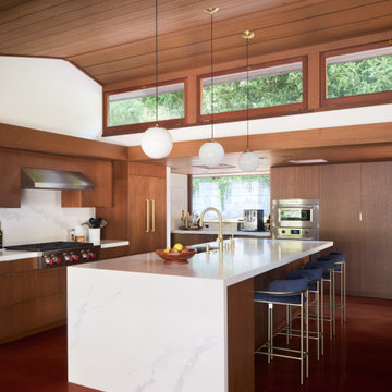
A key objective was to increase natural light in the kitchen—a departure from Wrightian principles of enclosed, intimate cooking spaces—while maintaining the home’s architectural language. The kitchen was reconfigured to foster a stronger connection to adjacent living spaces while retaining the underlying concept of spatial separation. One of the most transformative architectural changes was the removal of a ridge beam that was originally planned to remain visible through the kitchen. During construction, the team collaborated on a better solution: a wide-flanged steel beam concealed within the roof envelope. This subtle move preserved the clean lines and ceiling continuity, a modern update carried out with utmost respect for the existing framework.
The home’s original powder room, previously accessible only through the kitchen, was relocated for better flow and privacy. A new powder room was carved out of former kitchen cabinetry—a narrow, interior space that could have felt dark and enclosed. To avoid this, the design extended the line of original transom windows into the new powder room and added a skylight above the vanity. The result is a bright and airy space that feels consistent with the rest of the home. Other updates included the installation of new solid-core interior doors with veneers carefully matched to the original mahogany, enhancing the continuity of the interiors. Even smaller decisions, such as placing the door knobs at 42 inches high, mirrored the original proportions. Every choice reflected a shared belief between the architect, contractor, and client: that new work should serve the integrity of the old.
The home’s extensive interior redwood millwork and paneling was meticulously restored. Where new materials were introduced—such as the replacement redwood soffit paneling—the contractor took pains to find finish nails that matched the original, rather than using modern equivalents. This level of craftsmanship and collaboration defined the project. It extended even to the detailing of a blind door to the new powder room, which had to disappear into the existing redwood board-and-batten wall. It was a team effort: the owner found a suitable handle, the architects devised the custom in-swing mechanism, and the contractor executed it so the door aligned precisely with the battens. Throughout, the homeowners were deeply engaged in the design process. One, a meticulous design enthusiast, focused on aesthetic integrity and historic detail. The other brought a practical and function-driven perspective, ensuring that new fixtures and materials would be durable and require minimal maintenance.
While the home’s location posed no major site challenges, sustainability was a key concern. The team upgraded the roof insulation, installed solar panels with battery storage, and added ductless mini-split cooling systems. Lighting was another area where modern technology was woven into a historic framework: new square LED fixtures echo the original custom perimeter soffit lights, maintaining the design language while offering advanced performance.
A planned expansion of a bedroom into suite with a bathroom had to be shelved due to budget constraints and the high cost of below-grade foundation work. Still, the team focused their efforts on making the most of the existing footprint, resolving constraints through design ingenuity rather than adding square footage. This renovation represents a collaborative achievement in preserving and evolving a historically significant home. Every decision was shaped by a shared ethos among clients, architects, and contractor: to maintain the home’s architectural soul while updating it for contemporary life. The result is a timeless modernist residence that continues Olof Dahlstrand’s legacy, remaining grounded in nature, craftsmanship, and human-scale design.
Klopf Architecture Team: John Klopf, AIA, Klara Kevane, Fernanda Bernardes
Interior Architectural Design: Klopf Architecture
Structural Engineer: Daniel Bastiao
Contractor: Don Larwood, Larwood Construction
Photography: Mariko Reed
Year Completed: 2022

Sponsored
Columbus, OH
Free consultation for landscape design!

Peabody Landscape Group
Columbus' Reliable Landscape Design & Contracting
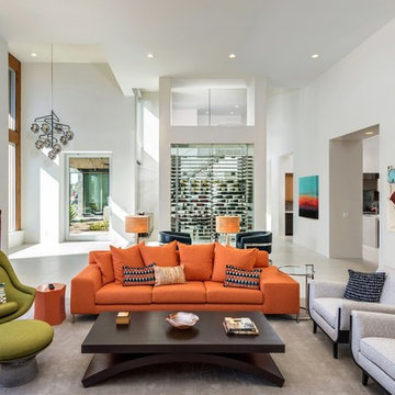 Drewett Works
The unique opportunity and challenge for the Joshua Tree project was to enable the architecture to prioritize views. Set in the valley between Mummy and Camelback mountains, two iconic landforms located in Paradise Valley, Arizona, this lot “has it all” regarding views. The challenge was answered with what we refer to as the desert pavilion.
This highly penetrated piece of architecture carefully maintains a one-room deep composition. This allows each space to leverage the majestic mountain views. The material palette is executed in a panelized massing composition. The home, spawned from mid-century modern DNA, opens seamlessly to exterior living spaces providing for the ultimate in indoor/outdoor living.
Project Details:
Architecture: Drewett Works, Scottsdale, AZ // C.P. Drewett, AIA, NCARB // www.drewettworks.com
Builder: Bedbrock Developers, Paradise Valley, AZ // http://www.bedbrock.com
Interior Designer: Est Est, Scottsdale, AZ // http://www.estestinc.com
Photographer: Michael Duerinckx, Phoenix, AZ // www.inckx.com
 Modulor
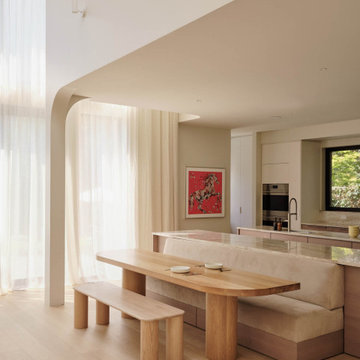
The renovation of Maison Gray was an ambitious project, marked by technical challenges to transform this 1960s residence into a modern and bright living space. Due to urban planning constraints, it was impossible to completely demolish the house. Therefore, a progressive approach was adopted, methodically deconstructing and rebuilding each wall while keeping the roof in place with temporary supports. This required rigorous coordination between the demolition and construction teams, who worked in parallel to successfully complete the large-scale project.
Major structural and framing work allowed for the roof slopes to be redefined and the creation of a double-height space, a central feature of the house's new architecture. Despite the complexity of the project, the work was completed in a relatively short period, an impressive achievement for such a large-scale transformation.
Thanks to meticulous execution, the house was practically rebuilt from scratch, with a mezzanine and new spaces arranged in half-levels within a generous volume. The tall arch on the façade marks the vaulted entrance leading to an open living space in double height, naturally lit by a skylight and large windows opening to the garden. Achieving these elements and alignments required great precision, with every architectural detail, from curves to openings, carefully executed to create a fluid and harmonious flow. Sangaré Studio designed the interior with natural materials in soft tones, creating intimate and fluid spaces.
Built with care, Maison Gray offers a welcoming and soothing environment, allowing the family to enjoy spaces designed for comfort and tranquility.
 Simply Home Decorating
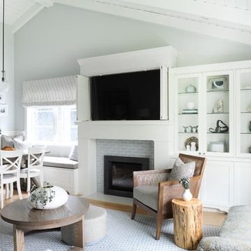
This tiny home is located on a treelined street in the Kitsilano neighborhood of Vancouver. We helped our client create a living and dining space with a beach vibe in this small front room that comfortably accommodates their growing family of four. The starting point for the decor was the client's treasured antique chaise (positioned under the large window) and the scheme grew from there. We employed a few important space saving techniques in this room... One is building seating into a corner that doubles as storage, the other is tucking a footstool, which can double as an extra seat, under the custom wood coffee table. The TV is carefully concealed in the custom millwork above the fireplace. Finally, we personalized this space by designing a family gallery wall that combines family photos and shadow boxes of treasured keepsakes. Interior Decorating by Lori Steeves of Simply Home Decorating. Photos by Tracey Ayton Photography
9