
Search results for "Space related challenges" in Home Design Ideas
 DesignARC
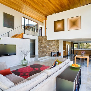
Falcon House is located on Falcon Ridge Road, which winds along a steeply inclined ridge in a stretch of foothills within Carmel Valley in Monterey County. An old lichen covered barn and split rail, cedar fences characterize this area known as Markham Ranch, and contrast sharply with the preponderance of sprawling, large estate-style homes, many more at-home in the Italian countryside than any landscape of California.
Designed for a young family, Falcon House responds to the family’s desire to live a more modest lifestyle, eschewing overt displays of extravagance for an intimate and deferential relation to nature.
The 3,200-square-foot residence occupies a difficult portion of the northern slope of a hillside, overlooking a verdant valley and oriented toward Castle Rock in the distance. The steep terrain necessitated a compartmentalized plan capable of negotiating the gentle hillock at the center of the site. A corridor bridge spans two pieces of the house, uniting living and sleeping spaces and allowing an existing watercourse to flow essentially through the house unobstructed.
Large panels of glass open the living spaces to the landscape, beneath the deep overhang of a butterfly roof. Operable clerestories placed high on the window-wall allow prevailing breezes to cool the interior spaces. The bedroom wing of the house hugs the hillside as it turns to the west, ensuring privacy from the main living spaces. The sense of seclusion and protection of this wing is reinforced by its lower roofline and its embedment into the hill.
Initial resistance by neighboring homeowners has given way to appreciation, having seen the results of careful siting and a material and color palate sympathetic to the surrounding hillsides. The dwelling embodies an attitude of respect for the landscape, and through that perspective Falcon House has become as natural a part of its environment as the hawks flying overhead.
2008 AIA Orange County Chapter Merit Award
 Drewett Works
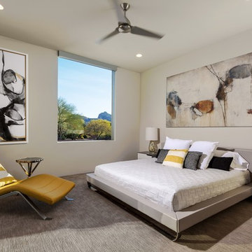
The unique opportunity and challenge for the Joshua Tree project was to enable the architecture to prioritize views. Set in the valley between Mummy and Camelback mountains, two iconic landforms located in Paradise Valley, Arizona, this lot “has it all” regarding views. The challenge was answered with what we refer to as the desert pavilion.
This highly penetrated piece of architecture carefully maintains a one-room deep composition. This allows each space to leverage the majestic mountain views. The material palette is executed in a panelized massing composition. The home, spawned from mid-century modern DNA, opens seamlessly to exterior living spaces providing for the ultimate in indoor/outdoor living.
Project Details:
Architecture: Drewett Works, Scottsdale, AZ // C.P. Drewett, AIA, NCARB // www.drewettworks.com
Builder: Bedbrock Developers, Paradise Valley, AZ // http://www.bedbrock.com
Interior Designer: Est Est, Scottsdale, AZ // http://www.estestinc.com
Photographer: Michael Duerinckx, Phoenix, AZ // www.inckx.com
 Drewett Works
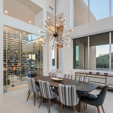
The unique opportunity and challenge for the Joshua Tree project was to enable the architecture to prioritize views. Set in the valley between Mummy and Camelback mountains, two iconic landforms located in Paradise Valley, Arizona, this lot “has it all” regarding views. The challenge was answered with what we refer to as the desert pavilion.
This highly penetrated piece of architecture carefully maintains a one-room deep composition. This allows each space to leverage the majestic mountain views. The material palette is executed in a panelized massing composition. The home, spawned from mid-century modern DNA, opens seamlessly to exterior living spaces providing for the ultimate in indoor/outdoor living.
Project Details:
Architecture: Drewett Works, Scottsdale, AZ // C.P. Drewett, AIA, NCARB // www.drewettworks.com
Builder: Bedbrock Developers, Paradise Valley, AZ // http://www.bedbrock.com
Interior Designer: Est Est, Scottsdale, AZ // http://www.estestinc.com
Photographer: Michael Duerinckx, Phoenix, AZ // www.inckx.com
Find the right local pro for your project
 The Brooklyn Studio
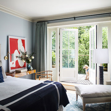
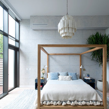
This Cobble Hill Brownstone for a family of five is a fun and captivating design, the perfect blend of the wife’s love of English country style and the husband’s preference for modern. The young power couple, her the co-founder of Maisonette and him an investor, have three children and a dog, requiring that all the surfaces, finishes and, materials used throughout the home are both beautiful and durable to make every room a carefree space the whole family can enjoy.
The primary design challenge for this project was creating both distinct places for the family to live their day to day lives and also a whole floor dedicated to formal entertainment. The clients entertain large dinners on a monthly basis as part of their profession. We solved this by adding an extension on the Garden and Parlor levels. This allowed the Garden level to function as the daily family operations center and the Parlor level to be party central. The kitchen on the garden level is large enough to dine in and accommodate a large catering crew.
On the parlor level, we created a large double parlor in the front of the house; this space is dedicated to cocktail hour and after-dinner drinks. The rear of the parlor is a spacious formal dining room that can seat up to 14 guests. The middle "library" space contains a bar and facilitates access to both the front and rear rooms; in this way, it can double as a staging area for the parties.
The remaining three floors are sleeping quarters for the family and frequent out of town guests. Designing a row house for private and public functions programmatically returns the building to a configuration in line with its original design.
This project was published in Architectural Digest.
Photography by Sam Frost
 threshold interiors
Location: Brooklyn, NY, United States
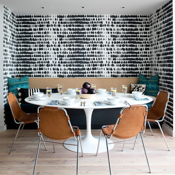
This brand-new townhouse at Pierhouse, Brooklyn was a gorgeous space, but was crying out for some personalization to reflect our clients vivid, sophisticated and lively design aesthetic. Bold Patterns and Colors were our friends in this fun and eclectic project. Our amazing clients collaborated with us to select the fabrics for the den's custom Roche Bobois Mah Jong sofa and we also customized a vintage swedish rug from Doris Leslie Blau. for the Living Room Our biggest challenge was to capture the space under the Staircase so that it would become usable for this family. We created cubby storage, a desk area, coat closet and oversized storage. We even managed to fit in a 12' ladder - not an easy feat!
Photographed by: James Salomon
 threshold interiors
Location: Brooklyn, NY, United States
This brand-new townhouse at Pierhouse, Brooklyn was a gorgeous space, but was crying out for some personalization to reflect our clients vivid, sophisticated and lively design aesthetic. Bold Patterns and Colors were our friends in this fun and eclectic project. Our amazing clients collaborated with us to select the fabrics for the den's custom Roche Bobois Mah Jong sofa and we also customized a vintage swedish rug from Doris Leslie Blau. for the Living Room Our biggest challenge was to capture the space under the Staircase so that it would become usable for this family. We created cubby storage, a desk area, coat closet and oversized storage. We even managed to fit in a 12' ladder - not an easy feat!
Photographed by: James Salomon
 Vetter Architects
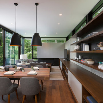
The client’s request was quite common - a typical 2800 sf builder home with 3 bedrooms, 2 baths, living space, and den. However, their desire was for this to be “anything but common.” The result is an innovative update on the production home for the modern era, and serves as a direct counterpoint to the neighborhood and its more conventional suburban housing stock, which focus views to the backyard and seeks to nullify the unique qualities and challenges of topography and the natural environment.
The Terraced House cautiously steps down the site’s steep topography, resulting in a more nuanced approach to site development than cutting and filling that is so common in the builder homes of the area. The compact house opens up in very focused views that capture the natural wooded setting, while masking the sounds and views of the directly adjacent roadway. The main living spaces face this major roadway, effectively flipping the typical orientation of a suburban home, and the main entrance pulls visitors up to the second floor and halfway through the site, providing a sense of procession and privacy absent in the typical suburban home.
Clad in a custom rain screen that reflects the wood of the surrounding landscape - while providing a glimpse into the interior tones that are used. The stepping “wood boxes” rest on a series of concrete walls that organize the site, retain the earth, and - in conjunction with the wood veneer panels - provide a subtle organic texture to the composition.
The interior spaces wrap around an interior knuckle that houses public zones and vertical circulation - allowing more private spaces to exist at the edges of the building. The windows get larger and more frequent as they ascend the building, culminating in the upstairs bedrooms that occupy the site like a tree house - giving views in all directions.
The Terraced House imports urban qualities to the suburban neighborhood and seeks to elevate the typical approach to production home construction, while being more in tune with modern family living patterns.
Overview:
Elm Grove
Size:
2,800 sf,
3 bedrooms, 2 bathrooms
Completion Date:
September 2014
Services:
Architecture, Landscape Architecture
Interior Consultants: Amy Carman Design

 Saikley Architects
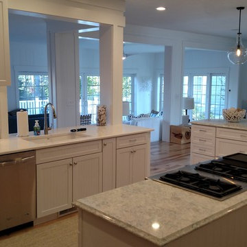
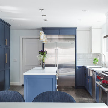
Our busy Silicon Valley clients asked us to convert their tight-quartered 1960’s ranch house to a gracious family home that would meet their long term needs. Ease of living was paramount, both in functionality and in ordered design.
The project was completed on a moderate budget.While retaining most of the structure of the existing house to avoid costly structural changes, we opened walls to improve the sight lines and flow of the house and bring in more light. We made small additions at the front and back bedrooms to gain space for the family and relatives. An existing underused patio area was improved with a simple outdoor kitchen and overhang to extend the living space to the outside. Costs were kept down with choices of modest materials.
Everything was made to be functional. Ample storage has been built into the right places. The details of the kitchen were carefully worked out to accommodate all the wishes of the various cooks in the family. The house is set up to be easy to keep clean. Acoustic walls separate living from bedroom spaces so adults can enjoy time together while children sleep. The outdoor kitchen has easy access to the indoor kitchen and the garage, and its setup promotes socializing while cooking outdoors.
A large part of the narrow back yard was previously unusable space due to a steep slope up to a neighbor’s higher fence. With a new retaining wall and some re-grading we took back more of the yard for the patio and play space on a new lawn.
The remodeled house is a mix of contemporary and traditional elements. Cool colors have a calming effect. Traditional items such as prairie style windows, trellis, mosaic tiles, and Shaker style cabinets, break down the scale in an otherwise streamlined, contemporary design. A new gabled roof with a broad arch at the front of the house marks the entry and resolves a challenging form where the central entry is set back from walls on both sides.
Photography: Kurt Manley
https://saikleyarchitects.com/portfolio/modern-ranch/
 Drewett Works
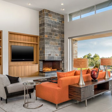
The unique opportunity and challenge for the Joshua Tree project was to enable the architecture to prioritize views. Set in the valley between Mummy and Camelback mountains, two iconic landforms located in Paradise Valley, Arizona, this lot “has it all” regarding views. The challenge was answered with what we refer to as the desert pavilion.
This highly penetrated piece of architecture carefully maintains a one-room deep composition. This allows each space to leverage the majestic mountain views. The material palette is executed in a panelized massing composition. The home, spawned from mid-century modern DNA, opens seamlessly to exterior living spaces providing for the ultimate in indoor/outdoor living.
Project Details:
Architecture: Drewett Works, Scottsdale, AZ // C.P. Drewett, AIA, NCARB // www.drewettworks.com
Builder: Bedbrock Developers, Paradise Valley, AZ // http://www.bedbrock.com
Interior Designer: Est Est, Scottsdale, AZ // http://www.estestinc.com
Photographer: Michael Duerinckx, Phoenix, AZ // www.inckx.com
 Cummings Architecture + Interiors
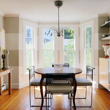
Blending contemporary and historic styles requires innovative design and a well-balanced aesthetic. That was the challenge we faced in creating a modern kitchen for this historic home in Lynnfield, MA. The final design retained the classically beautiful spatial and structural elements of the home while introducing a sleek sophistication. We mixed the two design palettes carefully. For instance, juxtaposing the warm, distressed wood of an original door with the smooth, brightness of non-paneled, maple cabinetry. A cork floor and accent cabinets of white metal add texture while a seated, step-down peninsula and built in bookcase create an open transition from the kitchen proper to an inviting dining space. This is truly a space where the past and present can coexist harmoniously.
Photo Credit: Eric Roth
 DesignARC
Falcon House is located on Falcon Ridge Road, which winds along a steeply inclined ridge in a stretch of foothills within Carmel Valley in Monterey County. An old lichen covered barn and split rail, cedar fences characterize this area known as Markham Ranch, and contrast sharply with the preponderance of sprawling, large estate-style homes, many more at-home in the Italian countryside than any landscape of California.
Designed for a young family, Falcon House responds to the family’s desire to live a more modest lifestyle, eschewing overt displays of extravagance for an intimate and deferential relation to nature.
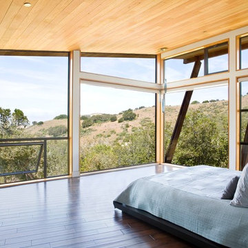
The 3,200-square-foot residence occupies a difficult portion of the northern slope of a hillside, overlooking a verdant valley and oriented toward Castle Rock in the distance. The steep terrain necessitated a compartmentalized plan capable of negotiating the gentle hillock at the center of the site. A corridor bridge spans two pieces of the house, uniting living and sleeping spaces and allowing an existing watercourse to flow essentially through the house unobstructed.
Large panels of glass open the living spaces to the landscape, beneath the deep overhang of a butterfly roof. Operable clerestories placed high on the window-wall allow prevailing breezes to cool the interior spaces. The bedroom wing of the house hugs the hillside as it turns to the west, ensuring privacy from the main living spaces. The sense of seclusion and protection of this wing is reinforced by its lower roofline and its embedment into the hill.
Initial resistance by neighboring homeowners has given way to appreciation, having seen the results of careful siting and a material and color palate sympathetic to the surrounding hillsides. The dwelling embodies an attitude of respect for the landscape, and through that perspective Falcon House has become as natural a part of its environment as the hawks flying overhead.
2008 AIA Orange County Chapter Merit Award
 Kelly Peloza Photo LLC
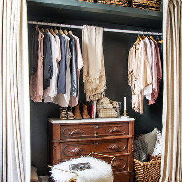
Interior photography of EM Interiors Chicago's spring 2015 One Room Challenge.
Calling It Home's One Room Challenge is a biannual design event that challenges 20 design bloggers to transform a space over the course of the month.
Photography ©2015 by Kelly Peloza Photo
 Décor Aid
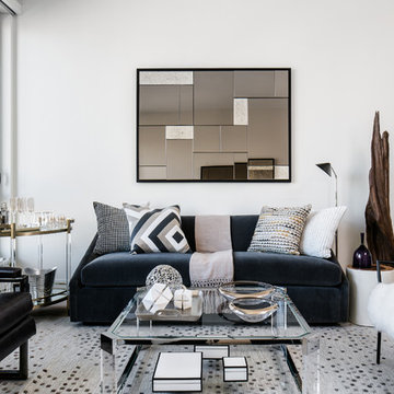
Million Dollar Listing’s celebrity broker Ryan Serhant reached out to Decor Aid to stage a luxurious Brooklyn condo development. The only caveat was that our interior designers had 48 hours to come up with the design, concept, and source all the furniture. Always up for a challenge, we partnered with Mitchell Gold & Bob Williams to create this contemporary gem.
Staying true to their contemporary vision, our interior decorators sourced all pieces through MGBW. Starting in the living room, we placed the Gunner Sofa, a piece that offers clean-lined living. The thin arms and slanted profile emphasize the modern elegance of the home. Through the use of various contemporary patterns and textures we were able to avoid the one-dimensional ambiance, and instead, the apartment’s living room feels detailed and thought out, without making anyone who enters overcrowded with home decor.
The Melrose cocktail table was sourced for its sleek, stainless steel and glass design that contrasts with more substantial pieces in the space, while also complementing the contemporary style. The glass design gives the illusion that this table takes up less space, giving the living room design a light and airy feel all around. The living space transformed into something out of a decor catalog with just the right amount of personality, creating a room that follows through with our starting design, yet functional for everyday use.
After the living room area, we set our eyes on designing the master bedroom. Our interior decorators were immediately drawn to the Celina Floating Rail Bed, it’s opulent nailhead trim, and dramatic design brings fresh sophistication to the bedroom design, while also standing out as a timeless piece that can complement various trends or styles that might be added later on to the bedroom decoration. We sourced the Roland Table Lamp to add texture, with its elaborate ribbed design, that compliments the air of masculinity the Carmen Leather Ottoman add while contrasting with the light, sleeker pieces. This difference in weight left us with a bedroom decoration that lives up to the trending modern standards, yet a space that is timeless and stylish no matter the decor trends.
Once we finished and the project was completed, our senior designers took a step back and took in all of their hard labor. Decor Aid was able to make this newly built blank space and design it into a modern wonder small brooklyn apartment. The MGBW furnishings were all hand-picked to keep an even balance of complementing and contrasting contemporary pieces, which was one of our more critical apartment decorating ideas. The apartment home decor brings to life this modern concept in a way that isn’t overbearing and shows off their style making the space in every sense an accurate reflection of a chic contemporary style.


 Wiedemann Architects LLC
courtyard, dignified, elegantly decorated, entertaining space, family home, majestic,
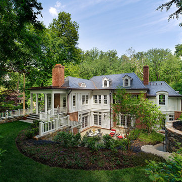
Our client was drawn to the property in Wesley Heights as it was in an established neighborhood of stately homes, on a quiet street with views of park. They wanted a traditional home for their young family with great entertaining spaces that took full advantage of the site.
The site was the challenge. The natural grade of the site was far from traditional. The natural grade at the rear of the property was about thirty feet above the street level. Large mature trees provided shade and needed to be preserved.
The solution was sectional. The first floor level was elevated from the street by 12 feet, with French doors facing the park. We created a courtyard at the first floor level that provide an outdoor entertaining space, with French doors that open the home to the courtyard.. By elevating the first floor level, we were able to allow on-grade parking and a private direct entrance to the lower level pub "Mulligans". An arched passage affords access to the courtyard from a shared driveway with the neighboring homes, while the stone fountain provides a focus.
A sweeping stone stair anchors one of the existing mature trees that was preserved and leads to the elevated rear garden. The second floor master suite opens to a sitting porch at the level of the upper garden, providing the third level of outdoor space that can be used for the children to play.
The home's traditional language is in context with its neighbors, while the design allows each of the three primary levels of the home to relate directly to the outside.
Builder: Peterson & Collins, Inc
Photos © Anice Hoachlander

 TKS Design Group
Download our free ebook, Creating the Ideal Kitchen. DOWNLOAD NOW
For many, extra time at home during COVID left them wanting more from their homes. Whether you realized the shortcomings of your space or simply wanted to combat boredom, a well-designed and functional home was no longer a want, it became a need. Tina found herself wanting more from her Old Irving Park home and reached out to The Kitchen Studio about adding function to her kitchen to make the most of the available real estate.
At the end of the day, there is nothing better than returning home to a bright and happy space you love. And this kitchen wasn’t that for Tina. Dark and dated, with a palette from the past and features that didn’t make the most of the available square footage, this remodel required vision and a fresh approach to the space. Lead designer, Stephanie Cole’s main design goal was better flow, while adding greater functionality with organized storage, accessible open shelving, and an overall sense of cohesion with the adjoining family room.
The original kitchen featured a large pizza oven, which was rarely used, yet its footprint limited storage space. The nearby pantry had become a catch-all, lacking the organization needed in the home. The initial plan was to keep the pizza oven, but eventually Tina realized she preferred the design possibilities that came from removing this cumbersome feature, with the goal of adding function throughout the upgraded and elevated space. Eliminating the pantry added square footage and length to the kitchen for greater function and more storage. This redesigned space reflects how she lives and uses her home, as well as her love for entertaining.
The kitchen features a classic, clean, and timeless palette. White cabinetry, with brass and bronze finishes, contrasts with rich wood flooring, and lets the large, deep blue island in Woodland’s custom color Harbor – a neutral, yet statement color – draw your eye.
The kitchen was the main priority. In addition to updating and elevating this space, Tina wanted to maximize what her home had to offer. From moving the location of the patio door and eliminating a window to removing an existing closet in the mudroom and the cluttered pantry, the kitchen footprint grew. Once the floorplan was set, it was time to bring cohesion to her home, creating connection between the kitchen and surrounding spaces.
The color palette carries into the mudroom, where we added beautiful new cabinetry, practical bench seating, and accessible hooks, perfect for guests and everyday living. The nearby bar continues the aesthetic, with stunning Carrara marble subway tile, hints of brass and bronze, and a design that further captures the vibe of the kitchen.
Every home has its unique design challenges. But with a fresh perspective and a bit of creativity, there is always a way to give the client exactly what they want [and need]. In this particular kitchen, the existing soffits and high slanted ceilings added a layer of complexity to the lighting layout and upper perimeter cabinets.
While a space needs to look good, it also needs to function well. This meant making the most of the height of the room and accounting for the varied ceiling features, while also giving Tina everything she wanted and more. Pendants and task lighting paired with an abundance of natural light amplify the bright aesthetic. The cabinetry layout and design compliments the soffits with subtle profile details that bring everything together. The tile selections add visual interest, drawing the eye to the focal area above the range. Glass-doored cabinets further customize the space and give the illusion of even more height within the room.
While her family may be grown and out of the house, Tina was focused on adding function without sacrificing a stunning aesthetic and dreamy finishes that make the kitchen the gathering place of any home. It was time to love her kitchen again, and if you’re wondering what she loves most, it’s the niche with glass door cabinetry and open shelving for display paired with the marble mosaic backsplash over the range and complimenting hood. Each of these features is a stunning point of interest within the kitchen – both brag-worthy additions to a perimeter layout that previously felt limited and lacking.
Whether your remodel is the result of special needs in your home or simply the excitement of focusing your energy on creating a fun new aesthetic, we are here for it. We love a good challenge because there is always a way to make a space better – adding function and beauty simultaneously.
 Precision Homecrafters, LLC
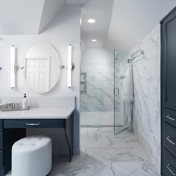
The Inverness Bathroom remodel had these goals: to complete the work while allowing the owner to continue to use their workshop below the project's construction, to provide a high-end quality product that was low-maintenance to the owners, to allow for future accessibility, more natural light and to better meet the daily needs of both the husband's and wife's lifestyles.
The first challenge was providing the required structural support to continue to clear span the two cargarage below which housed a workshop. The sheetrock removal, framing and sheetrock repairs and painting were completed first so the owner could continue to use his workshop, as requested. The HVAC supply line was originally an 8" duct that barely fit in the roof triangle between the ridge pole and ceiling. In order to provide the required air flow to additional supply vents in ceiling, a triangular duct was fabricated allowing us to use every square inch of available space. Since every exterior wall in the space adjoined a sloped ceiling, we installed ventilation baffles between each rafter and installed spray foam insulation.This project more than doubled the square footage of usable space. The new area houses a spaciousshower, large bathtub and dressing area. The addition of a window provides natural light. Instead of a small double vanity, they now have a his-and-hers vanity area. We wanted to provide a practical and comfortable space for the wife to get ready for her day and were able to incorporate a sit down make up station for her. The honed white marble looking tile is not only low maintenance but creates a clean bright spa appearance. The custom color vanities and built in linen press provide the perfect contrast of boldness to create the WOW factor. The sloped ceilings allowed us to maximize the amount of usable space plus provided the opportunity for the built in linen press with drawers at the bottom for additional storage. We were also able to combine two closets and add built in shelves for her. This created a dream space for our client that craved organization and functionality. A separate closet on opposite side of entrance provided suitable and comfortable closet space for him. In the end, these clients now have a large, bright and inviting master bath that will allow for complete accessibility in the future.
 Wiedemann Architects LLC
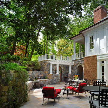
Our client was drawn to the property in Wesley Heights as it was in an established neighborhood of stately homes, on a quiet street with views of park. They wanted a traditional home for their young family with great entertaining spaces that took full advantage of the site.
The site was the challenge. The natural grade of the site was far from traditional. The natural grade at the rear of the property was about thirty feet above the street level. Large mature trees provided shade and needed to be preserved.
The solution was sectional. The first floor level was elevated from the street by 12 feet, with French doors facing the park. We created a courtyard at the first floor level that provide an outdoor entertaining space, with French doors that open the home to the courtyard.. By elevating the first floor level, we were able to allow on-grade parking and a private direct entrance to the lower level pub "Mulligans". An arched passage affords access to the courtyard from a shared driveway with the neighboring homes, while the stone fountain provides a focus.
A sweeping stone stair anchors one of the existing mature trees that was preserved and leads to the elevated rear garden. The second floor master suite opens to a sitting porch at the level of the upper garden, providing the third level of outdoor space that can be used for the children to play.
The home's traditional language is in context with its neighbors, while the design allows each of the three primary levels of the home to relate directly to the outside.
Builder: Peterson & Collins, Inc
Photos © Anice Hoachlander

Sponsored
Columbus, OH
Free consultation for landscape design!

Peabody Landscape Group
Franklin County's Reliable Landscape Design & Contracting
 Bilotta Kitchen & Home
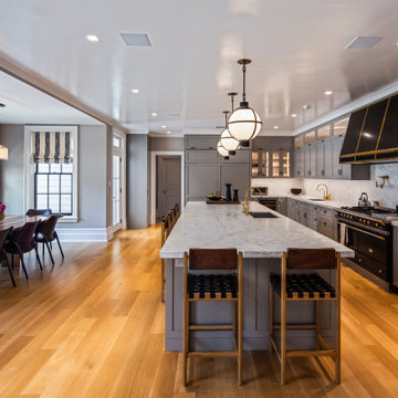
This kitchen was designed for a family who decided to leave life in the big city and move up to Westchester for more room. The large space exuberates a calm, clean and classic feeling. “I love being brought in as a collaborative partner with both the architect and homeowner. It becomes my job as the kitchen designer to deliver on the vision of which the architect and homeowner are dreaming” says Bilotta Designer Randy O’Kane. The details become the focus, such as in this case, using just the right fluted Bendheim low iron Pyramid textured glass with just the correct proportions. Understanding the appliances (a mix of SubZero, Wolf and Miele) and their exterior panel and space requirements is critical. Framing out each doorway while lining up all the reveals can only happen when the architect has an eye for detail. Ira of Ira Grandberg Architects focuses on how all the surrounding rooms center on the kitchen so that from every angle you see one cohesive space, interfacing with the adjacent rooms. The client had specific "asks" as it related to the door style and color as well as the range and hood (a La Canche French Range by Art Culinaire in Matte Black with Brass Trim with a Custom Hood by Rangecraft.) Kismet is when there are "just the right" number of cooks creating this amazing kitchen. The challenge for the architect was designing a larger eat-in kitchen that did not feel overpowering. With all the light coming in from the many windows they wanted to keep the space bright but not use the typical white paint and so opted for a soft grey for the custom cabinetry. They decided to forgo the cabinet and countertop surfaces on the exterior wall so that they could have a large table for the family to eat meals at together. This also brought an enormous amount of light into the space – very inviting.
Bilotta Designer: Randy O’Kane
Photographer: Kirt Washington
Architect: Ira Grandberg Architects
Builder: ABC Construction
 Furnitureland South
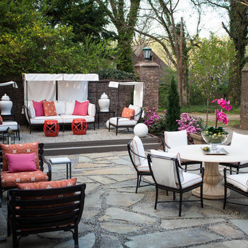
“Greensboro’s Grandest House” was recently selected as the 2013 ShowHouse presented by the Junior League of Greensboro and national media sponsor Traditional Home. Among the local and national design talent featured in this special fundraising event was design duo Patti Allen and Stephanie James of Furnitureland South, who transformed the estate’s patio into a classic, colorful and cozy space.
Built in the early 1920s, the Adamsleigh estate is more than 15,000 square feet and covers 13.5 acres that include pools, a lake, tennis courts, a stone gazebo and a five-car garage. The 30×60 patio presented a special design challenge – the space was in disrepair and sat unevenly on a downward slope. Rising to the challenge, Patti and Stephanie partnered with Outer Space Landscapes to change the elevation of the patio in order to draw attention to the focal point and inspiration of the project: a beautiful canopy sofa by Century Furniture.
The addition of 6 tons of landscaping material included Pennsylvania blue stone, pebbles, sand, cherry trees, azaleas and geraniums all blooming in the colors of the latest Sunbrella fabrics featured in the outdoor furnishings: crisp, sandy white, fuchsia and tangerine. Patti and Stephanie wanted to showcase clean and classic outdoor style with an edge of color and unexpected elements. Playful ottomans by Baker float in the space for multiple functions, adding an extra pop of color to the sophisticated setting which includes a dining table by Oscar de la Renta, organic spot tables from Phillips Collection, and daybeds and seating from Century Furniture.
Combining their passion for interior spaces with signature designs, Allen and James Designs gave this outdoor space the comfort, color and style it deserved.
Patti and Stephanie, co-founders of Allen and James Designs, are committed to inspire and influence unique spaces for home, work, play and relaxation. With over 25 years of experience and a dedication to client relationships, their infusion of international inspiration with style, color, texture and vision make Patti and Stephanie a creative duo capable of exceeding the expectations of any client’s design project. By forming over 400 connections with key manufactures such as Henredon, Century, Lillian August, Dovetail, Maitland Smith and Huntington House, Allen and James Designs can provide a broad range of options that virtually meet any need a client has to create their dream home.
 TKS Design Group
Free ebook, Creating the Ideal Kitchen. DOWNLOAD NOW
The Klimala’s and their three kids are no strangers to moving, this being their fifth house in the same town over the 20-year period they have lived there. “It must be the 7-year itch, because every seven years, we seem to find ourselves antsy for a new project or a new environment. I think part of it is being a designer, I see my own taste evolve and I want my environment to reflect that. Having easy access to wonderful tradesmen and a knowledge of the process makes it that much easier”.
This time, Klimala’s fell in love with a somewhat unlikely candidate. The 1950’s ranch turned cape cod was a bit of a mutt, but it’s location 5 minutes from their design studio and backing up to the high school where their kids can roll out of bed and walk to school, coupled with the charm of its location on a private road and lush landscaping made it an appealing choice for them.
“The bones of the house were really charming. It was typical 1,500 square foot ranch that at some point someone added a second floor to. Its sloped roofline and dormered bedrooms gave it some charm.” With the help of architect Maureen McHugh, Klimala’s gutted and reworked the layout to make the house work for them. An open concept kitchen and dining room allows for more frequent casual family dinners and dinner parties that linger. A dingy 3-season room off the back of the original house was insulated, given a vaulted ceiling with skylights and now opens up to the kitchen. This room now houses an 8’ raw edge white oak dining table and functions as an informal dining room. “One of the challenges with these mid-century homes is the 8’ ceilings. I had to have at least one room that had a higher ceiling so that’s how we did it” states Klimala.
The kitchen features a 10’ island which houses a 5’0” Galley Sink. The Galley features two faucets, and double tiered rail system to which accessories such as cutting boards and stainless steel bowls can be added for ease of cooking. Across from the large sink is an induction cooktop. “My two teen daughters and I enjoy cooking, and the Galley and induction cooktop make it so easy.” A wall of tall cabinets features a full size refrigerator, freezer, double oven and built in coffeemaker. The area on the opposite end of the kitchen features a pantry with mirrored glass doors and a beverage center below.
The rest of the first floor features an entry way, a living room with views to the front yard’s lush landscaping, a family room where the family hangs out to watch TV, a back entry from the garage with a laundry room and mudroom area, one of the home’s four bedrooms and a full bath. There is a double sided fireplace between the family room and living room. The home features pops of color from the living room’s peach grass cloth to purple painted wall in the family room. “I’m definitely a traditionalist at heart but because of the home’s Midcentury roots, I wanted to incorporate some of those elements into the furniture, lighting and accessories which also ended up being really fun. We are not formal people so I wanted a house that my kids would enjoy, have their friends over and feel comfortable.”
The second floor houses the master bedroom suite, two of the kids’ bedrooms and a back room nicknamed “the library” because it has turned into a quiet get away area where the girls can study or take a break from the rest of the family. The area was originally unfinished attic, and because the home was short on closet space, this Jack and Jill area off the girls’ bedrooms houses two large walk-in closets and a small sitting area with a makeup vanity. “The girls really wanted to keep the exposed brick of the fireplace that runs up the through the space, so that’s what we did, and I think they feel like they are in their own little loft space in the city when they are up there” says Klimala.
Designed by: Susan Klimala, CKD, CBD
Photography by: Carlos Vergara
For more information on kitchen and bath design ideas go to: www.kitchenstudio-ge.com
7