
Search results for "Space related challenges" in Home Design Ideas
 Zieba Builders, Inc.
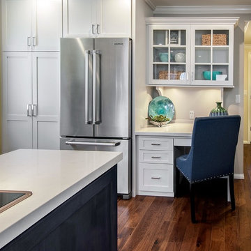
Our clients loved the location of their duplex home with its peak-a-boo ocean view, but their existing kitchen was not suited for their growing family. They wanted a kitchen with a coastal vibe, plenty of storage space, and an eat-in area.
We started by bringing the far wall into the kitchen space to accommodate a large panty and communication center for the family. Doing this allowed us to move the refrigerator out of the main traffic area and doubled the amount of storage space. Several new windows were added to bring in natural light. A half wall was moved to allow more countertop area and open up sight lines. The previously awkwardly shaped island was slimmed down to create better flow.
There were a few venting challenges to overcome; gas lines and plumbing had to be re-routed without disturbing the unit below. To open up sight lines, soffits were eliminated which allowed the extension of cabinets to the ceiling. To stay within the homeowner’s budget, we match existing scraped flooring by lacing in and repairing patches.
The old dining area was too small for table, so we designed and built a custom banquette to maximize the space and take advantage of the outdoor views. The overall space works for family meals as well as entertaining.
A light summer palette was used to reflect the shades of the sand, sea and sky. Even though the new kitchen is actually smaller than the original space, its now far more functional and open.
 Chermak Construction, Inc.
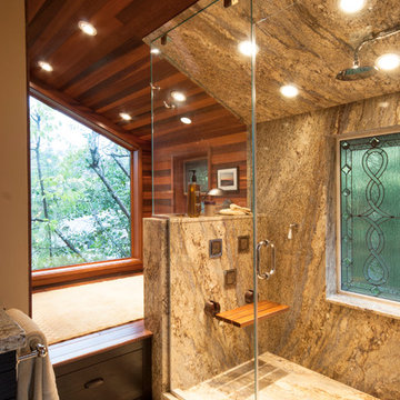
Our client’s intension was to make this bathroom suite a very specialized spa retreat. She envisioned exquisite, highly crafted components and loved the colors gold and purple. We were challenged to mix contemporary, traditional and rustic features.
Also on the wish-list were a sizeable wardrobe room and a meditative loft-like retreat. Hydronic heated flooring was installed throughout. The numerous features in this project required replacement of the home’s plumbing and electrical systems. The cedar ceiling and other places in the room replicate what is found in the rest of the home. The project encompassed 400 sq. feet.
Features found at one end of the suite are new stained glass windows – designed to match to existing, a Giallo Rio slab granite platform and a Carlton clawfoot tub. The platform is banded at the floor by a mosaic of 1″ x 1″ glass tile.
Near the tub platform area is a large walnut stained vanity with Contemporary slab door fronts and shaker drawers. This is the larger of two separate vanities. Each are enhanced with hand blown artisan pendant lighting.
A custom fireplace is centrally placed as a dominant design feature. The hammered copper that surrounds the fireplace and vent pipe were crafted by a talented local tradesman. It is topped with a Café Imperial marble.
A lavishly appointed shower is the centerpiece of the bathroom suite. The many slabs of granite used on this project were chosen for the beautiful veins of quartz, purple and gold that our client adores.
Two distinct spaces flank a small vanity; the wardrobe and the loft-like Magic Room. Both precisely fulfill their intended practical and meditative purposes. A floor to ceiling wardrobe and oversized built-in dresser keep clothing, shoes and accessories organized. The dresser is topped with the same marble used atop the fireplace and inset into the wardrobe flooring.
The Magic Room is a space for resting, reading or just gazing out on the serene setting. The reading lights are Oil Rubbed Bronze. A drawer within the step up to the loft keeps reading and writing materials neatly tucked away.
Within the highly customized space, marble, granite, copper and art glass come together in a harmonious design that is organized for maximum rejuvenation that pleases our client to not end!
 Cummings Architecture + Interiors
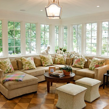
Designing additions for Victorian homes is a challenging task. The architects and builders who designed and built these homes were masters in their craft. No detail of design or proportion went unattended. Cummings Architects is often approached to work on these types of projects because of their unwavering dedication to ensure structural and aesthetic continuity both inside and out.
Upon meeting the owner of this stately home in Winchester, Massachusetts, Mathew immediately began sketching a beautifully detail drawing of a design for a family room with an upstairs master suite. Though the initial ideas were just rough concepts, the client could already see that Mathew’s vision for the house would blend the new space seamlessly into the fabric of the turn of the century home.
In the finished design, expanses of glass stretch along the lines of the living room, letting in an expansive amount of light and creating a sense of openness. The exterior walls and interior trims were designed to create an environment that merged the indoors and outdoors into a single comfortable space. The family enjoys this new room so much, that is has become their primary living space, making the original sitting rooms in the home a bit jealous.
Photo Credit: Cydney Ambrose
Find the right local pro for your project
 Haven Design and Construction
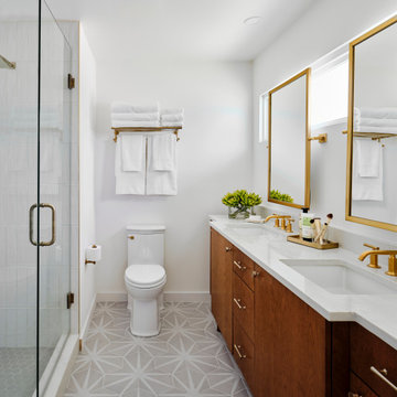
Remodeling the master bath provided many design challenges. The long and narrow space was visually expanded by removing an impeding large linen closet from the space. The additional space allowed for two sinks where there was previously only one. In addition, the long and narrow window in the bath provided amazing natural light, but made it difficult to incorporate vanity mirrors that were tall enough. The designer solved this issue by incorporating pivoting mirrors that mounted just below the long window. Finally, a custom walnut vanity was designed to utilize every inch of space. The vanity front steps in and out on the ends to make access by the toilet area more functional and spacious. A large shower with a built in quartz shower seat and hand held shower wand provide touch of luxury. Finally, the ceramic floor tile design provides a mid century punch without overpowering the tranquil space.
 Southview Design
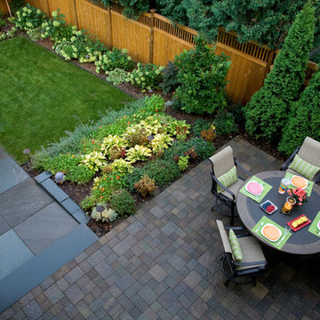
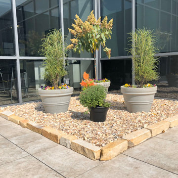
The client wanted patio space for a chair so she could relax in the sun when the mood struck. The only spot in the yard with any sun is near the fence gate. A full-range New York Bluestone patio was added using 30” x 30” slabs. These slabs are dry-set so leveling was a challenge.
 Drury Design
THE SETUP
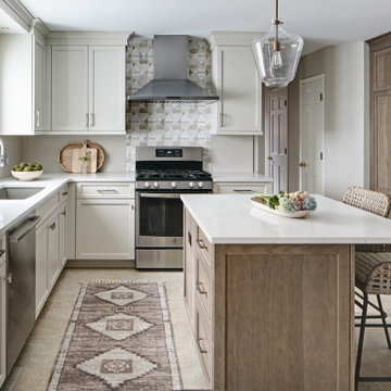
Client Background: Our clients, a couple who have transitioned into the empty nest phase, have cherished their home for over three decades without undergoing any significant renovations. With a newfound desire to adapt their living space to better suit their current lifestyle, they’ve embarked on a journey to reimagine their kitchen — the heart of their home. Their aspiration is to cultivate a serene, neutral-toned sanctuary on the first floor that seamlessly merges with their family room, ensuring a harmonious and inviting environment.
Design Inspiration: The renovation is inspired by the couple’s penchant for soft, calming neutrals, using their cherished family room and the kitchen’s existing tile flooring as the cornerstone for the color scheme. This approach aims to foster a sense of warmth and tranquility throughout.
Design Objectives:
Harmonize the kitchen with the family room by adopting a soothing, neutral color scheme, ensuring a seamless flow across the first floor.
Enhance kitchen functionality with thoughtfully designed cabinetry, providing a designated place for every item and maximizing storage efficiency.
Cultivate an inviting and comfortable atmosphere that reflects the homeowners’ desire for a calm and relaxing space.
Design Challenges:
The homeowners wish to retain the existing kitchen tile flooring and integrate it into a refreshed, modern design.
Accommodating a dining area spacious enough for family visits without compromising the kitchen’s open feel or functional layout.
Despite liking the current placement of plumbing and appliances, the homeowners aspire for a more open floor plan to facilitate better movement and interaction.
The need to amplify natural light in the kitchen, especially around the sink area, where existing lighting is insufficient.
Preserving the half-wall between the kitchen and family room, a feature the homeowners want to keep, while ensuring it complements the new design.
THE RENEWED SPACE
Design Solutions:
By choosing a neutral color palette that complements the existing tile, the design unifies the kitchen with the adjacent spaces. The tile’s grout was cleaned and restored, enhancing the floor’s appearance and integrating it seamlessly with the new kitchen aesthetic.
The inclusion of a larger island with seating for two, alongside maintaining a substantial dining table, was achieved by optimizing the spatial layout. This allowed for a sociable yet functional kitchen, accommodating large family gatherings without feeling crowded.
Minor adjustments to the kitchen’s layout maintained the preferred locations for plumbing and appliances while introducing an ‘open’ design concept. Strategic modifications, such as angling the pantry wall, improved the flow and accessibility within the space.
Replacing the garden window with a broader, standard window significantly increased natural light, transforming the sink area into a bright, welcoming space with enhanced views of the outdoors.
The decision to keep the half-wall was ingeniously leveraged to define the dining area while maintaining an open connection to the family room. This feature not only serves as a visual separator but also ties the two spaces together through the shared color scheme and design elements.
The homeowners are thrilled with their newly remodeled kitchen, which has become a hub of warmth and hospitality. Hosting a wedding shower and a birthday party, they have shared their renewed space with friends and family, who have been equally enamored. This remodel has not only met their functional and aesthetic desires but has also enriched their home with a fresh sense of serenity and joy.
The upstairs part of the home is shaping up nicely. Here’s their newly remodeled primary bathroom.
 Amazing Spaces
The existing U-shaped kitchen was tucked away in a small corner while the dining table was swimming in a room much too large for its size. The client’s needs and the architecture of the home made it apparent that the perfect design solution for the home was to swap the spaces.
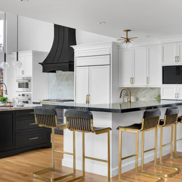
The homeowners entertain frequently and wanted the new layout to accommodate a lot of counter seating, a bar/buffet for serving hors d’oeuvres, an island with prep sink, and all new appliances. They had a strong preference that the hood be a focal point and wanted to go beyond a typical white color scheme even though they wanted white cabinets.
While moving the kitchen to the dining space gave us a generous amount of real estate to work with, two of the exterior walls are occupied with full-height glass creating a challenge how best to fulfill their wish list. We used one available wall for the needed tall appliances, taking advantage of its height to create the hood as a focal point. We opted for both a peninsula and island instead of one large island in order to maximize the seating requirements and create a barrier when entertaining so guests do not flow directly into the work area of the kitchen. This also made it possible to add a second sink as requested. Lastly, the peninsula sets up a well-defined path to the new dining room without feeling like you are walking through the kitchen. We used the remaining fourth wall for the bar/buffet.
Black cabinetry adds strong contrast in several areas of the new kitchen. Wire mesh wall cabinet doors at the bar and gold accents on the hardware, light fixtures, faucets and furniture add further drama to the concept. The focal point is definitely the black hood, looking both dramatic and cohesive at the same time.

Sponsored
Columbus, OH
Free consultation for landscape design!

Peabody Landscape Group
Columbus' Reliable Landscape Design & Contracting
 emma delon
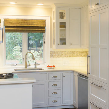
Maximizing the functionality of this space, and coordinating the new kitchen with the beautiful remodel completed previously by the client were the two most important aspects of this project. The existing spaces are elegantly decorated with an open plan, dark hardwood floors, and natural stone accents. The new, lighter, more open kitchen flows beautifully into the client’s existing dining room space. Satin nickel hardware blends with the stainless steel appliances and matches the satin nickel details throughout the home. The fully integrated refrigerator next to the narrow pull-out pantry cabinet, take up less visual weight than a traditional stainless steel appliance and the two combine to provide fantastic storage. The glass cabinet doors and decorative lighting beautifully highlight the client’s glassware and dishes. Finished with white subway tile, Dreamy Marfil quartz countertops, and a warm natural wood blind; the space warm, inviting, elegant, and extremely functional.
copyright 2013 marilyn peryer photography
 Orren Pickell Building Group
**Project Overview**
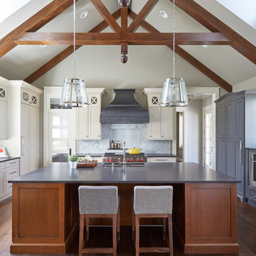
This new construction home built next to a serene lake features a gorgeous, large-scale kitchen that also connects to a bar, home office, breakfast room and great room. The homeowners sought the warmth of traditional styling, updated for today. In addition, they wanted to incorporate unexpected touches that would add personality. Strategic use of furniture details combined with clean lines brings the traditional style forward, making the kitchen feel fresh, new and timeless.
**What Makes This Project Unique?*
Three finishes, including vintage white paint, stained cherry and textured painted gray oak cabinetry, work together beautifully to create a varied, unique space. Above the wall cabinets, glass cabinets with X mullions add interest and decorative storage. Single ovens are tucked in cabinets under a window, and a warming drawer under one perfectly matches the cabinet drawer under the other. Matching furniture-style armoires flank the wall ovens, housing the freezer and a pantry in one and custom designed large scale appliance garage with retractable doors in the other. Other furniture touches can be found on the sink cabinet and range top cabinet that help complete the look. The variety of colors and textures of the stained and painted cabinetry, custom dark finish copper hood, wood ceiling beams, glass cabinets, wood floors and sleek backsplash bring the whole look together.
**Design Challenges*
Even though the space is large, we were challenged by having to work around the two doorways, two windows and many traffic patterns that run through the kitchen. Wall space for large appliances was quickly in short supply. Because we were involved early in the project, we were able to work with the architect to expanded the kitchen footprint in order to make the layout work and get appliance placement just right. We had other architectural elements to work with that we wanted to compliment the kitchen design but also dictated what we could do with the cabinetry. The wall cabinet height was determined based on the beams in the space. The oven wall with furniture armoires was designed around the window with the lake view. The height of the oven cabinets was determined by the window. We were able to use these obstacles and challenges to design creatively and make this kitchen one of a kind.
Photo by MIke Kaskel
 Haven Design and Construction
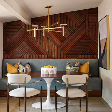
One functional challenge was that the home did not have a pantry. MCM closets were historically smaller than the walk-in closets and pantries of today. So, we printed out the home’s floorplan and began sketching ideas. The breakfast area was quite large, and it backed up to the primary bath on one side and it also adjoined the main hallway. We decided to reconfigure the large breakfast area by making part of it into a new walk-in pantry. This gave us the extra space we needed to create a new main hallway, enough space for a spacious walk-in pantry, and finally, we had enough space remaining in the breakfast area to add a cozy built-in walnut dining bench. Above the new dining bench, we designed and incorporated a geometric walnut accent wall to add warmth and texture.
 TKS Design Group
Free ebook, Creating the Ideal Kitchen. DOWNLOAD NOW
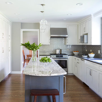
The homeowners of this mid-century Colonial and family of four were frustrated with the layout of their existing kitchen which was a small, narrow peninsula layout but that was adjoining a large space that they could not figure out how to use. Stealing part of the unused space seemed like an easy solution, except that there was an existing transition in floor height which made that a bit tricky. The solution of bringing the floor height up to meet the height of the existing kitchen allowed us to do just that.
This solution also offered some challenges. The exterior door had to be raised which resulted in some exterior rework, and the floor transition had to happen somewhere to get out to the garage, so we ended up “pushing” it towards what is now a new mudroom and powder room area. This solution allows for a small but functional and hidden mudroom area and more private powder room situation.
Another challenge of the design was the very narrow space. To minimize issues with this, we moved the location of the refrigerator into the newly found space which gave us an L-shaped layout allowing for an island and even some shallow pantry storage. The windows over the kitchen sink were expanded in size and relocated to allow more light into the room. A breakfast table fits perfectly in the area adjacent to the existing French doors and there was even room for a small bar area that helps transition from inside to outside for entertaining. The confusing unused space now makes sense and provides functionality on a daily basis.
To help bring some calm to this busy family, a pallet of soft neutrals was chosen -- gray glass tile with a simple metal accent strip, clear modern pendant lights and a neutral color scheme for cabinetry and countertops.
For more information on kitchen and bath design ideas go to: www.kitchenstudio-ge.com
 Drury Design
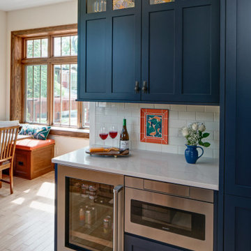
The 100-year old home’s kitchen was old and just didn’t function well. A peninsula in the middle of the main part of the kitchen blocked the path from the back door. This forced the homeowners to mostly use an odd, U-shaped corner of the kitchen.
Design objectives:
-Add an island
-Wow-factor design
-Incorporate arts and crafts with a touch of Mid-century modern style
-Allow for a better work triangle when cooking
-Create a seamless path coming into the home from the backdoor
-Make all the countertops in the space 36” high (the old kitchen had different base cabinet heights)
Design challenges to be solved:
-Island design
-Where to place the sink and dishwasher
-The family’s main entrance into the home is a back door located within the kitchen space. Samantha needed to find a way to make an unobstructed path through the kitchen to the outside
-A large eating area connected to the kitchen felt slightly misplaced – Samantha wanted to bring the kitchen and materials more into this area
-The client does not like appliance garages/cabinets to the counter. The more countertop space, the better!
Design solutions:
-Adding the right island made all the difference! Now the family has a couple of seats within the kitchen space. -Multiple walkways facilitate traffic flow.
-Multiple pantry cabinets (both shallow and deep) are placed throughout the space. A couple of pantry cabinets were even added to the back door wall and wrap around into the breakfast nook to give the kitchen a feel of extending into the adjoining eating area.
-Upper wall cabinets with clear glass offer extra lighting and the opportunity for the client to display her beautiful vases and plates. They add and an airy feel to the space.
-The kitchen had two large existing windows that were ideal for a sink placement. The window closest to the back door made the most sense due to the fact that the other window was in the corner. Now that the sink had a place, we needed to worry about the dishwasher. Samantha didn’t want the dishwasher to be in the way of people coming in the back door – it’s now in the island right across from the sink.
-The homeowners love Motawi Tile. Some fantastic pieces are placed within the backsplash throughout the kitchen. -Larger tiles with borders make for nice accent pieces over the rangetop and by the bar/beverage area.
-The adjacent area for eating is a gorgeous nook with massive windows. We added a built-in furniture-style banquette with additional lower storage cabinets in the same finish. It’s a great way to connect and blend the two areas into what now feels like one big space!
 Kimball Starr Interior Design
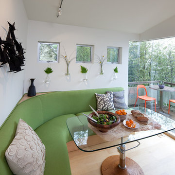
Small space living solutions are used throughout this contemporary 596 square foot tiny house. Adjustable height table in the entry area serves as both a coffee table for socializing and as a dining table for eating. Curved banquette is upholstered in outdoor fabric for durability and maximizes space with hidden storage underneath the seat. Kitchen island has a retractable countertop for additional seating while the living area conceals a work desk and media center behind sliding shoji screens.
Calming tones of sand and deep ocean blue fill the tiny bedroom downstairs. Glowing bedside sconces utilize wall-mounting and swing arms to conserve bedside space and maximize flexibility.

 DesignARC
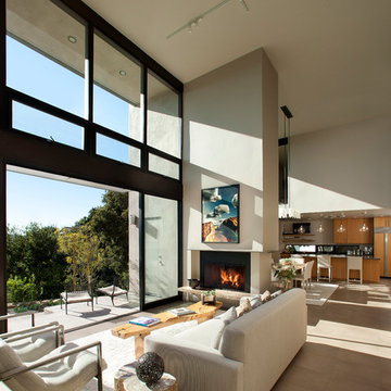
The Tice Residences replace a run-down and aging duplex with two separate, modern, Santa Barbara homes. Although the unique creek-side site (which the client’s original home looked toward across a small ravine) proposed significant challenges, the clients were certain they wanted to live on the lush “Riviera” hillside.
The challenges presented were ultimately overcome through a thorough and careful study of site conditions. With an extremely efficient use of space and strategic placement of windows and decks, privacy is maintained while affording expansive views from each home to the creek, downtown Santa Barbara and Pacific Ocean beyond. Both homes appear to have far more openness than their compact lots afford.
The solution strikes a balance between enclosure and openness. Walls and landscape elements divide and protect two private domains, and are in turn, carefully penetrated to reveal views.
Both homes are variations on one consistent theme: elegant composition of contemporary, “warm” materials; strong roof planes punctuated by vertical masses; and floating decks. The project forms an intimate connection with its setting by using site-excavated stone, terracing landscape planters with native plantings, and utilizing the shade provided by its ancient Riviera Oak trees.
2012 AIA Santa Barbara Chapter Merit Award
Jim Bartsch Photography
 J Design Group - Interior Designers Miami - Modern
Projects by J Design Group, Your friendly Interior designers firm in Miami, FL. at your service.
AVENTURA MAGAZINE selected our client’s luxury 5000 Sf ocean front apartment in Miami Beach, to publish it in their issue and they Said:
Story by Linda Marx, Photography by Daniel Newcomb
Light & Bright
New York snowbirds redesigned their Miami Beach apartment to take advantage of the tropical lifestyle.
New York snowbirds redesigned their Miami Beach apartment to take advantage of the tropical lifestyle.
WHEN INTERIOR DESIGNER JENNIFER CORREDOR was asked to recreate a four-bedroom, six-bath condominium at The Bath Club in Miami Beach, she seized the opportunity to open the rooms and better utilize the vast ocean views.
In five months last year, the designer transformed a dark and closed 5,000-square-foot unit located on a high floor into a series of sweeping waterfront spaces and updated the well located apartment into a light and airy retreat for a sports-loving family of five.
“They come down from New York every other weekend and wanted to make their waterfront home a series of grand open spaces,” says Jennifer Corrredor, of the J. Design Group in Miami, a firm specializing in modern and contemporary interiors. “Since many of the rooms face the ocean, it made sense to open and lighten up the home, taking advantage of the awesome views of the sea and the bay.”
The designer used 40 x 40 all white tile throughout the apartment as a clean base. This way, her sophisticated use of color would stand out and bring the outdoors in.
The close-knit family members—two parents and three boys in college—like to do things together. But there were situations to overcome in the process of modernizing and opening the space. When Jennifer Corredor was briefed on their desires, nothing seemed too daunting. The confident designer was ready to delve in. For example, she fixed an area at the front door
that was curved. “The wood was concave so I straightened it out,” she explains of a request from the clients. “It was an obstacle that I overcame as part of what I do in a redesign. I don’t consider it a difficult challenge. Improving what I see is part of the process.”
She also tackled the kitchen with gusto by demolishing a wall. The kitchen had formerly been enclosed, which was a waste of space and poor use of available waterfront ambience. To create a grand space linking the kitchen to the living room and dining room area, something had to go. Once the wall was yesterday’s news, she relocated the refrigerator and freezer (two separate appliances) to the other side of the room. This change was a natural functionality in the new open space. “By tearing out the wall, the family has a better view of the kitchen from the living and dining rooms,” says Jennifer Corredor, who also made it easier to walk in and out of one area and into the other. “The views of the larger public space and the surrounding water are breathtaking.
Opening it up changed everything.”
They clients can now see the kitchen from the living and dining areas, and at the same time, dwell in an airy and open space instead of feeling stuck in a dark enclosed series of rooms. In fact, the high-top bar stools that Jennifer Corredor selected for the kitchen can be twirled around to use for watching TV in the living room.
In keeping with the theme of moving seamlessly from one room to the other, Corredor designed a subtle wall of glass in the living room along with lots of comfortable seating. This way, all family members feel at ease while relaxing, talking, or watching sporting events on the large flat screen television. “For this room, I wanted more open space, light and a supreme airy feeling,” she says. “With the glass design making a statement, it quickly became the star of the show.”…….
….. To add texture and depth, Jennifer Corredor custom created wood doors here, and in other areas of the home. They provide a nice contrast to the open Florida tropical feel. “I added character to the openness by using exotic cherry wood,” she says. “I repeated this throughout the home and it works well.”
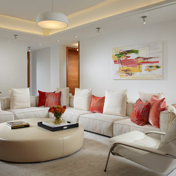
Known for capturing the client’s vision while adding her own innovative twists, Jennifer Corredor lightened the family room, giving it a contemporary and modern edge with colorful art and matching throw pillows on the sofas. She added a large beige leather ottoman as the center coffee table in the room. This round piece was punctuated with a bold-toned flowering plant atop. It effortlessly matches the pillows and colors of the contemporary canvas.
Jennifer Corredor also gutted all of the bathrooms, resulting in a major redesign of the master. She jettisoned the whirlpool and created the dazzling illusion of a floating tub. From an area where there were two toilets, she eliminated one to make a grand rectangular shower, which became an overall showpiece. The master bath went from being just a functional water closet to a sophisticated spa-like space. “The client said I was ‘delicious’ after seeing the change,” laughed Jennifer Corredor, who emphasized that her clients love their part-time life
in South Florida more each time they come down. Even when the husband has to work from their Miami Beach digs, he is surrounded by tropical beauty. For instance, there are times when the master bedroom must double as the husband’s home office.
The room had to be large enough to accommodate a working space for this purpose. So Jennifer Corredor placed an appropriate table near the window and across from the king-size bed. “No blocking of the amazing water view was necessary,” she says. “I kept an open space with a lot of white so It functions well and the work space fits right in.” She repeated the bold modern art in the
room as well as in the guest bedroom, which also has a workspace for the sons when they are home from school and need to study.
The designer is still happy and glowing with the results of her toil in this apartment. She gets a “spiritual feeling” when she walks inside. “It is so peaceful and serene, with subtle hints of explosive statements,” she says. “The entire space is open, yet anchored by the warmth of the exotic woods.” The client wrote Jennifer Corredor a letter at the end of the project congratulating her on a
job well done. She revealed that owning a Miami Beach home was her husband’s dream 30 years ago. “Now we have a quality perfect yet practical home,” she wrote to the designer. “You solved the challenges, and the end
result far exceeds our expectations. We love it.”
Thanks for your interest in our Contemporary Interior Design projects and if you have any question please do not hesitate to ask us.
http://www.JDesignGroup.com
305.444.4611
Modern Interior designer Miami. Contemporary
Miami
Miami Interior Designers
Miami Interior Designer
Interior Designers Miami
Interior Designer Miami
Modern Interior Designers
Modern Interior Designer
Modern interior decorators
Modern interior decorator
Contemporary Interior Designers
Contemporary Interior Designer
Interior design decorators
Interior design decorator
Interior Decoration and Design
Black Interior Designers
Black Interior Designer
Interior designer
Interior designers
Interior design decorators
Interior design decorator
Home interior designers
Home interior designer
Interior design companies
Interior decorators
Interior decorator
Decorators
Decorator
Miami Decorators
Miami Decorator
Decorators Miami
Decorator Miami
Interior Design Firm
Interior Design Firms
Interior Designer Firm
Interior Designer Firms
Interior design
Interior designs
home decorators
Interior decorating Miami
Best Interior Designers.
225 Malaga Ave.
Coral Gable, FL 33134
http://www.JDesignGroup.com
305.444.4611
 TKS Design Group
WATCH the time lapse video of this kitchen remodel: https://youtu.be/caemXXlauLU
Free ebook, Creating the Ideal Kitchen. DOWNLOAD NOW
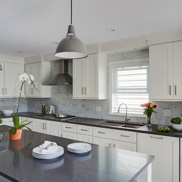
This Glen Ellyn homeowner came to us, frustrated with the layout and size of their current kitchen, looking for help generating ideas for how to maximize functionality within the constraints of the space. After visiting with them and seeing the home’s layout, I realized that looking at the bigger picture of how they used the entire first floor might bring us some dramatic solutions. We ended up flipping the kitchen and family room and taking down the wall separating the two creating one big open floor plan for the family to enjoy. There is still a visual separation between the rooms because of their different lengths and the overall space now relates nicely to the dining room which was also opened up to both rooms.
The new kitchen is an L-shaped space that is no longer cramped and small and is truly a cook’s dream. The fridge is on one end, a large cooktop and sink are located along the main perimeter and double ovens located at the end of the “L” complete the layout. Ample work surface along the perimeter and on the large island makes entertaining a breeze. An existing door to the patio remains, floods the room with light and provides easy access to the existing outdoor deck for entertaining and grilling.
White cabinetry with quartz countertops, Carrera marble backsplash tile and a contrasting gray island give the space a clean and modern feel. The gray pendant lights and stainless appliances bring a slight industrial feel to the space letting you know that some serious cooking will take place here.
Once we had their Dream Kitchen design completed, the homeowners decided to tackle another project at the same time. We made plans to create a master suite upstairs by combining two existing bedrooms into a larger bedroom, bathroom and walk-in closet. The existing spaces were not overly large so getting everything on the wish list into the design was a challenge. In the end, we came up with a design that works. The two bedrooms were adjoined, one wall moved back slightly to make for a slightly larger bedroom, and the remaining space was allotted to the new bathroom and a walk in closet.
The bathroom consists of a double vanity and a large shower with a barn door shower door. A skylight brings light into the space and helps make it feel larger and more open. The new walk-in closet is accessible through the bathroom, and we even managed to fit in a small entry vestibule that houses some additional storage and makes a nice transition from the hallway. A white vanity, Carrera tops and gray floor tile make for a serene space that feels just right for this home.
Designed by: Susan Klimala, CKD, CBD
Photography by: Mike Kaskel
For more information on kitchen and bath design ideas go to: www.kitchenstudio-ge.com
 Peters Billiards
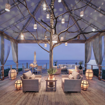
The Club Woven by Summer Classics is the resin version of the aluminum Club Collection. Executed in durable woven wrought aluminum it is ideal for any outdoor space. Club Woven is hand woven in exclusive N-dura resin polyethylene in Oyster. French Linen, or Mahogany. The comfort of Club with the classic look and durability of resin will be perfect for any outdoor space.
Sponsored
Columbus, OH

Structural Remodeling
Franklin County's Heavy Timber Specialists | Best of Houzz 2020!
 Klopf Architecture
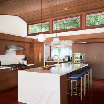
Nestled in the hills of Orinda, California, this 1951 residence is one of only seven extant homes, now known as “The Magnificent Seven”, designed by architect Olof Dahlstrand, a protégé of Frank Lloyd Wright. With its low-slung rooflines, natural materials, and deep integration with the sloping landscape, the home is a pristine example of mid-century modern design inspired by Wright’s organic principles. Over the years, prior homeowners have emphasized preservation, ensuring that the house remained relatively untouched. Each owner has respected the original architecture and stayed true to Dahlstrand’s intent. When a family of five—two college-aged sons and a middle school-aged daughter—acquired the property, they were captivated by its history, legacy of care, and architectural significance. While they appreciated Dahlstrand’s original vision, they also recognized the need to adapt the home for contemporary living while preserving its design integrity.
The remodel was conceived as a thoughtful response to the past—an effort to bring the house into the 21st century without compromising its soul. The primary mandate was to maintain architectural continuity while improving the functionality, comfort, and livability for a modern family. The design team—architects and contractor alike—worked with a shared reverence for the original architecture, allowing that mindset to guide even the most technical or pragmatic decisions.
A key objective was to increase natural light in the kitchen—a departure from Wrightian principles of enclosed, intimate cooking spaces—while maintaining the home’s architectural language. The kitchen was reconfigured to foster a stronger connection to adjacent living spaces while retaining the underlying concept of spatial separation. One of the most transformative architectural changes was the removal of a ridge beam that was originally planned to remain visible through the kitchen. During construction, the team collaborated on a better solution: a wide-flanged steel beam concealed within the roof envelope. This subtle move preserved the clean lines and ceiling continuity, a modern update carried out with utmost respect for the existing framework.
The home’s original powder room, previously accessible only through the kitchen, was relocated for better flow and privacy. A new powder room was carved out of former kitchen cabinetry—a narrow, interior space that could have felt dark and enclosed. To avoid this, the design extended the line of original transom windows into the new powder room and added a skylight above the vanity. The result is a bright and airy space that feels consistent with the rest of the home. Other updates included the installation of new solid-core interior doors with veneers carefully matched to the original mahogany, enhancing the continuity of the interiors. Even smaller decisions, such as placing the door knobs at 42 inches high, mirrored the original proportions. Every choice reflected a shared belief between the architect, contractor, and client: that new work should serve the integrity of the old.
The home’s extensive interior redwood millwork and paneling was meticulously restored. Where new materials were introduced—such as the replacement redwood soffit paneling—the contractor took pains to find finish nails that matched the original, rather than using modern equivalents. This level of craftsmanship and collaboration defined the project. It extended even to the detailing of a blind door to the new powder room, which had to disappear into the existing redwood board-and-batten wall. It was a team effort: the owner found a suitable handle, the architects devised the custom in-swing mechanism, and the contractor executed it so the door aligned precisely with the battens. Throughout, the homeowners were deeply engaged in the design process. One, a meticulous design enthusiast, focused on aesthetic integrity and historic detail. The other brought a practical and function-driven perspective, ensuring that new fixtures and materials would be durable and require minimal maintenance.
While the home’s location posed no major site challenges, sustainability was a key concern. The team upgraded the roof insulation, installed solar panels with battery storage, and added ductless mini-split cooling systems. Lighting was another area where modern technology was woven into a historic framework: new square LED fixtures echo the original custom perimeter soffit lights, maintaining the design language while offering advanced performance.
A planned expansion of a bedroom into suite with a bathroom had to be shelved due to budget constraints and the high cost of below-grade foundation work. Still, the team focused their efforts on making the most of the existing footprint, resolving constraints through design ingenuity rather than adding square footage. This renovation represents a collaborative achievement in preserving and evolving a historically significant home. Every decision was shaped by a shared ethos among clients, architects, and contractor: to maintain the home’s architectural soul while updating it for contemporary life. The result is a timeless modernist residence that continues Olof Dahlstrand’s legacy, remaining grounded in nature, craftsmanship, and human-scale design.
Klopf Architecture Team: John Klopf, AIA, Klara Kevane, Fernanda Bernardes
Interior Architectural Design: Klopf Architecture
Structural Engineer: Daniel Bastiao
Contractor: Don Larwood, Larwood Construction
Photography: Mariko Reed
Year Completed: 2022
 Dream Kitchens, Inc.
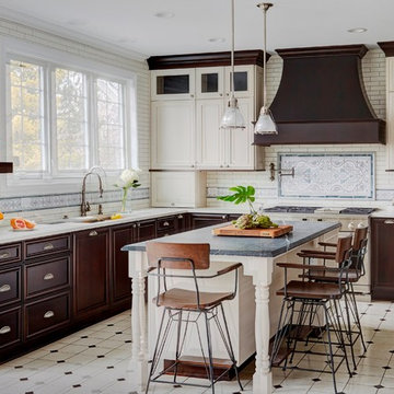
The goal of the project was to create a more functional kitchen, but to remodel with an eco-friendly approach. To minimize the waste going into the landfill, all the old cabinetry and appliances were donated, and the kitchen floor was kept intact because it was in great condition. The challenge was to design the kitchen around the existing floor and the natural soapstone the client fell in love with. The clients continued with the sustainable theme throughout the room with the new materials chosen: The back splash tiles are eco-friendly and hand-made in the USA.. The custom range hood was a beautiful addition to the kitchen. We maximized the counter space around the custom sink by extending the integral drain board above the dishwasher to create more prep space. In the adjacent laundry room, we continued the same color scheme to create a custom wall of cabinets to incorporate a hidden laundry shoot, and dog area. We also added storage around the washer and dryer including two different types of hanging for drying purposes.
 TEW Design Studio
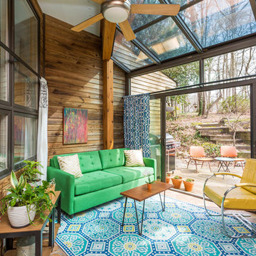
This home is a true gem in the heart of MacGregor Downs community in Cary, NC. Built in the 1980's in true Modernist design and architecture, the new owners wanted to keep the integrity of the original design. We redesigned the Half Bath, created floor plan layouts for new furniture, spec'd out furniture, accessories, flooring material, lighting, and artwork, as well as worked on brightening the wall and ceiling paint colors. One challenge we faced during the design process were the very tall ceilings, the very wide walls, and unusual angles. We chose interesting , engaging, and minimalistic artwork for the walls, which proved a successful solution. Another challenge was having a large open angled living room space; we created the perfect layout with separate functional gathering areas and eliminated unused corners.
Photo credit: Bob Fortner
2