
Search results for "Split level garage conversion" in Home Design Ideas
 Melissa Cooley, CKBR/ Case Design/Remodeling Inc.
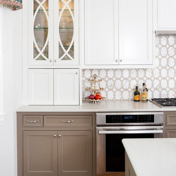
Inspiration for a contemporary kitchen remodel in DC Metro

 Granit Architects + Interiors
Photo Credit: Andy Beasley
Pavilion Grey Kitchen cabinets teamed with a white quartz stone countertop makes for an ultra sleek and contemporary kitchen with a very subtle injection of colour. A contrasting bespoke dark grey dresser with glass doors is great for storing glasses or in this case, tucking away a television.
The industrial feel of this property is continued throughout the house with accessories and little features. The pendant lights here match the light tone of the kitchen whilst the chrome and metal shade tie in the steel appliances with the industrial accents.
Bar Stools - Eve wooden bar stools from Atlanticshopping.co.uk £69.50 each

 Alair Homes - Salt Lake
Brad Montgomery
Large transitional black one-story stone gable roof idea in Salt Lake City with a shingle roof
Large transitional black one-story stone gable roof idea in Salt Lake City with a shingle roof
Find the right local pro for your project

 Sheffield Construction Company, Inc
Inspiration for a huge timeless white one-story brick house exterior remodel in Atlanta with a shingle roof

 Advance Design Studio, Ltd.
Jennifer and Dan have lived in their Deer Park Illinois home for 15 years, slowly making minor fixes like painting and decorating; but they had a new plan for their kitchen the entire time. An awkwardly placed garage door, and an island cooktop with a terrible downdraft made a full-scale kitchen remodel an absolute must. Jennifer had many ideas in mind and wanted to work with a company that could provide high-end work, while partnering with a designer that would tailor the kitchen to her ideas.
She was intrigued by the phrase “Common Sense Remodeling” in Advance Design’s feature she discovered while perusing an issue of the community’s Quintessential Barrington Magazine. Doing further research on the company’s website, as she looked through project profiles and read about Advance Design’s “Common Sense Remodeling” philosophy, she promptly scheduled an appointment to see if the people and ideas she read about were truly who they said they were. The more she read, the more she knew that the “Common Sense” approach to remodeling they described was exactly the type of company she was looking for.
The partnership was sealed after an initial consultation with Owner Todd Jurs and Project Designer Michelle Lecinski. They displayed a combination of friendliness, professionalism and respect that was unmatched by any of the other companies Jennifer talked to. She knew that with Advance Design, she would be able to retain the vision that she had in mind with high-quality craftsmanship.
“I reached out to Advance Design because of the ‘Common Sense Remodeling’ tagline,” Jennifer said. “That’s what lingered for me”. “Advance Design was the most respectful- of the house and of my design ideas, and the most professional of the handful of companies that looked at my project”.
Soon after the meeting Jennifer began working with Michelle on the project design. They quickly developed chemistry. Jennifer loved how Michelle researched and located every detail that Jennifer wanted for the kitchen. Between the two of them, every concept and idea was worked through and perfected. “Jennifer had definite ideas about what she wanted the new kitchen to look like, she just didn’t know how to bring it all together. We worked together really well to make her ideas into the practical reality necessary for a well-functioning kitchen, with the look and feel that she had envisioned”, says Michelle.
“Michelle was wonderful in using the CAD system she would show me new drawings every time we changed the layout while working through the design,” Jennifer said. “She was a really wonderful partner in execution, she made sure everything happened quickly and easily.”
The finished design drew out elements of Jennifer’s style and personality. The pair call the look “sophisticated farmhouse” to describe the kitchen renovation to family and friends. The result was a beautifully crafted, authentic-feeling space that satisfied Jennifer’s dreams 15 years in the making. The whole project consisted of a kitchen remodel, mudroom upgrade with powder room, and garage entry relocation. “The projects I personally like the best, are the ones that put the client’s dreams on display,” Project Designer Michelle said. “And this is one of those projects.”
The main focal point of the kitchen is custom zinc and brass ventilation hood with a vintage sheen, which was hand made to order by a small company in Indiana named Vogler Metalworking. “It’s like sculpture, a true work of art”, says Jennifer. Your eye is immediately drawn towards this elegant yet practical hood that eliminated the home’s downdraft problem and added a striking conversation piece at the same time. The carpenters had to use special gloves when transporting and installing it, so they didn’t smudge it with fingerprints. The beautiful hood centers proudly over the stunning black enamel and brass LaCornue Range. “I had a friend who had a LaCornue range and after learning how easy it was to cook perfect meals, I was convinced I wanted to have one”, says Jennifer. This unique, breathtaking combination anchors the entire kitchen and is apparent immediately as you walk into the great room the surrounds the space.
DuraSupreme Crestwood cabinets with a Kendall Panel add function and sophistication. A custom gray paint color paired with a storm blue was developed so that the new kitchen looked like it belonged to the existing space. Unlacquered brass faucets and hardware were important to Jennifer because she wanted the living finishes to age over time. Remarkable brass diamond mesh cabinet door inserts imported from the UK continue to add this one-of-a-kind kitchen renovation; giving it a “you won’t see this everywhere” quality. The use of old railcar flooring for the coffee bar countertop and reclaimed oak for the open shelving gives an authenticity to the space uncommon in kitchens today.
Jennifer and Michelle fell in love with the Limestone Grey Stone while they were investigating unique island countertop ideas. They liked the fact that the limestone as a living finish will age and change over time. Calcutta Miel Quartz countertops made for an excellent pairing around the perimeter, as it’s durable and perfect for cooking preparations. A textured white subway tile backsplash that runs to the ceiling keeps your eye moving towards the open shelving, and to the main focal point of the stunning range hood combination.
“The kitchen functions beautifully, and it’s gorgeous,” beams Jennifer as she gestures with both hands while smiling ear to ear. “The most important thing was I wanted a kitchen that had a wonderful flow, cooked beautiful meals and was a great gathering place for family and friends, and this space does that perfectly! Beauty wise, it turned out exactly how I had envisioned. I felt the function part was the hardest part, and that was nailed”!
Relocating the garage entry to the new mudroom was a huge priority and has finally separated the family’s arriving home functions from their kitchen. Now coats and shoes and bags have their own area for dropping once members arrive home. Matching gray DuraSupreme cabinetry helped create gorgeous, purposeful lockers for the family. A reclaimed vintage sink and custom wall paper were added to the tiny powder room to beautify the once previously only functional space. Advance Design was even able to create a custom space for their dog to sleep while the family is away.
“It was unbelievable that a project of this size was completed in such a short time, and I think that’s because of the large amount of planning and preparation that went into it,” Jennifer marveled, “When we started, we were ready, and everything was prepared”.
When it came to execution, Project Manager Justin Davis and his crew were quick, accessible, and organized. Projects like this kitchen are typically completed in as little as 8-10 weeks. Jennifer’s kitchen however despite the relocation of some challenging HVAC in a soffit and moving of an exterior door was completed remarkably fast in part because the team was working with an existing tile floor that ran throughout the first floor that the client really loved.
“You get to know these people really well because they’re living in your house while you’re living in your house. They were so fast and really good, it didn’t take as long as even planned” reported Jennifer. “I would text Justin and he always responded almost immediately. I got to know all the guys who were working in our house and they were all wonderful people”.
Details in a customized kitchen like this one require skill and care from the people who install it. “All the guys on the job were skilled at what the did. I wanted small details like little feet to look like furniture, that is where their carpentry skill came in to make these all perfect”, said Jennifer. “The tile guys were wonderful. They even let me determine how I wanted the texture with the grout to appear for a salt and pepper look; now that is a very skilled trade person making it custom”.
In Jennifer’s interview, she continued to reference Advance Design’s “Common Sense Remodeling”, so I took a minute to ask her exactly what that phrase meant to her and how it played out in her experience with her project and the Advance Design team. Here is what she said: “I was intrigued about Common Sense Remodeling and in my head that there would be clear costs and prices, great communication between the design team, the execution team and me”, said Jennifer. They did deliver on that, it was so clear about the cost breakdown, what I could expect from everyone who came to my house, and everything that we had ordered. That to me is the Common Sense”!
It’s great to see a client take literally our assertion that a well-planned remodeling project is simply “Common Sense”! She anticipated each step of the way would be clear, concise, and predictable, all the while protecting the outcome due to the careful upfront planning. “Advance Design delivered on their ‘Common Sense Remodeling’ promise,” Jennifer said. “From the design team, to the execution team - everything was straight forward like I imagined. The project turned out exactly how I envisioned, I enjoyed this process and absolutely would recommend Advance Design Studio to anyone.”

 Susan Yeley Homes
Bloomington is filled with a lot of homes that have remained trapped in time, which is awesome and fascinating (albeit sometimes frightening). When this young family moved to Bloomington last spring, they saw potential behind the Florida wallpaper of this Eastside ranch, and good bones despite its choppy layout. Wisely, they called SYI and Loren Wood Builders for help bringing it into the two thousand-teens.
Two adjacent bathrooms were gutted together and went back up in much better configurations. A half bath and mud-cum-laundry room near the garage went from useful but blah, to an area you don't have to close the door on when guests come over. Walls came down to open up the family, living, kitchen and dining areas, creating a flow of light and function that we all openly envy at SYI. (We do not hide it whatsoever. We all want to live in this happy, bright house. Also the homeowners are amazing cooks, another good reason to want to move in.)
Like split-levels and bi-levels, ranches are often easy to open up for the casual and connected spaces we dig so much in middle America this century.
Knock down walls; unify flooring; lighten and brighten the space; and voila! a dated midcentury shell becomes a modern family home.
Contractor: Loren Wood Builders
Cabinetry: Stoll's Woodworking
Tile work: Fitzgerald Flooring & Construction
Photography: Gina Rogers

 Risa Boyer Architecture
Photo Credits: Aaron Leitz
Inspiration for a mid-sized modern beige split-level wood house exterior remodel in Portland with a shingle roof
Inspiration for a mid-sized modern beige split-level wood house exterior remodel in Portland with a shingle roof

 Shuler Architecture
This 3 BR, 3 1/2 bath home allows the owners to live on one level most of the time. The Master Suite is on the main level along with the Living Room, Kitchen, Dining, pantries, Sun Room and service areas. The upper level houses two ample bedrooms while the lower level supports a rec center, media room, wine cellar, shop and full wet bar. Conceived as a Great Room house, the main level is designed as one seamless space that flows onto an ample deck overlooking the rear yard.
We also incorporated a variety of green building techniques - photo-voltaic shingles on the roof of the garage to generate a portion of the home's energy, a super insulated building envelope, rain water harvesting, high performance windows and doors, a high efficiency heat pump, low flow bath & kitchen fixtures, Energy Star appliances and LED lighting - that greatly reduced this structure's carbon footprint. All of the strategies amounted to a 30% reduction in the energy consumption in this home relative to comparable structures.
 ODS Architecture
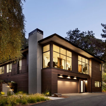
In a wooded area of Lafayette, a mid-century home was re-imagined for a graphic designer and kindergarten teacher couple and their three children. A major new design feature is a high ceiling great room that wraps from the front to the back yard, turning a corner at the kitchen and ending at the family room fireplace. This room was designed with a high flat roof to work in conjunction with existing roof forms to create a unified whole, and raise interior ceiling heights from eight to over ten feet. All new lighting and large floor to ceiling Fleetwood aluminum windows expand views of the trees beyond.
The existing home was enlarged by 700 square feet with a small exterior addition enlarging the kitchen over an existing deck, and a larger amount by excavating out crawlspace at the garage level to create a new home office with full bath, and separate laundry utility room. The remodeled residence became 3,847 square feet in total area including the garage.
Exterior curb appeal was improved with all new Fleetwood windows, stained wood siding and stucco. New steel railing and concrete steps lead up to the front entry. Front and rear yard new landscape design by Huettl Landscape Architecture dramatically alters the site. New planting was added at the front yard with landscape lighting and modern concrete pavers and the rear yard has multiple decks for family gatherings with the focal point a concrete conversation circle with central fire feature.
Everything revolves around the corner kitchen, large windows to the backyard, quartz countertops and cabinetry in painted and walnut finishes. The homeowners enjoyed the process of selecting Heath Tile for the kitchen backsplash and white oval tiles at the family room fireplace. Black brick tiles by Fireclay were used on the living room hearth. The kitchen flows into the family room all with views to the beautifully landscaped yards.
The primary suite has a built-in window seat with large windows overlooking the garden, walnut cabinetry in a skylit walk-in closet, and a large dramatic skylight bouncing light into the shower. The kid’s bath also has a skylight slot with light angling downward over double sinks. More colorful tile shows up in these spaces, as does a geometric patterned tile in the downstairs office bath shower.
The large yard is taken full advantage of with concrete paved walkways, stairs and firepit circle. New retaining walls in the rear yard helped to add more level usable outdoor space, with wood slats to visually blend them into the overall design.
The end result is a beautiful transformation of a mid-century home, that both captures the client’s personalities and elevates the house into the modern age.

 Visbeen Architects
Designed with an open floor plan and layered outdoor spaces, the Onaway is a perfect cottage for narrow lakefront lots. The exterior features elements from both the Shingle and Craftsman architectural movements, creating a warm cottage feel. An open main level skillfully disguises this narrow home by using furniture arrangements and low built-ins to define each spaces’ perimeter. Every room has a view to each other as well as a view of the lake. The cottage feel of this home’s exterior is carried inside with a neutral, crisp white, and blue nautical themed palette. The kitchen features natural wood cabinetry and a long island capped by a pub height table with chairs. Above the garage, and separate from the main house, is a series of spaces for plenty of guests to spend the night. The symmetrical bunk room features custom staircases to the top bunks with drawers built in. The best views of the lakefront are found on the master bedrooms private deck, to the rear of the main house. The open floor plan continues downstairs with two large gathering spaces opening up to an outdoor covered patio complete with custom grill pit.

 Michael Nash Design, Build & Homes
2011 NARI CAPITAL COTY FINALIST AWARD WINNER
This 1970’s split-level single-family home in an upscale Arlington neighborhood had been neglected for years. With his surrounding neighbors all doing major exterior and interior remodeling, however, the owner decided it was time to renovate his property as well. After several consultation meetings with the design team at Michael Nash Design, Build & Homes, he settled on an exterior layout to create an Art & Craft design for the home.
It all got started by excavating the front and left side of the house and attaching a wrap-around stone porch. Key design attributes include a black metal roof, large tapered columns, blue and grey random style flag stone, beaded stain ceiling paneling and an octagonal seating area on the left side of this porch. The front porch has a wide stairway and another set of stairs leads to the back yard.
All exterior walls of the home were modified with new headers to allow much larger custom-made windows, new front doors garage doors, and French side and back doors. A custom-designed mahogany front door with leaded glass provides more light and offers a wider entrance into the home’s living area.
Design challenges included removing the entire face of the home and then adding new insulation, Tyvek and Hardiplank siding. The use of high-efficiency low-e windows makes the home air tight.
The Arts & Crafts design touches include the front gable over the front porch, the prairie-style grill pattern on the windows and doors, the use of tapered columns sitting over stone columns and the leaded glass front door. Decorative exterior lighting provides the finishing touches to this look.
Inside, custom woodwork, crown molding, custom glass cabinets and interior pillars carry the design. Upon entering the space, visitors face a large partition that separates the living area from a gourmet Arts & Crafts kitchen and dining room.
The home’s signature space, the kitchen offers contrasting dark and light cherry cabinets. Wide plank hard wood floors, exotic granite counters and stainless steel professional-grade appliances make this a kitchen fit for any chef.
 Susan Yeley Homes
Bloomington is filled with a lot of homes that have remained trapped in time, which is awesome and fascinating (albeit sometimes frightening). When this young family moved to Bloomington last spring, they saw potential behind the Florida wallpaper of this Eastside ranch, and good bones despite its choppy layout. Wisely, they called SYI and Loren Wood Builders for help bringing it into the two thousand-teens.
Two adjacent bathrooms were gutted together and went back up in much better configurations. A half bath and mud-cum-laundry room near the garage went from useful but blah, to an area you don't have to close the door on when guests come over. Walls came down to open up the family, living, kitchen and dining areas, creating a flow of light and function that we all openly envy at SYI. (We do not hide it whatsoever. We all want to live in this happy, bright house. Also the homeowners are amazing cooks, another good reason to want to move in.)
Like split-levels and bi-levels, ranches are often easy to open up for the casual and connected spaces we dig so much in middle America this century.
Knock down walls; unify flooring; lighten and brighten the space; and voila! a dated midcentury shell becomes a modern family home.
Contractor: Loren Wood Builders
Cabinetry: Stoll's Woodworking
Tile work: Fitzgerald Flooring & Construction
Photography: Gina Rogers

 McCall Homes
A Carolee McCall Smith design, this new home took its inspiration from the old-world charm of traditional farmhouse style. Details of texture rather than color create an inviting feeling while keeping the decor fresh and updated. Painted brick, natural wood accents, shiplap, and rustic no-maintenance floors act as the canvas for the owner’s personal touches.
The layout offers defined spaces while maintaining natural connections between rooms. A wine bar between the kitchen and living is a favorite part of this home! Spend evening hours with family and friends on the private 3-season screened porch.
For those who want a master suite sanctuary, this home is for you! A private south wing gives you the luxury you deserve with all the desired amenities: a soaker tub, a modern shower, a water closet, and a massive walk-in closet. An adjacent laundry room makes one-level living totally doable in this house!
Kids claim their domain upstairs where 3 bedrooms and a split bath surround a casual family room.
The surprise of this home is the studio loft above the 3-car garage. Use it for a returning adult child, an aging parent, or an income opportunity.
Included energy-efficient features are: A/C, Andersen Windows, Rheem 95% efficient furnace, Energy Star Whirlpool Appliances, tankless hot water, and underground programmable sprinklers for lanscaping.
 Aris Keshishian
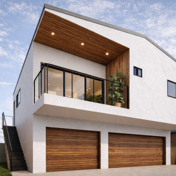
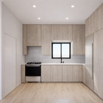
The Angelino ADU is a two-story ADU in Burbank, California, designed as a two-bedroom accessory dwelling unit that balances privacy, natural light, and efficient residential living on a constrained site. Positioned between two existing units, the project places a 1,000-square-foot upper-level residence above a generous three-car garage, creating a well-resolved living environment with two bedrooms, two bathrooms, and a full kitchen.
The design was shaped by the challenge of building alongside taller multifamily structures, where privacy, daylight, and ventilation all had to be carefully considered. Strategic window placement and thoughtfully located skylights bring natural light deep into the interior while maintaining a strong sense of seclusion. This approach also supports cross ventilation throughout the living spaces, contributing to a more comfortable and functional home.
Rather than treating the ADU as a secondary structure, the project was designed as a complete residential environment with a clear emphasis on livability, efficiency, and contemporary use. The result is a thoughtfully planned Burbank accessory dwelling unit that responds to site constraints with practical spatial organization, natural light, and everyday comfort.
 Michael Nash Design, Build & Homes
2011 NARI CAPITAL COTY FINALIST AWARD WINNER
This 1970’s split-level single-family home in an upscale Arlington neighborhood had been neglected for years. With his surrounding neighbors all doing major exterior and interior remodeling, however, the owner decided it was time to renovate his property as well. After several consultation meetings with the design team at Michael Nash Design, Build & Homes, he settled on an exterior layout to create an Art & Craft design for the home.
It all got started by excavating the front and left side of the house and attaching a wrap-around stone porch. Key design attributes include a black metal roof, large tapered columns, blue and grey random style flag stone, beaded stain ceiling paneling and an octagonal seating area on the left side of this porch. The front porch has a wide stairway and another set of stairs leads to the back yard.
All exterior walls of the home were modified with new headers to allow much larger custom-made windows, new front doors garage doors, and French side and back doors. A custom-designed mahogany front door with leaded glass provides more light and offers a wider entrance into the home’s living area.
Design challenges included removing the entire face of the home and then adding new insulation, Tyvek and Hardiplank siding. The use of high-efficiency low-e windows makes the home air tight.
The Arts & Crafts design touches include the front gable over the front porch, the prairie-style grill pattern on the windows and doors, the use of tapered columns sitting over stone columns and the leaded glass front door. Decorative exterior lighting provides the finishing touches to this look.
Inside, custom woodwork, crown molding, custom glass cabinets and interior pillars carry the design. Upon entering the space, visitors face a large partition that separates the living area from a gourmet Arts & Crafts kitchen and dining room.
The home’s signature space, the kitchen offers contrasting dark and light cherry cabinets. Wide plank hard wood floors, exotic granite counters and stainless steel professional-grade appliances make this a kitchen fit for any chef.

 TVL Creative Ltd.
[Our Clients]
We were so excited to help these new homeowners re-envision their split-level diamond in the rough. There was so much potential in those walls, and we couldn’t wait to delve in and start transforming spaces. Our primary goal was to re-imagine the main level of the home and create an open flow between the space. So, we started by converting the existing single car garage into their living room (complete with a new fireplace) and opening up the kitchen to the rest of the level.
[Kitchen]
The original kitchen had been on the small side and cut-off from the rest of the home, but after we removed the coat closet, this kitchen opened up beautifully. Our plan was to create an open and light filled kitchen with a design that translated well to the other spaces in this home, and a layout that offered plenty of space for multiple cooks. We utilized clean white cabinets around the perimeter of the kitchen and popped the island with a spunky shade of blue. To add a real element of fun, we jazzed it up with the colorful escher tile at the backsplash and brought in accents of brass in the hardware and light fixtures to tie it all together. Through out this home we brought in warm wood accents and the kitchen was no exception, with its custom floating shelves and graceful waterfall butcher block counter at the island.
[Dining Room]
The dining room had once been the home’s living room, but we had other plans in mind. With its dramatic vaulted ceiling and new custom steel railing, this room was just screaming for a dramatic light fixture and a large table to welcome one-and-all.
[Living Room]
We converted the original garage into a lovely little living room with a cozy fireplace. There is plenty of new storage in this space (that ties in with the kitchen finishes), but the real gem is the reading nook with two of the most comfortable armchairs you’ve ever sat in.
[Master Suite]
This home didn’t originally have a master suite, so we decided to convert one of the bedrooms and create a charming suite that you’d never want to leave. The master bathroom aesthetic quickly became all about the textures. With a sultry black hex on the floor and a dimensional geometric tile on the walls we set the stage for a calm space. The warm walnut vanity and touches of brass cozy up the space and relate with the feel of the rest of the home. We continued the warm wood touches into the master bedroom, but went for a rich accent wall that elevated the sophistication level and sets this space apart.
[Hall Bathroom]
The floor tile in this bathroom still makes our hearts skip a beat. We designed the rest of the space to be a clean and bright white, and really let the lovely blue of the floor tile pop. The walnut vanity cabinet (complete with hairpin legs) adds a lovely level of warmth to this bathroom, and the black and brass accents add the sophisticated touch we were looking for.
[Office]
We loved the original built-ins in this space, and knew they needed to always be a part of this house, but these 60-year-old beauties definitely needed a little help. We cleaned up the cabinets and brass hardware, switched out the formica counter for a new quartz top, and painted wall a cheery accent color to liven it up a bit. And voila! We have an office that is the envy of the neighborhood.
 Aris Keshishian
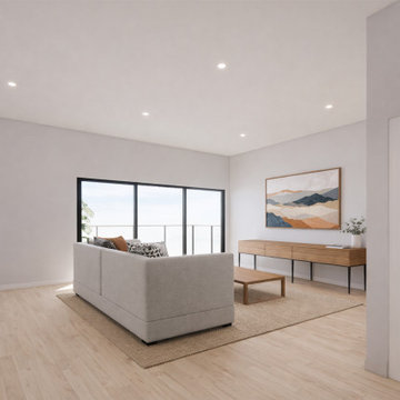
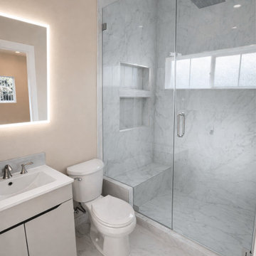
The Angelino ADU is a two-story ADU in Burbank, California, designed as a two-bedroom accessory dwelling unit that balances privacy, natural light, and efficient residential living on a constrained site. Positioned between two existing units, the project places a 1,000-square-foot upper-level residence above a generous three-car garage, creating a well-resolved living environment with two bedrooms, two bathrooms, and a full kitchen.
The design was shaped by the challenge of building alongside taller multifamily structures, where privacy, daylight, and ventilation all had to be carefully considered. Strategic window placement and thoughtfully located skylights bring natural light deep into the interior while maintaining a strong sense of seclusion. This approach also supports cross ventilation throughout the living spaces, contributing to a more comfortable and functional home.
Rather than treating the ADU as a secondary structure, the project was designed as a complete residential environment with a clear emphasis on livability, efficiency, and contemporary use. The result is a thoughtfully planned Burbank accessory dwelling unit that responds to site constraints with practical spatial organization, natural light, and everyday comfort.
 Aris Keshishian
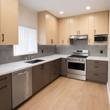
The Angelino ADU is a two-story ADU in Burbank, California, designed as a two-bedroom accessory dwelling unit that balances privacy, natural light, and efficient residential living on a constrained site. Positioned between two existing units, the project places a 1,000-square-foot upper-level residence above a generous three-car garage, creating a well-resolved living environment with two bedrooms, two bathrooms, and a full kitchen.
The design was shaped by the challenge of building alongside taller multifamily structures, where privacy, daylight, and ventilation all had to be carefully considered. Strategic window placement and thoughtfully located skylights bring natural light deep into the interior while maintaining a strong sense of seclusion. This approach also supports cross ventilation throughout the living spaces, contributing to a more comfortable and functional home.
Rather than treating the ADU as a secondary structure, the project was designed as a complete residential environment with a clear emphasis on livability, efficiency, and contemporary use. The result is a thoughtfully planned Burbank accessory dwelling unit that responds to site constraints with practical spatial organization, natural light, and everyday comfort.
 Aris Keshishian
The Angelino ADU is a two-story ADU in Burbank, California, designed as a two-bedroom accessory dwelling unit that balances privacy, natural light, and efficient residential living on a constrained site. Positioned between two existing units, the project places a 1,000-square-foot upper-level residence above a generous three-car garage, creating a well-resolved living environment with two bedrooms, two bathrooms, and a full kitchen.
The design was shaped by the challenge of building alongside taller multifamily structures, where privacy, daylight, and ventilation all had to be carefully considered. Strategic window placement and thoughtfully located skylights bring natural light deep into the interior while maintaining a strong sense of seclusion. This approach also supports cross ventilation throughout the living spaces, contributing to a more comfortable and functional home.
Rather than treating the ADU as a secondary structure, the project was designed as a complete residential environment with a clear emphasis on livability, efficiency, and contemporary use. The result is a thoughtfully planned Burbank accessory dwelling unit that responds to site constraints with practical spatial organization, natural light, and everyday comfort.
 Aris Keshishian
The Angelino ADU is a two-story ADU in Burbank, California, designed as a two-bedroom accessory dwelling unit that balances privacy, natural light, and efficient residential living on a constrained site. Positioned between two existing units, the project places a 1,000-square-foot upper-level residence above a generous three-car garage, creating a well-resolved living environment with two bedrooms, two bathrooms, and a full kitchen.
The design was shaped by the challenge of building alongside taller multifamily structures, where privacy, daylight, and ventilation all had to be carefully considered. Strategic window placement and thoughtfully located skylights bring natural light deep into the interior while maintaining a strong sense of seclusion. This approach also supports cross ventilation throughout the living spaces, contributing to a more comfortable and functional home.
Rather than treating the ADU as a secondary structure, the project was designed as a complete residential environment with a clear emphasis on livability, efficiency, and contemporary use. The result is a thoughtfully planned Burbank accessory dwelling unit that responds to site constraints with practical spatial organization, natural light, and everyday comfort.
115