
Search results for "Squeeze" in Home Design Ideas
 Gaile Guevara
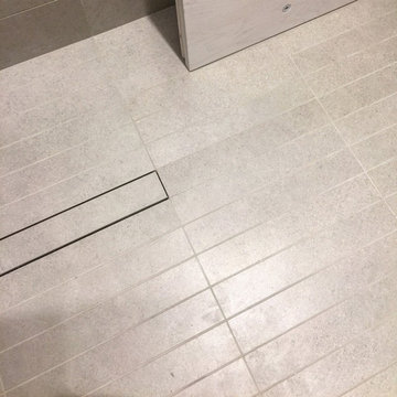
| DETAILS | in concrete constructed condos it's very rare that we ever want to have to core new drain locations. For the Master Ensuite more and more when we do full renovations down to studs we are removing the terrible 5' tubs and tiny itty bitty 3x3' showers. For some reason the idea of luxury meant squeeze as much as you can so you have a long list of features when you go to market. More and more we are doing oversized his and hers showers. So when you have a drain that you are repurposing from previous plumbing fixtures and the drain isn't centred, it's pretty much magic to have the team surprise you after several site meetings and evaluations - we opted for the plumbers favourite to use Schluter linear tile over drains and have the oversized tile cut to fit and provide the necessary grout lines for a flush shower threshold. This might seem like nothing but is everything when we have the perfect tile layout be inline with the what we think is a centred drain. These are the kind of details that make my OCD sister inside so happy, we call it the centre flush drain happy dance. Kudos to @caisleydevelopments @4thdimensionconstruction with the help of @stonetilevancouver for finding a perfect subtle sand toned oversized porcelain. A large format tile in a shade and same tone value as our hardwood floor and one shade darker than our Baltic Birch flush panels for ease of cleaning and hiding dirt. When you want things clean I opt for showers with minimal detailing to be in shades darker than white. Cleaning becomes less treacherous. Also gone is this idea of ugly accent tile, we opt for uniform tile one material throughout a bathroom floor to ceiling and if possible all walls. Construction geekery 101 continues
 Ethan Allen
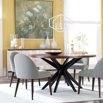
Clean lines, geometric forms. A mix of natural and industrial elements - a fresh squeeze of midcentury modern will add zest to any design.
Dining room - mid-century modern dining room idea in New York
Dining room - mid-century modern dining room idea in New York
 Saltair Building + Design
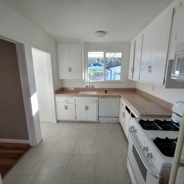
We got referred by our clients family member who we've done work for in the past. After getting similar priced bids this client has decided to go with us for a wall removal, Layout re-imagining and kitchen remodel. We started the process, as always, with our in-house designer, landed on an idea which fits their budget and started the process, permits didn't take as long as we anticipated so we managed to squeeze this project in and finished it within the time frame we promised once permits were pulled. Client is overall happy and this is a project we are very proud of.
Find the right local pro for your project
 Shuler Architecture
Like many West Coast cities, Seattle is facing a severe housing shortage at a time when labor and material costs have skyrocketed. Combined with a lack of available dirt, housing vacancy rates stubbornly hover under 5%.
A response to this housing perfect storm has been the evolution of a new housing prototype called a detached Auxiliary Dwelling Unit (DADU). This is commonly referred to as a Mother-in-Law (MIL) unit. As the name implies, this is a small, self-contained housing type that allows for additional housing to be built on an existing lot, creating greater density within our urban fabric. Generally thought of as either starter housing or aging-in-place concepts, these are extremely efficient floor plans that squeeze all the basic living functions into a compact space while envisioning the urban fabric as one's living room. In the case of our little DADU, our footprint is 20' x 20' and provides a ground level garage/music studio and an upper level apartment.
The misconception of these structure - thanks in large part to the misinformation campaign of the Not-So-Big-House movement - is the smaller translates into cheaper. Since these are essentially small houses, the truth is these are very expensive structures on a cost/sf basis. We conceptualized this structure as inexpensively as we could think of and it still ended up costing more than $400,000 or around $500/sf.
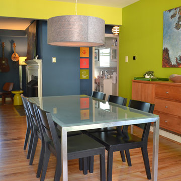
 Spring Creek Design
Tim & Elissa have a beautiful home in the most desirable Wyomissing neighborhood. Broad sidewalks under stately oaks, with nearby parks makes it a perfect place to raise a growing family. But their 2-bedroom mid-century rancher was becoming a squeeze. They asked Spring Creek Design to come up with a cost-effective solution to their space problem, while also tackling some of the home’s aged infrastructure.
Design Criteria:
- Increase living space by adding a new 2nd storey Master Suite.
- Enhance livability with an open floorplan on the first floor.
- Improve the connection to the outdoors.
- Update basics systems with new windows, HVAC and insulation.
- Update interior with paint & refinished floors.
Special Features:
- Bright, mid-century modern design is true to the home’s vintage.
- Custom steel cable railings at both stairways.
- New open plan creates strong connections between kitchen, living room, dining room and deck.
- High-performance Pella windows throughout, including a new triple-panel slider to the deck.
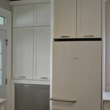
 New Angle Design
Small transitional vinyl floor kitchen photo in Other with a farmhouse sink, shaker cabinets, white cabinets, quartz countertops, multicolored backsplash, ceramic backsplash, white appliances and no island
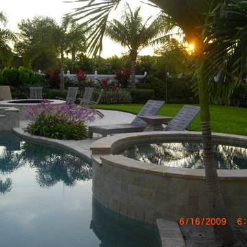
 Arley
ArleyThe spa is 9' diameter and can seat 8 adults, and as many children as can squeeze into the middle. In the winter, the kids actually use the hot tub as there "pool". Although we have a heater we seldom use it to heat the whole pool as we have very hot summers, and it is a little costly in the winter.
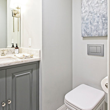
 All Pro Builders Inc.
A stunning entertainment home! Removing 4 walls and extending the kitchen space by less than 40 sf. did amazing things for this space—now it's completely open to the living area & gorgeous wall of windows overlooking the Fullerton trails. The attention to details make it all come together: black Cambria quartz counter, Wolf stove, Rolf faucet, custom-built cabinetry, pop up electrical outlets, and the custom-cut marble tile backsplash. The transformation also included updating the laundry room & squeezing in a powder room.
 Klopf Architecture
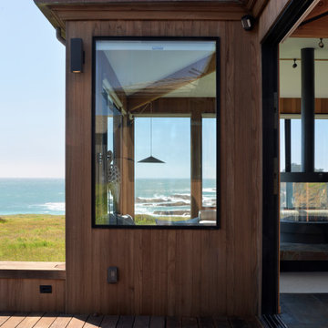
Built for the Bluff, A Sea Ranch Home is Remade from the Inside Out
The house had always been grounded, on an ocean bluff at The Sea Ranch. It sits unencumbered, adjacent to one of the most dramatic stretches of the Sonoma coast with protected commons meadow to the east, uninterrupted Pacific views to the west, and a bluff trail running alongside. What it lacked was the feeling of home, one that could hold up its own against the natural landscape.
The owners are entrepreneurs with deep involvement across tech, real estate, and development and they know how things are built. The Sea Ranch house had been in their lives for years, a second residence and a place for family to gather. Built for a different time, it felt more compromising than comfortable. Sitting in a closed off nook, the kitchen fit one cook at a time and turned its back on the rest of the house. The entry was dim and compressed, divided by a structural column that presented itself at exactly the wrong moment. The primary suite was small relative to the view outside it. A large rear bedroom sat behind a lowered ceiling with a bathroom that had never been added. The house was certainly worth the trouble of doing it right.
What followed was not one project but four, each with its own design challenge, each addressed over a period of time.
Where the House Meets the Ocean
The most complex piece of the project, in both structural and spatial terms, was the kitchen expansion. The existing room was a single-person galley squeezed in as an afterthought with no meaningful connection to the dining room, the living space, or the deck outside. To make it useful for a family that cooks and gathers, it needed to grow outward into an existing patio and flow into the rooms around it.
A big challenge was the roofline. Several planes at different pitches and angles converged directly where additional volume was needed. A new form had to join that geometry without reading as a correction. The solution found the simplest possible connection between the existing angles, a roofline that from outside the structure, appears entirely original. From the bluff trail where the addition is visible, there is no discernible seam.
Inside, the kitchen is now open to the living and dining rooms without interruption. A large sliding glass door connects the space onto the rear deck. The deck itself was expanded and oriented so that the body of the house shields it from the coastal wind which is a common consideration that determines whether outdoor space at The Sea Ranch actually gets used. The result is a room that works for large family gatherings where no one feels cutoff, and one that makes the boundary between being inside and outside easy to ignore.
Welcoming Light
A structural column stood at the convergence of eight distinct roof planes in the entry. It was load-bearing, but it was also the reason the entry had always felt like a hallway rather than a welcoming arrival.
With the structural engineer, a custom steel connector was designed to receive beams from six separate directions, redistributing the load through a single new continuous beam. The column was surgically removed. Three triangular skylights were then cut into the roof above, their shapes drawn from the
existing geometry of the planes around them. The entry is now bright and open. The skylights feel native to the structure because they follow the logic already present in the roof.
Two Suites, Two Views
At opposite ends of the house, the two bedroom suites were each reconfigured, and each found a different way to introduce more of the landscape into the room.
An addition to the primary suite extended the structure outward to create a wraparound plan with a loop from the bedroom through bath and closet that had not been possible before. The expansion opened a slot view from the tub and shower toward the ocean. The view is precise and private. The ocean view is present and deliberate.
The rear bedroom absorbed an adjacent storage room to transform it into a full second suite with a vaulted ceiling, a large bathroom with a tub, a shower, and a sauna. A private fenced garden courtyard sits just beyond the glass bringing the outdoors inside. The tub was placed so that, looking past the courtyard and through the bedroom beyond, the ocean is visible at the far end. It is a long view and it makes the room feel larger and more settled than its footprint would suggest.
Glass on Four Sides, Fire at the Center
The main living and gathering room had always been caught between two competing facts: glass on four sides meant exceptional views but at The Sea Ranch, it also meant a cold room. A 360-degree cylindrical fireplace was added at the center on a raised stone base, providing radiant heat in every direction and giving the room a focal point around which a group naturally orients itself, whether that means two people at the end of the day or the whole family after dinner.
Owners Who Picked Up the Tools
The owner was not a passive client. they came with construction knowledge, specific ideas, and the desire to be an active part of the process, a dynamic that other architects may had found difficult, which Klopf Architecture accepted as an asset. They took it upon themselves to complete some of the work during construction, including the installation of a new radiant heating system beneath the floors.
The radiant system added to the older and less-desirable forced-air setup. At The Sea Ranch, that change matters as the house sits close enough to the ocean and moving air competes with the sound of it, where radiant heat does not. Solar panels were added to the roof as part of the new system. Insulation was upgraded throughout the walls, roof, and crawl space. The house that had always had the right setting now holds warmth the way a house on the bluff should.
They were also deeply involved in the design and selections throughout, and the finished house reflects both of them in ways that are specific rather than generic. The process took longer and moved through more iterations than a more arms-length relationship might have allowed. The result is more defined and personal because of it.
The Landscape Holds Priority
Every exterior decision was shaped by The Sea Ranch Design Standards, which require that buildings defer to the landscape around them rather than compete with it. Because this house sits on the bluff and is visible from the public trail, the additions faced a close review. Existing materials were matched. Geometries were resolved. The additions had to become indistinguishable from the original building.
From the trail, the house reads exactly as it always has — low, cedar-clad, secondary to the meadow and the water. The setting holds priority. Inside, the house has been remade.
Klopf Architecture Project Team: Geoff Campen and Trenton Jewett
Contractor: Shawn Bettega Construction
Photography: ©2025 Mariko Reed
Year Completed: 2023
Location: The Sea Ranch, CA
 Niche reDesign
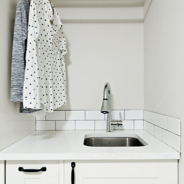
We managed to squeeze in a lot in this tight space! Upper storage, small sink, and a narrow pull out on castors for laundry detergent etc. We made a shelf out of the leftover countertop material for the bench seat.
 Carter Fox Design Build
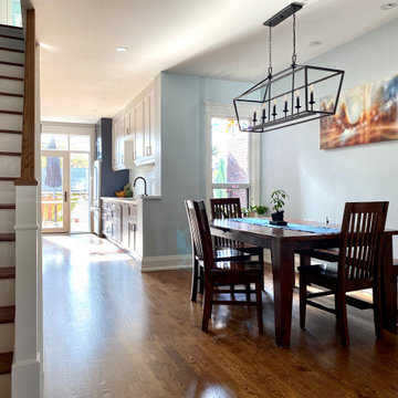
How do you squeeze a soaker tub, steam shower, walk-in closet, large master bedroom, and a private study into the renovation of a 2-story East Danforth semi? By going UP!
For this project, the homeowner had a firm budget and didn't dream it could include a new kitchen as well as the 3rd-floor addition. With some creative solutions and our experience remodeling older homes, Carter Fox delivered an open-concept light-filled home that preserved several original elements in order to save budget for the must-have items - AND a new, customized kitchen.
 Alexandra Crafton
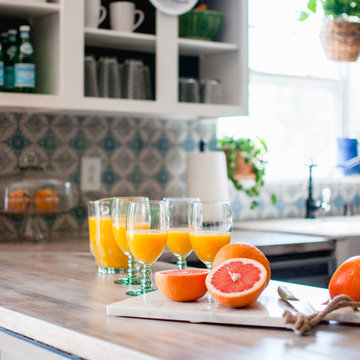
Photo: Alexandra Crafton © 2016 Houzz
Example of a farmhouse home design design in Louisville
Example of a farmhouse home design design in Louisville
 Amy Pearson Design
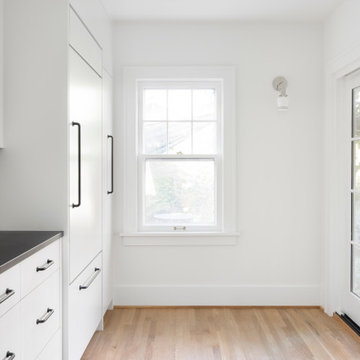
This classic Portland bungalow in the highly desirable Irvington neighborhood was in desperate need of a kitchen update. Aside from tired finishes and cabinets that have seen a full life, the original layout left the family living in a small portion of the kitchen and not taking advantage of the full square footage.
The family desired a design that married both the original architectural details of their bungalow with their preference for clean and modern European design. To accomplish this request, APD brought in sleek flat panel custom frameless cabinets filled with smart and strategic accessories to make the most out of every cabinet box, including full height pantry pull-out, spice and utensil pull-outs flanking the cooking zone, a blind corner pull-0ut to avoid loosing items in the hard-to-reach space, trash & recycling pull-0ut disguised to blend with the adjacent three drawers, and a wall cabinet pull-out sized to fit under the support beam spanning the width of the room. For the traditional - we kept the classic moldings around the windows and doors, continued the homes hardwood floors into the new space, incorporated classic school house light fixtures, and swapped out the slider to the back patio in favor for one with divided lights adding to the architectural detail. Matte black granite countertops with handmade black ceramic tile backsplash bridge the gap between the modern and the traditional thanks to their clean lines, high contrast color palette, and textural and artistic details.
Opting for a few adjustments to the layout created a space plan that took advantage of the full square footage of the room! In the original layout, the refrigerator was squeezed onto the same wall as the cooking, leaving very little counterspace around the hard working cooking zone along with a significant portion of the room (a previous addition) under-utilized. Relocating the refrigerator increased counterspace and storage while creating a “flow” through the entire room.
Luxury Miele and Subzero appliances make this kitchen a chef’s dream! To add to the clean modern look, we opted for an induction cooktop with wall oven directly below … a great alternative to the often used range! Paneling the built-in refrigerator and dishwasher help to calm the overall visual noise of the space, hiding the two hardworking appliances away!
This new family kitchen is at once hardworking, sleek, and timeless!
 Viahouse
A proud project that I would like to share.
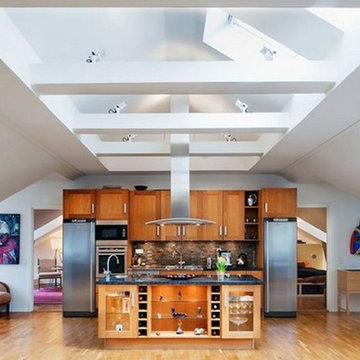
I got a project from a family who lived in a penthouse apartment.
They found it difficult to furnish the apartment as there were sloping walls, also lacked the apartment too light outside.
My suggestion was to turn on the light by low ceiling and then install some larger windows in the ceiling. It works just really good, the apartment has a completely new look and now has plenty of light.
When making high ceiling solution space becomes very large, because they do not feel they are being squeezed to the sloping walls.
A super solution and the budget was affordable. But all expenditures, the budget kept at $ 38,000
 Reico Kitchen & Bath
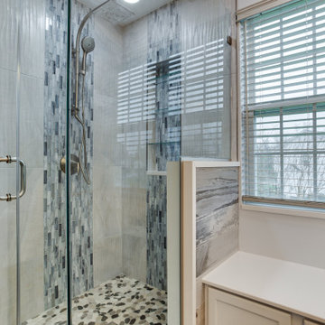
Designed by Jen Denham of Reico Kitchen & Bath in White Plains MD in collaboration with Personal Touch Installation, this transitional bathroom features Merillat Basics cabinets in the Collins door style with a Cotton finish. The vanity countertops are Steel Gray Granite Leathered.
The bathroom includes Kohler fixtures, Gaya Onyx Blue Wavy 12x24 (shower wall tiles), Glazzio Martine Blue NWG-793 (accent tiles) and Arpa Expo Wood Multicolor 5x32 Planks (flooring tiles).
“It was a strangely laid out bathroom, with a large garden tub that was never used. The clients wanted to expand the shower as much as possible, keeping in mind of the window hampering our ability to expand the shower length wise,” said Jen. “We made the shower look as large as possible with the space we had by taking tile to the ceiling and creating two waterfall accents to bring the blue from the floor into the shower. The clients wanted to create a more spa like feel with the pebble tile flooring and Kohler Hydrorail Shower column. We also worked in a knee wall with glass panel to keep the space feeling more open and worked in a small corner bench as well.”
“We tried to create as much storage and function as possible. We were able to design a window bench, make up area, and squeeze in a tall pantry cabinet for more storage. They really liked the gray/blue color scheme that is present in the rest of the house so we tried to tie that in as best we could to make the primary bath gel with the look of the rest of the house,” said Jen.
“We had a vision of what we wanted our bathroom to look like and they made it happen. It turned out beautiful and everyone was so wonderful to work with,” said the clients.
Photos courtesy of BTW Images LLC.
 Aardvark Architecture
This proposal is for a new two-story home on the vacant heavily wooded lot with an existing 150-foot-long driveway lined by several beautiful oak trees culminating in a behemoth 43-inch oak tree where the driveway meets the main lot. The far end of the driveway terminates in a grove of three 43/40/43-inch redwoods and at the very center of the vacant lot stands a gargantuan V-twin 59-inch redwood tree paired with a “small” 29-inch redwood tree. The owners want to build a beautiful contemporary-styled home for their family that fully enjoys and embraces the mature trees on their cozy 65-foot by 100-foot lot.
As with all small, constrained lots, this project’s site design started first with meeting the relatively large parking and car maneuvering requirements. Menlo Park’s Department of Transportation typically requires side-facing garages to have 24-feet of backup space. So that they could give the largest feature redwood tree on site an added four feet (50%) of clearance outside of its critical root zone, the owners agreed to install a vehicle turntable at the end of their driveway to eliminate the extra four feet of space needed to back up and turnaround. This allowed them to pull their garage forward an additional four feet towards the front property line on the panhandle side, drastically reducing the rest of the home’s impact on the gargantuan V-Twin paired redwood tree at the center of the lot.
One of the owners has mobility issues, and accordingly, they first sought to design a one-story floor plan that incorporated all their family’s needs including plenty of covered patio and deck space to enjoy our fantastic California weather. But that single-story footprint spread too far into the critical root zones of several of the redwood trees on site, even despite the use of the vehicle turntable. During my interview process with the owners, they made it clear to me that one of their primary concerns is ensuring that the largest trees on site would thrive and become features of their new home after construction is complete. The single-story designs that removed the grove of three huge redwood trees were non-starters, as was the skimpy 5x10 master bath I designed when trying to squeeze the whole house program into an overly compromised single-story design. It was therefore deemed necessary to go with a two-story design despite the owner’s mobility issues. This two-story design has a much more compact ground floor footprint and has no bedrooms downstairs, other than the detached ADU. The owners must give up the floor area and incur the costs to install a residential elevator to access their upstairs master suite.
Our ground floor footprint is smaller due to the two-story design decision, and our foundation is pulled away from the trees thanks to the vehicle turntable. Yet, a tiny portion of the home’s ground floor footprint still encroaches into the critical root zones of the largest 59” redwood tree. Therefore, as outlined in the Arborist Report prepared by Aesculus Arboricultural Consulting, the structural engineers are incorporating an array of drilled piers and shallow-grade beams for the main home’s foundation and deck area nearest the redwood’s critical root zone. This drilled piers and grade beam foundation is a type of “bridging” foundation as outlined in Aesculus’ report to preserve the health of these trees that the property was designed around. The rest of the foundation will be constructed as an insulated slab-on-grade foundation to minimize the number of steps and ramps needed for the owners to enjoy their home and patio areas.
Despite the owner’s desire to keep as many trees as possible on site, and despite the smaller ground floor footprint and the advantage of the vehicle turntable, the need for a 20x20-foot garage and 20x20/25-foot guest parking space on our panhandle lot requires the removal of two heritage trees in the required driveway, a 16” coast redwood, and a 17” coast redwood. An alternate design, such as swapping the garage and guest parking locations north-to-south, still requires the removal of these two trees for vehicle maneuvering but has the added disadvantage of cutting off the home’s sightlines to the behemoth 43” oak tree just outside the currently proposed front patio space and living room. Jim Redman of Elements Landscape is proposing 13 new trees be planted on site to replace the lost value of these two heritage coast redwood trees.
This contemporary architectural design features clean lines, and an abundance of full-height windows and large skylights to best take in the immense trees on site. To blend in with the forest-like setting, the home boasts a mix of rich textures and features a color palette of natural wood tones contrasted with dark blue and black. Once through the new steel gate at the street and down the 150-foot tree-lined driveway, a large covered front patio becomes visible past the neighbor’s detached accessory structure. The covered patio is just across the driveway from the beautiful 43” behemoth coast live oak. The single plane of the covered patio roof is delicately supported by a pair of steel posts in a “V-twin” configuration much like the largest redwood trees that tower over the center of the lot and will still be visible above the new two-story home, even from the front yard. The patio is covered in a dark-colored standing seam roof, with steel C-channel fascias, and tongue-and-groove wood ceiling planks on the underside. Generously sized skylights on the patio roof and inside the living area allow for impressive views of the amazing oak canopy as well as precious natural light.
Supporting the sloped covered patio on the other side is the two-car garage with a secondary bedroom suite stacked above the garage. This two-story volume is to be clad in vertical clear-coated redwood siding, to tie in with the grove of three 43-inch redwood trees just beyond. The garage door, and the bank of windows for Bedroom#2 above feature a steel fascia eyebrow header feature to provide shade and overhang protection, as we are not proposing a large overhang at this “redwood trunk”. The garage and bedroom volume are pulled 16 feet away from the side property line, instead of the minimum required setback of 6’-6”, thus leaving plenty of room for the redwood grove and existing mature pear tree to continue to thrive. This existing mature green screen in this 16-foot-wide side yard is a feature worth soaking in, which is why tall windows with low sill heights are proposed for both the stairs and the upstairs hallway. Though it may be infrequent to approve side-facing 2nd floor windows with sill heights as low as what we’re proposing, we are confident that the mature green screen and the over 16-foot-wide side yard are sufficient to provide for the continued privacy of our neighbor’s rear yard space, especially considering theses windows are in walkway zones.
The covered patio at the front entry is also bound by the 10-foot-tall living room. The great room is clad in a dark blue brick veneer, which wraps around all three sides of the living room. Upon entering the home from the covered patio, you are immediately greeted with one of the most impressive features of the home’s design: a 10-foot-tall by 24-foot-wide set of sliding glass doors. From the entry, this huge opening gives merely an initial glimpse of the massive trunks of the gargantuan V-twin redwoods sitting at the center of the lot. All three sliding glass panels open directly out into the smaller partially covered deck in the rear. This roof overhang element matches the design of the front patio with a steel C-channel fascia and a large skylight. But the rear deck’s roof element is set flat at a ten-foot ceiling height so that the living room’s ceiling seems to float above and out beyond the expanse of full-height sliding doors, thus creating an indoor-outdoor living space that will feel much larger than the home’s actual footprint. This rear covered deck is smaller than the patio in the front and also has a mix of solid and open-slatted roofing to allow for more solar access for the relatively small amount of open sky available.
The downstairs living room is open to the dining and kitchen areas, as well as the stair-and-elevator tower beyond. The stair tower is very open and glassy, and the stairs wind up and around the redwood-clad elevator tower. From certain perspectives in the 16-foot-wide side yard, it will almost seem as if the grove of three redwoods has a fourth tree that the house and the stairs were carefully built around. Other than the 3-foot-wide windows, the exterior walls of the stair tower, downstairs utility spaces, and Bedroom#3 above are finished in cement plaster, painted dark blue and black. The sloped roof over the stair-and-elevator tower continues cleanly over the area of upstairs Bedroom#3. This roof level is set by the side daylight plane and only yields an inside wall height of just under 6 feet in height. The owners are satisfied that the rest of this upstairs room has a nice vaulted ceiling to make up for the one short wall under the daylight plane.
The rest of the ground floor adjacent to the stair tower consists of a small utility wing containing a half-bath, laundry, storage area, and an exterior alcove for the electric heat pump HVAC unit. This short wing also gives more accessible access to the rear yard deck, as well as a backdrop for an outdoor kitchen. The bright white stone backsplash for the outdoor kitchen provides contrast to the otherwise consistent use of cement plaster painted dark blue and black for the two-story wing closest to the detached ADU. Though Bedroom#3 is stacked directly above this small wing, it is relatively short to comply with the side daylight plane of this narrow lot. Still, to further help break up the scale of this wall, another steel fascia eyebrow element is set about 8 feet above the rear deck.
The master suite sits centered above the ten-foot-tall great room. The master bedroom and its balcony, as well as the master bathtub area, have a commanding view of the central redwood trees and their impressive canopy, though the balcony is mostly recessed and should pose no privacy concerns to the neighbor’s rear yards. The master balcony parapet is clad in the same brick veneer continuing up from the living room below. A dark-painted metal rail makes up the rest of the open guardrail height. The entire length of the master balcony is comprised of 9-foot-tall sliding glass doors, but the area above the doors, as well as the area below the master bathroom windows, is accented with more redwood siding. The remainder of the master suite bathroom and walk-in closet is finished in cement plaster painted dark blue. The master bathroom has one side yard-facing window but will be frosted glass for both the owner’s and the neighbor’s privacy.
The 2nd floor is capped under a simple gable roof design with one roof ridge and varying eave and rake overhangs depending on the 2nd-floor layout and solar orientation. Since these roof planes are quite difficult to see in the middle of the heavily wooded panhandle lot, we are proposing a white TPO roofing for these two upper roof planes as a more sustainable choice compared to more dark-colored roofing like the covered patios and detached ADU.
The owners also wish to build a detached 292-square-foot Accessory Dwelling Unit (ADU) as an office and guest suite. For the ADU foundation to be situated outside the central redwood tree’s critical root zone, this relatively tiny structure takes advantage of the narrower 4-foot side and rear setbacks allowed for ADUs smaller than 800 square feet. The small L-shaped detached ADU frames a wonderful quasi-courtyard around the gargantuan V-twin redwoods at the center of the lot. The ADU shares a matching material palette consisting of cement plaster painted blue and black, vertical redwood siding and soffits, and thin brick veneer. The ADU also features large full-height windows. The only difference between the main home and the ADU material palette is that the roofing will be a dark composition shingle roofing since it will be quite visible from the master balcony.
 Shuler Architecture
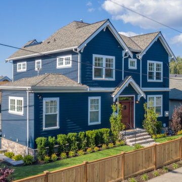
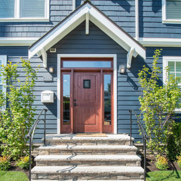
Completed in 2019, this is a home we completed for client who initially engaged us to remodeled their 100 year old classic craftsman bungalow on Seattle’s Queen Anne Hill. During our initial conversation, it became readily apparent that their program was much larger than a remodel could accomplish and the conversation quickly turned toward the design of a new structure that could accommodate a growing family, a live-in Nanny, a variety of entertainment options and an enclosed garage – all squeezed onto a compact urban corner lot.
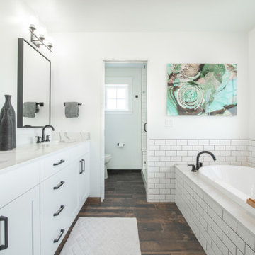
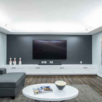
Project entitlement took almost a year as the house size dictated that we take advantage of several exceptions in Seattle’s complex zoning code. After several meetings with city planning officials, we finally prevailed in our arguments and ultimately designed a 4 story, 3800 sf house on a 2700 sf lot. The finished product is light and airy with a large, open plan and exposed beams on the main level, 5 bedrooms, 4 full bathrooms, 2 powder rooms, 2 fireplaces, 4 climate zones, a huge basement with a home theatre, guest suite, climbing gym, and an underground tavern/wine cellar/man cave. The kitchen has a large island, a walk-in pantry, a small breakfast area and access to a large deck. All of this program is capped by a rooftop deck with expansive views of Seattle’s urban landscape and Lake Union.
Unfortunately for our clients, a job relocation to Southern California forced a sale of their dream home a little more than a year after they settled in after a year project. The good news is that in Seattle’s tight housing market, in less than a week they received several full price offers with escalator clauses which allowed them to turn a nice profit on the deal.
 Shuler Architecture
Completed in 2019, this is a home we completed for client who initially engaged us to remodeled their 100 year old classic craftsman bungalow on Seattle’s Queen Anne Hill. During our initial conversation, it became readily apparent that their program was much larger than a remodel could accomplish and the conversation quickly turned toward the design of a new structure that could accommodate a growing family, a live-in Nanny, a variety of entertainment options and an enclosed garage – all squeezed onto a compact urban corner lot.
Project entitlement took almost a year as the house size dictated that we take advantage of several exceptions in Seattle’s complex zoning code. After several meetings with city planning officials, we finally prevailed in our arguments and ultimately designed a 4 story, 3800 sf house on a 2700 sf lot. The finished product is light and airy with a large, open plan and exposed beams on the main level, 5 bedrooms, 4 full bathrooms, 2 powder rooms, 2 fireplaces, 4 climate zones, a huge basement with a home theatre, guest suite, climbing gym, and an underground tavern/wine cellar/man cave. The kitchen has a large island, a walk-in pantry, a small breakfast area and access to a large deck. All of this program is capped by a rooftop deck with expansive views of Seattle’s urban landscape and Lake Union.
Unfortunately for our clients, a job relocation to Southern California forced a sale of their dream home a little more than a year after they settled in after a year project. The good news is that in Seattle’s tight housing market, in less than a week they received several full price offers with escalator clauses which allowed them to turn a nice profit on the deal.
 Shuler Architecture
Completed in 2019, this is a home we completed for client who initially engaged us to remodeled their 100 year old classic craftsman bungalow on Seattle’s Queen Anne Hill. During our initial conversation, it became readily apparent that their program was much larger than a remodel could accomplish and the conversation quickly turned toward the design of a new structure that could accommodate a growing family, a live-in Nanny, a variety of entertainment options and an enclosed garage – all squeezed onto a compact urban corner lot.
Project entitlement took almost a year as the house size dictated that we take advantage of several exceptions in Seattle’s complex zoning code. After several meetings with city planning officials, we finally prevailed in our arguments and ultimately designed a 4 story, 3800 sf house on a 2700 sf lot. The finished product is light and airy with a large, open plan and exposed beams on the main level, 5 bedrooms, 4 full bathrooms, 2 powder rooms, 2 fireplaces, 4 climate zones, a huge basement with a home theatre, guest suite, climbing gym, and an underground tavern/wine cellar/man cave. The kitchen has a large island, a walk-in pantry, a small breakfast area and access to a large deck. All of this program is capped by a rooftop deck with expansive views of Seattle’s urban landscape and Lake Union.
Unfortunately for our clients, a job relocation to Southern California forced a sale of their dream home a little more than a year after they settled in after a year project. The good news is that in Seattle’s tight housing market, in less than a week they received several full price offers with escalator clauses which allowed them to turn a nice profit on the deal.
 Shuler Architecture
Completed in 2019, this is a home we completed for client who initially engaged us to remodeled their 100 year old classic craftsman bungalow on Seattle’s Queen Anne Hill. During our initial conversation, it became readily apparent that their program was much larger than a remodel could accomplish and the conversation quickly turned toward the design of a new structure that could accommodate a growing family, a live-in Nanny, a variety of entertainment options and an enclosed garage – all squeezed onto a compact urban corner lot.
Project entitlement took almost a year as the house size dictated that we take advantage of several exceptions in Seattle’s complex zoning code. After several meetings with city planning officials, we finally prevailed in our arguments and ultimately designed a 4 story, 3800 sf house on a 2700 sf lot. The finished product is light and airy with a large, open plan and exposed beams on the main level, 5 bedrooms, 4 full bathrooms, 2 powder rooms, 2 fireplaces, 4 climate zones, a huge basement with a home theatre, guest suite, climbing gym, and an underground tavern/wine cellar/man cave. The kitchen has a large island, a walk-in pantry, a small breakfast area and access to a large deck. All of this program is capped by a rooftop deck with expansive views of Seattle’s urban landscape and Lake Union.
Unfortunately for our clients, a job relocation to Southern California forced a sale of their dream home a little more than a year after they settled in after a year project. The good news is that in Seattle’s tight housing market, in less than a week they received several full price offers with escalator clauses which allowed them to turn a nice profit on the deal.
51