
Search results for "Staggering levels" in Home Design Ideas

 Arredo Casa Group
Modern with a hint of industrial accents. This bathroom is from the Young collection and there are different colors and styles available. This is a great option for a minimalist or industrial bathroom. Textured counters and lightly textured white cabinets work together for a subtle yet elegant look.

 BRC Remodeling Group
The master bathroom was also created from scratch we even had to move the plumbing around. Walk-in shower with 2 soap niches, and built in shelving for towels and knick-knacks. Single Vanity with granite counter top. The walls are Agreeable Gray SW 7029 and the floor is Daltile Salerno SL84 Grigio Perla. 18x18.

 Thomas Roszak Architecture, LLC
Photo credit: Scott McDonald @ Hedrich Blessing
7RR-Ecohome:
The design objective was to build a house for a couple recently married who both had kids from previous marriages. How to bridge two families together?
The design looks forward in terms of how people live today. The home is an experiment in transparency and solid form; removing borders and edges from outside to inside the house, and to really depict “flowing and endless space”. The house floor plan is derived by pushing and pulling the house’s form to maximize the backyard and minimize the public front yard while welcoming the sun in key rooms by rotating the house 45-degrees to true north. The angular form of the house is a result of the family’s program, the zoning rules, the lot’s attributes, and the sun’s path. We wanted to construct a house that is smart and efficient in terms of construction and energy, both in terms of the building and the user. We could tell a story of how the house is built in terms of the constructability, structure and enclosure, with a nod to Japanese wood construction in the method in which the siding is installed and the exposed interior beams are placed in the double height space. We engineered the house to be smart which not only looks modern but acts modern; every aspect of user control is simplified to a digital touch button, whether lights, shades, blinds, HVAC, communication, audio, video, or security. We developed a planning module based on a 6-foot square room size and a 6-foot wide connector called an interstitial space for hallways, bathrooms, stairs and mechanical, which keeps the rooms pure and uncluttered. The house is 6,200 SF of livable space, plus garage and basement gallery for a total of 9,200 SF. A large formal foyer celebrates the entry and opens up to the living, dining, kitchen and family rooms all focused on the rear garden. The east side of the second floor is the Master wing and a center bridge connects it to the kid’s wing on the west. Second floor terraces and sunscreens provide views and shade in this suburban setting. The playful mathematical grid of the house in the x, y and z axis also extends into the layout of the trees and hard-scapes, all centered on a suburban one-acre lot.
Many green attributes were designed into the home; Ipe wood sunscreens and window shades block out unwanted solar gain in summer, but allow winter sun in. Patio door and operable windows provide ample opportunity for natural ventilation throughout the open floor plan. Minimal windows on east and west sides to reduce heat loss in winter and unwanted gains in summer. Open floor plan and large window expanse reduces lighting demands and maximizes available daylight. Skylights provide natural light to the basement rooms. Durable, low-maintenance exterior materials include stone, ipe wood siding and decking, and concrete roof pavers. Design is based on a 2' planning grid to minimize construction waste. Basement foundation walls and slab are highly insulated. FSC-certified walnut wood flooring was used. Light colored concrete roof pavers to reduce cooling loads by as much as 15%. 2x6 framing allows for more insulation and energy savings. Super efficient windows have low-E argon gas filled units, and thermally insulated aluminum frames. Permeable brick and stone pavers reduce the site’s storm-water runoff. Countertops use recycled composite materials. Energy-Star rated furnaces and smart thermostats are located throughout the house to minimize duct runs and avoid energy loss. Energy-Star rated boiler that heats up both radiant floors and domestic hot water. Low-flow toilets and plumbing fixtures are used to conserve water usage. No VOC finish options and direct venting fireplaces maintain a high interior air quality. Smart home system controls lighting, HVAC, and shades to better manage energy use. Plumbing runs through interior walls reducing possibilities of heat loss and freezing problems. A large food pantry was placed next to kitchen to reduce trips to the grocery store. Home office reduces need for automobile transit and associated CO2 footprint. Plan allows for aging in place, with guest suite than can become the master suite, with no need to move as family members mature.
Find the right local pro for your project

 Lewis Floor & Home
This Stanton carpet stair runner on a circular stairway in the front hall of this Long Grove, IL home makes a dramatic statement and looks beautiful on the dark wood staircase.
 TKS Design Group
Download our free ebook, Creating the Ideal Kitchen. DOWNLOAD NOW
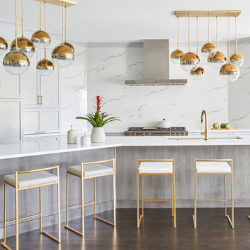
This client was referred to us from a past client. They are a busy 2-career household with young children and enjoy entertaining friends and family in their home. They have a beautiful open concept home but unfortunately the kitchen was not fitting for the rest of the home. They were not quite sure what to do with the space. We talked about trying to refresh it or do more of a minor remodel, but in the end they decided a full gut would get them to where they wanted to be.
One problem was there was no place for guests to hang out other than the large and awkward banquette area. The brick wall and tiled hood area were feeling a bit dated and tired. The space was just not functional for their lifestyle. There was no prep space near the cooktop and no landing area for items coming out of the ovens or refrigerator, plus a big dead zone in the center of the room.
Banquettes, like the one they previously had in the space, are great for small spaces, but when they get really large like this one, it makes getting in and out of the seating area awkward and uncomfortable. Plus, there was room for a large table, so we eliminated the awkward built in.
We started by removing the faux brick wall between the kitchen and back entry. We relocated the entry to the garage over a couple feet in order to get every last inch out of the new kitchen. We also made the decision to close up the primary window that faced the pretty ho hum brick wall of the neighbor’s house. There was plenty of light coming in from the seating area, so we just didn’t feel the window was adding much to the room.
Construction went smoothy. There was a bit of rework with electrical, flooring and HVAC, but in the end, we think it was well worth it.
The clients really wanted a sleek contemporary look, and we originally had planned for a full height slab backsplash, but due to it’s size, it was a budget buster. Instead, we got creative and settled on large format porcelain tiles that have a similar feel but were a fraction of the cost. We made sure the wall was plumb and level so that the fit and finish would mimic that of slab material.
The final space was quite a change. A large prep sink sits directly across from the new pro-style range with plenty additional prep space on the large island. The refrigerator and ovens now have miles of landing space, and a nice tight work triangle makes cooking a breeze.
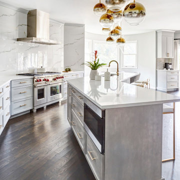
Since we wanted a more contemporary feel, not many wall cabinets were included. Instead, we outfitted some of the drawers for dish storage with a peg system. Two large pantries flanking the refrigerator hold baking supplies and small appliances. Large drawers by the cooktop hold pots and pans, and an appliance garage tucked away to the left of the range hides away miscellaneous items. The large island also houses a microwave drawer and tons of storage, most of which is drawers offering maximum convenience.
The island now seats 5-6 people comfortably along with the new table in the seating area which can seat up to 8. Entertaining will be a breeze in this space. With such a clean backdrop, we knew we would need some drama with the lighting, so we chose two sets of staggered pendants, which we adjusted for the right visual balance above the island.
We also included a small coffee station to the right of the main kitchen, which helps keep the coffee clutter out of the kitchen proper. Two tones of complimentary gray are featured in this kitchen. The perimeter is a light gray that reads almost white. The island is a gray stain that adds some depth and interest with the visible wood texture. The countertops are clean white quartz, and the hardware, barstools and light fixtures add warm brass tones. I see lots of cooking and entertaining with family and friends in the near future in this bright and airy new space.
Designed by: Susan Klimala, CKD, CBD
Photography by: Michael Kaskel
For more information on kitchen and bath design ideas go to: www.kitchenstudio-ge.com

 Top Tread Stairways
We're in the shop here today showing you an alternating-tread staircase that's' going to a job-site in Napa tomorrow. I'm standing on the landing which is at exactly mid-floor level. It's going into one one these 100-year-old houses with a steep roof and lots of attic space. The homeowner called me last month saying he wants to access this large attic area with something better than a ladder. He didn't have room for a conventional stair but this alternating-tread space-saving stair was a perfect fit. It's all Red Oak which matches the hardwood floors throughout the house. Once these are installed at the site we'll put a handrail on top of the stringers on the open side.
I'll tell you a little about the alternating-tread staircases. It's built in a way that is nearly as easy to climb as a conventional stair. When we walk up a convectional stairway we normally use half of the stair tread at a time, placing one foot on the right half and the next foot on the left half. The idea of an alternating-tread stair is make half of each tread wide enough for your foot and then alternate the wide end of these paddle-shape treads from left to right. You still have your 10 inch minimum tread depth plus a 1 inch nosing projection. This give you 11" of support for each foot, just like a conventional stair. We normally make the risers a max of 7-3/4", but code allows us to go as high as 9 inches. This one is 7-3/4" which is very comfortable.
We installed a metal bar across the middle of each open-riser to limit the open space to less than a 4 inch gap.
Anyway, I just wanted to give you a quick shot of this. Tomorrow morning we get to go to the job-site and install this. I'd can't wait to see the look on the customer's face when we have this installed. I'll let him do the bragging :-)
Last but not least, I'd like to give glory to God and special recognition to a Jewish carpenter named Jesus. I don't know for sure if He built stairways as a carpenter, but I am happy to say that He is my LORD and I want to live my whole life for Him. God bless you!
And please contact me if you want any type of custom stairs.
Clyde 520-895-2060 or 916-991-9700

 Santa Barbara Home Design
Design Consultant Jeff Doubét is the author of Creating Spanish Style Homes: Before & After – Techniques – Designs – Insights. The 240 page “Design Consultation in a Book” is now available. Please visit SantaBarbaraHomeDesigner.com for more info.
Jeff Doubét specializes in Santa Barbara style home and landscape designs. To learn more info about the variety of custom design services I offer, please visit SantaBarbaraHomeDesigner.com
Jeff Doubét is the Founder of Santa Barbara Home Design - a design studio based in Santa Barbara, California USA.


 LANDline design
Kevin Wells, www.kevinwellsphoto.com
This is an example of a contemporary landscaping in Portland.
This is an example of a contemporary landscaping in Portland.


 Top Tread Stairways
We're in the shop here today showing you an alternating-tread staircase that's' going to a job-site in Napa tomorrow. I'm standing on the landing which is at exactly mid-floor level. It's going into one one these 100-year-old houses with a steep roof and lots of attic space. The homeowner called me last month saying he wants to access this large attic area with something better than a ladder. He didn't have room for a conventional stair but this alternating-tread space-saving stair was a perfect fit. It's all Red Oak which matches the hardwood floors throughout the house. Once these are installed at the site we'll put a handrail on top of the stringers on the open side.
I'll tell you a little about the alternating-tread staircases. It's built in a way that is nearly as easy to climb as a conventional stair. When we walk up a convectional stairway we normally use half of the stair tread at a time, placing one foot on the right half and the next foot on the left half. The idea of an alternating-tread stair is make half of each tread wide enough for your foot and then alternate the wide end of these paddle-shape treads from left to right. You still have your 10 inch minimum tread depth plus a 1 inch nosing projection. This give you 11" of support for each foot, just like a conventional stair. We normally make the risers a max of 7-3/4", but code allows us to go as high as 9 inches. This one is 7-3/4" which is very comfortable.
We installed a metal bar across the middle of each open-riser to limit the open space to less than a 4 inch gap.
Anyway, I just wanted to give you a quick shot of this. Tomorrow morning we get to go to the job-site and install this. I'd can't wait to see the look on the customer's face when we have this installed. I'll let him do the bragging :-)
Last but not least, I'd like to give glory to God and special recognition to a Jewish carpenter named Jesus. I don't know for sure if He built stairways as a carpenter, but I am happy to say that He is my LORD and I want to live my whole life for Him. God bless you!
And please contact me if you want any type of custom stairs.
Clyde 520-895-2060 or 916-991-9700


 TKS Design Group
Download our free ebook, Creating the Ideal Kitchen. DOWNLOAD NOW
This client was referred to us from a past client. They are a busy 2-career household with young children and enjoy entertaining friends and family in their home. They have a beautiful open concept home but unfortunately the kitchen was not fitting for the rest of the home. They were not quite sure what to do with the space. We talked about trying to refresh it or do more of a minor remodel, but in the end they decided a full gut would get them to where they wanted to be.
One problem was there was no place for guests to hang out other than the large and awkward banquette area. The brick wall and tiled hood area were feeling a bit dated and tired. The space was just not functional for their lifestyle. There was no prep space near the cooktop and no landing area for items coming out of the ovens or refrigerator, plus a big dead zone in the center of the room.
Banquettes, like the one they previously had in the space, are great for small spaces, but when they get really large like this one, it makes getting in and out of the seating area awkward and uncomfortable. Plus, there was room for a large table, so we eliminated the awkward built in.
We started by removing the faux brick wall between the kitchen and back entry. We relocated the entry to the garage over a couple feet in order to get every last inch out of the new kitchen. We also made the decision to close up the primary window that faced the pretty ho hum brick wall of the neighbor’s house. There was plenty of light coming in from the seating area, so we just didn’t feel the window was adding much to the room.
Construction went smoothy. There was a bit of rework with electrical, flooring and HVAC, but in the end, we think it was well worth it.
The clients really wanted a sleek contemporary look, and we originally had planned for a full height slab backsplash, but due to it’s size, it was a budget buster. Instead, we got creative and settled on large format porcelain tiles that have a similar feel but were a fraction of the cost. We made sure the wall was plumb and level so that the fit and finish would mimic that of slab material.
The final space was quite a change. A large prep sink sits directly across from the new pro-style range with plenty additional prep space on the large island. The refrigerator and ovens now have miles of landing space, and a nice tight work triangle makes cooking a breeze.
Since we wanted a more contemporary feel, not many wall cabinets were included. Instead, we outfitted some of the drawers for dish storage with a peg system. Two large pantries flanking the refrigerator hold baking supplies and small appliances. Large drawers by the cooktop hold pots and pans, and an appliance garage tucked away to the left of the range hides away miscellaneous items. The large island also houses a microwave drawer and tons of storage, most of which is drawers offering maximum convenience.
The island now seats 5-6 people comfortably along with the new table in the seating area which can seat up to 8. Entertaining will be a breeze in this space. With such a clean backdrop, we knew we would need some drama with the lighting, so we chose two sets of staggered pendants, which we adjusted for the right visual balance above the island.
We also included a small coffee station to the right of the main kitchen, which helps keep the coffee clutter out of the kitchen proper. Two tones of complimentary gray are featured in this kitchen. The perimeter is a light gray that reads almost white. The island is a gray stain that adds some depth and interest with the visible wood texture. The countertops are clean white quartz, and the hardware, barstools and light fixtures add warm brass tones. I see lots of cooking and entertaining with family and friends in the near future in this bright and airy new space.
Designed by: Susan Klimala, CKD, CBD
Photography by: Michael Kaskel
For more information on kitchen and bath design ideas go to: www.kitchenstudio-ge.com
 Metaamo Studio
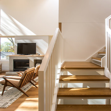
The P+M House is a new infill home for a family of four in Saskatoon’s Varsity View neighborhood.
Constructed of daylight, natural wood, and human interaction, it strives to create a rich, family-focused environment that pulls nature and ever-changing sunlight into the heart of the house.
Situated at the doorsteps of President Murray Park and the U of S campus, the home opens to the South, affronting an established street while allowing a row of towering American elms to provide natural shading and focus to the interior spaces.
The house is divided into four program zones: public, private, parents, and kids. The internal organization is a direct result of a daylight management concept, where dark-craving spaces are condensed and allocated to areas with low-light access, while providing strategic separation between zones. Left behind as a result are airy, light-filled living spaces that offer internal / external views, space for family interaction, while taking maximum advantage of limited South and West light.
The architecture begins with a main floor sectional shift that breaks the house into front & back, creating an internal topography that lets South light reach the back of the house. A trio of continuous, interlocking walls then give shape and order to the primary spaces, while openings in or between these walls extend the interior spaces into the yard and let daylight wash the heart of the house.
The highly-insulated house is the result of a thoughtful process that sought to leverage the site’s severe environmental constraints (minimal southern exposure in an extreme cold climate, where temps reach 40 below) and turn them into opportunities.
The house is composed of a 2800 sf main house, a 650 sf basement suite, and a 600 sf garage. It is constructed of reinforced concrete, 2x staggered stud walls, exposed spruce posts / glulam beams, and open-web engineered wood trusses. It is clad in stucco and western red cedar; with triple-glazed fiberglass windows and natural white oak finishes throughout.
Architectural Design: METAAMO studio w/ Oxbow Architecture
All Imagery Copyright 2017 Metaamo Studio, All Rights Reserved. No commercial use without prior written approval.
Sponsored
Columbus, OH

Hope Restoration & General Contracting
Columbus Design-Build, Kitchen & Bath Remodeling, Historic Renovations

 CairnsCraft Design & Remodel
Great spacious bathroom with lot of amenities.
Photographer: Jon Upson
Large elegant master beige tile and porcelain tile drop-in bathtub photo in San Diego with an undermount sink, raised-panel cabinets, medium tone wood cabinets, granite countertops, beige walls and a two-piece toilet
Large elegant master beige tile and porcelain tile drop-in bathtub photo in San Diego with an undermount sink, raised-panel cabinets, medium tone wood cabinets, granite countertops, beige walls and a two-piece toilet

 Metropolis Drafting and Construction Inc
The Master bath everyone want. The space we had to work with was perfect in size to accommodate all the modern needs of today’s client.
A custom made double vanity with a double center drawers unit which rise higher than the sink counter height gives a great work space for the busy couple.
A custom mirror cut to size incorporates an opening for the window and sconce lights.
The counter top and pony wall top is made from Quartz slab that is also present in the shower and tub wall niche as the bottom shelve.
The Shower and tub wall boast a magnificent 3d polished slate tile, giving a Zen feeling as if you are in a grand spa.
Each shampoo niche has a bottom shelve made out of quarts to allow more storage space.
The Master shower has all the needed fixtures from the rain shower head, regular shower head and the hand held unit.
The glass enclosure has a privacy strip done by sand blasting a portion of the glass walls.
And don't forget the grand Jacuzzi tub having 6 regular jets, 4 back jets and 2 neck jets so you can really unwind after a hard day of work.
To complete the ensemble all the walls around a tiled with 24 by 6 gray rugged cement look tiles placed in a staggered layout.

 Rudloff Custom Builders
In the kitchen we re-worked a load-bearing wall to create a peninsula, opening the kitchen to the family room. The large windows, custom white and glass cabinetry, white quartzite counters and white marble backsplash work beautifully together to create a light-filled airy kitchen. The custom hood and pot filler over the range and the custom cabinetry and storage are special touches that we added to tailor this kitchen to the homeowners. Throughout the first floor, we added new red oak flooring.
The main projects in this Wayne, PA home were renovating the kitchen and the master bathroom, but we also updated the mudroom and the dining room. Using different materials and textures in light colors, we opened up and brightened this lovely home giving it an overall light and airy feel. Interior Designer Larina Kase, of Wayne, PA, used furniture and accent pieces in bright or contrasting colors that really shine against the light, neutral colored palettes in each room.
Rudloff Custom Builders has won Best of Houzz for Customer Service in 2014, 2015 2016, 2017 and 2019. We also were voted Best of Design in 2016, 2017, 2018, 2019 which only 2% of professionals receive. Rudloff Custom Builders has been featured on Houzz in their Kitchen of the Week, What to Know About Using Reclaimed Wood in the Kitchen as well as included in their Bathroom WorkBook article. We are a full service, certified remodeling company that covers all of the Philadelphia suburban area. This business, like most others, developed from a friendship of young entrepreneurs who wanted to make a difference in their clients’ lives, one household at a time. This relationship between partners is much more than a friendship. Edward and Stephen Rudloff are brothers who have renovated and built custom homes together paying close attention to detail. They are carpenters by trade and understand concept and execution. Rudloff Custom Builders will provide services for you with the highest level of professionalism, quality, detail, punctuality and craftsmanship, every step of the way along our journey together.
Specializing in residential construction allows us to connect with our clients early in the design phase to ensure that every detail is captured as you imagined. One stop shopping is essentially what you will receive with Rudloff Custom Builders from design of your project to the construction of your dreams, executed by on-site project managers and skilled craftsmen. Our concept: envision our client’s ideas and make them a reality. Our mission: CREATING LIFETIME RELATIONSHIPS BUILT ON TRUST AND INTEGRITY.
Photo Credit: Jon Friedrich

 FLOORIANS
Natural Sisal Carpet runner on wood staircase. Neutral colour carpet and edging, Custom work.
Example of an island style carpeted straight staircase design in Toronto with carpeted risers
Example of an island style carpeted straight staircase design in Toronto with carpeted risers
Sponsored
Delaware, OH

Buckeye Basements, Inc.
Central Ohio's Basement Finishing ExpertsBest Of Houzz '13-'21

 Blue Haven Pools & Spas By Calvitti
This Flemington, NJ landscape and free-form pool was carefully designed on a property with a rolling hill to extend as much usable outdoor living space as possible while simultaneously adding privacy from the neighbors, and the side street. Key to this space is the large retaining wall built at the back end of the yard after the hill was excavated out and the land leveled. The pool deck extends far to the one side to provide sun bathing chairs and furniture; also to tie in the views from the deck and back of the house to the pool lounging area. The planting scheme also was designed to keep the pool open to the house and privacy kept from the neighbors and other surroundings. The pool features a sitting bench or cozy corner for kids to take a rest on while playing in the pool. Overall the design of this space really transformed a hilly tight backyard with not much usable space into the perfect scene for entertaining with friends or family.

 Modern Metal Solutions
Example of a large minimalist wooden curved staircase design in Boston with wooden risers
 Top Tread Stairways
We're in the shop here today showing you an alternating-tread staircase that's' going to a job-site in Napa tomorrow. I'm standing on the landing which is at exactly mid-floor level. It's going into one one these 100-year-old houses with a steep roof and lots of attic space. The homeowner called me last month saying he wants to access this large attic area with something better than a ladder. He didn't have room for a conventional stair but this alternating-tread space-saving stair was a perfect fit. It's all Red Oak which matches the hardwood floors throughout the house. Once these are installed at the site we'll put a handrail on top of the stringers on the open side.
I'll tell you a little about the alternating-tread staircases. It's built in a way that is nearly as easy to climb as a conventional stair. When we walk up a convectional stairway we normally use half of the stair tread at a time, placing one foot on the right half and the next foot on the left half. The idea of an alternating-tread stair is make half of each tread wide enough for your foot and then alternate the wide end of these paddle-shape treads from left to right. You still have your 10 inch minimum tread depth plus a 1 inch nosing projection. This give you 11" of support for each foot, just like a conventional stair. We normally make the risers a max of 7-3/4", but code allows us to go as high as 9 inches. This one is 7-3/4" which is very comfortable.
We installed a metal bar across the middle of each open-riser to limit the open space to less than a 4 inch gap.
Anyway, I just wanted to give you a quick shot of this. Tomorrow morning we get to go to the job-site and install this. I'd can't wait to see the look on the customer's face when we have this installed. I'll let him do the bragging :-)
Last but not least, I'd like to give glory to God and special recognition to a Jewish carpenter named Jesus. I don't know for sure if He built stairways as a carpenter, but I am happy to say that He is my LORD and I want to live my whole life for Him. God bless you!
And please contact me if you want any type of custom stairs.
Clyde 520-895-2060 or 916-991-9700
57