
Search results for "Standing foot" in Home Design Ideas
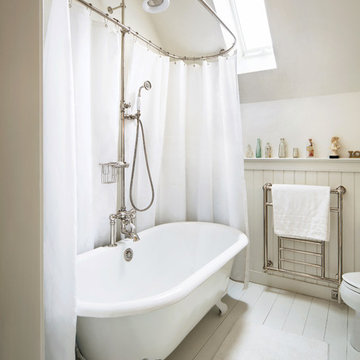
 Johann Grobler Architects
Amanda Kirkpatrick
Example of a farmhouse painted wood floor claw-foot bathtub design in New York with white walls
Example of a farmhouse painted wood floor claw-foot bathtub design in New York with white walls
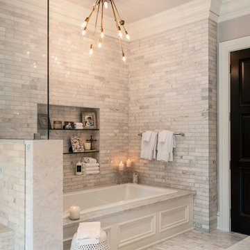
 Tabberson Architects
Transitional master white tile and marble tile marble floor drop-in bathtub photo in Indianapolis
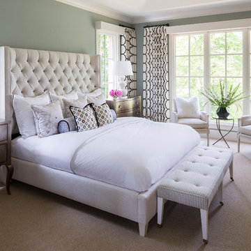
 O’Hara Interiors
Martha O'Hara Interiors, Interior Design & Photo Styling | Kyle Hunt & Partners, Builder | Troy Thies, Photography
Please Note: All “related,” “similar,” and “sponsored” products tagged or listed by Houzz are not actual products pictured. They have not been approved by Martha O’Hara Interiors nor any of the professionals credited. For information about our work, please contact design@oharainteriors.com.
Find the right local pro for your project
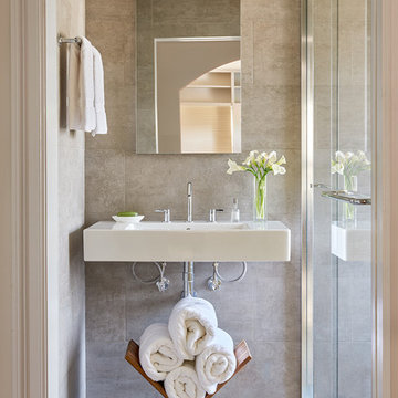
 CARNEMARK design + build
Photography by Anice Hoachlander
Bathroom - contemporary bathroom idea in DC Metro
Bathroom - contemporary bathroom idea in DC Metro
 Liz Schupanitz Designs
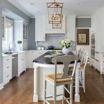
A PLACE TO GATHER
Location: Eagan, MN, USA
This family of five wanted an inviting space to gather with family and friends. Mom, the primary cook, wanted a large island with more organized storage – everything in its place – and a crisp white kitchen with the character of an older home.
Challenges:
Design an island that could accommodate this family of five for casual weeknight dinners.
Create more usable storage within the existing kitchen footprint.
Design a better transition between the upper cabinets on the 8-foot sink wall and the adjoining 9-foot cooktop wall.
Make room for more counter space around the cooktop. It was poorly lit, cluttered with small appliances and confined by the tall oven cabinet.
Solutions:
A large island, that seats 5 comfortably, replaced the small island and kitchen table. This allowed for more storage including cookbook shelves, a heavy-duty roll out shelf for the mixer, a 2-bin recycling center and a bread drawer.
Tall pantries with decorative grilles were placed between the kitchen and family room. These created ample storage and helped define each room, making each one feel larger, yet more intimate.
A space intentionally separates the upper cabinets on the sink wall from those on the cooktop wall. This created symmetry on the sink wall and made room for an appliance garage, which keeps the countertops uncluttered.
Moving the double ovens to the former pantry location made way for more usable counter space around the cooktop and a dramatic focal point with the hood, cabinets and marble backsplash.
Special Features:
Custom designed corbels and island legs lend character.
Gilt open lanterns, antiqued nickel grilles on the pantries, and the soft linen shade at the kitchen sink add personality and charm.
The unique bronze hardware with a living finish creates the patina of an older home.
A walnut island countertop adds the warmth and feel of a kitchen table.
This homeowner truly understood the idea of living with the patina of marble. Her grandmother’s marble-topped antique table inspired the Carrara countertops.
The result is a highly organized kitchen with a light, open feel that invites you to stay a while.
Liz Schupanitz Designs
Photographed by: Andrea Rugg

 FineLine Kitchens, Inc.
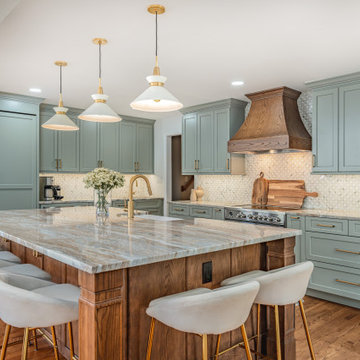
Hi everyone, I'm Sarah and Ogun we are here with fine line kitchens. So we are a couple working together. I do the interior design and remodeling of the space material selection meeting with the clients. And I handled operations outside, you know meaning all the construction work that is taking place the inside. The houses that we work in. I handle all the aspects of the construction, so today's project is very special. We're in Vienna and the client had a very big family. It's a family of seven that lives here. So we had a few aspects that we needed to keep in mind while designing this one. Having everybody be able to sit on the island. So we wanted plenty of seating all the way around. We didn't want anybody standing or anything like that. So what we did is we maximize the space. The center island is the biggest part of the kitchen. We use a natural stone to kind of give it a beautiful texture versus quartz. It's kind of standard white or kind of fabricated, so I wanted something very natural. We did this because I took my inspiration from the outside, so the inspiration if you look at the view right in front of me is there are so many greens there's a lot of brass accents and I wanted to bring this. Into this kitchen while designing it for my clients. She is very warm very. She wanted a very homey, comfy kind of look for the kitchen. So that's what we did today. As you can see, the cabinets are sage green, very light, so I still think it's a neutral, but it's a lighter color that again brings the outside in and we combine that with the oak right behind me so it's a slightly warm oak. It's not very dark. It's not very light. It's a medium brown and the same color went on the island. To kind of tie these two in and the backsplash, my favorite part is where you can see a little bit of design. It is, in my opinion still classic, but includes a pattern so the outside part is as we said in the beginning, is handled by my husband. I'd like him to speak a little bit about that. Thanks, Sarah, I want to talk to you guys a little bit about the construction part of this project. Originally this kitchen was located mostly in this area. They had their stove there sing. It was more of a peninsula layout in Sarah's and the customer vision they wanted. They wanted to get rid of the peninsula and they want to be able to have a huge island that can at least sit seven people because they're familiar with seven. So we wanted to make sure that we can achieve this design and bring it to life so that they can be happy with this layout. Some of the challenges we had, the house, the home being, you know, old home. There were a lot of you know the older electrical and plumbing that had to be replaced. We had to relocate the stove from here to this area. Over here we had put a nice foot fan that we had to relocate all the ductwork and the plumbing. Was being on the peninsula area. We had to relocate it to the center islands. So we achieved all this and kind of like bring it to bring in this kitchen up to date it looks beautiful. That's true, so yes, the old layout did not function for my clients because everything was kind of gathered on one side of the kitchen. So there was like a peninsula right there. So the end of this island kind of continued straight. And that was just the L shape. Kind of where everything was and there used to be another big table here, so they were using only kind of half of the space. So like I said at the beginning, our vision was to kind of feed everybody at the island, create some symmetry. 'cause I love that. So as you can see behind me, this is kind of the focal point symmetrical. Everything is kind of even we wanted to also panel the fridge here so it mimics the pantry and another size. So when you're looking at it, it is bringing again that symmetry back again. I hope you enjoyed this kitchen and this video and I'll see you soon. So how do you think this project turned out? It's nice. I like the color. I think it turned out nice. It's kind of like a little bit different color than what we always do. So I realize. Are you giving me a little bit of credit here that I did something different? Are you proud? I'm so proud of you. Other than that I like it. That they have kind of like a two sink. So if this was our kitchen, if we ever like you can have your own. I can have mine if we ever get into a fight then this can be like my own kitchen. Why are we gonna bring in a fight right now? So I'm cooking anyway. You're grilling most of the time, So what are you even talking about? My kitchen? That's my kitchen. You can just take the small sink. That's fine. It's always good to have your own space right there, so anyways. Thank you guys for watching. We hope to see you soon and if you have any questions please click the link below. It'll lead you to our website, house, YouTube and all of the social media is so nice to have you guys. We'll see you soon. Thanks bye bye-bye.
 FineLine Kitchens, Inc.
Hi everyone, I'm Sarah and Ogun we are here with fine line kitchens. So we are a couple working together. I do the interior design and remodeling of the space material selection meeting with the clients. And I handled operations outside, you know meaning all the construction work that is taking place the inside. The houses that we work in. I handle all the aspects of the construction, so today's project is very special. We're in Vienna and the client had a very big family. It's a family of seven that lives here. So we had a few aspects that we needed to keep in mind while designing this one. Having everybody be able to sit on the island. So we wanted plenty of seating all the way around. We didn't want anybody standing or anything like that. So what we did is we maximize the space. The center island is the biggest part of the kitchen. We use a natural stone to kind of give it a beautiful texture versus quartz. It's kind of standard white or kind of fabricated, so I wanted something very natural. We did this because I took my inspiration from the outside, so the inspiration if you look at the view right in front of me is there are so many greens there's a lot of brass accents and I wanted to bring this. Into this kitchen while designing it for my clients. She is very warm very. She wanted a very homey, comfy kind of look for the kitchen. So that's what we did today. As you can see, the cabinets are sage green, very light, so I still think it's a neutral, but it's a lighter color that again brings the outside in and we combine that with the oak right behind me so it's a slightly warm oak. It's not very dark. It's not very light. It's a medium brown and the same color went on the island. To kind of tie these two in and the backsplash, my favorite part is where you can see a little bit of design. It is, in my opinion still classic, but includes a pattern so the outside part is as we said in the beginning, is handled by my husband. I'd like him to speak a little bit about that. Thanks, Sarah, I want to talk to you guys a little bit about the construction part of this project. Originally this kitchen was located mostly in this area. They had their stove there sing. It was more of a peninsula layout in Sarah's and the customer vision they wanted. They wanted to get rid of the peninsula and they want to be able to have a huge island that can at least sit seven people because they're familiar with seven. So we wanted to make sure that we can achieve this design and bring it to life so that they can be happy with this layout. Some of the challenges we had, the house, the home being, you know, old home. There were a lot of you know the older electrical and plumbing that had to be replaced. We had to relocate the stove from here to this area. Over here we had put a nice foot fan that we had to relocate all the ductwork and the plumbing. Was being on the peninsula area. We had to relocate it to the center islands. So we achieved all this and kind of like bring it to bring in this kitchen up to date it looks beautiful. That's true, so yes, the old layout did not function for my clients because everything was kind of gathered on one side of the kitchen. So there was like a peninsula right there. So the end of this island kind of continued straight. And that was just the L shape. Kind of where everything was and there used to be another big table here, so they were using only kind of half of the space. So like I said at the beginning, our vision was to kind of feed everybody at the island, create some symmetry. 'cause I love that. So as you can see behind me, this is kind of the focal point symmetrical. Everything is kind of even we wanted to also panel the fridge here so it mimics the pantry and another size. So when you're looking at it, it is bringing again that symmetry back again. I hope you enjoyed this kitchen and this video and I'll see you soon. So how do you think this project turned out? It's nice. I like the color. I think it turned out nice. It's kind of like a little bit different color than what we always do. So I realize. Are you giving me a little bit of credit here that I did something different? Are you proud? I'm so proud of you. Other than that I like it. That they have kind of like a two sink. So if this was our kitchen, if we ever like you can have your own. I can have mine if we ever get into a fight then this can be like my own kitchen. Why are we gonna bring in a fight right now? So I'm cooking anyway. You're grilling most of the time, So what are you even talking about? My kitchen? That's my kitchen. You can just take the small sink. That's fine. It's always good to have your own space right there, so anyways. Thank you guys for watching. We hope to see you soon and if you have any questions please click the link below. It'll lead you to our website, house, YouTube and all of the social media is so nice to have you guys. We'll see you soon. Thanks bye bye-bye.
Sponsored
Fredericksburg, OH

High Point Cabinets
Columbus' Experienced Custom Cabinet Builder | 4x Best of Houzz Winner
 FineLine Kitchens, Inc.
Hi everyone, I'm Sarah and Ogun we are here with fine line kitchens. So we are a couple working together. I do the interior design and remodeling of the space material selection meeting with the clients. And I handled operations outside, you know meaning all the construction work that is taking place the inside. The houses that we work in. I handle all the aspects of the construction, so today's project is very special. We're in Vienna and the client had a very big family. It's a family of seven that lives here. So we had a few aspects that we needed to keep in mind while designing this one. Having everybody be able to sit on the island. So we wanted plenty of seating all the way around. We didn't want anybody standing or anything like that. So what we did is we maximize the space. The center island is the biggest part of the kitchen. We use a natural stone to kind of give it a beautiful texture versus quartz. It's kind of standard white or kind of fabricated, so I wanted something very natural. We did this because I took my inspiration from the outside, so the inspiration if you look at the view right in front of me is there are so many greens there's a lot of brass accents and I wanted to bring this. Into this kitchen while designing it for my clients. She is very warm very. She wanted a very homey, comfy kind of look for the kitchen. So that's what we did today. As you can see, the cabinets are sage green, very light, so I still think it's a neutral, but it's a lighter color that again brings the outside in and we combine that with the oak right behind me so it's a slightly warm oak. It's not very dark. It's not very light. It's a medium brown and the same color went on the island. To kind of tie these two in and the backsplash, my favorite part is where you can see a little bit of design. It is, in my opinion still classic, but includes a pattern so the outside part is as we said in the beginning, is handled by my husband. I'd like him to speak a little bit about that. Thanks, Sarah, I want to talk to you guys a little bit about the construction part of this project. Originally this kitchen was located mostly in this area. They had their stove there sing. It was more of a peninsula layout in Sarah's and the customer vision they wanted. They wanted to get rid of the peninsula and they want to be able to have a huge island that can at least sit seven people because they're familiar with seven. So we wanted to make sure that we can achieve this design and bring it to life so that they can be happy with this layout. Some of the challenges we had, the house, the home being, you know, old home. There were a lot of you know the older electrical and plumbing that had to be replaced. We had to relocate the stove from here to this area. Over here we had put a nice foot fan that we had to relocate all the ductwork and the plumbing. Was being on the peninsula area. We had to relocate it to the center islands. So we achieved all this and kind of like bring it to bring in this kitchen up to date it looks beautiful. That's true, so yes, the old layout did not function for my clients because everything was kind of gathered on one side of the kitchen. So there was like a peninsula right there. So the end of this island kind of continued straight. And that was just the L shape. Kind of where everything was and there used to be another big table here, so they were using only kind of half of the space. So like I said at the beginning, our vision was to kind of feed everybody at the island, create some symmetry. 'cause I love that. So as you can see behind me, this is kind of the focal point symmetrical. Everything is kind of even we wanted to also panel the fridge here so it mimics the pantry and another size. So when you're looking at it, it is bringing again that symmetry back again. I hope you enjoyed this kitchen and this video and I'll see you soon. So how do you think this project turned out? It's nice. I like the color. I think it turned out nice. It's kind of like a little bit different color than what we always do. So I realize. Are you giving me a little bit of credit here that I did something different? Are you proud? I'm so proud of you. Other than that I like it. That they have kind of like a two sink. So if this was our kitchen, if we ever like you can have your own. I can have mine if we ever get into a fight then this can be like my own kitchen. Why are we gonna bring in a fight right now? So I'm cooking anyway. You're grilling most of the time, So what are you even talking about? My kitchen? That's my kitchen. You can just take the small sink. That's fine. It's always good to have your own space right there, so anyways. Thank you guys for watching. We hope to see you soon and if you have any questions please click the link below. It'll lead you to our website, house, YouTube and all of the social media is so nice to have you guys. We'll see you soon. Thanks bye bye-bye.
 Kathleen Bost Architecture + Design
Matthew Millman
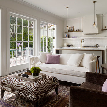
Transitional open concept living room photo in San Francisco with white walls
Transitional open concept living room photo in San Francisco with white walls
 Homes by Tradition
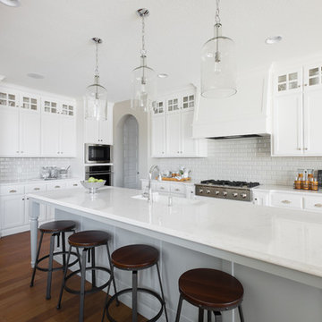
A white kitchen with large gray center island. Perfect for entertaining as the kitchen opens up to living room and dining room. The unique pendant lighting over the island is the perfect touch to finish off the space.
This home was professionally staged by Ambiance at Home Staging Specialists. For any staging or furniture questions, please contact Ambiance at (952) 440-6757.
 Western Window Systems
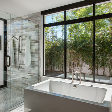
Praised for its visually appealing, modern yet comfortable design, this Scottsdale residence took home the gold in the 2014 Design Awards from Professional Builder magazine. Built by Calvis Wyant Luxury Homes, the 5,877-square-foot residence features an open floor plan that includes Western Window Systems’ multi-slide pocket doors to allow for optimal inside-to-outside flow. Tropical influences such as covered patios, a pool, and reflecting ponds give the home a lush, resort-style feel.


Sponsored
Columbus, OH

Hope Restoration & General Contracting
Columbus Design-Build, Kitchen & Bath Remodeling, Historic Renovations

 Anne Sneed Architectural Interiors
Jim Brady Architectural Photography
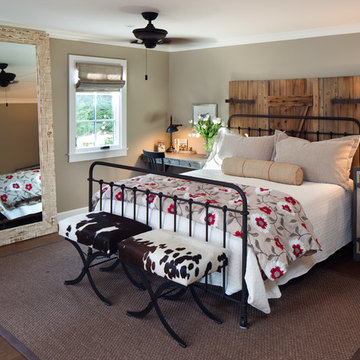
Bedroom - farmhouse master bedroom idea in San Diego with brown walls
Bedroom - farmhouse master bedroom idea in San Diego with brown walls
 Riverbend Timber Framing
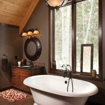
The stark white stand-alone bathtub is a focal point of this well-lit bathroom.
Photos: Copyright Heidi Long, Longview Studios, Inc.
Inspiration for a mid-sized rustic master brown tile freestanding bathtub remodel in Edmonton with an undermount sink, shaker cabinets, medium tone wood cabinets, granite countertops and gray walls
Inspiration for a mid-sized rustic master brown tile freestanding bathtub remodel in Edmonton with an undermount sink, shaker cabinets, medium tone wood cabinets, granite countertops and gray walls
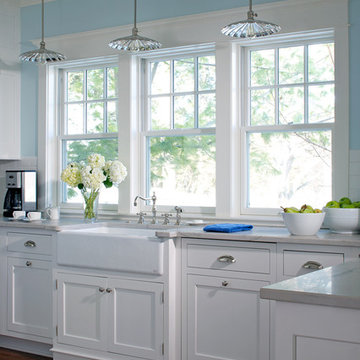
 Signature Kitchens
Jim Yochum Photography
Kitchen - small country kitchen idea with white cabinets, quartzite countertops and a farmhouse sink
Kitchen - small country kitchen idea with white cabinets, quartzite countertops and a farmhouse sink

Sponsored
Sunbury, OH

J.Holderby - Renovations
Franklin County's Leading General Contractors - 2X Best of Houzz!
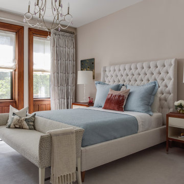
 Andrea A. Design
NYC townhouse with eclectic style that represents a modern urban vibe while respecting the traditional architecture of home.
Bedroom - transitional bedroom idea in New York
Bedroom - transitional bedroom idea in New York
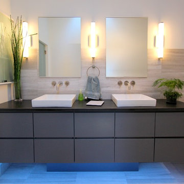
 Change Your Bathroom©
The goal of this project was to upgrade the builder grade finishes and create an ergonomic space that had a contemporary feel. This bathroom transformed from a standard, builder grade bathroom to a contemporary urban oasis. This was one of my favorite projects, I know I say that about most of my projects but this one really took an amazing transformation. By removing the walls surrounding the shower and relocating the toilet it visually opened up the space. Creating a deeper shower allowed for the tub to be incorporated into the wet area. Adding a LED panel in the back of the shower gave the illusion of a depth and created a unique storage ledge. A custom vanity keeps a clean front with different storage options and linear limestone draws the eye towards the stacked stone accent wall.
Houzz Write Up: https://www.houzz.com/magazine/inside-houzz-a-chopped-up-bathroom-goes-streamlined-and-swank-stsetivw-vs~27263720
The layout of this bathroom was opened up to get rid of the hallway effect, being only 7 foot wide, this bathroom needed all the width it could muster. Using light flooring in the form of natural lime stone 12x24 tiles with a linear pattern, it really draws the eye down the length of the room which is what we needed. Then, breaking up the space a little with the stone pebble flooring in the shower, this client enjoyed his time living in Japan and wanted to incorporate some of the elements that he appreciated while living there. The dark stacked stone feature wall behind the tub is the perfect backdrop for the LED panel, giving the illusion of a window and also creates a cool storage shelf for the tub. A narrow, but tasteful, oval freestanding tub fit effortlessly in the back of the shower. With a sloped floor, ensuring no standing water either in the shower floor or behind the tub, every thought went into engineering this Atlanta bathroom to last the test of time. With now adequate space in the shower, there was space for adjacent shower heads controlled by Kohler digital valves. A hand wand was added for use and convenience of cleaning as well. On the vanity are semi-vessel sinks which give the appearance of vessel sinks, but with the added benefit of a deeper, rounded basin to avoid splashing. Wall mounted faucets add sophistication as well as less cleaning maintenance over time. The custom vanity is streamlined with drawers, doors and a pull out for a can or hamper.
A wonderful project and equally wonderful client. I really enjoyed working with this client and the creative direction of this project.
Brushed nickel shower head with digital shower valve, freestanding bathtub, curbless shower with hidden shower drain, flat pebble shower floor, shelf over tub with LED lighting, gray vanity with drawer fronts, white square ceramic sinks, wall mount faucets and lighting under vanity. Hidden Drain shower system. Atlanta Bathroom.
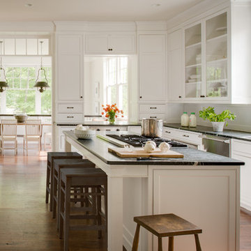
 Donald Lococo Architects
A simple front facade consisting solely of ten-foot shuttered French doors radiates elegance in this new traditional foursquare home in Washington, D.C. Featured in Country Living magazine, the airy plan offers spaciousness in a limited-fronted site of the American foursquare house. The goal for the design was creating a contemporary foursquare style house. The family room and kitchen of this American foursquare interior are separated by a glassy built-in rather than walls, encouraging visual connection between the spaces in the four square house. Though nestled in the city, this American foursquare home feels like a classic country home.
6