
Search results for "Start thinking" in Home Design Ideas
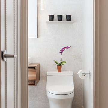
 Cabinet Plant
See what our client say about working with us:
I started my search for a contractor about a year before I hired Paul to do a kitchen and bathroom renovation. This was my first time at the bat, and I really had no idea what to expect. I had many contractor proposals that swung wildly in price but for some reason I never felt inclined to hire any of the guys I met with. I happened to be looking at Houzz one day and came across Paul’s company and he had very good reviews. I gave him a call and he came to my apartment quickly. I liked him immediately when we met. I thought it was strange that he asked me for my budget and how much I wanted to spend but in hindsight, providing that information allowed Paul to come back to me with a very detailed proposal based on my budget. I soon realized that the lower proposals I had did not include many of the budget items that would be necessary to complete the job. Paul laid out the pricing and provided a very reasonable “allowance” based on your measurements for tile, toilet, sinks, etc. It is up to you to stay within that allowance.
Another reason I hired Paul was because of his design skills. Paul met me in the at tile stores several times and helped guide me in choosing tile and a style for the bathroom that really looks beautiful. I fought him a little but in the end, was glad I went with his recommendations. He also uses a kitchen cabinet maker so all the cabinets are custom to what you want. Paul also has a great customer website that allows you to see all the expenses, make choices, and easily communicate with him.
If you are planning to do a renovation, I think it helps to plan for the worst and hope for the best. I live in a co-op and we had a couple of little glitches and Paul was always quick to resolve issues as they arose. He was extremely responsive and really cared about the work and doing a good job. I would definitely hire Paul again if I needed a contractor.
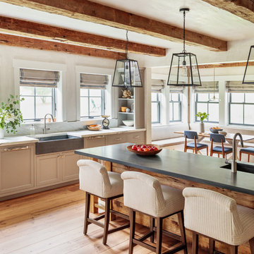
 Jess Cooney Interiors
Custom kitchen with Danby Marble and Pietra Cardosa Counters
Example of a farmhouse kitchen design in Boston
Example of a farmhouse kitchen design in Boston
 User
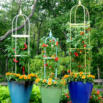
UserPeppers and tomatoes are underplanted with zinnias in this beautiful vegetable garden. Learn how to grow easy vegetables that look great on your patio from the book "Easy Container Combos: Vegetables & Flowers." See a free, 24 page sample of the book at www.pamela-crawford.com. in the 'Books' section. Pamela Crawford designed and photographed the planter. Pamela designs landscapes throughout Palm Beach County, FL, including Boca Raton, Delray Beach, the town of Palm Beach, Palm Beach Gardens, Jupiter, and Wellington.
Find the right local pro for your project
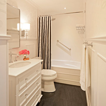
 David Crosson Design Collective
The client decided that she was in her "forever home" and wanted to create a space that felt clean and fresh but referenced elements of a vintage aesthetic. Panel molding, gently swooping paintable wallpaper, a high-contrast palette and gleaming fixtures from Kohler's Artifacts line all contributed to the look. "I'm never leaving this room," she said when we were done--and somehow I believe that might just be true!
Image shot by John Bilodeau

 Steve Masley Consulting and Design
Jalapeño grown organically in a 7-gallon Smart Pot. This plant produced 69 jalapeños! Photo by Steve Masley
Example of an eclectic home design design in San Francisco
Example of an eclectic home design design in San Francisco
 Thyme & Place Design LLC
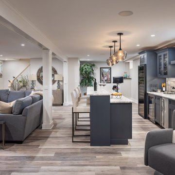
When my client had to move from her company office to work at home, she set up in the dining room. Despite her best efforts, this was not the long-term solution she was looking for. My client realized she needed a dedicated space not on the main floor of the home. On one hand, having your office space right next to the kitchen is handy. On the other hand, it made separating work and home life was not that easy.
The house was a ranch. In essence, the basement would run entire length of the home. As we came down the steps, we entered a time capsule. The house was built in the 1950’s. The walls were covered with original knotty pine paneling. There was a wood burning fireplace and considering this was a basement, high ceilings. In addition, there was everything her family could not store at their own homes. As we wound though the space, I though “wow this has potential”, Eventually, after walking through the laundry room we came to a small nicely lit room. This would be the office.
My client looked at me and asked what I thought. Undoubtedly, I said, this can be a great workspace, but do you really want to walk through this basement and laundry to get here? Without reservation, my client said where do we start?
Once the design was in place, we started the renovation. The knotty pine paneling had to go. Specifically, to add some insulation and control the dampness and humidity. The laundry room wall was relocated to create a hallway to the office.
At the far end of the room, we designated a workout zone. Weights, mats, exercise bike and television are at the ready for morning or afternoon workouts. The space can be concealed by a folding screen for party time. Doors to an old closet under the stairs were relocated to the workout area for hidden storage. Now we had nice wall for a beautiful console and mirror for storage and serving during parties.
In order to add architectural details, we covered the old ugly support columns with simple recessed millwork panels. This detail created a visual division between the bar area and the seating area in front of the fireplace. The old red brick on the fireplace surround was replaced with stack stone. A mantle was made from reclaimed wood. Additional reclaimed wood floating shelves left and right of the fireplace provides decorative display while maintaining a rustic element balancing the copper end table and leather swivel rocker.
We found an amazing rug which tied all of the colors together further defining the gathering space. Russet and burnt orange became the accent color unifying each space. With a bit of whimsy, a rather unusual light fixture which looks like roots from a tree growing through the ceiling is a conversation piece.
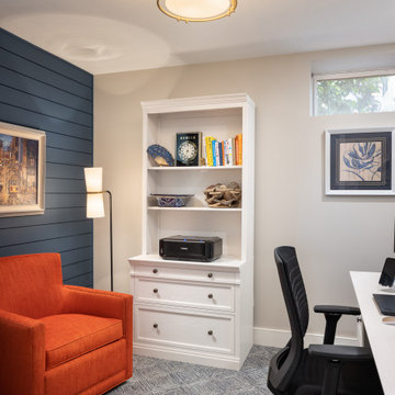
The office space is quite and removed from the main part of the basement. There is a desk large enough for multiple screens, a small bookcase holding office supplies and a comfortable chair for conference calls. Because working from home requires many online meetings, we added a shiplap wall painted in Hale Navy to contrast with the orange fabric on the chair. We finished the décor with a painting from my client’s father. This is the background online visitors will see.
The last and best part of the renovation is the beautiful bar. My client is an avid collector of wine. She already had the EuroCave refrigerator, so I incorporated it into the design. The cabinets are painted Temptation Grey from Benjamin Moore. The counter tops are my favorite hard working quartzite Brown Fantasy. The backsplash is a combination of rustic wood and old tin ceiling like porcelain tiles. Together with the textures of the reclaimed wood and hide poofs balanced against the smooth finish of the cabinets, we created a comfortable luxury for relaxing.
There is ample storage for bottles, cans, glasses, and anything else you can think of for a great party. In addition to the wine storage, we incorporated a beverage refrigerator, an ice maker, and a sink. Floating shelves with integrated lighting illuminate the back bar. The raised height of the front bar provides the perfect wine tasting and paring spot. I especially love the pendant lights which look like wine glasses.
Finally, I selected carpet for the stairs and office. It is perfect for noise reduction. Meanwhile for the overall flooring, I specifically selected a high-performance vinyl plank floor. We often use this product as it is perfect to install on a concrete floor. It is soft to walk on, easy to clean and does not reduce the overall height of the space.
 Scott Haase | REALTOR®
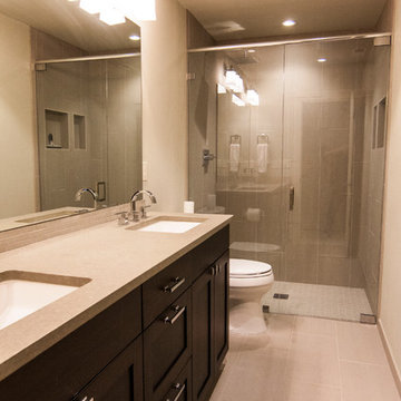
This is a guest bathroom in my personal residence. The previous bathroom has a fiberglass tub/shower combo where the existing shower is at currently. This room is located in a daylight basement with no natural light. My design goal to to create a timeless space where guests would feel welcomed and comfortable while also improving my property for my own use. I added three LED recessed lights (the one in the shower is on its own switch), an additional light source over the second sink, caesarstone rosemary countertops, bamboo cabinets, and a 24x12 tile was used on the floor and shower walls. I used all polished chrome fixtures as well as a square shower drain.


 Margot Hartford Photography
Photo: Margot Hartford Photography © 2014 Houzz
Design: Jennifer Jones, Niche Interiors
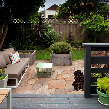
Example of a transitional patio design in San Francisco
Example of a transitional patio design in San Francisco

![[project] lake wisconsin](https://st.hzcdn.com/fimgs/fe11e86e03002cef_0472-w360-h360-b0-p0--.jpg)

 Thyme & Place Design LLC
When my client had to move from her company office to work at home, she set up in the dining room. Despite her best efforts, this was not the long-term solution she was looking for. My client realized she needed a dedicated space not on the main floor of the home. On one hand, having your office space right next to the kitchen is handy. On the other hand, it made separating work and home life was not that easy.
The house was a ranch. In essence, the basement would run entire length of the home. As we came down the steps, we entered a time capsule. The house was built in the 1950’s. The walls were covered with original knotty pine paneling. There was a wood burning fireplace and considering this was a basement, high ceilings. In addition, there was everything her family could not store at their own homes. As we wound though the space, I though “wow this has potential”, Eventually, after walking through the laundry room we came to a small nicely lit room. This would be the office.
My client looked at me and asked what I thought. Undoubtedly, I said, this can be a great workspace, but do you really want to walk through this basement and laundry to get here? Without reservation, my client said where do we start?
Once the design was in place, we started the renovation. The knotty pine paneling had to go. Specifically, to add some insulation and control the dampness and humidity. The laundry room wall was relocated to create a hallway to the office.
At the far end of the room, we designated a workout zone. Weights, mats, exercise bike and television are at the ready for morning or afternoon workouts. The space can be concealed by a folding screen for party time. Doors to an old closet under the stairs were relocated to the workout area for hidden storage. Now we had nice wall for a beautiful console and mirror for storage and serving during parties.
In order to add architectural details, we covered the old ugly support columns with simple recessed millwork panels. This detail created a visual division between the bar area and the seating area in front of the fireplace. The old red brick on the fireplace surround was replaced with stack stone. A mantle was made from reclaimed wood. Additional reclaimed wood floating shelves left and right of the fireplace provides decorative display while maintaining a rustic element balancing the copper end table and leather swivel rocker.
We found an amazing rug which tied all of the colors together further defining the gathering space. Russet and burnt orange became the accent color unifying each space. With a bit of whimsy, a rather unusual light fixture which looks like roots from a tree growing through the ceiling is a conversation piece.
The office space is quite and removed from the main part of the basement. There is a desk large enough for multiple screens, a small bookcase holding office supplies and a comfortable chair for conference calls. Because working from home requires many online meetings, we added a shiplap wall painted in Hale Navy to contrast with the orange fabric on the chair. We finished the décor with a painting from my client’s father. This is the background online visitors will see.
The last and best part of the renovation is the beautiful bar. My client is an avid collector of wine. She already had the EuroCave refrigerator, so I incorporated it into the design. The cabinets are painted Temptation Grey from Benjamin Moore. The counter tops are my favorite hard working quartzite Brown Fantasy. The backsplash is a combination of rustic wood and old tin ceiling like porcelain tiles. Together with the textures of the reclaimed wood and hide poofs balanced against the smooth finish of the cabinets, we created a comfortable luxury for relaxing.
There is ample storage for bottles, cans, glasses, and anything else you can think of for a great party. In addition to the wine storage, we incorporated a beverage refrigerator, an ice maker, and a sink. Floating shelves with integrated lighting illuminate the back bar. The raised height of the front bar provides the perfect wine tasting and paring spot. I especially love the pendant lights which look like wine glasses.
Finally, I selected carpet for the stairs and office. It is perfect for noise reduction. Meanwhile for the overall flooring, I specifically selected a high-performance vinyl plank floor. We often use this product as it is perfect to install on a concrete floor. It is soft to walk on, easy to clean and does not reduce the overall height of the space.
 TKS Design Group
Download our free ebook, Creating the Ideal Kitchen. DOWNLOAD NOW
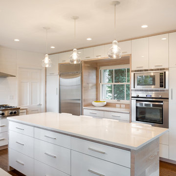
Lakefront property in the northwest suburbs of Chicago is hard to come by, so when we were hired by this young family with exactly that, we were immediately inspired by not just the unusually large footprint of this 1950’s colonial revival but also the lovely views of the manmade lake it was sited on. The large 5-bedroom home was solidly stuck in the 1980’s, but we saw tons of potential. We started out by updating the existing staircase with a fresh coat of paint and adding new herringbone slate to the entry hall.
The powder room off the entryway also got a refresh - new flooring, new cabinets and fixtures. We ran the new slate right through into this space for some consistency. A fun wallpaper and shiplap trim add a welcoming feel and set the tone for the home.
Next, we tackled the kitchen. Located away from the rest of the first floor, the kitchen felt a little isolated, so we immediately began planning for how to better connect it to the rest of the first floor. We landed on removing the wall between the kitchen and dining room and designed a modified galley style space with separate cooking and clean up zones. The cooking zone consists of the refrigerator, prep sink and cooktop, along with a nice long run of prep space at the island. The cleanup side of the kitchen consists of the main sink and dishwasher. Both areas are situated so that the user can view the lake during prep work and cleanup!
One of the home’s main puzzles was how to incorporate the mudroom and area in front of the patio doors at the back of the house. We already had a breakfast table area, so the space by the patio doors was a bit of a no man’s land. We decided to separate the kitchen proper from what became the new mudroom with a large set of barn doors. That way you can quickly hide any mudroom messes but have easy access to the light coming in through the patio doors as well as the outdoor grilling station. We also love the impact the barn doors add to the overall space.
The homeowners’ first words to us were “it’s time to ditch the brown,” so we did! We chose a lovely blue pallet that reflects the home’s location on the lake which is also vibrant yet easy on the eye. Countertops are white quartz, and the natural oak floor works well with the other honey accents. The breakfast table was given a refresh with new chairs, chandelier and window treatments that frame the gorgeous views of the lake out the back.
We coordinated the slate mudroom flooring with that used in the home’s main entrance for a consistent feel. The storage area consists of open and closed storage to allow for some clutter control as needed.
Next on our “to do” list was revamping the dated brown bar area in the neighboring dining room. We eliminated the clutter by adding some closed cabinets and did some easy updates to help the space feel more current. One snag we ran into here was the discovery of a beam above the existing open shelving that had to be modified with a smaller structural beam to allow for our new design to work. This was an unexpected surprise, but in the end we think it was well worth it!
We kept the colors here a bit more muted to blend with the homeowner’s existing furnishings. Open shelving and polished nickel hardware add some simple detail to the new entertainment zone which also looks out onto the lake!
Next we tackled the upstairs starting with the homeowner’s son’s bath. The bath originally had both a tub shower and a separate shower, so we decided to swap out the shower for a new laundry area. This freed up some space downstairs in what used to be the mudroom/laundry room and is much more convenient for daily laundry needs.
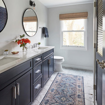
We continued the blue palette here with navy cabinetry and the navy tile in the shower. Porcelain floor tile and chrome fixtures keep maintenance to a minimum while matte black mirrors and lighting add some depth the design. A low maintenance runner adds some warmth underfoot and ties the whole space together.
We added a pocket door to the bathroom to minimize interference with the door swings. The left door of the laundry closet is on a 180 degree hinge to allow for easy full access to the machines. Next we tackled the master bath which is an en suite arrangement. The original was typical of the 1980’s with the vanity outside of the bathroom, situated near the master closet. And the brown theme continued here with multiple shades of brown.
Our first move was to segment off the bath and the closet from the master bedroom. We created a short hall from the bedroom to the bathroom with his and hers walk-in closets on the left and right as well as a separate toilet closet outside of the main bathroom for privacy and flexibility.
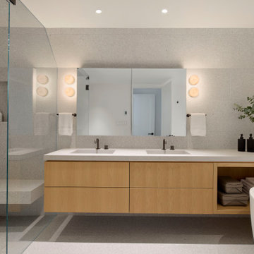
The original bathroom had a giant soaking tub with steps (dangerous!) as well as a small shower that did not work well for our homeowner who is 6’3”. With other bathtubs in the home, they decided to eliminate the tub and create an oversized shower which takes up the space where the old tub was located. The double vanity is on the opposite wall and a bench is located under the window for morning conversations and a place to set a couple of towels.
The pallet in here is light and airy with a mix of blond wood, creamy porcelain and marble tile, and brass accents. A simple roman shade adds some texture and it’s top-down mechanism allows for light and privacy.
This large whole house remodel gave our homeowners not only the ability to maximize the potential of their home but also created a lovely new frame from which to view their fabulous lake views.
Designed by: Susan Klimala, CKD, CBD
Photography by: Michael Kaskel
For more information on kitchen and bath design ideas go to: www.kitchenstudio-ge.com





 April Case Underwood
Stacy Goldberg
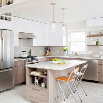
Mid-sized trendy l-shaped porcelain tile eat-in kitchen photo in Chicago with an undermount sink, flat-panel cabinets, quartz countertops, gray backsplash, ceramic backsplash, stainless steel appliances and an island
Mid-sized trendy l-shaped porcelain tile eat-in kitchen photo in Chicago with an undermount sink, flat-panel cabinets, quartz countertops, gray backsplash, ceramic backsplash, stainless steel appliances and an island
 Reiter Architecture & Design
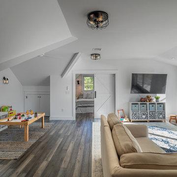
Inspiration for a coastal dark wood floor and brown floor playroom remodel in Portland Maine with white walls


 Elizabeth Eason Architecture LLC
Bruce Cole Photography
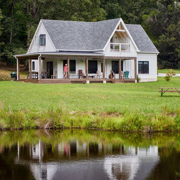
Example of a small farmhouse white exterior home design in Other with a shingle roof
Example of a small farmhouse white exterior home design in Other with a shingle roof
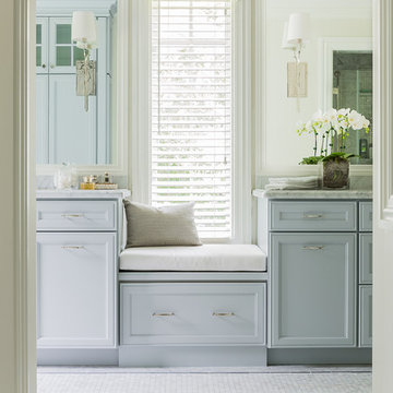
 Janine Dowling Design Inc.
Janine Dowling Design, Inc.
www.janinedowling.com
Michael J. Lee Photography
Bathroom Design by Jodi L. Swartz
Inspiration for a mid-sized timeless master white tile and stone tile marble floor walk-in shower remodel in Boston with an undermount sink, recessed-panel cabinets, gray cabinets, marble countertops, a one-piece toilet and gray walls
Inspiration for a mid-sized timeless master white tile and stone tile marble floor walk-in shower remodel in Boston with an undermount sink, recessed-panel cabinets, gray cabinets, marble countertops, a one-piece toilet and gray walls
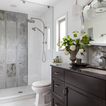
 Treefrog Design
The new space feels light, airy and open exuding a tranquil sophistication. A relaxed, meditative atmosphere is achieved by combining glass tile, white walls, dark cabinets and a porcelain countertop.
39