
Search results for "Start thinking" in Home Design Ideas
 TKS Design Group
Download our free ebook, Creating the Ideal Kitchen. DOWNLOAD NOW
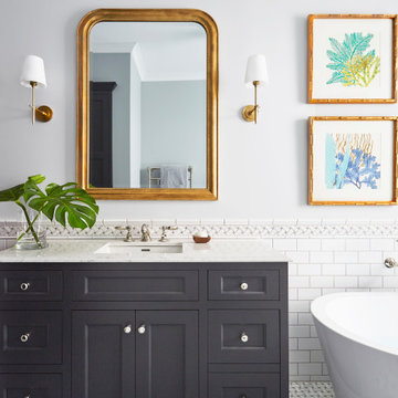
This master bath remodel is the cat's meow for more than one reason! The materials in the room are soothing and give a nice vintage vibe in keeping with the rest of the home. We completed a kitchen remodel for this client a few years’ ago and were delighted when she contacted us for help with her master bath!
The bathroom was fine but was lacking in interesting design elements, and the shower was very small. We started by eliminating the shower curb which allowed us to enlarge the footprint of the shower all the way to the edge of the bathtub, creating a modified wet room. The shower is pitched toward a linear drain so the water stays in the shower. A glass divider allows for the light from the window to expand into the room, while a freestanding tub adds a spa like feel.
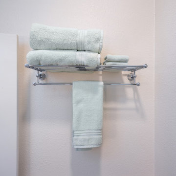
The radiator was removed and both heated flooring and a towel warmer were added to provide heat. Since the unit is on the top floor in a multi-unit building it shares some of the heat from the floors below, so this was a great solution for the space.
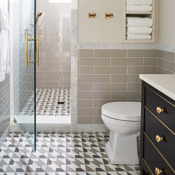
The custom vanity includes a spot for storing styling tools and a new built in linen cabinet provides plenty of the storage. The doors at the top of the linen cabinet open to stow away towels and other personal care products, and are lighted to ensure everything is easy to find. The doors below are false doors that disguise a hidden storage area. The hidden storage area features a custom litterbox pull out for the homeowner’s cat! Her kitty enters through the cutout, and the pull out drawer allows for easy clean ups.
The materials in the room – white and gray marble, charcoal blue cabinetry and gold accents – have a vintage vibe in keeping with the rest of the home. Polished nickel fixtures and hardware add sparkle, while colorful artwork adds some life to the space.
 Weisz Selection Outdoor Living Specialists
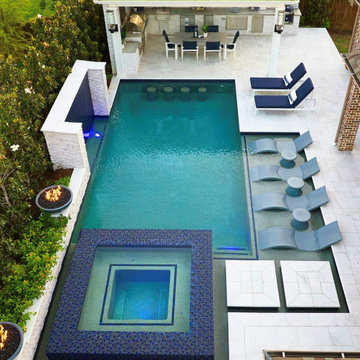
Quintessential Texas blue and white exudes modern luxury in this backyard transformation from ordinary to extraordinary by Weisz Selection! Every angle excites the viewer and beckons them to enjoy what this project has to offer. From gathering around the fire pit, jumping in the pool, soaking in the infinity edge spa framed by mesmerizing twin fire bowls, lounging on the tanning ledge, relaxing pool side on the platinum marble deck, sipping on your favorite beverage while sitting at the swim-up bar stools, savoring some delicious fare prepared in the outdoor kitchen, to watching a favorite event or show on the tv, all while listening to the Zen like trickling of water down the glass tile water feature, this project has it ALL!! One would think they need an expansive space to encompass all those wonderful features; however, our designers accomplished this in a backyard that is less than 90’ X 30’. Showcasing the expertise of our design team, we created a concept for our lucky clients that is an excellent utilization of space and encompasses all the items on their wish list! This gorgeous custom pool, spa, outdoor fire pit, and outdoor kitchen looks more like something you’d find at a luxury hotel instead of in your neighbor’s backyard. Maybe you’d like something similar in your backyard. Don’t let our next project be in your other neighbor’s yard. What is on your wish list? Contact Weisz Selection today to get started building your own dream staycation worthy backyard!
 Designs by Debra Cruz
Photo credit: www.home-pix.com
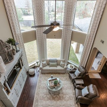
Inspiration for a large transitional home design remodel in Houston
Inspiration for a large transitional home design remodel in Houston
Find the right local pro for your project

 Kathleen Jennison
An Arts & Crafts Bungalow is one of my favorite styles of homes. We have quite a few of them in our Stockton Mid-Town area. And when C&L called us to help them remodel their 1923 American Bungalow, I was beyond thrilled.
As per usual, when we get a new inquiry, we quickly Google the project location while we are talking to you on the phone. My excitement escalated when I saw the Google Earth Image of the sweet Sage Green bungalow in Mid-Town Stockton. "Yes, we would be interested in working with you," I said trying to keep my cool.
But what made it even better was meeting C&L and touring their home, because they are the nicest young couple, eager to make their home period perfect. Unfortunately, it had been slightly molested by some bad house-flippers, and we needed to bring the bathroom back to it "roots."
We knew we had to banish the hideous brown tile and cheap vanity quickly. But C&L complained about the condensation problems and the constant fight with mold. This immediately told me that improper remodeling had occurred and we needed to remedy that right away.
The Before: Frustrations with a Botched Remodel
The bathroom needed to be brought back to period appropriate design with all the functionality of a modern bathroom. We thought of things like marble countertop, white mosaic floor tiles, white subway tile, board and batten molding, and of course a fabulous wallpaper.
This small (and only) bathroom on a tight budget required a little bit of design sleuthing to figure out how we could get the proper look and feel. Our goal was to determine where to splurge and where to economize and how to complete the remodel as quickly as possible because C&L would have to move out while construction was going on.
The Process: Hard Work to Remedy Design and Function
During our initial design study, (which included 2 hours in the owners’ home), we noticed framed images of William Morris Arts and Crafts textile patterns and knew this would be our design inspiration. We presented C&L with three options and they quickly selected the Pimpernel Design Concept.
We had originally selected the Black and Olive colors with a black vanity, mirror, and black and white floor tile. C&L liked it but weren’t quite sure about the black, We went back to the drawing board and decided the William & Co Pimpernel Wallpaper in Bayleaf and Manilla color with a softer gray painted vanity and mirror and white floor tile was more to their liking.
After the Design Concept was approved, we went to work securing the building permit, procuring all the elements, and scheduling our trusted tradesmen to perform the work.
We did uncover some shoddy work by the flippers such as live electrical wires hidden behind the wall, plumbing venting cut-off and buried in the walls (hence the constant dampness), the tub barely balancing on two fence boards across the floor joist, and no insulation on the exterior wall.
All of the previous blunders were fixed and the bathroom put back to its previous glory. We could feel the house thanking us for making it pretty again.
The After Reveal: Cohesive Design Decisions
We selected a simple white subway tile for the tub/shower. This is always classic and in keeping with the style of the house.
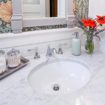
We selected a pre-fab vanity and mirror, but they look rich with the quartz countertop. There is much more storage in this small vanity than you would think.
The Transformation: A Period Perfect Refresh
We began the remodel just as the pandemic reared and stay-in-place orders went into effect. As C&L were already moved out and living with relatives, we got the go-ahead from city officials to get the work done (after all, how can you shelter in place without a bathroom?).
All our tradesmen were scheduled to work so that only one crew was on the job site at a time. We stayed on the original schedule with only a one week delay.
The end result is the sweetest little bathroom I've ever seen (and I can't wait to start work on C&L's kitchen next).
Thank you for joining me in this project transformation. I hope this inspired you to think about being creative with your design projects, determining what works best in keeping with the architecture of your space, and carefully assessing how you can have the best life in your home.

 Kathleen Jennison
An Arts & Crafts Bungalow is one of my favorite styles of homes. We have quite a few of them in our Stockton Mid-Town area. And when C&L called us to help them remodel their 1923 American Bungalow, I was beyond thrilled.
As per usual, when we get a new inquiry, we quickly Google the project location while we are talking to you on the phone. My excitement escalated when I saw the Google Earth Image of the sweet Sage Green bungalow in Mid-Town Stockton. "Yes, we would be interested in working with you," I said trying to keep my cool.
But what made it even better was meeting C&L and touring their home, because they are the nicest young couple, eager to make their home period perfect. Unfortunately, it had been slightly molested by some bad house-flippers, and we needed to bring the bathroom back to it "roots."
We knew we had to banish the hideous brown tile and cheap vanity quickly. But C&L complained about the condensation problems and the constant fight with mold. This immediately told me that improper remodeling had occurred and we needed to remedy that right away.
The Before: Frustrations with a Botched Remodel
The bathroom needed to be brought back to period appropriate design with all the functionality of a modern bathroom. We thought of things like marble countertop, white mosaic floor tiles, white subway tile, board and batten molding, and of course a fabulous wallpaper.
This small (and only) bathroom on a tight budget required a little bit of design sleuthing to figure out how we could get the proper look and feel. Our goal was to determine where to splurge and where to economize and how to complete the remodel as quickly as possible because C&L would have to move out while construction was going on.
The Process: Hard Work to Remedy Design and Function
During our initial design study, (which included 2 hours in the owners’ home), we noticed framed images of William Morris Arts and Crafts textile patterns and knew this would be our design inspiration. We presented C&L with three options and they quickly selected the Pimpernel Design Concept.
We had originally selected the Black and Olive colors with a black vanity, mirror, and black and white floor tile. C&L liked it but weren’t quite sure about the black, We went back to the drawing board and decided the William & Co Pimpernel Wallpaper in Bayleaf and Manilla color with a softer gray painted vanity and mirror and white floor tile was more to their liking.
After the Design Concept was approved, we went to work securing the building permit, procuring all the elements, and scheduling our trusted tradesmen to perform the work.
We did uncover some shoddy work by the flippers such as live electrical wires hidden behind the wall, plumbing venting cut-off and buried in the walls (hence the constant dampness), the tub barely balancing on two fence boards across the floor joist, and no insulation on the exterior wall.
All of the previous blunders were fixed and the bathroom put back to its previous glory. We could feel the house thanking us for making it pretty again.
The After Reveal: Cohesive Design Decisions
We selected a simple white subway tile for the tub/shower. This is always classic and in keeping with the style of the house.
We selected a pre-fab vanity and mirror, but they look rich with the quartz countertop. There is much more storage in this small vanity than you would think.
The Transformation: A Period Perfect Refresh
We began the remodel just as the pandemic reared and stay-in-place orders went into effect. As C&L were already moved out and living with relatives, we got the go-ahead from city officials to get the work done (after all, how can you shelter in place without a bathroom?).
All our tradesmen were scheduled to work so that only one crew was on the job site at a time. We stayed on the original schedule with only a one week delay.
The end result is the sweetest little bathroom I've ever seen (and I can't wait to start work on C&L's kitchen next).
Thank you for joining me in this project transformation. I hope this inspired you to think about being creative with your design projects, determining what works best in keeping with the architecture of your space, and carefully assessing how you can have the best life in your home.


 Tricia Shay Photography
©Tricia Shay
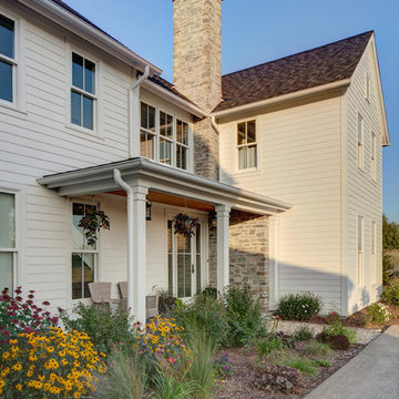
Mid-sized cottage white two-story concrete fiberboard exterior home idea in Milwaukee
Mid-sized cottage white two-story concrete fiberboard exterior home idea in Milwaukee
 Mattson & Company
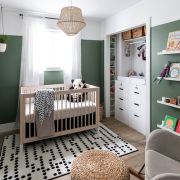
This nursery was a low-budget, DIY job. The idea was to create a space that both baby and momma could be comfortable in, and enjoy spending a lot of hours in (particularly in the first few months!). The theme started as "sophisticated gender neutral with subtle elements of whimsy and nature" - and I think we achieved that! The space was only 8' x 10', so storage solutions were key. The closet drawers and side table were both (very worn) antique pieces that were given a new life!

 Davetta Moore Designs
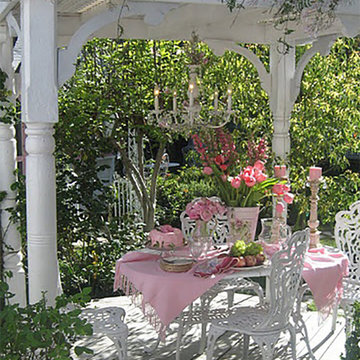
For those of you that love Spring like me I think it's time to get busy and decorate your table for Easter, plan a Garden Party or just invite someone you love over for a simple little tea party. Have fun and let's get this party started.
Join periodic email updates http://bit.ly/1EL0wWY
Interior Design for the way you live your life now. If I can be of help to you or someone you know, please email or call 704.699.0668. I would be happy to help you!
Connect at
Google Plus https://plus.google.com/+DavettaMooreDesignsConcord/posts
Facebook https://www.facebook.com/davettamooredesigns
Pinterest https://www.pinterest.com/davettamoore/
Twitter https://twitter.com/davettamoore
Image credit: http://wwwcindyellisartcom.blogspot.com.es/search?updated-max=2010-09-25T01:09:00-07:00&max-results=100

 Steve Masley Consulting and Design
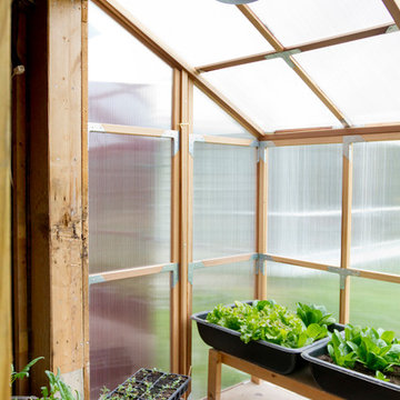
The "secret ingredient" in organic container gardens: worm castings with live worms. Red compost worms convert organic nutrients in potting soils into plant-available form, and the last chamber of the worm gut is loaded with beneficial bacteria and fungi that boost plant immunity, cycle nutrients, and increase the water-holding capacity of the potting soil. Photo by Steve Masley.
 Emilia Decor
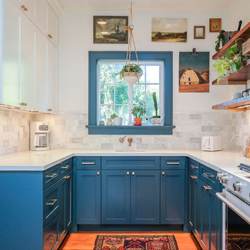
Kitchen - transitional u-shaped light wood floor kitchen idea in Portland with shaker cabinets, blue cabinets, quartzite countertops, porcelain backsplash and a peninsula
Sponsored
Sunbury, OH

J.Holderby - Renovations
Franklin County's Leading General Contractors - 2X Best of Houzz!
 Advance Design Studio, Ltd.
Jennifer and Dan have lived in their Deer Park Illinois home for 15 years, slowly making minor fixes like painting and decorating; but they had a new plan for their kitchen the entire time. An awkwardly placed garage door, and an island cooktop with a terrible downdraft made a full-scale kitchen remodel an absolute must. Jennifer had many ideas in mind and wanted to work with a company that could provide high-end work, while partnering with a designer that would tailor the kitchen to her ideas.
She was intrigued by the phrase “Common Sense Remodeling” in Advance Design’s feature she discovered while perusing an issue of the community’s Quintessential Barrington Magazine. Doing further research on the company’s website, as she looked through project profiles and read about Advance Design’s “Common Sense Remodeling” philosophy, she promptly scheduled an appointment to see if the people and ideas she read about were truly who they said they were. The more she read, the more she knew that the “Common Sense” approach to remodeling they described was exactly the type of company she was looking for.
The partnership was sealed after an initial consultation with Owner Todd Jurs and Project Designer Michelle Lecinski. They displayed a combination of friendliness, professionalism and respect that was unmatched by any of the other companies Jennifer talked to. She knew that with Advance Design, she would be able to retain the vision that she had in mind with high-quality craftsmanship.
“I reached out to Advance Design because of the ‘Common Sense Remodeling’ tagline,” Jennifer said. “That’s what lingered for me”. “Advance Design was the most respectful- of the house and of my design ideas, and the most professional of the handful of companies that looked at my project”.
Soon after the meeting Jennifer began working with Michelle on the project design. They quickly developed chemistry. Jennifer loved how Michelle researched and located every detail that Jennifer wanted for the kitchen. Between the two of them, every concept and idea was worked through and perfected. “Jennifer had definite ideas about what she wanted the new kitchen to look like, she just didn’t know how to bring it all together. We worked together really well to make her ideas into the practical reality necessary for a well-functioning kitchen, with the look and feel that she had envisioned”, says Michelle.
“Michelle was wonderful in using the CAD system she would show me new drawings every time we changed the layout while working through the design,” Jennifer said. “She was a really wonderful partner in execution, she made sure everything happened quickly and easily.”
The finished design drew out elements of Jennifer’s style and personality. The pair call the look “sophisticated farmhouse” to describe the kitchen renovation to family and friends. The result was a beautifully crafted, authentic-feeling space that satisfied Jennifer’s dreams 15 years in the making. The whole project consisted of a kitchen remodel, mudroom upgrade with powder room, and garage entry relocation. “The projects I personally like the best, are the ones that put the client’s dreams on display,” Project Designer Michelle said. “And this is one of those projects.”
The main focal point of the kitchen is custom zinc and brass ventilation hood with a vintage sheen, which was hand made to order by a small company in Indiana named Vogler Metalworking. “It’s like sculpture, a true work of art”, says Jennifer. Your eye is immediately drawn towards this elegant yet practical hood that eliminated the home’s downdraft problem and added a striking conversation piece at the same time. The carpenters had to use special gloves when transporting and installing it, so they didn’t smudge it with fingerprints. The beautiful hood centers proudly over the stunning black enamel and brass LaCornue Range. “I had a friend who had a LaCornue range and after learning how easy it was to cook perfect meals, I was convinced I wanted to have one”, says Jennifer. This unique, breathtaking combination anchors the entire kitchen and is apparent immediately as you walk into the great room the surrounds the space.
DuraSupreme Crestwood cabinets with a Kendall Panel add function and sophistication. A custom gray paint color paired with a storm blue was developed so that the new kitchen looked like it belonged to the existing space. Unlacquered brass faucets and hardware were important to Jennifer because she wanted the living finishes to age over time. Remarkable brass diamond mesh cabinet door inserts imported from the UK continue to add this one-of-a-kind kitchen renovation; giving it a “you won’t see this everywhere” quality. The use of old railcar flooring for the coffee bar countertop and reclaimed oak for the open shelving gives an authenticity to the space uncommon in kitchens today.
Jennifer and Michelle fell in love with the Limestone Grey Stone while they were investigating unique island countertop ideas. They liked the fact that the limestone as a living finish will age and change over time. Calcutta Miel Quartz countertops made for an excellent pairing around the perimeter, as it’s durable and perfect for cooking preparations. A textured white subway tile backsplash that runs to the ceiling keeps your eye moving towards the open shelving, and to the main focal point of the stunning range hood combination.
“The kitchen functions beautifully, and it’s gorgeous,” beams Jennifer as she gestures with both hands while smiling ear to ear. “The most important thing was I wanted a kitchen that had a wonderful flow, cooked beautiful meals and was a great gathering place for family and friends, and this space does that perfectly! Beauty wise, it turned out exactly how I had envisioned. I felt the function part was the hardest part, and that was nailed”!
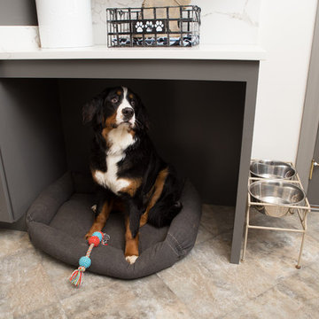
Relocating the garage entry to the new mudroom was a huge priority and has finally separated the family’s arriving home functions from their kitchen. Now coats and shoes and bags have their own area for dropping once members arrive home. Matching gray DuraSupreme cabinetry helped create gorgeous, purposeful lockers for the family. A reclaimed vintage sink and custom wall paper were added to the tiny powder room to beautify the once previously only functional space. Advance Design was even able to create a custom space for their dog to sleep while the family is away.
“It was unbelievable that a project of this size was completed in such a short time, and I think that’s because of the large amount of planning and preparation that went into it,” Jennifer marveled, “When we started, we were ready, and everything was prepared”.
When it came to execution, Project Manager Justin Davis and his crew were quick, accessible, and organized. Projects like this kitchen are typically completed in as little as 8-10 weeks. Jennifer’s kitchen however despite the relocation of some challenging HVAC in a soffit and moving of an exterior door was completed remarkably fast in part because the team was working with an existing tile floor that ran throughout the first floor that the client really loved.
“You get to know these people really well because they’re living in your house while you’re living in your house. They were so fast and really good, it didn’t take as long as even planned” reported Jennifer. “I would text Justin and he always responded almost immediately. I got to know all the guys who were working in our house and they were all wonderful people”.
Details in a customized kitchen like this one require skill and care from the people who install it. “All the guys on the job were skilled at what the did. I wanted small details like little feet to look like furniture, that is where their carpentry skill came in to make these all perfect”, said Jennifer. “The tile guys were wonderful. They even let me determine how I wanted the texture with the grout to appear for a salt and pepper look; now that is a very skilled trade person making it custom”.
In Jennifer’s interview, she continued to reference Advance Design’s “Common Sense Remodeling”, so I took a minute to ask her exactly what that phrase meant to her and how it played out in her experience with her project and the Advance Design team. Here is what she said: “I was intrigued about Common Sense Remodeling and in my head that there would be clear costs and prices, great communication between the design team, the execution team and me”, said Jennifer. They did deliver on that, it was so clear about the cost breakdown, what I could expect from everyone who came to my house, and everything that we had ordered. That to me is the Common Sense”!
It’s great to see a client take literally our assertion that a well-planned remodeling project is simply “Common Sense”! She anticipated each step of the way would be clear, concise, and predictable, all the while protecting the outcome due to the careful upfront planning. “Advance Design delivered on their ‘Common Sense Remodeling’ promise,” Jennifer said. “From the design team, to the execution team - everything was straight forward like I imagined. The project turned out exactly how I envisioned, I enjoyed this process and absolutely would recommend Advance Design Studio to anyone.”
 Lauren Maroney for Ethan Allen Sterling, VA
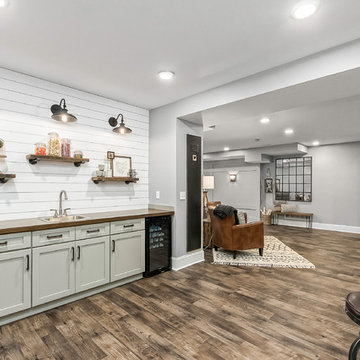
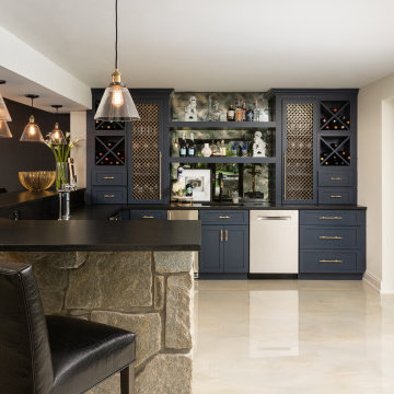
Chic. Moody. Sexy. These are just a few of the words that come to mind when I think about the W Hotel in downtown Bellevue, WA. When my client came to me with this as inspiration for her Basement makeover, I couldn’t wait to get started on the transformation. Everything from the poured concrete floors to mimic Carrera marble, to the remodeled bar area, and the custom designed billiard table to match the custom furnishings is just so luxe! Tourmaline velvet, embossed leather, and lacquered walls adds texture and depth to this multi-functional living space.
 TKS Design Group
Free ebook, CREATING THE IDEAL KITCHEN
Download now → http://bit.ly/idealkitchen
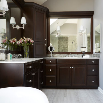
The homeowners came to us with the desire to update their master bathroom into a more spa-like retreat that was also more functional for their daily needs. The existing space was large with a vaulted ceiling, lots of natural light and an existing private water closet. So the bones of the space were great and the room just needed a few tweaks.
We started by relocating the cramped shower that shared the water closet room, to the existing tub location. The giant whirlpool tub took up more than its share of real estate in the room, and the beautiful new shower, which gets used daily, now sits in its spot. The new shower features beautiful lass tile accents as well as a bench seat and frameless shower door.
The new tub is freestanding and sits in front of an updated slightly smaller window, providing a sculptural focal point upon entry to the room. There was still plenty of room for two large vanities, and a corner storage cabinet and appliance garage that hides small bathroom necessities.
The water closet remains in its own private room and the area that once housed the shower, is now an additional closet for the master bedroom. The room is a pallet of soft grays and whites with the cherry vanities adding some warmth. Polished chrome and glass accents bring some sparkle to the space.
Designed by: Susan Klimala, CKD, CBD
Photography by: Mike Kaskel
For more information on kitchen and bath design ideas go to: www.kitchenstudio-ge.com
 Tammara Stroud Design
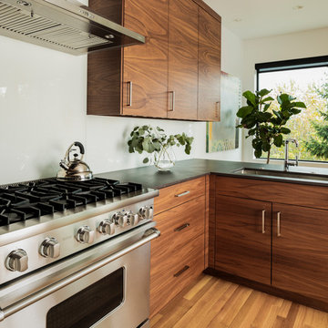
In 1949, one of mid-century modern’s most famous NW architects, Paul Hayden Kirk, built this early “glass house” in Hawthorne Hills. Rather than flattening the rolling hills of the Northwest to accommodate his structures, Kirk sought to make the least impact possible on the building site by making use of it natural landscape. When we started this project, our goal was to pay attention to the original architecture--as well as designing the home around the client’s eclectic art collection and African artifacts. The home was completely gutted, since most of the home is glass, hardly any exterior walls remained. We kept the basic footprint of the home the same—opening the space between the kitchen and living room. The horizontal grain matched walnut cabinets creates a natural continuous movement. The sleek lines of the Fleetwood windows surrounding the home allow for the landscape and interior to seamlessly intertwine. In our effort to preserve as much of the design as possible, the original fireplace remains in the home and we made sure to work with the natural lines originally designed by Kirk.

 Rockwood Kitchens
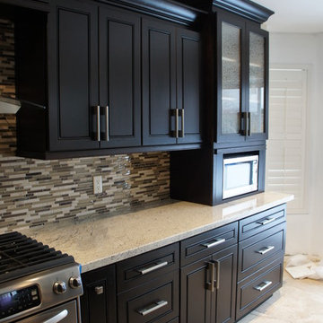
Inspiration for a mid-sized contemporary l-shaped ceramic tile eat-in kitchen remodel in Toronto with an undermount sink, raised-panel cabinets, dark wood cabinets, granite countertops, beige backsplash, glass sheet backsplash, stainless steel appliances and an island
 LMB Interiors
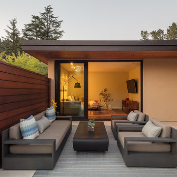
Outdoor patio: Rug by Dash and Albert
Photo by Eric Rorer
While we adore all of our clients and the beautiful structures which we help fill and adorn, like a parent adores all of their children, this recent mid-century modern interior design project was a particular delight.
This client, a smart, energetic, creative, happy person, a man who, in-person, presents as refined and understated — he wanted color. Lots of color. When we introduced some color, he wanted even more color: Bright pops; lively art.
In fact, it started with the art.
This new homeowner was shopping at SLATE ( https://slateart.net) for art one day… many people choose art as the finishing touches to an interior design project, however this man had not yet hired a designer.
He mentioned his predicament to SLATE principal partner (and our dear partner in art sourcing) Danielle Fox, and she promptly referred him to us.
At the time that we began our work, the client and his architect, Jack Backus, had finished up a massive remodel, a thoughtful and thorough update of the elegant, iconic mid-century structure (originally designed by Ratcliff & Ratcliff) for modern 21st-century living.
And when we say, “the client and his architect” — we mean it. In his professional life, our client owns a metal fabrication company; given his skills and knowledge of engineering, build, and production, he elected to act as contractor on the project.
His eye for metal and form made its way into some of our furniture selections, in particular the coffee table in the living room, fabricated and sold locally by Turtle and Hare.
Color for miles: One of our favorite aspects of the project was the long hallway. By choosing to put nothing on the walls, and adorning the length of floor with an amazing, vibrant, patterned rug, we created a perfect venue. The rug stands out, drawing attention to the art on the floor.
In fact, the rugs in each room were as thoughtfully selected for color and design as the art on the walls. In total, on this project, we designed and decorated the living room, family room, master bedroom, and back patio. (Visit www.lmbinteriors.com to view the complete portfolio of images.)
While my design firm is known for our work with traditional and transitional architecture, and we love those projects, I think it is clear from this project that Modern is also our cup of tea.
If you have a Modern house and are thinking about how to make it more vibrantly YOU, contact us for a consultation.
 KitchenLab Interiors
KitchenLab Interiors’ first, entirely new construction project in collaboration with GTH architects who designed the residence. KLI was responsible for all interior finishes, fixtures, furnishings, and design including the stairs, casework, interior doors, moldings and millwork. KLI also worked with the client on selecting the roof, exterior stucco and paint colors, stone, windows, and doors. The homeowners had purchased the existing home on a lakefront lot of the Valley Lo community in Glenview, thinking that it would be a gut renovation, but when they discovered a host of issues including mold, they decided to tear it down and start from scratch. The minute you look out the living room windows, you feel as though you're on a lakeside vacation in Wisconsin or Michigan. We wanted to help the homeowners achieve this feeling throughout the house - merging the causal vibe of a vacation home with the elegance desired for a primary residence. This project is unique and personal in many ways - Rebekah and the homeowner, Lorie, had grown up together in a small suburb of Columbus, Ohio. Lorie had been Rebekah's babysitter and was like an older sister growing up. They were both heavily influenced by the style of the late 70's and early 80's boho/hippy meets disco and 80's glam, and both credit their moms for an early interest in anything related to art, design, and style. One of the biggest challenges of doing a new construction project is that it takes so much longer to plan and execute and by the time tile and lighting is installed, you might be bored by the selections of feel like you've seen them everywhere already. “I really tried to pull myself, our team and the client away from the echo-chamber of Pinterest and Instagram. We fell in love with counter stools 3 years ago that I couldn't bring myself to pull the trigger on, thank god, because then they started showing up literally everywhere", Rebekah recalls. Lots of one of a kind vintage rugs and furnishings make the home feel less brand-spanking new. The best projects come from a team slightly outside their comfort zone. One of the funniest things Lorie says to Rebekah, "I gave you everything you wanted", which is pretty hilarious coming from a client to a designer.
67