
Search results for "Start thinking" in Home Design Ideas
 Valentini Kids Furniture Brooklyn NY
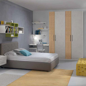
Modern Kids Bedroom Set WEB-76 by SPAR
Made in Italy by Spar
WEB Junior by Spar is an Italian kids bedroom furniture collection that is remarkable for its innovative modern solutions that help not only safe so valuable space, but get maximum out of every inch of your kids room. Modern technologies, brilliant design and outstanding quality are met within this collection, giving you endless opportunities for color and size customization, so you could realize all your individuality and meet all the requirements. WEB Bedroom line by Spar thinks about you and your lovely kids, or teenagers, providing designer bedroom solutions for all occasions, making your child's room awesome for everything: sleeping, studying and playing. WEB Junior Bedroom Furniture collection is here to realize all your biggest dreams and take care of your kids!
All the pieces can be mixed & matched from one set to another and are available in a variety of sizes and colors. Please contact our office regarding customization of this kids bedroom set.
The starting price is for the "As Shown" kids bedroom set WEB 76 that includes the following items:
1 Storage Twin Size Bed (fits US standard Twin Size mattress 39" x 75")
1 Desk with file cabinet
1 Chair
3 Wall Shelves
1 Hanging 2-Drawer Nightstand
5 Complementing Hanging Bookcases
4 Complementing Hanging Bookcase Corners
2 Horizontal Hanging Bookcases
1 Wardrobe (4 Doors)
Please Note: Room/Bed decorative accessories and the mattress are not included in the price.
MATERIAL/CONSTRUCTION:
E1-Class ecological panels, which are produced exclusively trough a wood recycling production process
Used lacquers conform to the norm 71/3 (toys directive)
Structure: 18 mm thick melamine-coated particle board
Shelves: 25mm thick melamine-coated particle board
Back panels: medium density coated fibreboard 5mm thick
Doors: 18 mm thick melamine-coated particle board finished on 4 sides
Hardware: metal runners with self-closing system and double stop; adjustable self closing hinges; quick-mount and braking systems
Dimensions:
Twin Size Storage Bed: W43.7" x D82.7." x H39.4" (internal 39" x 75" US Standard)
Full Size Storage Bed: W58.7" x D82.7" x H39.4" (internal 54" x 75" US Standard)
Desk: W47.2" x D25.6" x H30"
Hanging 2-Drawer Nightstand: W19.2" x D13.8" x H14"
Complementing Hanging Bookcase: W11.8" x D10" x H11.8"
Complementing Hanging Bookcase Corner: W5.2" x D10" x H5.2"
Wall Shelf: W53.2" x D10" x H1"
Horizontal Hanging Bookcase Unit: W23.6" x D11.5" x H11.8"
4-Door Wardrobe: W71.8" x D23.6" x H89.8" or H102.4"


Find the right local pro for your project

 Merit In Home
Castaway Cabinets
Steve Bracci
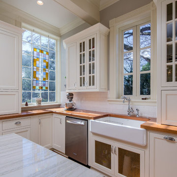
Large elegant u-shaped medium tone wood floor eat-in kitchen photo in Atlanta with a farmhouse sink, white cabinets, white backsplash, stainless steel appliances, an island, shaker cabinets, wood countertops and subway tile backsplash
Large elegant u-shaped medium tone wood floor eat-in kitchen photo in Atlanta with a farmhouse sink, white cabinets, white backsplash, stainless steel appliances, an island, shaker cabinets, wood countertops and subway tile backsplash

 Mariane Wheatley-Miller
Wild flower meadow next to the lake and apple orchards showcasing Upstate New York apple production. Some areas mowed for entertaining and tents.
Inspiration for a huge rustic drought-tolerant and partial sun front yard stone vegetable garden landscape in New York for spring.
Inspiration for a huge rustic drought-tolerant and partial sun front yard stone vegetable garden landscape in New York for spring.
 TKS Design Group
Download our free ebook, Creating the Ideal Kitchen. DOWNLOAD NOW
Lakefront property in the northwest suburbs of Chicago is hard to come by, so when we were hired by this young family with exactly that, we were immediately inspired by not just the unusually large footprint of this 1950’s colonial revival but also the lovely views of the manmade lake it was sited on. The large 5-bedroom home was solidly stuck in the 1980’s, but we saw tons of potential. We started out by updating the existing staircase with a fresh coat of paint and adding new herringbone slate to the entry hall.
The powder room off the entryway also got a refresh - new flooring, new cabinets and fixtures. We ran the new slate right through into this space for some consistency. A fun wallpaper and shiplap trim add a welcoming feel and set the tone for the home.
Next, we tackled the kitchen. Located away from the rest of the first floor, the kitchen felt a little isolated, so we immediately began planning for how to better connect it to the rest of the first floor. We landed on removing the wall between the kitchen and dining room and designed a modified galley style space with separate cooking and clean up zones. The cooking zone consists of the refrigerator, prep sink and cooktop, along with a nice long run of prep space at the island. The cleanup side of the kitchen consists of the main sink and dishwasher. Both areas are situated so that the user can view the lake during prep work and cleanup!
One of the home’s main puzzles was how to incorporate the mudroom and area in front of the patio doors at the back of the house. We already had a breakfast table area, so the space by the patio doors was a bit of a no man’s land. We decided to separate the kitchen proper from what became the new mudroom with a large set of barn doors. That way you can quickly hide any mudroom messes but have easy access to the light coming in through the patio doors as well as the outdoor grilling station. We also love the impact the barn doors add to the overall space.
The homeowners’ first words to us were “it’s time to ditch the brown,” so we did! We chose a lovely blue pallet that reflects the home’s location on the lake which is also vibrant yet easy on the eye. Countertops are white quartz, and the natural oak floor works well with the other honey accents. The breakfast table was given a refresh with new chairs, chandelier and window treatments that frame the gorgeous views of the lake out the back.
We coordinated the slate mudroom flooring with that used in the home’s main entrance for a consistent feel. The storage area consists of open and closed storage to allow for some clutter control as needed.
Next on our “to do” list was revamping the dated brown bar area in the neighboring dining room. We eliminated the clutter by adding some closed cabinets and did some easy updates to help the space feel more current. One snag we ran into here was the discovery of a beam above the existing open shelving that had to be modified with a smaller structural beam to allow for our new design to work. This was an unexpected surprise, but in the end we think it was well worth it!
We kept the colors here a bit more muted to blend with the homeowner’s existing furnishings. Open shelving and polished nickel hardware add some simple detail to the new entertainment zone which also looks out onto the lake!
Next we tackled the upstairs starting with the homeowner’s son’s bath. The bath originally had both a tub shower and a separate shower, so we decided to swap out the shower for a new laundry area. This freed up some space downstairs in what used to be the mudroom/laundry room and is much more convenient for daily laundry needs.
We continued the blue palette here with navy cabinetry and the navy tile in the shower. Porcelain floor tile and chrome fixtures keep maintenance to a minimum while matte black mirrors and lighting add some depth the design. A low maintenance runner adds some warmth underfoot and ties the whole space together.
We added a pocket door to the bathroom to minimize interference with the door swings. The left door of the laundry closet is on a 180 degree hinge to allow for easy full access to the machines. Next we tackled the master bath which is an en suite arrangement. The original was typical of the 1980’s with the vanity outside of the bathroom, situated near the master closet. And the brown theme continued here with multiple shades of brown.
Our first move was to segment off the bath and the closet from the master bedroom. We created a short hall from the bedroom to the bathroom with his and hers walk-in closets on the left and right as well as a separate toilet closet outside of the main bathroom for privacy and flexibility.
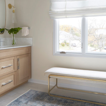
The original bathroom had a giant soaking tub with steps (dangerous!) as well as a small shower that did not work well for our homeowner who is 6’3”. With other bathtubs in the home, they decided to eliminate the tub and create an oversized shower which takes up the space where the old tub was located. The double vanity is on the opposite wall and a bench is located under the window for morning conversations and a place to set a couple of towels.
The pallet in here is light and airy with a mix of blond wood, creamy porcelain and marble tile, and brass accents. A simple roman shade adds some texture and it’s top-down mechanism allows for light and privacy.
This large whole house remodel gave our homeowners not only the ability to maximize the potential of their home but also created a lovely new frame from which to view their fabulous lake views.
Designed by: Susan Klimala, CKD, CBD
Photography by: Michael Kaskel
For more information on kitchen and bath design ideas go to: www.kitchenstudio-ge.com


 Door Architects LLC
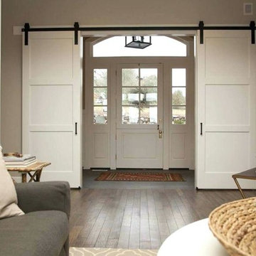
Our barn doors are a perfect choice for those looking to add unique details to their home. All barn doors by Door Architects are custom designed and handmade with precise craftsmanship to perfectly suit your space. Whether you choose a modern look or a rustic one, our team will consult, measure, design, build and install your one-of-a-kind door!
Door Architects’ sliding barn doors are not only works of art, but they are incredibly practical. Our stylish doors offer a great way to increase usable space in a room and are exceptionally durable!
Take a look at some of our design options for inspiration to start creating your custom barn door...
http://doorarchitects.com/sliding-barn-door/
 Swanson Homes
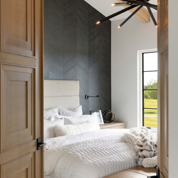
Waking up to vaulted ceilings, reclaimed beams, and natural lighting is our builder's prescription to a morning that starts on the right note! Add a few extraordinary design details like this modern chandelier and a bold accent wall and you may think you are still dreaming...

 Marty Rhein, CKD, CBD - BAC Design Group
Williamson Photography
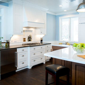
Example of a mid-sized beach style u-shaped dark wood floor eat-in kitchen design in Other with an undermount sink, recessed-panel cabinets, white cabinets, granite countertops, white backsplash, subway tile backsplash, stainless steel appliances and an island
Example of a mid-sized beach style u-shaped dark wood floor eat-in kitchen design in Other with an undermount sink, recessed-panel cabinets, white cabinets, granite countertops, white backsplash, subway tile backsplash, stainless steel appliances and an island

 Square Footage Inc.
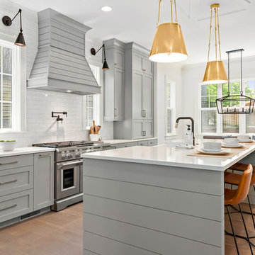
Example of a large transitional u-shaped medium tone wood floor and brown floor eat-in kitchen design in Toronto with a farmhouse sink, shaker cabinets, blue cabinets, quartz countertops, white backsplash, stainless steel appliances, an island and white countertops
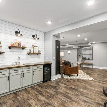
Sponsored
Sunbury, OH

J.Holderby - Renovations
Franklin County's Leading General Contractors - 2X Best of Houzz!
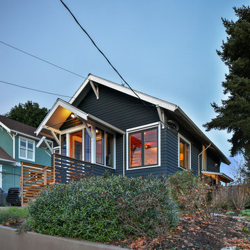
 Studio Zerbey Architecture + Interiors
Photo Credit: Studio Zerbey
Example of a minimalist exterior home design in Seattle
Example of a minimalist exterior home design in Seattle
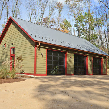
 John Gehri Zerrer
Studio / workshop shed - large cottage detached studio / workshop shed idea in New York
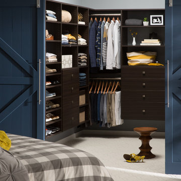
 EasyClosets
Give your home a boost of elegance with a custom walk-in closet, featured here in French Roast. Choose your own combination of hanging rods, open shelves, and drawers to accommodate all of your clothes and accessories so you can start and end each day organized.
 Comerio Homes
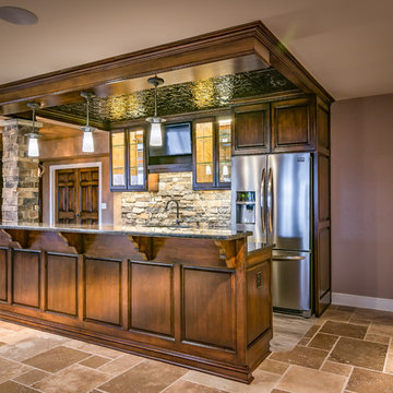
This basement finish was already finished when we started. The owners decided they wanted an entire face lift with a more in style look. We removed all the previous finishes and basically started over adding ceiling details and an additional workout room. Complete with a home theater, wine tasting area and game room.


 KitchenLab Interiors
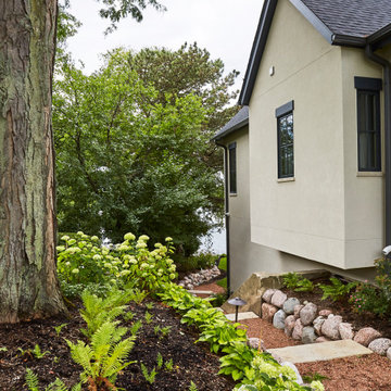
KitchenLab Interiors’ first, entirely new construction project in collaboration with GTH architects who designed the residence. KLI was responsible for all interior finishes, fixtures, furnishings, and design including the stairs, casework, interior doors, moldings and millwork. KLI also worked with the client on selecting the roof, exterior stucco and paint colors, stone, windows, and doors. The homeowners had purchased the existing home on a lakefront lot of the Valley Lo community in Glenview, thinking that it would be a gut renovation, but when they discovered a host of issues including mold, they decided to tear it down and start from scratch. The minute you look out the living room windows, you feel as though you're on a lakeside vacation in Wisconsin or Michigan. We wanted to help the homeowners achieve this feeling throughout the house - merging the causal vibe of a vacation home with the elegance desired for a primary residence. This project is unique and personal in many ways - Rebekah and the homeowner, Lorie, had grown up together in a small suburb of Columbus, Ohio. Lorie had been Rebekah's babysitter and was like an older sister growing up. They were both heavily influenced by the style of the late 70's and early 80's boho/hippy meets disco and 80's glam, and both credit their moms for an early interest in anything related to art, design, and style. One of the biggest challenges of doing a new construction project is that it takes so much longer to plan and execute and by the time tile and lighting is installed, you might be bored by the selections of feel like you've seen them everywhere already. “I really tried to pull myself, our team and the client away from the echo-chamber of Pinterest and Instagram. We fell in love with counter stools 3 years ago that I couldn't bring myself to pull the trigger on, thank god, because then they started showing up literally everywhere", Rebekah recalls. Lots of one of a kind vintage rugs and furnishings make the home feel less brand-spanking new. The best projects come from a team slightly outside their comfort zone. One of the funniest things Lorie says to Rebekah, "I gave you everything you wanted", which is pretty hilarious coming from a client to a designer.
 Susan Yeley Homes
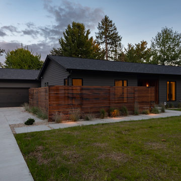
This gem of a house was built in the 1950s, when its neighborhood undoubtedly felt remote. The university footprint has expanded in the 70 years since, however, and today this home sits on prime real estate—easy biking and reasonable walking distance to campus.
When it went up for sale in 2017, it was largely unaltered. Our clients purchased it to renovate and resell, and while we all knew we'd need to add square footage to make it profitable, we also wanted to respect the neighborhood and the house’s own history. Swedes have a word that means “just the right amount”: lagom. It is a guiding philosophy for us at SYH, and especially applied in this renovation. Part of the soul of this house was about living in just the right amount of space. Super sizing wasn’t a thing in 1950s America. So, the solution emerged: keep the original rectangle, but add an L off the back.
With no owner to design with and for, SYH created a layout to appeal to the masses. All public spaces are the back of the home--the new addition that extends into the property’s expansive backyard. A den and four smallish bedrooms are atypically located in the front of the house, in the original 1500 square feet. Lagom is behind that choice: conserve space in the rooms where you spend most of your time with your eyes shut. Put money and square footage toward the spaces in which you mostly have your eyes open.
In the studio, we started calling this project the Mullet Ranch—business up front, party in the back. The front has a sleek but quiet effect, mimicking its original low-profile architecture street-side. It’s very Hoosier of us to keep appearances modest, we think. But get around to the back, and surprise! lofted ceilings and walls of windows. Gorgeous.
 Pillar 3 Design Group
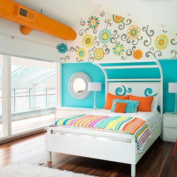
Interior by Pillar 3 Design
Mural by Pillar 3 Design
Custom bed by Pillar 3 Design and Garrett Stovall
Photo by Brian Wilson
Inspiration for a coastal kids' room remodel in Other
Inspiration for a coastal kids' room remodel in Other
66