
Search results for "Start thinking" in Home Design Ideas
 Valentini Kids Furniture Brooklyn NY
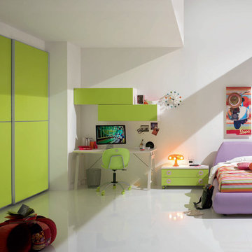
Italian Kids Bedroom Set WEB-16 by SPAR
Made in Italy by Spar
WEB Junior by Spar is an Italian kids bedroom furniture collection that is remarkable for its innovative modern solutions that help not only safe so valuable space, but get maximum out of every inch of your kids room. Modern technologies, brilliant design and outstanding quality are met within this collection, giving you endless opportunities for color and size customization, so you could realize all your individuality and meet all the requirements. WEB Bedroom line by Spar thinks about you and your lovely kids, or teenagers, providing designer bedroom solutions for all occasions, making your child's room awesome for everything: sleeping, studying and playing. WEB Junior Bedroom Furniture collection is here to realize all your biggest dreams and take care of your kids!
All the pieces can be mixed & matched from one set to another and are available in a variety of sizes and colors. Please contact our office regarding customization of this kids bedroom set.
The starting price is for the "As Shown" kids bedroom set WEB 16 that includes the following items:
1 Twin Size Upholstered Bed (bed fits US standard Twin size mattress 39" x 75")
1 2-Drawer Nightstand (on wheels)
1 Desk
2 Horizontal Hanging Door-Units W45.7"
1 Sliding Door Wardrobe (2 Doors)
Please Note: Room/Bed decorative accessories and the mattress are not included in the price.
MATERIAL/CONSTRUCTION:
E1-Class ecological panels, which are produced exclusively trough a wood recycling production process
Used lacquers conform to the norm 71/3 (toys directive)
Structure: 18 mm thick melamine-coated particle board
Shelves: 25mm thick melamine-coated particle board
Back panels: medium density coated fibreboard 5mm thick
Doors: 18 mm thick melamine-coated particle board finished on 4 sides
Hardware: metal runners with self-closing system and double stop; adjustable self closing hinges; quick-mount and braking systems
Dimensions:
Twin Size Bed: W49" x D91.3" x H35.4" (internal 39" x 75" US Standard)
Full Size Bed: W64" x D91.3" x H35.4" (internal 54" x 75" US Standard)
Nightstand: W35.6" x D16.5" x H17"
Desk: W59" x D25.6" x H30"
Horizontal Hanging Door-Unit: W45.7" x D13.7" x H12.7"
Sliding Door Wardrobe: W92" x D23.6" x H89.8" or H102.4"
 San Luis Kitchen Co.
So to begin, we start with an existing kitchen that is outdated and just too neutral for the homeowners. They wanted unity and drama in their space, not mundane confusion! Mismatched appliances – white refrigerator, stainless range, black dishwasher – give a disjointed and unplanned vibe to the room and are crammed together in less than half of the available kitchen space. The beautiful wood floor extends throughout the house, but in the kitchen it falls flat – as the medium gold cabinets and almond tile counters provide no contrast and no interest.
A bank of floor to ceiling cabinets separates the dining area from the kitchen, confining the space in both rooms. Note the massive blank end of the cabinets – in desperation to reduce the scale of this monolith, the homeowners decorated it with a clock and small nick-knacks, but it didn’t help. This is not a welcoming entrance to the kitchen. On the dining side, there is a hutch (with mirrored back), which ostensibly could serve as a buffet, however it is inconvenient to the prep area of the kitchen as it is tucked behind the tall pantry cabinets. And on the opposite wall is a separate wet bar which could serve more conveniently with a more unified kitchen and dining space.
You would think that the large pantry cabinets would be a plus in a kitchen, however their placement and the deep fixed shelves belie any positive contribution.
The looming wall of cabinetry confines the space and is a claustrophobe’s nightmare. Then note the clutter and chaos of storing small food items (normally most of your daily supplies don’t come in giant bulk quantities and sizes) on deep fixed shelves. Nothing really fits and canned goods become lost behind cereal boxes while baking supplies are piled on top of the snacks!
The decision to remodel – the lady of the house wanted her kitchen to reflect the couples’ modern lifestyle. They are passionate people who love to entertain their friends and family – they need an open and accessible space that is both dramatic in bearing and easy to use on a daily basis.
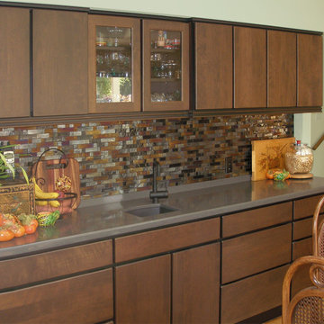
San Luis Kitchen began design by helping the homeowners choose a style and color scheme for their kitchen. The decision was made – a slab style cabinet door in a “Dark Lager” stain on maple wood. Because the homeowners did not want handles on their cabinets, we used a face frame cabinet construction to allow for “finger-pull” opening of the doors and drawers. The face frame is colored black as a contrast to the doors for a bold finish. Dark gray engineered-quartz counters and full height backsplash complete the picture.
Kitchen layout and design is next. The sink remains at the corner window with the dishwasher moved to the left wall – giving space for a 36” range-top and dramatic 42” rectilinear hood. The refrigerator remains in place but is replaced with a black model. The cabinet above it is now 24” deep for a custom look and a built-in microwave/oven combo are placed to the right. Simple-line contemporary trim and uniform black and stainless modern appliances reinforce the linear aesthetic created by the doorstyle and face frame detailing.
In place of the pantry, San Luis Kitchen designed a true buffet – accessible from both kitchen and dining sides. The storage needs are met by upper cabinets, base corner swing-out shelves and drawers, and a tall (adjustable) roll-out shelf unit on the dining side. We added an end wall (with niches) and extended the cabinetry and counter beyond as a welcome to the kitchen. In the dining room glass doors for display items grace the buffet. The wet bar is now visually and functionally joined to the kitchen – matching cabinetry and the more open overall plan tie everything together as a whole.
Now in their new kitchen, the homeowners can prepare, serve, and enjoy a meal with their guests. The mosaic glass backsplash used at the bar adds pizzazz for fun gatherings and an evening’s entertainment.
Wood-Mode Fine Custom Cabinetry: Brookhaven's Fairfield
 Inspired Remodels
This bright and stylish remodel in Aliso Viejo blends modern coastal aesthetics with clean, functional design for everyday living.
The kitchen boasts a timeless white-on-white palette featuring Shaker-style cabinetry, brushed brass hardware, and sleek stainless steel appliances. Warm wide-plan luxury vinyl flooring grounds the space, adding a layer of organic texture.
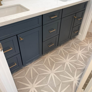
In the bathroom, bold navy Shaker-style cabinetry add a rich pop or color, balanced by white quartz countertops and statement brushed brass fixtures. The space is elevated by graphic encaustic-style tile floor, reflecting a rising trend in patterned cement-look tiles that bring subtle movement and artistry to otherwise clean spaces.
The overall result is a light, airy, and approachable design that feel fresh, function and forward thinking - perfect suited for modern Southern California living.
Ready to bring the same feel to your home? Contact Inspired Remodels today to get started with your renovation!.
Find the right local pro for your project
 Revival by Design
We just love it when a client comes to us and says “I’ve come to you because I want something different, I don’t want a standard bathroom companies design and layout.” For us this is brilliant, because it means we have some creative freedom to design something special.
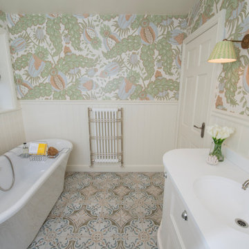
Having worked with this client before, we knew she liked pattern and colour, specifically William Morris. Keen not to overdo it on William Morris print we considered other designs that might be of a similar look and feel, so we used Lewis and Wood for the powder room and Christopher Farr for the family bathroom, both wonderful wallpapers that offer more of a mural feel.
With the powder room we considered the adjoining rooms, the rural location and also the size of the space. When it comes to small spaces I think more really is more, so we went for it, we know our client loved green and also the London Basin Company, so those were our starting points.
The family bathroom, located in a completely different part of the house, has a more serene feel, although still embraces pattern and colour. The Christopher Farr wallpaper was finished in decorators varnish to ensure a good moisture barrier and the baked tile company tiles continue the muted colour palette.
Our client tells us that they have received lots of complements already :)
 Pierre Jean-Baptiste Interiors
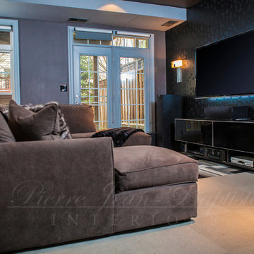
This media room started off as a plain empty beige room off of the garage. We added new carpet tile, wallpaper, paint, furniture, blackout shades, bar at the rear, and audio video equipment. We completely remodeled the fireplace and added new “Black Galaxy” granite to match the new bars countertop. New light fixtures and wall sconces brighten this dark media room when required. What do you think? pierreji.com

 Classic Kitchens Designs & Renovations Ltd.
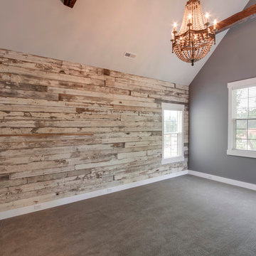
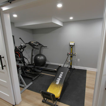
✨ From Dark & Unfinished to the Ultimate Hangout Spot! ✨
We are absolutely thrilled to share the incredible transformation of our Homeowners basement! Swipe through to see the before pictures ➡️ and you’ll see exactly where we started: a blank, uninspired, and underutilized space. Our team completely reimagined the footprint, turning it into a bright, modern, and beautifully finished living area that feels like a natural extension of the upper floors. Whether it’s for family movie nights, hosting game days, or just enjoying some well deserved relaxation, this stunning new space is ready for years of memories.
Thinking about maximizing your home's potential? Let’s talk about transforming your basement next! ??


 KATZ BUILDERS
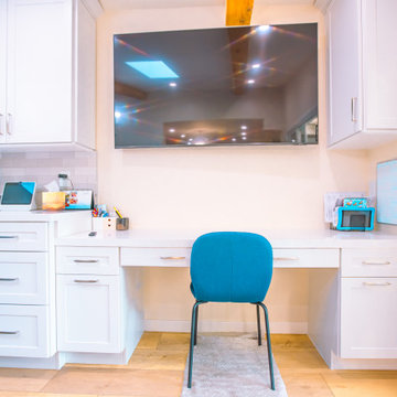
Enhance your Huntington Beach home with Katz Design & Builders! We mix Huntington Beach's laid-back vibe with modern style for cool, sturdy spaces. Enjoy a straightforward process from beginning to end. Think about giving your home a fresh look that wows guests and family. Contact us to start your project. Have a great weekend! Katz Design & Builders – where style is simple and chic!
 O'Hanlon Kitchen & Bath
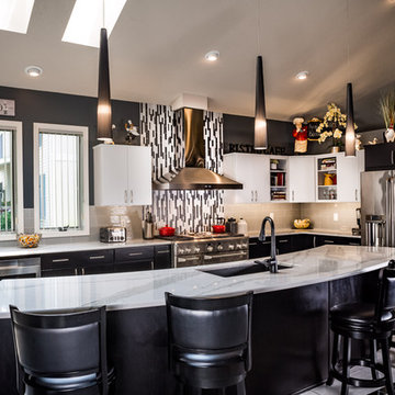
With a massive island as the centerpiece; this kitchen is contemporary in style, modern in technology, and is designed for comfort for the whole family. The door style is Carlisle Slab in Maple by Echelon Cabinetry in two tones. The upper cabinetry finish is Alpine White and the lowers are in Onyx. The island and surrounding countertops are quartz in Brittanicca by Cambria. In the island is the super single undermount Blanco sink with a Moen faucet. The island also houses a programmable 48 bottle built-in wine fridge. A new state of the art 48-inch GE Monogram stove with four burners, a griddle, a grill, and one and a half ovens was added. A new french door refrigerator with a bottom freezer slide out was added as well. The homeowners opted for under and above cabinet lighting to not only light the countertop work space but to also light her favorite pieces displayed above the cabinets. The glass subway tile was laid in a vertical pattern instead of horizontal which helps give a more contemporary feel to the space. Photo credit: Hayman Studio
 HDR Remodeling Inc.
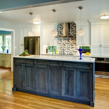
The home was constructed in the 1920’s and the clients wanted to update the look and layout. Much of the rear wall was taken over by interior rear stairs and a first floor laundry room.
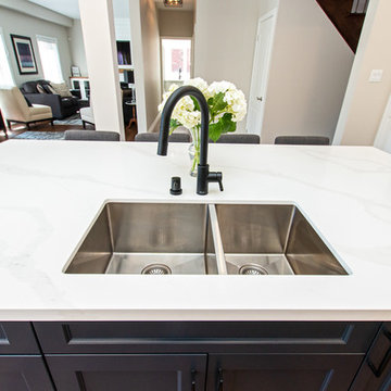
The owners wanted to increase the size of the kitchen and combine the space from the old dining room into a large family space open to the remodeled kitchen. We converted the rear stairs and laundry area into a bay window with seating around a small family table for doing homework. We relocated the laundry center upstairs with new Maytag washer and dryer. We reorganized the kitchen layout to add a spacious island with seating for three and included an in-island single sink with double Motion-sense touchless faucets.
Treve Johnson photographer
HDR Remodeling Inc. specialize in classic East Bay homes. Whole-house remodels, kitchen and bathroom remodeling, garage and basement conversions are our specialties. Our start-to-finish process -- from design concept to permit-ready plans to production -- will guide you along the way to make sure your project is completed on time and on budget and take the uncertainty and stress out of remodeling your home. Our philosophy -- and passion -- is to help our clients make their remodeling dreams come true.
 Thompson Remodeling
When dreaming about the perfect master suite remodel, there are two important ingredients that are always in the mix– the closet space and the master bath. Too often, existing homes will have small closets and baths in the master suite leaving homeowners frustrated and ultimately unsatisfied. At Thompson Remodeling, we have seen our share of strange configurations, but that’s part of the fun. We enjoy the challenge of reconfiguring space to make it work better for our clients.
In this recent master suite remodel, the existing floor plan had a small bath with vanities located in the bedroom not the bath, two reach-in closets, and a massive closet with a vaulted ceiling and skylight. Now, who doesn’t love a great big closet? But this one was roughly 11’x 14’ – big enough to be a bedroom!
To start, we decided to get rid of the two reach-in closets to make the main section of the bedroom larger, a gain of 66 square feet. In the massive closet space we designed a spacious bathroom and dressing area. With a window and skylight already in place, there is a ton of natural light. Next, we swapped the original bath space out for a closet.
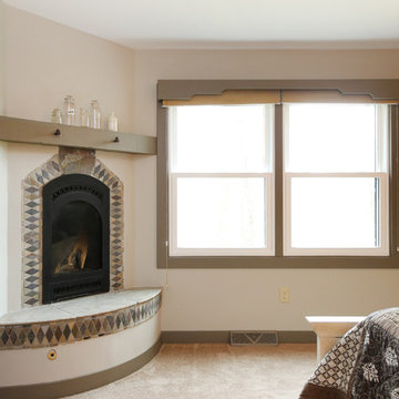
The flow of this master bedroom is so much better now! Before, you would walk in to the room and be facing a double vanity sink. Now, there’s a small entryway that leads to a much more open and inviting space. The homeowners wanted an organic feel to the space and we used an existing corner fireplace to set the tone. Cream, muted grays and taupes are mixed with natural and weathered woods throughout.
We replaced glass block with a barn door made of reclaimed wood. This creates a beautiful focal point in the room.
In the bathroom, quartz countertops are accented with a stone mosaic backsplash. Maple cabinets with a java finish are a rich offset to the lighter wood vanity mirror and heated ceramic floor.
We think this new master suite remodel is stunning! What a major improvement in the functionality of the entire space.
 ershworks
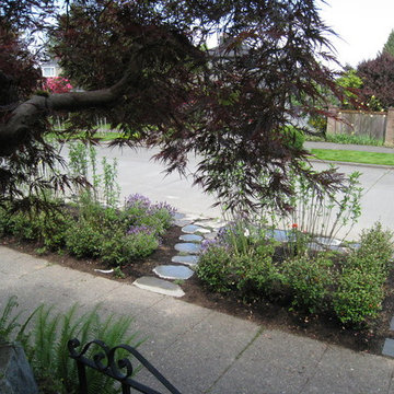
pacific northwest parking strip design
photo credit: ashley thorner
ershworks
This is an example of a traditional landscaping in Seattle.
This is an example of a traditional landscaping in Seattle.
 Jarrett Design
These clients win the award for ‘Most Jarrett Design Projects in One Home’! We consider ourselves extremely fortunate to have been able to work with these kind folks so consistently over the years.
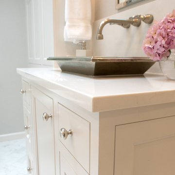
The most recent project features their master bath, a room they have been wanting to tackle for many years. We think it was well worth the wait! It started off as an outdated space with an enormous platform tub open to the bedroom featuring a large round column. The open concept was inspired by island homes long ago, but it was time for some privacy. The water closet, shower and linen closet served the clients well, but the tub and vanities had to be updated with storage improvements desired. The clients also wanted to add organized spaces for clothing, shoes and handbags. Swapping the large tub for a dainty freestanding tub centered on the new window, cleared space for gorgeous his and hers vanities and armoires flanking the tub. The area where the old double vanity existed was transformed into personalized storage closets boasting beautiful custom mirrored doors. The bathroom floors and shower surround were replaced with classic white and grey materials. Handmade vessel sinks and faucets add a rich touch. Soft brass wire doors are the highlight of a freestanding custom armoire created to house handbags adding more convenient storage and beauty to the bedroom. Star sconces, bell jar fixture, wallpaper and window treatments selected by the homeowner with the help of the talented Lisa Abdalla Interiors provide the finishing traditional touches for this sanctuary.
Jacqueline Powell Photography
Sponsored
Sunbury, OH

J.Holderby - Renovations
Franklin County's Leading General Contractors - 2X Best of Houzz!
 Revival by Design
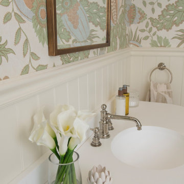
We just love it when a client comes to us and says “I’ve come to you because I want something different, I don’t want a standard bathroom companies design and layout.” For us this is brilliant, because it means we have some creative freedom to design something special.
Having worked with this client before, we knew she liked pattern and colour, specifically William Morris. Keen not to overdo it on William Morris print we considered other designs that might be of a similar look and feel, so we used Lewis and Wood for the powder room and Christopher Farr for the family bathroom, both wonderful wallpapers that offer more of a mural feel.
With the powder room we considered the adjoining rooms, the rural location and also the size of the space. When it comes to small spaces I think more really is more, so we went for it, we know our client loved green and also the London Basin Company, so those were our starting points.
The family bathroom, located in a completely different part of the house, has a more serene feel, although still embraces pattern and colour. The Christopher Farr wallpaper was finished in decorators varnish to ensure a good moisture barrier and the baked tile company tiles continue the muted colour palette.
Our client tells us that they have received lots of complements already :)
 InnovationLand
We are so excited about this stylish Houston patio addition!
It's one of our most recent outdoor living space design projects - and one of our new favorites!
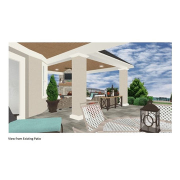
We particularly love the rustic corner fireplace, the beautiful, vaulted pine ceiling and the Restoration Hardware furniture and accessories.
"Even though this space has an outdoor kitchen - often the highlight of our projects - the focus here is beautiful, comfortable outdoor living," says Outdoor Homescapes of Houston owner Wayne Franks. "And I have to say, I think this is one of the most gorgeous spaces we've created for doing that - in style."
"This project was special from the start, as we were creating this space for a friend of Wayne’s who had been a long time mentor to his boys growing up," adds Lisha Maxey, owner of LGH Designs in Houston (she coordinated furniture and finishes for the project). "This client was the principal of their high school and knew all of them very well and Wayne, too. This made it very personal, indeed, and we wanted everything to be perfect!"
The 23- by 16-foot addition, located at the back of the house in Cypress, looks out onto a manmade lake in the homeowners' subdivision. The focal point? A 9-foot-8-inch-high-by-7-foot-wide corner fireplace in Earth Grey rustic ledgestone from Colorstone in Houston. The fireplace features a custom wooden mantel, stone bench seating and a 52-inch Sunbrite outdoor TV.
Another highlight is the flooring - silver travertine tile laid out in a Versailles pattern. "We chose silver travertine in a 'Tumbled' color palette with variations of cream and brown," says Lisha. "So we had those two colors, plus grey, to pull from."
The 7-foot-long, stucco outdoor kitchen island's countertops are also noteworthy - Absolute Black granite in a leathered finish offering a modern look and a dark grey hue that works perfectly with the color palette. The kitchen island also houses an RCS 30-inch grill and fridge.
The seating area includes a sectional couch, coffee table, two swivel chairs and two ottomans - all from Restoration Hardware.
"We used Restoration Hardware's Biscayne sectional, swivel chairs and ottomans in gray, with textured linen weave in Sand and cushions and peacock accent pillows in gray," says Lisha. The coffee table is made of solid teak with a concrete top - as is the matching side table.
"We added a console table, also in teak, behind the sofa. And for accents, we added three Amalfi lanterns from Restoration Hardware in weathered zinc."
A Sunbrella® Heathered area rug (in Gray) was added to anchor the space and visually tie it together.
"The space as a whole leans towards a transitional style, in that it has many traditional cozy comforts and colors, but the furniture gives it a more contemporary look," says Lisha. "The idea from the beginning was to marry these two styles, as our clients wanted a look that would not age and be in vogue for years to come."
On the exterior, you can see how we worked to make the addition blend with the existing home - matching the shingles and stucco and continuing the landscaping.
3D graphic renderings and a virtual video tour allowed the clients to know exactly what the space would look like beforehand.
"It takes a lot of the guesswork out of the process," says Outdoor Homescapes' graphic designer, Kristy Buell Franks. "Floor plans and elevation drawings are good for giving an idea of the overall scope of the project, but it's the 3D renderings that really show what the space is going to look like."
The 3D graphics and video tours also help immensely when choosing finishing materials and furniture, she says: "The clients' choices can be put into the design to allow the clients to see how the materials will work with the existing materials on the house and how the furniture will look in the space."
What do you like about this space? Post a comment and let us know!
URL http://www.outdoorhomescapes.com
 The Home Depot
Striking decorative accessories, touchable texture and warm wood tones elevate your look from a basic study spot to a conversation-starting workspace. Combine a classic sawhorse desk, ultra-modern Eames-inspired seating and hanging accents that speak to global style. Think up your next great idea in a cozy bohemian retreat that’s exclusively yours. Scroll to explore the pieces in this eclectic space.
 Amy Troute Inspired Interior Design
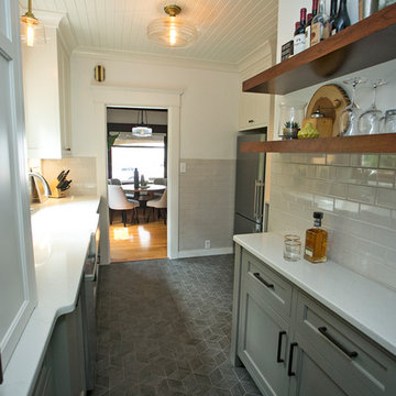
There’s nothing quite like a cozy cottage to call home. Especially when you can get creative, renovating key spaces to balance modern convenience and vintage charm. We collaborated with the talented homeowners to bring their vision to life an the results speak for themselves. A gourmet kitchen fits seamlessly in the original home’s footprint and not one, but two thoughtfully re-designed bathrooms bring a slice of luxury and function to this sweet little home. The modern-meets-classic kitchen tiles started it all, setting the tone for the entire renovation. Gourmet appliances and custom cabinetry maximized function and storage and new lighting was a perfect finishing touch. We completely re-worked the home’s “master” bath (you should see the “before!”), adding a spacious frameless glass shower. In the basement, the new bathroom is every bit the retreat the homeowner dreamed of, with the freestanding composite tub, an enormous vanity and a hidden stackable washer and dryer. The decommissioned fireplace is oh-so decorative, showing off with new Ann Sacks marble mosaic tile. The transformation is impressive, and it’s so rewarding to see this lovely couple and sweet pup happy in their adorable home! Furniture staging for photography provided by Crush Staging, Portland. Photography by Cody Wheeler.


 The Wright Kitchen
Our designer Jamie finally had the pleasure of designing her own kitchen. After nearly 10 years of designing for clients, it was time she designed her own home. Jamie knew what she wanted right from the start, and we think she nailed the look!
 Wayne Homes
This is a home that uses space to create peace. Let’s start with the 3.5 baths. Think how many fights won’t happen over who gets to take a shower first. Now look at your luxurious master suite. Note the dual walk-in closets that say “His” and “Hers” — which can be translated as “His pile of dirty clothes won’t get in the way of Her finding the right pair of shoes.” There’s even a walk-in kitchen pantry, where canned soups and family-sized cereal boxes have all the space they could ask for. And when you consider that it’s easy to add a fifth bedroom and a bonus room with another bath … well, that’s a lot of peace. Tour the spacious Winchester today at our Portage office.
 Living with Lolo
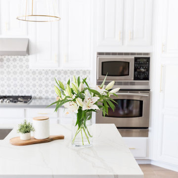
Kitchen in 45th Place | Budget-Friendly Kitchen Remodel in Phoenix, AZ |
Room Type: Kitchen Remodel |
Project Name: 45th Place |
Key Feature: A transitional kitchen remodel that proves smart material selections and a clear design vision can deliver a high-impact result without a luxury budget.
Challenge: The kitchen needed a full refresh but the project had real budget constraints. The challenge was making intentional material choices that looked elevated and cohesive without overspending, while still delivering the clean, transitional aesthetic the clients wanted.
Solution: Living with Lolo approached this as a design problem first, identifying where to invest and where to pull back without sacrificing the overall look. Budget-friendly materials were selected strategically so the finished kitchen felt intentional and designed rather than value-engineered. The result is a space that punches above its price point because the design thinking behind it was sound from the start.
Materials: Budget-conscious cabinetry, transitional hardware and fixtures, and durable countertop surfaces selected for both value and visual impact.
Budget: $30,000 to $75,000 |
Timeline: Completed approximately 2019, roughly 2 to 4 months from design through completion.
93