
Search results for "Start thinking" in Home Design Ideas
 Peter Q Brown Innovative Design
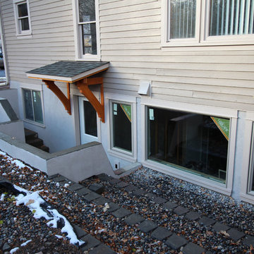
This project started as a repair to a severely age degraded basement wall. With a bit of creative thinking it became an opportunity for creating a daylight basement.
See Project Video:
Part 1: https://youtu.be/xaDcO0X1wOI
Part 2: https://youtu.be/9nGNaCc6Fpw
The basement wall repair solution is a new below grade window wall and covered entry door area. The plan for this daylight basement project was to terrace the adjacent grade, allowing for a wall of lower level windows and a set of steps dropping down to a new exterior entry door. We had just enough room in the side yard setback to fit it all in. A daylight basement project such as this is no small matter regarding safety issues. I have a lot of respect for the fearless yet professional manner that Jason Smith of Ozz Construction showed to execute this difficult project. The temporary support shoring allowed the crew enough working room to put in the structural steel and wall framing that holds up the entire south side of the building. The completed daylight basement transforms the feel and functionality of this formally dark and dreary area. This new natural light will be a great improvement to this future finished apartment space.
 Safferstone Interiors
Meet Meridith: a super-mom who’s as busy as she is badass — and easily my favorite overachiever. She slays her office job and comes home to an equally high-octane family life.
We share a love for city living with farmhouse aspirations. There’s a vegetable garden in the backyard, a black cat, and a floppy eared rabbit named Rocky. There has been a mobile chicken coop and a colony of bees in the backyard. At one point they even had a pregnant hedgehog on their hands!
Between gardening, entertaining, and helping with homework, Meridith has zero time for interior design. Spending several days a week in New York for work, she has limited amount of time at home with her family. My goal was to let her make the most of it by taking her design projects off her to do list and let her get back to her family (and rabbit).
I wanted her to spend her weekends at her son's baseball games, not shopping for sofas. That’s my cue!
Meridith is wonderful. She is one of the kindest people I know. We had so much fun, it doesn’t seem fair to call this “work”. She is loving, and smart, and funny. She’s one of those girlfriends everyone wants to call their own best friend. I wanted her house to reflect that: to feel cozy and inviting, and encourage guests to stay a while.
Meridith is not your average beige person, and she has excellent taste. Plus, she was totally hands-on with design choices. It was a true collaboration. We played up her quirky side and built usable, inspiring spaces one lightbulb moment at a time.
I took her love for color (sacré blue!) and immediately started creating a plan for her space and thinking about her design wish list. I set out hunting for vibrant hues and intriguing patterns that spoke to her color palette and taste for pattern.
I focused on creating the right vibe in each space: a bit of drama in the dining room, a bit more refined and quiet atmosphere for the living room, and a neutral zen tone in their master bedroom.
Her stuff. My eye.
Meridith’s impeccable taste comes through in her art collection. The perfect placement of her beautiful paintings served as the design model for color and mood.
We had a bit of a chair graveyard on our hands, but we worked with some key pieces of her existing furniture and incorporated other traditional pieces, which struck a pleasant balance. French chairs, Asian-influenced footstools, turned legs, gilded finishes, glass hurricanes – a wonderful mash-up of traditional and contemporary.
Some special touches were custom-made (the marble backsplash in the powder room, the kitchen banquette) and others were happy accidents (a wallpaper we spotted via Pinterest). They all came together in a design aesthetic that feels warm, inviting, and vibrant — just like Meridith!
We built her space based on function.
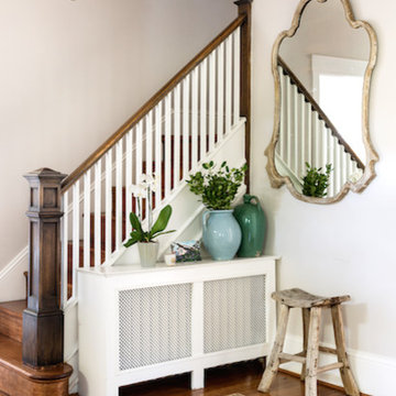
We asked ourselves, “how will her family use each room on any given day?” Meridith throws legendary dinner parties, so we needed curated seating arrangements that could easily switch from family meals to elegant entertaining. We sought a cozy eat-in kitchen and decongested entryways that still made a statement. Above all, we wanted Meredith’s style and panache to shine through every detail. From the pendant in the entryway, to a wild use of pattern in her dining room drapery, Meredith’s space was a total win. See more of our work at www.safferstone.com. Connect with us on Facebook, get inspired on Pinterest, and share modern musings on life & design on Instagram. Or, share what's on your plate with us at hello@safferstone.com.
Photo: Angie Seckinger
 TKS Design Group
Free ebook, Creating the Ideal Kitchen. DOWNLOAD NOW
Our clients came in after thinking a long time about what to do with their kitchen – new cabinets or paint them, white kitchen or wood, custom or is semi-custom? All good questions to ask! They were committed to making this home for a while, they decided to do a full remodel. The kitchen was not living up to its potential both visually and functionally. The dark cabinets and countertop made the room feel dull. And the major drawback, a large corner pantry that was eating into the room, make it appear smaller than it was.
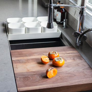
We started by ditching the corner pantry. It created a perfectly centered spot for the new professional range and made room for a much larger island that now houses a beverage center, microwave drawer, seating for three and tons of storage. The multi-generational family does a ton of cooking, so this kitchen gets used! We spent lots of time fine tuning the storage devices and planning where critical items would be stored. This included the new pantry area across from the refrigerator that houses small appliances and food staples.
Designed by: Susan Klimala, CKBD
Photography by: LOMA Studios
For more information on kitchen and bath design ideas go to: www.kitchenstudio-ge.com
Find the right local pro for your project
 Interior Changes home design & consulting
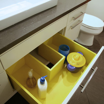
Who doesn't LOVE a yellow drawer?
Example of a mid-sized eclectic 3/4 white tile and ceramic tile ceramic tile doorless shower design in Milwaukee with a vessel sink, flat-panel cabinets, white cabinets, granite countertops and white walls
Example of a mid-sized eclectic 3/4 white tile and ceramic tile ceramic tile doorless shower design in Milwaukee with a vessel sink, flat-panel cabinets, white cabinets, granite countertops and white walls
 BANDD DESIGN
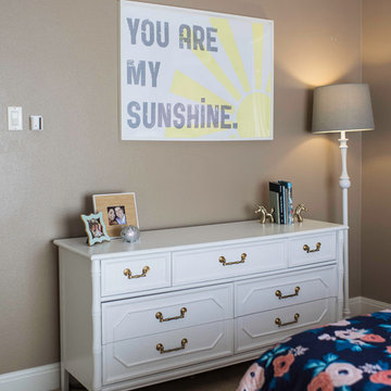
This was a big girl room makeover I did for my daughter. She has always been a party animal at bedtime and that includes her climbing out of her crib around 13 months! She’s almost 5 now and once she started showing that she was a bit more responsible at bedtime, we upgraded her space. I opted for a queen size bed with a bed frame that doesn't require a box spring, which opens up for storage underneath. I also wanted the space to speak to her, so I left a small area that was for playing and reading. This space will be good as she gets older and wants to spend time in her room more often. Thinking about how she would use the space for years to come was a big deal. I made sure the larger pieces were transitional and only small items like bedding or lighting would need to be swapped out in the future.
Designed by Sara Barney’s BANDD DESIGN, who are based in Austin, Texas and serving throughout Round Rock, Lake Travis, West Lake Hills, and Tarrytown.
For more about BANDD DESIGN, click here: https://bandddesign.com/
To learn more about this project, click here: https://bandddesign.com/big-girl-room-makeover/
 Vaisman Design Studio
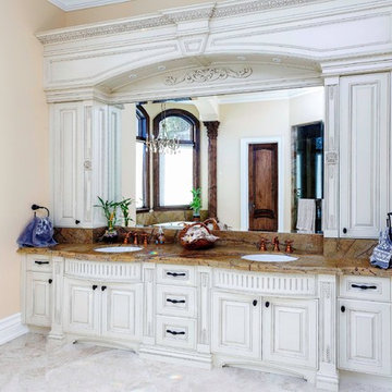
Inspiration for a large mediterranean master beige tile and stone tile marble floor bathroom remodel in Toronto with an undermount sink, raised-panel cabinets, beige cabinets, marble countertops, a two-piece toilet and multicolored walls
 Devine Bath & Kitchen
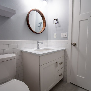
This condo was stuck in the 70s: dingy brown cabinets, worn out fixtures, and ready for a complete overhaul. What started as a bathroom update turned into a complete remodel of the condo. The kitchen became our main target, and as we brought it out of the 70s, the rest came with it.
Our client wanted a home closer to their grandchildren, but to be comfortable and functional, it needed an update. Once we begin on a design plan for one space, the vision can spread across to the other rooms, up the walls, and down to the floors. Beginning with the bathroom, our client opted for a clean and elegant look: white quartz, subway tile, and floating shelves, all of which was easy to translate into the kitchen.
The shower and tub were replaced and tiled with a perfectly sized niche for soap and shampoo, and a slide bar hand shower from Delta for an easy shower experience. Perfect for bath time with the grandkids! And to maximize storage, we installed floating shelves to hide away those extra bath toys! In a condo where the kitchen is only a few steps from the master bath, it's helpful to stay consistent, so we used the same quartz countertops, tiles, and colors for a consistent look that's easy on the eyes.
The kitchen received a total overhaul. New appliances, way more storage with tall corner cabinets, and lighting that makes the space feel bright and inviting. But the work did not stop there! Our team repaired and painted sheetrock throughout the entire condo, and also replaced the doors and window frames. So when we're asked, "Do you do kitchens?" the answer is, "We do it all!"
Sponsored
Sunbury, OH

J.Holderby - Renovations
Franklin County's Leading General Contractors - 2X Best of Houzz!
 Baker Patios
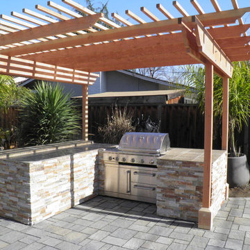
We are a reliable and professional patio and decks contractor, offering the much needed pergola design and construction services in Los Angeles and neighboring cities. If you are thinking about the next patio project, let Baker Patios offer the excellent construction services that you need. We start by creating a custom plan for your dream residential patio and work with you to the very end!
Pergola Design and Construction in Los Angeles, CA - http://www.bakerpatios.com/
 David Morello Garden Enterprises, Inc.
Enrique Arellano
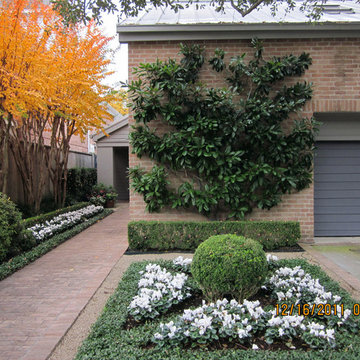
This is an example of a contemporary landscaping in Houston.
This is an example of a contemporary landscaping in Houston.
 Susan Yeley Homes
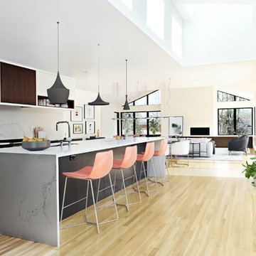
This gem of a house was built in the 1950s, when its neighborhood undoubtedly felt remote. The university footprint has expanded in the 70 years since, however, and today this home sits on prime real estate—easy biking and reasonable walking distance to campus.
When it went up for sale in 2017, it was largely unaltered. Our clients purchased it to renovate and resell, and while we all knew we'd need to add square footage to make it profitable, we also wanted to respect the neighborhood and the house’s own history. Swedes have a word that means “just the right amount”: lagom. It is a guiding philosophy for us at SYH, and especially applied in this renovation. Part of the soul of this house was about living in just the right amount of space. Super sizing wasn’t a thing in 1950s America. So, the solution emerged: keep the original rectangle, but add an L off the back.
With no owner to design with and for, SYH created a layout to appeal to the masses. All public spaces are the back of the home--the new addition that extends into the property’s expansive backyard. A den and four smallish bedrooms are atypically located in the front of the house, in the original 1500 square feet. Lagom is behind that choice: conserve space in the rooms where you spend most of your time with your eyes shut. Put money and square footage toward the spaces in which you mostly have your eyes open.
In the studio, we started calling this project the Mullet Ranch—business up front, party in the back. The front has a sleek but quiet effect, mimicking its original low-profile architecture street-side. It’s very Hoosier of us to keep appearances modest, we think. But get around to the back, and surprise! lofted ceilings and walls of windows. Gorgeous.
 Veronica Devereaux
Nina Leone Photography
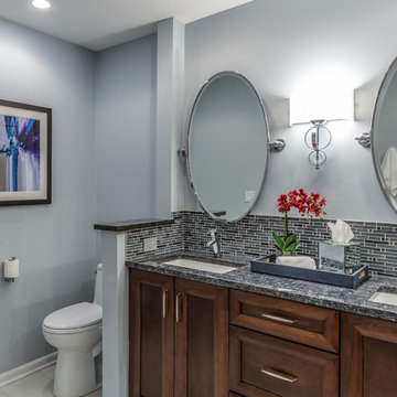
Example of a mid-sized trendy master gray tile and glass tile porcelain tile double shower design in Chicago with an undermount sink, recessed-panel cabinets, medium tone wood cabinets, granite countertops, a two-piece toilet and gray walls
Example of a mid-sized trendy master gray tile and glass tile porcelain tile double shower design in Chicago with an undermount sink, recessed-panel cabinets, medium tone wood cabinets, granite countertops, a two-piece toilet and gray walls
 Thompson Remodeling
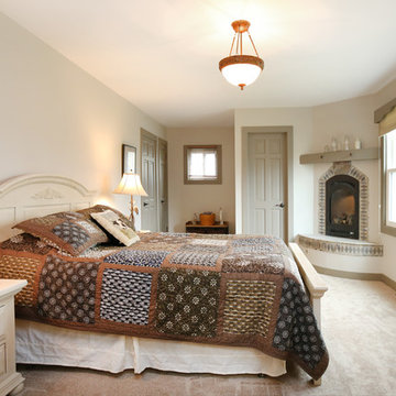
When dreaming about the perfect master suite remodel, there are two important ingredients that are always in the mix– the closet space and the master bath. Too often, existing homes will have small closets and baths in the master suite leaving homeowners frustrated and ultimately unsatisfied. At Thompson Remodeling, we have seen our share of strange configurations, but that’s part of the fun. We enjoy the challenge of reconfiguring space to make it work better for our clients.
In this recent master suite remodel, the existing floor plan had a small bath with vanities located in the bedroom not the bath, two reach-in closets, and a massive closet with a vaulted ceiling and skylight. Now, who doesn’t love a great big closet? But this one was roughly 11’x 14’ – big enough to be a bedroom!
To start, we decided to get rid of the two reach-in closets to make the main section of the bedroom larger, a gain of 66 square feet. In the massive closet space we designed a spacious bathroom and dressing area. With a window and skylight already in place, there is a ton of natural light. Next, we swapped the original bath space out for a closet.
The flow of this master bedroom is so much better now! Before, you would walk in to the room and be facing a double vanity sink. Now, there’s a small entryway that leads to a much more open and inviting space. The homeowners wanted an organic feel to the space and we used an existing corner fireplace to set the tone. Cream, muted grays and taupes are mixed with natural and weathered woods throughout.
We replaced glass block with a barn door made of reclaimed wood. This creates a beautiful focal point in the room.
In the bathroom, quartz countertops are accented with a stone mosaic backsplash. Maple cabinets with a java finish are a rich offset to the lighter wood vanity mirror and heated ceramic floor.
We think this new master suite remodel is stunning! What a major improvement in the functionality of the entire space.
 LMB Interiors
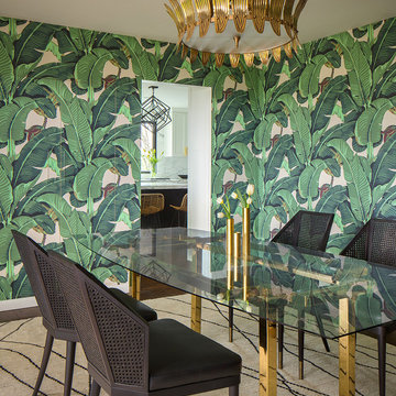
When we were brought on board, the bold, green, palm-frond wallpaper had already been installed in the dining room. With that as one of our starting places, we had to think like our client, to connect our chandelier and furnishing choices for the dining room with that wallpaper, and continue that connection in our designs for her kitchen and front entry with her aesthetic choices throughout the house.
About the wallpaper: This is a famous, iconic pattern, called “The Martinique,” and best known for its presence in the halls of the Beverly Hills Hotel.
Photo credit: Eric Rorer




 Decorated Bathroom LLC
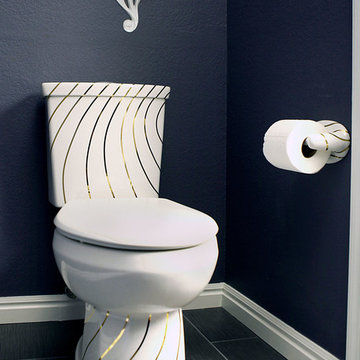
Shot of the toilet bowl and tank decorated with the Gold Swirling Lines designl. Same design on the toilet paper holder. We did not decorate the bowl portion of the toilet, It's a small powder room and you can't see it when you are using it. I think the toilet seat needs to be decorated as well which could be done with mylar tape and some sealer. By Decoratedbathroom.com.
 Molly's Marketplace, a home renovation's paradise
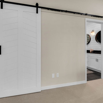
Our goal in this room was to make it a retreat and make you think that you were staying in a cool hotel room. We started with installing new can lighting and that gave us an opportunity to brighten the space and give it a clean look. We then installed this custom wood wall treatment with board and batten design. We kept the wall colors neutral and then we custom built 2 white sliding interior barn doors with black sliding barn door hardware with black flush mount barn door handles to give the space a calm and cool feeling.
 InnovationLand
We are so excited about this stylish Houston patio addition!
It's one of our most recent outdoor living space design projects - and one of our new favorites!
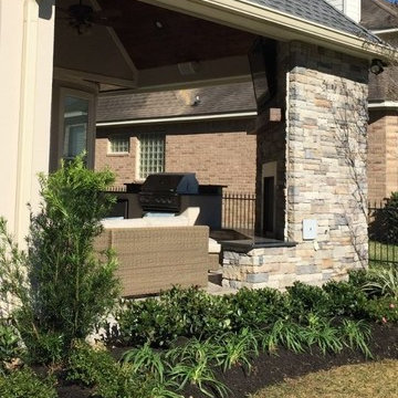
We particularly love the rustic corner fireplace, the beautiful, vaulted pine ceiling and the Restoration Hardware furniture and accessories.
"Even though this space has an outdoor kitchen - often the highlight of our projects - the focus here is beautiful, comfortable outdoor living," says Outdoor Homescapes of Houston owner Wayne Franks. "And I have to say, I think this is one of the most gorgeous spaces we've created for doing that - in style."
"This project was special from the start, as we were creating this space for a friend of Wayne’s who had been a long time mentor to his boys growing up," adds Lisha Maxey, owner of LGH Designs in Houston (she coordinated furniture and finishes for the project). "This client was the principal of their high school and knew all of them very well and Wayne, too. This made it very personal, indeed, and we wanted everything to be perfect!"
The 23- by 16-foot addition, located at the back of the house in Cypress, looks out onto a manmade lake in the homeowners' subdivision. The focal point? A 9-foot-8-inch-high-by-7-foot-wide corner fireplace in Earth Grey rustic ledgestone from Colorstone in Houston. The fireplace features a custom wooden mantel, stone bench seating and a 52-inch Sunbrite outdoor TV.
Another highlight is the flooring - silver travertine tile laid out in a Versailles pattern. "We chose silver travertine in a 'Tumbled' color palette with variations of cream and brown," says Lisha. "So we had those two colors, plus grey, to pull from."
The 7-foot-long, stucco outdoor kitchen island's countertops are also noteworthy - Absolute Black granite in a leathered finish offering a modern look and a dark grey hue that works perfectly with the color palette. The kitchen island also houses an RCS 30-inch grill and fridge.
The seating area includes a sectional couch, coffee table, two swivel chairs and two ottomans - all from Restoration Hardware.
"We used Restoration Hardware's Biscayne sectional, swivel chairs and ottomans in gray, with textured linen weave in Sand and cushions and peacock accent pillows in gray," says Lisha. The coffee table is made of solid teak with a concrete top - as is the matching side table.
"We added a console table, also in teak, behind the sofa. And for accents, we added three Amalfi lanterns from Restoration Hardware in weathered zinc."
A Sunbrella® Heathered area rug (in Gray) was added to anchor the space and visually tie it together.
"The space as a whole leans towards a transitional style, in that it has many traditional cozy comforts and colors, but the furniture gives it a more contemporary look," says Lisha. "The idea from the beginning was to marry these two styles, as our clients wanted a look that would not age and be in vogue for years to come."
On the exterior, you can see how we worked to make the addition blend with the existing home - matching the shingles and stucco and continuing the landscaping.
3D graphic renderings and a virtual video tour allowed the clients to know exactly what the space would look like beforehand.
"It takes a lot of the guesswork out of the process," says Outdoor Homescapes' graphic designer, Kristy Buell Franks. "Floor plans and elevation drawings are good for giving an idea of the overall scope of the project, but it's the 3D renderings that really show what the space is going to look like."
The 3D graphics and video tours also help immensely when choosing finishing materials and furniture, she says: "The clients' choices can be put into the design to allow the clients to see how the materials will work with the existing materials on the house and how the furniture will look in the space."
What do you like about this space? Post a comment and let us know!
 BANDD DESIGN
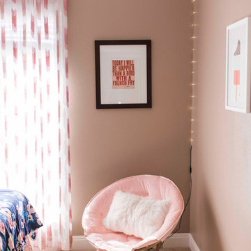
This was a big girl room makeover I did for my daughter. She has always been a party animal at bedtime and that includes her climbing out of her crib around 13 months! She’s almost 5 now and once she started showing that she was a bit more responsible at bedtime, we upgraded her space. I opted for a queen size bed with a bed frame that doesn't require a box spring, which opens up for storage underneath. I also wanted the space to speak to her, so I left a small area that was for playing and reading. This space will be good as she gets older and wants to spend time in her room more often. Thinking about how she would use the space for years to come was a big deal. I made sure the larger pieces were transitional and only small items like bedding or lighting would need to be swapped out in the future.
Designed by Sara Barney’s BANDD DESIGN, who are based in Austin, Texas and serving throughout Round Rock, Lake Travis, West Lake Hills, and Tarrytown.
For more about BANDD DESIGN, click here: https://bandddesign.com/
To learn more about this project, click here: https://bandddesign.com/big-girl-room-makeover/
 Marti Neely, APLD
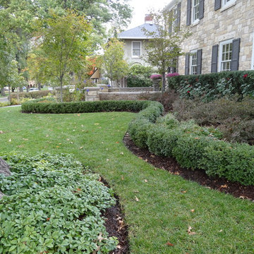
Photo of a mid-sized transitional partial sun courtyard stone formal garden in Omaha for fall.
90