
Search results for "Start thinking" in Home Design Ideas
 Linda Cloutier Kitchens and Baths, LLC
John Hession
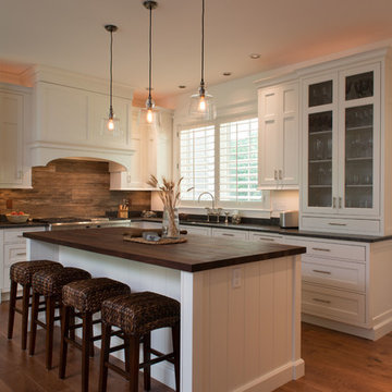
Example of a mid-sized transitional l-shaped light wood floor eat-in kitchen design in Boston with a single-bowl sink, recessed-panel cabinets, white cabinets, wood countertops, brown backsplash, glass sheet backsplash, stainless steel appliances and an island
Example of a mid-sized transitional l-shaped light wood floor eat-in kitchen design in Boston with a single-bowl sink, recessed-panel cabinets, white cabinets, wood countertops, brown backsplash, glass sheet backsplash, stainless steel appliances and an island
 Molly's Marketplace, a home renovation's paradise
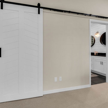
Our goal in this room was to make it a retreat and make you think that you were staying in a cool hotel room. We started with installing new can lighting and that gave us an opportunity to brighten the space and give it a clean look. We then installed this custom wood wall treatment with board and batten design. We kept the wall colors neutral and then we custom built 2 white sliding interior barn doors with black sliding barn door hardware with black flush mount barn door handles to give the space a calm and cool feeling.
 InnovationLand
We are so excited about this stylish Houston patio addition!
It's one of our most recent outdoor living space design projects - and one of our new favorites!
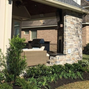
We particularly love the rustic corner fireplace, the beautiful, vaulted pine ceiling and the Restoration Hardware furniture and accessories.
"Even though this space has an outdoor kitchen - often the highlight of our projects - the focus here is beautiful, comfortable outdoor living," says Outdoor Homescapes of Houston owner Wayne Franks. "And I have to say, I think this is one of the most gorgeous spaces we've created for doing that - in style."
"This project was special from the start, as we were creating this space for a friend of Wayne’s who had been a long time mentor to his boys growing up," adds Lisha Maxey, owner of LGH Designs in Houston (she coordinated furniture and finishes for the project). "This client was the principal of their high school and knew all of them very well and Wayne, too. This made it very personal, indeed, and we wanted everything to be perfect!"
The 23- by 16-foot addition, located at the back of the house in Cypress, looks out onto a manmade lake in the homeowners' subdivision. The focal point? A 9-foot-8-inch-high-by-7-foot-wide corner fireplace in Earth Grey rustic ledgestone from Colorstone in Houston. The fireplace features a custom wooden mantel, stone bench seating and a 52-inch Sunbrite outdoor TV.
Another highlight is the flooring - silver travertine tile laid out in a Versailles pattern. "We chose silver travertine in a 'Tumbled' color palette with variations of cream and brown," says Lisha. "So we had those two colors, plus grey, to pull from."
The 7-foot-long, stucco outdoor kitchen island's countertops are also noteworthy - Absolute Black granite in a leathered finish offering a modern look and a dark grey hue that works perfectly with the color palette. The kitchen island also houses an RCS 30-inch grill and fridge.
The seating area includes a sectional couch, coffee table, two swivel chairs and two ottomans - all from Restoration Hardware.
"We used Restoration Hardware's Biscayne sectional, swivel chairs and ottomans in gray, with textured linen weave in Sand and cushions and peacock accent pillows in gray," says Lisha. The coffee table is made of solid teak with a concrete top - as is the matching side table.
"We added a console table, also in teak, behind the sofa. And for accents, we added three Amalfi lanterns from Restoration Hardware in weathered zinc."
A Sunbrella® Heathered area rug (in Gray) was added to anchor the space and visually tie it together.
"The space as a whole leans towards a transitional style, in that it has many traditional cozy comforts and colors, but the furniture gives it a more contemporary look," says Lisha. "The idea from the beginning was to marry these two styles, as our clients wanted a look that would not age and be in vogue for years to come."
On the exterior, you can see how we worked to make the addition blend with the existing home - matching the shingles and stucco and continuing the landscaping.
3D graphic renderings and a virtual video tour allowed the clients to know exactly what the space would look like beforehand.
"It takes a lot of the guesswork out of the process," says Outdoor Homescapes' graphic designer, Kristy Buell Franks. "Floor plans and elevation drawings are good for giving an idea of the overall scope of the project, but it's the 3D renderings that really show what the space is going to look like."
The 3D graphics and video tours also help immensely when choosing finishing materials and furniture, she says: "The clients' choices can be put into the design to allow the clients to see how the materials will work with the existing materials on the house and how the furniture will look in the space."
What do you like about this space? Post a comment and let us know!
Find the right local pro for your project
 D.I.G. Landscape
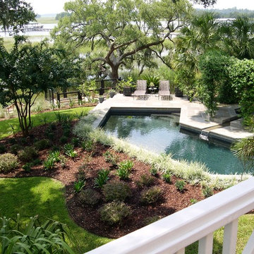
Inspiration for a large contemporary backyard stone water fountain landscape in Charleston for summer.
 A+ Home Improvements, LLC
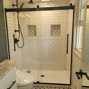
Talk about a huge change in appearance! The larger shower nearly doubled the enclosure size. The new space now has a clean, modern look, and we loved being a part of the transformation!
Sometimes a bathroom only provides a certain amount of space with no logical way of making the room larger. While you can typically make a space larger, this kind of project can be cost prohibitive. Our clients faced that challenge with their master bathroom. While coming up with a game plan, they decided that installing a larger shower would definitely help the cause.
Our client chose an awesome black and white penny tile for the floor that paired perfectly with the other fixture selections and subway tile. Matte black finishes provide a clean, sleek look to any bathroom. We completed the new master bathroom with a vanity, shower door and other fixtures.
Always feel free to think outside of the box when imagining your next project. Give A+ Home Improvements a call to get your project started today!! We look forward to working with you.
 BANDD DESIGN
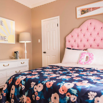
This was a big girl room makeover I did for my daughter. She has always been a party animal at bedtime and that includes her climbing out of her crib around 13 months! She’s almost 5 now and once she started showing that she was a bit more responsible at bedtime, we upgraded her space. I opted for a queen size bed with a bed frame that doesn't require a box spring, which opens up for storage underneath. I also wanted the space to speak to her, so I left a small area that was for playing and reading. This space will be good as she gets older and wants to spend time in her room more often. Thinking about how she would use the space for years to come was a big deal. I made sure the larger pieces were transitional and only small items like bedding or lighting would need to be swapped out in the future.
Designed by Sara Barney’s BANDD DESIGN, who are based in Austin, Texas and serving throughout Round Rock, Lake Travis, West Lake Hills, and Tarrytown.
For more about BANDD DESIGN, click here: https://bandddesign.com/
To learn more about this project, click here: https://bandddesign.com/big-girl-room-makeover/
 Transitions Designs
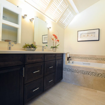
2013 ASID Platinum Award Winner for Best Bath Design! This Master Bath creates a soothing, spa like environment including a deep soaking tub and multi-function water features in the shower. Natural stone and glass tile complement the dark cabinets. This clean, contemporary style is enhanced by a quartz countertop, chrome faucets, dual undermount sinks and floating mirrors. Photo: J. Brent Reeves
Sponsored
Sunbury, OH

J.Holderby - Renovations
Franklin County's Leading General Contractors - 2X Best of Houzz!
 YD Construction and Development
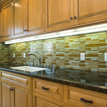
Inspiration for a small timeless galley ceramic tile enclosed kitchen remodel in Los Angeles with an undermount sink, raised-panel cabinets, medium tone wood cabinets, granite countertops, brown backsplash, glass tile backsplash, white appliances and no island
 User
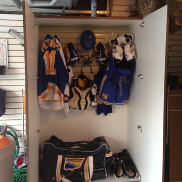
UserAfter years of dealing with smelly hockey equipment, this family decided it was time to start storing the gear in the garage, so we came up with this solution including vents in the sides to keep air circulating!
 Green Circle Construction, Inc.
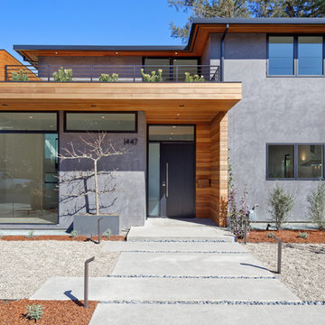
Example of a mid-sized trendy gray two-story concrete exterior home design in San Francisco
 Paulina Perrault Interiors
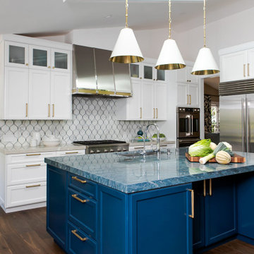
Our clients came to us with a dream to create a home that was beautiful, filled with classic details yet embody a Modern French aesthetic. We started with the foundation, selecting materials that would be the building blocks for our design. One of the joys of this project was the client's love of color, primarily in hues of blue. A special moment in the kitchen with its jewel-like Azul Macauba Quartzite countertop, brass hardware, and sailor’s coat blue island. As we are designing for a family, practical touches along with luxury elements were a must. Creative thinking was used to reimagine the entry closet into a multi-purpose space including the laundry, drop zone, and pantry. The master bath was filled with a classic design from the scones, wallcoverings to crystal hardware...all to transport you to a french apartment overlooking the streets of Paris. A modern twist inserted was the approach for the family room fireplace. The clean lines of stacked stone were the perfect touch. Our clients' dream home became reality in our Modern French Project and will be loved for years to come.


Sponsored
Sunbury, OH
J.Holderby - Renovations
Franklin County's Leading General Contractors - 2X Best of Houzz!
 E.L.I. land design, LLC
Rick Frank
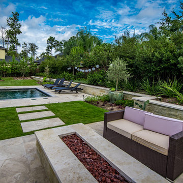
Hot tub - mid-sized traditional backyard tile and rectangular lap hot tub idea in Houston
Hot tub - mid-sized traditional backyard tile and rectangular lap hot tub idea in Houston
 Hagman Architects
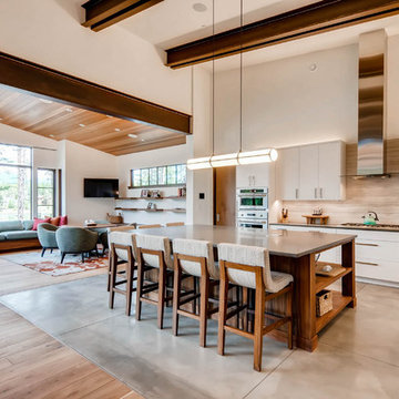
Family home that redefines contemporary architecture in Breckenridge, Colorado. Cutting edge concept, perfectly embraces its waterfront site and the Peaks Range beyond! Responsibly designed and built from start to finish.
 Advance Design Studio, Ltd.
Curtis and Peggy had been thinking of a kitchen remodel for quite some time, but they knew their house would have a unique set of challenges. Their older Victorian house was built in 1891. The kitchen cabinetry was original, and they wanted to keep the authenticity of their period home while adding modern comforts that would improve their quality of life.
A friend recommended Advance Design Studio for their exceptional experience and quality of work. After meeting with designer Michelle Lecinski at Advance Design, they were confident they could partner with Advance to accomplish the unique kitchen renovation they’d been talking about for years. “We wanted to do the kitchen for a long, long time,” Curtis said. “(We asked ourselves) what are we actually going to do? How are we going to do this? And who are we going to find to do exactly what we want?”
The goal for the project was to keep the home renovation and new kitchen feeling authentic to the time in which it was built. They desperately wanted the modern comforts that come with a larger refrigerator and the dishwasher that they never had! The old home was also a bit drafty so adding a fireplace, wall insulation and new windows became a priority. They very much wanted to create a comfortable hearth room adjacent to the kitchen, complete with old world brick.
The original cabinetry had to go to make way for beautiful new kitchen cabinetry that appears as if it was a hundred years old, but with all the benefits of cutting-edge storage, self-closing drawers, and a brand-new look. “We just wanted to keep it old looking, but with some modern updates,” Peggy said.
Dura Supreme Highland Cabinets with a Heritage Old World Painted Finish replaced the original 1891 cabinets. The hand-applied careful rubbed-off detailing makes these exquisite cabinets look as if they came from a far-gone era. Despite the small size of the kitchen, Peggy, Curtis and Michelle utilized every inch with custom cabinet sizes to increase storage capacity. The custom cabinets allowed for the addition of a 24” Fisher Paykel dishwasher with a concealing Dura Supreme door panel. Michelle was also able to work into the new design a larger 30” Fisher Paykel French refrigerator. “We made every ¼ inch count in this small space,” designer Michelle said. “Having the ability to custom size the cabinetry was the only way to achieve this.”
“The kitchen essentially was designed around the Heartland Vintage range and oven,” says Michelle. A classic appliance that combines nostalgic beauty and craftsmanship for modern cooking, with nickel plated trim and elegantly shaped handles and legs; the not to miss range is a striking focal point of the entire room and an engaging conversation piece.
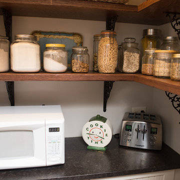
Granite countertops in Kodiak Satin with subtle veining kept with the old-world style. The delicate porcelain La Vie Crackle Sonoma tile kitchen backsplash compliments the home’s style perfectly. A handcrafted passthrough designed to show off Peggy’s fine china was custom built by project carpenters Justin Davis and Jeff Dallain to physically and visually open the space. Additional storage was created in the custom panty room with Latte Edinburg cabinets, hand-made weathered wood shelving with authentic black iron brackets, and an intricate tin copper ceiling.
Peggy and Curtis loved the idea of adding a Vermont stove to make the hearth-room not only functional, but a truly beckoning place to be. A stunning Bordeaux red Vermont Castings Stove with crisp black ventilation was chosen and combined with the authentic reclaimed Chicago brick wall. Advance’s talented carpenters custom-built elegant weathered shelves to house family memorabilia, installed carefully chosen barn sconces, and made the hearth room an inviting place to relax with a cup of coffee and a good book.
“Peggy and Curtis’ project was so much fun to work on. Creating a space that looks and feels like it always belonged in this beautiful old Victorian home is a designer’s dream. To see the delight in their faces when they saw the design details coming together truly made it worth the time and effort that went into making the very compact kitchen space work”, said Michelle. “The result is an amazing custom kitchen, packed with functionality in every inch, nook and cranny!” exclaims Michelle.
The renovation didn’t end with the kitchen. New Pella windows were added to help lessen the drafts. The removal of the original windows and trim necessitated the re-creation of hand-made corbels and trim details no longer available today. The talented carpenter team came to the rescue, crafting new pieces and masterfully finishing them as if they were always there. New custom gutters were formed and installed with a front entry rework necessary to accommodate the changes.
The whole house functions better, but it still feels like the original 1891 home. “From start to finish it’s just a much better space than we used to have,” Peggy said. “Jeff and Justin were amazing.” Curtis added; “We were lucky to find Advance Design, because they really came through for us. I loved that they had everything in house, anything you needed to have done, they could do it”.
 BANDD DESIGN
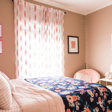
This was a big girl room makeover I did for my daughter. She has always been a party animal at bedtime and that includes her climbing out of her crib around 13 months! She’s almost 5 now and once she started showing that she was a bit more responsible at bedtime, we upgraded her space. I opted for a queen size bed with a bed frame that doesn't require a box spring, which opens up for storage underneath. I also wanted the space to speak to her, so I left a small area that was for playing and reading. This space will be good as she gets older and wants to spend time in her room more often. Thinking about how she would use the space for years to come was a big deal. I made sure the larger pieces were transitional and only small items like bedding or lighting would need to be swapped out in the future.
Designed by Sara Barney’s BANDD DESIGN, who are based in Austin, Texas and serving throughout Round Rock, Lake Travis, West Lake Hills, and Tarrytown.
For more about BANDD DESIGN, click here: https://bandddesign.com/
To learn more about this project, click here: https://bandddesign.com/big-girl-room-makeover/


 BANDD DESIGN
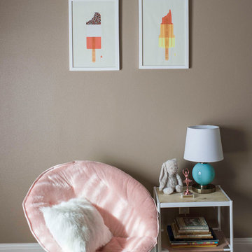
This was a big girl room makeover I did for my daughter. She has always been a party animal at bedtime and that includes her climbing out of her crib around 13 months! She’s almost 5 now and once she started showing that she was a bit more responsible at bedtime, we upgraded her space. I opted for a queen size bed with a bed frame that doesn't require a box spring, which opens up for storage underneath. I also wanted the space to speak to her, so I left a small area that was for playing and reading. This space will be good as she gets older and wants to spend time in her room more often. Thinking about how she would use the space for years to come was a big deal. I made sure the larger pieces were transitional and only small items like bedding or lighting would need to be swapped out in the future.
Designed by Sara Barney’s BANDD DESIGN, who are based in Austin, Texas and serving throughout Round Rock, Lake Travis, West Lake Hills, and Tarrytown.
For more about BANDD DESIGN, click here: https://bandddesign.com/
To learn more about this project, click here: https://bandddesign.com/big-girl-room-makeover/
 Laure Nell Interiors
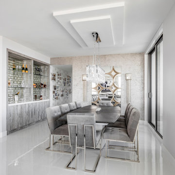
Every inch of this 4,200-square-foot condo on Las Olas—two units combined into one inside the tallest building in Fort Lauderdale—is dripping with glamour, starting right away in the entrance with Phillip Jeffries’ Cloud wallpaper and crushed velvet gold chairs by Koket. Along with tearing out some of the bathrooms and installing sleek and chic new vanities, Laure Nell Interiors outfitted the residence with all the accoutrements that make it perfect for the owners—two doctors without children—to enjoy an evening at home alone or entertaining friends and family. On one side of the condo, we turned the previous kitchen into a wet bar off the family room. Inspired by One Hotel, the aesthetic here gives off permanent vacation vibes. A large rattan light fixture sets a beachy tone above a custom-designed oversized sofa. Also on this side of the unit, a light and bright guest bedroom, affectionately named the Bali Room, features Phillip Jeffries’ silver leaf wallpaper and heirloom artifacts that pay homage to the Indian heritage of one of the owners. In another more-moody guest room, a Currey and Co. Grand Lotus light fixture gives off a golden glow against Phillip Jeffries’ dip wallcovering behind an emerald green bed, while an artist hand painted the look on each wall. The other side of the condo took on an aesthetic that reads: The more bling, the better. Think crystals and chrome and a 78-inch circular diamond chandelier. The main kitchen, living room (where we custom-surged together Surya rugs), dining room (embellished with jewelry-like chain-link Yale sconces by Arteriors), office, and master bedroom (overlooking downtown and the ocean) all reside on this side of the residence. And then there’s perhaps the jewel of the home: the powder room, illuminated by Tom Dixon pendants. The homeowners hiked Machu Picchu together and fell in love with a piece of art on their trip that we designed the entire bathroom around. It’s one of many personal objets found throughout the condo, making this project a true labor of love.
 Susan Yeley Homes
This gem of a house was built in the 1950s, when its neighborhood undoubtedly felt remote. The university footprint has expanded in the 70 years since, however, and today this home sits on prime real estate—easy biking and reasonable walking distance to campus.
When it went up for sale in 2017, it was largely unaltered. Our clients purchased it to renovate and resell, and while we all knew we'd need to add square footage to make it profitable, we also wanted to respect the neighborhood and the house’s own history. Swedes have a word that means “just the right amount”: lagom. It is a guiding philosophy for us at SYH, and especially applied in this renovation. Part of the soul of this house was about living in just the right amount of space. Super sizing wasn’t a thing in 1950s America. So, the solution emerged: keep the original rectangle, but add an L off the back.
With no owner to design with and for, SYH created a layout to appeal to the masses. All public spaces are the back of the home--the new addition that extends into the property’s expansive backyard. A den and four smallish bedrooms are atypically located in the front of the house, in the original 1500 square feet. Lagom is behind that choice: conserve space in the rooms where you spend most of your time with your eyes shut. Put money and square footage toward the spaces in which you mostly have your eyes open.
In the studio, we started calling this project the Mullet Ranch—business up front, party in the back. The front has a sleek but quiet effect, mimicking its original low-profile architecture street-side. It’s very Hoosier of us to keep appearances modest, we think. But get around to the back, and surprise! lofted ceilings and walls of windows. Gorgeous.
91