
Search results for "Staying connected" in Home Design Ideas

 Alair Homes Plano
We loved updating this 1977 house giving our clients a more transitional kitchen, living room and powder bath. Our clients are very busy and didn’t want too many options. Our designers narrowed down their selections and gave them just enough options to choose from without being overwhelming.
In the kitchen, we replaced the cabinetry without changing the locations of the walls, doors openings or windows. All finished were replaced with beautiful cabinets, counter tops, sink, back splash and faucet hardware.
In the Master bathroom, we added all new finishes. There are two closets in the bathroom that did not change but everything else did. We.added pocket doors to the bedroom, where there were no doors before. Our clients wanted taller 36” height cabinets and a seated makeup vanity, so we were able to accommodate those requests without any problems. We added new lighting, mirrors, counter top and all new plumbing fixtures in addition to removing the soffits over the vanities and the shower, really opening up the space and giving it a new modern look. They had also been living with the cold and hot water reversed in the shower, so we also fixed that for them!
In their den, they wanted to update the dark paneling, remove the large stone from the curved fireplace wall and they wanted a new mantel. We flattened the wall, added a TV niche above fireplace and moved the cable connections, so they have exactly what they wanted. We left the wood paneling on the walls but painted them a light color to brighten up the room.
There was a small wet bar between the den and their family room. They liked the bar area but didn’t feel that they needed the sink, so we removed and capped the water lines and gave the bar an updated look by adding new counter tops and shelving. They had some previous water damage to their floors, so the wood flooring was replaced throughout the den and all connecting areas, making the transition from one room to the other completely seamless. In the end, the clients love their new space and are able to really enjoy their updated home and now plan stay there for a little longer!
Design/Remodel by Hatfield Builders & Remodelers | Photography by Versatile Imaging
Less
 Alair Homes Plano
We loved updating this 1977 house giving our clients a more transitional kitchen, living room and powder bath. Our clients are very busy and didn’t want too many options. Our designers narrowed down their selections and gave them just enough options to choose from without being overwhelming.
In the kitchen, we replaced the cabinetry without changing the locations of the walls, doors openings or windows. All finished were replaced with beautiful cabinets, counter tops, sink, back splash and faucet hardware.
In the Master bathroom, we added all new finishes. There are two closets in the bathroom that did not change but everything else did. We.added pocket doors to the bedroom, where there were no doors before. Our clients wanted taller 36” height cabinets and a seated makeup vanity, so we were able to accommodate those requests without any problems. We added new lighting, mirrors, counter top and all new plumbing fixtures in addition to removing the soffits over the vanities and the shower, really opening up the space and giving it a new modern look. They had also been living with the cold and hot water reversed in the shower, so we also fixed that for them!
In their living room, they wanted to update the dark paneling, remove the large stone from the curved fireplace wall and they wanted a new mantel. We flattened the wall, added a TV niche above fireplace and moved the cable connections, so they have exactly what they wanted. We left the wood paneling on the walls but painted them a light color to brighten up the room.
There was a small wet bar between the living room and their family room. They liked the bar area but didn’t feel that they needed the sink, so we removed and capped the water lines and gave the bar an updated look by adding new counter tops and shelving. They had some previous water damage to their floors, so the wood flooring was replaced throughout the den and all connecting areas, making the transition from one room to the other completely seamless. In the end, the clients love their new space and are able to really enjoy their updated home and now plan stay there for a little longer!
Design/Remodel by Hatfield Builders & Remodelers | Photography by Versatile Imaging
Less
 Alair Homes Plano
We loved updating this 1977 house giving our clients a more transitional kitchen, living room and powder bath. Our clients are very busy and didn’t want too many options. Our designers narrowed down their selections and gave them just enough options to choose from without being overwhelming.
In the kitchen, we replaced the cabinetry without changing the locations of the walls, doors openings or windows. All finished were replaced with beautiful cabinets, counter tops, sink, back splash and faucet hardware.
In the Master bathroom, we added all new finishes. There are two closets in the bathroom that did not change but everything else did. We.added pocket doors to the bedroom, where there were no doors before. Our clients wanted taller 36” height cabinets and a seated makeup vanity, so we were able to accommodate those requests without any problems. We added new lighting, mirrors, counter top and all new plumbing fixtures in addition to removing the soffits over the vanities and the shower, really opening up the space and giving it a new modern look. They had also been living with the cold and hot water reversed in the shower, so we also fixed that for them!
In their living room, they wanted to update the dark paneling, remove the large stone from the curved fireplace wall and they wanted a new mantel. We flattened the wall, added a TV niche above fireplace and moved the cable connections, so they have exactly what they wanted. We left the wood paneling on the walls but painted them a light color to brighten up the room.
There was a small wet bar between the living room and their family room. They liked the bar area but didn’t feel that they needed the sink, so we removed and capped the water lines and gave the bar an updated look by adding new counter tops and shelving. They had some previous water damage to their floors, so the wood flooring was replaced throughout the den and all connecting areas, making the transition from one room to the other completely seamless. In the end, the clients love their new space and are able to really enjoy their updated home and now plan stay there for a little longer!
Design/Remodel by Hatfield Builders & Remodelers | Photography by Versatile Imaging
Less
Find the right local pro for your project
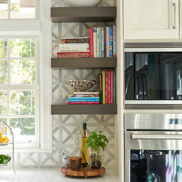
 Bilotta Kitchen & Home
Written by Mary Kate Hogan for Westchester Home Magazine.
"The Goal: The family that cooks together has the most fun — especially when their kitchen is equipped with four ovens and tons of workspace. After a first-floor renovation of a home for a couple with four grown children, the new kitchen features high-tech appliances purchased through Royal Green and a custom island with a connected table to seat family, friends, and cooking spectators. An old dining room was eliminated, and the whole area was transformed into one open, L-shaped space with a bar and family room.
“They wanted to expand the kitchen and have more of an entertaining room for their family gatherings,” says designer Danielle Florie. She designed the kitchen so that two or three people can work at the same time, with a full sink in the island that’s big enough for cleaning vegetables or washing pots and pans.
Key Features:
Well-Stocked Bar: The bar area adjacent to the kitchen doubles as a coffee center. Topped with a leathered brown marble, the bar houses the coffee maker as well as a wine refrigerator, beverage fridge, and built-in ice maker. Upholstered swivel chairs encourage people to gather and stay awhile.
Finishing Touches: Counters around the kitchen and the island are covered with a Cambria quartz that has the light, airy look the homeowners wanted and resists stains and scratches. A geometric marble tile backsplash is an eye-catching decorative element.
Into the Wood: The larger table in the kitchen was handmade for the family and matches the island base. On the floor, wood planks with a warm gray tone run diagonally for added interest."
Bilotta Designer: Danielle Florie
Photographer: Phillip Ennis

 Irons Brothers Construction Inc
This rambler’s small kitchen was dysfunctional and out of touch with our client’s needs. She desired a larger footprint without an addition or expanding the footprint to stay within a realistic budget for her homes size and neighborhood.
The existing kitchen was “boxed-in” at the back of the house. The entrance from
the hallway was very narrow causing congestion and cramping the cook. In the living room the existing fireplace was a room hog, taking up the middle of the house. The kitchen was isolated from the other room’s downstairs.
The design team and homeowner decided to open the kitchen, connecting it to the dining room by removing the fireplace. This expanded the interior floor space. To create further integration amongst the spaces, the wall opening between the dining and living room was also widened. An archway was built to replicate the existing arch at the hallway & living room, giving a more spacious feel.
The new galley kitchen includes generous workspaces and enhanced storage. All designed for this homeowners’ specific needs in her kitchen. We also created a kitchen peninsula where guests can sit and enjoy conversations with the cook. (After 5,6) The red Viking range gives a fun pop of color to offset the monochromatic floor, cabinets and counters. It also plays to her Stanford alumni colors.
One of our favorite and most notable features of this kitchen is the “flip-out” window at the sink. This creative solution allows for an enhanced outdoor living experience, without an expansive remodel or addition. When the window is open the party can happen inside and outside with an interactive experience between spaces. The countertop was installed flush to the window, specifically designed as a cocktail/counter rail surface.
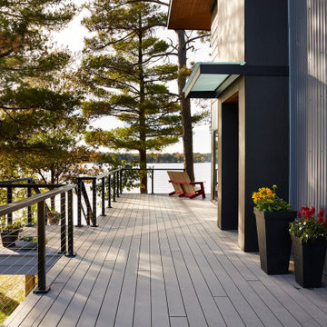
 CHRISTOPHER STROM ARCHITECTS
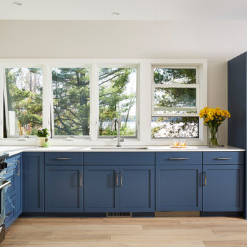
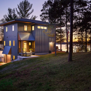
Sommerhus is a private retreat for two empty-nesters. The clients purchased the previous cabin after falling in love with its location on a private, lakefront peninsula. However, this beautiful site was a challenging site to build on, due to its position sandwiched between the lake and protected wet land. The clients disliked the old cabin because it could only be used in the summer months, due to its lack of both insulation and heat. In addition, it was too small for their needs. They wanted to build a new, larger retreat, but were met with yet another constraint: the new cabin would be limited to the previous cabin’s small footprint. Thus, they decided to approach an architect to design their dream cabin.
As the clients described, “We visited Denmark for a family wedding in 2015, and while biking near Gilleleje, a fishing village on the Baltic Sea, we fell in love with the aesthetic of ‘Sommerhus’: dark exteriors, clean, simple lines, and lots of windows.” We set out to design a cabin that fit this aesthetic while also meeting the site’s constraints.
The clients were committed to keeping all existing trees on their site. In addition, zoning codes required the new retreat to stay within the previous cabin's small footprint. Thus, to maximize the square footage of the cabin without removing trees or expanding the footprint, the new structure had to grow vertically. At the same time, the clients wanted to be good neighbors. To them, this meant that their cabin should disappear into the woods, especially when viewed from the lake. To accomplish both these requests, the architect selected a dark exterior metal façade that would visually retreat into the trees. The metal siding is a modern, low-maintenance, and cost-effective solution, especially when compared to traditional wood siding. Warm wood on the soffits of the large roof overhang contrast with the metal siding. Sommerhus's resulting exterior is just as the clients’ requested: boldly modern yet respectful of the serene surroundings.
The homeowners desired a beach-house-inspired interior, full of light and warmth, in contrast to the dark exterior. As the homeowner explained, “I wanted it to feel like a porch inside.” To achieve this, the living room has two walls of sliding glass doors that connect to the wrap-around porch. This creates a beautiful, indoor-outdoor living space. The crisp and bright kitchen also connects to the porch with the window that opens to an outdoor counter - perfect for passing food and drinks to those lounging on the porch. The kitchen is open to the rest of the first-floor entertaining space, and brings a playful, beach-house feel to the cabin.
After the completion of the project, the homeowners remarked, “Working with Christopher and Eric [of CSA] was a wonderful experience. We absolutely love our home, and each season on the lake is more special than the last.”

 ALL Renovation & Design LLC
A 20-year old builder kitchen that desperately needed an update. That is why the Louds called us. A few years previously, we had completed a finished basement project for them that you can view here: https://www.allrd.com/project/loud-basement/
To connect the kitchen a little more with the dining room, we opened the doorway as wide and high as we could.
One special feature of the kitchen is the beverage pantry. It was something the homeowner had seen online and wanted to make practical. Because pull outdoors would have been in the way, we went with slide-in, fold-out doors like what you would see in an entertainment center.
The other unique feature of the kitchen is the center island. The blue was chosen to match the color theme of the connecting living room. The solid wood countertop is a striking centerpiece that steals the show. The cooktop was moved to the island, but because the homeowner did not want a bulky range hood hanging from the ceiling, we had to get creative with a downdraft range vent and a fan mounted on the outside of the house to pull the air out.
Another interesting aspect to the cooktop is that we had originally recommended an induction cooktop instead of regular electric cooktop. The reason being that an induction cooktop cools instantly the moment the pot is removed whereas an electric cooktop stays hot but with no visual cue to warn you. The homeowner initially decided to go with the less expensive electric cooktop. But, before we had even finished construction, one of the family members slid their hand over the cooktop while walking by just after a pan had been removed and got burned. Immediately the homeowner requested we install the induction cooktop instead.
Soft Maple Cabinets painted Simply White, Taj Mihal Granite countertops, farmhouse sink, 3” x 6” Antiqua Ceramic tile backsplash in Feelings Grigio, 30” Dacor HoodDowndraft vent, Luxury Vinyl tile floor, and LED i-Lighting undercabinet lighting.
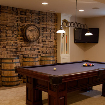
Sponsored
Delaware, OH

Buckeye Basements, Inc.
Central Ohio's Basement Finishing ExpertsBest Of Houzz '13-'21

 ListenUp
Several years ago, one couple began an extensive renovation of this East Denver home. The residence was originally designed by Victor Hornbein, a legendary local architect best known for his work (along with Ed White) on the Boettcher Memorial Tropical Conservatory at the Denver Botanic Gardens. The homeowner, himself an architect, spearheaded the project with the goal of staying true to Hornbein's original vision.
Part of the two-year restoration included the addition of state-of-the-art appliances and lighting, and eventually the planning of the audio/video.
Because the homeowners wanted to have the functionality of a first-rate home theater in a multipurpose room, ListenUp designed a setup featuring a wall-mounted 84-inch Sony 4K TV. The sleek Salamander credenza houses a McIntosh LCR80 center channel speaker, the top-of-the-line MX151 preamp/processor, an MC303 pwoer amp, and the MVP 891 universal disc player. The credenza is flanked by tow McIntosh XR100 speakers whose high-gloss finish mirrors that of the cabinet's smoked-glass doors. The surround channels are handled by two CS100 in-ceiling speakers, and three REL subwoofers deliver dramatic deep bass.
This is truly a whole-house audio system, with 12 zones of audio throughout the home and outdoor areas. Family members can access their favorite music services and music stored on a local hard drive. A high-quality Pro-Ject turntable is even wired into the system.
In the kitchen and some of the other first-floor rooms, the mid-century modern design is enhanced by custom wood and fabric grille covers for the architectural speakers. The pool area benefits from a Sonance outdoor system that employs strategically located speakers along with an underground subwoofer. And, of course, it's all connected to the Sonos system for endless entertainment options.
Photo Credit: Vicki Kerr Photography
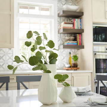 Bilotta Kitchen & Home
Written by Mary Kate Hogan for Westchester Home Magazine.
"The Goal: The family that cooks together has the most fun — especially when their kitchen is equipped with four ovens and tons of workspace. After a first-floor renovation of a home for a couple with four grown children, the new kitchen features high-tech appliances purchased through Royal Green and a custom island with a connected table to seat family, friends, and cooking spectators. An old dining room was eliminated, and the whole area was transformed into one open, L-shaped space with a bar and family room.
“They wanted to expand the kitchen and have more of an entertaining room for their family gatherings,” says designer Danielle Florie. She designed the kitchen so that two or three people can work at the same time, with a full sink in the island that’s big enough for cleaning vegetables or washing pots and pans.
Key Features:
Well-Stocked Bar: The bar area adjacent to the kitchen doubles as a coffee center. Topped with a leathered brown marble, the bar houses the coffee maker as well as a wine refrigerator, beverage fridge, and built-in ice maker. Upholstered swivel chairs encourage people to gather and stay awhile.
Finishing Touches: Counters around the kitchen and the island are covered with a Cambria quartz that has the light, airy look the homeowners wanted and resists stains and scratches. A geometric marble tile backsplash is an eye-catching decorative element.
Into the Wood: The larger table in the kitchen was handmade for the family and matches the island base. On the floor, wood planks with a warm gray tone run diagonally for added interest."
Bilotta Designer: Danielle Florie
Photographer: Phillip Ennis
 Alair Homes Plano
We loved updating this 1977 house giving our clients a more transitional kitchen, living room and powder bath. Our clients are very busy and didn’t want too many options. Our designers narrowed down their selections and gave them just enough options to choose from without being overwhelming.
In the kitchen, we replaced the cabinetry without changing the locations of the walls, doors openings or windows. All finished were replaced with beautiful cabinets, counter tops, sink, back splash and faucet hardware.
In the Master bathroom, we added all new finishes. There are two closets in the bathroom that did not change but everything else did. We.added pocket doors to the bedroom, where there were no doors before. Our clients wanted taller 36” height cabinets and a seated makeup vanity, so we were able to accommodate those requests without any problems. We added new lighting, mirrors, counter top and all new plumbing fixtures in addition to removing the soffits over the vanities and the shower, really opening up the space and giving it a new modern look. They had also been living with the cold and hot water reversed in the shower, so we also fixed that for them!
In their den, they wanted to update the dark paneling, remove the large stone from the curved fireplace wall and they wanted a new mantel. We flattened the wall, added a TV niche above fireplace and moved the cable connections, so they have exactly what they wanted. We left the wood paneling on the walls but painted them a light color to brighten up the room.
There was a small wet bar between the den and their family room. They liked the bar area but didn’t feel that they needed the sink, so we removed and capped the water lines and gave the bar an updated look by adding new counter tops and shelving. They had some previous water damage to their floors, so the wood flooring was replaced throughout the den and all connecting areas, making the transition from one room to the other completely seamless. In the end, the clients love their new space and are able to really enjoy their updated home and now plan stay there for a little longer!
Design/Remodel by Hatfield Builders & Remodelers | Photography by Versatile Imaging
Less
 CHRISTOPHER STROM ARCHITECTS
Sommerhus is a private retreat for two empty-nesters. The clients purchased the previous cabin after falling in love with its location on a private, lakefront peninsula. However, this beautiful site was a challenging site to build on, due to its position sandwiched between the lake and protected wet land. The clients disliked the old cabin because it could only be used in the summer months, due to its lack of both insulation and heat. In addition, it was too small for their needs. They wanted to build a new, larger retreat, but were met with yet another constraint: the new cabin would be limited to the previous cabin’s small footprint. Thus, they decided to approach an architect to design their dream cabin.
As the clients described, “We visited Denmark for a family wedding in 2015, and while biking near Gilleleje, a fishing village on the Baltic Sea, we fell in love with the aesthetic of ‘Sommerhus’: dark exteriors, clean, simple lines, and lots of windows.” We set out to design a cabin that fit this aesthetic while also meeting the site’s constraints.
The clients were committed to keeping all existing trees on their site. In addition, zoning codes required the new retreat to stay within the previous cabin's small footprint. Thus, to maximize the square footage of the cabin without removing trees or expanding the footprint, the new structure had to grow vertically. At the same time, the clients wanted to be good neighbors. To them, this meant that their cabin should disappear into the woods, especially when viewed from the lake. To accomplish both these requests, the architect selected a dark exterior metal façade that would visually retreat into the trees. The metal siding is a modern, low-maintenance, and cost-effective solution, especially when compared to traditional wood siding. Warm wood on the soffits of the large roof overhang contrast with the metal siding. Sommerhus's resulting exterior is just as the clients’ requested: boldly modern yet respectful of the serene surroundings.
The homeowners desired a beach-house-inspired interior, full of light and warmth, in contrast to the dark exterior. As the homeowner explained, “I wanted it to feel like a porch inside.” To achieve this, the living room has two walls of sliding glass doors that connect to the wrap-around porch. This creates a beautiful, indoor-outdoor living space. The crisp and bright kitchen also connects to the porch with the window that opens to an outdoor counter - perfect for passing food and drinks to those lounging on the porch. The kitchen is open to the rest of the first-floor entertaining space, and brings a playful, beach-house feel to the cabin.
After the completion of the project, the homeowners remarked, “Working with Christopher and Eric [of CSA] was a wonderful experience. We absolutely love our home, and each season on the lake is more special than the last.”
 Alair Homes Plano
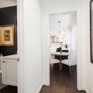
We loved updating this 1977 house giving our clients a more transitional kitchen, living room and powder bath. Our clients are very busy and didn’t want too many options. Our designers narrowed down their selections and gave them just enough options to choose from without being overwhelming.
In the kitchen, we replaced the cabinetry without changing the locations of the walls, doors openings or windows. All finished were replaced with beautiful cabinets, counter tops, sink, back splash and faucet hardware.
In the Master bathroom, we added all new finishes. There are two closets in the bathroom that did not change but everything else did. We.added pocket doors to the bedroom, where there were no doors before. Our clients wanted taller 36” height cabinets and a seated makeup vanity, so we were able to accommodate those requests without any problems. We added new lighting, mirrors, counter top and all new plumbing fixtures in addition to removing the soffits over the vanities and the shower, really opening up the space and giving it a new modern look. They had also been living with the cold and hot water reversed in the shower, so we also fixed that for them!
In their den, they wanted to update the dark paneling, remove the large stone from the curved fireplace wall and they wanted a new mantel. We flattened the wall, added a TV niche above fireplace and moved the cable connections, so they have exactly what they wanted. We left the wood paneling on the walls but painted them a light color to brighten up the room.
There was a small wet bar between the den and their family room. They liked the bar area but didn’t feel that they needed the sink, so we removed and capped the water lines and gave the bar an updated look by adding new counter tops and shelving. They had some previous water damage to their floors, so the wood flooring was replaced throughout the den and all connecting areas, making the transition from one room to the other completely seamless. In the end, the clients love their new space and are able to really enjoy their updated home and now plan stay there for a little longer!
Design/Remodel by Hatfield Builders & Remodelers | Photography by Versatile Imaging
Less
 ListenUp
Several years ago, one couple began an extensive renovation of this East Denver home. The residence was originally designed by Victor Hornbein, a legendary local architect best known for his work (along with Ed White) on the Boettcher Memorial Tropical Conservatory at the Denver Botanic Gardens. The homeowner, himself an architect, spearheaded the project with the goal of staying true to Hornbein's original vision.
Part of the two-year restoration included the addition of state-of-the-art appliances and lighting, and eventually the planning of the audio/video.
Because the homeowners wanted to have the functionality of a first-rate home theater in a multipurpose room, ListenUp designed a setup featuring a wall-mounted 84-inch Sony 4K TV. The sleek Salamander credenza houses a McIntosh LCR80 center channel speaker, the top-of-the-line MX151 preamp/processor, an MC303 pwoer amp, and the MVP 891 universal disc player. The credenza is flanked by tow McIntosh XR100 speakers whose high-gloss finish mirrors that of the cabinet's smoked-glass doors. The surround channels are handled by two CS100 in-ceiling speakers, and three REL subwoofers deliver dramatic deep bass.
This is truly a whole-house audio system, with 12 zones of audio throughout the home and outdoor areas. Family members can access their favorite music services and music stored on a local hard drive. A high-quality Pro-Ject turntable is even wired into the system.
In the kitchen and some of the other first-floor rooms, the mid-century modern design is enhanced by custom wood and fabric grille covers for the architectural speakers. The pool area benefits from a Sonance outdoor system that employs strategically located speakers along with an underground subwoofer. And, of course, it's all connected to the Sonos system for endless entertainment options.
Photo Credit: Vicki Kerr Photography
 Dream Coast Builders
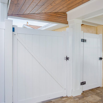
Welcome to our breathtaking beachfront haven, where the gentle waves meet the shore and tranquility fills the air. Our latest Houzz project, the "Coastal Elegance" beach home, is a symphony of timeless design and modern comfort. This story unfolds on the backdrop of white walls and is adorned with elements that celebrate the beauty of outdoor living.
As you cross the threshold, the first thing you'll notice is the stunning white door that welcomes you into the world of serene sophistication. Beyond it, the airy living space features brick flooring, grounding the interior in rustic charm and a connection to the beachside setting.
A pair of ceiling fans adorned with star-shaped blades grace the ceiling, providing a gentle, cooling breeze while becoming a striking design focal point. The soft illumination from the ceiling lights bathes the space in a warm, inviting ambiance, whether it's a sunlit day or a starry night.
Moving further inside, the living area seamlessly transitions to an outdoor patio, creating a harmonious connection to nature. The marble flooring underfoot is a visual delight, mirroring the rippling patterns of the ocean. Step out onto the patio, and you'll discover an idyllic spot for relaxation and entertainment, framed by white walls that offer a sense of openness and tranquility.
Here, a ceiling fan above the patio area ensures you stay comfortable even on the warmest days, enhancing the allure of outdoor living. With the soothing sounds of the sea in the background, you can savor every moment in this coastal paradise.
The "Coastal Elegance" beach home is not just a house; it's an experience. A testament to the allure of white, brick, marble, and the great outdoors, it's the perfect blend of beach-inspired design and contemporary luxury. Come, let us take you on a journey where every detail celebrates the art of coastal living.
 Evergreen Remodeling & Construction
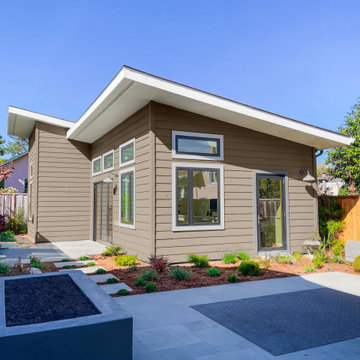
When these La Jolla homeowners first contacted us, they had a problem common among California families: their elderly mother needed to move closer, but no one wanted to give up their independence. “We want her nearby, but she needs her own space,” they told us. An accessory dwelling unit (ADU) was the perfect solution.
The challenge? Their backyard wasn’t very large, and La Jolla’s building codes are notoriously strict. We spent weeks managing permits and setback requirements, but it was worth it. The result is a compact, bright studio that, despite its size, feels spacious.
The exterior maintains a simple, modern style: clean lines, a pitched roof with a steep slope, and warm taupe siding that complements the main house without being an exact replica. The black-framed windows aren’t just elegant; they were strategically placed to maximize natural light while preserving privacy from neighboring properties. The landscaping with drought-resistant plants and contemporary concrete pavers? It was a collaboration between us and the homeowners’ landscaper, and the result harmonizes everything perfectly.
Inside, we designed a surprisingly functional linear kitchen despite its small size. In an ADU, every inch counts, so we opted for European-style flat-panel cabinets that offer great storage capacity, stainless steel appliances adapted to the space, and that glass door opening to the private patio—because even a small house deserves to feel connected to the outdoors.
The bedroom is our favorite room. The tall windows flood the space with light while preserving privacy, and the vaulted ceiling makes it seem twice as large. The black window frames create a striking architectural contrast with the soft cream walls.
Six months after moving in, the daughter sent us a photo: her mother having morning coffee on that little patio, smiling. That’s why we do this work. It’s not just about building structures, but about creating spaces where families can stay connected while respecting each person’s need for independence.

 Edgewater Design Group
As written in Northern Home & Cottage by Elizabeth Edwards
For years, Jeff and Ellen Miller spent their vacations sailing in Northern Michigan—so they had plenty of time to check out which small harbor town they might like to retire to someday. When that time arrived several years ago, they looked at properties up and down the coast and along inland lakes. When they discovered a sweet piece on the outskirts of Boyne City that included waterfront and a buildable lot, with a garage on it, across the street, they knew they’d found home. The couple figured they could find plans for their dream lake cottage online. After all, they weren’t looking to build anything grandiose. Just a small-to-medium sized contemporary Craftsman. But after an unfruitful online search they gave up, frustrated. Every plan they found had the back of the house facing the water—they needed a blueprint for a home that fronted on the water. The Millers first met the woman, Stephanie Baldwin, Owner & President of Edgewater Design Group, who solved that issue and a number of others on the 2015
Northern Home & Cottage Petoskey Area Home Tour. Baldwin’s home that year was a smart, 2000-square cottage on Crooked Lake with simple lines and a Craftsman sensibility. That home proved to the couple that Edgewater Design Group is as proficient at small homes as the larger ones they are often known for. Edgewater Design Group did indeed come up with the perfect plan for the Millers. At 2400 square feet, the simple Craftsman with its 3 bedrooms, vaulted ceiling in the great room and upstairs deck is everything the Millers wanted—including the fact that construction stayed within their budget. An extra courtesy of working with the talented design team is a screened in porch facing the lake (“She told us, of course you have to have a screened in porch,” Ellen says. “And we love it!’) Edgewater’s other touches are more subtle. The Millers wanted to keep the garage, but the home needed to be sited on a small knoll some feet away in order to capture the views of Lake Charlevoix across the street. The solution is a covered walkway and steps that are so artful they enhance the home. Another favor Baldwin did for them was to connect them with Legacy Construction, a firm known for its craftsmanship and attention to detail. The Miller home, outfitted with touches including custom molding, cherry cabinetry, a stunning custom range hood, built in shelving and custom vanities. A warm hickory floor and lovely earth-toned Craftsman-style color palette pull it all together, while a fireplace mantel hewn from a tree taken on the property rounds out this gracious lake cottage.

 StoneWood Design, Inc.
As part of an addition to a full house remodel, a bathroom designated for guests who would be staying in an adjacent room would also serve the multipurpose home office/laundry and connect to the outdoor backyard and pool. The family looked to the designer for a bath with a shower only. The importance of a design with a playful but adult character was proposed to bridge the various age groups using the bathroom.
A custom vanity was designed for the space which would set the style for the room. Contrasting cinnamon and evony stains on the vanity bring in warmth and continue the repetition of black design elements in the space. Special milk glass octagonal knobs complement the checkerboard black and white tile which conveys whimsy and fun. This motif is carried into the steam shower as a border. Classic white subway tiles continue up the walls of the shower and onto the ceiling while white hexagonal tiles bring interest to the floor and the shower seat. Matching soft fold roman shades unify the two varying height windows. A black crown molding and outline trim on the window treatments complete the story. The mirror is framed and finished with a classic pediment and highlighted with a single beribboned pendant light. A cheerful bathroom that makes all ages smile was the result!
 CHRISTOPHER STROM ARCHITECTS
Sommerhus is a private retreat for two empty-nesters. The clients purchased the previous cabin after falling in love with its location on a private, lakefront peninsula. However, this beautiful site was a challenging site to build on, due to its position sandwiched between the lake and protected wet land. The clients disliked the old cabin because it could only be used in the summer months, due to its lack of both insulation and heat. In addition, it was too small for their needs. They wanted to build a new, larger retreat, but were met with yet another constraint: the new cabin would be limited to the previous cabin’s small footprint. Thus, they decided to approach an architect to design their dream cabin.
As the clients described, “We visited Denmark for a family wedding in 2015, and while biking near Gilleleje, a fishing village on the Baltic Sea, we fell in love with the aesthetic of ‘Sommerhus’: dark exteriors, clean, simple lines, and lots of windows.” We set out to design a cabin that fit this aesthetic while also meeting the site’s constraints.
The clients were committed to keeping all existing trees on their site. In addition, zoning codes required the new retreat to stay within the previous cabin's small footprint. Thus, to maximize the square footage of the cabin without removing trees or expanding the footprint, the new structure had to grow vertically. At the same time, the clients wanted to be good neighbors. To them, this meant that their cabin should disappear into the woods, especially when viewed from the lake. To accomplish both these requests, the architect selected a dark exterior metal façade that would visually retreat into the trees. The metal siding is a modern, low-maintenance, and cost-effective solution, especially when compared to traditional wood siding. Warm wood on the soffits of the large roof overhang contrast with the metal siding. Sommerhus's resulting exterior is just as the clients’ requested: boldly modern yet respectful of the serene surroundings.
The homeowners desired a beach-house-inspired interior, full of light and warmth, in contrast to the dark exterior. As the homeowner explained, “I wanted it to feel like a porch inside.” To achieve this, the living room has two walls of sliding glass doors that connect to the wrap-around porch. This creates a beautiful, indoor-outdoor living space. The crisp and bright kitchen also connects to the porch with the window that opens to an outdoor counter - perfect for passing food and drinks to those lounging on the porch. The kitchen is open to the rest of the first-floor entertaining space, and brings a playful, beach-house feel to the cabin.
After the completion of the project, the homeowners remarked, “Working with Christopher and Eric [of CSA] was a wonderful experience. We absolutely love our home, and each season on the lake is more special than the last.”

 Kay Cosby Interiors
Historic homes are a hidden gem, and when this client approached me about remodeling her family home in one of the oldest neighborhoods in Dallas I
knew we had a diamond in the rough. Under many layers of vinyl tile and plywood, the kitchen floors revealed pristine hardwoods waiting to be brought to life. An inefficient vintage kitchen had begun to break down and cramp the client's style and productivity. Mullioned windows obstructed the client's view
and hindered her from connecting with nature. The detail elements such as soft arches transitioning from room to room were lost in a sea of white. This beloved home had become something it wasn't meant to be. Our goal was to help it welcome friends and family with open arms and provide a casual atmosphere in which to love, laugh and relax. We needed to transform it all; floors, walls, kitchen and bedrooms. We left no stone unturned until we had the perfect collaboration of traditional family heirlooms mixed in with a modern palette. New brown stained floors, grey European style cabinets, white quartz counters, textured backsplash tile, mullion free vinyl windows and an open floorplan modernized this kitchen while staying true to its natural roots. Neutral gray walls collaborate with dark accents in the arches to define their detail. Reupholstering the furniture in patterned fabrics updated each room to span the spectrum of traditional to modern. The curated collection of family antiques finished in new hues and newly acquired pieces create a space unique to and adored by this client. Photos by Zack Lewis of Showcase Photographers

 Safferstone Interiors
Dennis and Joe have a large, light-filled house. New construction meant lofted space and open floor plans with traditional styling. Running a busy dental practice by day and engaged in a rich social life by night, this couple needed a professional to take the lead on making their house a home.
That’s my cue!
They wanted to take risks, and stay away from “matchy-matchy”. We gussied up a plain ol’ TV room and gave it a healthy dose of luxury.
Our plan was initially inspired by an abstract painting hanging over their stone fireplace. We brought in their love of the outdoors to make things cozy and used family furniture whenever possible for nostalgia and comfort.
I took their love for one-of-a-kind objects and started making a design plan, aiming to solve their biggest frustration: the family room. They had a tortured relationship with a “forgotten family room,” a great space that was spacious and bright, but not at all cozy or joyful, and certainly not “them.”
I wanted to create a cozy space functional for everyday curling up with puppies and watching TV after dinner, yet chic enough for hosting the pre-dinner kitchen overflow and cocktails during parties.
I went looking for contrasting textures and materials. I wanted to balance patterns and scale, and use non-traditional colors as neutrals to create an overall sense of “BAM!”
Dennis and Joe loved the nod to the classics juxtaposed with new and different globally-inspired pieces. For this project our design aesthetic can be described as Middle Eastern/tribal meets mid-century modern. We played to their sensible side with proportion and balance, and stayed as far away from boring/bleh as we could.
You could say this room was pretty successful...It was featured in DC Modern Luxury. (#nobigdeal, right?)
From there we moved on to other spaces.. We added colorful pillows and sheer drapery to finish off their formal living room. We kept an inherited bedroom set from Dennis’ Mom and added color, draperies, and pillows to overhaul the guest bedroom.
Their project was not a rip-and-replace, we weren’t starting from scratch with a blank piece of paper.
Rather, our goal was to take what was already there and make it better, more like them. Using functionality first, we focused on giving the house a soothing, joyful aesthetic. We upped the chic factor by a gajillion and helped them find their ‘happy’ at home. See more Safferstone stuff at www.safferstone.com. Connect with us on Facebook, get inspired on Pinterest, and share modern musings on life & design on Instagram. Or, send us a love note at hello@safferstone.com.
Photo: Angie Seckinger
72