
Search results for "Strategically" in Home Design Ideas
 MAKHNO studio
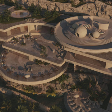
This hotel design captivates with its aerial perspective, showcasing a series of organic, flowing terraces that integrate seamlessly into the natural topography. The architecture employs circular and curved designs to soften the visual impact, creating a harmonious balance with the rugged landscape. Strategic placement of outdoor seating areas, sculptures, and lush plantings enhance the luxurious yet eco-conscious aesthetic, making the space not only a place to stay but a profound experience of design and nature.
 Chi Renovation & Design
 In the heart of Chicago's vibrant West Loop, this transformative renovation reimagined the main level of a distinguished home, meticulously enhancing its functionality and aesthetic appeal.
The project ambitiously relocated the laundry facilities to the basement and removed the existing pantry, strategically reclaiming valuable square footage to expand the kitchen area. This thoughtful redesign paved the way for a more expansive, state-of-the-art culinary space.
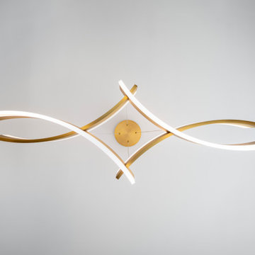
Central to the kitchen's allure is a striking aged brass chandelier, suspended with precision above the island. This elegant fixture not only serves as a luminous focal point but also embodies the sleek and sophisticated design ethos that permeates the entire renovation.
The primary aim of this project was to elevate the home's guest entertaining capabilities, a goal achieved with remarkable success. The guest bathroom received a significant upgrade, adorned with the distinctive charm of Harlequin, a British brand wallpaper, known for its bold and whimsical designs. This choice adds a layer of refined eccentricity and texture to the space, enhancing the guest experience.
Furthering the enhancements, the entryway to the house was also updated, setting a welcoming tone that harmonizes with the overall design narrative. These alterations collectively contribute to a more inviting and functional environment, perfectly suited for hosting and entertaining.
This comprehensive renovation, encompassing design, labor, and materials, represented an investment of just over $160,000. The result is a testament to the power of thoughtful design and strategic planning, culminating in a space that not only meets the contemporary needs of its inhabitants but does so with unmatched elegance and style.
Project designed by Chi Renovation & Design, a renowned renovation firm based in Skokie. We specialize in general contracting, kitchen and bath remodeling, and design & build services. We cater to the entire Chicago area and its surrounding suburbs, with emphasis on the North Side and North Shore regions. You'll find our work from the Loop through Lincoln Park, Skokie, Evanston, Wilmette, and all the way up to Lake Forest.
For more info about Chi Renovation & Design, click here: https://www.chirenovation.com/
 Studio Terrain
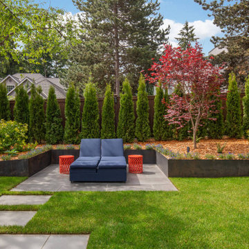
With a focus on simplicity, we have successfully converted this backyard into a versatile and functional space, utilizing a modular and contemporary paver design. By strategically placing architectural slabs within the lawn, we have established distinct outdoor rooms that cater to various activities, all within the convenience of a single backyard. The integration of rusted steel and concrete retaining walls not only levels the lawn but also optimizes the available space, providing ample room for the entire family to enjoy.
Find the right local pro for your project
 Studio Terrain
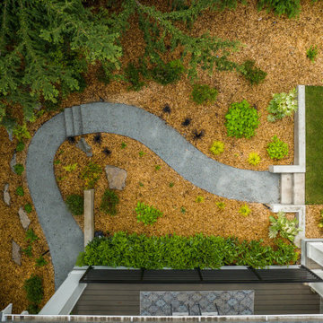
With a focus on simplicity, we have successfully converted this backyard into a versatile and functional space, utilizing a modular and contemporary paver design. By strategically placing architectural slabs within the lawn, we have established distinct outdoor rooms that cater to various activities, all within the convenience of a single backyard. The integration of rusted steel and concrete retaining walls not only levels the lawn but also optimizes the available space, providing ample room for the entire family to enjoy.
 Amy Pearson Design
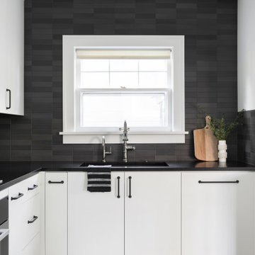
This classic Portland bungalow in the highly desirable Irvington neighborhood was in desperate need of a kitchen update. Aside from tired finishes and cabinets that have seen a full life, the original layout left the family living in a small portion of the kitchen and not taking advantage of the full square footage.
The family desired a design that married both the original architectural details of their bungalow with their preference for clean and modern European design. To accomplish this request, APD brought in sleek flat panel custom frameless cabinets filled with smart and strategic accessories to make the most out of every cabinet box, including full height pantry pull-out, spice and utensil pull-outs flanking the cooking zone, a blind corner pull-0ut to avoid loosing items in the hard-to-reach space, trash & recycling pull-0ut disguised to blend with the adjacent three drawers, and a wall cabinet pull-out sized to fit under the support beam spanning the width of the room. For the traditional - we kept the classic moldings around the windows and doors, continued the homes hardwood floors into the new space, incorporated classic school house light fixtures, and swapped out the slider to the back patio in favor for one with divided lights adding to the architectural detail. Matte black granite countertops with handmade black ceramic tile backsplash bridge the gap between the modern and the traditional thanks to their clean lines, high contrast color palette, and textural and artistic details.
Opting for a few adjustments to the layout created a space plan that took advantage of the full square footage of the room! In the original layout, the refrigerator was squeezed onto the same wall as the cooking, leaving very little counterspace around the hard working cooking zone along with a significant portion of the room (a previous addition) under-utilized. Relocating the refrigerator increased counterspace and storage while creating a “flow” through the entire room.
Luxury Miele and Subzero appliances make this kitchen a chef’s dream! To add to the clean modern look, we opted for an induction cooktop with wall oven directly below … a great alternative to the often used range! Paneling the built-in refrigerator and dishwasher help to calm the overall visual noise of the space, hiding the two hardworking appliances away!
This new family kitchen is at once hardworking, sleek, and timeless!
 Amy Pearson Design
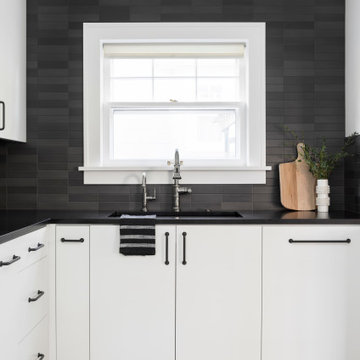
This classic Portland bungalow in the highly desirable Irvington neighborhood was in desperate need of a kitchen update. Aside from tired finishes and cabinets that have seen a full life, the original layout left the family living in a small portion of the kitchen and not taking advantage of the full square footage.
The family desired a design that married both the original architectural details of their bungalow with their preference for clean and modern European design. To accomplish this request, APD brought in sleek flat panel custom frameless cabinets filled with smart and strategic accessories to make the most out of every cabinet box, including full height pantry pull-out, spice and utensil pull-outs flanking the cooking zone, a blind corner pull-0ut to avoid loosing items in the hard-to-reach space, trash & recycling pull-0ut disguised to blend with the adjacent three drawers, and a wall cabinet pull-out sized to fit under the support beam spanning the width of the room. For the traditional - we kept the classic moldings around the windows and doors, continued the homes hardwood floors into the new space, incorporated classic school house light fixtures, and swapped out the slider to the back patio in favor for one with divided lights adding to the architectural detail. Matte black granite countertops with handmade black ceramic tile backsplash bridge the gap between the modern and the traditional thanks to their clean lines, high contrast color palette, and textural and artistic details.
Opting for a few adjustments to the layout created a space plan that took advantage of the full square footage of the room! In the original layout, the refrigerator was squeezed onto the same wall as the cooking, leaving very little counterspace around the hard working cooking zone along with a significant portion of the room (a previous addition) under-utilized. Relocating the refrigerator increased counterspace and storage while creating a “flow” through the entire room.
Luxury Miele and Subzero appliances make this kitchen a chef’s dream! To add to the clean modern look, we opted for an induction cooktop with wall oven directly below … a great alternative to the often used range! Paneling the built-in refrigerator and dishwasher help to calm the overall visual noise of the space, hiding the two hardworking appliances away!
This new family kitchen is at once hardworking, sleek, and timeless!

 Simply Home Decorating
There are not many things better than a room full of your favourite people. As you gather you smell dinner cooking in the kitchen and music playing in the background, as joyful conversation and laughter fill the room. I feel so grateful that we are inching our way back to these days. How about you?
The project I’m sharing with you today has beautiful moments like these at its heart. Spaces that invite people in, foster connection, and make everyday living so simple that it’s impossible not to enjoy...
Meet our Delightful Clients:
The family behind this 1950s North Vancouver home transformation enjoy entertaining friends just as much as cosying up to watch a movie together. A professional couple (I'll call them Jon and Anna) with two elementary school-aged sons, Anna and Jon approached us with the task of furnishing the main floor living spaces and the basement of their family home.
Anna is a busy lawyer who is now working almost full time from home, and Jon works in the film industry. With full careers, two active boys, and a love of gathering, they craved a home that could support their everyday lifestyle.
Design and Lifestyle Goals:
Our central goal for this project was simple: to uncover the hidden potential in their home and create a family-friendly space that functioned well and flowed seamlessly.
On the main floor, our clients tasked us with creating an area for the family to relax and entertain, along with crafting a work and play space for the boys. They also dreamed of a more functional and bright basement, which they envisioned as a dual purpose family room and home office for Anna.
Reveal: Comfortable and Welcoming Entryway & Living Room:
Imagine you are coming home, and you walk through a bright, sunny front door like this one. You are met by this entryway of calming earth and sea tones, paired with warm, natural wood flooring. You feel instantly welcomed and eager to venture further inside... The same is now true for our clients!
The simple details in their entryway are thoughtfully arranged with clean lines and colourful art as the focal point, achieving a timeless and friendly aesthetic. Dried wheat brings movement into the space and plays up the beauty of nature, while the vibrant yet warm colours and textures evoke feelings of comfort and homecoming.
The entry flows seamlessly into this connected living area, which is adorned with ample seating strategically arranged to host and accommodate joyful conversations. With the fireplace and wood mantel as the focal point, these natural elements and hues warm up the room to make it feel beautifully lived-in (not like an untouchable museum).
Another colourful work of art graces the space above Jon’s and Anna’s sofa, and we used decorative pillows and a throw blanket to tempt those colours into the rest of the room. A simply styled coffee table keeps the space feeling open and engaged. Reading material, anyone?
Just beyond this living area, you get a glimpse of the second space our clients requested on their main floor...
A Collected Space for Children to Work + Play:
When Jon and Anna realised that their formal dining area wasn’t being used to its full potential, they imagined creating a work and play space for their boys instead. We came up with a plan to create a shared desk area with plentiful storage.
This timeless natural wood desk was the perfect way to maximise surface area and give the boys plenty of space to do homework during the school year, or spend time crafting or building LEGOs during the summers. The drawers provide storage for all the wonderful items that fuel their productivity or creativity. Or both.
I also love how the white floating shelves display a collection of nostalgic toys, providing just the right amount of childhood endearment to this sophisticated and functional space. This workspace now has endless possibilities for the boys, and it helps Jon and Anna keep their minds and spaces clear, too. Which brings us to...
Basement Family Room & Home Office:
In general, we knew we had to maximise surface area in this ‘50s home, and this was especially true for our clients’ basement. I’m happy to say that we designed an effortlessly comfortable space that focuses on family and makes it simple to settle in and work… or leave the workday behind.
Welcome to this dual-function office and family room. Toward the back of the room, we strategically positioned Anna’s wraparound desk facing out into the room and gave her a wallpaper-and-art backdrop for stunning Zoom calls (she has already received glowing compliments). There is plenty of storage for easy organization including a space to store the family’s shared printer near the door… so they don’t have to interrupt “Mom” to get to it.
Anna also wanted the freedom to be able to relax in this space with her family and turn her back on the work day — quite literally! The sofa is perfectly positioned backing onto the desk allowing her to do just that.
We relocated an existing mustard yellow chair and used pops of the same colour to integrate it into the overall scheme. The wood armrests on this modular sectional provide surfaces for snacks and drinks where there was no room for an end table. The walnut finish carries the theme of natural comfort from the upstairs spaces down into the family room.
The view from the sectional is less business and more pleasure, featuring cosy seating and throw pillows in cheerful colours and patterns.
The highlight of this space? A wallpapered accent wall where we were able to achieve the high-end feel of custom built-in shelving with a simple IKEA hack. The shelves and cabinetry around the television offer plenty of much needed storage space to house family games and movies at a budget price point.
This fun room is the perfect balance of work and play, accommodating and supporting our clients’ daily family adventures.
What Our Clients Had to Say...
Our clients could not be happier with their warm yet functional new rooms. With thoughtful consideration and a plan of action, we were able to transform two areas of their home into spaces that function well and feel good. In fact, they had this to say:
“Lori and her team were everything we were looking for: great listeners, wonderfully creative and highly professional. We couldn't be happier with our interior makeover.” — Clients
That is why we do what we do. If you're ready to start your redesign project, we would love to help. Reach out to us here, and let's get to know more about each other.
 D. A. Dunlevy
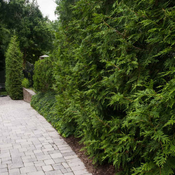
Strategic design turns a busy location into a secret garden.
The bustling commuter road right outside was the only thing standing in the way of our client’s happiness with their new home. Though moving Foxhall Road wasn’t an option, the team at D. A. Dunlevy came up with an equally appealing solution. The landscape design incorporated plantings of various heights with impressive stone walls and walkways, and was completed with custom automatic entry gates. The resulting design provides much-needed privacy and a buffer from the busy road, safety for the children, and a stunning landscape that will continue to impress over the years.
 Dwellify
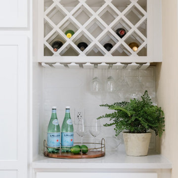
This Coastal kitchen renovation was a detail-oriented renovation, as every small detail made up the greater difference between an outdated kitchen and a Coastal-inspired gathering place. Every detail was meticulously tailored to open up the space and harness the natural light, culminating in a sanctuary of timeless elegance. With the removal of overhead cabinets, dark appliances and a cluttered backsplash, the kitchen instantly opened up, creating an airy, light-filled atmosphere. From white walls to white countertops, predominantly white features were strategically chosen to reflect and amplify the abundant natural light streaming through the expansive windows, creating a luminous and inviting environment. The backsplash, positioned horizontally to visually widen the space, creates a visual sense of expansiveness. Silver appliances contribute to a cool tone which ultimately creates a calm feeling. The accentual wood elements bring warmth and charm, seamlessly blending with the Coastal theme while adding a cozy ambiance. From the removal of clutter to the strategic use of white hues and natural materials, small details contributed to the greater whole to create a serene haven for culinary creativity and cherished gatherings to come to this kitchen.
 Drury Design
The Setup
For this primary bathroom project, the homeowners sought to transform their outdated, beige-toned space into a bright, functional sanctuary. The existing bathroom felt cramped and lifeless, with a small shower and limited storage options. The goal was to create a fresh, updated bathroom that maximizes the existing footprint while addressing specific desires for a more open, organized space with timeless materials.
Design objectives:
Brighten the bathroom and eliminate the dated beige color scheme
Install a freestanding tub in a compact space
Create a larger, more open shower without encroaching on the existing foot print too much
Incorporate hidden storage solutions
Maintain the existing bathroom layout while improving functionality
Update lighting and fixtures to create a contemporary feel
The Remodel
Design challenges to be solved:
- Compact Space Utilization – The small bathroom required careful planning to accommodate a freestanding tub while maintaining functionality and avoiding overcrowding.
- Hidden Storage Integration – The clients wanted a discreet hamper solution that wouldn’t clutter the limited floor space.
- Shower Niche Placement – With plumbing limitations and the clients’ desire to preserve their wavy accent tile wall, finding the perfect niche spot became a creative puzzle.
- Tile and Finish Coordination – Selecting complementary white tile and floor materials that worked harmoniously together.
- Larger Shower Space – Make the shower feel more open and brighter
The Renewed Space
Design solutions:
- Strategic Tub Placement – The freestanding tub was carefully positioned to maximize space, with its faucet strategically placed to allow easy access while preserving walking room. We reduced the counter depth just a bit by the tub, allowing more room for hamper cabinet and window access.
- Concealed Hamper Storage – A custom pull-out hamper was integrated into the vanity (right side, by tub), providing discreet storage within an 18-inch depth constraint.
- Shower Plumbing Wall Niche – We shifted the niche left, just enough to work around the plumbing infrastructure and still score a roomy storage spot that looks intentional.
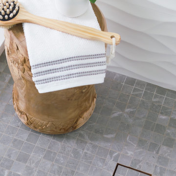
- Sophisticated Selections – Porcelanosa curvy white tile, Kohler brushed gold fixtures, and a neutral grey tile floor created a simple, timeless aesthetic that will be loved years to come.
- Open Shower – Replacing the side wall with a clear glass surround, continuing the tile on the ceiling and extending the footprint opened up this area to the room while allowing more natural lighting into the shower space.
This bathroom transformation shows how thoughtful design turns challenges into opportunities. Brushed gold fixtures add warmth to the fresh white palette, while the perfectly balanced floor tile brings just the right depth. A partially glass-fronted vanity introduces subtle charm, giving the space a unique edge. Once cramped and outdated, this bathroom now feels bright, spacious, and serene—a testament to how every design detail makes a difference.
 Make Architecture
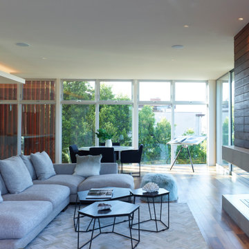
Explosive views flank this shared living and kitchen space. Exterior wood screening is strategically incorporated to afford privacy, but installed at an angle avoiding interruption of the stunning views. Strategic lowered ceilings conceal building systems in a thoughtful manner to result in a composed architectural moment accommodating a thin edge cove, concealing lighting washing the ceiling and maximizing the volume of the space. Above the plaster wrapped fireplace, ipe cladding bleeds in from the exterior and incorporates a concealed flat screen TV.
MAKE Architecture | www.makearch.com | 323-669-0278
 MAKHNO studio
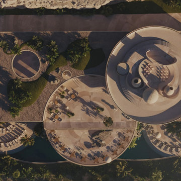
This hotel design captivates with its aerial perspective, showcasing a series of organic, flowing terraces that integrate seamlessly into the natural topography. The architecture employs circular and curved designs to soften the visual impact, creating a harmonious balance with the rugged landscape. Strategic placement of outdoor seating areas, sculptures, and lush plantings enhance the luxurious yet eco-conscious aesthetic, making the space not only a place to stay but a profound experience of design and nature.
 Drury Design
The Setup
For this primary bathroom project, the homeowners sought to transform their outdated, beige-toned space into a bright, functional sanctuary. The existing bathroom felt cramped and lifeless, with a small shower and limited storage options. The goal was to create a fresh, updated bathroom that maximizes the existing footprint while addressing specific desires for a more open, organized space with timeless materials.
Design objectives:
Brighten the bathroom and eliminate the dated beige color scheme
Install a freestanding tub in a compact space
Create a larger, more open shower without encroaching on the existing foot print too much
Incorporate hidden storage solutions
Maintain the existing bathroom layout while improving functionality
Update lighting and fixtures to create a contemporary feel
The Remodel
Design challenges to be solved:
- Compact Space Utilization – The small bathroom required careful planning to accommodate a freestanding tub while maintaining functionality and avoiding overcrowding.
- Hidden Storage Integration – The clients wanted a discreet hamper solution that wouldn’t clutter the limited floor space.
- Shower Niche Placement – With plumbing limitations and the clients’ desire to preserve their wavy accent tile wall, finding the perfect niche spot became a creative puzzle.
- Tile and Finish Coordination – Selecting complementary white tile and floor materials that worked harmoniously together.
- Larger Shower Space – Make the shower feel more open and brighter
The Renewed Space
Design solutions:
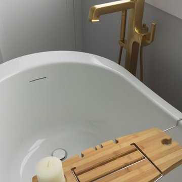
- Strategic Tub Placement – The freestanding tub was carefully positioned to maximize space, with its faucet strategically placed to allow easy access while preserving walking room. We reduced the counter depth just a bit by the tub, allowing more room for hamper cabinet and window access.
- Concealed Hamper Storage – A custom pull-out hamper was integrated into the vanity (right side, by tub), providing discreet storage within an 18-inch depth constraint.
- Shower Plumbing Wall Niche – We shifted the niche left, just enough to work around the plumbing infrastructure and still score a roomy storage spot that looks intentional.
- Sophisticated Selections – Porcelanosa curvy white tile, Kohler brushed gold fixtures, and a neutral grey tile floor created a simple, timeless aesthetic that will be loved years to come.
- Open Shower – Replacing the side wall with a clear glass surround, continuing the tile on the ceiling and extending the footprint opened up this area to the room while allowing more natural lighting into the shower space.
This bathroom transformation shows how thoughtful design turns challenges into opportunities. Brushed gold fixtures add warmth to the fresh white palette, while the perfectly balanced floor tile brings just the right depth. A partially glass-fronted vanity introduces subtle charm, giving the space a unique edge. Once cramped and outdated, this bathroom now feels bright, spacious, and serene—a testament to how every design detail makes a difference.
 Amy Pearson Design
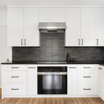
This classic Portland bungalow in the highly desirable Irvington neighborhood was in desperate need of a kitchen update. Aside from tired finishes and cabinets that have seen a full life, the original layout left the family living in a small portion of the kitchen and not taking advantage of the full square footage.
The family desired a design that married both the original architectural details of their bungalow with their preference for clean and modern European design. To accomplish this request, APD brought in sleek flat panel custom frameless cabinets filled with smart and strategic accessories to make the most out of every cabinet box, including full height pantry pull-out, spice and utensil pull-outs flanking the cooking zone, a blind corner pull-0ut to avoid loosing items in the hard-to-reach space, trash & recycling pull-0ut disguised to blend with the adjacent three drawers, and a wall cabinet pull-out sized to fit under the support beam spanning the width of the room. For the traditional - we kept the classic moldings around the windows and doors, continued the homes hardwood floors into the new space, incorporated classic school house light fixtures, and swapped out the slider to the back patio in favor for one with divided lights adding to the architectural detail. Matte black granite countertops with handmade black ceramic tile backsplash bridge the gap between the modern and the traditional thanks to their clean lines, high contrast color palette, and textural and artistic details.
Opting for a few adjustments to the layout created a space plan that took advantage of the full square footage of the room! In the original layout, the refrigerator was squeezed onto the same wall as the cooking, leaving very little counterspace around the hard working cooking zone along with a significant portion of the room (a previous addition) under-utilized. Relocating the refrigerator increased counterspace and storage while creating a “flow” through the entire room.
Luxury Miele and Subzero appliances make this kitchen a chef’s dream! To add to the clean modern look, we opted for an induction cooktop with wall oven directly below … a great alternative to the often used range! Paneling the built-in refrigerator and dishwasher help to calm the overall visual noise of the space, hiding the two hardworking appliances away!
This new family kitchen is at once hardworking, sleek, and timeless!
 Harmony Design Northwest
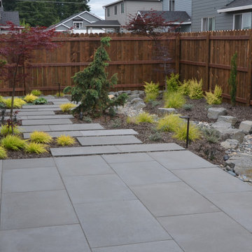
Transforming the blank canvas of a basic builder’s backyard into a captivating retreat, we turned a grass-dominated space into an effortlessly elegant low-maintenance haven with a distinct Asian flair. At the heart of this metamorphosis is the expanded patio and walkway, featuring offset architectural pavers that not only captivate the eye but also contribute to a dynamic sense of flow throughout the elongated backyard.
A key focal point is the thoughtfully designed rain garden, adorned with strategically placed boulders that manages stormwater runoff in an aesthetically pleasing way.
The carefully curated plant palette plays a pivotal role in achieving the desired aesthetic. The deliberate choice of low grasses and foliage-forward perennials, coupled with the inclusion of small evergreen plants and vibrant Japanese maples, creates a harmonious blend of colors, shapes, and sizes. This contrasting arrangement not only ensures visual interest year-round but also infuses the space with a timeless allure inspired by Asian design principles.
The result is a backyard oasis that transcends the ordinary, offering a serene escape with minimal upkeep requirements. The strategic combination of hardscape elements, lush greenery, and carefully selected plants transforms this space into a sanctuary where the beauty of nature meets the sophistication of thoughtful design.
 Studio Terrain
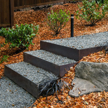
With a focus on simplicity, we have successfully converted this backyard into a versatile and functional space, utilizing a modular and contemporary paver design. By strategically placing architectural slabs within the lawn, we have established distinct outdoor rooms that cater to various activities, all within the convenience of a single backyard. The integration of rusted steel and concrete retaining walls not only levels the lawn but also optimizes the available space, providing ample room for the entire family to enjoy.
 Moda Kitchen and Bath
*Layout and Spatial Arrangement:*
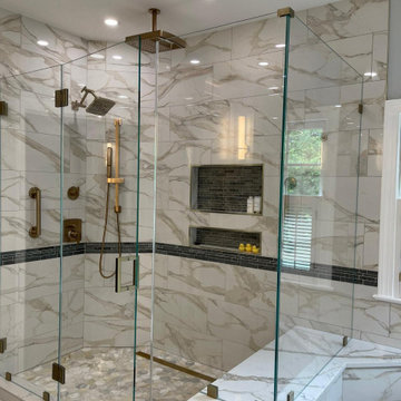
The layout maximizes the available space, creating an open and airy atmosphere. The free-standing tub becomes a focal point, strategically placed to offer a sense of luxury and relaxation. The custom glass shower enclosure contributes to the open feel, allowing natural light to permeate the space.
*Color Scheme:*
A neutral color palette dominates the design, with shades of white, gray, and beige creating a timeless and sophisticated ambiance. The introduction of a modern champagne bronze finish for fixtures adds a touch of warmth and elegance to the overall look.
*Flooring and Wall Finishes:*
Large-format tiles with a polished finish cover the bathroom floor, providing a seamless and easy-to-maintain surface. The walls may feature a combination of tiles and perhaps a feature wall with a textured or patterned finish to add visual interest.
*Fixtures and Cabinetry:*
The centerpiece is a freestanding bathtub with clean lines, possibly positioned near a large window to capitalize on natural light. The fixtures, such as the sink faucets, showerheads, and towel bars, boast a modern champagne bronze finish, creating a cohesive and stylish look. Custom-built cabinetry with minimalist handles complements the overall design, offering both functionality and aesthetics.
*Custom Glass Shower Enclosure:*
The shower area is enclosed with custom glass, ensuring a seamless and open appearance. This enclosure not only enhances the modern aesthetic but also allows the beauty of the shower tiles to be showcased. The shower itself features a rain showerhead and perhaps a built-in niche for bath products.
*Lighting and Mirrors:*
Modern and energy-efficient LED lighting fixtures are strategically placed to illuminate the space effectively. Large mirrors, possibly with integrated lighting, contribute to the sense of spaciousness and add a touch of glamour to the design.
 MAKHNO studio
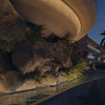
This hotel design is an exemplary model of blending architecture with the surrounding natural landscape. Its flowing, curved lines mimic the undulating rock formations nearby, harmonizing built environments with the organic textures of nature. Strategic placement of palm trees and tropical vegetation around curved pools and cascading water features enhances the sense of a secluded paradise, seamlessly integrating water elements into the architectural framework.
 Amy Pearson Design
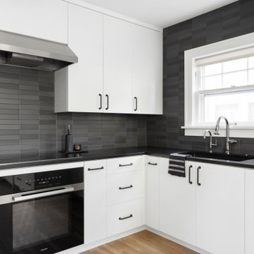
This classic Portland bungalow in the highly desirable Irvington neighborhood was in desperate need of a kitchen update. Aside from tired finishes and cabinets that have seen a full life, the original layout left the family living in a small portion of the kitchen and not taking advantage of the full square footage.
The family desired a design that married both the original architectural details of their bungalow with their preference for clean and modern European design. To accomplish this request, APD brought in sleek flat panel custom frameless cabinets filled with smart and strategic accessories to make the most out of every cabinet box, including full height pantry pull-out, spice and utensil pull-outs flanking the cooking zone, a blind corner pull-0ut to avoid loosing items in the hard-to-reach space, trash & recycling pull-0ut disguised to blend with the adjacent three drawers, and a wall cabinet pull-out sized to fit under the support beam spanning the width of the room. For the traditional - we kept the classic moldings around the windows and doors, continued the homes hardwood floors into the new space, incorporated classic school house light fixtures, and swapped out the slider to the back patio in favor for one with divided lights adding to the architectural detail. Matte black granite countertops with handmade black ceramic tile backsplash bridge the gap between the modern and the traditional thanks to their clean lines, high contrast color palette, and textural and artistic details.
Opting for a few adjustments to the layout created a space plan that took advantage of the full square footage of the room! In the original layout, the refrigerator was squeezed onto the same wall as the cooking, leaving very little counterspace around the hard working cooking zone along with a significant portion of the room (a previous addition) under-utilized. Relocating the refrigerator increased counterspace and storage while creating a “flow” through the entire room.
Luxury Miele and Subzero appliances make this kitchen a chef’s dream! To add to the clean modern look, we opted for an induction cooktop with wall oven directly below … a great alternative to the often used range! Paneling the built-in refrigerator and dishwasher help to calm the overall visual noise of the space, hiding the two hardworking appliances away!
This new family kitchen is at once hardworking, sleek, and timeless!
 Ernesto Santalla PLLC
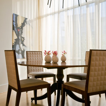
Ernesto Santalla was approached to create a new home for two Washington, DC lawyers wishing to downsize their living space. The move took them from a row house in Washington's historic Dupont Circle neighborhood to a two bedroom apartment in the vibrant, up-and-coming U Street Corridor. Our task was to transform a rather plain and generic apartment into a custom, sophisticated space in a few strategic moves. Ceiling details serve to define functional areas of the living space without creating divisions. Changing some doors from wood to frosted glass, creates a sense of continuity between spaces, and allows light to travel between spaces. Lighting was inserted strategically, to enhance certain functions of the home. The kitchen was partially enclosed with a plane of frosted glass to create visual separation from the main living space while still allowing natural light to filter in from the expansive wall of floor-to-ceiling windows. Color was used to reinforce the architectural intent and simplify spaces, such as the entry, which as many doors and frames. Furniture was selected to blend with the client's collection of heirloom pieces, creating a sophisticated juxtaposition. Statement pieces like a ceiling light from Viabizzuno create impact while maintaining the visual simplicity of our minimal approach.
This project was featured in DC Modern Luxury. https://www.modernluxury.com/washington-dc/story/grand-nest
Photography by Geoffrey Hodgdon
31