
Search results for "Struggle" in Home Design Ideas
 TVL Creative Ltd.
This project was such an incredible design opportunity, and instilled inspiration and excitement at every turn! Our amazing clients came to us with the challenge of converting their beloved family home into a welcoming haven for all members of the family. At the time that we met our clients, they were struggling with the difficult personal decision of the fate of the home. Their father/father-in-law had passed away and their mother/mother-in-law had recently been admitted into a nursing facility and was fighting Alzheimer’s. Resistant to loss of the home now that both parents were out of it, our clients purchased the home to keep in in the family. Despite their permanent home currently being in New Jersey, these clients dedicated themselves to keeping and revitalizing the house. We were moved by the story and became immediately passionate about bringing this dream to life.
The home was built by the parents of our clients and was only ever owned by them, making this a truly special space to the family. Our goal was to revitalize the home and to bring new energy into every room without losing the special characteristics that were original to the home when it was built. In this way, we were able to develop a house that maintains its own unique personality while offering a space of welcoming neutrality for all members of the family to enjoy over time.
The renovation touched every part of the home: the exterior, foyer, kitchen, living room, sun room, garage, six bedrooms, three bathrooms, the laundry room, and everything in between. The focus was to develop a style that carried consistently from space to space, but allowed for unique expression in the small details in every room.
Starting at the entry, we renovated the front door and entry point to offer more presence and to bring more of the mid-century vibe to the home’s exterior. We integrated a new modern front door, cedar shingle accents, new exterior paint, and gorgeous contemporary house numbers that really allow the home to stand out. Just inside the entry, we renovated the foyer to create a playful entry point worthy of attention. Cement look tile adorns the foyer floor, and we’ve added new lighting and upgraded the entry coat storage.
Upon entering the home, one will immediately be captivated by the stunning kitchen just off the entry. We transformed this space in just about every way. While the footprint of the home ultimately remained almost identical, the aesthetics were completely turned on their head. We re-worked the kitchen to maximize storage and to create an informal dining area that is great for casual hosting or morning coffee.
We removed the entry to the garage that was once in the informal dining, and created a peninsula in its place that offers a unique division between the kitchen/informal dining and the formal dining and living areas. The simple light warm light gray cabinetry offers a bit of traditional elegance, along with the marble backsplash and quartz countertops. We extended the original wood flooring into the kitchen and stained all floors to match for a warmth that truly resonates through all spaces. We upgraded appliances, added lighting everywhere, and finished the space with some gorgeous mid century furniture pieces.
In the formal dining and living room, we really focused on maintaining the original marble fireplace as a focal point. We cleaned the marble, repaired the mortar, and refinished the original fireplace screen to give a new sleek look in black. We then integrated a new gas insert for modern heating and painted the upper portion in a rich navy blue; an accent that is carried through the home consistently as a nod to our client’s love of the color.
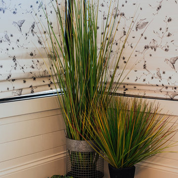
The former entry into the old covered porch is now an elegant glass door leading to a stunning finished sunroom. This room was completely upgraded as well. We wrapped the entire space in cozy white shiplap to keep a casual feel with brightness. We tiled the floor with large format concrete look tile, and painted the old brick fireplace a bright white. We installed a new gas burning unit, and integrated transitional style lighting to bring warmth and elegance into the space. The new black-frame windows are adorned with decorative shades that feature hand-sketched bird prints, and we’ve created a dedicated garden-ware “nook” for our client who loves to work in the yard. The far end of this space is completed with two oversized chaise loungers and overhead lights…the most perfect little reading nook!
Just off the dining room, we created an entirely new space to the home: a mudroom. The clients lacked this space and desperately needed a landing spot upon entering the home from the garage. We uniquely planned existing space in the garage to utilize for this purpose, and were able to create a small but functional entry point without losing the ability to park cars in the garage. This new space features cement-look tile, gorgeous deep brown cabinetry, and plenty of storage for all the small items one might need to store while moving in and out of the home.
The remainder of the upstairs level includes massive renovations to the guest hall bathroom and guest bedroom, upstairs master bed/bath suite, and a third bedroom that we converted into a home office for the client.
Some of the largest transformations were made in the basement, where unfinished space and lack of light were converted into gloriously lit, cozy, finished spaces. Our first task was to convert the massive basement living room into the new master bedroom for our clients. We removed existing built-ins, created an entirely new walk-in closet, painted the old brick fireplace, installed a new gas unit, added carpet, introduced new lighting, replaced windows, and upgraded every part of the aesthetic appearance. One of the most incredible features of this space is the custom double sliding barn door made by a Denver artisan. This space is truly a retreat for our clients!
We also completely transformed the laundry room, back storage room, basement master bathroom, and two bedrooms.
This home’s massive scope and ever-evolving challenges were thrilling and exciting to work with, and the result is absolutely amazing. At the end of the day, this home offers a look and feel that the clients love. Above all, though, the clients feel the spirit of their family home and have a welcoming environment for all members of the family to enjoy for years to come.
 Drury Design
THE SETUP
“You have to figure out how to rebuild a life worth living,” Basia Kozub’s client says. Her husband passed away suddenly three years ago. Holidays with family became more important, and she found herself struggling with a 37-year old kitchen that was falling apart. “I made a decision to move forward,” she says. “I went, ‘You know what? I’m redoing the kitchen.'”
The big task of getting started was as easy as having a conversation – literally. Basia was on the job, helping the client sort through priorities, wishes and ideas. Basia’s client is 5′ 4″, likes keeping an eye on the kiddoes in the backyard and wanted certain things to have their own place.
THE REMODEL
The objectives were:
Enlarge and open the space
Find a classic look that incorporates blues
Upgrade to easy-to-use appliances
Hide an office space within the space
Ample storage for dishes
Design challenges:
Uneven window alignment on the back wall
Original kitchen smaller than desired, stuctural concerns if walls to be moved
Keep folks close – figure out seating for entertaining
Main sink in corner is ideal, but windows are hard to reach
Lots of storage needed for dishes, glass collection, pantry items, bar bottles and office supplies
Specific storage needs for oft-used spices and utensils
THE RENEWED SPACE
Design solutions:
Replace back wall windows, establish window size continuity
Take out two walls to open up the space, tall shallow cabinet and a tall filler added to conceal a new header
Large island that seats six easily
Custom corner sink cabinet with recessed edge allows vertically challenged homeowner to reach the windows
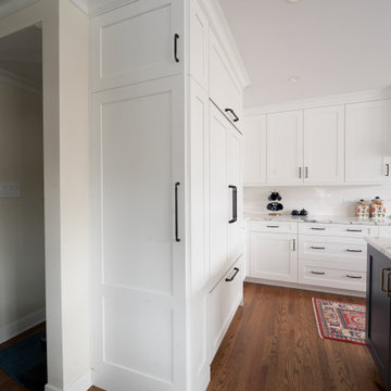
Mindful storage planning features: plenty of cabinets, pull-out bar bottle storage, file drawers & cubbies with pocket doors for office appliances, magic corner pullouts, and appliance garages with pocket doors
Shelf behind range for easy access to daily-use spices and oils. Also: spice and utensil pullouts on either side of range
The clients says every priority and wish box got checked. The highly functional design absorbed everything that used to be in that area of the house, but now those things are out of the way.
“In the past, we were all spread out when we gathered for the holidays, because we had to spread out. Now, we’re all in here together, including my 92-year old mother. We’re visiting, cooking, laughing… everyone is here. And I’m really learning how to use these appliances. This kitchen has given me a whole new life.”
 Kendall Design Build
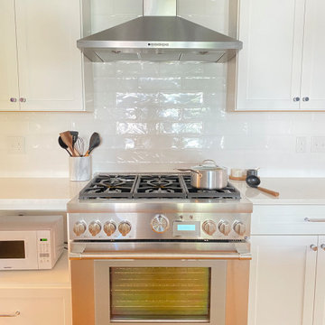
In addition to needing some updates, our clients were struggling with too much space and not enough functionality. They requested a kitchen remodel and a family room family room redesign. So, we started by partitioning off part of the oversized family room to create a custom mud bench and drop zone by the back door to limit mess. We relocated the fireplace and added built-in cabinetry to store toys, games, and books and to accommodate a better furniture layout. And we ended with a beautiful new kitchen with tons of storage and modern touches. This is an upgrade that will be enjoyed for years in Huntington Woods, MI.
Find the right local pro for your project
 Mottram Architecture
Timber frame homes offer unique challenges during a remodel. What often makes them beautiful and attractive to most homeowners, also makes them challenging for space requirements.
Context: The lovely couple that owned this home were struggling with some interesting floor plan challenges that just didn't work for their family. The loved the beautiful timbers and woodwork of their home, but the dramatically sloping ceilings on the second floor, particularly in the bathroom, just didn't work for this 1 1/2 bath home. Needing to use the skylight to approach the toilet was a less then ideal scenario. Although the bathroom footprint was more then adequate, the sloped ceiling only made half of the space useable. Check out the Before/After post on our blog to see the photos of the house pre-renovation. As much as they loved all the wood features in their home, another challenge they had was light. The wood ceiling made everything inside the house darker, even with a fantastic array of south facing windows, there were spaces in the home that felt dark and small. When they contacted us they wanted to know how could they make their brighter and more inviting, were there solutions to the 2nd floor sloped ceiling issues, and if they were going to do all of this work, how could they make their home more comfortable and efficient. A nagging water leak in the upstairs bathroom spurred them into action and here is how we solved their dilemma.
Conclusion: First, we added a little dormer to the rear of the house so we could get full headroom in nearly all of the upstairs bathroom! Then we decided to extend that dormer one more timber bay over to create a walk in closet with natural light and plenty of space. Since we were contemplating energy efficiency, we resolved a nagging issue that is present in a lot of timber frame construction, air tightness. Commonly found in timber frame construction, fiberglass insulation is installed in the rafter bays and board ceilings are installed over top. Unfortunately, board ceilings are anything but air tight, and fiberglass insulation needs to be in an airtight cavity for maximum effectiveness. So we were able to solve two issues at the same time for this homeowner. We removed the board ceiling and fiberglass insulation, we dense packed the rafter bays with cellulose insulation, and installed sheetrock in place of the boards. The boards were salvaged for re-use by the homeowner, and the space and light quality was dramatically improved. Some may think that losing the board ceiling took something away from the space, but what you'll see in the pictures is that it highly accentuates the heavy timbers and really makes them stand out in a beautiful way. Now with this added airtightness, better insulation, and brighter space, the homeowner hardly runs their wood stove, and it's so quiet in the space, an added bonus from changing the insulation. It became necessary to also add a sheetrock ceiling to the living room to hide the plumbing from the new bathroom layout above. Changing this ceiling gave the homeowner some real quality lighting that was lacking in the living room before. The brighter ceiling and new lighting layout completely transforms the living room into a space you want to hang out, even though the layout didn't change at all. When the homeowner saw the finished spaces she said "I can't believe this is my house, I want to live in this house"
Energy Efficiency: I touched a little on the efficiency above, but like all projects done with Mottram Architecture, we always want to leave you with a little extra. Timber frame construction with board ceilings and fiberglass insulation are notoriously leaky! If you want to know what we think about fiberglass insulation, check our our blog post on Why Fiberglass Insulation Sucks. By installing cellulose insulation and covering it with sheetrock we were able to greatly reduce the heat flowing out of this home. It not only improves cashflow it improves the comfort level in the space. Who wants to sit in their living room and feel a draft? Let us remind you, we are not saying cellulose insulation is an air barrier, we use the sheetrock to help with that, but it does significantly reduce the air flow over fiberglass insulation. And when we reduce the airflow, we reduce the heat flow. And when we reduce the heat flow, we reduce the need to re-heat that drafty air from outside. When it comes to energy efficiency the first and best place to start is air infiltration. We greatly reduced the air infiltration with the new insulation, but we also added a hat and warm boots. What I mean by that is, we improved the insulation in the roof, and we installed insulation in the basement. Maybe it's a silly analogy, but when you think about keeping warm, we always start with the hat and boots! With sustainability in mind, the next project will be to add a deck to the front of this house with rain catchment barrels from the metal roof. They are planning to plant a garden in the spring and the rain catchment system will help to irrigate the new garden.
Builder: East Shore Builders
Photographer: Michael Eric Berube
 VVM Designs
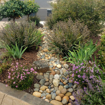
Replaced struggling lawn with Dry creek bed and year-round color
Design ideas for a full sun front yard landscaping in San Francisco.
Design ideas for a full sun front yard landscaping in San Francisco.
 Laura Elizabeth Interiors LLC
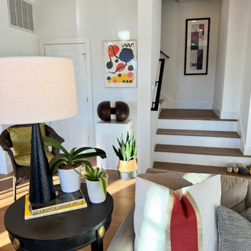
This lovely client was living on her own for the first time in 40 years. She had lots of beautiful art and meaningful glassware, but she was struggling with where to put them in her new home, and how to make everything go together cohesively.
She came to Laura Elizabeth Interiors because she learned that our Budget-Friendly Design Package can work WITH the pieces you already have, to curate a space that is personalized to you.
(Not the standard designer “rip and replace”.)
Our client combined our Budget-Friendly Design Package with our Hourly Design Package.
This way, I was able to take her in-person to trade showrooms and pick out new pieces at wholesale prices!
She described her style as “Eclectic~Modern”.
How do you think we did?
 Drury Design
THE SETUP
“You have to figure out how to rebuild a life worth living,” Basia Kozub’s client says. Her husband passed away suddenly three years ago. Holidays with family became more important, and she found herself struggling with a 37-year old kitchen that was falling apart. “I made a decision to move forward,” she says. “I went, ‘You know what? I’m redoing the kitchen.'”
The big task of getting started was as easy as having a conversation – literally. Basia was on the job, helping the client sort through priorities, wishes and ideas. Basia’s client is 5′ 4″, likes keeping an eye on the kiddoes in the backyard and wanted certain things to have their own place.
THE REMODEL
The objectives were:
Enlarge and open the space
Find a classic look that incorporates blues
Upgrade to easy-to-use appliances
Hide an office space within the space
Ample storage for dishes
Design challenges:
Uneven window alignment on the back wall
Original kitchen smaller than desired, stuctural concerns if walls to be moved
Keep folks close – figure out seating for entertaining
Main sink in corner is ideal, but windows are hard to reach
Lots of storage needed for dishes, glass collection, pantry items, bar bottles and office supplies
Specific storage needs for oft-used spices and utensils
THE RENEWED SPACE
Design solutions:
Replace back wall windows, establish window size continuity
Take out two walls to open up the space, tall shallow cabinet and a tall filler added to conceal a new header
Large island that seats six easily
Custom corner sink cabinet with recessed edge allows vertically challenged homeowner to reach the windows
Mindful storage planning features: plenty of cabinets, pull-out bar bottle storage, file drawers & cubbies with pocket doors for office appliances, magic corner pullouts, and appliance garages with pocket doors
Shelf behind range for easy access to daily-use spices and oils. Also: spice and utensil pullouts on either side of range
The clients says every priority and wish box got checked. The highly functional design absorbed everything that used to be in that area of the house, but now those things are out of the way.
“In the past, we were all spread out when we gathered for the holidays, because we had to spread out. Now, we’re all in here together, including my 92-year old mother. We’re visiting, cooking, laughing… everyone is here. And I’m really learning how to use these appliances. This kitchen has given me a whole new life.”
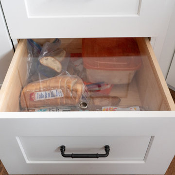
This is a custom specialty bread drawer!


 615interiors - Gwen Canfield
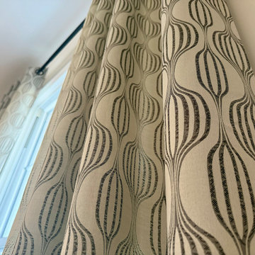
We had a great time collaborating with these clients in Mt. Juliet to transform their living room into a mid-century modern retreat. Their 1968 home features a narrow living room, and while they desired a fresh look, they were struggling to find a functional furniture arrangement. That's when they reached out to 615interiors. With a love for both traditional and mid-century modern styles, they wanted to blend these influences into the room’s new design, while also incorporating a few cherished pieces they already owned. Our design plan featured a striking board & batten accent wall, along with carefully selected furnishings and decor that honored their mid-century aesthetic. The are thrilled with the outcome!
 Armitage Interiors - Home Design & Renovation
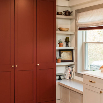
When we arrived at this kitchen in Solebury it was dated and closed in. A center peninsula divided the space and a wall at the end separated a tiny dining room. We completely redesigned the layout by removing the wall between the kitchen and dining room and adding a window to gain some natural light.
The homeowners loved the rich cranberry color but struggled to integrate it without overwhelming the space with red. The window treatments and floor to ceiling pantry gave us the perfect opportunity to accent the color palette throughout the room. Some open shelving and a chair rail along the top of the backsplash allow for decoration and keep the counters clutter free.
This quickly became one of our favorite kitchen renovations simply because of the dramatic changes we were able to make
 TVL Creative Ltd.
This project was such an incredible design opportunity, and instilled inspiration and excitement at every turn! Our amazing clients came to us with the challenge of converting their beloved family home into a welcoming haven for all members of the family. At the time that we met our clients, they were struggling with the difficult personal decision of the fate of the home. Their father/father-in-law had passed away and their mother/mother-in-law had recently been admitted into a nursing facility and was fighting Alzheimer’s. Resistant to loss of the home now that both parents were out of it, our clients purchased the home to keep in in the family. Despite their permanent home currently being in New Jersey, these clients dedicated themselves to keeping and revitalizing the house. We were moved by the story and became immediately passionate about bringing this dream to life.
The home was built by the parents of our clients and was only ever owned by them, making this a truly special space to the family. Our goal was to revitalize the home and to bring new energy into every room without losing the special characteristics that were original to the home when it was built. In this way, we were able to develop a house that maintains its own unique personality while offering a space of welcoming neutrality for all members of the family to enjoy over time.
The renovation touched every part of the home: the exterior, foyer, kitchen, living room, sun room, garage, six bedrooms, three bathrooms, the laundry room, and everything in between. The focus was to develop a style that carried consistently from space to space, but allowed for unique expression in the small details in every room.
Starting at the entry, we renovated the front door and entry point to offer more presence and to bring more of the mid-century vibe to the home’s exterior. We integrated a new modern front door, cedar shingle accents, new exterior paint, and gorgeous contemporary house numbers that really allow the home to stand out. Just inside the entry, we renovated the foyer to create a playful entry point worthy of attention. Cement look tile adorns the foyer floor, and we’ve added new lighting and upgraded the entry coat storage.
Upon entering the home, one will immediately be captivated by the stunning kitchen just off the entry. We transformed this space in just about every way. While the footprint of the home ultimately remained almost identical, the aesthetics were completely turned on their head. We re-worked the kitchen to maximize storage and to create an informal dining area that is great for casual hosting or morning coffee.
We removed the entry to the garage that was once in the informal dining, and created a peninsula in its place that offers a unique division between the kitchen/informal dining and the formal dining and living areas. The simple light warm light gray cabinetry offers a bit of traditional elegance, along with the marble backsplash and quartz countertops. We extended the original wood flooring into the kitchen and stained all floors to match for a warmth that truly resonates through all spaces. We upgraded appliances, added lighting everywhere, and finished the space with some gorgeous mid century furniture pieces.
In the formal dining and living room, we really focused on maintaining the original marble fireplace as a focal point. We cleaned the marble, repaired the mortar, and refinished the original fireplace screen to give a new sleek look in black. We then integrated a new gas insert for modern heating and painted the upper portion in a rich navy blue; an accent that is carried through the home consistently as a nod to our client’s love of the color.
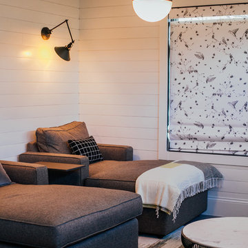
The former entry into the old covered porch is now an elegant glass door leading to a stunning finished sunroom. This room was completely upgraded as well. We wrapped the entire space in cozy white shiplap to keep a casual feel with brightness. We tiled the floor with large format concrete look tile, and painted the old brick fireplace a bright white. We installed a new gas burning unit, and integrated transitional style lighting to bring warmth and elegance into the space. The new black-frame windows are adorned with decorative shades that feature hand-sketched bird prints, and we’ve created a dedicated garden-ware “nook” for our client who loves to work in the yard. The far end of this space is completed with two oversized chaise loungers and overhead lights…the most perfect little reading nook!
Just off the dining room, we created an entirely new space to the home: a mudroom. The clients lacked this space and desperately needed a landing spot upon entering the home from the garage. We uniquely planned existing space in the garage to utilize for this purpose, and were able to create a small but functional entry point without losing the ability to park cars in the garage. This new space features cement-look tile, gorgeous deep brown cabinetry, and plenty of storage for all the small items one might need to store while moving in and out of the home.
The remainder of the upstairs level includes massive renovations to the guest hall bathroom and guest bedroom, upstairs master bed/bath suite, and a third bedroom that we converted into a home office for the client.
Some of the largest transformations were made in the basement, where unfinished space and lack of light were converted into gloriously lit, cozy, finished spaces. Our first task was to convert the massive basement living room into the new master bedroom for our clients. We removed existing built-ins, created an entirely new walk-in closet, painted the old brick fireplace, installed a new gas unit, added carpet, introduced new lighting, replaced windows, and upgraded every part of the aesthetic appearance. One of the most incredible features of this space is the custom double sliding barn door made by a Denver artisan. This space is truly a retreat for our clients!
We also completely transformed the laundry room, back storage room, basement master bathroom, and two bedrooms.
This home’s massive scope and ever-evolving challenges were thrilling and exciting to work with, and the result is absolutely amazing. At the end of the day, this home offers a look and feel that the clients love. Above all, though, the clients feel the spirit of their family home and have a welcoming environment for all members of the family to enjoy for years to come.
 Well Arranged Home
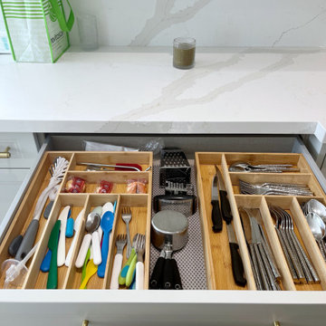
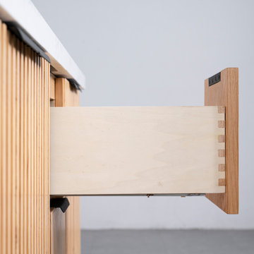
This drawer was struggling with ill-fitting bamboo organizers that not only wasted space but also clashed with the sleek kitchen design. The mismatched sections and awkward layout made it hard to keep everything in place or find what you needed. A functional and stylish upgrade was overdue!
 Paintzen, Inc.
For many, professional interior design is a luxury. Whether your home’s design project is large or small, having the ability to transform your house, apartment or condo into a beautiful, unique space is a wonderful opportunity for self-expression. Even if it is a just simple accent wall painted in a color that speaks to you, or a complete renovation of your cabinets to achieve the kitchen of your dreams, interior design allows you to create an environment that is both personal and comfortable.
That is exactly how interior designer and founder of Design Exchange Sean Carlson Perry feels about what he does for a living. “The reason that I love designing spaces, and value the impact of space design on people, is the way the spaces make us feel, the visceral appeal of good design. Good design should stimulate the senses and generate an emotionally engaging experience. As a designer, I get to massage and sculpt people’s experience of space!” Perry shared with us.
In late 2017, the Paintzen team connected with Perry regarding a very special design project he was working on. Design Exchange was renovating, redesigning and re-furnishing The Ali Forney Center. The Ali Forney Center, based in New York City, is the largest and most comprehensive organization dedicated to housing homeless LGBTQ youth. Nearly 40% of the homeless youth population is LGBTQ. Homeless LGBTQ youth are eight times more likely to experience violence, discrimination, and suicide. AFC houses 124 youths each night and provides services to over 1,400 homeless young people per year.
Although the organization does an incredible job to provide safety and shelter to homeless youth, Perry and his team felt the space itself could use some updating and could feel more welcoming. Rooms were dark, cold, and lacked proper storage. Furniture was in poor shape and didn’t work. The rooms were being under-utilized; overall, there was so much more that could be done within the walls of the AFC that could be improved using interior design & paint!
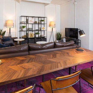
We at Paintzen were excited to partner with Design Exchange to do our part in this transformation. The dark, paneled walls were re-painted white. This entirely opened up the space, making it brighter, warmer and more welcoming. The white walls also served as a much better backdrop for smart lighting, as well as for the furniture, wall decor, and new flooring. Beyond painting, Perry and his team used FLOR carpet tiles for durability in a bright Fuchsia shade for a pop of color. They created a more functional layout to maximize the space and make better use of its architectural details and added new furniture including lamps, tables, throws, a sofa, a TV and a Roku to make the space beautiful, and even fun.
“Design increases connection and community,” Perry told us. “When we revamp a shelter space, history tells us that the residents spend more time in the space, more time with their peers, building connections and community; a greater sense of home.” Perry’s goal was to create an environment that set its residents up for success by improving their quality of life, outlook and self-esteem.
“This isn’t extreme home makeover (although I wish I had that budget!). It’s about improving the aesthetics of the space to create a better environment and experience for people who are going through challenging times. I’ve been lucky enough to have an amount of work that allows me to donate a portion of profits to Design Exchange Projects.”
Sean Carlson Perry founded Design Exchange as a way to use his talent, passion, and skills to help those who are struggling, or in a place of immediate need. He was searching to bring deeper meaning and a humanitarian component to his work. Perry has worked with clients in New York, San Francisco, and Los Angeles. “Good design—functionally, aesthetically and ergonomically—promotes a better quality of life.” This is a mantra that describes why Perry does what he does through Design Exchange, working to help the underserved of New York City and other cities across the country.
“I grew up gay in Nebraska, and have gone through some hard times when I was younger, but I can’t imagine going through what these kids go through – rejection from family, being kicked out of the house for being who they are, homeless and having nowhere else to turn,” said Perry. “Luckily, there is The Ali Forney Center. Doing these projects for AFC strikes close to home for me, so they are extra special and close to my heart.”
 Art & Architecture Inc
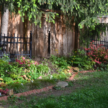
A 2019 update of the woodland garden planted below existing 60 year old row of Spruce trees. Big change in 50% loss of sunlight where 100% of low western sun is now blocked by the 6' tall privacy fence. This caused some loss in Azaleas, with 3 shrubs die out completely, and one year of no flowers. So it has been another struggle to grow in deep shade. Only 1-2 hours of morning sun hits these plants, even less in spring & fall.

 Five Star Tree Care
Adding woodchips underneath your trees has many benefits. Some of these benefits include:
-soil moisture retention
-nutrient leaching when decomposing over time
-smother weeds and invasive plants
But before you add any woodchips to your gardens and trees, it’s important to make sure you aerate the root zone. Doing so improves the oxygen supply and leaching to the roots. You will see more growth when there is more oxygen. Our team at Five Star Tree Services has come up with a guide on how you can use woodchips in your gardens.
Where To Place Woodchips
Even though there are many benefits for your trees, there is a right and wrong way to use them. If used incorrectly, you can actually end up hurting your tree instead of helping it. This can happen when there is an excessive amount piled up around a tree, its roots, and the trunk. Woodchips should never touch the trunk of a tree for extended periods of time. What happens is that moisture is retained in the chips and will eventually cause the tree to rot. The end result is death if not caught in time.
An indication of rot and decay is fruiting bodies or mushrooms. It is important to keep an eye out for these indicators by taking a good look at your trees. To avoid this situation, make sure to evenly and carefully spread out the chips around the root zone. Clear any chips away from the trunk by an inch or two.
When applied correctly; you will see your trees thrive and prosper. They will stay healthy and vivacious from the moisture retention and gradual organic leaching.
Soil Compaction
Soil compaction can dramatically affect your trees. This is often an overlooked issue for many landscapers. Due to things like foot traffic, large amounts of rain, construction, and the use of heavy machinery, are all factors that result in soil compaction. Things like water and nutrients can’t saturate through the soil when it becomes too compact. This results in soil that is without minerals and dry. When this happens, tree roots struggle to push through the soil, resulting in stressed trees.
Preventing Soil Compaction
If a tree is left in compacted soil, it will eventually die. One way to avoid this if you are having any construction done in your yard is to set up a Tree Protection Zone, or TPZ. Fences are used to create a barrier where heavy equipment and machinery can’t go in. When heavy machinery is used, this creates extremely compact soil and has been known to crush roots.
How Five Star Tree Services Can Help
Using woodchips is a great way to help your gardens thrive. But it is vitally important to use it properly, otherwise you will end up hurting your trees, instead of helping them. If you require any Richmond Hill Tree Care Services, don’t hesitate to give us at Five Star Tree Services a call at (416) 990-3355!
 Virtu USA
Struggling to find a vanity that truly elevates your large bathroom? Virtu USA’s Large Space Vanity Collection is designed to transform oversized spaces with statement-making style, expansive countertops, and luxurious proportions -giving you the stunning centerpiece your bathroom deserves.

 Vevor Official Store US
Our outdoor stair railing for concrete provides extra protection for the elderly, children, and disabled struggling to use stairs. The flexible height allows the exterior handrail for steps to fit 4 stairs, meeting your different needs.
 Old Saratoga Restorations Incorporated
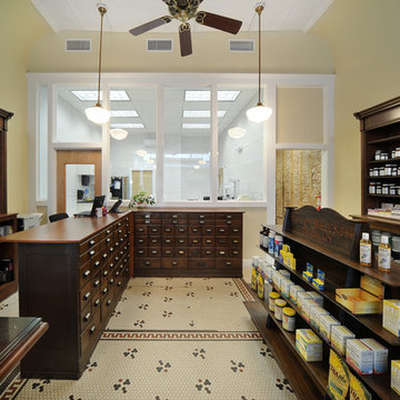
When Menges & Curtis Pharmacy opened during the height of the Industrial Revolution on Saratoga Springs’ main street, its druggists mixed tinctures and remedies to their own formulas, examined and treated patients and even applied leeches if it was deemed appropriate.
By 2010, the family that had owned the Menges & Curtis for the past 50 years was struggling with the conventional pharmacist’s lot in modern life: handing out prepared medications for an increasingly lower insurance reimbursements, and trying to make up the difference by selling spa and personal care products. All the while, M&C’s traditional clientele was drifting away to chain drugstores, supermarkets and retailers such as Walmart stores, which were dispensing medications at low margins to lure shoppers into their aisles while they waited for their prescriptions.
The owner restructured his business plan, selling his traditional pharmacy assets to a chain and creating a partnership with a “compounding shop” in Latham to go back to time-honored methods of creating personally formulated nutritional and vitamin supplements, hormone balancers and natural wellness herbal extracts for preventative health maintenance, chronic illnesses, veterinary and pediatric care.
Now a new business with an old-school ethos, Fallon Wellness Pharmacy needed substantial renovations to its iconic storefront in the S.W. Ainsworth Building in Saratoga’s Broadway Historic District. The low ceilings made the space feel cramped, and storage was ineffective. The new partners called upon Old Saratoga Restorations to project manage a complete modernization of the space, adding graceful private consultation rooms and compounding labs to comply with health and safety codes, while respecting the integrity of the ornate High Victorian 1871 brick commercial block building.
 Robin's Nest Interiors
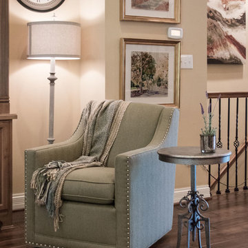
This project was for a long time client of mine who lives in a wonderful patio home with a finished basement. There were several challenges with which to contend. First, as you enter the Foyer, all of the spaces are open to each other so we had to make sure everything worked together. Second, furniture arrangement had always been a struggle for the large living area with the fireplace on an angled corner wall and large built-in. Last, although the homeowner loves color – especially blue/greens – we had to convince her to bring it into her home as an accent and make it work with the other spaces.
We started with a neutral sofa positioned across from the built-ins and paired it with a settee in a blue/green fabric. The settee does not block the fireplace and reinforces our color scheme. The homeowner upgraded her husband’s chair and ottoman with a contemporary leather one, and we added a perfectly scaled swivel chair to the corner next to the built-ins. We finished off the space with a mixture of unique accent tables including a beautiful coffee table with wood inlay, a small metal french drink table, a two-tiered egg shaped table, and a pedestal table with marble top. We added lighting, artwork and accessories to the built-ins and tables to complete the space. We also added blue/green accessories to the breakfast area to make the spaces flow seamlessly.
We love how these spaces in the Open Concept Redesign turned out. It is a very pleasing palette that does not overwhelm the spaces, but adds interest. Enjoy!
 TVL Creative Ltd.
This project was such an incredible design opportunity, and instilled inspiration and excitement at every turn! Our amazing clients came to us with the challenge of converting their beloved family home into a welcoming haven for all members of the family. At the time that we met our clients, they were struggling with the difficult personal decision of the fate of the home. Their father/father-in-law had passed away and their mother/mother-in-law had recently been admitted into a nursing facility and was fighting Alzheimer’s. Resistant to loss of the home now that both parents were out of it, our clients purchased the home to keep in in the family. Despite their permanent home currently being in New Jersey, these clients dedicated themselves to keeping and revitalizing the house. We were moved by the story and became immediately passionate about bringing this dream to life.
The home was built by the parents of our clients and was only ever owned by them, making this a truly special space to the family. Our goal was to revitalize the home and to bring new energy into every room without losing the special characteristics that were original to the home when it was built. In this way, we were able to develop a house that maintains its own unique personality while offering a space of welcoming neutrality for all members of the family to enjoy over time.
The renovation touched every part of the home: the exterior, foyer, kitchen, living room, sun room, garage, six bedrooms, three bathrooms, the laundry room, and everything in between. The focus was to develop a style that carried consistently from space to space, but allowed for unique expression in the small details in every room.
Starting at the entry, we renovated the front door and entry point to offer more presence and to bring more of the mid-century vibe to the home’s exterior. We integrated a new modern front door, cedar shingle accents, new exterior paint, and gorgeous contemporary house numbers that really allow the home to stand out. Just inside the entry, we renovated the foyer to create a playful entry point worthy of attention. Cement look tile adorns the foyer floor, and we’ve added new lighting and upgraded the entry coat storage.
Upon entering the home, one will immediately be captivated by the stunning kitchen just off the entry. We transformed this space in just about every way. While the footprint of the home ultimately remained almost identical, the aesthetics were completely turned on their head. We re-worked the kitchen to maximize storage and to create an informal dining area that is great for casual hosting or morning coffee.
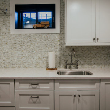
We removed the entry to the garage that was once in the informal dining, and created a peninsula in its place that offers a unique division between the kitchen/informal dining and the formal dining and living areas. The simple light warm light gray cabinetry offers a bit of traditional elegance, along with the marble backsplash and quartz countertops. We extended the original wood flooring into the kitchen and stained all floors to match for a warmth that truly resonates through all spaces. We upgraded appliances, added lighting everywhere, and finished the space with some gorgeous mid century furniture pieces.
In the formal dining and living room, we really focused on maintaining the original marble fireplace as a focal point. We cleaned the marble, repaired the mortar, and refinished the original fireplace screen to give a new sleek look in black. We then integrated a new gas insert for modern heating and painted the upper portion in a rich navy blue; an accent that is carried through the home consistently as a nod to our client’s love of the color.
The former entry into the old covered porch is now an elegant glass door leading to a stunning finished sunroom. This room was completely upgraded as well. We wrapped the entire space in cozy white shiplap to keep a casual feel with brightness. We tiled the floor with large format concrete look tile, and painted the old brick fireplace a bright white. We installed a new gas burning unit, and integrated transitional style lighting to bring warmth and elegance into the space. The new black-frame windows are adorned with decorative shades that feature hand-sketched bird prints, and we’ve created a dedicated garden-ware “nook” for our client who loves to work in the yard. The far end of this space is completed with two oversized chaise loungers and overhead lights…the most perfect little reading nook!
Just off the dining room, we created an entirely new space to the home: a mudroom. The clients lacked this space and desperately needed a landing spot upon entering the home from the garage. We uniquely planned existing space in the garage to utilize for this purpose, and were able to create a small but functional entry point without losing the ability to park cars in the garage. This new space features cement-look tile, gorgeous deep brown cabinetry, and plenty of storage for all the small items one might need to store while moving in and out of the home.
The remainder of the upstairs level includes massive renovations to the guest hall bathroom and guest bedroom, upstairs master bed/bath suite, and a third bedroom that we converted into a home office for the client.
Some of the largest transformations were made in the basement, where unfinished space and lack of light were converted into gloriously lit, cozy, finished spaces. Our first task was to convert the massive basement living room into the new master bedroom for our clients. We removed existing built-ins, created an entirely new walk-in closet, painted the old brick fireplace, installed a new gas unit, added carpet, introduced new lighting, replaced windows, and upgraded every part of the aesthetic appearance. One of the most incredible features of this space is the custom double sliding barn door made by a Denver artisan. This space is truly a retreat for our clients!
We also completely transformed the laundry room, back storage room, basement master bathroom, and two bedrooms.
This home’s massive scope and ever-evolving challenges were thrilling and exciting to work with, and the result is absolutely amazing. At the end of the day, this home offers a look and feel that the clients love. Above all, though, the clients feel the spirit of their family home and have a welcoming environment for all members of the family to enjoy for years to come.
 Amsted Design-Build
Previously renovated with a two-story addition in the 80’s, the home’s square footage had been increased, but the current homeowners struggled to integrate the old with the new.
An oversized fireplace and awkward jogged walls added to the challenges on the main floor, along with dated finishes. While on the second floor, a poorly configured layout was not functional for this expanding family.
From the front entrance, we can see the fireplace was removed between the living room and dining rooms, creating greater sight lines and allowing for more traditional archways between rooms.
At the back of the home, we created a new mudroom area, and updated the kitchen with custom two-tone millwork, countertops and finishes. These main floor changes work together to create a home more reflective of the homeowners’ tastes.
On the second floor, the master suite was relocated and now features a beautiful custom ensuite, walk-in closet and convenient adjacency to the new laundry room.
Gordon King Photography
101