
Search results for "Struggles" in Home Design Ideas
 Tile Merchant
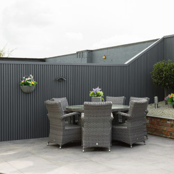
Exterior Wall Cladding: The Ultimate Patio Makeover ?️?
Modern design that actually survives the Irish weather. Take a look at this stunning transformation by the team at Four Seasons Plantscapes.
By choosing our Grey Exterior Wall Panelling, they achieved that sleek, contemporary finish that—let’s be honest—traditional timber just can’t maintain in Ireland without a constant struggle. ???
Why this makeover works:
Architectural Contrast: Clean grey lines that make the garden greenery pop.
Total Resilience: 100% waterproof. No rot, no warping, no drama.
Zero Maintenance: The luxury look of wood without ever picking up a sander or paintbrush again. ??
Professional Finish: Flawless install thanks to our specialized tongue-and-groove system.
It’s the perfect example of how the right materials turn a standard garden into a proper outdoor sanctuary. ☕️?
 Amazing Cabinetry & Bath
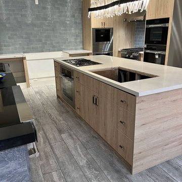
From chic countertops to custom cabinetry you won't struggle to envision a fun, functional, and stylish environment that meets your taste and style. Convenient, value, and a functional heart of your house are just a cooking space remodel away.
#kitchen_design
#kitchen
#interior_design
#kitchen_remodel
#kitchen_cabinets
#Laguna_Beach
 Alair Homes Plano
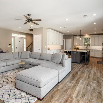
Our clients wanted to increase the size of their kitchen, which was small, in comparison to the overall size of the home. They wanted a more open livable space for the family to be able to hang out downstairs. They wanted to remove the walls downstairs in the front formal living and den making them a new large den/entering room. They also wanted to remove the powder and laundry room from the center of the kitchen, giving them more functional space in the kitchen that was completely opened up to their den. The addition was planned to be one story with a bedroom/game room (flex space), laundry room, bathroom (to serve as the on-suite to the bedroom and pool bath), and storage closet. They also wanted a larger sliding door leading out to the pool.
We demoed the entire kitchen, including the laundry room and powder bath that were in the center! The wall between the den and formal living was removed, completely opening up that space to the entry of the house. A small space was separated out from the main den area, creating a flex space for them to become a home office, sitting area, or reading nook. A beautiful fireplace was added, surrounded with slate ledger, flanked with built-in bookcases creating a focal point to the den. Behind this main open living area, is the addition. When the addition is not being utilized as a guest room, it serves as a game room for their two young boys. There is a large closet in there great for toys or additional storage. A full bath was added, which is connected to the bedroom, but also opens to the hallway so that it can be used for the pool bath.
The new laundry room is a dream come true! Not only does it have room for cabinets, but it also has space for a much-needed extra refrigerator. There is also a closet inside the laundry room for additional storage. This first-floor addition has greatly enhanced the functionality of this family’s daily lives. Previously, there was essentially only one small space for them to hang out downstairs, making it impossible for more than one conversation to be had. Now, the kids can be playing air hockey, video games, or roughhousing in the game room, while the adults can be enjoying TV in the den or cooking in the kitchen, without interruption! While living through a remodel might not be easy, the outcome definitely outweighs the struggles throughout the process.
Find the right local pro for your project
 Houseplay Renovations LLC
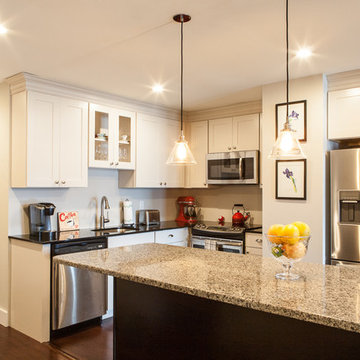
When this family wanted to renovate their 1-bedroom apartment, they called on Houseplay to help. Together, we created a cozy, modern layout that both facilitates relationships and increases the value of their home.
Specifically, the new layout features a larger bathroom, a new standing shower, an open plan kitchen with an island, and a laundry closet too. Our team installed new bamboo flooring, new doors and mouldings, and new recessed and feature lighting throughout the space; we also painted the entire apartment.
It’s amazing what a difference the layout of a space can make. If you’re struggling with a sub-par layout in your home or apartment, don’t wait; contact Houseplay for a consultation today!
Photo Credit: Anne Ruthmann Photography
 Marvista Design + Build
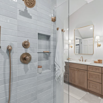
Our clients were struggling with their existing bathroom layout as it was not an efficient use of space.Their vision included a freestanding tub and a more open shower. The existing tile was also very dark and didn’t reflect the homeowners style. In order to achieve the aesthetics and functionality our clients were looking for, we designed a wet room to accommodate a tub and shower area by using the space where the toilet once sat. We also turned the shower into a water closet, elevating the bathroom’s functionality. The wall to wall maple stained vanity provides plenty of storage space for the homeowners. The space was brightened with elegant pulpis marble-inspired porcelain and a light wall tile.

 UpScapers: Landscape, Elevated
Vistafolia's luxurious foliage panels provided the perfect decorative screening solution for this classic formal garden in Hampstead, London, harmonizing beautifully with the conventional elegance of the scheme.
Privacy screening with the customary trellis from the neighboring property posed a problem in the shady boundary space, as real planting would struggle without sufficient natural light. The client also desired an attractive green backdrop to improve the visual appeal of the bust sculpture as well as the handsome formal trees lining the perimeter.
 Odyssey Woodworks
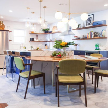
Inspiration for a large contemporary l-shaped marble floor and white floor eat-in kitchen remodel in Charleston with a farmhouse sink, flat-panel cabinets, blue cabinets, quartzite countertops, white backsplash, stainless steel appliances and an island


 Tile Merchant
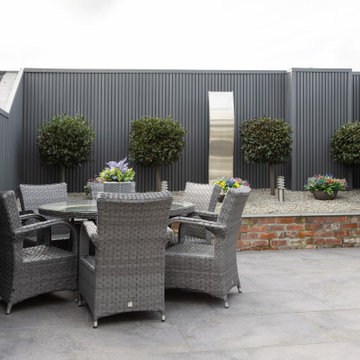
Exterior Wall Cladding: The Ultimate Patio Makeover ?️?
Modern design that actually survives the Irish weather. Take a look at this stunning transformation by the team at Four Seasons Plantscapes.
By choosing our Grey Exterior Wall Panelling, they achieved that sleek, contemporary finish that—let’s be honest—traditional timber just can’t maintain in Ireland without a constant struggle. ???
Why this makeover works:
Architectural Contrast: Clean grey lines that make the garden greenery pop.
Total Resilience: 100% waterproof. No rot, no warping, no drama.
Zero Maintenance: The luxury look of wood without ever picking up a sander or paintbrush again. ??
Professional Finish: Flawless install thanks to our specialized tongue-and-groove system.
It’s the perfect example of how the right materials turn a standard garden into a proper outdoor sanctuary. ☕️?
 David Heide Design Studio
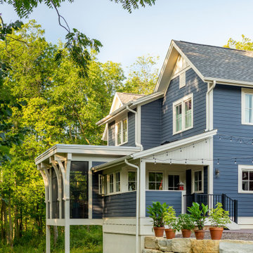
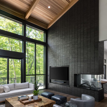
In coming to Minnesota from Iceland, the owners of Home 4 found themselves more than 3,000 miles away from home, hoping to build something new – literally and figuratively – that would feel like home for their family of five. They purchased a scenic piece of land in Rochester and identified a general idea of the spaces they would need, but they struggled with how to define a sense of character that would incorporate their culture and identity into the design. The architect-led design team was tasked with creating a house that would help establish the homeowners’ roots in a new country while still recalling familiar comforts of their heritage.
The result is a warm family home that combines elements of Nordic design with a touch of American farmhouse aesthetic. Gracious proportions, custom woodworking, and cheerful details create a welcoming atmosphere, while modern conveniences like a large mudroom and second-floor laundry help day-to-day life feel easy.
Around each corner, a new detail greets the eye, from the Lundie-inspired column at the staircase, to the double-heart detail inscribed in the woodwork, to the custom table designed for the breakfast nook. Each element is lovely individually, but experiencing the holistic effect as the details intentionally pair and play together helps to craft a house that feels like home.
Most important, the homeowners’ history, heritage, and hopes are melded together into a home that represents their family. Each unique element and carefully considered material combine to form a house that feels as if it could have belonged to this family for generations, even though it is brand new.
 Forward Design Build Remodel
Our clients relocated to Ann Arbor and struggled to find an open layout home that was fully functional for their family. We worked to create a modern inspired home with convenient features and beautiful finishes.
This 4,500 square foot home includes 6 bedrooms, and 5.5 baths. In addition to that, there is a 2,000 square feet beautifully finished basement. It has a semi-open layout with clean lines to adjacent spaces, and provides optimum entertaining for both adults and kids.
The interior and exterior of the home has a combination of modern and transitional styles with contrasting finishes mixed with warm wood tones and geometric patterns.
 ornamental land design
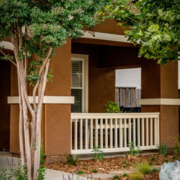
This front yard was transformed from a patchy lawn and sparse, struggling shrubs into a vibrant and welcoming garden. The old grass and tired plantings were removed to make way for a new design featuring colorful perennials, soft-textured grasses, and rich mulch for a polished, healthy look. Striking green boulders were added as sculptural focal points—subtle in dry weather but revealing a deeper, more vivid green hue when wet. These stones anchor the space and provide natural contrast to the planting. The updated landscape brings curb appeal, texture, and seasonal color to the front of the home.
 Mottram Architecture
Timber frame homes offer unique challenges during a remodel. What often makes them beautiful and attractive to most homeowners, also makes them challenging for space requirements.
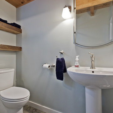
Context: The lovely couple that owned this home were struggling with some interesting floor plan challenges that just didn't work for their family. The loved the beautiful timbers and woodwork of their home, but the dramatically sloping ceilings on the second floor, particularly in the bathroom, just didn't work for this 1 1/2 bath home. Needing to use the skylight to approach the toilet was a less then ideal scenario. Although the bathroom footprint was more then adequate, the sloped ceiling only made half of the space useable. Check out the Before/After post on our blog to see the photos of the house pre-renovation. As much as they loved all the wood features in their home, another challenge they had was light. The wood ceiling made everything inside the house darker, even with a fantastic array of south facing windows, there were spaces in the home that felt dark and small. When they contacted us they wanted to know how could they make their brighter and more inviting, were there solutions to the 2nd floor sloped ceiling issues, and if they were going to do all of this work, how could they make their home more comfortable and efficient. A nagging water leak in the upstairs bathroom spurred them into action and here is how we solved their dilemma.
Conclusion: First, we added a little dormer to the rear of the house so we could get full headroom in nearly all of the upstairs bathroom! Then we decided to extend that dormer one more timber bay over to create a walk in closet with natural light and plenty of space. Since we were contemplating energy efficiency, we resolved a nagging issue that is present in a lot of timber frame construction, air tightness. Commonly found in timber frame construction, fiberglass insulation is installed in the rafter bays and board ceilings are installed over top. Unfortunately, board ceilings are anything but air tight, and fiberglass insulation needs to be in an airtight cavity for maximum effectiveness. So we were able to solve two issues at the same time for this homeowner. We removed the board ceiling and fiberglass insulation, we dense packed the rafter bays with cellulose insulation, and installed sheetrock in place of the boards. The boards were salvaged for re-use by the homeowner, and the space and light quality was dramatically improved. Some may think that losing the board ceiling took something away from the space, but what you'll see in the pictures is that it highly accentuates the heavy timbers and really makes them stand out in a beautiful way. Now with this added airtightness, better insulation, and brighter space, the homeowner hardly runs their wood stove, and it's so quiet in the space, an added bonus from changing the insulation. It became necessary to also add a sheetrock ceiling to the living room to hide the plumbing from the new bathroom layout above. Changing this ceiling gave the homeowner some real quality lighting that was lacking in the living room before. The brighter ceiling and new lighting layout completely transforms the living room into a space you want to hang out, even though the layout didn't change at all. When the homeowner saw the finished spaces she said "I can't believe this is my house, I want to live in this house"
Energy Efficiency: I touched a little on the efficiency above, but like all projects done with Mottram Architecture, we always want to leave you with a little extra. Timber frame construction with board ceilings and fiberglass insulation are notoriously leaky! If you want to know what we think about fiberglass insulation, check our our blog post on Why Fiberglass Insulation Sucks. By installing cellulose insulation and covering it with sheetrock we were able to greatly reduce the heat flowing out of this home. It not only improves cashflow it improves the comfort level in the space. Who wants to sit in their living room and feel a draft? Let us remind you, we are not saying cellulose insulation is an air barrier, we use the sheetrock to help with that, but it does significantly reduce the air flow over fiberglass insulation. And when we reduce the airflow, we reduce the heat flow. And when we reduce the heat flow, we reduce the need to re-heat that drafty air from outside. When it comes to energy efficiency the first and best place to start is air infiltration. We greatly reduced the air infiltration with the new insulation, but we also added a hat and warm boots. What I mean by that is, we improved the insulation in the roof, and we installed insulation in the basement. Maybe it's a silly analogy, but when you think about keeping warm, we always start with the hat and boots! With sustainability in mind, the next project will be to add a deck to the front of this house with rain catchment barrels from the metal roof. They are planning to plant a garden in the spring and the rain catchment system will help to irrigate the new garden.
Builder: East Shore Builders
Photographer: Michael Eric Berube
 TVL Creative Ltd.
This project was such an incredible design opportunity, and instilled inspiration and excitement at every turn! Our amazing clients came to us with the challenge of converting their beloved family home into a welcoming haven for all members of the family. At the time that we met our clients, they were struggling with the difficult personal decision of the fate of the home. Their father/father-in-law had passed away and their mother/mother-in-law had recently been admitted into a nursing facility and was fighting Alzheimer’s. Resistant to loss of the home now that both parents were out of it, our clients purchased the home to keep in in the family. Despite their permanent home currently being in New Jersey, these clients dedicated themselves to keeping and revitalizing the house. We were moved by the story and became immediately passionate about bringing this dream to life.
The home was built by the parents of our clients and was only ever owned by them, making this a truly special space to the family. Our goal was to revitalize the home and to bring new energy into every room without losing the special characteristics that were original to the home when it was built. In this way, we were able to develop a house that maintains its own unique personality while offering a space of welcoming neutrality for all members of the family to enjoy over time.
The renovation touched every part of the home: the exterior, foyer, kitchen, living room, sun room, garage, six bedrooms, three bathrooms, the laundry room, and everything in between. The focus was to develop a style that carried consistently from space to space, but allowed for unique expression in the small details in every room.
Starting at the entry, we renovated the front door and entry point to offer more presence and to bring more of the mid-century vibe to the home’s exterior. We integrated a new modern front door, cedar shingle accents, new exterior paint, and gorgeous contemporary house numbers that really allow the home to stand out. Just inside the entry, we renovated the foyer to create a playful entry point worthy of attention. Cement look tile adorns the foyer floor, and we’ve added new lighting and upgraded the entry coat storage.
Upon entering the home, one will immediately be captivated by the stunning kitchen just off the entry. We transformed this space in just about every way. While the footprint of the home ultimately remained almost identical, the aesthetics were completely turned on their head. We re-worked the kitchen to maximize storage and to create an informal dining area that is great for casual hosting or morning coffee.
We removed the entry to the garage that was once in the informal dining, and created a peninsula in its place that offers a unique division between the kitchen/informal dining and the formal dining and living areas. The simple light warm light gray cabinetry offers a bit of traditional elegance, along with the marble backsplash and quartz countertops. We extended the original wood flooring into the kitchen and stained all floors to match for a warmth that truly resonates through all spaces. We upgraded appliances, added lighting everywhere, and finished the space with some gorgeous mid century furniture pieces.
In the formal dining and living room, we really focused on maintaining the original marble fireplace as a focal point. We cleaned the marble, repaired the mortar, and refinished the original fireplace screen to give a new sleek look in black. We then integrated a new gas insert for modern heating and painted the upper portion in a rich navy blue; an accent that is carried through the home consistently as a nod to our client’s love of the color.
The former entry into the old covered porch is now an elegant glass door leading to a stunning finished sunroom. This room was completely upgraded as well. We wrapped the entire space in cozy white shiplap to keep a casual feel with brightness. We tiled the floor with large format concrete look tile, and painted the old brick fireplace a bright white. We installed a new gas burning unit, and integrated transitional style lighting to bring warmth and elegance into the space. The new black-frame windows are adorned with decorative shades that feature hand-sketched bird prints, and we’ve created a dedicated garden-ware “nook” for our client who loves to work in the yard. The far end of this space is completed with two oversized chaise loungers and overhead lights…the most perfect little reading nook!
Just off the dining room, we created an entirely new space to the home: a mudroom. The clients lacked this space and desperately needed a landing spot upon entering the home from the garage. We uniquely planned existing space in the garage to utilize for this purpose, and were able to create a small but functional entry point without losing the ability to park cars in the garage. This new space features cement-look tile, gorgeous deep brown cabinetry, and plenty of storage for all the small items one might need to store while moving in and out of the home.
The remainder of the upstairs level includes massive renovations to the guest hall bathroom and guest bedroom, upstairs master bed/bath suite, and a third bedroom that we converted into a home office for the client.
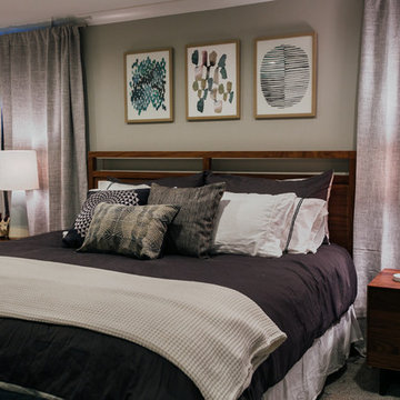
Some of the largest transformations were made in the basement, where unfinished space and lack of light were converted into gloriously lit, cozy, finished spaces. Our first task was to convert the massive basement living room into the new master bedroom for our clients. We removed existing built-ins, created an entirely new walk-in closet, painted the old brick fireplace, installed a new gas unit, added carpet, introduced new lighting, replaced windows, and upgraded every part of the aesthetic appearance. One of the most incredible features of this space is the custom double sliding barn door made by a Denver artisan. This space is truly a retreat for our clients!
We also completely transformed the laundry room, back storage room, basement master bathroom, and two bedrooms.
This home’s massive scope and ever-evolving challenges were thrilling and exciting to work with, and the result is absolutely amazing. At the end of the day, this home offers a look and feel that the clients love. Above all, though, the clients feel the spirit of their family home and have a welcoming environment for all members of the family to enjoy for years to come.
 Bellwether Windows, Siding & Doors
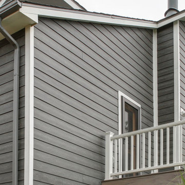
This Louisville home in the Boulder Area had old, cracked and warping cedar siding on it. The homeowners were struggling to maintain it and had a persistent problem with woodpeckers. They like the look of natural wood but wanted something that would outlast their time in the home and would allow for minimal upkeep. We suggested a unique product that we love, which happens to meet both of these requirements: James Hardie siding from WoodTone RusticSeries. This product is a James Hardie lap siding product that has a factory finish from a third-party finishing company, WoodTone. The base product, James Hardie HardiePlank lap siding, has a 30-year warranty. WoodTone's process for finishing this product gives it the look of stained wood with the benefit of a 15-year finish warranty. The homeowner selected the color Costal Gray for the body and James Hardie's Arctic White for the trim. We also installed James Hardie ColorPlus fascia and vented soffits in the color Arctic White. How do you think it turned out?
 Sosna Inc
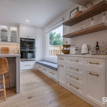
Our clients, a vibrant young family with two energetic kids and a playful dog, were feeling the constraints of their outdated, cramped house. The Main Floor was divided by walls, fragmenting the Kitchen, Dining Room, and living areas, making family time and entertaining a bit of a struggle.
The Kitchen was small and dim, lacking counter space and storage. The kids' study/play table was squeezed into a tight corner, emphasizing the lack of space. The dark hardwood floors were scratched and worn, and the foyer felt cramped and uninviting. The powder room was also
The idea of a major renovation brought both excitement and a bit of anxiety. The couple was unsure about design decisions and worried about the challenges of dealing with structural columns and beams.
Collaborating with Sosna designer Camila, the family embarked on a journey to transform their outdated house into a bright, functional home.
To open up the space, walls were removed, creating a seamless flow between the foyer, living room, dining room, and kitchen.
The kitchen was relocated and expanded to include generous counter space and a large island, providing the ideal spot for the kids to help prepare meals—a task they’ve come to enjoy since the renovation—or work on their homework. Additionally, the addition of a cozy window bench offers extra seating for hanging out with the family. It’s also the perfect place to curl up with a good book.
The once dark and gloomy powder room was completely refreshed with new fixtures, a white oak vanity, and beautiful floor tiles, which significantly brightened it up.
Additionally, the dark hardwood floors were replaced with a lighter, more modern option, brightening the entire main floor.
The renovation wasn't without its hiccups. A mix-up with the hardwood flooring led to a last-minute scramble for a replacement. But in the end, the family fell in love with the new flooring, proving that sometimes unexpected changes can lead to even better outcomes.
The renovation completely transformed the home. What was once a cramped and segmented main floor is now a bright, open space perfectly suited to the family's lifestyle. The new kitchen island became the heart of the home, providing a place for the kids to do homework while their parents cooked, fostering a sense of togetherness. The open layout also made hosting gatherings effortless.
Throughout the renovation, the kids and their dog brought a playful energy to the construction site, forming a special bond with the crew. Despite the challenges of living through a renovation, the family managed to maintain a sense of normalcy, working from home when possible and appreciating the crew's efforts to keep things tidy.
What started as a simple update turned into a full-scale transformation that reflects the family’s needs and personal style. Their willingness to embrace bold design choices, such as blush pink tiles and bright floral patterns, adds a unique touch to the space. And that hardwood flooring mix-up? It turned out to be a happy accident, resulting in a floor they love even more.
In the end, this renovation was more than just a home makeover; it was about creating a space that truly feels like home, nurturing family connections, and bringing joy to everyday life.
 Jenii Strzelecki
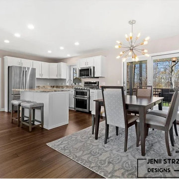
This Caledonia couple had been in their home for a short time, but were really struggling with what to do with their long and odd shaped great room. They both had a great vision for the style they wanted and had known they wanted a mix of contemporary and industrial pieces to take up the space. After some careful space planning, I was able to come up with a plan that maximized their living space and captured the mixed media style they were hoping for! We also replaced their dining set, furnished their back patio and converted their loft area from an office to a comfy lounge area!
 Designs By Des Interiors
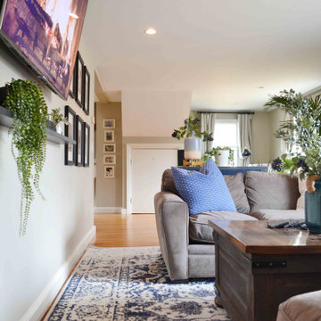
The "Nautical Green Living" project was a residential project that included an open living room space, dining room, and entryway. The client struggled with creating an inviting open room without it being cluttered. By diving the room into functional sections, the reading nook, entertainment, and small office area, we created a multi-functional space filled with green life and nautical vibes.
 Blackwood Painting
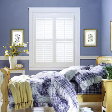
Mid-sized elegant light wood floor and beige floor bedroom photo in Other with purple walls and no fireplace
 Spark Modern Fires
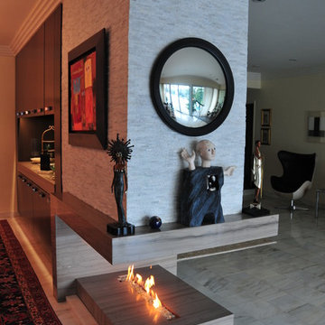
An incredible three-sided fireplace wall that separated our dining room from our living room was the last element in our 1950 that needed to be remodeled. As the Architect and homeowner, I struggled with how to modernize this feature. The new look is clean and modern, but also very comforting and approachable. The renovated fireplace and fireplace wall evokes conversation. Although our fireplace season is short in Miami Beach, we still turn it on during cocktail parties and when friends come over. The new fireplace wall and fireplace incorporates a buffet and cabinetry on the dining room side, a mantle that becomes a shelf on the living room side, and of course a striking linear fire in a new open to the air fireplace.
Architect: TSAO Design Group
Designer: Jason Hagopian
Photographer: Jason Hagopian
Linear Burner System Indoor
 Rockland Interiors Incorporated
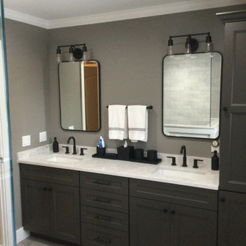
The customer requested a larger vanity with two sinks and a linen storage tower to replace the small vanity that they struggled with. The shower used to be where the new linen tower is.
63