
Search results for "Style problem" in Home Design Ideas

 Trilogy Construction Company
Great glass scallop tile detail. This tile is bordered by slabs of white marble.
Bathroom - modern bathroom idea in Miami
Bathroom - modern bathroom idea in Miami

 Alisha Taylor Interiors
A parent-freindly playroom means that this room can act as a gathering place for the entire family!!! A comfy custom sectional with a custom ottoman to put your feet up on, a large screen TV wall for adults and kids alike! The built-in bookcases have pull out desktops hidden away with patterned ottomans as desk chairs or can double as a footrest while lounging with a good book on the window seat. Two whiteboards and a magnetic board to display the very best art projects, handwriting and math problems. Each lit with the kelly green wall pandants. A multishelf gutter style bookcase wall under the vintage letters that say it all "PLAY!" Kid books on the bottom shelves with mom's parenting magazines on the top shelf. Custom drapes frame in the bay window and help seperate the bold damask wallpaper from the rest of the space. The bay is complete with two art tables, four chairs and a roll of white paper where the creativity can start. Checkerboard ceramic tile floor in 24" x 24" tiles set the tone for the pattern-filled playroom. The custom rug with bold raised polka dots adds comfort for little ones who want to lay on the ground and add a dramatic twist to the entire room. Two wallpapers, 3 paint colors, one unique floor, a custom patterened area rug, and over 12 patterened fabrics used in just this room!
Who says you can't have fun with patterns?
Interior Designer: Alisha Newman
Photo Credit: Joshua Caldwell

 TKS Design Group
Free ebook, Creating the Ideal Kitchen. DOWNLOAD NOW
Designed by: Susan Klimala, CKD, CBD
Photography by: LOMA Studios
For more information on kitchen and bath design ideas go to: www.kitchenstudio-ge.com
Find the right local pro for your project

 Regenesis Ecological Design
Clematis armandii 'Evergreen Clematis' (foreground) arches over a custom-built cedar arbor, modeled to accentuate the home's Craftsman-style architecture. Welded mild-steel panel fills create a scaffold for Akebia quinata 'Five-leaf Akebia Vine' (background), lending seasonal privacy and afternoon shade along this narrow sideyard access walkway.

 Sunspace Design, Inc.
This project’s owner originally contacted Sunspace because they needed to replace an outdated, leaking sunroom on their North Hampton, New Hampshire property. The aging sunroom was set on a fieldstone foundation that was beginning to show signs of wear in the uppermost layer. The client’s vision involved repurposing the ten foot by ten foot area taken up by the original sunroom structure in order to create the perfect space for a new home office. Sunspace Design stepped in to help make that vision a reality.
We began the design process by carefully assessing what the client hoped to achieve. Working together, we soon realized that a glass conservatory would be the perfect replacement. Our custom conservatory design would allow great natural light into the home while providing structure for the desired office space.
Because the client’s beautiful home featured a truly unique style, the principal challenge we faced was ensuring that the new conservatory would seamlessly blend with the surrounding architectural elements on the interior and exterior. We utilized large, Marvin casement windows and a hip design for the glass roof. The interior of the home featured an abundance of wood, so the conservatory design featured a wood interior stained to match.
The end result of this collaborative process was a beautiful conservatory featured at the front of the client’s home. The new space authentically matches the original construction, the leaky sunroom is no longer a problem, and our client was left with a home office space that’s bright and airy. The large casements provide a great view of the exterior landscape and let in incredible levels of natural light. And because the space was outfitted with energy efficient glass, spray foam insulation, and radiant heating, this conservatory is a true four season glass space that our client will be able to enjoy throughout the year.

 Decorating Den Interiors-Barbara Tabak
The client’s goal for this makeover was to create a clean style with a contemporary vibe in her cold empty bedroom. The client’s main focus for the design was to block the morning sun that woke her up long before she wanted to begin her day.
Problem(s) addressed:
The room was void of furnishings, bedding and accessories. The décor consisted of a mattress, box spring, jewelry chest and an old comforter, and therefore had no inspirational piece from which to begin the design. We were literally starting from scratch. As for the morning sun dilemma, I was excited to come up with a better solution to the sun challenge than her temporary solution of stacking towels in the arch window.
Solution provided:
Furnishings were the first priority. Rich espresso-stained contemporary dresser, gentleman’s chest and nightstands began the design. Next, a leopard print upholstered chaise was selected to sit in front of the double arched window providing a place to read, work on a laptop, and listen to music or just lounge. Two faux leather ottomans were selected to perch at the end of the bed.
Custom bedding and color scheme was next on the list. The client had requested a restful color palette, which fell into place when we found the perfect heather-gray, gold and cream hued bed ensemble. With the bedding selected, a coordinating wall paint and gold velvet fabric was chosen for the upholstered headboard.
To solve the clients early morning wake up call, traversing draperies that are installed above the window arch were designed to shut out the morning sun. The inverted French pleat draperies, with their color block design, enhance the room’s clean contemporary style. Brushed silver hardware with cracked crystal finials coordinated the furniture hardware and added a touch of sophistication.
Finally, a combination of elegant lighting, mixed media art, an area rug and accessories finish the room’s contemporary design.
 Che Bella Interiors Design + Remodeling
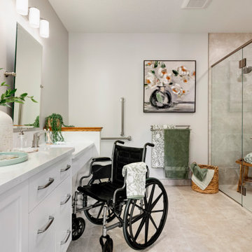
With an eye toward accessibility, this bathroom is designed to ease the everyday routines of a homeowner who often uses a wheelchair. Universal design strategies guided the project structurally with ADA-compatible elements incorporated throughout. One side of the vanity is set lower and left intentionally open underneath to accommodate the wheelchair when needed.
Visually, the project shines just as bright with white shaker-style cabinetry balanced by warm tones found elsewhere. Oversized warm gray porcelain wall tile partners beautifully with a diminutive square tile on the shower floor, while brushed nickel hardware and quartz countertops complete a timeless, classic appeal.
Photos by Spacecrafting Photography


 Custom Concepts Construction Inc.
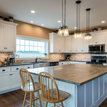
The overall appearance of the James Hardie products used on this home was a large improvement from before. It allowed the family to have the home they always wanted without any of the typical problems with vinyl siding.

 Built-Rite Kitchens
Inspiration for a transitional galley beige floor eat-in kitchen remodel in Orlando with a farmhouse sink, shaker cabinets, gray cabinets, white backsplash, subway tile backsplash, stainless steel appliances and white countertops
 Almesedoors
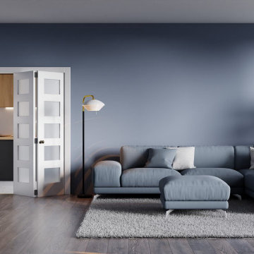
FINISH: PRIMED
The advantages of this approach – of this type of interior door finish – are fairly obvious. Pick a color, any color that suits your projects best. Mix and apply. Re- coat whenever you feel it is necessary to do so. Touch it up. It gives you, the proud owner of these interior doors, complete freedom of choice, and the significant savings, especially where it comes to bulk orders, can be a true source of joy.
As Kurt Vonnegut mentions in one of his novels (Bluebeard, unless I’m mistaken … check it out when you get a chance), the thrill of laying on colors is a large part of the artist’s professional satisfaction. In other words, a keen pleasure.
When back in the remote past visual arts became a field dominated by professionals rather than hobbyists, the main problem of “just laying on paint” became obvious: you can’t.
The medium of choice back then was egg tempera, a permanent, fast-drying substance consisting of colored pigments mixed with a water-soluble binder medium, usually glutinous material such as egg yolk. Portraits and ornaments were executed in this medium, and the wood panel was the surface of choice. One of tempera’s interesting features is that it is not as easily absorbed by wood as other mediums. Some sort of primer was necessary, of course, but pretty much any substance that dried evenly could be used.
The drawbacks of tempera, or pintura al temple, as the Spanish call it, only became obvious with the advent of the Renaissance, when the leading representatives of the trade turned to oil (and interior doors suddenly became a great deal less crude, but that’s a story for another day).
Oil painting is the process of “painting with pigments with a medium of drying oil as the binder.” Commonly used types include linseed (highly preferable in art, though not necessarily in interior doors, mind you), poppy seed, walnut, and safflower.
Today, five hundred years later, it is safe to say that oil is more versatile than pintura al temple – by orders of magnitude. Specifically, the contrasts achieved through the former are much greater, the darks are far deeper, and three- dimensional, highly realistic images are much easier to achieve. Next time you visit a museum, take a closer look at pintura al temple portraits. All of them, without exception, come off as a bit “flat” as opposed to their latter-day counterparts.
Also, where glazing is concerned …
Glazing: a painting technique in which a transparent layer, with just a touch of pigment, is laid over a previously painted surface, allowing light to travel through the glaze and be reflected back off of the opaque layer below. Gentle shadows, subtle changes of color, smooth transitions – all these can be achieved through glazing, which was used by all artists up until the middle of the Nineteenth Century, when artist tubes were invented, revolutionizing the field, and other techniques began to be explored.
Tempera enthusiasts (it takes all kinds to make a world) will assure you that glazing is not just possible in pintura al temple but is actually the basis of the whole enterprise. Well, what are you going to do? They’re enthusiasts.
Anyway, la peinture à l'huile, as the French call it, re-introduced the ancient problem of most surface’s propensity to absorb dipingere, as the Italians call the stuff. Wood or canvas, it is all the same: you’re not going to get very far without a good primer.
Experiments were conducted, and soon rabbit skin glue emerged as the least expensive and most effective solution. It was easy to apply. It dried evenly. It made the application of the l’huile stuff on top of it a walk in the park.
There were drawbacks. Today, rabbit skin glue is considered to be a major cause of cracking by most modern conservators. (Remember, when you visited the Metropolitan Museum of Art – and did you see those interior doors? … some of them are quite something … - most “old masters” pictures are completely covered with a cobweb of cracks? There you go). Because the glue is hygroscopic, it continually absorbs moisture from the atmosphere, causing the glue to swell and shrink as ambient humidity levels change. Over many humidity cycles, this repeated flexing causes the brittle oily layers to crack.
To combat this problem, modern primers are made of acrylic materials which are guaranteed not to cause any damage to the dipingere. No bubbling, no cracks. Your interior doors are safe.

 Vesel Contemporary Kitchens
BRICK CITY HOUSE
This client with the help of their architect, studio b architects / Aspen designed a program that
interconnected the interior, and courtyard / pool spaces with the beautiful colorado sky above.
simple clean, walnut wall paneling creates a warm and timeless feel that flows through this home.
The kitchen uses the full height of the interior, while staying in proportion to the space. The ease of
access to this dynamic area allows its multi purpose island to function as a pool party bar,
or gourmet kitchen for entertaining large groups… and as always a work zone for daily problem solving.
This extremely functional, but friendly kitchen was kept simple with small precise details to mimic the overall home.
veselbrand™ met the design challenges of this unique space using their Europa line of cabinetry with integrated horizontal pulls in tactical matte black
keeping the design simple & streamlined, beveled top drawer fronts mimic the knife edge krion countertop giving the large top the structural stability while looking light and minimal.
white matte glass upper cabinet doors and backsplashes accent the walnut and create a perfect place in the backsplash for the patented veselbrand power ports / invisible electrical receptacles.
project details:
brushed walnut veneer
white matte glass
snow white krion tops
veselbrand " stick " tall pulls
veselbrand power ports
miele appliances

 Paul Lopa Designs
See what our client say about Paul Lopa Designs:
It went as smooth as it possibly could go. The only bumps in the road was with what we found during demolition, you never know what your gonna run into when all the walls, floors and fixtures come out. Paul had explained to us that depending on what we found under all the out dated stuff it might take a little longer. Paul was there doing the work with his workers he showed up on time and finished on schedule. It was no problem being in touch with Paul because he answered his phone or got back to us in a timely fashion. He has an excellent sense of design he knows what goes well together and makes the house flow with comfort and usability.
Paul Lopa designs,inc

 TaylorPro Design and Remodeling, Inc.
"TaylorPro completely remodeled our master bathroom. We had our outdated shower transformed into a modern walk-in shower, new custom cabinets installed with a beautiful quartz counter top, a giant framed vanity mirror which makes the bathroom look so much bigger and brighter, and a wood ceramic tile floor including under floor heating. Kerry Taylor also solved a hot water problem we had by installing a recirculating hot water system which allows us to have instant hot water in the shower rather than waiting forever for the water to heat up.
From start to finish TaylorPro did a professional, quality job. Kerry Taylor was always quick to respond to any question or problem and made sure all work was done properly. Bonnie, the resident designer, did a great job of creating a beautiful, functional bathroom design combining our ideas with her own. Every member of the TaylorPro team was professional, hard-working, considerate, and competent. Any remodeling project is going to be somewhat disruptive, but the TaylorPro crew made the process as painless as possible by being respectful of our home environment and always cleaning up their mess at the end of the day. I would recommend TaylorPro Design to anyone who wants a quality project done by a great team of professionals. You won't be disappointed!"
~ Judy and Stuart C, Clients
Carlsbad home with Caribbean Blue mosaic glass tile, NuHeat radiant floor heating, grey weathered plank floor tile, pebble shower pan and custom "Whale Tail" towel hooks. Classic white painted vanity with quartz counter tops.
Bathroom Design - Bonnie Bagley Catlin, Signature Designs Kitchen Bath.
Contractor - TaylorPro Design and Remodeling
Photos by: Kerry W. Taylor

 Walczak Design And Build
THE PROBLEM
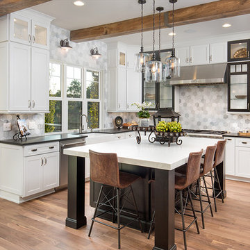
Our client adores their traditional layout and their traditional design style. But there were a few things that could be improved including flow and functionality in the kitchen - not to mention the cabinets, counters and appliances that had seen better days. The family room was used heavily for movie viewing, but it did not have a great set-up for the TV and was seriously lacking in the audio department. Their garage entry had become the primary way into the home for the homeowners, however it did not offer the welcoming feeling they wanted to have after a long day.
THE SOLUTION
To create better flow, we shifted the entry from the mud hall down a bit which gave us the space to add another run of cabinetry and relocate the fridge. We closed up the former dining room wall and converted it into a new office space as both homeowners work from home. Due to the shift in the entry from the mud hall, we also were able to then center the island to where it should be in the room creating some much needed balance.
Because we were not creating an open floor plan and removing walls and such, there was more budget for high ticket finishes. One of which was a 11’ custom walnut countertop for the island which became the anchoring design element for the kitchen along with custom cabinetry and high-end appliances.

 TAB Interior Designs LLC
Ready for a wonderful meal with friend!
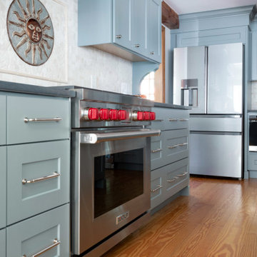
Example of a mid-sized transitional galley vinyl floor and brown floor eat-in kitchen design in Denver with an undermount sink, shaker cabinets, blue cabinets, quartz countertops, white backsplash, ceramic backsplash, stainless steel appliances, no island and white countertops
Example of a mid-sized transitional galley vinyl floor and brown floor eat-in kitchen design in Denver with an undermount sink, shaker cabinets, blue cabinets, quartz countertops, white backsplash, ceramic backsplash, stainless steel appliances, no island and white countertops
 Reico Kitchen & Bath
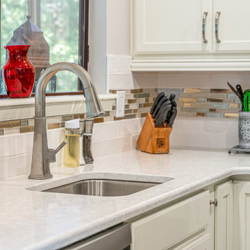
Designed by Sharleen Gomez of Reico Kitchen & Bath in Wilmington, DE in collaboration with Gives Me Shelter, this kitchen remodeling project features the transformation of a small kitchen into a transitional style inspired design. The kitchen features Merillat Classic cabinets in the door style Spring Valley in two finishes. The perimeter cabinets features a Chiffon finish with the kitchen island in a Steel Gray finish. The kitchen countertops Silestone Lusso.
The kitchen also includes Ceramica Ribesalbes 3x12 Matte Ivory subway tile, Glazzio Frost Glass Merino Glam tile and 12x24 V-Lux LVT Marfil flooring.
“I was changing the layout of my kitchen, and other companies I spoke to couldn’t get everything I needed in the confined space. Reico made it work! I love the look of the new countertop and backsplash, and Sharleen’s picks for tile were perfect! Sharleen was a wonderful and was essential to the process. She dealt with any problems that popped up quickly and efficiently,” said the customer.
“The client’s original kitchen was tiny. The space felt cramped, outdated and it made moving around and cooking difficult. The kitchen was also surrounded by soffits that we couldn’t remove,” said Sharleen.
“We wanted to create a space that was cohesive, modernized and brought in light to an otherwise dark room. The space we created is beautiful, light and so much more functional than the original! Working with the client was wonderful and making their ideas come alive was even better. She trusted my judgement and was super involved in the process!”
Photos courtesy of Dan Williams Photography.
 Reico Kitchen & Bath
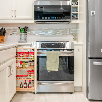
Designed by Sharleen Gomez of Reico Kitchen & Bath in Wilmington, DE in collaboration with Gives Me Shelter, this kitchen remodeling project features the transformation of a small kitchen into a transitional style inspired design. The kitchen features Merillat Classic cabinets in the door style Spring Valley in two finishes. The perimeter cabinets features a Chiffon finish with the kitchen island in a Steel Gray finish. The kitchen countertops Silestone Lusso.
The kitchen also includes Ceramica Ribesalbes 3x12 Matte Ivory subway tile, Glazzio Frost Glass Merino Glam tile and 12x24 V-Lux LVT Marfil flooring.
“I was changing the layout of my kitchen, and other companies I spoke to couldn’t get everything I needed in the confined space. Reico made it work! I love the look of the new countertop and backsplash, and Sharleen’s picks for tile were perfect! Sharleen was a wonderful and was essential to the process. She dealt with any problems that popped up quickly and efficiently,” said the customer.
“The client’s original kitchen was tiny. The space felt cramped, outdated and it made moving around and cooking difficult. The kitchen was also surrounded by soffits that we couldn’t remove,” said Sharleen.
“We wanted to create a space that was cohesive, modernized and brought in light to an otherwise dark room. The space we created is beautiful, light and so much more functional than the original! Working with the client was wonderful and making their ideas come alive was even better. She trusted my judgement and was super involved in the process!”
Photos courtesy of Dan Williams Photography.
Sponsored
Westerville, OH

Custom Home Works
Franklin County's Award-Winning Design, Build and Remodeling Expert
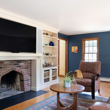 Walczak Design And Build
THE PROBLEM
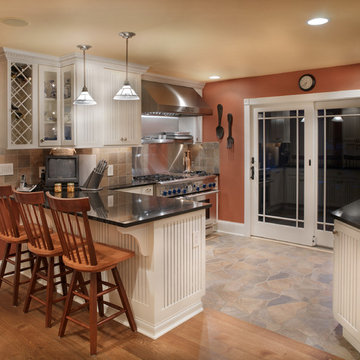
Our client adores their traditional layout and their traditional design style. But there were a few things that could be improved including flow and functionality in the kitchen - not to mention the cabinets, counters and appliances that had seen better days. The family room was used heavily for movie viewing, but it did not have a great set-up for the TV and was seriously lacking in the audio department. Their garage entry had become the primary way into the home for the homeowners, however it did not offer the welcoming feeling they wanted to have after a long day.
THE SOLUTION
To create better flow, we shifted the entry from the mud hall down a bit which gave us the space to add another run of cabinetry and relocate the fridge. We closed up the former dining room wall and converted it into a new office space as both homeowners work from home. Due to the shift in the entry from the mud hall, we also were able to then center the island to where it should be in the room creating some much needed balance.
Because we were not creating an open floor plan and removing walls and such, there was more budget for high ticket finishes. One of which was a 11’ custom walnut countertop for the island which became the anchoring design element for the kitchen along with custom cabinetry and high-end appliances.
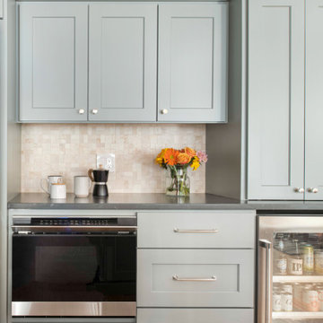 Walczak Design And Build
THE PROBLEM
Our client adores their traditional layout and their traditional design style. But there were a few things that could be improved including flow and functionality in the kitchen - not to mention the cabinets, counters and appliances that had seen better days. The family room was used heavily for movie viewing, but it did not have a great set-up for the TV and was seriously lacking in the audio department. Their garage entry had become the primary way into the home for the homeowners, however it did not offer the welcoming feeling they wanted to have after a long day.
THE SOLUTION
To create better flow, we shifted the entry from the mud hall down a bit which gave us the space to add another run of cabinetry and relocate the fridge. We closed up the former dining room wall and converted it into a new office space as both homeowners work from home. Due to the shift in the entry from the mud hall, we also were able to then center the island to where it should be in the room creating some much needed balance.
Because we were not creating an open floor plan and removing walls and such, there was more budget for high ticket finishes. One of which was a 11’ custom walnut countertop for the island which became the anchoring design element for the kitchen along with custom cabinetry and high-end appliances.
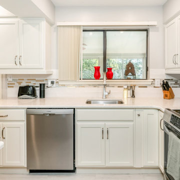 Reico Kitchen & Bath
Designed by Sharleen Gomez of Reico Kitchen & Bath in Wilmington, DE in collaboration with Gives Me Shelter, this kitchen remodeling project features the transformation of a small kitchen into a transitional style inspired design. The kitchen features Merillat Classic cabinets in the door style Spring Valley in two finishes. The perimeter cabinets features a Chiffon finish with the kitchen island in a Steel Gray finish. The kitchen countertops Silestone Lusso.
The kitchen also includes Ceramica Ribesalbes 3x12 Matte Ivory subway tile, Glazzio Frost Glass Merino Glam tile and 12x24 V-Lux LVT Marfil flooring.
“I was changing the layout of my kitchen, and other companies I spoke to couldn’t get everything I needed in the confined space. Reico made it work! I love the look of the new countertop and backsplash, and Sharleen’s picks for tile were perfect! Sharleen was a wonderful and was essential to the process. She dealt with any problems that popped up quickly and efficiently,” said the customer.
“The client’s original kitchen was tiny. The space felt cramped, outdated and it made moving around and cooking difficult. The kitchen was also surrounded by soffits that we couldn’t remove,” said Sharleen.
“We wanted to create a space that was cohesive, modernized and brought in light to an otherwise dark room. The space we created is beautiful, light and so much more functional than the original! Working with the client was wonderful and making their ideas come alive was even better. She trusted my judgement and was super involved in the process!”
Photos courtesy of Dan Williams Photography.
106