
Search results for "Style problem" in Home Design Ideas
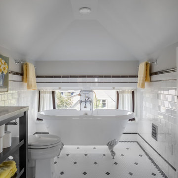
 Sheila Mayden Interiors
Attic bathroom with classic black and white tile scheme
Freestanding bathtub - small craftsman white tile and ceramic tile marble floor, white floor and single-sink freestanding bathtub idea in Seattle with shaker cabinets, black cabinets, a two-piece toilet, gray walls, an undermount sink, marble countertops, gray countertops, a niche and a freestanding vanity
Freestanding bathtub - small craftsman white tile and ceramic tile marble floor, white floor and single-sink freestanding bathtub idea in Seattle with shaker cabinets, black cabinets, a two-piece toilet, gray walls, an undermount sink, marble countertops, gray countertops, a niche and a freestanding vanity

 Before and After Builders, Inc.
Totally remodeled this bathroom and added a shower with a corner seat.
Inspiration for a small timeless 3/4 porcelain tile porcelain tile corner shower remodel in Nashville with an undermount sink, shaker cabinets, white cabinets, granite countertops, a two-piece toilet and green walls
Inspiration for a small timeless 3/4 porcelain tile porcelain tile corner shower remodel in Nashville with an undermount sink, shaker cabinets, white cabinets, granite countertops, a two-piece toilet and green walls

 Designer Kitchen & Bath of New York
This 1890's Farm House Kitchen had one major problem, the windows were too low to accommodate regular height cabinetry in front of them, stealing away storage and counter space. We added storage with custom drawer bench seats beneath each window. These aren't standard cabinets from Fabuwood, we used 12" wide x 42" high wall cabinet face frames and doors horizontally and installed wood dovetail drawer boxes with soft closing drawer glides to match the rest of the kitchen. We added valuable counter space with custom fitted, removable, Butcher Blocks by John Boos. The trash unit shown is Rev-a-shelf's latest and greatest installed onsite. The Spice pullouts by Rev-a-Shelf are also custom installed.
Kitchen Design by Alec Crosas
Fabuwood Cabinetry from Designer Kitchen & Bath of New York
Find the right local pro for your project

 Main Line Kitchen Design
The best kitchen showroom in your area may be closer closer than you think. The four designers there are some of the most experienced award winning kitchen designers in the Delaware Valley. They design in and sell 6 national cabinet lines. And their pricing for cabinetry is slightly less than at home centers in apples to apples comparisons. Where is this kitchen showroom and how come you don’t remember seeing it when it is so close by? It’s in your own home!
Main Line Kitchen Design brings all the same samples you select from when you travel to other showrooms to your home. We make design changes on our laptops in 20-20 CAD with you present usually in the very kitchen being renovated. Understanding what designs will look like and how sample kitchen cabinets, doors, and finishes will look in your home is easy when you are standing in the very room being renovated. Design changes can be emailed to you to print out and discuss with friends and family if you choose. Best of all our design time is free since it is incorporated into the very competitive pricing of your cabinetry when you purchase a kitchen from Main Line Kitchen Design.
Finally there is a kitchen business model and design team that carries the highest quality cabinetry, is experienced, convenient, and reasonably priced. Call us today and find out why we get the best reviews on the internet or Google us and check. We look forward to working with you.
As our company tag line says:
“The world of kitchen design is changing…”
Scott Fredrick Photography

 David Moulton AIA
The downstairs kitchen and a dining area that was dominated by a network of darkly-stained, hand-chipped beams and brick-red floor tiles. To bring these disparate rooms together, Sea Ranch Architect David Moultona AIA's design included new windows to replace several outdated stained glass windows and a new picture window to the west. Ikea kitchen cabinets provided a cost-effective solution to achieving a sleek and efficient kitchen layout topped by Organic White Ceasarstone countertops, stainless steel backsplash and chef's style open shelves. A new kitchen peninsula topped with Cherry Butcher Block provides a note of rustic authenticity by incorporating the owner's antique ice chest as an end cabinet.
searanchimages.com
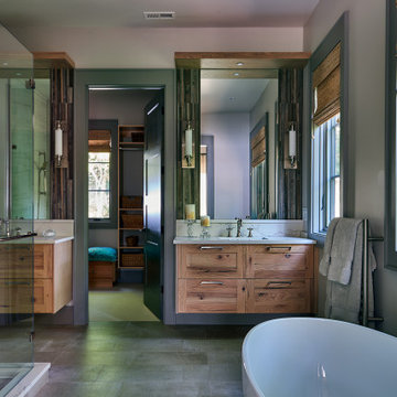
 Black Rock Design | Build
Gorgeous master bathroom with two vanities wih single sinks, and pendant lights
Inspiration for a mid-sized transitional master ceramic tile, gray floor and double-sink freestanding bathtub remodel with recessed-panel cabinets, brown cabinets, a one-piece toilet, beige walls, an undermount sink, granite countertops, a hinged shower door, white countertops and a built-in vanity
Inspiration for a mid-sized transitional master ceramic tile, gray floor and double-sink freestanding bathtub remodel with recessed-panel cabinets, brown cabinets, a one-piece toilet, beige walls, an undermount sink, granite countertops, a hinged shower door, white countertops and a built-in vanity

 Kitchen Inspiration Inc.
Project highlight – We are in the mission to improve the sage green galley kitchen in a cozy house in SF bay area.
Homeowners’ wish list for the new kitchen-
1. Improve lighting
2. More storage
3. More countertop space
4. Light maintenance countertop
5. Refrigerator door conflicts with wall.
6. Better flow
7. Add a mini Fridge
How did we transform the kitchen?
1. Added recessed light to ceiling & pendant light above the sink. Lighter color cabinet, back splash & countertop will bright up the space as well.
2. Adding a tall pantry with pull out shelves to the kitchen takes care the food storage. We also add 15 linear feet of base storage space under banquette seating.
3. Designating food storage in pantry clear out plenty of countertop space for food prep.
4. No more grout line on countertop. The engineer quartz countertop not only gives a beautiful touch to the kitchen but easy maintenance at the same time.
5. Common problem solved by adding a pantry between refrigerator & returning wall. Now the Ref door can be wide open with easy access to food.
6. The small peninsula in existing kitchen interrupts the flow and make kitchen feel smaller. It’s an item being removed.
7. Mini beverage fridge adds value to the kitchen for sure. Now, all drinks have a new home!
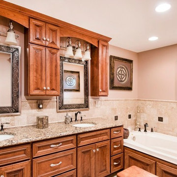


 Kitchen Associates
This kitchen remodel in Hopkinton, MA features Brookhaven custom cabinetry with a Winfield Raised door style. The main cabinets are Antique White on Maple with Charcoal Glaze and the island is Cottage Black with distressing. The countertop is Golden Beach granite. Design and installation by Kitchen Associates. Photo by Aaron Sponenberg.

 STYLE BATH ENCLOSURES
Audra Miller Interiors' client is disabled and this bathroom is fully functional to access all features easily with his wheelchair. The design concept was created to be clean, simple, yet textural, mixing materials to bring in color.
 ASR DESIGN STUDIO
Built in 1907 and nestled into the beating heart of San Fran’s Bernal Heights neighbourhood, this adorable abode was an unpolished gem ready to be turned into our clients’ dream home.
Our mission was to gift Bonview with classic, natural and timeless style while setting it up with impressive functionality so that it was ready to be the pet-friendly, kid-friendly and entertaining-friendly home they needed it to be. Mission accepted!
Our clients’ vision was clear: They wanted whites, blacks and wood tones with texture and personality. Oh, and that spunky wine fridge? Yep, that was a non-negotiable. ?
“It’s not unusual for our friends and family to drop past unannounced any day of the week. And we love it!” They told us during our initial Design Therapy Sesh.
We knew immediately what she meant - we have an open-door policy with our families, too! Which was why we consciously created living spaces that were open, inviting and welcoming.
Now, the only problem our clients would have would be convincing their guests to leave!
Our clients also enjoyed cooking and baking casually, so we created an organized, intuitive and functional kitchen and pantry that made whipping up homemade dips and snacks for their game nights a breeze.
 Walczak Design And Build
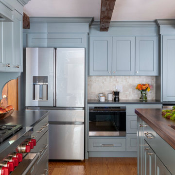
THE PROBLEM
Our client adores their traditional layout and their traditional design style. But there were a few things that could be improved including flow and functionality in the kitchen - not to mention the cabinets, counters and appliances that had seen better days. The family room was used heavily for movie viewing, but it did not have a great set-up for the TV and was seriously lacking in the audio department. Their garage entry had become the primary way into the home for the homeowners, however it did not offer the welcoming feeling they wanted to have after a long day.
THE SOLUTION
To create better flow, we shifted the entry from the mud hall down a bit which gave us the space to add another run of cabinetry and relocate the fridge. We closed up the former dining room wall and converted it into a new office space as both homeowners work from home. Due to the shift in the entry from the mud hall, we also were able to then center the island to where it should be in the room creating some much needed balance.
Because we were not creating an open floor plan and removing walls and such, there was more budget for high ticket finishes. One of which was a 11’ custom walnut countertop for the island which became the anchoring design element for the kitchen along with custom cabinetry and high-end appliances.

 serra|wersinger architects
dining room view
Eirik Johnson Photographer
Kitchen/dining room combo - mid-sized contemporary light wood floor and brown floor kitchen/dining room combo idea in Seattle with white walls
Kitchen/dining room combo - mid-sized contemporary light wood floor and brown floor kitchen/dining room combo idea in Seattle with white walls

 Sustainable Sedona
Imagine a situation where you love to cook but your dinning room is too small and there is not room to expand the area. This Sedona addition and kitchen remodel project solved the problem by converting the existing two car garage into a magnificent dining room and by building a detached garage in another location on the lot.
A new roof pitch was added to the old garage to give the interior a vaulted dining room feel, and to make the exterior match the existing architecture of the main house. An enclosed patio is added to the dinning room addtion for the outdoor experience.
The detached two car garage is designed with an offset between the two car spaces for two reasons; first, to make it visually interesting and secondly to accommodate the tight property set back conditions.
A breakfast nook was also added next to the kitchen to give the home an intimate dining area when large dinner parties were not needed. The kitchen was also updated to please the chef and give the home it's final touch of elegance.
Sustainable Sedona Residential Design
Sponsored
Columbus, OH

Trish Takacs Design
Award Winning & Highly Skilled Kitchen & Bath Designer in Columbus

 The Artisans Group, Inc.
This prefabricated 1,800 square foot Certified Passive House is designed and built by The Artisans Group, located in the rugged central highlands of Shaw Island, in the San Juan Islands. It is the first Certified Passive House in the San Juans, and the fourth in Washington State. The home was built for $330 per square foot, while construction costs for residential projects in the San Juan market often exceed $600 per square foot. Passive House measures did not increase this projects’ cost of construction.
The clients are retired teachers, and desired a low-maintenance, cost-effective, energy-efficient house in which they could age in place; a restful shelter from clutter, stress and over-stimulation. The circular floor plan centers on the prefabricated pod. Radiating from the pod, cabinetry and a minimum of walls defines functions, with a series of sliding and concealable doors providing flexible privacy to the peripheral spaces. The interior palette consists of wind fallen light maple floors, locally made FSC certified cabinets, stainless steel hardware and neutral tiles in black, gray and white. The exterior materials are painted concrete fiberboard lap siding, Ipe wood slats and galvanized metal. The home sits in stunning contrast to its natural environment with no formal landscaping.
Photo Credit: Art Gray

 Thomas Roszak Architecture, LLC
Photo credit: Scott McDonald @ Hedrich Blessing
7RR-Ecohome:
The design objective was to build a house for a couple recently married who both had kids from previous marriages. How to bridge two families together?
The design looks forward in terms of how people live today. The home is an experiment in transparency and solid form; removing borders and edges from outside to inside the house, and to really depict “flowing and endless space”. The house floor plan is derived by pushing and pulling the house’s form to maximize the backyard and minimize the public front yard while welcoming the sun in key rooms by rotating the house 45-degrees to true north. The angular form of the house is a result of the family’s program, the zoning rules, the lot’s attributes, and the sun’s path. We wanted to construct a house that is smart and efficient in terms of construction and energy, both in terms of the building and the user. We could tell a story of how the house is built in terms of the constructability, structure and enclosure, with a nod to Japanese wood construction in the method in which the siding is installed and the exposed interior beams are placed in the double height space. We engineered the house to be smart which not only looks modern but acts modern; every aspect of user control is simplified to a digital touch button, whether lights, shades, blinds, HVAC, communication, audio, video, or security. We developed a planning module based on a 6-foot square room size and a 6-foot wide connector called an interstitial space for hallways, bathrooms, stairs and mechanical, which keeps the rooms pure and uncluttered. The house is 6,200 SF of livable space, plus garage and basement gallery for a total of 9,200 SF. A large formal foyer celebrates the entry and opens up to the living, dining, kitchen and family rooms all focused on the rear garden. The east side of the second floor is the Master wing and a center bridge connects it to the kid’s wing on the west. Second floor terraces and sunscreens provide views and shade in this suburban setting. The playful mathematical grid of the house in the x, y and z axis also extends into the layout of the trees and hard-scapes, all centered on a suburban one-acre lot.
Many green attributes were designed into the home; Ipe wood sunscreens and window shades block out unwanted solar gain in summer, but allow winter sun in. Patio door and operable windows provide ample opportunity for natural ventilation throughout the open floor plan. Minimal windows on east and west sides to reduce heat loss in winter and unwanted gains in summer. Open floor plan and large window expanse reduces lighting demands and maximizes available daylight. Skylights provide natural light to the basement rooms. Durable, low-maintenance exterior materials include stone, ipe wood siding and decking, and concrete roof pavers. Design is based on a 2' planning grid to minimize construction waste. Basement foundation walls and slab are highly insulated. FSC-certified walnut wood flooring was used. Light colored concrete roof pavers to reduce cooling loads by as much as 15%. 2x6 framing allows for more insulation and energy savings. Super efficient windows have low-E argon gas filled units, and thermally insulated aluminum frames. Permeable brick and stone pavers reduce the site’s storm-water runoff. Countertops use recycled composite materials. Energy-Star rated furnaces and smart thermostats are located throughout the house to minimize duct runs and avoid energy loss. Energy-Star rated boiler that heats up both radiant floors and domestic hot water. Low-flow toilets and plumbing fixtures are used to conserve water usage. No VOC finish options and direct venting fireplaces maintain a high interior air quality. Smart home system controls lighting, HVAC, and shades to better manage energy use. Plumbing runs through interior walls reducing possibilities of heat loss and freezing problems. A large food pantry was placed next to kitchen to reduce trips to the grocery store. Home office reduces need for automobile transit and associated CO2 footprint. Plan allows for aging in place, with guest suite than can become the master suite, with no need to move as family members mature.

 Tina Moizer Designs
Mike Moizer
Inspiration for a small craftsman master vinyl floor and brown floor freestanding bathtub remodel in Vancouver with an undermount sink, shaker cabinets, white cabinets, marble countertops and gray walls
Inspiration for a small craftsman master vinyl floor and brown floor freestanding bathtub remodel in Vancouver with an undermount sink, shaker cabinets, white cabinets, marble countertops and gray walls

 building Lab, inc.
As one follows the natural light to enter the bathroom, one’s attention is immediately captured by the L-shaped mirror framing the large window with another sort of infinity view outside. All the walls are solidly clad with white Carrara marble with pale grey veins that are complemented by the matte grey floor tiles. Bax+Towner photography
Sponsored
Plain City, OH

Kuhns Contracting, Inc.
Central Ohio's Trusted Home Remodeler Specializing in Kitchens & Baths

 Advance Design Studio, Ltd.
After six years of living in their Huntley IL home, Chris and Meghan were tired of their dark, dingy, outdated kitchen and it was finally time for a long-anticipated change. “The kitchen is the place where we live, it’s where we do everything,” Meghan said. “It was important that it be a space where we wanted to be.” Meghan loves cooking and enjoys including their girls in healthy meal prepping, this led them to want a brighter, more enjoyable kitchen with increased functionality and improved storage.
For Chris especially, the laundry room was an entirely dysfunctional eyesore. “We had a washer and a dryer, but it was all kind-of cobbled together!” Chris said. “There were always laundry piles everywhere, we weren’t really sure what we wanted to do in there, but it was time for us to make a change.” The mess of the space was stressful every time they walked in the door from the garage each day. Kids’ backpacks and shoes piled up haphazardly in the makeshift boot-bench closet left the family feeling disorganized and stressed. They needed space for folding clothes and locker cubbies to help keep the family organized.
Having known Christine and Todd in the Huntley community for years, Chris and Meghan were familiar with their work. “We already trusted them personally and having seen their projects for years we knew they did top notch work. After we reviewed the initial round of designs, we knew that hiring them was definitely the right choice,” Meghan and Chris said. Although Chris had done a lot of work in their home himself, the kitchen and laundry room renovation was such a large undertaking that he didn’t want to steal time away from his family to spend what would surely be many long weekends doing the job himself. “That would not have been a wise choice for us,” Chris laughed.
“Our designer, Michelle was very, very, easy to work with; anything we wanted to see or weren’t sure about, she went above and beyond to make this easy for us. She was easy to get hold of and always quick to respond,” the couple said. Michelle pulled ideas that mirrored the couple’s taste and style and was adept at directing the couple to limited choices that didn’t overwhelm them and kept the process moving. “I have a hard time making decisions. Michelle made the decision-making process so easy. I loved how she listened to what I liked and then presented three great options for me to choose from,” Meghan said.
The main objectives for the kitchen were better storage solutions, they wanted the space to reflect their lifestyle and taste, and they wanted it to last for years with low maintenance. One of the first steps in creating a more functional kitchen was relocating the refrigerator, creating an improved workflow for the busy family.
“We didn’t know that we could even move the refrigerator to a new location where it is now, that was something that we never would have thought of,” Chris said. “The new refrigerator location makes the kitchen feel so much bigger. We didn’t add any space, but our whole kitchen with the new design just seems like it’s so much larger than before!” Meghan said.
The perimeter mist colored cabinets helped warm and brighten the entire room, while the graphite colored cabinets on the island added contrast. Using this fresh, clean color palette satisfied the couple’s desire for a bright space that was the exact opposite of what they had before. Organization accessories were also added to the cabinets such as a spice drawer tray and roll outs to create hidden convenience.
“I absolutely love the hidden spices – it makes cooking so much more enjoyable!” Chris said. “And all the pull outs, and the double trash bin, who would think you could get so excited about organization!” the couple said in unison.
One thing they hated in their original kitchen was how dark the space felt. Added lighting on the ceiling with the new light fixtures combined with the lighter cabinetry colors throughout solved this problem. “Our new kitchen has this warm, almost cozy feeling that our old kitchen never had, it’s just a space that I love spending my time in now,” Meghan said. The light airy feeling was accentuated with the use of floating white shelves on either side of the decorative range hood. “We have so much cabinetry space, the new design is amazing we actually have more storage space than we will ever need,” Meghan said.
The island was extended to create more work surface and added space for stool seating. “The new island changes how we live. Now the kids can be in the kitchen with us, doing homework, eating breakfast, and the three of us have special dinners there when Chris is working late,” Meghan said.
The Carrara Marmi Quartz countertops were chosen because they are, not only beautiful, but are made from hard-working material that doesn’t require maintenance. The white subway tile backsplash that wraps to the ceiling behind the focal point cooktop range/hood compliments the crisp white countertops perfectly, while brushed brass hardware and light fixtures keep the design fresh and new.
The couple had a few fears at the beginning of the project, as most homeowners do. Their biggest fear was being out of their kitchen and laundry room for an extended time. The crew made it very easy for the family to work in a limited space keeping the washer and dryer hooked up the majority of the time, and also getting appliances working with minimal downtime.
“They above and beyond accommodated us to get us through the process,” Meghan said. “They did a great job making sure we were as comfortable as possible throughout the process,” Chris added.
“Our project manager DJ did a great job. He was very good at updating us on schedule changes, getting guys in as quickly as possible. Everyone that stepped in the house was nice and did great work,” said Chris. They thought Advance’s carpenter was phenomenal and were impressed when he took a conceptual idea from a photograph and worked with designer Michelle to create a one of a kind range/hood that has become the topic of conversation with friends and family who visit the new kitchen. “He was in our house literally every day for several weeks. He was easy to work with and good at what he did,” Meghan and Chris said.
The focal point of the kitchen; a hand-crafted, custom-built ventilation hood was clad with handpicked reclaimed barnwood. Advance Design’s carpenter built the framework and the cladding to create a one-of-a-kind design element that the couple loves.
“I think it was especially fun for him to create something unique from scratch, showcasing his talent in this area,” Meghan said. “I love that my kitchen is not like everyone else’s. I got to pick out the wood on my hood and watch it being built and was able to choose what pieces of wood went where on it. It’s totally unique.”
Red Oak flooring was toothed-in throughout the kitchen and the rest of the first floor anywhere changes were made. Then the whole floor was refinished to tone down the orange undertones in the existing floor stain, ultimately changing the color complexion of the entire first floor. The result is a completely new feeling to the entire home.
Renovating the laundry room was extremely important to Meghan and Chris, but they had trouble visualizing what the possibilities were for the seemingly small space. Michelle produced beautiful 3D illustrations that helped them envision the space in a whole new way.
“I must have told Michelle 100 times that I am a visual person, seeing the designs in 3D made it so easy to make decisions and see what we could really do with our space,” Meghan said.
A dividing wall and doorway were removed between the existing laundry room and hallway formerly containing a coat closet, providing space to design specialized graphite colored cabinetry matching the kitchen island to house custom storage cubbies for each family member. Adding the tall utility cabinetry in the new laundry area helped solve the storage issue, tucking away cleaning supplies, household items, and even the cat got its own cubby.
“I love how everything is now hidden in its own space. I can’t tell you how much I hated coming home and seeing everything sitting around on counters,” Chris said.
Electrical outlets were planned for the inside of utility cabinets, so devices could charge in hidden locations. Stacking the washer and dryer allowed for wider countertop space to provide a folding area and a special space for clothes to hang. “The way I do laundry has been completely transformed! I can actually fold clothes and hang them now right out of the washer and dryer,” Meghan said.
“The end result in the kitchen and the laundry/mud room was an updated light and bright space, with a smarter work flow that better meets the needs of this family,” Michelle said.
“I would totally recommend Advance Design,” Meghan said. “Sometimes I sit and just look at my kitchen and laundry room and think ‘Wow, I can’t believe I get to live here!’ It’s an understatement to say we love our new space.”

 Forward Design Build Remodel
Goals
While their home provided them with enough square footage, the original layout caused for many rooms to be underutilized. The closed off kitchen and dining room were disconnected from the other common spaces of the home causing problems with circulation and limited sight-lines. A tucked-away powder room was also inaccessible from the entryway and main living spaces in the house.
Our Design Solution
We sought out to improve the functionality of this home by opening up walls, relocating rooms, and connecting the entryway to the mudroom. By moving the kitchen into the formerly over-sized family room, it was able to really become the heart of the home with access from all of the other rooms in the house. Meanwhile, the adjacent family room was made into a cozy, comfortable space with updated fireplace and new cathedral style ceiling with skylights. The powder room was relocated to be off of the entry, making it more accessible for guests.
A transitional style with rustic accents was used throughout the remodel for a cohesive first floor design. White and black cabinets were complimented with brass hardware and custom wood features, including a hood top and accent wall over the fireplace. Between each room, walls were thickened and archway were put in place, providing the home with even more character.
 Walczak Design And Build
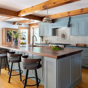
THE PROBLEM
Our client adores their traditional layout and their traditional design style. But there were a few things that could be improved including flow and functionality in the kitchen - not to mention the cabinets, counters and appliances that had seen better days. The family room was used heavily for movie viewing, but it did not have a great set-up for the TV and was seriously lacking in the audio department. Their garage entry had become the primary way into the home for the homeowners, however it did not offer the welcoming feeling they wanted to have after a long day.
THE SOLUTION
To create better flow, we shifted the entry from the mud hall down a bit which gave us the space to add another run of cabinetry and relocate the fridge. We closed up the former dining room wall and converted it into a new office space as both homeowners work from home. Due to the shift in the entry from the mud hall, we also were able to then center the island to where it should be in the room creating some much needed balance.
Because we were not creating an open floor plan and removing walls and such, there was more budget for high ticket finishes. One of which was a 11’ custom walnut countertop for the island which became the anchoring design element for the kitchen along with custom cabinetry and high-end appliances.
105