
Search results for "Style problem" in Home Design Ideas

 BKC Kitchen and Bath
With a blend of hickory cabinets and colorful Southwestern décor, this spacious kitchen remodel has a warm, earthy atmosphere. The recessed-panel cabinet doors by Crystal Cabinet Works offer a clean, transitional look, while the white Corian countertop reflects light from both the under-cabinet fixtures and the high ceiling, making this great room seem even larger.
Cabinets: Crystal Cabinet Works, Gentry door style, Driftwood finish on hickory with a Van Dyke Brown highlight.
Countertop: Witch Hazel by Corian
Hardware: Berenson, 9231-1BPN
Design by: Paul Lintault, BKC Kitchen and Bath, in partnership with Newmyer Contracting

 Thomas Roszak Architecture, LLC
Photo credit: Scott McDonald @ Hedrich Blessing
7RR-Ecohome:
The design objective was to build a house for a couple recently married who both had kids from previous marriages. How to bridge two families together?
The design looks forward in terms of how people live today. The home is an experiment in transparency and solid form; removing borders and edges from outside to inside the house, and to really depict “flowing and endless space”. The house floor plan is derived by pushing and pulling the house’s form to maximize the backyard and minimize the public front yard while welcoming the sun in key rooms by rotating the house 45-degrees to true north. The angular form of the house is a result of the family’s program, the zoning rules, the lot’s attributes, and the sun’s path. We wanted to construct a house that is smart and efficient in terms of construction and energy, both in terms of the building and the user. We could tell a story of how the house is built in terms of the constructability, structure and enclosure, with a nod to Japanese wood construction in the method in which the siding is installed and the exposed interior beams are placed in the double height space. We engineered the house to be smart which not only looks modern but acts modern; every aspect of user control is simplified to a digital touch button, whether lights, shades, blinds, HVAC, communication, audio, video, or security. We developed a planning module based on a 6-foot square room size and a 6-foot wide connector called an interstitial space for hallways, bathrooms, stairs and mechanical, which keeps the rooms pure and uncluttered. The house is 6,200 SF of livable space, plus garage and basement gallery for a total of 9,200 SF. A large formal foyer celebrates the entry and opens up to the living, dining, kitchen and family rooms all focused on the rear garden. The east side of the second floor is the Master wing and a center bridge connects it to the kid’s wing on the west. Second floor terraces and sunscreens provide views and shade in this suburban setting. The playful mathematical grid of the house in the x, y and z axis also extends into the layout of the trees and hard-scapes, all centered on a suburban one-acre lot.
Many green attributes were designed into the home; Ipe wood sunscreens and window shades block out unwanted solar gain in summer, but allow winter sun in. Patio door and operable windows provide ample opportunity for natural ventilation throughout the open floor plan. Minimal windows on east and west sides to reduce heat loss in winter and unwanted gains in summer. Open floor plan and large window expanse reduces lighting demands and maximizes available daylight. Skylights provide natural light to the basement rooms. Durable, low-maintenance exterior materials include stone, ipe wood siding and decking, and concrete roof pavers. Design is based on a 2' planning grid to minimize construction waste. Basement foundation walls and slab are highly insulated. FSC-certified walnut wood flooring was used. Light colored concrete roof pavers to reduce cooling loads by as much as 15%. 2x6 framing allows for more insulation and energy savings. Super efficient windows have low-E argon gas filled units, and thermally insulated aluminum frames. Permeable brick and stone pavers reduce the site’s storm-water runoff. Countertops use recycled composite materials. Energy-Star rated furnaces and smart thermostats are located throughout the house to minimize duct runs and avoid energy loss. Energy-Star rated boiler that heats up both radiant floors and domestic hot water. Low-flow toilets and plumbing fixtures are used to conserve water usage. No VOC finish options and direct venting fireplaces maintain a high interior air quality. Smart home system controls lighting, HVAC, and shades to better manage energy use. Plumbing runs through interior walls reducing possibilities of heat loss and freezing problems. A large food pantry was placed next to kitchen to reduce trips to the grocery store. Home office reduces need for automobile transit and associated CO2 footprint. Plan allows for aging in place, with guest suite than can become the master suite, with no need to move as family members mature.
 Custom Kitchens by John Wilkins, Inc.
Mike Kaskel
Example of a transitional home design design in San Francisco
Example of a transitional home design design in San Francisco
Find the right local pro for your project

 Forward Design Build Remodel
Goals
While their home provided them with enough square footage, the original layout caused for many rooms to be underutilized. The closed off kitchen and dining room were disconnected from the other common spaces of the home causing problems with circulation and limited sight-lines. A tucked-away powder room was also inaccessible from the entryway and main living spaces in the house.
Our Design Solution
We sought out to improve the functionality of this home by opening up walls, relocating rooms, and connecting the entryway to the mudroom. By moving the kitchen into the formerly over-sized family room, it was able to really become the heart of the home with access from all of the other rooms in the house. Meanwhile, the adjacent family room was made into a cozy, comfortable space with updated fireplace and new cathedral style ceiling with skylights. The powder room was relocated to be off of the entry, making it more accessible for guests.
A transitional style with rustic accents was used throughout the remodel for a cohesive first floor design. White and black cabinets were complimented with brass hardware and custom wood features, including a hood top and accent wall over the fireplace. Between each room, walls were thickened and archway were put in place, providing the home with even more character.
 Explore Your Spirit with Kala
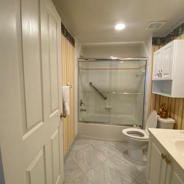
BEFORE PHOTO: We all have that one room in our home that we wish could be different. Maybe the room is too small, too dark, too something that's just not right. In my current home, it's the guest bathroom. It's small and shaped at an odd angle. You can get in there to do what you need to do, but there's nothing fun or relaxing about it.
There's not much that can be done with this space, it's squeezed into an area where there's no room to expand the walls ,so there are serious limits to what can be done.
The most apparent problem in this space is what greets you when you walk into it, which is the very old, outdated wallpaper. You know it's old when you see it, for several reasons, first, wallpaper has been out of style for over two decades and is only making a comeback now and second, it has the trademarked look of 90's wallpaper, which means, it's not just wallpaper, it also has a wallpaper border on top of the wallpaper.
Let's take a look at the bathroom: (Before)

 Traditions In Tile At Brier Creek
The owners wanted something different than a grey or white subway tile backsplash. She liked the idea of the brick pattern. Pratt and Larson had the perfect glaze for her. W96 is a crackle glaze. Glazed edges were also used instead of a trim piece. That is part of the beauty of Pratt and Larson. Made to order with very specific requests are no problem! Traditions in Tile is the exclusive Pratt and Larson distributor in the greater Triangle area.
 DDK Kitchen Design Group
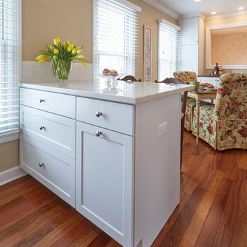
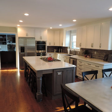
Work space in a small kitchen is always a challenge. This tiny kitchen in an older home that was in need of some solutions. The corner sinks opens up the countertop space left and right of the range. Add a microwave hood and small pennisula and work space is no longer a problem. The best part is the pantry wall with ample space for storage and a a bar for entertaining or a standing organization area. Even have your guests sit and at the snack bar while you cook. Cabinets are semi custom transitional styling. Top drawer is a slab drawer head but the lower drawers are 5 piece to add some interest. White cabinetry adds to the feeling of openness and space.
Design by Dan Thompson for DDK Kitchen Design Group.
Photographs by Mike Kaskel.
Sponsored
Sunbury, OH

J.Holderby - Renovations
Franklin County's Leading General Contractors - 2X Best of Houzz!
 Twelve Stones Designs, LLC
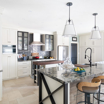
The owners of this kitchen had spent the money to upgrade the finishes in their kitchen upon building the home 12 years ago, but after living in the space for several years they realized how nonfunctional the layout really was. The (then) two preschool aged children had grown into busy, hungry teenagers with many friends who also liked to hang out at the house. So the family needed a more functional kitchen with better traffic flow, space for daily activities revolving around the kitchen at different times of day, and a kitchen that could accommodate cooking for and serving large groups. Furthermore, the dark, traditional finishes no longer reflected the homeowners’ style. They requested a brighter, more relaxed, coastal style that reflected their love of the seaside cities they like to visit.
Originally, the kitchen was U-shaped with a narrow island in the middle. The island created narrow aisles that bottle-necked at the dishwasher, refrigerator, and cooktop areas. There was a pass-through from the foyer into the kitchen, but the owners never liked that the pass-through was also located so close to the powder room. The awkward proximity was unappealing and made guests feel uncomfortable.
The kitchen’s storage was made up of lots of narrow cabinets, apothecary drawers, clipped corner units, and very few drawers. It lacked useful storage for the larger items the family used on a daily basis. And the kitchen’s only pantry was small closet that had only builder-grade, narrow shelving with no illumination to be able to see the contents inside.
Overall, the kitchen’s lighting plan was poorly executed. Only six recessed cans illuminated the entire kitchen and nook areas. The under cabinet lighting was not evenly distributed either. In fact, the builder had mis-placed the under cabinet lighting around the decorative pilasters which made for choppy, dark cubbies. Further, the builder didn’t include any lighting over the sink or the bar area, which meant whoever was doing the dishes was always in their own shadow. That, coupled with the steep overhang of the game room above made the bar area feel like a dim, cavernous space that wasn’t inviting or task oriented. The kitchen looked out into the main living space, but the raised bar and a narrow wall (which held the only large cabinet in the kitchen) created more of a barrier than a relationship to the living room or breakfast nook. In fact, one couldn’t even see the breakfast nook from the cooktop or sink areas due to its orientation. The raised bar top was too narrow to comfortably sit to either dine at or chat from due to the lack of knee space. The the homeowners confided that the kitchen felt more like a dark, dirty prison than place where the family, or their guests, wanted to gather and commune.
The clients' needs and desires were:
➢ to create a kitchen that would be a space the family loved to be in; to relate to the adjacent spaces all around, and to have better flow for entertaining large groups
➢ to remove the walls between the breakfast nook and living area and to be able to utilize the natural light from the windows in both those areas
➢ to incorporate a functional chopping block for prepping fresh food for home cooked meals, an island with a large sink and drain board, 2 pull out trash cans, and seating for at least the 2 teens to eat or do homework
➢ to design a kitchen and breakfast nook with an airy, coastal, relaxed vibe that blended with the rest of the house's coastal theme
➢ to integrate a layered lighting plan which would include ample general illumination, specific task lighting, decorative lighting, and lots of illuminated storage
➢ to design a kitchen with not only more storage for all the husband’s kitchen gadgets and collection of oils and spices, but smart storage, including a coffee/breakfast bar and a place to store and conceal the toaster oven and microwave
➢ to find a way to utilize the large open space between the kitchen, pantry area, and breakfast nook
Twelve Stones Designs achieved the owner's goals by:
➢ removing the walls between the kitchen and living room to allow the natural light to filter in from the adjacent rooms and to create a connection between the kitchen, nook, and living spaces for a sense of unity and communion
➢ removing the existing pantry and designing 3 large pantry style cabinets with LED tape lights and rollout drawers to house lots of kitchen appliances, gadgets, and tons of groceries. We also took the cabinets all the way up to the 9’ ceiling for additional storage for seasonal items and bulk storage.
➢ designing 2 islands - 1 with a gorgeous black walnut chopping block that houses a drawer for chopping and carving knives and a custom double pull out trash unit for point of use utilization - and 1 that houses the dishwasher, a large Blanco Gourmet sink with integrated drain board, woven baskets for fresh root vegetables and kitchen towels, plenty of drawer storage for kitchen items, and bar seating for up to 4 diners.
➢ closing off the space between the kitchen and the powder room to create a beautiful new private alcove for the powder room as well as adding some decorative storage. This also gave us space to include more tall storage near the new range for precision placement of the husband’s extensive oil and spice collection as well as a location for a combo-steam oven the wife wanted for baking and cooking healthy meals.
The project is enhanced functionally by:
➢ incorporated USB and standard receptacles for the kids’ laptops and phone charging in the large island
➢ designing the small island to include additional open shelving for items used on a daily basis such as a variety of bowls, plates, and colanders. This set up also works well for the husband who prefers to “plate” his dinners in restaurant-style fashion before presenting them to the table.
➢ the integration of specific storage units, such as double stacked cutlery drawers, a custom spice pull-out, a Kuerig coffee and tea pod drawer, and custom double stacked utensil drawers
➢ moving the refrigerator to the old oven location - this eliminated the bottle neck as well as created a better relationship to the eating table. It also utilizes the floor space between the pantry, nook, and kitchen
➢ creating a banquet style breakfast nook - this banquette seating not only doubles the amount of seating for large gatherings but it better utilizes the odd space between the kitchen and the previous nook area. It also helps to create a distinct pathway from the mudroom room through the pantry area, kitchen, nook, and living room.
➢ the coffee/breakfast bar area which includes the perfect location for the concealed microwave and toaster oven, convenient storage for the coffee pods and tea accoutrements. Roll-out drawers below also house the smoothie maker, hot water kettle, and a plethora of smoothie-making ingredients such as protein powders, smoothie additives, etc. Furthermore, the drawers below the Keurig house measuring utensil, cutlery, baking supplies and tupperware storage.
➢ incorporating lots of wide drawers and pullouts to accommodate large cookware.
➢ utilizing as much vertical space as possible by building storage to the ceiling which accommodates the family’s abundant amount of serving platters, baking sheets, bakeware, casserole dishes, and additional cutting boards.
The project is enhanced aesthetically by:
➢ new 5-piece Versailles pattern porcelain tile that now seamlessly joins the entire down stairs area together creating a bright, cohesiveness feeling instead of choppy separated spaces - it also adds a coastal feeling
➢ designing a cabinet to conceal the microwave and toaster oven
➢ the coastal influenced light fixtures over the nook table and island
➢ the sandy colors of the Langdon Cambria countertops. The swirling pattern and sparkling quartz pieces remind the homeowner of black-and-tan sandy beaches
➢ the striped banquet seating whose creamy white background and blue-green stripes were the inspiration for the cabinet and wall colors.
➢ All the interior doors were painted black to coordinate with the blacks and grays in the backsplash tile and countertop. This also adds a hint of tailored formality to an otherwise casual space.
➢ the use of WAC's Oculux small aperture LED units for the overhead lighting complimented with Diode LED strips for task lighting under the cabinets and inside the pantry and glass wall cabinets. All of the lighting applications are on separate dimmer switches.
Innovative uses of materials or construction methods by Realty Restoration LLC:
➢ Each 1-1/2” x 3” block of reclaimed end-grain black walnut that makes up the center island chopping block was hand milled and built in the shop. It was designed to look substantial and proportional to the surrounding elements, executed by creating the 4 inch tall top with a solid wood chamfered edge band.
➢ The metal doors on either side of the vent hood were also custom designed for this project and built in the Realty Restoration LLC shop. They are made 1x2, 11-gauge mild steel with ribbed glass. Weighing 60 lbs a piece, heavy duty cabinet hinges were added to support the weight of the door and keep them from sagging.
➢ Under-cabinet receptacles were added along the range wall in order to have a clean, uninterrupted backsplash.
Design obstacles to overcome:
➢ Because we were removing the demising walls between the kitchen and living room, we had to find a way to plumb and vent the new island. We did this by tunneling through the slab (the slab had post tension cables which prevented us from just trenching) to run a new wet vent through a nearby structural wall. We pulled the existing hot and cold lines between upper floor joists and ran them down the structural wall as well and up through a conduit in the tunnel.
➢ Since we were converting from wall overs to a gas range it allowed us to utilize the 220 feed for the wall ovens to provide a new sub panel for all the new kitchen circuits
➢ Due to framing deficiencies inherited from the original build there was a 1-1/2” differential in the floor-to-ceiling height over a 20 foot span; by utilizing the process of cutting and furring coupled with the crown moulding details on the cabinet elevations we were able to mask the problem and provide seamless transitions between the cabinet components.
Evidence of superior craftsmanship:
➢ uniquely designed, one-of-a-kind metal “X” end panels on the large island. The end panels were custom made in the Realty Restoration LLC shop and fitted to the exact dimensions of the island. The welding seams are completely indistinguishable - the posts look like they are cut from a single sheet of metal
➢ square metal posts on the small island were also custom made and designed to compliment and carry through the metal element s throughout the kitchen
➢ the beautiful, oversized end panels on the pantry cabinets which give the breakfast nook a tailored look
➢ integrating a large format 5 piece Versailles tile pattern to seamlessly flow from the existing spaces into the new kitchen space
➢ By constructing a custom cabinet that jogged around a corner we could not remodel (housing the entry way coat closet) we were able to camouflage the adjacent wall offset within the upper and lower cabinets. By designing around the existing jog in the structural walls we accomplished a few things: we were able to find the space to house, and hide, the microwave and toaster oven yet still have a clean cohesive appearance from the kitchen side. Additionally, the owners were able to keep their much needed coat closet and we didn’t have to increase the budget with unnecessary structural work.

 John McClain Design
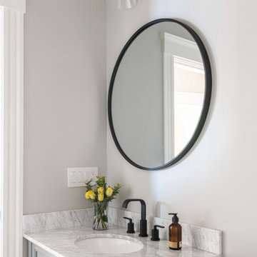
A clean and simple master bathroom is instantly brought to life with a focal wall behind the tub. We used a reclaimed "purple poplar" wood that extends from floor to ceiling and across the tub. The simple white rectangular tub really stands out in front of the wood wall. To top the space off, an antiqued octagonal pendant light hangs gracefully over the tub. To the left, is the large steam shower with curbless entry.
Floors and shower walls are marble.
Stephen Allen Photography


 Walczak Design And Build
THE PROBLEM
Our client had recently purchased a beautiful home on the Merrimack River with breathtaking views. Unfortunately the views did not extend to the primary bedroom which was on the front of the house. In addition, the second floor did not offer a secondary bathroom for guests or other family members.
THE SOLUTION
Relocating the primary bedroom with en suite bath to the front of the home introduced complex framing requirements, however we were able to devise a plan that met all the requirements that our client was seeking.
In addition to a riverfront primary bedroom en suite bathroom, a walk-in closet, and a new full bathroom, a small deck was built off the primary bedroom offering expansive views through the full height windows and doors.
Updates from custom stained hardwood floors, paint throughout, updated lighting and more completed every room of the floor.

 Ehrecke Construction Inc.
The kitchen cabinets are an Oxford Arched door style in a Soft Cream Opaque painted finish. Countertops are 3CM Blue Pearl granite highlighted with Glass Mosaic Inlay in white subway tiles.

 ASR DESIGN STUDIO
Our clients wanted to make the most of space so we gutted the home and rebuilt the inside to create a functional and kid-friendly home with timeless style.
Our clients’ vision was clear: They wanted a warm and timeless design that was easy to clean and maintain with two-active boys.
“It’s not unusual for our friends and family to drop past unannounced any day of the week. And we love it!” They told us during our initial Design Therapy Sesh.
We knew immediately what she meant - we have an open-door policy with our families, too! Which was why we consciously created living spaces that were open, inviting and welcoming.
Now, the only problem our clients would have would be convincing their guests to leave!
Our clients also enjoy coffee and tea so we created a separate coffee nook to help them kick start their day.
Photography: Helynn Ospina


 Eldorado Stone
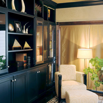
It was a mutual love of Italy, specifically the Tuscan countryside, that inspired renowned architect Mark Scheurer and his wife, Jane, to build their dream home in a simplistic, but elegant style reminiscent of a centuries old Italian farmhouse. Scheurer’s aim was to bring light, air, and an indoor/outdoor feeling into the home while preserving privacy throughout this rustic Southern California home, all of which was achieved a lot in part due to the implementation of Eldorado Stone.
The use of stone was a predominant element throughout the design. Scheurer used 2,800 square feet of a custom blend of Eldorado’s Veneto Fieldledge and Hillstone profiles, both of which were applied with an overgrout technique, creating a sense of ageless authenticity and textural beauty. Another 500 square feet was used in the interior to create a dramatic focal point of exposed stone in the living room and boast large, arching windows that open up the living room and filter in light. Upstairs, the master bedroom continues the home’s rustic Italian design with exposed stone walls that reach to the beamed ceiling above.
Although Scheurer is in a neighborhood that request for real products to be used in home construction, he had no problem obtaining approval to use Eldorado Stone, which speaks volumes about Eldorado’s beauty and believability. No one doubted the authenticity of the product. In fact, Scheurer believes that Eldorado is even better than natural stone in that the color palette is easily controlled as well as consistent.
Eldorado Stone Profile Featured: Veneto Fieldledge and Custom Hillstone with an overgrout technique
Architect: Scheurer Architects, Newport Beach, CA
Website: www.msa-arch.com
Builder: RS Construction Company, Corona del Mar, CA

 MainStreet Design Build
The challenges for this kitchen remodel are also what makes this home so unique. One of the problems was finding an appropriate new flooring to coordinate perfectly with the adjacent flooring finishes. The original dark clay tile flooring in the kitchen was also used throughout the main living area of the entire home, only separated by a terrazzo hallway floor. Updating the kitchen flooring was critical to the new aesthetics, but the homeowners were wary of the idea of three hard flooring finishes. The over-sized 24x24 cement style porcelain tiles were the perfect complement not only to the terrazzo hallway, but also the large outdoor porch directly off the eating area.
 DDK Kitchen Design Group
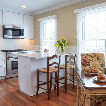
Work space in a small kitchen is always a challenge. This tiny kitchen in an older home that was in need of some solutions. The corner sinks opens up the countertop space left and right of the range. Add a microwave hood and small pennisula and work space is no longer a problem. The best part is the pantry wall with ample space for storage and a a bar for entertaining or a standing organization area. Even have your guests sit and at the snack bar while you cook. Cabinets are semi custom transitional styling. Top drawer is a slab drawer head but the lower drawers are 5 piece to add some interest. White cabinetry adds to the feeling of openness and space.
Design by Dan Thompson for DDK Kitchen Design Group.
Photographs by Mike Kaskel.

 Redstart Design Build
Photos by Focus-Pocus
Inspiration for a mid-sized transitional ceramic tile laundry room remodel in Chicago with shaker cabinets, white cabinets, marble countertops, gray walls and a side-by-side washer/dryer
Inspiration for a mid-sized transitional ceramic tile laundry room remodel in Chicago with shaker cabinets, white cabinets, marble countertops, gray walls and a side-by-side washer/dryer

 Simply Home Decorating
This beautiful North Vancouver home belongs to a nature-loving and health-conscious couple, Emma and Vince (names changed), their two young children, and their dog, Jasper. When they contacted us about renovating and furnishing their kitchen and family room, we walked in and saw a world of potential waiting to be uncovered.
Before: Larkhall Crescent Home:
Like many original North Vancouver homes, the interior was definitely dated. We encountered late ‘80s finishes in powder pink and teal green, old carpet, and a kitchen that wasn’t maximized to suit this family’s modern-day lifestyle. However, the size of the rooms offered us a ton of space with which to get creative.
Knowing our clients’ love of cooking, need for work spaces (Emma and Vince both work remotely), and growing family, we developed a design concept that would increase usable space, optimize storage, and create intimacy in this large area. As for the style, we were inspired by their European roots, inventing a new and modern take on “Belgian Farmhouse” style. Now, the home is truly one-of-a-kind.
After: Warm & Cozy Family Room:
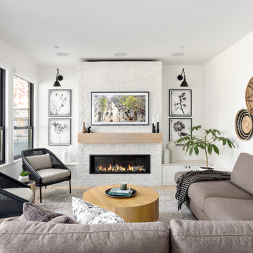
Fresh, bright, and comfortable, this living area has been transformed! We started with the fireplace as a focal point, selecting aged brick tiles for added texture and a crisp wood mantle. The taupe-coloured sectional infuses the room with visual warmth and serves the added purpose of separating the family room from the kitchen.
Emma and Vince were also keen on using non-toxic materials in their home, and we were happy to oblige. To meet their needs, we sourced natural wood elements and sought out Canadian-made products - that adhere to high health standards - whenever possible.
Look closer at the elements of this space, and you will find this stunning, honeycomb-patterned rug in earthy gold, beige, and charcoal tones. It’s plush to the touch and full of visual texture that brings this room’s colour palette together. We sourced these two-tone chairs with caning, petrified wood side table, black sconces, and botanical prints in greyscale from local artist, Heather Johnston.
We topped off the space with this dark wood and rattan console that offers storage facing the kitchen and presents an opportunity to display cherished items. The result is a cozy lounging space brimming with comfort and functionality. It’s perfect for enjoying quality family time, or Emma can simply slide the coffee table away to make room for her morning yoga practice.
Now, let’s turn around and give some attention to the kitchen. Do you remember what the original kitchen looked like? If not, scroll back up, because the transformation is shocking…
Moody & Welcoming Kitchen for Healthy Living:
This kitchen looks very different from how it started, right? Though we didn’t touch any walls, the kitchen has almost doubled in usable space! We created a long, extended island with storage, an outlet for small appliances, and seating for comfortable prep, after-school snacking, or mingling among friends.
On the other side of the island, the family has even more storage and an integrated dishwasher within easy reach of the sink, perfect for quick clean-up. From this angle, you can also see the expansive custom Shaker cabinetry in white and the integrated double ovens. These facilitate their cooking experience and gave us the opportunity to add an additional surprise…
A coffee garage station and more hidden storage! Keeping these items located along the perimeter allows them to be accessed by the family or their guests without someone getting under the cook’s feet. These are the little details that make everyday life easier and more enjoyable.
Moving deeper into the kitchen, the seamless induction cooktop topped with a freestanding concealed hood fan commands attention in a soft yet prominent way. The natural wood accent mirrors the fireplace mantle, and the choice of off-black wood-grain cabinets not only continues our black-and-white colour palette but adds a sense of depth and contrast. The corner sink is located to the right and perfectly positioned with a view of their thriving backyard.
To invite more of this family’s character into the space, we mixed metals for interest — matte black, dark pewter, and warm brass — and created open shelves in white oak for their plants and decor. You can also glimpse the tumbled edge of the backsplash tile, which echoes the rustic brick of the fireplace. It adds that farmhouse charm while still feeling timeless and sophisticated.
Last but not least, we designed this dining banquette in the bay window (with integrated bench storage, of course), where the family can share a meal together, the kids can do homework, or Emma and Vince can work and enjoy a change of scenery from their offices. Like the other spaces in the home, it was designed to be beautiful, multi-functional, and long-lasting.
Praise from Our Clients:
It is clear that we love this home, but what did our clients have to say?
“Lori is a visionary and masters execution to the finest detail all at the same time. When she first met us to know more about who we are and how we live, she could right away envision how we could use the space in our kitchen and living room…The results exceeded our expectations.
Lori and her team were also a delight to work with — coordination with all the trades, fast problem-solving, regular updates, professional and friendly attitude of her entire team — made it the dream team. Thank you SHD for making our space so beautiful!”
In turn, we are so grateful for this family’s trust, their open communication, and for being wonderful people with whom to work. (So, thank you!)
 Kerstin Hellmann Architecture
The Hive
This remodel transforms three small, crowded rooms into an expansive, open kitchen connecting directly onto a new backyard deck. The coziness of a former breakfast nook is re-created with a built-in bench with discreet storage, and a pre-existing island is re-imagined with a new marble surface and complementary marble slab installed above the counters. The new modern kitchen, combines bamboo, white, and glass cabinet materials and integrates an original Wedgewood range stove providing a spacious, open environment.
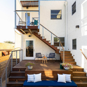
Outside, the new deck design addresses a previous basement flooding problem and brings together the upper and lower floors with a floating “crow’s nest” balcony, maximizing available outdoor space for use by both couples. To avoid the need for a support post, the balcony is supported by steel beams cantilevered into the house itself. Its custom rail system is galvanized steel and stainless steel cable, leaving as much space open as possible, and a steel awning overhead protects the new door from potential rain damage. The deck itself, as well as its railings and trellis structure, are built in durable ipe, a smooth barefoot-friendly hardwood. Stairs and seating create a smooth transition from the elevated deck down into the yard, where the new owners installed flagstones and setup their own bee hives.


92