
Search results for "Substantial" in Home Design Ideas
 Cheng Design
Fu-Tung Cheng, CHENG Design
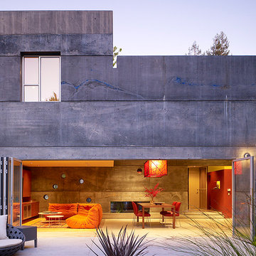
• Exterior View from Back Yard, House 6 Concrete and Wood Home
House 6, is Cheng Design’s sixth custom home project, was redesigned and constructed from top-to-bottom. The project represents a major career milestone thanks to the unique and innovative use of concrete, as this residence is one of Cheng Design’s first-ever ‘hybrid’ structures, constructed as a combination of wood and concrete.
Photography: Matthew Millman
 Michael Robert Construction
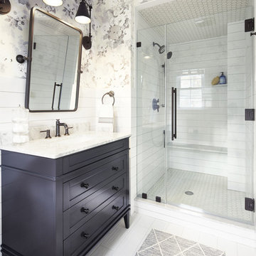
Just off of the master bedroom in our recently completed George to the Rescue project was a small and original bathroom. Tiny, pink, and stuck in the '60s, it was a less than ideal place for a working mom of two kids to start and end her day. We created a bright and fun, but low maintenance retreat for her behind a custom sliding barn door. We claimed an additional 2 feet for the bathroom by moving the wall and stealing a bit of space (it wasn't missed!) from the bedroom. Oversized ceramic subway tile laid to look like shiplap (shiplap! Everyone loved shiplap!) gives the now spacious shower an updated farmhouse feel. Exaggerated shower hardware (an 18" handle!), @hansgroheusa faucets (generously donated!), a pivoting rounded rectangle mirror, and a pair of articulating arm sconces all in matte black finish punctuate the space and mirror the hardware finish throughout the renovation. The elegant floral Anna French wallpaper is a surprising background for the substantial charcoal and white marble-topped vanity, and makes this a feminine space, just for a well-deserving mom.
 ODS Architecture
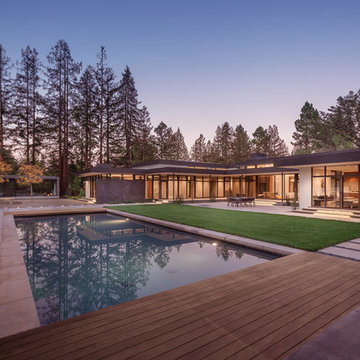
Atherton has many large substantial homes - our clients purchased an existing home on a one acre flag-shaped lot and asked us to design a new dream home for them. The result is a new 7,000 square foot four-building complex consisting of the main house, six-car garage with two car lifts, pool house with a full one bedroom residence inside, and a separate home office /work out gym studio building. A fifty-foot swimming pool was also created with fully landscaped yards.
Given the rectangular shape of the lot, it was decided to angle the house to incoming visitors slightly so as to more dramatically present itself. The house became a classic u-shaped home but Feng Shui design principals were employed directing the placement of the pool house to better contain the energy flow on the site. The main house entry door is then aligned with a special Japanese red maple at the end of a long visual axis at the rear of the site. These angles and alignments set up everything else about the house design and layout, and views from various rooms allow you to see into virtually every space tracking movements of others in the home.
The residence is simply divided into two wings of public use, kitchen and family room, and the other wing of bedrooms, connected by the living and dining great room. Function drove the exterior form of windows and solid walls with a line of clerestory windows which bring light into the middle of the large home. Extensive sun shadow studies with 3D tree modeling led to the unorthodox placement of the pool to the north of the home, but tree shadow tracking showed this to be the sunniest area during the entire year.
Sustainable measures included a full 7.1kW solar photovoltaic array technically making the house off the grid, and arranged so that no panels are visible from the property. A large 16,000 gallon rainwater catchment system consisting of tanks buried below grade was installed. The home is California GreenPoint rated and also features sealed roof soffits and a sealed crawlspace without the usual venting. A whole house computer automation system with server room was installed as well. Heating and cooling utilize hot water radiant heated concrete and wood floors supplemented by heat pump generated heating and cooling.
A compound of buildings created to form balanced relationships between each other, this home is about circulation, light and a balance of form and function. Photo by John Sutton Photography.
Find the right local pro for your project

 HOBBS INC
Architect: Amanda Martocchio Architecture & Design
Photography: Michael Moran
Project Year:2016
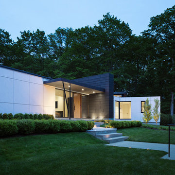
This LEED-certified project was a substantial rebuild of a 1960's home, preserving the original foundation to the extent possible, with a small amount of new area, a reconfigured floor plan, and newly envisioned massing. The design is simple and modern, with floor to ceiling glazing along the rear, connecting the interior living spaces to the landscape. The design process was informed by building science best practices, including solar orientation, triple glazing, rain-screen exterior cladding, and a thermal envelope that far exceeds code requirements.
 Century Stair Company
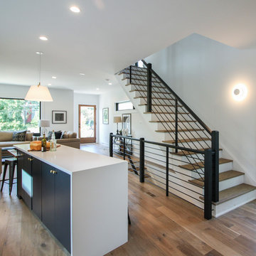
This sleek contemporary staircase pairs rich ebony-stained oak with satin black horizontal iron balusters for a striking modern aesthetic. Square oak newels with chamfered tops anchor the design, while thick contemporary oak treads provide substantial footing. The ebony-stained custom handrails tie the dark tones together, creating visual cohesion from bottom to top. The result is a staircase that balances bold contrast with refined simplicity, proving that durable materials and precise craftsmanship create designs that stand the test of time.
1976-2026 © Century Stair Company
 Cricklewood Interiors
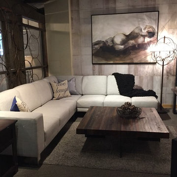
Here we have the Canadian made Jaymar Excalibur 3 piece sectional.
With contemporary chrome feet and clean lines, this beauty is on Sale in store, priced so right and ready to take home tomorrow.


 Lorin Hill, Architect
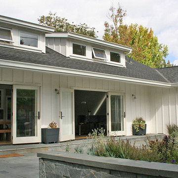
An existing mid-century ranch house is renovated and expanded to accommodate the client's preference for a modern style of living. The extent of the renovation included a reworked floor plan, new kitchen, a large, open great room with indoor/outdoor space and an expended and reconfigured bedroom wing. Newly vaulted ceilings with shed dormers bring substantial daylight into the living spaces of the home. The exterior of the home is reinterpreted as a modern take on the traditional farmhouse.
Interior Design: Lillie Design
Photographer: Caroline Johnson
 TVLiftCabinet, Inc
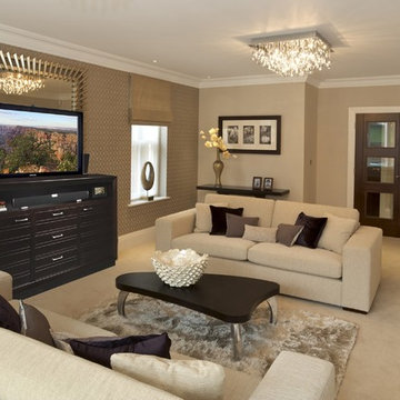
TVLIFTCABINET, Inc was established in 2003. Before that, they already had 25 years of experience in designing and manufacturing furniture. Our focus now is on building innovative pop-up TV lift systems, with traditional wood craftsmanship and design. We design and manufacture every element that goes into the consoles, including the TV lift systems and the infrared relays. It is by controlling the design and manufacture of every element that we can be certain of the quality of each console they ship.
Because we control all aspects of the creation of our TV Lift consoles, and sell direct to you, our customer, we are also able to offer substantially lower prices than you would find in any traditional furniture store or even nation-wide chain. In fact, our prices are typically half what you would expect to pay for comparable quality elsewhere.
All of our products are made with the best of materials and the finest finishes: quality wood stock from pine to oak, cherry and mahogany. Over 20 in-house inspectors then assure that our exacting standards are met throughout the entire TV lift system design, production and packaging process. In addition, we then offer free shipping and a White Glove placement service that ensures your console is installed exactly where you want it, hassle-free.
Our commitment is to provide you with TV lift consoles of the very highest quality and reliability, with unmatched service, and for the very best price. If they ever fall short of that goal, please let us know.
 Twelve Stones Designs, LLC
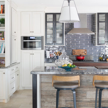
The owners of this kitchen had spent the money to upgrade the finishes in their kitchen upon building the home 12 years ago, but after living in the space for several years they realized how nonfunctional the layout really was. The (then) two preschool aged children had grown into busy, hungry teenagers with many friends who also liked to hang out at the house. So the family needed a more functional kitchen with better traffic flow, space for daily activities revolving around the kitchen at different times of day, and a kitchen that could accommodate cooking for and serving large groups. Furthermore, the dark, traditional finishes no longer reflected the homeowners’ style. They requested a brighter, more relaxed, coastal style that reflected their love of the seaside cities they like to visit.
Originally, the kitchen was U-shaped with a narrow island in the middle. The island created narrow aisles that bottle-necked at the dishwasher, refrigerator, and cooktop areas. There was a pass-through from the foyer into the kitchen, but the owners never liked that the pass-through was also located so close to the powder room. The awkward proximity was unappealing and made guests feel uncomfortable.
The kitchen’s storage was made up of lots of narrow cabinets, apothecary drawers, clipped corner units, and very few drawers. It lacked useful storage for the larger items the family used on a daily basis. And the kitchen’s only pantry was small closet that had only builder-grade, narrow shelving with no illumination to be able to see the contents inside.
Overall, the kitchen’s lighting plan was poorly executed. Only six recessed cans illuminated the entire kitchen and nook areas. The under cabinet lighting was not evenly distributed either. In fact, the builder had mis-placed the under cabinet lighting around the decorative pilasters which made for choppy, dark cubbies. Further, the builder didn’t include any lighting over the sink or the bar area, which meant whoever was doing the dishes was always in their own shadow. That, coupled with the steep overhang of the game room above made the bar area feel like a dim, cavernous space that wasn’t inviting or task oriented. The kitchen looked out into the main living space, but the raised bar and a narrow wall (which held the only large cabinet in the kitchen) created more of a barrier than a relationship to the living room or breakfast nook. In fact, one couldn’t even see the breakfast nook from the cooktop or sink areas due to its orientation. The raised bar top was too narrow to comfortably sit to either dine at or chat from due to the lack of knee space. The the homeowners confided that the kitchen felt more like a dark, dirty prison than place where the family, or their guests, wanted to gather and commune.
The clients' needs and desires were:
➢ to create a kitchen that would be a space the family loved to be in; to relate to the adjacent spaces all around, and to have better flow for entertaining large groups
➢ to remove the walls between the breakfast nook and living area and to be able to utilize the natural light from the windows in both those areas
➢ to incorporate a functional chopping block for prepping fresh food for home cooked meals, an island with a large sink and drain board, 2 pull out trash cans, and seating for at least the 2 teens to eat or do homework
➢ to design a kitchen and breakfast nook with an airy, coastal, relaxed vibe that blended with the rest of the house's coastal theme
➢ to integrate a layered lighting plan which would include ample general illumination, specific task lighting, decorative lighting, and lots of illuminated storage
➢ to design a kitchen with not only more storage for all the husband’s kitchen gadgets and collection of oils and spices, but smart storage, including a coffee/breakfast bar and a place to store and conceal the toaster oven and microwave
➢ to find a way to utilize the large open space between the kitchen, pantry area, and breakfast nook
Twelve Stones Designs achieved the owner's goals by:
➢ removing the walls between the kitchen and living room to allow the natural light to filter in from the adjacent rooms and to create a connection between the kitchen, nook, and living spaces for a sense of unity and communion
➢ removing the existing pantry and designing 3 large pantry style cabinets with LED tape lights and rollout drawers to house lots of kitchen appliances, gadgets, and tons of groceries. We also took the cabinets all the way up to the 9’ ceiling for additional storage for seasonal items and bulk storage.
➢ designing 2 islands - 1 with a gorgeous black walnut chopping block that houses a drawer for chopping and carving knives and a custom double pull out trash unit for point of use utilization - and 1 that houses the dishwasher, a large Blanco Gourmet sink with integrated drain board, woven baskets for fresh root vegetables and kitchen towels, plenty of drawer storage for kitchen items, and bar seating for up to 4 diners.
➢ closing off the space between the kitchen and the powder room to create a beautiful new private alcove for the powder room as well as adding some decorative storage. This also gave us space to include more tall storage near the new range for precision placement of the husband’s extensive oil and spice collection as well as a location for a combo-steam oven the wife wanted for baking and cooking healthy meals.
The project is enhanced functionally by:
➢ incorporated USB and standard receptacles for the kids’ laptops and phone charging in the large island
➢ designing the small island to include additional open shelving for items used on a daily basis such as a variety of bowls, plates, and colanders. This set up also works well for the husband who prefers to “plate” his dinners in restaurant-style fashion before presenting them to the table.
➢ the integration of specific storage units, such as double stacked cutlery drawers, a custom spice pull-out, a Kuerig coffee and tea pod drawer, and custom double stacked utensil drawers
➢ moving the refrigerator to the old oven location - this eliminated the bottle neck as well as created a better relationship to the eating table. It also utilizes the floor space between the pantry, nook, and kitchen
➢ creating a banquet style breakfast nook - this banquette seating not only doubles the amount of seating for large gatherings but it better utilizes the odd space between the kitchen and the previous nook area. It also helps to create a distinct pathway from the mudroom room through the pantry area, kitchen, nook, and living room.
➢ the coffee/breakfast bar area which includes the perfect location for the concealed microwave and toaster oven, convenient storage for the coffee pods and tea accoutrements. Roll-out drawers below also house the smoothie maker, hot water kettle, and a plethora of smoothie-making ingredients such as protein powders, smoothie additives, etc. Furthermore, the drawers below the Keurig house measuring utensil, cutlery, baking supplies and tupperware storage.
➢ incorporating lots of wide drawers and pullouts to accommodate large cookware.
➢ utilizing as much vertical space as possible by building storage to the ceiling which accommodates the family’s abundant amount of serving platters, baking sheets, bakeware, casserole dishes, and additional cutting boards.
The project is enhanced aesthetically by:
➢ new 5-piece Versailles pattern porcelain tile that now seamlessly joins the entire down stairs area together creating a bright, cohesiveness feeling instead of choppy separated spaces - it also adds a coastal feeling
➢ designing a cabinet to conceal the microwave and toaster oven
➢ the coastal influenced light fixtures over the nook table and island
➢ the sandy colors of the Langdon Cambria countertops. The swirling pattern and sparkling quartz pieces remind the homeowner of black-and-tan sandy beaches
➢ the striped banquet seating whose creamy white background and blue-green stripes were the inspiration for the cabinet and wall colors.
➢ All the interior doors were painted black to coordinate with the blacks and grays in the backsplash tile and countertop. This also adds a hint of tailored formality to an otherwise casual space.
➢ the use of WAC's Oculux small aperture LED units for the overhead lighting complimented with Diode LED strips for task lighting under the cabinets and inside the pantry and glass wall cabinets. All of the lighting applications are on separate dimmer switches.
Innovative uses of materials or construction methods by Realty Restoration LLC:
➢ Each 1-1/2” x 3” block of reclaimed end-grain black walnut that makes up the center island chopping block was hand milled and built in the shop. It was designed to look substantial and proportional to the surrounding elements, executed by creating the 4 inch tall top with a solid wood chamfered edge band.
➢ The metal doors on either side of the vent hood were also custom designed for this project and built in the Realty Restoration LLC shop. They are made 1x2, 11-gauge mild steel with ribbed glass. Weighing 60 lbs a piece, heavy duty cabinet hinges were added to support the weight of the door and keep them from sagging.
➢ Under-cabinet receptacles were added along the range wall in order to have a clean, uninterrupted backsplash.
Design obstacles to overcome:
➢ Because we were removing the demising walls between the kitchen and living room, we had to find a way to plumb and vent the new island. We did this by tunneling through the slab (the slab had post tension cables which prevented us from just trenching) to run a new wet vent through a nearby structural wall. We pulled the existing hot and cold lines between upper floor joists and ran them down the structural wall as well and up through a conduit in the tunnel.
➢ Since we were converting from wall overs to a gas range it allowed us to utilize the 220 feed for the wall ovens to provide a new sub panel for all the new kitchen circuits
➢ Due to framing deficiencies inherited from the original build there was a 1-1/2” differential in the floor-to-ceiling height over a 20 foot span; by utilizing the process of cutting and furring coupled with the crown moulding details on the cabinet elevations we were able to mask the problem and provide seamless transitions between the cabinet components.
Evidence of superior craftsmanship:
➢ uniquely designed, one-of-a-kind metal “X” end panels on the large island. The end panels were custom made in the Realty Restoration LLC shop and fitted to the exact dimensions of the island. The welding seams are completely indistinguishable - the posts look like they are cut from a single sheet of metal
➢ square metal posts on the small island were also custom made and designed to compliment and carry through the metal element s throughout the kitchen
➢ the beautiful, oversized end panels on the pantry cabinets which give the breakfast nook a tailored look
➢ integrating a large format 5 piece Versailles tile pattern to seamlessly flow from the existing spaces into the new kitchen space
➢ By constructing a custom cabinet that jogged around a corner we could not remodel (housing the entry way coat closet) we were able to camouflage the adjacent wall offset within the upper and lower cabinets. By designing around the existing jog in the structural walls we accomplished a few things: we were able to find the space to house, and hide, the microwave and toaster oven yet still have a clean cohesive appearance from the kitchen side. Additionally, the owners were able to keep their much needed coat closet and we didn’t have to increase the budget with unnecessary structural work.

 JWT Associates
A wall was removed to open up the dining room to the new kitchen.
Inspiration for a mid-sized 1960s open concept light wood floor living room remodel in Los Angeles with multicolored walls, a standard fireplace, a tile fireplace and no tv
Inspiration for a mid-sized 1960s open concept light wood floor living room remodel in Los Angeles with multicolored walls, a standard fireplace, a tile fireplace and no tv
 CAST architecture
CAST architecture
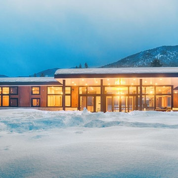
Inspiration for a small modern brown one-story metal exterior home remodel in Seattle with a shed roof
Inspiration for a small modern brown one-story metal exterior home remodel in Seattle with a shed roof
 Décor Aid
Having a small child, loving to entertain and looking to declutter and kid-proof the gathering spaces of their home in the quaint village of Rockville Centre, Long Island, a stone’s throw from Manhattan, our client’s main objective was to have their living room and den transformed with a family friendly home makeover with mid-century modern tones boasting a formal, yet relaxed spirit
Stepping into the home we found their living room and den both architecturally well appointed yet in need of modern transitional furniture pieces and the pops of color our clients admired, as there was a substantial amount of cool, cold grays in the rooms.
Decor Aid designer Vivian C. approached the design and placement of the pieces sourced to be kid-friendly while remaining sophisticated and practical for entertaining.
“We played off of the clients love for blush pinks, mid-century modern and turquoise. We played with the use of gold and silver metals to mix it up.”
In the living room, we used the prominent bay window and its illuminating natural light as the main architectural focal point, while the fireplace and mantels soft white tone helped inform the minimalist color palette for which we styled the room around.
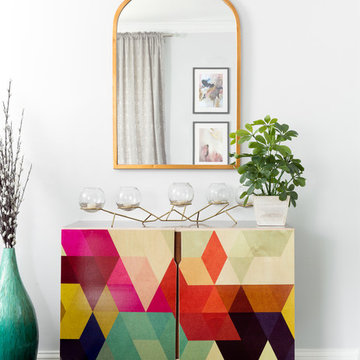
To add warmth to the living room we played off of the clients love for blush pinks and turquoise while elevating the room with flashes of gold and silver metallic pieces. For a sense of play and to tie the space together we punctuated the kid-friendly living room with an eclectic juxtaposition of colors and materials, from a beautifully patchworked geometric cowhide rug from All Modern, to a whimsical mirror placed over an unexpected, bold geometric credenza, to the blush velvet barrel chair and abstract blue watercolor pillows.
“When sourcing furniture and objects, we chose items that had rounded edges and were shatter proof as it was vital to keep each room’s decor childproof.” Vivian ads.
Their vision for the den remained chic, with comfort and practical functionality key to create an area for the young family to come together.
For the den, our main challenge was working around the pre-existing dark gray sectional sofa. To combat its chunkiness, we played off of the hues in the cubist framed prints placed above and focused on blue and orange accents which complement and play off of each other well. We selected orange storage ottomans in easy to clean, kid-friendly leather to maximize space and functionality. To personalize the appeal of the den we included black and white framed family photos. In the end, the result created a fun, relaxed space where our clients can enjoy family moments or watch a game while taking in the scenic view of their backyard.
For harmony between the rooms, the overall tone for each room is mid-century modern meets bold, yet classic contemporary through the use of mixed materials and fabrications including marble, stone, metals and plush velvet, creating a cozy yet sophisticated enough atmosphere for entertaining family and friends and raising a young children.
“The result od this family friendly room was really fantastic! Adding some greenery, more pillows and throws really made the space pop.” Vivian C. Decor Aid’s Designer
 CG&S Design-Build
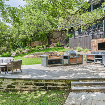
Inspiration for a mid-sized contemporary backyard concrete paver patio kitchen remodel in Austin with no cover
 Garden Tech Horticultural Services LLC
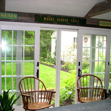
Screen doors combined with the cupola give plenty of ventilation to enjoy this room even in the heat of summer.
Photo by Bob Trainor
Inspiration for a mid-sized timeless detached shed remodel in Boston
Inspiration for a mid-sized timeless detached shed remodel in Boston
 transFORM Home
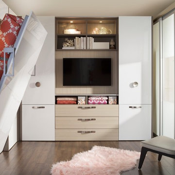
transFORM’s custom designed wall beds provide comfort, convenience and charm without sacrificing valuable floor space. This multifunctional unit was made with White High Gloss and complementing Latte and Light Driftwood finishes. Tastefully accented with large handle, chrome finished hardware and paired with a pop of color, this neutral combination proves to be anything but dull.
Convenience and functionality play a big role in the design of this unit. A wall bed is a perfect addition to any spot that doubles as a guest room or has a limited amount of floor space. Converting your wall bed is a stress-free operation that requires very little effort. In just a few seconds you can unfold this convenient bed into instant sleeping arrangements, complete with a comfortable standard-size mattress. Our convertible design makes it simple to fold out the bed and tuck it back away when not in use.
This dual-purpose unit was designed with tons of cabinetry and shelving for extra storage. With two large cabinets, you can easily hang a long skirt with enough room underneath to store your favorite footwear. Front to back pull-out hanging rods provide ample hanging space in a shallow cabinet. Visualizing your available clothing options face on will cut down the time it takes to mix and match the perfect ensemble.
This design also includes plenty of deep drawer storage, which can be a useful place for storing spare linens. Top shelves are a perfect way to personalize your room with mementos, collectibles and home décor. Open shelving offers a substantial amount of depth, allowing you to display your exclusive handbags. Conveniently kept in the lower cabinet is a hide away ironing board. The drawer mounted ironing board slides out when needed and easily folds up when not in use. It also rotates, which gives you the freedom to position it where you feel most comfortable. Having necessities readily available can make tedious house chores a little more enjoyable.
This design is completed with integrated LED lighting. Positioned by the bed, touch dimmable LED’s provide mood lighting for your living space. Within the open shelving, recessed LED lights enhance the look of the unit while showcasing your displayed possessions. Our lighting systems offer features such as touch switches and dimmers, which allow you to set the right scene and feel at ease and relaxed at home.
Photography by Ken Stabile
 Delphinium Design
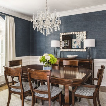
Beautifully refinished dining room with navy blue grasscloth wallpaper, white wainscoting, medium hardwood floors, antique dark wood dining set, custom window treatments, and wool rug in the Providence Plantation neighborhood of Charlotte, NC
 ODS Architecture
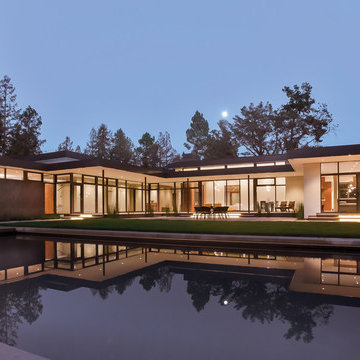
Atherton has many large substantial homes - our clients purchased an existing home on a one acre flag-shaped lot and asked us to design a new dream home for them. The result is a new 7,000 square foot four-building complex consisting of the main house, six-car garage with two car lifts, pool house with a full one bedroom residence inside, and a separate home office /work out gym studio building. A fifty-foot swimming pool was also created with fully landscaped yards.
Given the rectangular shape of the lot, it was decided to angle the house to incoming visitors slightly so as to more dramatically present itself. The house became a classic u-shaped home but Feng Shui design principals were employed directing the placement of the pool house to better contain the energy flow on the site. The main house entry door is then aligned with a special Japanese red maple at the end of a long visual axis at the rear of the site. These angles and alignments set up everything else about the house design and layout, and views from various rooms allow you to see into virtually every space tracking movements of others in the home.
The residence is simply divided into two wings of public use, kitchen and family room, and the other wing of bedrooms, connected by the living and dining great room. Function drove the exterior form of windows and solid walls with a line of clerestory windows which bring light into the middle of the large home. Extensive sun shadow studies with 3D tree modeling led to the unorthodox placement of the pool to the north of the home, but tree shadow tracking showed this to be the sunniest area during the entire year.
Sustainable measures included a full 7.1kW solar photovoltaic array technically making the house off the grid, and arranged so that no panels are visible from the property. A large 16,000 gallon rainwater catchment system consisting of tanks buried below grade was installed. The home is California GreenPoint rated and also features sealed roof soffits and a sealed crawlspace without the usual venting. A whole house computer automation system with server room was installed as well. Heating and cooling utilize hot water radiant heated concrete and wood floors supplemented by heat pump generated heating and cooling.
A compound of buildings created to form balanced relationships between each other, this home is about circulation, light and a balance of form and function. Photo by Philip Liang Photography.
 Twelve Stones Designs, LLC
The owners of this kitchen had spent the money to upgrade the finishes in their kitchen upon building the home 12 years ago, but after living in the space for several years they realized how nonfunctional the layout really was. The (then) two preschool aged children had grown into busy, hungry teenagers with many friends who also liked to hang out at the house. So the family needed a more functional kitchen with better traffic flow, space for daily activities revolving around the kitchen at different times of day, and a kitchen that could accommodate cooking for and serving large groups. Furthermore, the dark, traditional finishes no longer reflected the homeowners’ style. They requested a brighter, more relaxed, coastal style that reflected their love of the seaside cities they like to visit.
Originally, the kitchen was U-shaped with a narrow island in the middle. The island created narrow aisles that bottle-necked at the dishwasher, refrigerator, and cooktop areas. There was a pass-through from the foyer into the kitchen, but the owners never liked that the pass-through was also located so close to the powder room. The awkward proximity was unappealing and made guests feel uncomfortable.
The kitchen’s storage was made up of lots of narrow cabinets, apothecary drawers, clipped corner units, and very few drawers. It lacked useful storage for the larger items the family used on a daily basis. And the kitchen’s only pantry was small closet that had only builder-grade, narrow shelving with no illumination to be able to see the contents inside.
Overall, the kitchen’s lighting plan was poorly executed. Only six recessed cans illuminated the entire kitchen and nook areas. The under cabinet lighting was not evenly distributed either. In fact, the builder had mis-placed the under cabinet lighting around the decorative pilasters which made for choppy, dark cubbies. Further, the builder didn’t include any lighting over the sink or the bar area, which meant whoever was doing the dishes was always in their own shadow. That, coupled with the steep overhang of the game room above made the bar area feel like a dim, cavernous space that wasn’t inviting or task oriented. The kitchen looked out into the main living space, but the raised bar and a narrow wall (which held the only large cabinet in the kitchen) created more of a barrier than a relationship to the living room or breakfast nook. In fact, one couldn’t even see the breakfast nook from the cooktop or sink areas due to its orientation. The raised bar top was too narrow to comfortably sit to either dine at or chat from due to the lack of knee space. The the homeowners confided that the kitchen felt more like a dark, dirty prison than place where the family, or their guests, wanted to gather and commune.
The clients' needs and desires were:
➢ to create a kitchen that would be a space the family loved to be in; to relate to the adjacent spaces all around, and to have better flow for entertaining large groups
➢ to remove the walls between the breakfast nook and living area and to be able to utilize the natural light from the windows in both those areas
➢ to incorporate a functional chopping block for prepping fresh food for home cooked meals, an island with a large sink and drain board, 2 pull out trash cans, and seating for at least the 2 teens to eat or do homework
➢ to design a kitchen and breakfast nook with an airy, coastal, relaxed vibe that blended with the rest of the house's coastal theme
➢ to integrate a layered lighting plan which would include ample general illumination, specific task lighting, decorative lighting, and lots of illuminated storage
➢ to design a kitchen with not only more storage for all the husband’s kitchen gadgets and collection of oils and spices, but smart storage, including a coffee/breakfast bar and a place to store and conceal the toaster oven and microwave
➢ to find a way to utilize the large open space between the kitchen, pantry area, and breakfast nook
Twelve Stones Designs achieved the owner's goals by:
➢ removing the walls between the kitchen and living room to allow the natural light to filter in from the adjacent rooms and to create a connection between the kitchen, nook, and living spaces for a sense of unity and communion
➢ removing the existing pantry and designing 3 large pantry style cabinets with LED tape lights and rollout drawers to house lots of kitchen appliances, gadgets, and tons of groceries. We also took the cabinets all the way up to the 9’ ceiling for additional storage for seasonal items and bulk storage.
➢ designing 2 islands - 1 with a gorgeous black walnut chopping block that houses a drawer for chopping and carving knives and a custom double pull out trash unit for point of use utilization - and 1 that houses the dishwasher, a large Blanco Gourmet sink with integrated drain board, woven baskets for fresh root vegetables and kitchen towels, plenty of drawer storage for kitchen items, and bar seating for up to 4 diners.
➢ closing off the space between the kitchen and the powder room to create a beautiful new private alcove for the powder room as well as adding some decorative storage. This also gave us space to include more tall storage near the new range for precision placement of the husband’s extensive oil and spice collection as well as a location for a combo-steam oven the wife wanted for baking and cooking healthy meals.
The project is enhanced functionally by:
➢ incorporated USB and standard receptacles for the kids’ laptops and phone charging in the large island
➢ designing the small island to include additional open shelving for items used on a daily basis such as a variety of bowls, plates, and colanders. This set up also works well for the husband who prefers to “plate” his dinners in restaurant-style fashion before presenting them to the table.
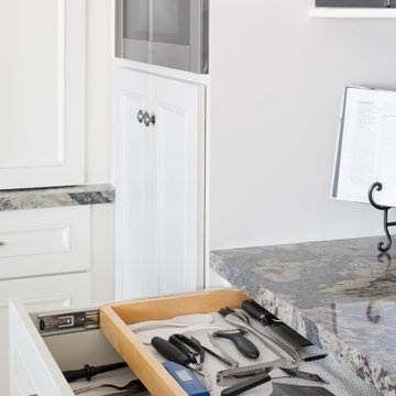
➢ the integration of specific storage units, such as double stacked cutlery drawers, a custom spice pull-out, a Kuerig coffee and tea pod drawer, and custom double stacked utensil drawers
➢ moving the refrigerator to the old oven location - this eliminated the bottle neck as well as created a better relationship to the eating table. It also utilizes the floor space between the pantry, nook, and kitchen
➢ creating a banquet style breakfast nook - this banquette seating not only doubles the amount of seating for large gatherings but it better utilizes the odd space between the kitchen and the previous nook area. It also helps to create a distinct pathway from the mudroom room through the pantry area, kitchen, nook, and living room.
➢ the coffee/breakfast bar area which includes the perfect location for the concealed microwave and toaster oven, convenient storage for the coffee pods and tea accoutrements. Roll-out drawers below also house the smoothie maker, hot water kettle, and a plethora of smoothie-making ingredients such as protein powders, smoothie additives, etc. Furthermore, the drawers below the Keurig house measuring utensil, cutlery, baking supplies and tupperware storage.
➢ incorporating lots of wide drawers and pullouts to accommodate large cookware.
➢ utilizing as much vertical space as possible by building storage to the ceiling which accommodates the family’s abundant amount of serving platters, baking sheets, bakeware, casserole dishes, and additional cutting boards.
The project is enhanced aesthetically by:
➢ new 5-piece Versailles pattern porcelain tile that now seamlessly joins the entire down stairs area together creating a bright, cohesiveness feeling instead of choppy separated spaces - it also adds a coastal feeling
➢ designing a cabinet to conceal the microwave and toaster oven
➢ the coastal influenced light fixtures over the nook table and island
➢ the sandy colors of the Langdon Cambria countertops. The swirling pattern and sparkling quartz pieces remind the homeowner of black-and-tan sandy beaches
➢ the striped banquet seating whose creamy white background and blue-green stripes were the inspiration for the cabinet and wall colors.
➢ All the interior doors were painted black to coordinate with the blacks and grays in the backsplash tile and countertop. This also adds a hint of tailored formality to an otherwise casual space.
➢ the use of WAC's Oculux small aperture LED units for the overhead lighting complimented with Diode LED strips for task lighting under the cabinets and inside the pantry and glass wall cabinets. All of the lighting applications are on separate dimmer switches.
Innovative uses of materials or construction methods by Realty Restoration LLC:
➢ Each 1-1/2” x 3” block of reclaimed end-grain black walnut that makes up the center island chopping block was hand milled and built in the shop. It was designed to look substantial and proportional to the surrounding elements, executed by creating the 4 inch tall top with a solid wood chamfered edge band.
➢ The metal doors on either side of the vent hood were also custom designed for this project and built in the Realty Restoration LLC shop. They are made 1x2, 11-gauge mild steel with ribbed glass. Weighing 60 lbs a piece, heavy duty cabinet hinges were added to support the weight of the door and keep them from sagging.
➢ Under-cabinet receptacles were added along the range wall in order to have a clean, uninterrupted backsplash.
Design obstacles to overcome:
➢ Because we were removing the demising walls between the kitchen and living room, we had to find a way to plumb and vent the new island. We did this by tunneling through the slab (the slab had post tension cables which prevented us from just trenching) to run a new wet vent through a nearby structural wall. We pulled the existing hot and cold lines between upper floor joists and ran them down the structural wall as well and up through a conduit in the tunnel.
➢ Since we were converting from wall overs to a gas range it allowed us to utilize the 220 feed for the wall ovens to provide a new sub panel for all the new kitchen circuits
➢ Due to framing deficiencies inherited from the original build there was a 1-1/2” differential in the floor-to-ceiling height over a 20 foot span; by utilizing the process of cutting and furring coupled with the crown moulding details on the cabinet elevations we were able to mask the problem and provide seamless transitions between the cabinet components.
Evidence of superior craftsmanship:
➢ uniquely designed, one-of-a-kind metal “X” end panels on the large island. The end panels were custom made in the Realty Restoration LLC shop and fitted to the exact dimensions of the island. The welding seams are completely indistinguishable - the posts look like they are cut from a single sheet of metal
➢ square metal posts on the small island were also custom made and designed to compliment and carry through the metal element s throughout the kitchen
➢ the beautiful, oversized end panels on the pantry cabinets which give the breakfast nook a tailored look
➢ integrating a large format 5 piece Versailles tile pattern to seamlessly flow from the existing spaces into the new kitchen space
➢ By constructing a custom cabinet that jogged around a corner we could not remodel (housing the entry way coat closet) we were able to camouflage the adjacent wall offset within the upper and lower cabinets. By designing around the existing jog in the structural walls we accomplished a few things: we were able to find the space to house, and hide, the microwave and toaster oven yet still have a clean cohesive appearance from the kitchen side. Additionally, the owners were able to keep their much needed coat closet and we didn’t have to increase the budget with unnecessary structural work.
 Cummings Architecture + Interiors
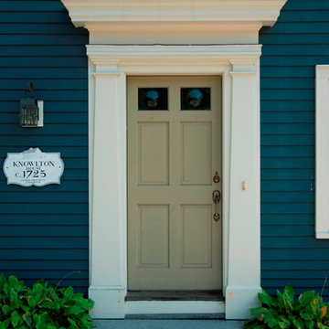
The Abraham Knowlton House (c. 1725) was nearly demolished to make room for the expansion of a nearby commercial building. Thankfully, this historic home was saved from that fate after surviving a long, drawn out battle. When we began the project, the building was in a lamentable state of disrepair due to long-term neglect. Before we could begin on the restoration and renovation of the house proper, we needed to raise the entire structure in order to repair and fortify the foundation. The design project was substantial, involving the transformation of this historic house into beautiful and yet highly functional condominiums. The final design brought this home back to its original, stately appearance while giving it a new lease on life as a home for multiple families.
Winner, 2003 Mary P. Conley Award for historic home restoration and preservation
Photo Credit: Cynthia August
34