
Search results for "Subtle color" in Home Design Ideas
 TKS Design Group
Download our free ebook, Creating the Ideal Kitchen. DOWNLOAD NOW
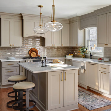
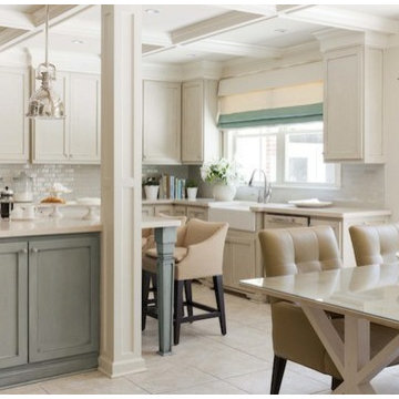
This family from Wheaton was ready to remodel their kitchen, dining room and powder room. The project didn’t call for any structural or space planning changes but the makeover still had a massive impact on their home. The homeowners wanted to change their dated 1990’s brown speckled granite and light maple kitchen. They liked the welcoming feeling they got from the wood and warm tones in their current kitchen, but this style clashed with their vision of a deVOL type kitchen, a London-based furniture company. Their inspiration came from the country homes of the UK that mix the warmth of traditional detail with clean lines and modern updates.
To create their vision, we started with all new framed cabinets with a modified overlay painted in beautiful, understated colors. Our clients were adamant about “no white cabinets.” Instead we used an oyster color for the perimeter and a custom color match to a specific shade of green chosen by the homeowner. The use of a simple color pallet reduces the visual noise and allows the space to feel open and welcoming. We also painted the trim above the cabinets the same color to make the cabinets look taller. The room trim was painted a bright clean white to match the ceiling.
In true English fashion our clients are not coffee drinkers, but they LOVE tea. We created a tea station for them where they can prepare and serve tea. We added plenty of glass to showcase their tea mugs and adapted the cabinetry below to accommodate storage for their tea items. Function is also key for the English kitchen and the homeowners. They requested a deep farmhouse sink and a cabinet devoted to their heavy mixer because they bake a lot. We then got rid of the stovetop on the island and wall oven and replaced both of them with a range located against the far wall. This gives them plenty of space on the island to roll out dough and prepare any number of baked goods. We then removed the bifold pantry doors and created custom built-ins with plenty of usable storage for all their cooking and baking needs.
The client wanted a big change to the dining room but still wanted to use their own furniture and rug. We installed a toile-like wallpaper on the top half of the room and supported it with white wainscot paneling. We also changed out the light fixture, showing us once again that small changes can have a big impact.
As the final touch, we also re-did the powder room to be in line with the rest of the first floor. We had the new vanity painted in the same oyster color as the kitchen cabinets and then covered the walls in a whimsical patterned wallpaper. Although the homeowners like subtle neutral colors they were willing to go a bit bold in the powder room for something unexpected. For more design inspiration go to: www.kitchenstudio-ge.com
 ICON Custom Builders, LLC
Photo by: Jay Sinclair.
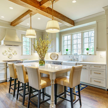
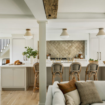
Elegant l-shaped medium tone wood floor and brown floor kitchen photo in Other with a farmhouse sink, shaker cabinets, beige cabinets, white backsplash, paneled appliances, an island and white countertops
Elegant l-shaped medium tone wood floor and brown floor kitchen photo in Other with a farmhouse sink, shaker cabinets, beige cabinets, white backsplash, paneled appliances, an island and white countertops
 Before and After Builders, Inc.
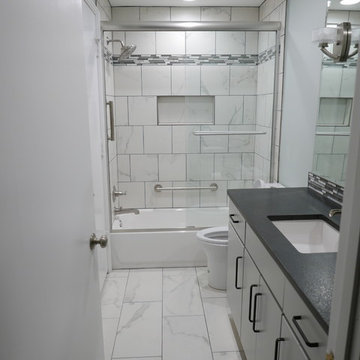
New ProFlo tub, Anatolia Classic Calacatta 13" x 13" porcelain tub/shower wall tile laid in a brick style pattern with Cathedral Waterfall linear accent tile, custom recess/niche, Delta grab bars, Brizo Rook Series tub/shower fixtures, and frameless tub/shower sliding glass door! Anatolia Classic Calacatta 12" x 24" porcelain floor tile laid in a 1/3-2/3 pattern, Medallion custom cabinetry with full overlay slab doors and drawers, leathered Black Pearl granite countertop, and Top Knobs cabinet hardware!
Find the right local pro for your project
 Adrienne DeRosa
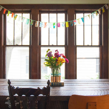
A broad mix of chairs lends a playful note to the dining table, which Kiel designed and built out of reclaimed barn wood. Its straightforward construction with exposed fasteners bespeaks of the material's rustic origins. A bench under the window provides flexible seating for entertaining guests.
A simplified floral arrangement and some bunting give the room a kick of color proving that spare, yet selective treatments can still add a welcoming touch to a space.
Photo: Adrienne DeRosa Photography © 2014 Houzz
 Sherwin-Williams
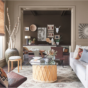
Some spirits can never be fenced in. They need to soak in the blue of endless horizon and the subtle earthy colors of the high plains and desert. Sun-washed and warm, this palette can be seen in the baked clay canyons, worn leather and woven wool blankets of the true New West.
INFLUENCERS:
Carefree Bohemian
Modern cowgirl
Unbridled adventure
Southwestern twist
PALETTE:
Origami White SW 7636
Cavern Clay SW 7701
Moth Wing SW 9174
Baked Cookie SW 9098
Dark Clove SW 9183
Distance SW 6243
Caramelized SW 9186
Main Walls: Moth Wing SW 9174
Back Accent Wall: Dark Clove SW 9183
Bookshelf Trim: Origami White SW 7636
 Showplace Design & Remodel
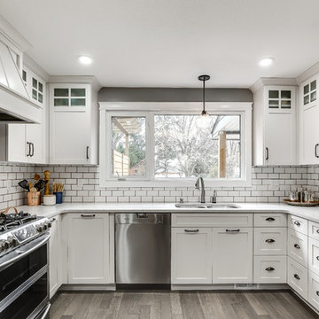
Inspiration for a transitional u-shaped eat-in kitchen remodel in Nashville with a farmhouse sink, shaker cabinets, white cabinets, quartz countertops, white backsplash, subway tile backsplash and stainless steel appliances
 Dura Supreme Cabinetry
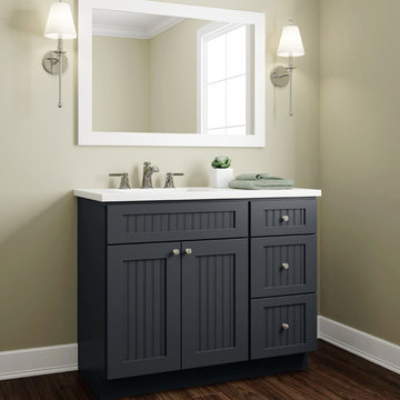
This nautical styled bathroom features Sherwin-Williams “Cyberspace” SW 7076 on Dura Supreme’s Craftsman Beaded Panel cabinet door style. This dark navy blue is subtle, neutral, and dramatic all at the same time. This color was selected for Dura Supreme’s 2017-2018 Curated Color Collection. Dura Supreme’s Curated Color Collection is a collection of cabinet paint colors that are always fresh, current and reflective of popular color trends for home interiors and cabinetry. This offering of colors is continuously updated as color trends shift.
Painted cabinetry is more popular than ever before and the color you select for your home should be a reflection of your personal taste and style. Our Personal Paint Match Program offers the entire Sherwin-William’s paint palette and Benjamin Moore’s paint palette, over 5,000 colors, for your new kitchen or bath cabinetry.
Color is a highly personal preference for most people and although there are specific colors that are considered “on trend” or fashionable, color choices should ultimately be based on what appeals to you personally. Homeowners often ask about color trends and how to incorporate them into newly designed or renovated interiors. And although trends and fashion should be taken into consideration, that should not be the only deciding factor. If you love a specific shade of green, select complementing neutrals and coordinating colors to create an entire palette that will remain an everlasting classic. It could be something as simple as being able to select the perfect shade of white that complements the countertop and tile and works well in a specific lighting situation. Our new Personal Paint Match system makes that process so much easier.
Request a FREE Dura Supreme Brochure Packet:
http://www.durasupreme.com/request-brochure
Sponsored
Columbus, OH

Trish Takacs Design
Award Winning & Highly Skilled Kitchen & Bath Designer in Columbus
 Superior Cabinets
Designer: Marina Arthur, Superior Cabinets Saskatoon
Finish: Fusion Meringue
Door style: Hamilton
Door Hardware: Oil Rubbed Bronze HBP86863128BORB
Drawer Hardware: Oil Rubbed Bronze HBP30342ORB
Countertop: Caesarstone Bianca Drift
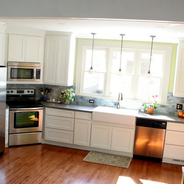
 Ben Clair
White cabinets with a Cambria quartz counter top, Ikea farmhouse sink and oil rubbed bronze hardware.
Inspiration for a timeless l-shaped kitchen remodel in Richmond with a farmhouse sink, shaker cabinets, white cabinets, quartz countertops, multicolored backsplash, ceramic backsplash and stainless steel appliances
Inspiration for a timeless l-shaped kitchen remodel in Richmond with a farmhouse sink, shaker cabinets, white cabinets, quartz countertops, multicolored backsplash, ceramic backsplash and stainless steel appliances
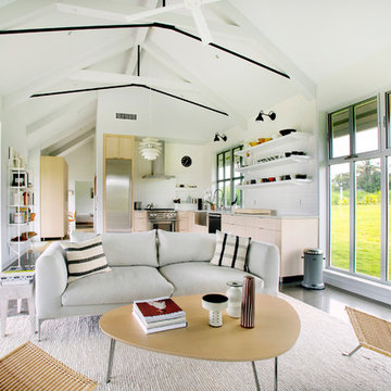
Living room - farmhouse open concept concrete floor and gray floor living room idea in Portland with white walls
 Mercury Mosaics and Tile
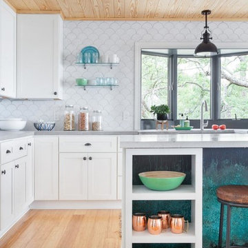
This Florida Gulf home is a project by DIY Network where they asked viewers to design a home and then they built it! Talk about giving a consumer what they want!
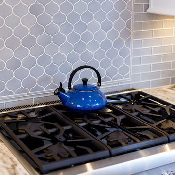
We were fortunate enough to have been picked to tile the kitchen--and our tile is everywhere! Using tile from countertop to ceiling is a great way to make a dramatic statement. But it's not the only dramatic statement--our monochromatic Moroccan Fish Scale tile provides a perfect, neutral backdrop to the bright pops of color throughout the kitchen. That gorgeous kitchen island is recycled copper from ships!
Overall, this is one kitchen we wouldn't mind having for ourselves.
Large Moroccan Fish Scale Tile - 130 White
Photos by: Christopher Shane

 Sunrise Building & Remodeling Inc
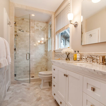
guest bath with marble mosaic tile, marble floor and base, custom wood J Tribble vanity with marble top
Inspiration for a timeless gray tile and mosaic tile marble floor bathroom remodel in New York with furniture-like cabinets, white cabinets, a one-piece toilet, white walls, an undermount sink and marble countertops
Inspiration for a timeless gray tile and mosaic tile marble floor bathroom remodel in New York with furniture-like cabinets, white cabinets, a one-piece toilet, white walls, an undermount sink and marble countertops


 Raywal Cabinets
Cabinets:
Forest Hill, MDF, Cloud White with Grey Brushstroke
Hardware: #114
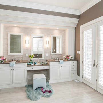
Inspiration for a large transitional master beige tile ceramic tile bathroom remodel in Toronto with raised-panel cabinets, white cabinets and brown walls
Inspiration for a large transitional master beige tile ceramic tile bathroom remodel in Toronto with raised-panel cabinets, white cabinets and brown walls
 Dura Supreme Cabinetry
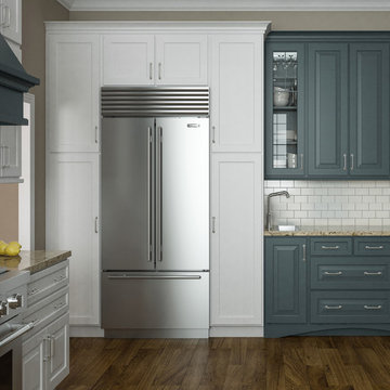
This fun and stylish bathroom features Sherwin-Williams “Slate Tile" SW 7624 on Dura Supreme’s Hawthorne door style. This elegant blue/gray paint color is subtle, calm, and inspiring. This color was selected for Dura Supreme’s 2017-2018 Curated Color Collection. Dura Supreme’s Curated Color Collection is a collection of cabinet paint colors that are always fresh, current and reflective of popular color trends for home interiors and cabinetry. This offering of colors is continuously updated as color trends shift.
Painted cabinetry is more popular than ever before and the color you select for your home should be a reflection of your personal taste and style. Our Personal Paint Match Program offers the entire Sherwin-William’s paint palette and Benjamin Moore’s paint palette, over 5,000 colors, for your new kitchen or bath cabinetry.
Color is a highly personal preference for most people and although there are specific colors that are considered “on trend” or fashionable, color choices should ultimately be based on what appeals to you personally. Homeowners often ask about color trends and how to incorporate them into newly designed or renovated interiors. And although trends and fashion should be taken into consideration, that should not be the only deciding factor. If you love a specific shade of green, select complementing neutrals and coordinating colors to create an entire palette that will remain an everlasting classic. It could be something as simple as being able to select the perfect shade of white that complements the countertop and tile and works well in a specific lighting situation. Our new Personal Paint Match system makes that process so much easier.
Request a FREE Dura Supreme Brochure Packet:
http://www.durasupreme.com/request-brochure
 Abrams Valenti Interiors
Scott Shigley
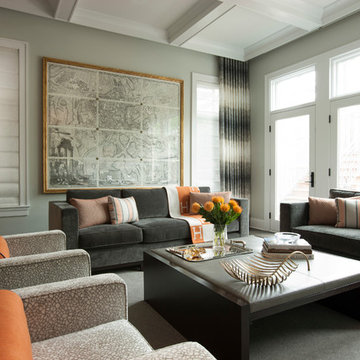
Living room - contemporary formal carpeted living room idea in Chicago with gray walls, no fireplace and no tv
Living room - contemporary formal carpeted living room idea in Chicago with gray walls, no fireplace and no tv
 Castle Rock Custom Homes
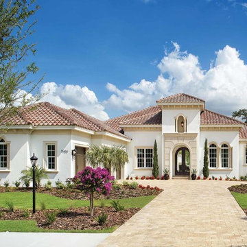
Inspiration for a large mediterranean white two-story stucco gable roof remodel in Orlando

Sponsored
Columbus, OH

Snider & Metcalf Interior Design, LTD
Leading Interior Designers in Columbus, Ohio & Ponte Vedra, Florida
 Kathleen Bost Architecture + Design
Matthew Millman
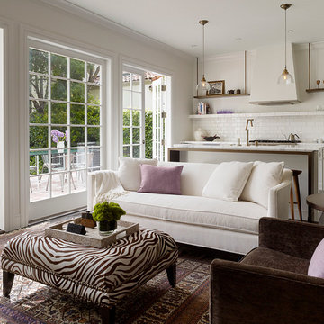
Transitional open concept living room photo in San Francisco with white walls
Transitional open concept living room photo in San Francisco with white walls
 Interior Style, LLC
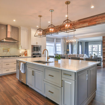
Took down walls to create a much larger open space. Used reclaimed wood and black and gold fixtures to give it a farmhouse feel but still modern and transitional.

26