
Search results for "Support extends" in Home Design Ideas
 The Brooklyn Studio
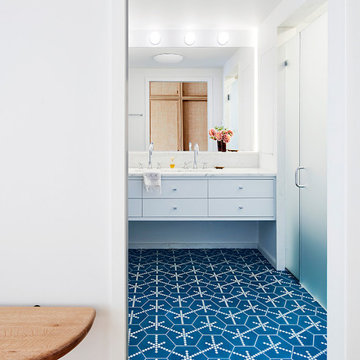
This residence was a complete gut renovation of a 4-story row house in Park Slope, and included a new rear extension and penthouse addition. The owners wished to create a warm, family home using a modern language that would act as a clean canvas to feature rich textiles and items from their world travels. As with most Brooklyn row houses, the existing house suffered from a lack of natural light and connection to exterior spaces, an issue that Principal Brendan Coburn is acutely aware of from his experience re-imagining historic structures in the New York area. The resulting architecture is designed around moments featuring natural light and views to the exterior, of both the private garden and the sky, throughout the house, and a stripped-down language of detailing and finishes allows for the concept of the modern-natural to shine.
Upon entering the home, the kitchen and dining space draw you in with views beyond through the large glazed opening at the rear of the house. An extension was built to allow for a large sunken living room that provides a family gathering space connected to the kitchen and dining room, but remains distinctly separate, with a strong visual connection to the rear garden. The open sculptural stair tower was designed to function like that of a traditional row house stair, but with a smaller footprint. By extending it up past the original roof level into the new penthouse, the stair becomes an atmospheric shaft for the spaces surrounding the core. All types of weather – sunshine, rain, lightning, can be sensed throughout the home through this unifying vertical environment. The stair space also strives to foster family communication, making open living spaces visible between floors. At the upper-most level, a free-form bench sits suspended over the stair, just by the new roof deck, which provides at-ease entertaining. Oak was used throughout the home as a unifying material element. As one travels upwards within the house, the oak finishes are bleached to further degrees as a nod to how light enters the home.
The owners worked with CWB to add their own personality to the project. The meter of a white oak and blackened steel stair screen was designed by the family to read “I love you” in Morse Code, and tile was selected throughout to reference places that hold special significance to the family. To support the owners’ comfort, the architectural design engages passive house technologies to reduce energy use, while increasing air quality within the home – a strategy which aims to respect the environment while providing a refuge from the harsh elements of urban living.
This project was published by Wendy Goodman as her Space of the Week, part of New York Magazine’s Design Hunting on The Cut.
Photography by Kevin Kunstadt
 Ben saroussi Shoval
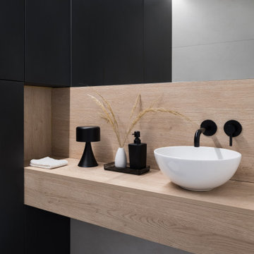
The image showcases a modern bathroom with a sleek and minimalist design. A wooden countertop with a light finish extends across the space, supporting a round white sink with a stylish black faucet mounted on the wall. Above the sink, black cabinets provide storage, contrasting with the light wood. The countertop is decorated with a small black lamp, a vase with dried grasses, a black soap dispenser, and a neatly folded white towel. The background features a combination of grey and white walls, with recessed lighting along the ceiling adding a soft glow to the space. The floor is covered in grey tiles, complementing the overall neutral and contemporary aesthetic of the bathroom. The design emphasizes clean lines, natural materials, and a clutter-free environment.
 Lola Cwikowski Studio
A couple took ownership of their new residence on a top floor of a quiet street in central Lisbon. Our studio’s brief was to transform the duplex into a hideaway to detach from daily life and spend quality time with visiting relatives.
The design manifests family-focused features: upon entry, there is plentiful storage for shoes and coats; in the main living room, a custom island crafted in solid surface extends the compact kitchen into the social area, seamlessly bridging cooking and convivial gatherings. A buffet supports more elaborate meals. Sculptural pendants and niches that accentuate horizontal continuity favor interaction between the dining and flexible lounge areas.
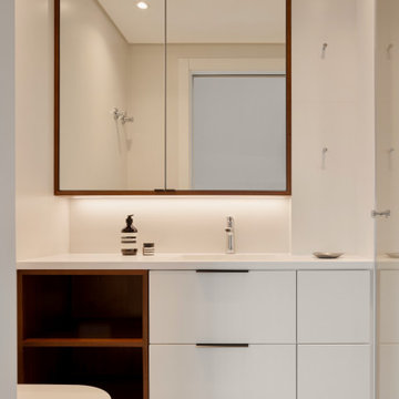
Reimagined with durable materials, the bathrooms embrace efficiency and elegance. Cabinetry is integrated around the planes of countertops and insets carried across the room. Dark wood and textured accents punctuate the white surfaces, grounding the spaces in tactile warmth. The bedrooms, designed for adaptability, offer separable sleeping arrangements, peaceful workspaces, and versatile wardrobe solutions.
The light-toned furniture and organic elements are tailored to the interior, softening the contrasting architectural palette and rectilinear forms. Soothing accent lighting is interwoven throughout, offering an adaptable, serene atmosphere.
Find the right local pro for your project
 Grabill Cabinets
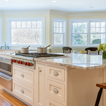
A big island with seating for four and cooktop on a granite counter provided the centerpiece with plenty of room for helpers to lend a hand. Pull-out storage and drawers for pans, knives, dishes, cooking oils, spices and other elements of a chef’s desire, are all within easy reach to either side of the cooktop or in the wall of cabinets behind. Designer Jennifer Griffin called the island “tricky” as the cooktop has a down vent, “so we had to extend the sides of the cabinets and make the back panel a little extra thick to support the countertop,” she explained.
Photographed by Stephanie Rosseel
 Kehoe Wilson Design LLC
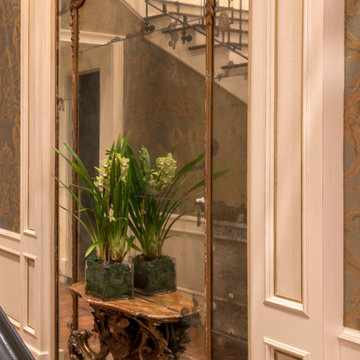
We found this mirror panel at Les Puce Saint-Ouen, shipped it home, and built the rest of the casing around it. The center mirror is in 3 pieces, surrounded by gilt wood frame with feet, and then a ring of exterior mirror pieces. In the middle bottom, there is a gilt wood bracket extending through the glass, and it supports the marble shelf on which the flowers sit.

 exclusivelytodesign
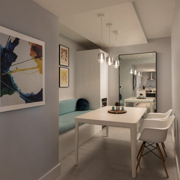
This Downtown Miami dining room was transformed from a small, underused 9-by-9-foot space into a custom dining, work, and storage flex room for a family traveling between London and Miami. Exclusively To Design created a built-in banquette with concealed storage beneath the cushion, integrated USB charging behind the back cushion, custom tower storage, and an expanded dining table so the compact bayfront condo could support family meals, remote work, entertaining, and extended stays.


 D&G Construction
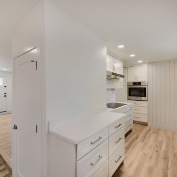
This interior remodel reimagined a dated kitchen and bathroom as one cohesive, light-filled living environment. The homeowners wanted a home that felt calm, organized, and effortless to live in — spaces that support everyday routines rather than complicate them.
D&G managed the entire project under a single Design-Build process: design, material selections, engineering, permitting, construction, and final quality control handled by one team with one point of accountability.
The Kitchen
The galley kitchen was opened into an adjacent dining area to improve flow and natural light. Soft white cabinetry pairs with quartz countertops and a full-height marble-look quartz backsplash behind the induction cooktop, creating a clean, uninterrupted surface that's as practical as it is refined.
A vertical shiplap accent wall introduces subtle texture and depth, balanced by a floating natural maple shelf that echoes the wood tones throughout the home. Integrated appliance placement — a wall oven, concealed microwave shelf, and under-cabinet ventilation — keeps countertops clear and sightlines uncluttered.
Adjacent to the kitchen, a custom built-in storage wall blends natural maple upper cabinetry with white base cabinetry, delivering pantry-level capacity without the visual weight of a closed pantry. Timeless, functional, and designed to age well.
The Bathroom
The bathroom carries the same design language as the kitchen: a natural maple vanity with raised-panel doors, brushed nickel hardware, quartz countertop with integrated backsplash, and an undermount sink.
A recessed medicine cabinet extends storage without intruding on the room, while a glass-enclosed shower with a low-threshold base and window-driven natural light keeps the space open, bright, and easy to maintain.
Wood-look tile flooring ties the bathroom to the wide-plank flooring used throughout the home — a detail that makes the renovation read as one intentional project rather than a series of separate updates.
 Azenco Outdoor
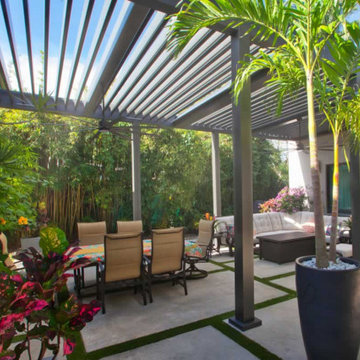
With the fans positioned directly over the outdoor dining space and the lounge area, these homeowners could enjoy a nice breeze regardless of where on their covered patio they chose to relax. To ensure plenty of clearance for the outdoor patio fans, the designers also extended the support columns to 14 feet making the space feel even more open and spacious. Additionally, to ensure their evening entertainment could carry on through the night, we also embedded LED ramping lights allowing the overhead fixtures to be dimmed for more intimate evenings.
 Green Goods
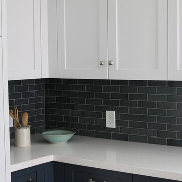
This remodel by Green Goods dramatically enhanced the appeal and function of the kitchen. The original small galley kitchen was closed off by a wall between the kitchen and the large dining and living area. We removed the wall and added a recessed beam to support the loft above, opening up the kitchen to the vaulted ceilings in the adjacent rooms. We installed a single pane awning window that allows the maximum amount of natural light to enter the space. The window looks out at the bay, so the designer, Lisa Denker chose Heath 2" x 6" off-set tile backsplash in Heron Blue (G65) to replicate the blue of the ocean beyond. The custom cabinetry features shaker style drawers and doors, painted a rich blue on the lowers and white on the upper cabinets. The Caesarstone Quartz countertops in Blizzard (2141) allow for the light from the exterior to brighten up the room even more. We pulled the existing carpeting that extended into the living and dining rooms and ran Kraus, Touch of Euro, Natural Topaz Oak (KPHTE035J) White Oak throughout.
 Rachiele Custom Sinks
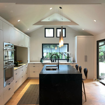
Set in a serene, light-filled modern home, this kitchen exudes both warmth and bold sophistication. At the heart of it all is a 42" hand-finished stainless steel Paragon™ workstation sink by Rachiele®—a showpiece that redefines what it means to cook in comfort and style. Designed for seamless performance and intuitive use, the sink offers a dual-tier ledge system that transforms it from a simple basin into a fully integrated prep zone. From chopping and rinsing to plating and cleaning, every task flows effortlessly thanks to custom-fit accessories that move along the interior ledge system.
The gleaming stainless steel sink makes a striking statement against the deep, dramatic veining of the black soapstone island. Paired with a matte black extended-reach faucet and a matching air switch, the entire workstation reads as both refined and powerful. Each element was selected not just for its visual impact, but for how it supports the rhythm of daily life in the kitchen—from quick weekday breakfasts to sprawling weekend dinner prep.
Every detail of this space was curated with intention: the crisp cabinetry, the understated lighting, and the seamless view out to the treetops all reinforce the idea that a kitchen should be as beautiful as it is functional. Crafted in the USA and built to last, the Paragon™ sink doesn’t just meet expectations—it elevates them.
 Drury Design
THE SETUP
Multiple ovens, multiple workspaces, multiple sinks – when you think about it, non-jewish kitchens have been adapting the criteria of kosher kitchens for years.
Gladys’ clients in West Rogers Park are Orthodox Jewish. The house they bought already had a kosher kitchen – it just wasn’t done that well. It needed some more things to be duplicated for the dairy side and the meat side. Plus, it was dark and the configuration wasn’t very conducive for a family of eight.
It was time for a remodel.
Design Objectives
Improve kosher kitchen
Add more storage in the island
Better lighting
More open, lighter feel
Change the wood floor in the kitchen to tile
THE REMODEL
Design Challenges
- We had originally planned on removing a wing wall by the breakfast area. During demolition, we learned it contained a support beam.
- The kitchen is a substantial size, but having two sinks, dishwashers, and ovens presented a challenge – how do we fit it all in and make it flow with the storage still accessible near the work areas?
Where do you stop the materials for the new space? - -- The right tile, paint, lighting, etc. would be needed to make the remodeled area cohesive with the rest of the main floor.
- An existing column limited cabinet options and thus, storage capacity. Could we conceal it without disrupting the cabinetry flow?
Design Solutions
- We had to keep the wing wall, but decided to continue the tile on the sides of the cabinets and maintain the height of the tile to line up with the rest of the backsplash. This actually presented a very nice and cohesive look, especially since the opposite side has a wing wall to the left of the refrigerator.
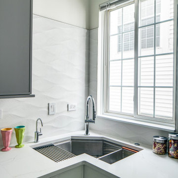
- We used “L-shaped” corner sinks instead of the rectangular ones set on an angle. This gave us more of the legs of the triangles versus the hypotenuse, which allowed for the two dishwashers, and the pullout utensil canisters and spice pullouts while still keeping the 3-drawer cabinets on either side of the range (by the sinks). The old island had the recess for stools which the family never used. By extending the width of the island 6” and utilizing this leg space, we were able to fit 18”-deep cabinets on this side – adding lots of accessible storage. The family can now work simultaneously on the dairy side (the side with the fridge) and the meat side (opposite) without getting in each other’s way. We separated the cooking by using the range oven for the meat and a built-in microwave in the base cabinet. The wall oven with built-in microwave on top is for dairy.
- Corner sinks opened up the middle area for a wider range – we went from a 30” to a 36”. Removing all the wall cabinets (on the range wall) made a big difference. That opened up the entire space while adding some visual impact. (Not pictured: We also made the cabinets directly opposite the range wall tall and removed the countertop, resulting in more room for rollouts and even more storage!) The kitchen now has more storage than it did before.
- We ended up painting the ceiling of the kitchen into the hallway that leads to the foyer. The living and dining rooms were separated by a soffit, so that became a natural boundary. We kept the tile in the kitchen by stopping it short of the hallway and lining it up with the pantry wall. This creates a border between the breakfast area and family room. The rest of the existing wood floors were refinished to refresh and make the hue darker. We also painted a dark accent wall and carried it into the breakfast area to make the rooms look deeper.
- The in-the-way column housed plumbing and couldn’t be moved. We still built cabinets in that spot – we just had to build a chase inside it to conceal the pipes. There was still plenty of room for new storage. We also took the cabinets all the way to the ceiling. The continuous tall cabinets added a functional elegance to the space.
THE RENEWED SPACE
The client’s long-awaited dream of a better kosher kitchen has finally been achieved, beautifully combining enhanced storage solutions with adherence to the family’s orthodox dietary laws. The kitchen’s standout feature, an expanded island, now offers a spacious and efficient workspace. This allows several family members to cook together comfortably, without the inconvenience of bumping into each other, ensuring a harmonious and productive cooking environment.
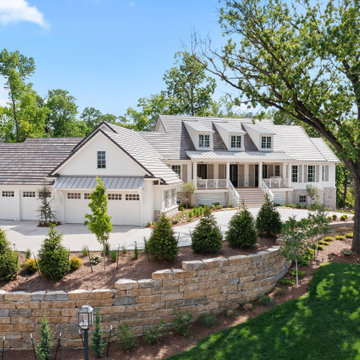
 NSPJ Architects
Key elements include hip roofs that extend over wide covered front porches supported by columns or pillars.
Transitional exterior home photo in Kansas City
Transitional exterior home photo in Kansas City

Sponsored
Fredericksburg, OH

High Point Cabinets
Columbus' Experienced Custom Cabinet Builder | 4x Best of Houzz Winner
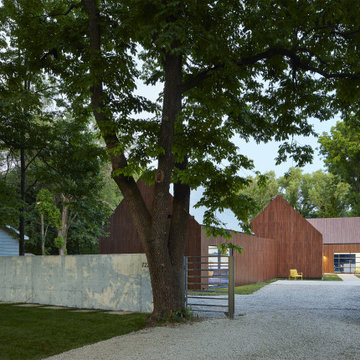
 Studio 804
The 722 Ash Street residence consists of a 1500 sf primary house with a contiguous 500 sf accessory dwelling. The project is set in the rich culture of North Lawrence, its rear property line abuts the Lawrence levee trail which runs for nine miles along the north bank of the Kansas River.
North Lawrence is known for its quality soil, large trees, curbless streets and random size parcels before it breaks into larger farms further from the urban center. It is built on the typical orthogonal grid of American development, but it represents the older growth of the city prior to urban planners and zoning regulations. The rumble of freight trains and farm trucks in the shadows of the towering grain elevators are only blocks away. It is home to many who enjoy being only a bridge crossing away from Lawrence’s vibrant downtown but are far enough away to maintain their independence from many of the restrictions on living near the historic district. They can work in their large gardens and toiling in their garages and shops in a manner more rural than urban.
The house on 722 Ash St. is imbued with the character of North Lawrence and the Levee Trail area. The design was inspired by the Midwestern farmstead vernacular of the region. These timeless vernacular qualities house all the accommodations necessary for modern, sustainable living. A unique feature of this house is the Accessory Dwelling Unit permitted in the zoning district. It is a small separate residence on the same lot that can be used for income property or for extended family members. It also supports the city of Lawrence’s goals of increased density close to downtown rather than continued sprawl into the countryside.
The buildings use technology and common-sense design to reduce the building’s footprint and assure the owners low energy use and costs. A 4.9 Kw solar collection system is located on the only south facing gable and the super insulated envelopes (r-62 roof and r-35 walls) of all three forms easily exceeds the standards. Studio 804 continues their long standing pattern of maintaining the highest level of sustainable design while remaining contextually sensitive to the surrounding community. This house, like every Studio 804 project since 2008, is USGBC LEED Platinum Certified.
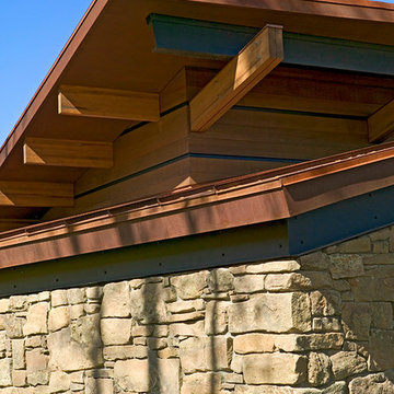
 Dynia Architects
This mountain vacation residence places the living and sleeping space for a family of three on the main level with guest bedrooms, recreation rooms, and garage below. The sloped site allows approach and entry on the main level, achieving the appearance of a one-story house. The scheme is an L-shaped, open-plan building containing primary living space covered with a shed roof. This configuration forms a “courtyard” facing southeast, which contains the main entry. Intersected with the shed roof component the mudroom, bedroom, and master closet and bath are contained in “cabins” of stone with arced roofs. The roof support at the northwest corner has been eliminated to allow a sliding glass system which, when open, voids the corner of the family room. This allows the living space to extend onto an elevated concrete terrace overlooking the view.
The result is a living environment that distinguishes public from private uses with form and space, provides outdoor areas of contrasting characteristics in a place of sharp seasonal contrast, and creates an image that blends with the landscape.
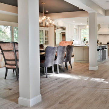
 Michael Nash Design, Build & Homes
A family in McLean VA decided to remodel two levels of their home.
There was wasted floor space and disconnections throughout the living room and dining room area. The family room was very small and had a closet as washer and dryer closet. Two walls separating kitchen from adjacent dining room and family room.
After several design meetings, the final blue print went into construction phase, gutting entire kitchen, family room, laundry room, open balcony.
We built a seamless main level floor. The laundry room was relocated and we built a new space on the second floor for their convenience.
The family room was expanded into the laundry room space, the kitchen expanded its wing into the adjacent family room and dining room, with a large middle Island that made it all stand tall.
The use of extended lighting throughout the two levels has made this project brighter than ever. A walk -in pantry with pocket doors was added in hallway. We deleted two structure columns by the way of using large span beams, opening up the space. The open foyer was floored in and expanded the dining room over it.
All new porcelain tile was installed in main level, a floor to ceiling fireplace(two story brick fireplace) was faced with highly decorative stone.
The second floor was open to the two story living room, we replaced all handrails and spindles with Rod iron and stained handrails to match new floors. A new butler area with under cabinet beverage center was added in the living room area.
The den was torn up and given stain grade paneling and molding to give a deep and mysterious look to the new library.
The powder room was gutted, redefined, one doorway to the den was closed up and converted into a vanity space with glass accent background and built in niche.
Upscale appliances and decorative mosaic back splash, fancy lighting fixtures and farm sink are all signature marks of the kitchen remodel portion of this amazing project.
I don't think there is only one thing to define the interior remodeling of this revamped home, the transformation has been so grand.
 TVL Creative Ltd.
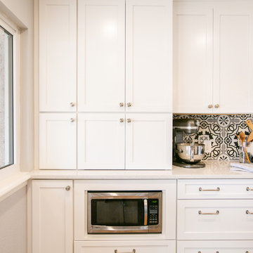
Cramped kitchen be gone! That was the project motto and top priority. The goal was to transform the current layout from multiple smaller spaces into a connected whole that would activate the main level for our clients, a young family of four.
The biggest obstacle was the wall dividing the kitchen and the dining room. Removing this wall was central to opening up and integrating the main living spaces, but the existing ductwork that ran right through the center of the wall posed a design challenge, er design opportunity. The resulting design solution features a central pantry that captures the ductwork and provides valuable storage- especially when compared to the original kitchen's 18" wide pantry cabinet. The pantry also anchors the kitchen island and serves as a visual separation of space between the kitchen and homework area.
Through our design development process, we learned the formal living room was of no service to their lifestyle and therefore space they rarely spent time in. With that in mind, we proposed to eliminate the unused living room and make it the new dining room. Relocating the dining room to this space inherently felt right given the soaring ceiling and ample room for holiday dinners and celebrations. The new dining room was spacious enough for us to incorporate a conversational seating area in the warm, south-facing window alcove.
Now what to do with the old dining room?! To answer that question we took inspiration from our clients' shared profession in education and developed a craft area/homework station for both of their boys. The semi-custom cabinetry of the desk area carries over to the adjacent wall and forms window bench base with storage that we topped with butcher block for a touch of warmth. While the boys are young, the bench drawers are the perfect place for a stash of toys close to the kitchen.
The kitchen begins just beyond the window seat with their refrigerator enclosure. Opposite the refrigerator is the new pantry with twenty linear feet of shelving and space for brooms and a stick vacuum. Extending from the backside of the pantry the kitchen island design incorporates counter seating on the family room side and a cabinetry configuration on the kitchen side with drawer storage, a trashcan center, farmhouse sink, and dishwasher.
We took careful time in design and execution to align the range and sink because while it might seem like a small detail, it plays an important role in supporting the symmetrical configuration of the back wall of the kitchen. The rear wall design utilizes an appliance garage mirrors the visual impact of the refrigerator enclosure and helps keep the now open kitchen tidy. Between the appliance garage and refrigerator enclosure is the cooking zone with 30" of cabinetry and work surface on either side of the range, a chimney style vent hood, and a bold graphic tile backsplash.
The backsplash is just one of many personal touches we added to the space to reflect our client's modern eclectic style and love of color. Swooping lines of the mid-mod style barstools compliment the pendants and backsplash pattern. A pop of vibrant green on the frame of the pantry door adds a fresh wash of color to an otherwise neutral space. The big show stopper is the custom charcoal gray and copper chevron wall installation in the dining room. This was an idea our clients softly suggested, and we excitedly embraced the opportunity. It is also a kickass solution to the head-scratching design dilemma of how to fill a large and lofty wall.
We are so grateful to bring this design to life for our clients and now dear friends.


 StoneUnlimited Kitchen and Bath Remodeling
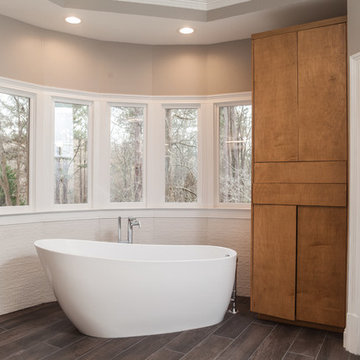
The modern feel of this master bathroom designed by Stoneunlimited Kitchen and Bath Remodeling has the perfect balance of warm and cool tones that create a space that is striking. While the walls, flooring and finishes are all cool toned, the custom made vanity, wardrobe and full length mirror add a visual component that makes the space both warm and welcoming.
This master bathroom has all the spa-like benefits that one could ever desire. The 68” acrylic soaking tub sits upon wood plank porcelain tiles that extend into the shower and provide the look of wood without the maintenance. The floor is heated and controlled by a programmable thermostat. A heated towel rack provides the benefit of having warm towels whenever needed. The shower enclosure showcases the aesthetics of the tile, tile work, modern fixtures and 36” Effendi Linear Shower Drain that adds another touch of modern appeal.
This spacious master bathroom features:
Tile:
Floor to Ceiling and Tub Surround: 13x39 Laja Blanco
Floor: Wood Plank Porcelain Tiles
Vanity, Wardrobe & Mirror:
Custom designed to accommodate the client’s needs
Modern Design to conceal hidden storage in all 3 units
Vanity Top: Quartz
Fixtures: Kohler
Tub: Gena Acrylic Slipper Tub
Towel Warmer: Brenton 20” Extra Tall Hard Wired
Heated Floors: Warmly Yours with Touch Programmable Thermostat
 Swatch Design Group
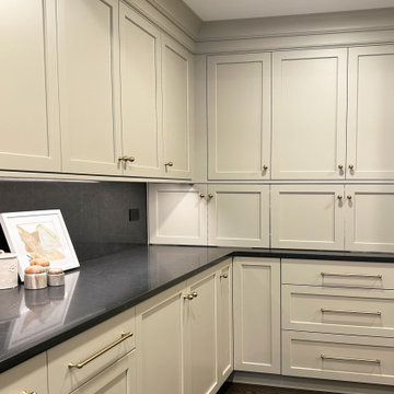
This comprehensive main floor remodel transformed a dated early-2000s home into a warm, distinctive space tailored for modern family life and effortless entertaining. Located in Northwest Indiana, the home’s renovation included the kitchen, living room, dining-to-sitting room conversion, office, mudroom, and laundry—each space reimagined with layered detail and a cohesive design language.
The project’s primary goal was to move away from builder-grade finishes and create a home full of character and comfort. In the kitchen, we reworked the layout to improve flow—removing a restrictive peninsula, extending the island for added seating, and designing a custom hood and cabinetry plan that worked around existing structural beams. A warmer palette of earth tones and neutrals reflected the clients’ personal style, while upgraded lighting, a statement range, and a larger pantry elevated functionality.
A double-sided fireplace connecting the kitchen and living room was redesigned to feel more intentional, with cohesive materials used on both faces. In the living area, a previously underwhelming wet bar became a standout moment with deep green cabinetry, a wine fridge, and built-in storage—adding both function and sophistication.
Throughout the project, structural limitations and narrow footprints presented design challenges that were met with custom solutions—from a uniquely shaped island to intentional lighting plans that worked around ceiling beams. The final result is a highly personal, connected series of spaces that support both everyday routines and meaningful moments of gathering—infused with warmth, purpose, and a relaxed sense of luxury.
 D&G Construction
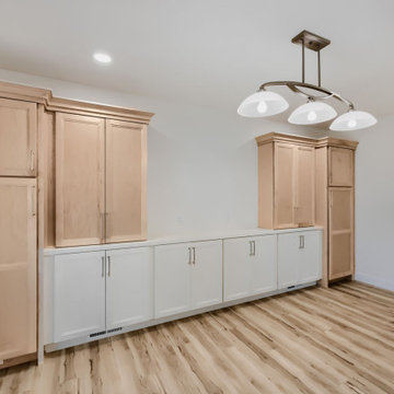
This interior remodel reimagined a dated kitchen and bathroom as one cohesive, light-filled living environment. The homeowners wanted a home that felt calm, organized, and effortless to live in — spaces that support everyday routines rather than complicate them.
D&G managed the entire project under a single Design-Build process: design, material selections, engineering, permitting, construction, and final quality control handled by one team with one point of accountability.
The Kitchen
The galley kitchen was opened into an adjacent dining area to improve flow and natural light. Soft white cabinetry pairs with quartz countertops and a full-height marble-look quartz backsplash behind the induction cooktop, creating a clean, uninterrupted surface that's as practical as it is refined.
A vertical shiplap accent wall introduces subtle texture and depth, balanced by a floating natural maple shelf that echoes the wood tones throughout the home. Integrated appliance placement — a wall oven, concealed microwave shelf, and under-cabinet ventilation — keeps countertops clear and sightlines uncluttered.
Adjacent to the kitchen, a custom built-in storage wall blends natural maple upper cabinetry with white base cabinetry, delivering pantry-level capacity without the visual weight of a closed pantry. Timeless, functional, and designed to age well.
The Bathroom
The bathroom carries the same design language as the kitchen: a natural maple vanity with raised-panel doors, brushed nickel hardware, quartz countertop with integrated backsplash, and an undermount sink.
A recessed medicine cabinet extends storage without intruding on the room, while a glass-enclosed shower with a low-threshold base and window-driven natural light keeps the space open, bright, and easy to maintain.
Wood-look tile flooring ties the bathroom to the wide-plank flooring used throughout the home — a detail that makes the renovation read as one intentional project rather than a series of separate updates.
90