
Search results for "Support work life" in Home Design Ideas
 FineLine Kitchens, Inc.
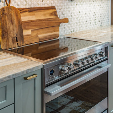
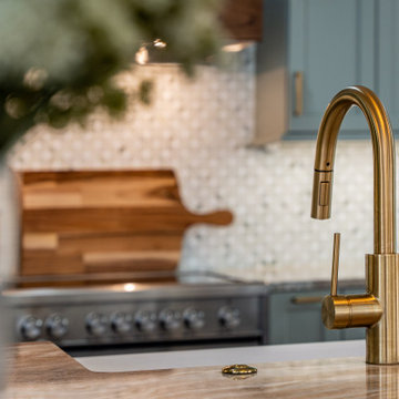
Hi everyone, I'm Sarah and Ogun we are here with fine line kitchens. So we are a couple working together. I do the interior design and remodeling of the space material selection meeting with the clients. And I handled operations outside, you know meaning all the construction work that is taking place the inside. The houses that we work in. I handle all the aspects of the construction, so today's project is very special. We're in Vienna and the client had a very big family. It's a family of seven that lives here. So we had a few aspects that we needed to keep in mind while designing this one. Having everybody be able to sit on the island. So we wanted plenty of seating all the way around. We didn't want anybody standing or anything like that. So what we did is we maximize the space. The center island is the biggest part of the kitchen. We use a natural stone to kind of give it a beautiful texture versus quartz. It's kind of standard white or kind of fabricated, so I wanted something very natural. We did this because I took my inspiration from the outside, so the inspiration if you look at the view right in front of me is there are so many greens there's a lot of brass accents and I wanted to bring this. Into this kitchen while designing it for my clients. She is very warm very. She wanted a very homey, comfy kind of look for the kitchen. So that's what we did today. As you can see, the cabinets are sage green, very light, so I still think it's a neutral, but it's a lighter color that again brings the outside in and we combine that with the oak right behind me so it's a slightly warm oak. It's not very dark. It's not very light. It's a medium brown and the same color went on the island. To kind of tie these two in and the backsplash, my favorite part is where you can see a little bit of design. It is, in my opinion still classic, but includes a pattern so the outside part is as we said in the beginning, is handled by my husband. I'd like him to speak a little bit about that. Thanks, Sarah, I want to talk to you guys a little bit about the construction part of this project. Originally this kitchen was located mostly in this area. They had their stove there sing. It was more of a peninsula layout in Sarah's and the customer vision they wanted. They wanted to get rid of the peninsula and they want to be able to have a huge island that can at least sit seven people because they're familiar with seven. So we wanted to make sure that we can achieve this design and bring it to life so that they can be happy with this layout. Some of the challenges we had, the house, the home being, you know, old home. There were a lot of you know the older electrical and plumbing that had to be replaced. We had to relocate the stove from here to this area. Over here we had put a nice foot fan that we had to relocate all the ductwork and the plumbing. Was being on the peninsula area. We had to relocate it to the center islands. So we achieved all this and kind of like bring it to bring in this kitchen up to date it looks beautiful. That's true, so yes, the old layout did not function for my clients because everything was kind of gathered on one side of the kitchen. So there was like a peninsula right there. So the end of this island kind of continued straight. And that was just the L shape. Kind of where everything was and there used to be another big table here, so they were using only kind of half of the space. So like I said at the beginning, our vision was to kind of feed everybody at the island, create some symmetry. 'cause I love that. So as you can see behind me, this is kind of the focal point symmetrical. Everything is kind of even we wanted to also panel the fridge here so it mimics the pantry and another size. So when you're looking at it, it is bringing again that symmetry back again. I hope you enjoyed this kitchen and this video and I'll see you soon. So how do you think this project turned out? It's nice. I like the color. I think it turned out nice. It's kind of like a little bit different color than what we always do. So I realize. Are you giving me a little bit of credit here that I did something different? Are you proud? I'm so proud of you. Other than that I like it. That they have kind of like a two sink. So if this was our kitchen, if we ever like you can have your own. I can have mine if we ever get into a fight then this can be like my own kitchen. Why are we gonna bring in a fight right now? So I'm cooking anyway. You're grilling most of the time, So what are you even talking about? My kitchen? That's my kitchen. You can just take the small sink. That's fine. It's always good to have your own space right there, so anyways. Thank you guys for watching. We hope to see you soon and if you have any questions please click the link below. It'll lead you to our website, house, YouTube and all of the social media is so nice to have you guys. We'll see you soon. Thanks bye bye-bye.
 FineLine Kitchens, Inc.
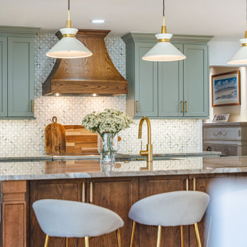
Hi everyone, I'm Sarah and Ogun we are here with fine line kitchens. So we are a couple working together. I do the interior design and remodeling of the space material selection meeting with the clients. And I handled operations outside, you know meaning all the construction work that is taking place the inside. The houses that we work in. I handle all the aspects of the construction, so today's project is very special. We're in Vienna and the client had a very big family. It's a family of seven that lives here. So we had a few aspects that we needed to keep in mind while designing this one. Having everybody be able to sit on the island. So we wanted plenty of seating all the way around. We didn't want anybody standing or anything like that. So what we did is we maximize the space. The center island is the biggest part of the kitchen. We use a natural stone to kind of give it a beautiful texture versus quartz. It's kind of standard white or kind of fabricated, so I wanted something very natural. We did this because I took my inspiration from the outside, so the inspiration if you look at the view right in front of me is there are so many greens there's a lot of brass accents and I wanted to bring this. Into this kitchen while designing it for my clients. She is very warm very. She wanted a very homey, comfy kind of look for the kitchen. So that's what we did today. As you can see, the cabinets are sage green, very light, so I still think it's a neutral, but it's a lighter color that again brings the outside in and we combine that with the oak right behind me so it's a slightly warm oak. It's not very dark. It's not very light. It's a medium brown and the same color went on the island. To kind of tie these two in and the backsplash, my favorite part is where you can see a little bit of design. It is, in my opinion still classic, but includes a pattern so the outside part is as we said in the beginning, is handled by my husband. I'd like him to speak a little bit about that. Thanks, Sarah, I want to talk to you guys a little bit about the construction part of this project. Originally this kitchen was located mostly in this area. They had their stove there sing. It was more of a peninsula layout in Sarah's and the customer vision they wanted. They wanted to get rid of the peninsula and they want to be able to have a huge island that can at least sit seven people because they're familiar with seven. So we wanted to make sure that we can achieve this design and bring it to life so that they can be happy with this layout. Some of the challenges we had, the house, the home being, you know, old home. There were a lot of you know the older electrical and plumbing that had to be replaced. We had to relocate the stove from here to this area. Over here we had put a nice foot fan that we had to relocate all the ductwork and the plumbing. Was being on the peninsula area. We had to relocate it to the center islands. So we achieved all this and kind of like bring it to bring in this kitchen up to date it looks beautiful. That's true, so yes, the old layout did not function for my clients because everything was kind of gathered on one side of the kitchen. So there was like a peninsula right there. So the end of this island kind of continued straight. And that was just the L shape. Kind of where everything was and there used to be another big table here, so they were using only kind of half of the space. So like I said at the beginning, our vision was to kind of feed everybody at the island, create some symmetry. 'cause I love that. So as you can see behind me, this is kind of the focal point symmetrical. Everything is kind of even we wanted to also panel the fridge here so it mimics the pantry and another size. So when you're looking at it, it is bringing again that symmetry back again. I hope you enjoyed this kitchen and this video and I'll see you soon. So how do you think this project turned out? It's nice. I like the color. I think it turned out nice. It's kind of like a little bit different color than what we always do. So I realize. Are you giving me a little bit of credit here that I did something different? Are you proud? I'm so proud of you. Other than that I like it. That they have kind of like a two sink. So if this was our kitchen, if we ever like you can have your own. I can have mine if we ever get into a fight then this can be like my own kitchen. Why are we gonna bring in a fight right now? So I'm cooking anyway. You're grilling most of the time, So what are you even talking about? My kitchen? That's my kitchen. You can just take the small sink. That's fine. It's always good to have your own space right there, so anyways. Thank you guys for watching. We hope to see you soon and if you have any questions please click the link below. It'll lead you to our website, house, YouTube and all of the social media is so nice to have you guys. We'll see you soon. Thanks bye bye-bye.
 FineLine Kitchens, Inc.
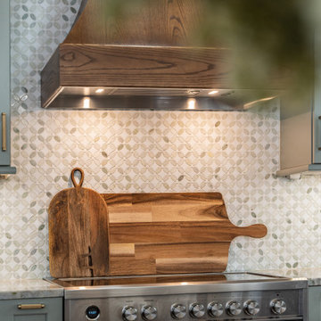
Hi everyone, I'm Sarah and Ogun we are here with fine line kitchens. So we are a couple working together. I do the interior design and remodeling of the space material selection meeting with the clients. And I handled operations outside, you know meaning all the construction work that is taking place the inside. The houses that we work in. I handle all the aspects of the construction, so today's project is very special. We're in Vienna and the client had a very big family. It's a family of seven that lives here. So we had a few aspects that we needed to keep in mind while designing this one. Having everybody be able to sit on the island. So we wanted plenty of seating all the way around. We didn't want anybody standing or anything like that. So what we did is we maximize the space. The center island is the biggest part of the kitchen. We use a natural stone to kind of give it a beautiful texture versus quartz. It's kind of standard white or kind of fabricated, so I wanted something very natural. We did this because I took my inspiration from the outside, so the inspiration if you look at the view right in front of me is there are so many greens there's a lot of brass accents and I wanted to bring this. Into this kitchen while designing it for my clients. She is very warm very. She wanted a very homey, comfy kind of look for the kitchen. So that's what we did today. As you can see, the cabinets are sage green, very light, so I still think it's a neutral, but it's a lighter color that again brings the outside in and we combine that with the oak right behind me so it's a slightly warm oak. It's not very dark. It's not very light. It's a medium brown and the same color went on the island. To kind of tie these two in and the backsplash, my favorite part is where you can see a little bit of design. It is, in my opinion still classic, but includes a pattern so the outside part is as we said in the beginning, is handled by my husband. I'd like him to speak a little bit about that. Thanks, Sarah, I want to talk to you guys a little bit about the construction part of this project. Originally this kitchen was located mostly in this area. They had their stove there sing. It was more of a peninsula layout in Sarah's and the customer vision they wanted. They wanted to get rid of the peninsula and they want to be able to have a huge island that can at least sit seven people because they're familiar with seven. So we wanted to make sure that we can achieve this design and bring it to life so that they can be happy with this layout. Some of the challenges we had, the house, the home being, you know, old home. There were a lot of you know the older electrical and plumbing that had to be replaced. We had to relocate the stove from here to this area. Over here we had put a nice foot fan that we had to relocate all the ductwork and the plumbing. Was being on the peninsula area. We had to relocate it to the center islands. So we achieved all this and kind of like bring it to bring in this kitchen up to date it looks beautiful. That's true, so yes, the old layout did not function for my clients because everything was kind of gathered on one side of the kitchen. So there was like a peninsula right there. So the end of this island kind of continued straight. And that was just the L shape. Kind of where everything was and there used to be another big table here, so they were using only kind of half of the space. So like I said at the beginning, our vision was to kind of feed everybody at the island, create some symmetry. 'cause I love that. So as you can see behind me, this is kind of the focal point symmetrical. Everything is kind of even we wanted to also panel the fridge here so it mimics the pantry and another size. So when you're looking at it, it is bringing again that symmetry back again. I hope you enjoyed this kitchen and this video and I'll see you soon. So how do you think this project turned out? It's nice. I like the color. I think it turned out nice. It's kind of like a little bit different color than what we always do. So I realize. Are you giving me a little bit of credit here that I did something different? Are you proud? I'm so proud of you. Other than that I like it. That they have kind of like a two sink. So if this was our kitchen, if we ever like you can have your own. I can have mine if we ever get into a fight then this can be like my own kitchen. Why are we gonna bring in a fight right now? So I'm cooking anyway. You're grilling most of the time, So what are you even talking about? My kitchen? That's my kitchen. You can just take the small sink. That's fine. It's always good to have your own space right there, so anyways. Thank you guys for watching. We hope to see you soon and if you have any questions please click the link below. It'll lead you to our website, house, YouTube and all of the social media is so nice to have you guys. We'll see you soon. Thanks bye bye-bye.
Find the right local pro for your project
 FineLine Kitchens, Inc.
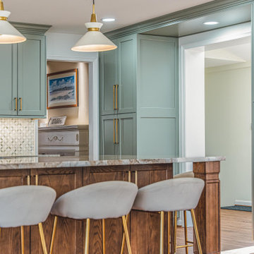
Hi everyone, I'm Sarah and Ogun we are here with fine line kitchens. So we are a couple working together. I do the interior design and remodeling of the space material selection meeting with the clients. And I handled operations outside, you know meaning all the construction work that is taking place the inside. The houses that we work in. I handle all the aspects of the construction, so today's project is very special. We're in Vienna and the client had a very big family. It's a family of seven that lives here. So we had a few aspects that we needed to keep in mind while designing this one. Having everybody be able to sit on the island. So we wanted plenty of seating all the way around. We didn't want anybody standing or anything like that. So what we did is we maximize the space. The center island is the biggest part of the kitchen. We use a natural stone to kind of give it a beautiful texture versus quartz. It's kind of standard white or kind of fabricated, so I wanted something very natural. We did this because I took my inspiration from the outside, so the inspiration if you look at the view right in front of me is there are so many greens there's a lot of brass accents and I wanted to bring this. Into this kitchen while designing it for my clients. She is very warm very. She wanted a very homey, comfy kind of look for the kitchen. So that's what we did today. As you can see, the cabinets are sage green, very light, so I still think it's a neutral, but it's a lighter color that again brings the outside in and we combine that with the oak right behind me so it's a slightly warm oak. It's not very dark. It's not very light. It's a medium brown and the same color went on the island. To kind of tie these two in and the backsplash, my favorite part is where you can see a little bit of design. It is, in my opinion still classic, but includes a pattern so the outside part is as we said in the beginning, is handled by my husband. I'd like him to speak a little bit about that. Thanks, Sarah, I want to talk to you guys a little bit about the construction part of this project. Originally this kitchen was located mostly in this area. They had their stove there sing. It was more of a peninsula layout in Sarah's and the customer vision they wanted. They wanted to get rid of the peninsula and they want to be able to have a huge island that can at least sit seven people because they're familiar with seven. So we wanted to make sure that we can achieve this design and bring it to life so that they can be happy with this layout. Some of the challenges we had, the house, the home being, you know, old home. There were a lot of you know the older electrical and plumbing that had to be replaced. We had to relocate the stove from here to this area. Over here we had put a nice foot fan that we had to relocate all the ductwork and the plumbing. Was being on the peninsula area. We had to relocate it to the center islands. So we achieved all this and kind of like bring it to bring in this kitchen up to date it looks beautiful. That's true, so yes, the old layout did not function for my clients because everything was kind of gathered on one side of the kitchen. So there was like a peninsula right there. So the end of this island kind of continued straight. And that was just the L shape. Kind of where everything was and there used to be another big table here, so they were using only kind of half of the space. So like I said at the beginning, our vision was to kind of feed everybody at the island, create some symmetry. 'cause I love that. So as you can see behind me, this is kind of the focal point symmetrical. Everything is kind of even we wanted to also panel the fridge here so it mimics the pantry and another size. So when you're looking at it, it is bringing again that symmetry back again. I hope you enjoyed this kitchen and this video and I'll see you soon. So how do you think this project turned out? It's nice. I like the color. I think it turned out nice. It's kind of like a little bit different color than what we always do. So I realize. Are you giving me a little bit of credit here that I did something different? Are you proud? I'm so proud of you. Other than that I like it. That they have kind of like a two sink. So if this was our kitchen, if we ever like you can have your own. I can have mine if we ever get into a fight then this can be like my own kitchen. Why are we gonna bring in a fight right now? So I'm cooking anyway. You're grilling most of the time, So what are you even talking about? My kitchen? That's my kitchen. You can just take the small sink. That's fine. It's always good to have your own space right there, so anyways. Thank you guys for watching. We hope to see you soon and if you have any questions please click the link below. It'll lead you to our website, house, YouTube and all of the social media is so nice to have you guys. We'll see you soon. Thanks bye bye-bye.
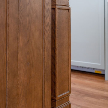 FineLine Kitchens, Inc.
Hi everyone, I'm Sarah and Ogun we are here with fine line kitchens. So we are a couple working together. I do the interior design and remodeling of the space material selection meeting with the clients. And I handled operations outside, you know meaning all the construction work that is taking place the inside. The houses that we work in. I handle all the aspects of the construction, so today's project is very special. We're in Vienna and the client had a very big family. It's a family of seven that lives here. So we had a few aspects that we needed to keep in mind while designing this one. Having everybody be able to sit on the island. So we wanted plenty of seating all the way around. We didn't want anybody standing or anything like that. So what we did is we maximize the space. The center island is the biggest part of the kitchen. We use a natural stone to kind of give it a beautiful texture versus quartz. It's kind of standard white or kind of fabricated, so I wanted something very natural. We did this because I took my inspiration from the outside, so the inspiration if you look at the view right in front of me is there are so many greens there's a lot of brass accents and I wanted to bring this. Into this kitchen while designing it for my clients. She is very warm very. She wanted a very homey, comfy kind of look for the kitchen. So that's what we did today. As you can see, the cabinets are sage green, very light, so I still think it's a neutral, but it's a lighter color that again brings the outside in and we combine that with the oak right behind me so it's a slightly warm oak. It's not very dark. It's not very light. It's a medium brown and the same color went on the island. To kind of tie these two in and the backsplash, my favorite part is where you can see a little bit of design. It is, in my opinion still classic, but includes a pattern so the outside part is as we said in the beginning, is handled by my husband. I'd like him to speak a little bit about that. Thanks, Sarah, I want to talk to you guys a little bit about the construction part of this project. Originally this kitchen was located mostly in this area. They had their stove there sing. It was more of a peninsula layout in Sarah's and the customer vision they wanted. They wanted to get rid of the peninsula and they want to be able to have a huge island that can at least sit seven people because they're familiar with seven. So we wanted to make sure that we can achieve this design and bring it to life so that they can be happy with this layout. Some of the challenges we had, the house, the home being, you know, old home. There were a lot of you know the older electrical and plumbing that had to be replaced. We had to relocate the stove from here to this area. Over here we had put a nice foot fan that we had to relocate all the ductwork and the plumbing. Was being on the peninsula area. We had to relocate it to the center islands. So we achieved all this and kind of like bring it to bring in this kitchen up to date it looks beautiful. That's true, so yes, the old layout did not function for my clients because everything was kind of gathered on one side of the kitchen. So there was like a peninsula right there. So the end of this island kind of continued straight. And that was just the L shape. Kind of where everything was and there used to be another big table here, so they were using only kind of half of the space. So like I said at the beginning, our vision was to kind of feed everybody at the island, create some symmetry. 'cause I love that. So as you can see behind me, this is kind of the focal point symmetrical. Everything is kind of even we wanted to also panel the fridge here so it mimics the pantry and another size. So when you're looking at it, it is bringing again that symmetry back again. I hope you enjoyed this kitchen and this video and I'll see you soon. So how do you think this project turned out? It's nice. I like the color. I think it turned out nice. It's kind of like a little bit different color than what we always do. So I realize. Are you giving me a little bit of credit here that I did something different? Are you proud? I'm so proud of you. Other than that I like it. That they have kind of like a two sink. So if this was our kitchen, if we ever like you can have your own. I can have mine if we ever get into a fight then this can be like my own kitchen. Why are we gonna bring in a fight right now? So I'm cooking anyway. You're grilling most of the time, So what are you even talking about? My kitchen? That's my kitchen. You can just take the small sink. That's fine. It's always good to have your own space right there, so anyways. Thank you guys for watching. We hope to see you soon and if you have any questions please click the link below. It'll lead you to our website, house, YouTube and all of the social media is so nice to have you guys. We'll see you soon. Thanks bye bye-bye.
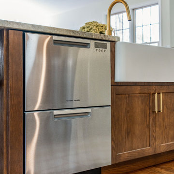 FineLine Kitchens, Inc.
Hi everyone, I'm Sarah and Ogun we are here with fine line kitchens. So we are a couple working together. I do the interior design and remodeling of the space material selection meeting with the clients. And I handled operations outside, you know meaning all the construction work that is taking place the inside. The houses that we work in. I handle all the aspects of the construction, so today's project is very special. We're in Vienna and the client had a very big family. It's a family of seven that lives here. So we had a few aspects that we needed to keep in mind while designing this one. Having everybody be able to sit on the island. So we wanted plenty of seating all the way around. We didn't want anybody standing or anything like that. So what we did is we maximize the space. The center island is the biggest part of the kitchen. We use a natural stone to kind of give it a beautiful texture versus quartz. It's kind of standard white or kind of fabricated, so I wanted something very natural. We did this because I took my inspiration from the outside, so the inspiration if you look at the view right in front of me is there are so many greens there's a lot of brass accents and I wanted to bring this. Into this kitchen while designing it for my clients. She is very warm very. She wanted a very homey, comfy kind of look for the kitchen. So that's what we did today. As you can see, the cabinets are sage green, very light, so I still think it's a neutral, but it's a lighter color that again brings the outside in and we combine that with the oak right behind me so it's a slightly warm oak. It's not very dark. It's not very light. It's a medium brown and the same color went on the island. To kind of tie these two in and the backsplash, my favorite part is where you can see a little bit of design. It is, in my opinion still classic, but includes a pattern so the outside part is as we said in the beginning, is handled by my husband. I'd like him to speak a little bit about that. Thanks, Sarah, I want to talk to you guys a little bit about the construction part of this project. Originally this kitchen was located mostly in this area. They had their stove there sing. It was more of a peninsula layout in Sarah's and the customer vision they wanted. They wanted to get rid of the peninsula and they want to be able to have a huge island that can at least sit seven people because they're familiar with seven. So we wanted to make sure that we can achieve this design and bring it to life so that they can be happy with this layout. Some of the challenges we had, the house, the home being, you know, old home. There were a lot of you know the older electrical and plumbing that had to be replaced. We had to relocate the stove from here to this area. Over here we had put a nice foot fan that we had to relocate all the ductwork and the plumbing. Was being on the peninsula area. We had to relocate it to the center islands. So we achieved all this and kind of like bring it to bring in this kitchen up to date it looks beautiful. That's true, so yes, the old layout did not function for my clients because everything was kind of gathered on one side of the kitchen. So there was like a peninsula right there. So the end of this island kind of continued straight. And that was just the L shape. Kind of where everything was and there used to be another big table here, so they were using only kind of half of the space. So like I said at the beginning, our vision was to kind of feed everybody at the island, create some symmetry. 'cause I love that. So as you can see behind me, this is kind of the focal point symmetrical. Everything is kind of even we wanted to also panel the fridge here so it mimics the pantry and another size. So when you're looking at it, it is bringing again that symmetry back again. I hope you enjoyed this kitchen and this video and I'll see you soon. So how do you think this project turned out? It's nice. I like the color. I think it turned out nice. It's kind of like a little bit different color than what we always do. So I realize. Are you giving me a little bit of credit here that I did something different? Are you proud? I'm so proud of you. Other than that I like it. That they have kind of like a two sink. So if this was our kitchen, if we ever like you can have your own. I can have mine if we ever get into a fight then this can be like my own kitchen. Why are we gonna bring in a fight right now? So I'm cooking anyway. You're grilling most of the time, So what are you even talking about? My kitchen? That's my kitchen. You can just take the small sink. That's fine. It's always good to have your own space right there, so anyways. Thank you guys for watching. We hope to see you soon and if you have any questions please click the link below. It'll lead you to our website, house, YouTube and all of the social media is so nice to have you guys. We'll see you soon. Thanks bye bye-bye.
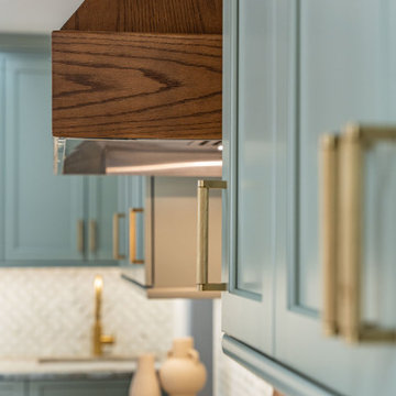 FineLine Kitchens, Inc.
Hi everyone, I'm Sarah and Ogun we are here with fine line kitchens. So we are a couple working together. I do the interior design and remodeling of the space material selection meeting with the clients. And I handled operations outside, you know meaning all the construction work that is taking place the inside. The houses that we work in. I handle all the aspects of the construction, so today's project is very special. We're in Vienna and the client had a very big family. It's a family of seven that lives here. So we had a few aspects that we needed to keep in mind while designing this one. Having everybody be able to sit on the island. So we wanted plenty of seating all the way around. We didn't want anybody standing or anything like that. So what we did is we maximize the space. The center island is the biggest part of the kitchen. We use a natural stone to kind of give it a beautiful texture versus quartz. It's kind of standard white or kind of fabricated, so I wanted something very natural. We did this because I took my inspiration from the outside, so the inspiration if you look at the view right in front of me is there are so many greens there's a lot of brass accents and I wanted to bring this. Into this kitchen while designing it for my clients. She is very warm very. She wanted a very homey, comfy kind of look for the kitchen. So that's what we did today. As you can see, the cabinets are sage green, very light, so I still think it's a neutral, but it's a lighter color that again brings the outside in and we combine that with the oak right behind me so it's a slightly warm oak. It's not very dark. It's not very light. It's a medium brown and the same color went on the island. To kind of tie these two in and the backsplash, my favorite part is where you can see a little bit of design. It is, in my opinion still classic, but includes a pattern so the outside part is as we said in the beginning, is handled by my husband. I'd like him to speak a little bit about that. Thanks, Sarah, I want to talk to you guys a little bit about the construction part of this project. Originally this kitchen was located mostly in this area. They had their stove there sing. It was more of a peninsula layout in Sarah's and the customer vision they wanted. They wanted to get rid of the peninsula and they want to be able to have a huge island that can at least sit seven people because they're familiar with seven. So we wanted to make sure that we can achieve this design and bring it to life so that they can be happy with this layout. Some of the challenges we had, the house, the home being, you know, old home. There were a lot of you know the older electrical and plumbing that had to be replaced. We had to relocate the stove from here to this area. Over here we had put a nice foot fan that we had to relocate all the ductwork and the plumbing. Was being on the peninsula area. We had to relocate it to the center islands. So we achieved all this and kind of like bring it to bring in this kitchen up to date it looks beautiful. That's true, so yes, the old layout did not function for my clients because everything was kind of gathered on one side of the kitchen. So there was like a peninsula right there. So the end of this island kind of continued straight. And that was just the L shape. Kind of where everything was and there used to be another big table here, so they were using only kind of half of the space. So like I said at the beginning, our vision was to kind of feed everybody at the island, create some symmetry. 'cause I love that. So as you can see behind me, this is kind of the focal point symmetrical. Everything is kind of even we wanted to also panel the fridge here so it mimics the pantry and another size. So when you're looking at it, it is bringing again that symmetry back again. I hope you enjoyed this kitchen and this video and I'll see you soon. So how do you think this project turned out? It's nice. I like the color. I think it turned out nice. It's kind of like a little bit different color than what we always do. So I realize. Are you giving me a little bit of credit here that I did something different? Are you proud? I'm so proud of you. Other than that I like it. That they have kind of like a two sink. So if this was our kitchen, if we ever like you can have your own. I can have mine if we ever get into a fight then this can be like my own kitchen. Why are we gonna bring in a fight right now? So I'm cooking anyway. You're grilling most of the time, So what are you even talking about? My kitchen? That's my kitchen. You can just take the small sink. That's fine. It's always good to have your own space right there, so anyways. Thank you guys for watching. We hope to see you soon and if you have any questions please click the link below. It'll lead you to our website, house, YouTube and all of the social media is so nice to have you guys. We'll see you soon. Thanks bye bye-bye.

Sponsored
Westerville, OH

Custom Home Works
Franklin County's Award-Winning Design, Build and Remodeling Expert
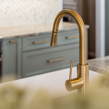 FineLine Kitchens, Inc.
Hi everyone, I'm Sarah and Ogun we are here with fine line kitchens. So we are a couple working together. I do the interior design and remodeling of the space material selection meeting with the clients. And I handled operations outside, you know meaning all the construction work that is taking place the inside. The houses that we work in. I handle all the aspects of the construction, so today's project is very special. We're in Vienna and the client had a very big family. It's a family of seven that lives here. So we had a few aspects that we needed to keep in mind while designing this one. Having everybody be able to sit on the island. So we wanted plenty of seating all the way around. We didn't want anybody standing or anything like that. So what we did is we maximize the space. The center island is the biggest part of the kitchen. We use a natural stone to kind of give it a beautiful texture versus quartz. It's kind of standard white or kind of fabricated, so I wanted something very natural. We did this because I took my inspiration from the outside, so the inspiration if you look at the view right in front of me is there are so many greens there's a lot of brass accents and I wanted to bring this. Into this kitchen while designing it for my clients. She is very warm very. She wanted a very homey, comfy kind of look for the kitchen. So that's what we did today. As you can see, the cabinets are sage green, very light, so I still think it's a neutral, but it's a lighter color that again brings the outside in and we combine that with the oak right behind me so it's a slightly warm oak. It's not very dark. It's not very light. It's a medium brown and the same color went on the island. To kind of tie these two in and the backsplash, my favorite part is where you can see a little bit of design. It is, in my opinion still classic, but includes a pattern so the outside part is as we said in the beginning, is handled by my husband. I'd like him to speak a little bit about that. Thanks, Sarah, I want to talk to you guys a little bit about the construction part of this project. Originally this kitchen was located mostly in this area. They had their stove there sing. It was more of a peninsula layout in Sarah's and the customer vision they wanted. They wanted to get rid of the peninsula and they want to be able to have a huge island that can at least sit seven people because they're familiar with seven. So we wanted to make sure that we can achieve this design and bring it to life so that they can be happy with this layout. Some of the challenges we had, the house, the home being, you know, old home. There were a lot of you know the older electrical and plumbing that had to be replaced. We had to relocate the stove from here to this area. Over here we had put a nice foot fan that we had to relocate all the ductwork and the plumbing. Was being on the peninsula area. We had to relocate it to the center islands. So we achieved all this and kind of like bring it to bring in this kitchen up to date it looks beautiful. That's true, so yes, the old layout did not function for my clients because everything was kind of gathered on one side of the kitchen. So there was like a peninsula right there. So the end of this island kind of continued straight. And that was just the L shape. Kind of where everything was and there used to be another big table here, so they were using only kind of half of the space. So like I said at the beginning, our vision was to kind of feed everybody at the island, create some symmetry. 'cause I love that. So as you can see behind me, this is kind of the focal point symmetrical. Everything is kind of even we wanted to also panel the fridge here so it mimics the pantry and another size. So when you're looking at it, it is bringing again that symmetry back again. I hope you enjoyed this kitchen and this video and I'll see you soon. So how do you think this project turned out? It's nice. I like the color. I think it turned out nice. It's kind of like a little bit different color than what we always do. So I realize. Are you giving me a little bit of credit here that I did something different? Are you proud? I'm so proud of you. Other than that I like it. That they have kind of like a two sink. So if this was our kitchen, if we ever like you can have your own. I can have mine if we ever get into a fight then this can be like my own kitchen. Why are we gonna bring in a fight right now? So I'm cooking anyway. You're grilling most of the time, So what are you even talking about? My kitchen? That's my kitchen. You can just take the small sink. That's fine. It's always good to have your own space right there, so anyways. Thank you guys for watching. We hope to see you soon and if you have any questions please click the link below. It'll lead you to our website, house, YouTube and all of the social media is so nice to have you guys. We'll see you soon. Thanks bye bye-bye.
 FineLine Kitchens, Inc.
Hi everyone, I'm Sarah and Ogun we are here with fine line kitchens. So we are a couple working together. I do the interior design and remodeling of the space material selection meeting with the clients. And I handled operations outside, you know meaning all the construction work that is taking place the inside. The houses that we work in. I handle all the aspects of the construction, so today's project is very special. We're in Vienna and the client had a very big family. It's a family of seven that lives here. So we had a few aspects that we needed to keep in mind while designing this one. Having everybody be able to sit on the island. So we wanted plenty of seating all the way around. We didn't want anybody standing or anything like that. So what we did is we maximize the space. The center island is the biggest part of the kitchen. We use a natural stone to kind of give it a beautiful texture versus quartz. It's kind of standard white or kind of fabricated, so I wanted something very natural. We did this because I took my inspiration from the outside, so the inspiration if you look at the view right in front of me is there are so many greens there's a lot of brass accents and I wanted to bring this. Into this kitchen while designing it for my clients. She is very warm very. She wanted a very homey, comfy kind of look for the kitchen. So that's what we did today. As you can see, the cabinets are sage green, very light, so I still think it's a neutral, but it's a lighter color that again brings the outside in and we combine that with the oak right behind me so it's a slightly warm oak. It's not very dark. It's not very light. It's a medium brown and the same color went on the island. To kind of tie these two in and the backsplash, my favorite part is where you can see a little bit of design. It is, in my opinion still classic, but includes a pattern so the outside part is as we said in the beginning, is handled by my husband. I'd like him to speak a little bit about that. Thanks, Sarah, I want to talk to you guys a little bit about the construction part of this project. Originally this kitchen was located mostly in this area. They had their stove there sing. It was more of a peninsula layout in Sarah's and the customer vision they wanted. They wanted to get rid of the peninsula and they want to be able to have a huge island that can at least sit seven people because they're familiar with seven. So we wanted to make sure that we can achieve this design and bring it to life so that they can be happy with this layout. Some of the challenges we had, the house, the home being, you know, old home. There were a lot of you know the older electrical and plumbing that had to be replaced. We had to relocate the stove from here to this area. Over here we had put a nice foot fan that we had to relocate all the ductwork and the plumbing. Was being on the peninsula area. We had to relocate it to the center islands. So we achieved all this and kind of like bring it to bring in this kitchen up to date it looks beautiful. That's true, so yes, the old layout did not function for my clients because everything was kind of gathered on one side of the kitchen. So there was like a peninsula right there. So the end of this island kind of continued straight. And that was just the L shape. Kind of where everything was and there used to be another big table here, so they were using only kind of half of the space. So like I said at the beginning, our vision was to kind of feed everybody at the island, create some symmetry. 'cause I love that. So as you can see behind me, this is kind of the focal point symmetrical. Everything is kind of even we wanted to also panel the fridge here so it mimics the pantry and another size. So when you're looking at it, it is bringing again that symmetry back again. I hope you enjoyed this kitchen and this video and I'll see you soon. So how do you think this project turned out? It's nice. I like the color. I think it turned out nice. It's kind of like a little bit different color than what we always do. So I realize. Are you giving me a little bit of credit here that I did something different? Are you proud? I'm so proud of you. Other than that I like it. That they have kind of like a two sink. So if this was our kitchen, if we ever like you can have your own. I can have mine if we ever get into a fight then this can be like my own kitchen. Why are we gonna bring in a fight right now? So I'm cooking anyway. You're grilling most of the time, So what are you even talking about? My kitchen? That's my kitchen. You can just take the small sink. That's fine. It's always good to have your own space right there, so anyways. Thank you guys for watching. We hope to see you soon and if you have any questions please click the link below. It'll lead you to our website, house, YouTube and all of the social media is so nice to have you guys. We'll see you soon. Thanks bye bye-bye.
 Shrock Premier Custom Construction
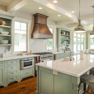
Shrock Premier Custom Construction works closely with clients to create a space which perfectly suits their desires, needs, and budget. The owners of this charming lake home wanted a retreat for family and friends with outdoor living and relaxation as the focus. Despite its cottage appearance, this Shrock Premier weekend get--a-way will certainly surprise visitors with it's ample size. The lovely open concept kitchen, living area, and breakfast room provide a wonderful flow and comfortable seating for all. The ceiling detail, delightful color palette, and choice of materials give this marvelous home that coveted lake vibe. www.shrockpremier.com
 Denver Mattress
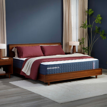
When better sleep is the goal, support matters. This sophisticated bedroom showcases the Doctor's Choice Elite Firm Mattress from Denver Mattress, designed for sleepers seeking enhanced support, pressure relief, and long-lasting comfort.
As the premium model in the Doctor's Choice Collection, the Elite Firm is engineered to help promote proper spinal alignment while providing the stable, supportive feel preferred by many back and stomach sleepers. Advanced comfort materials and thoughtfully designed support systems work together to create a sleep surface focused on recovery, comfort, and restorative rest.
The room's rich color palette, warm wood furnishings, layered textures, and calming atmosphere reinforce the connection between thoughtful design and healthy sleep. Together, the space and mattress create an environment dedicated to helping you wake up refreshed, supported, and ready for whatever the day brings.
 Denver Mattress
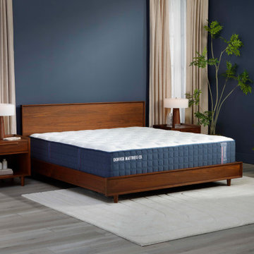
Better sleep starts with the right balance of comfort and support. This contemporary bedroom showcases the Doctor's Choice® Elite Medium Mattress from Denver Mattress, designed for sleepers seeking pressure relief, responsive comfort, and proper spinal alignment throughout the night.
As part of the premium Doctor's Choice® Collection, the Elite Medium delivers a balanced feel that adapts to a variety of sleep positions while providing the support needed for restorative rest. Advanced comfort materials and enhanced support technology work together to help reduce pressure points, promote healthy sleep posture, and support deeper, more comfortable sleep.
The room's rich navy walls, warm wood furnishings, soft textures, and calming atmosphere create a sophisticated retreat focused on wellness and recovery. Together, thoughtful bedroom design and engineered sleep support create a space dedicated to helping you wake up feeling refreshed, recovered, and ready for the day ahead.
 Advance Design Studio, Ltd.
Curtis and Peggy had been thinking of a kitchen remodel for quite some time, but they knew their house would have a unique set of challenges. Their older Victorian house was built in 1891. The kitchen cabinetry was original, and they wanted to keep the authenticity of their period home while adding modern comforts that would improve their quality of life.
A friend recommended Advance Design Studio for their exceptional experience and quality of work. After meeting with designer Michelle Lecinski at Advance Design, they were confident they could partner with Advance to accomplish the unique kitchen renovation they’d been talking about for years. “We wanted to do the kitchen for a long, long time,” Curtis said. “(We asked ourselves) what are we actually going to do? How are we going to do this? And who are we going to find to do exactly what we want?”
The goal for the project was to keep the home renovation and new kitchen feeling authentic to the time in which it was built. They desperately wanted the modern comforts that come with a larger refrigerator and the dishwasher that they never had! The old home was also a bit drafty so adding a fireplace, wall insulation and new windows became a priority. They very much wanted to create a comfortable hearth room adjacent to the kitchen, complete with old world brick.
The original cabinetry had to go to make way for beautiful new kitchen cabinetry that appears as if it was a hundred years old, but with all the benefits of cutting-edge storage, self-closing drawers, and a brand-new look. “We just wanted to keep it old looking, but with some modern updates,” Peggy said.
Dura Supreme Highland Cabinets with a Heritage Old World Painted Finish replaced the original 1891 cabinets. The hand-applied careful rubbed-off detailing makes these exquisite cabinets look as if they came from a far-gone era. Despite the small size of the kitchen, Peggy, Curtis and Michelle utilized every inch with custom cabinet sizes to increase storage capacity. The custom cabinets allowed for the addition of a 24” Fisher Paykel dishwasher with a concealing Dura Supreme door panel. Michelle was also able to work into the new design a larger 30” Fisher Paykel French refrigerator. “We made every ¼ inch count in this small space,” designer Michelle said. “Having the ability to custom size the cabinetry was the only way to achieve this.”
“The kitchen essentially was designed around the Heartland Vintage range and oven,” says Michelle. A classic appliance that combines nostalgic beauty and craftsmanship for modern cooking, with nickel plated trim and elegantly shaped handles and legs; the not to miss range is a striking focal point of the entire room and an engaging conversation piece.
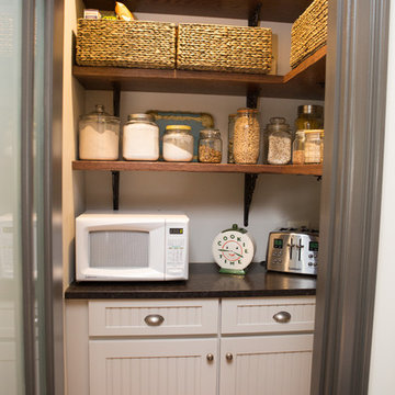
Granite countertops in Kodiak Satin with subtle veining kept with the old-world style. The delicate porcelain La Vie Crackle Sonoma tile kitchen backsplash compliments the home’s style perfectly. A handcrafted passthrough designed to show off Peggy’s fine china was custom built by project carpenters Justin Davis and Jeff Dallain to physically and visually open the space. Additional storage was created in the custom panty room with Latte Edinburg cabinets, hand-made weathered wood shelving with authentic black iron brackets, and an intricate tin copper ceiling.
Peggy and Curtis loved the idea of adding a Vermont stove to make the hearth-room not only functional, but a truly beckoning place to be. A stunning Bordeaux red Vermont Castings Stove with crisp black ventilation was chosen and combined with the authentic reclaimed Chicago brick wall. Advance’s talented carpenters custom-built elegant weathered shelves to house family memorabilia, installed carefully chosen barn sconces, and made the hearth room an inviting place to relax with a cup of coffee and a good book.
“Peggy and Curtis’ project was so much fun to work on. Creating a space that looks and feels like it always belonged in this beautiful old Victorian home is a designer’s dream. To see the delight in their faces when they saw the design details coming together truly made it worth the time and effort that went into making the very compact kitchen space work”, said Michelle. “The result is an amazing custom kitchen, packed with functionality in every inch, nook and cranny!” exclaims Michelle.
The renovation didn’t end with the kitchen. New Pella windows were added to help lessen the drafts. The removal of the original windows and trim necessitated the re-creation of hand-made corbels and trim details no longer available today. The talented carpenter team came to the rescue, crafting new pieces and masterfully finishing them as if they were always there. New custom gutters were formed and installed with a front entry rework necessary to accommodate the changes.
The whole house functions better, but it still feels like the original 1891 home. “From start to finish it’s just a much better space than we used to have,” Peggy said. “Jeff and Justin were amazing.” Curtis added; “We were lucky to find Advance Design, because they really came through for us. I loved that they had everything in house, anything you needed to have done, they could do it”.


 Klopf Architecture
Nestled in the hills of Orinda, California, this 1951 residence is one of only seven extant homes, now known as “The Magnificent Seven”, designed by architect Olof Dahlstrand, a protégé of Frank Lloyd Wright. With its low-slung rooflines, natural materials, and deep integration with the sloping landscape, the home is a pristine example of mid-century modern design inspired by Wright’s organic principles. Over the years, prior homeowners have emphasized preservation, ensuring that the house remained relatively untouched. Each owner has respected the original architecture and stayed true to Dahlstrand’s intent. When a family of five—two college-aged sons and a middle school-aged daughter—acquired the property, they were captivated by its history, legacy of care, and architectural significance. While they appreciated Dahlstrand’s original vision, they also recognized the need to adapt the home for contemporary living while preserving its design integrity.
The remodel was conceived as a thoughtful response to the past—an effort to bring the house into the 21st century without compromising its soul. The primary mandate was to maintain architectural continuity while improving the functionality, comfort, and livability for a modern family. The design team—architects and contractor alike—worked with a shared reverence for the original architecture, allowing that mindset to guide even the most technical or pragmatic decisions.
A key objective was to increase natural light in the kitchen—a departure from Wrightian principles of enclosed, intimate cooking spaces—while maintaining the home’s architectural language. The kitchen was reconfigured to foster a stronger connection to adjacent living spaces while retaining the underlying concept of spatial separation. One of the most transformative architectural changes was the removal of a ridge beam that was originally planned to remain visible through the kitchen. During construction, the team collaborated on a better solution: a wide-flanged steel beam concealed within the roof envelope. This subtle move preserved the clean lines and ceiling continuity, a modern update carried out with utmost respect for the existing framework.
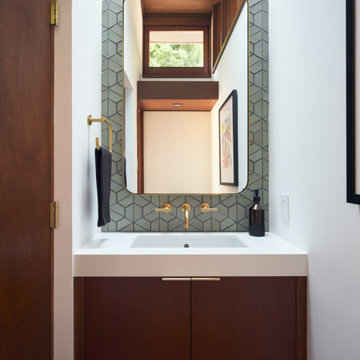
The home’s original powder room, previously accessible only through the kitchen, was relocated for better flow and privacy. A new powder room was carved out of former kitchen cabinetry—a narrow, interior space that could have felt dark and enclosed. To avoid this, the design extended the line of original transom windows into the new powder room and added a skylight above the vanity. The result is a bright and airy space that feels consistent with the rest of the home. Other updates included the installation of new solid-core interior doors with veneers carefully matched to the original mahogany, enhancing the continuity of the interiors. Even smaller decisions, such as placing the door knobs at 42 inches high, mirrored the original proportions. Every choice reflected a shared belief between the architect, contractor, and client: that new work should serve the integrity of the old.
The home’s extensive interior redwood millwork and paneling was meticulously restored. Where new materials were introduced—such as the replacement redwood soffit paneling—the contractor took pains to find finish nails that matched the original, rather than using modern equivalents. This level of craftsmanship and collaboration defined the project. It extended even to the detailing of a blind door to the new powder room, which had to disappear into the existing redwood board-and-batten wall. It was a team effort: the owner found a suitable handle, the architects devised the custom in-swing mechanism, and the contractor executed it so the door aligned precisely with the battens. Throughout, the homeowners were deeply engaged in the design process. One, a meticulous design enthusiast, focused on aesthetic integrity and historic detail. The other brought a practical and function-driven perspective, ensuring that new fixtures and materials would be durable and require minimal maintenance.
While the home’s location posed no major site challenges, sustainability was a key concern. The team upgraded the roof insulation, installed solar panels with battery storage, and added ductless mini-split cooling systems. Lighting was another area where modern technology was woven into a historic framework: new square LED fixtures echo the original custom perimeter soffit lights, maintaining the design language while offering advanced performance.
A planned expansion of a bedroom into suite with a bathroom had to be shelved due to budget constraints and the high cost of below-grade foundation work. Still, the team focused their efforts on making the most of the existing footprint, resolving constraints through design ingenuity rather than adding square footage. This renovation represents a collaborative achievement in preserving and evolving a historically significant home. Every decision was shaped by a shared ethos among clients, architects, and contractor: to maintain the home’s architectural soul while updating it for contemporary life. The result is a timeless modernist residence that continues Olof Dahlstrand’s legacy, remaining grounded in nature, craftsmanship, and human-scale design.
Klopf Architecture Team: John Klopf, AIA, Klara Kevane, Fernanda Bernardes
Interior Architectural Design: Klopf Architecture
Structural Engineer: Daniel Bastiao
Contractor: Don Larwood, Larwood Construction
Photography: Mariko Reed
Year Completed: 2022
 NB Construction
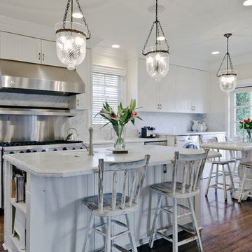
We can work with you to renovate cabinets, custom design around new appliances, or to overhaul the entire layout of the kitchen. With your needs and goals of an ideal kitchen in mind, we help bring your vision to life.
Taken by: Rick Rodney
 Architect
Why Mattress Thickness Is One of the Most Misunderstood Specs
When most people shop for a memory foam mattress, they focus on firmness, materials, and brand. Thickness tends to be an afterthought — or worse, treated as a proxy for quality. The assumption goes: thicker equals better. That assumption is wrong in a meaningful number of cases, and getting it wrong means waking up with exactly the kind of stiffness, pressure pain, or lower back ache you bought a new mattress to avoid.
The right thickness for a memory foam mattress is not a single number. It is a combination of your body weight, your sleep position, and any specific health conditions you are managing. A 14-inch mattress that provides ideal support for a 250-pound side sleeper may cause a 115-pound stomach sleeper to experience spinal misalignment all night. A 10-inch mattress that works perfectly for a back sleeper of average build offers inadequate pressure relief for a heavier side sleeper whose hips need to sink further into the comfort layer before the support base engages.
This guide maps thickness to the factors that actually determine whether a mattress works for your body. It covers the science of mattress layers, the three primary variables (weight, position, condition), and a complete decision table so you can find your ideal thickness without guesswork.
Understanding Mattress Thickness: Layers, Not Just Height
A memory foam mattress’s total thickness is the sum of its individual layers, and those layers serve entirely different functions. Two mattresses that are both 12 inches thick may feel radically different because their comfort layer depths and support core thicknesses are distributed differently.
The Two Parts That Matter
Every memory foam mattress has two functional zones: the comfort layer at the top and the support core at the bottom. The comfort layer — which in quality mattresses consists of gel-infused viscoelastic foam, transition foam, and a cooling cover — is the zone that contours to your body, relieves pressure, and cushions the joints. The support core — high-density foam or pocketed springs in a hybrid — is the zone that keeps the spine aligned and prevents the entire body from sinking into the mattress.
The key relationship is this: the comfort layer must be deep enough for your body’s heaviest pressure points to sink in fully before the firmer support core pushes back. If it is too shallow, those pressure points press against a firm surface and cause localised pain. If the support core is too thin, the whole mattress sags under body weight and the spine loses alignment regardless of how comfortable the top feels.
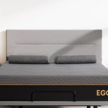
Here is how EGOHOME’s Black series layers map to these functions:
Layer
Material
Function
EGOHOME Technology
Cover (0.5–1")
Fabric + cooling tech
Temperature regulation, hygiene
Anti-heat™ Graphene Cooling Cover
Comfort layer (2–6")
Gel foam, AeroFusion™
Pressure relief, contouring
Copper Gel AeroFusion™ Foam
Transition layer (1–2")
Mid-density foam
Prevents sinkage past comfort zone
BraceSleeper™ Support Foam (upper)
Support core (6–12")
High-density foam or coils
Spinal alignment, edge support
BraceSleeper™ Support Foam (core)
Thickness alone does not tell you how a mattress will perform. A 14-inch mattress with a 2-inch comfort layer and a 12-inch support core will feel firm and supportive. A 14-inch mattress with a 6-inch comfort layer and an 8-inch support core will feel plush and contouring. Always check the comfort layer depth, not just the total inches.
Memory Foam Mattress Thickness Ranges: What Each Category Delivers
Here is a complete breakdown of what to expect from each thickness range and who each suits best:
Thickness
Profile
Best Use Case
Body Weight
Best Sleep Position
6–8"
Low profile
Children, bunk beds, guest rooms, adjustable bases
Under 130 lbs
Kids, lightweight, occasional use
8–10"
Standard-thin
Stomach sleepers, lightweight adults, budget setups
Under 130 lbs
Stomach, lightweight back sleepers
10–12"
Standard
Most adults, back sleepers, back pain relief
130–230 lbs
Back, stomach, combo sleepers
12–14"
High-profile
Side sleepers, plus-size, pressure relief
130–230 lbs+
Side sleepers, hip/shoulder pain
14"+
Premium
Plus-size sleepers, heavy duos, luxury setups
230 lbs+
Plus-size, side sleepers, chronic pain
6–8 Inches: Low-Profile (Specific Use Cases Only)
Low-profile mattresses in the 6 to 8 inch range are designed for specific applications rather than general adult use. They work well on bunk beds and trundle beds where height clearance is limited, for children’s beds where a lower sleep surface is safer, on adjustable bases where the mattress needs to flex significantly, and for lightweight individuals under 130 pounds who need minimal depth to reach the support core. For a standard adult of average build, a mattress under 8 inches is unlikely to provide adequate comfort layer depth for sustained pressure relief.
8–10 Inches: Standard-Thin (Stomach Sleepers and Lightweight Adults)
The 8 to 10 inch range is the practical starting point for most adult use. At this thickness, there is enough comfort layer to provide basic pressure relief without the excessive depth that allows heavier body sections to sink past the support zone. Stomach sleepers in particular benefit from this range: when sleeping face down, the goal is to keep the hips from sinking lower than the shoulders and chest, which would create a downward bow in the lumbar spine. A thinner mattress with a firmer feel prevents this hyperextension more reliably than a thicker, softer model. EGOHOME offers 8-inch memory foam options suited to this profile.
10–12 Inches: Standard (The Sweet Spot for Most Adults)
The 10 to 12 inch range is the most broadly appropriate thickness for adults of standard build. At this depth, a quality memory foam mattress contains enough comfort layer material to contour genuinely around the hips and shoulders without allowing the body to bottom out into the support core. It also contains enough support core depth to maintain spinal alignment under continuous body weight across seven or eight hours. Back sleepers of standard weight (130 to 230 pounds) typically find this range the most supportive, as the lumbar region receives adequate underlying resistance without the excessive softness that taller mattresses can develop under consistent pressure.
12–14 Inches: High-Profile (Side Sleepers and Plus-Size Sleepers)
The 12 to 14 inch range addresses two specific needs: side sleepers who require a deep enough comfort layer to allow the shoulder and hip to sink in while the waist remains supported, and heavier individuals whose body weight requires more foam depth before reaching full support core engagement. For a side sleeper of standard or higher body weight, a comfort layer of less than 4 to 6 inches is often not deep enough for the shoulder to sink fully into an aligned position. The result is an upward lateral bow in the thoracic spine that causes shoulder and upper back pain upon waking. The EGOHOME Black 14-inch Pro and Hybrid models are built specifically for this thickness range.
14 Inches and Above: Premium and Plus-Size
Mattresses at 14 inches or more are appropriate for plus-size sleepers over 230 pounds and for couples where one partner is significantly heavier. At higher body weights, a greater depth of both comfort material and support foam is required because the heavier load compresses the foam more aggressively. A support core that adequately resists a 160-pound sleeper may allow excessive sinkage under a 280-pound sleeper, causing the hips to drop past the point of lumbar support. EGOHOME’s Black 14-inch Firm model includes a 12-inch BraceSleeper™ Support Foam core specifically designed to resist this deep compression under higher body weights.
Thickness by Body Weight: The Primary Determining Factor
Body weight is the single most important variable in thickness selection because it directly determines how far the body sinks into the foam. The same mattress will feel completely different to a 120-pound sleeper versus a 240-pound sleeper, because the heavier person compresses the foam significantly more deeply.
Lightweight Sleepers (Under 130 lbs)
Lightweight sleepers do not need and often cannot benefit from thick mattresses. Because they exert less pressure on the foam, they may not compress a 14-inch mattress deeply enough to feel the support core at all, resulting in a floating sensation with insufficient underlying resistance. For lightweight sleepers, 8 to 10 inches provides adequate comfort layer depth for full pressure relief. The EGOHOME Black 10-inch Classic (medium feel) is the appropriate starting point for this weight category.
Standard-Weight Sleepers (130–230 lbs)
Standard-weight adults represent the broadest population of mattress buyers, and the 10 to 12 inch range was designed specifically for this group. At this weight range, the body compresses the comfort layer meaningfully enough for the foam to contour around pressure points, while the support core remains thick enough to prevent excessive sinkage. The EGOHOME Black 12-inch and the Black 10-inch ranges both address this category, with the 12-inch models being more appropriate for side sleepers who need the extra comfort layer depth.
Plus-Size Sleepers (Over 230 lbs)
Heavier sleepers require 12 to 14 inches at minimum to prevent bottoming out — the point at which body weight compresses through the comfort layer entirely and the sleeper feels the firm support core directly. Bottoming out eliminates pressure relief completely and can significantly worsen joint pain and lower back stiffness. EGOHOME recommends a suggested maximum of 300 pounds per person across their mattress range, and the 14-inch Hybrid and 14-inch Firm models are engineered with the deeper support cores required to handle higher body weights without performance degradation over time.
Thickness by Sleep Position: Matching Depth to Alignment Needs
Side Sleepers: 12 Inches or More
Side sleeping places the body’s heaviest pressure points — the shoulder and hip — in direct contact with the mattress. These points need to sink into the comfort layer deeply enough that the spine remains horizontal from head to toe. If the comfort layer is too thin or too firm, the shoulder cannot descend fully into the mattress, and the spine develops an upward lateral curve between the shoulder and the head. This causes the neck, shoulder, and upper back tension that many side sleepers report upon waking.
Side sleepers of standard weight need at least 12 inches, with a soft to medium-soft comfort layer. EGOHOME’s Black 12-inch Pro (soft feel, 7.5 out of 10 cooling score) is specifically recommended for side sleepers managing back, shoulder, or joint pain. The Black 14-inch Pro (medium-soft, 8 out of 10 cooling) adds additional comfort layer depth for those who need greater pressure relief.
Back Sleepers: 10–12 Inches
Back sleeping is the most spinal-alignment-friendly position because the body’s weight is distributed relatively evenly across the mattress. The primary challenge for back sleepers is lumbar support: the natural inward curve of the lower back creates a gap between the lumbar spine and the mattress surface that must be filled by the foam contouring upward into it. A mattress that is too soft allows the pelvis to sink excessively, flattening this curve and creating lower back compression. A mattress that is too firm cannot conform into the lumbar curve at all.
For back sleepers, 10 to 12 inches with a medium or medium-firm feel provides the optimal combination. EGOHOME’s Black 12-inch Hybrid (medium-firm, 6.5 out of 10 cooling) is specifically noted as ideal for back sleepers, combining pocketed spring zoned support with gel foam contouring for precise lumbar engagement.
Stomach Sleepers: 8–10 Inches
Stomach sleepers face the opposite alignment challenge from side sleepers. Rather than needing the mattress to yield deeply at the joints, they need the mattress to maintain a flat, firm surface that prevents the hips from sinking below the chest. If the hips drop lower than the upper body, the lumbar spine hyperextends into an arched position that compresses the posterior vertebral joints and causes significant lower back pain.
Stomach sleepers need a thinner mattress with a firmer feel. The EGOHOME Black 14-inch Firm is specifically recommended for stomach sleepers and heavier sleepers who need maximum surface resistance. Its 12-inch BraceSleeper™ Support Foam core provides the deep, unyielding base that prevents hip sinkage without requiring a thin mattress that compromises comfort.
Best Thickness for Back Pain: The Medium-Firm 10–12 Inch Principle
For people managing chronic lower back pain, herniated discs, sciatica, or general spinal stiffness, mattress thickness interacts with back health in a specific way that differs from general sleep comfort recommendations.
The key principle for back pain is controlled contouring. You need enough foam depth to relieve pressure at the hips and shoulders, but not so much depth that the foam develops a sag under the heavier sections of the body over time. Excessive thickness combined with a soft comfort layer is one of the most common causes of mattress-induced back pain — the sleeper sinks into a gentle hammock shape that feels comfortable initially but compresses the lumbar discs continuously throughout the night.
10–12 Inches: The Optimal Back Pain Range
A medium-firm mattress of 10 to 12 inches addresses both needs simultaneously. It provides adequate foam depth for genuine pressure relief at the hips and shoulders without the risk of comfort layer collapse that taller, softer mattresses can develop. The support core at this thickness is deep enough to maintain consistent lumbar support from the first night through years of regular use.
For side sleepers with lower back pain, the recommendation extends to 12 inches with a soft feel to ensure the hip can sink into full alignment. For back sleepers with lower back pain, 10 to 12 inches with a medium-firm feel is the target. For stomach sleepers with lower back pain, a firmer feel at any thickness is more important than depth — preventing hip sinkage is the priority.
⚠️ Mattresses over 14 inches with very soft comfort layers are a common hidden cause of lower back pain. The deep softness feels luxurious initially but allows the lumbar region to sag into misalignment through the night. If you sleep on a thick, very soft mattress and wake with lower back stiffness, the mattress — not your position — may be the cause.
Complete Thickness Decision Table: Your Position × Your Weight
Use this table to find your recommended thickness and the matching EGOHOME model:
Sleep Position
Body Weight
Ideal Thickness
EGOHOME Recommendation
Side sleeper
Under 130 lbs
12"
EGOHOME Black 12” Pro (soft, 7.5/10 cool)
Side sleeper
130–230 lbs
12–14"
EGOHOME Black 14” Pro (medium-soft, 8/10 cool)
Side sleeper
Over 230 lbs
14"
EGOHOME Black 14” Hybrid (medium-firm, 8.5/10 cool)
Back sleeper
Under 130 lbs
10"
EGOHOME Black 10” Classic (medium, 6/10 cool)
Back sleeper
130–230 lbs
10–12"
EGOHOME Black 12” Hybrid (medium-firm, 6.5/10 cool)
Back sleeper
Over 230 lbs
12–14"
EGOHOME Black 14” Hybrid (medium-firm, 8.5/10 cool)
Stomach sleeper
Under 130 lbs
8–10"
EGOHOME 8" Memory Foam (firm, standard support)
Stomach sleeper
130–230 lbs
10–12"
EGOHOME Black 10” Hybrid (medium-firm, 6.5/10 cool)
Stomach sleeper
Over 230 lbs
12–14"
EGOHOME Black 14” Firm (firm, 7/10 cool)
Combination
Any weight
10–14"
EGOHOME Black 14” Pro or 14” Hybrid
? If you are between two categories — for example, a 220-pound back sleeper with occasional side sleeping — choose the model suited to your heavier variable. A 12” hybrid model handles the heavier weight and still adapts to position changes. When in doubt, go medium-firm over soft.
EGOHOME Memory Foam Mattresses by Thickness
EGOHOME’s range spans 6 to 14 inches across memory foam and hybrid constructions, with every model carrying CertiPUR-US® and OEKO-TEX® Standard 100 certification, a 10-year warranty, a 100-night home trial, and free shipping and returns across the contiguous U.S.
For 8–10 Inch Needs
The EGOHOME 8-inch memory foam and Black 10-inch Classic and Hybrid models cover the lightweight and stomach sleeper range. The 10-inch Classic offers a medium feel suited to back and side sleepers under 130 pounds. The 10-inch Hybrid adds pocketed spring support for better lumbar engagement and airflow.
For 10–12 Inch Needs
The EGOHOME Black 12-inch range — Classic, Pro, and Hybrid — is the most widely applicable thickness tier. The 12-inch Classic (soft, cool 6/10) suits side sleepers and those with joint pain. The 12-inch Hybrid (medium-firm, cool 6.5/10) is specifically recommended for back sleepers and standard-weight adults across positions. The 12-inch Pro (soft, cool 7.5/10) is the top choice for side sleepers dealing with shoulder or hip pain.
For 12–14 Inch Needs
The EGOHOME Black 14-inch series is the flagship range. The 14-inch Pro (medium-soft, cool 8/10) is designed for side sleepers and pressure-relief-first buyers. The 14-inch Hybrid (medium-firm, cool 8.5/10) handles all sleep positions and is the strongest all-rounder in the range. The 14-inch Firm is built for stomach sleepers and heavier individuals, with a 12-inch BraceSleeper™ Support Foam core that resists sinkage under higher body weights.
Frequently Asked Questions
Is a thicker memory foam mattress always better?
No. Thickness should match your body weight and sleep position, not simply be maximised. A 14-inch mattress with a very soft comfort layer can cause back pain in lightweight sleepers or stomach sleepers by allowing excessive sinkage. A well-calibrated 10-inch mattress will consistently outperform an oversized 14-inch model for the wrong body type.
What thickness of memory foam is good for back pain?
A medium-firm mattress of 10 to 12 inches is the most widely recommended range for lower back pain. It provides enough foam depth for genuine pressure relief without the risk of comfort layer collapse that causes lumbar sagging. Side sleepers with back pain may benefit from 12 inches with a softer feel to ensure hip and shoulder alignment.
What is the minimum thickness for a memory foam mattress for adults?
For most adults, 8 inches is the practical minimum for sustained comfort. Below 8 inches, there is often insufficient comfort layer depth for pressure relief across a full night of sleep. The exception is stomach sleepers who may intentionally choose 8 inches for a firmer surface that prevents hip sinkage.
Does mattress thickness affect how long it lasts?
Yes, indirectly. A mattress that is too thin for the body weight it supports will experience faster comfort layer compression and develop sags and pressure indentations earlier than one appropriately sized for that load. Choosing the correct thickness for your weight extends the usable lifespan of the mattress. EGOHOME mattresses are expected to last 6 to 8 years with proper care, with regular rotation every 3 to 6 months recommended.
Can I use a thick mattress on an adjustable base?
Memory foam mattresses up to 14 inches are generally compatible with adjustable bases, though the mattress should be flexible enough to bend at the head and foot sections without cracking or deforming. EGOHOME mattresses are confirmed compatible with adjustable bases. For very thick or firm mattresses, check the specific flex requirements of your adjustable base before purchasing.
Final Thoughts
The best thickness for a memory foam mattress is not the thickest you can find or the most expensive number on the specification sheet. It is the thickness that aligns precisely with your body weight, your sleep position, and any specific conditions you are managing — then pairs that depth with a comfort layer and support core calibrated to work

 Twelve Stones Designs, LLC
The owners of this kitchen had spent the money to upgrade the finishes in their kitchen upon building the home 12 years ago, but after living in the space for several years they realized how nonfunctional the layout really was. The (then) two preschool aged children had grown into busy, hungry teenagers with many friends who also liked to hang out at the house. So the family needed a more functional kitchen with better traffic flow, space for daily activities revolving around the kitchen at different times of day, and a kitchen that could accommodate cooking for and serving large groups. Furthermore, the dark, traditional finishes no longer reflected the homeowners’ style. They requested a brighter, more relaxed, coastal style that reflected their love of the seaside cities they like to visit.
Originally, the kitchen was U-shaped with a narrow island in the middle. The island created narrow aisles that bottle-necked at the dishwasher, refrigerator, and cooktop areas. There was a pass-through from the foyer into the kitchen, but the owners never liked that the pass-through was also located so close to the powder room. The awkward proximity was unappealing and made guests feel uncomfortable.
The kitchen’s storage was made up of lots of narrow cabinets, apothecary drawers, clipped corner units, and very few drawers. It lacked useful storage for the larger items the family used on a daily basis. And the kitchen’s only pantry was small closet that had only builder-grade, narrow shelving with no illumination to be able to see the contents inside.
Overall, the kitchen’s lighting plan was poorly executed. Only six recessed cans illuminated the entire kitchen and nook areas. The under cabinet lighting was not evenly distributed either. In fact, the builder had mis-placed the under cabinet lighting around the decorative pilasters which made for choppy, dark cubbies. Further, the builder didn’t include any lighting over the sink or the bar area, which meant whoever was doing the dishes was always in their own shadow. That, coupled with the steep overhang of the game room above made the bar area feel like a dim, cavernous space that wasn’t inviting or task oriented. The kitchen looked out into the main living space, but the raised bar and a narrow wall (which held the only large cabinet in the kitchen) created more of a barrier than a relationship to the living room or breakfast nook. In fact, one couldn’t even see the breakfast nook from the cooktop or sink areas due to its orientation. The raised bar top was too narrow to comfortably sit to either dine at or chat from due to the lack of knee space. The the homeowners confided that the kitchen felt more like a dark, dirty prison than place where the family, or their guests, wanted to gather and commune.
The clients' needs and desires were:
➢ to create a kitchen that would be a space the family loved to be in; to relate to the adjacent spaces all around, and to have better flow for entertaining large groups
➢ to remove the walls between the breakfast nook and living area and to be able to utilize the natural light from the windows in both those areas
➢ to incorporate a functional chopping block for prepping fresh food for home cooked meals, an island with a large sink and drain board, 2 pull out trash cans, and seating for at least the 2 teens to eat or do homework
➢ to design a kitchen and breakfast nook with an airy, coastal, relaxed vibe that blended with the rest of the house's coastal theme
➢ to integrate a layered lighting plan which would include ample general illumination, specific task lighting, decorative lighting, and lots of illuminated storage
➢ to design a kitchen with not only more storage for all the husband’s kitchen gadgets and collection of oils and spices, but smart storage, including a coffee/breakfast bar and a place to store and conceal the toaster oven and microwave
➢ to find a way to utilize the large open space between the kitchen, pantry area, and breakfast nook
Twelve Stones Designs achieved the owner's goals by:
➢ removing the walls between the kitchen and living room to allow the natural light to filter in from the adjacent rooms and to create a connection between the kitchen, nook, and living spaces for a sense of unity and communion
➢ removing the existing pantry and designing 3 large pantry style cabinets with LED tape lights and rollout drawers to house lots of kitchen appliances, gadgets, and tons of groceries. We also took the cabinets all the way up to the 9’ ceiling for additional storage for seasonal items and bulk storage.
➢ designing 2 islands - 1 with a gorgeous black walnut chopping block that houses a drawer for chopping and carving knives and a custom double pull out trash unit for point of use utilization - and 1 that houses the dishwasher, a large Blanco Gourmet sink with integrated drain board, woven baskets for fresh root vegetables and kitchen towels, plenty of drawer storage for kitchen items, and bar seating for up to 4 diners.
➢ closing off the space between the kitchen and the powder room to create a beautiful new private alcove for the powder room as well as adding some decorative storage. This also gave us space to include more tall storage near the new range for precision placement of the husband’s extensive oil and spice collection as well as a location for a combo-steam oven the wife wanted for baking and cooking healthy meals.
The project is enhanced functionally by:
➢ incorporated USB and standard receptacles for the kids’ laptops and phone charging in the large island
➢ designing the small island to include additional open shelving for items used on a daily basis such as a variety of bowls, plates, and colanders. This set up also works well for the husband who prefers to “plate” his dinners in restaurant-style fashion before presenting them to the table.
➢ the integration of specific storage units, such as double stacked cutlery drawers, a custom spice pull-out, a Kuerig coffee and tea pod drawer, and custom double stacked utensil drawers
➢ moving the refrigerator to the old oven location - this eliminated the bottle neck as well as created a better relationship to the eating table. It also utilizes the floor space between the pantry, nook, and kitchen
➢ creating a banquet style breakfast nook - this banquette seating not only doubles the amount of seating for large gatherings but it better utilizes the odd space between the kitchen and the previous nook area. It also helps to create a distinct pathway from the mudroom room through the pantry area, kitchen, nook, and living room.
➢ the coffee/breakfast bar area which includes the perfect location for the concealed microwave and toaster oven, convenient storage for the coffee pods and tea accoutrements. Roll-out drawers below also house the smoothie maker, hot water kettle, and a plethora of smoothie-making ingredients such as protein powders, smoothie additives, etc. Furthermore, the drawers below the Keurig house measuring utensil, cutlery, baking supplies and tupperware storage.
➢ incorporating lots of wide drawers and pullouts to accommodate large cookware.
➢ utilizing as much vertical space as possible by building storage to the ceiling which accommodates the family’s abundant amount of serving platters, baking sheets, bakeware, casserole dishes, and additional cutting boards.
The project is enhanced aesthetically by:
➢ new 5-piece Versailles pattern porcelain tile that now seamlessly joins the entire down stairs area together creating a bright, cohesiveness feeling instead of choppy separated spaces - it also adds a coastal feeling
➢ designing a cabinet to conceal the microwave and toaster oven
➢ the coastal influenced light fixtures over the nook table and island
➢ the sandy colors of the Langdon Cambria countertops. The swirling pattern and sparkling quartz pieces remind the homeowner of black-and-tan sandy beaches
➢ the striped banquet seating whose creamy white background and blue-green stripes were the inspiration for the cabinet and wall colors.
➢ All the interior doors were painted black to coordinate with the blacks and grays in the backsplash tile and countertop. This also adds a hint of tailored formality to an otherwise casual space.
➢ the use of WAC's Oculux small aperture LED units for the overhead lighting complimented with Diode LED strips for task lighting under the cabinets and inside the pantry and glass wall cabinets. All of the lighting applications are on separate dimmer switches.
Innovative uses of materials or construction methods by Realty Restoration LLC:
➢ Each 1-1/2” x 3” block of reclaimed end-grain black walnut that makes up the center island chopping block was hand milled and built in the shop. It was designed to look substantial and proportional to the surrounding elements, executed by creating the 4 inch tall top with a solid wood chamfered edge band.
➢ The metal doors on either side of the vent hood were also custom designed for this project and built in the Realty Restoration LLC shop. They are made 1x2, 11-gauge mild steel with ribbed glass. Weighing 60 lbs a piece, heavy duty cabinet hinges were added to support the weight of the door and keep them from sagging.
➢ Under-cabinet receptacles were added along the range wall in order to have a clean, uninterrupted backsplash.
Design obstacles to overcome:
➢ Because we were removing the demising walls between the kitchen and living room, we had to find a way to plumb and vent the new island. We did this by tunneling through the slab (the slab had post tension cables which prevented us from just trenching) to run a new wet vent through a nearby structural wall. We pulled the existing hot and cold lines between upper floor joists and ran them down the structural wall as well and up through a conduit in the tunnel.
➢ Since we were converting from wall overs to a gas range it allowed us to utilize the 220 feed for the wall ovens to provide a new sub panel for all the new kitchen circuits
➢ Due to framing deficiencies inherited from the original build there was a 1-1/2” differential in the floor-to-ceiling height over a 20 foot span; by utilizing the process of cutting and furring coupled with the crown moulding details on the cabinet elevations we were able to mask the problem and provide seamless transitions between the cabinet components.
Evidence of superior craftsmanship:
➢ uniquely designed, one-of-a-kind metal “X” end panels on the large island. The end panels were custom made in the Realty Restoration LLC shop and fitted to the exact dimensions of the island. The welding seams are completely indistinguishable - the posts look like they are cut from a single sheet of metal
➢ square metal posts on the small island were also custom made and designed to compliment and carry through the metal element s throughout the kitchen
➢ the beautiful, oversized end panels on the pantry cabinets which give the breakfast nook a tailored look
➢ integrating a large format 5 piece Versailles tile pattern to seamlessly flow from the existing spaces into the new kitchen space
➢ By constructing a custom cabinet that jogged around a corner we could not remodel (housing the entry way coat closet) we were able to camouflage the adjacent wall offset within the upper and lower cabinets. By designing around the existing jog in the structural walls we accomplished a few things: we were able to find the space to house, and hide, the microwave and toaster oven yet still have a clean cohesive appearance from the kitchen side. Additionally, the owners were able to keep their much needed coat closet and we didn’t have to increase the budget with unnecessary structural work.
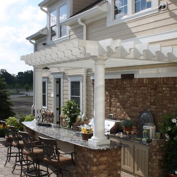
Sponsored
Columbus, OH
Free consultation for landscape design!

Peabody Landscape Group
Franklin County's Reliable Landscape Design & Contracting
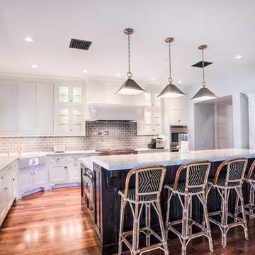
 Drewett Works
Located in Silverleaf's beautiful Horseshoe Canyon, this 7,700 square foot Ranch Hacienda serves as a vehicle for outdoor space.
The owners' desire for "classically traditional" with a lighter, brighter, and airier flavor than the neighborhood's popular, heavier Tuscan fare found expression in exterior materials and detailing that is simple in nature. The Nate Berkus-designed interiors complete the material and color palette with warm restraint.
The home, designed for a family with an extreme focus on outdoor living and sports, includes a basement equipped with a home gym, batting cage, and steam room. Outdoor facilities include a sport court and putting green. Additional features of the home include a motor court with dual garages, separate guest quarters, and a walk-in cooler.
The clients, receptive to the architect's exploration of multi-use spaces reflecting modern life, gained a laundry room which functions more as a home command station for a highly engaged mother than a place for chores. The multi-use room includes a washer and dryer, wrapping station, project area, winter storage, and her office. Additionally, it's connected to the outdoors, features a beautiful view, and is bathed in abundant natural light.
Project Details | Silverleaf - Horseshoe Canyon, Scottsdale, AZ
Architect: C.P. Drewett, AIA, NCARB, DrewettWorks, Scottsdale, AZ
Interiors: Nate Berkus, Nate Berkus Interior Design, Chicago, IL
Builder: Sonora West Development, Scottsdale, AZ
Photography: Bauhaus Photography, Scottsdale, AZ
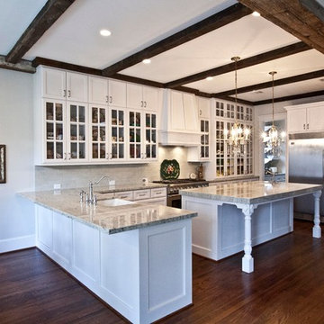
 Cedar Hill Interiors, LLC
The first thing people notice about my kitchen is the gorgeous reclaimed beams on the ceiling. Ironically, they were not part of the original plans, but were added to cover up a mistake. When the final plans arrived, the architect had added a cased opening to the breakfast room and a column that would have come down at the end of the kitchen peninsula. I was adamant that the column would ruin the look of the room, so Ridgewater Homes (my builder) worked with me to add a large ceiling beam for support. They were then able to remove the column from the plans. The builder covered the structurally necessary beam with rustic reclaimed wood, then added the smaller beams across the ceiling of the kitchen to make it look planned.
 TVL Creative Ltd.
This project was such an incredible design opportunity, and instilled inspiration and excitement at every turn! Our amazing clients came to us with the challenge of converting their beloved family home into a welcoming haven for all members of the family. At the time that we met our clients, they were struggling with the difficult personal decision of the fate of the home. Their father/father-in-law had passed away and their mother/mother-in-law had recently been admitted into a nursing facility and was fighting Alzheimer’s. Resistant to loss of the home now that both parents were out of it, our clients purchased the home to keep in in the family. Despite their permanent home currently being in New Jersey, these clients dedicated themselves to keeping and revitalizing the house. We were moved by the story and became immediately passionate about bringing this dream to life.
The home was built by the parents of our clients and was only ever owned by them, making this a truly special space to the family. Our goal was to revitalize the home and to bring new energy into every room without losing the special characteristics that were original to the home when it was built. In this way, we were able to develop a house that maintains its own unique personality while offering a space of welcoming neutrality for all members of the family to enjoy over time.
The renovation touched every part of the home: the exterior, foyer, kitchen, living room, sun room, garage, six bedrooms, three bathrooms, the laundry room, and everything in between. The focus was to develop a style that carried consistently from space to space, but allowed for unique expression in the small details in every room.
Starting at the entry, we renovated the front door and entry point to offer more presence and to bring more of the mid-century vibe to the home’s exterior. We integrated a new modern front door, cedar shingle accents, new exterior paint, and gorgeous contemporary house numbers that really allow the home to stand out. Just inside the entry, we renovated the foyer to create a playful entry point worthy of attention. Cement look tile adorns the foyer floor, and we’ve added new lighting and upgraded the entry coat storage.
Upon entering the home, one will immediately be captivated by the stunning kitchen just off the entry. We transformed this space in just about every way. While the footprint of the home ultimately remained almost identical, the aesthetics were completely turned on their head. We re-worked the kitchen to maximize storage and to create an informal dining area that is great for casual hosting or morning coffee.
We removed the entry to the garage that was once in the informal dining, and created a peninsula in its place that offers a unique division between the kitchen/informal dining and the formal dining and living areas. The simple light warm light gray cabinetry offers a bit of traditional elegance, along with the marble backsplash and quartz countertops. We extended the original wood flooring into the kitchen and stained all floors to match for a warmth that truly resonates through all spaces. We upgraded appliances, added lighting everywhere, and finished the space with some gorgeous mid century furniture pieces.
In the formal dining and living room, we really focused on maintaining the original marble fireplace as a focal point. We cleaned the marble, repaired the mortar, and refinished the original fireplace screen to give a new sleek look in black. We then integrated a new gas insert for modern heating and painted the upper portion in a rich navy blue; an accent that is carried through the home consistently as a nod to our client’s love of the color.
The former entry into the old covered porch is now an elegant glass door leading to a stunning finished sunroom. This room was completely upgraded as well. We wrapped the entire space in cozy white shiplap to keep a casual feel with brightness. We tiled the floor with large format concrete look tile, and painted the old brick fireplace a bright white. We installed a new gas burning unit, and integrated transitional style lighting to bring warmth and elegance into the space. The new black-frame windows are adorned with decorative shades that feature hand-sketched bird prints, and we’ve created a dedicated garden-ware “nook” for our client who loves to work in the yard. The far end of this space is completed with two oversized chaise loungers and overhead lights…the most perfect little reading nook!
Just off the dining room, we created an entirely new space to the home: a mudroom. The clients lacked this space and desperately needed a landing spot upon entering the home from the garage. We uniquely planned existing space in the garage to utilize for this purpose, and were able to create a small but functional entry point without losing the ability to park cars in the garage. This new space features cement-look tile, gorgeous deep brown cabinetry, and plenty of storage for all the small items one might need to store while moving in and out of the home.
The remainder of the upstairs level includes massive renovations to the guest hall bathroom and guest bedroom, upstairs master bed/bath suite, and a third bedroom that we converted into a home office for the client.
Some of the largest transformations were made in the basement, where unfinished space and lack of light were converted into gloriously lit, cozy, finished spaces. Our first task was to convert the massive basement living room into the new master bedroom for our clients. We removed existing built-ins, created an entirely new walk-in closet, painted the old brick fireplace, installed a new gas unit, added carpet, introduced new lighting, replaced windows, and upgraded every part of the aesthetic appearance. One of the most incredible features of this space is the custom double sliding barn door made by a Denver artisan. This space is truly a retreat for our clients!
We also completely transformed the laundry room, back storage room, basement master bathroom, and two bedrooms.
This home’s massive scope and ever-evolving challenges were thrilling and exciting to work with, and the result is absolutely amazing. At the end of the day, this home offers a look and feel that the clients love. Above all, though, the clients feel the spirit of their family home and have a welcoming environment for all members of the family to enjoy for years to come.
34