
Search results for "Support work life" in Home Design Ideas
 Cummings Architecture + Interiors
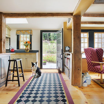
The historic restoration of this First Period Ipswich, Massachusetts home (c. 1686) was an eighteen-month project that combined exterior and interior architectural work to preserve and revitalize this beautiful home. Structurally, work included restoring the summer beam, straightening the timber frame, and adding a lean-to section. The living space was expanded with the addition of a spacious gourmet kitchen featuring countertops made of reclaimed barn wood. As is always the case with our historic renovations, we took special care to maintain the beauty and integrity of the historic elements while bringing in the comfort and convenience of modern amenities. We were even able to uncover and restore much of the original fabric of the house (the chimney, fireplaces, paneling, trim, doors, hinges, etc.), which had been hidden for years under a renovation dating back to 1746.
Winner, 2012 Mary P. Conley Award for historic home restoration and preservation
You can read more about this restoration in the Boston Globe article by Regina Cole, “A First Period home gets a second life.” http://www.bostonglobe.com/magazine/2013/10/26/couple-rebuild-their-century-home-ipswich/r2yXE5yiKWYcamoFGmKVyL/story.html
Photo Credit: Eric Roth
 Drewett Works
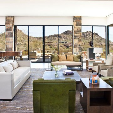
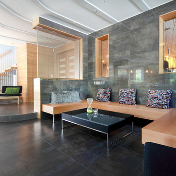
Designed to embrace an extensive and unique art collection including sculpture, paintings, tapestry, and cultural antiquities, this modernist home located in north Scottsdale’s Estancia is the quintessential gallery home for the spectacular collection within. The primary roof form, “the wing” as the owner enjoys referring to it, opens the home vertically to a view of adjacent Pinnacle peak and changes the aperture to horizontal for the opposing view to the golf course. Deep overhangs and fenestration recesses give the home protection from the elements and provide supporting shade and shadow for what proves to be a desert sculpture. The restrained palette allows the architecture to express itself while permitting each object in the home to make its own place. The home, while certainly modern, expresses both elegance and warmth in its material selections including canterra stone, chopped sandstone, copper, and stucco.
Project Details | Lot 245 Estancia, Scottsdale AZ
Architect: C.P. Drewett, Drewett Works, Scottsdale, AZ
Interiors: Luis Ortega, Luis Ortega Interiors, Hollywood, CA
Publications: luxe. interiors + design. November 2011.
Featured on the world wide web: luxe.daily
Photo by Grey Crawford.
 Housing & Building Association of Colorado Springs
The Home
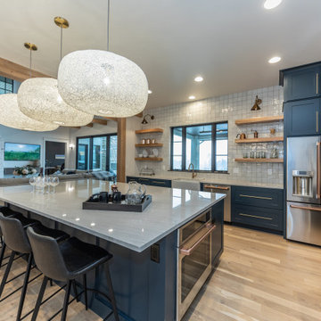
While looking for space where their active family could expand, these homeowners turned to Black Forest, with trees that remind them of their Indiana years. A stunning Pikes Peak view underscores how fortunate they are to live in Colorado. This home features classic nods to the owner’s French heritage while embracing a thoroughly of-the-moment Colorado lifestyle. Priorities for these homeowners included blending outdoor and indoor spaces wherever possible with generously proportioned windows and doors, porches, patios and balconies.
A gracious lime-washed brick entry punctuates a simplified white stucco and black-frame-windowed exterior with traditional
rooflines. Dramatic open spaces on the main floor comfortably accommodate the everyday activities of this busy family of four, while
providing for welcomed visits from family and friends. A functional, open kitchen is designed for serious cooking, a butler’s pantry for
staples, and serveware storage and dining spaces that effortlessly host after-school snacking to multi-course meals. A main-level,
Peak-view office comfortably supports working at home, complete with a beer cave and tasting nook for hosting fellow aficionados
after work is done. Guests will find comfort and privacy in a ma in-level guestroom suite or sleepover fun in the built-in bunks of the
expansive over-garage bonus room.
This home is a true collaboration that blends the homeowner’s long-held vision of their ideal home brought to life by the builder’s vision
and design/build process that achieves something truly…Warm and welcoming in the Forest.
The Builder
Stauffer & Sons Construction is a true Design-Build team creating some of the finest living spaces in the Pikes Peak region for over twenty years. We’ve developed an easy point-of-entry to the Design-Build process that begins with our very popular Conceptual Design and Budgeting Agreement. This affordable, low-commitment step provides answers to the early-stage questions of “what and how much?” With this critical information in place, a robust collaboration between client and builder ensues, resulting in a thoughtfully designed home that strikes a balance between size and scope and budget.
The Interior Design
Family, friends and soon-to-be friends are welcomed into this updated version of a French country farmhouse through a bricked archway and a solid arch-top entry door. Once inside, a sweeping gallery of windows adorned with flower-filled window boxes sets a nice foreground to the ponderosa pine forest. A great room with a two-story, lime-washed, brick fireplace sits juxtaposed to a cozy farm-styled kitchen with large island, plenty of storage and a Pikes Peak view. This family home features a simple, clean design with warm, wooden beams and solid, white-oak flooring. This home is designed to be lived in. Wherever you go, downstairs, upstairs or out on the porch, this home wraps around you and is a delightful place to enjoy.
Find the right local pro for your project
 Housing & Building Association of Colorado Springs
The Home
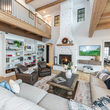
While looking for space where their active family could expand, these homeowners turned to Black Forest, with trees that remind them of their Indiana years. A stunning Pikes Peak view underscores how fortunate they are to live in Colorado. This home features classic nods to the owner’s French heritage while embracing a thoroughly of-the-moment Colorado lifestyle. Priorities for these homeowners included blending outdoor and indoor spaces wherever possible with generously proportioned windows and doors, porches, patios and balconies.
A gracious lime-washed brick entry punctuates a simplified white stucco and black-frame-windowed exterior with traditional
rooflines. Dramatic open spaces on the main floor comfortably accommodate the everyday activities of this busy family of four, while
providing for welcomed visits from family and friends. A functional, open kitchen is designed for serious cooking, a butler’s pantry for
staples, and serveware storage and dining spaces that effortlessly host after-school snacking to multi-course meals. A main-level,
Peak-view office comfortably supports working at home, complete with a beer cave and tasting nook for hosting fellow aficionados
after work is done. Guests will find comfort and privacy in a ma in-level guestroom suite or sleepover fun in the built-in bunks of the
expansive over-garage bonus room.
This home is a true collaboration that blends the homeowner’s long-held vision of their ideal home brought to life by the builder’s vision
and design/build process that achieves something truly…Warm and welcoming in the Forest.
The Builder
Stauffer & Sons Construction is a true Design-Build team creating some of the finest living spaces in the Pikes Peak region for over twenty years. We’ve developed an easy point-of-entry to the Design-Build process that begins with our very popular Conceptual Design and Budgeting Agreement. This affordable, low-commitment step provides answers to the early-stage questions of “what and how much?” With this critical information in place, a robust collaboration between client and builder ensues, resulting in a thoughtfully designed home that strikes a balance between size and scope and budget.
The Interior Design
Family, friends and soon-to-be friends are welcomed into this updated version of a French country farmhouse through a bricked archway and a solid arch-top entry door. Once inside, a sweeping gallery of windows adorned with flower-filled window boxes sets a nice foreground to the ponderosa pine forest. A great room with a two-story, lime-washed, brick fireplace sits juxtaposed to a cozy farm-styled kitchen with large island, plenty of storage and a Pikes Peak view. This family home features a simple, clean design with warm, wooden beams and solid, white-oak flooring. This home is designed to be lived in. Wherever you go, downstairs, upstairs or out on the porch, this home wraps around you and is a delightful place to enjoy.
 Guggenheim Architecture + Design Studio
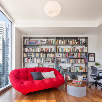
With sweeping views of the Willamette river and Mt. Hood, this Atwater Place condo was designed with a balance of minimalism and livability in mind. A complete kitchen remodel brought a dark interior kitchen to the light and a full furnishings package welcomed Los Angeles transplants home to their new modern and bright residence. Our clients, a retired camera operator for both feature films and television and a producer/production manager on numerous television series including Weeds and The Middle, relocated from their traditionally-styled LA bungalow to Portland in the Summer of 2014. The couple sought a design departure from their long-term California residence and a fresh start for their new life in the South Waterfront.
With only two pieces of sentimental furniture and a handful of artwork included in the plan, we set out to create a comfortable and clean-lined furnishings package complimenting the broad southeast views. Organically shaped upholstery pieces juxtaposed with angular steel and wood tables create a soft balance in the open floor plan. Several custom pieces, including a dining table designed by our studio and a custom hand-blown glass chandelier crafted by Scott Schiesel with Lightlite compliment timeless pieces from Knoll, Herman Miller, and B&B Italia.
The kitchen is designed to reflect light and create brilliance in a space that is otherwise naturally dark. A material balance of stainless steel, back painted glass, quartz composite, lacquer, and mirror all play their part in creating a vibrant cooking environment. We collectively decided to forgo the traditional island pendant for a linear commercial fixture that provides tremendous light to the prep surface and creates an unexpected architectural element. The mirrored prep island creates the illusion of open space while concealing casework and wine storage on the working side of the kitchen.
It is worth noting that this project was designed and installed almost entirely while our clients were still living in LA and wrapping up professional obligations and selling their home. This afforded us the tremendous opportunity to send our clients to showrooms not available in Portland to view key pieces before final specification. Textiles and finish samples were approved via mail and communication took place over e-mail, telephone, and an occasional office visit. This unique process lead to a successful result and a beautifully balanced living environment.
Josh Partee Photography
 Drewett Works
WINNER: Silver Award – One-of-a-Kind Custom or Spec 4,001 – 5,000 sq ft, Best in American Living Awards, 2019
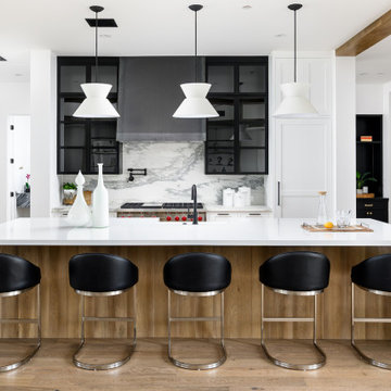
Affectionately called The Magnolia, a reference to the architect's Southern upbringing, this project was a grass roots exploration of farmhouse architecture. Located in Phoenix, Arizona’s idyllic Arcadia neighborhood, the home gives a nod to the area’s citrus orchard history.
Echoing the past while embracing current millennial design expectations, this just-complete speculative family home hosts four bedrooms, an office, open living with a separate “dirty kitchen”, and the Stone Bar. Positioned in the Northwestern portion of the site, the Stone Bar provides entertainment for the interior and exterior spaces. With retracting sliding glass doors and windows above the bar, the space opens up to provide a multipurpose playspace for kids and adults alike.
Nearly as eyecatching as the Camelback Mountain view is the stunning use of exposed beams, stone, and mill scale steel in this grass roots exploration of farmhouse architecture. White painted siding, white interior walls, and warm wood floors communicate a harmonious embrace in this soothing, family-friendly abode.
Project Details // The Magnolia House
Architecture: Drewett Works
Developer: Marc Development
Builder: Rafterhouse
Interior Design: Rafterhouse
Landscape Design: Refined Gardens
Photographer: ProVisuals Media
Awards
Silver Award – One-of-a-Kind Custom or Spec 4,001 – 5,000 sq ft, Best in American Living Awards, 2019
Featured In
“The Genteel Charm of Modern Farmhouse Architecture Inspired by Architect C.P. Drewett,” by Elise Glickman for Iconic Life, Nov 13, 2019
 Jess Pedersen Architecture
PHOTOS: Mountain Home Photo
CONTRACTOR: 3C Construction
Main level living: 1455 sq ft
Upper level Living: 1015 sq ft
Guest Wing / Office: 520 sq ft
Total Living: 2990 sq ft
Studio Space: 1520 sq ft
2 Car Garage : 575 sq ft
General Contractor: 3C Construction: Steve Lee
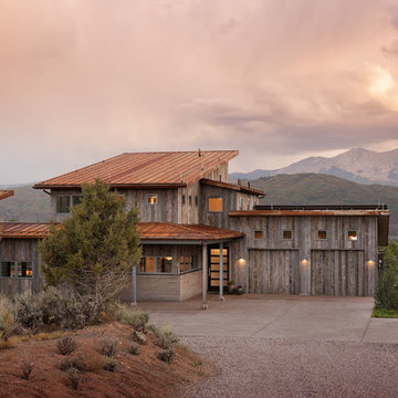
The client, a sculpture artist, and his wife came to J.P.A. only wanting a studio next to their home. During the design process it grew to having a living space above the studio, which grew to having a small house attached to the studio forming a compound. At this point it became clear to the client; the project was outgrowing the neighborhood. After re-evaluating the project, the live / work compound is currently sited in a natural protected nest with post card views of Mount Sopris & the Roaring Fork Valley. The courtyard compound consist of the central south facing piece being the studio flanked by a simple 2500 sq ft 2 bedroom, 2 story house one the west side, and a multi purpose guest wing /studio on the east side. The evolution of this compound came to include the desire to have the building blend into the surrounding landscape, and at the same time become the backdrop to create and display his sculpture.
“Jess has been our architect on several projects over the past ten years. He is easy to work with, and his designs are interesting and thoughtful. He always carefully listens to our ideas and is able to create a plan that meets our needs both as individuals and as a family. We highly recommend Jess Pedersen Architecture”.
- Client
“As a general contractor, I can highly recommend Jess. His designs are very pleasing with a lot of thought put in to how they are lived in. He is a real team player, adding greatly to collaborative efforts and making the process smoother for all involved. Further, he gets information out on or ahead of schedule. Really been a pleasure working with Jess and hope to do more together in the future!”
Steve Lee - 3C Construction

 Thyme & Place Design LLC
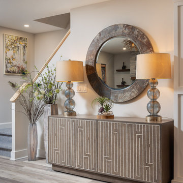
When my client had to move from her company office to work at home, she set up in the dining room. Despite her best efforts, this was not the long-term solution she was looking for. My client realized she needed a dedicated space not on the main floor of the home. On one hand, having your office space right next to the kitchen is handy. On the other hand, it made separating work and home life was not that easy.
The house was a ranch. In essence, the basement would run entire length of the home. As we came down the steps, we entered a time capsule. The house was built in the 1950’s. The walls were covered with original knotty pine paneling. There was a wood burning fireplace and considering this was a basement, high ceilings. In addition, there was everything her family could not store at their own homes. As we wound though the space, I though “wow this has potential”, Eventually, after walking through the laundry room we came to a small nicely lit room. This would be the office.
My client looked at me and asked what I thought. Undoubtedly, I said, this can be a great workspace, but do you really want to walk through this basement and laundry to get here? Without reservation, my client said where do we start?
Once the design was in place, we started the renovation. The knotty pine paneling had to go. Specifically, to add some insulation and control the dampness and humidity. The laundry room wall was relocated to create a hallway to the office.
At the far end of the room, we designated a workout zone. Weights, mats, exercise bike and television are at the ready for morning or afternoon workouts. The space can be concealed by a folding screen for party time. Doors to an old closet under the stairs were relocated to the workout area for hidden storage. Now we had nice wall for a beautiful console and mirror for storage and serving during parties.
In order to add architectural details, we covered the old ugly support columns with simple recessed millwork panels. This detail created a visual division between the bar area and the seating area in front of the fireplace. The old red brick on the fireplace surround was replaced with stack stone. A mantle was made from reclaimed wood. Additional reclaimed wood floating shelves left and right of the fireplace provides decorative display while maintaining a rustic element balancing the copper end table and leather swivel rocker.
We found an amazing rug which tied all of the colors together further defining the gathering space. Russet and burnt orange became the accent color unifying each space. With a bit of whimsy, a rather unusual light fixture which looks like roots from a tree growing through the ceiling is a conversation piece.
The office space is quite and removed from the main part of the basement. There is a desk large enough for multiple screens, a small bookcase holding office supplies and a comfortable chair for conference calls. Because working from home requires many online meetings, we added a shiplap wall painted in Hale Navy to contrast with the orange fabric on the chair. We finished the décor with a painting from my client’s father. This is the background online visitors will see.
The last and best part of the renovation is the beautiful bar. My client is an avid collector of wine. She already had the EuroCave refrigerator, so I incorporated it into the design. The cabinets are painted Temptation Grey from Benjamin Moore. The counter tops are my favorite hard working quartzite Brown Fantasy. The backsplash is a combination of rustic wood and old tin ceiling like porcelain tiles. Together with the textures of the reclaimed wood and hide poofs balanced against the smooth finish of the cabinets, we created a comfortable luxury for relaxing.
There is ample storage for bottles, cans, glasses, and anything else you can think of for a great party. In addition to the wine storage, we incorporated a beverage refrigerator, an ice maker, and a sink. Floating shelves with integrated lighting illuminate the back bar. The raised height of the front bar provides the perfect wine tasting and paring spot. I especially love the pendant lights which look like wine glasses.
Finally, I selected carpet for the stairs and office. It is perfect for noise reduction. Meanwhile for the overall flooring, I specifically selected a high-performance vinyl plank floor. We often use this product as it is perfect to install on a concrete floor. It is soft to walk on, easy to clean and does not reduce the overall height of the space.
 fuse57 llc architecture
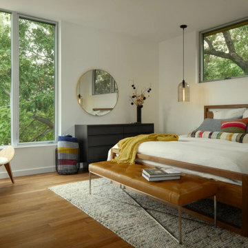
Nestled in the treetops overlooking Lake Sarah, this second-story addition was designed as both a retreat and an extension of home. Elevated above the shoreline, the new spaces immerse the homeowners in the beauty of their surroundings while supporting the rhythm of daily life.
The addition introduces a private guest en-suite for visiting family and friends, a quiet office for focused work, a cozy lounge for gathering, a dedicated ceramic studio for making, and an outdoor patio that connects seamlessly to views of the lake and woods.
Every space reflects the homeowners’ lifestyle—places where creativity can flourish, where moments of reflection are possible, and where memories with friends and family can be made. Natural light, framed views, and a strong connection to the outdoors guided the design, ensuring that each room feels both purposeful and restorative.
Outside, durable cement board siding, anodized aluminum Marvin windows, and composite decking ensure lasting performance. Inside, walnut flooring and custom millwork bring warmth and texture, balancing comfort with modern practicality
This project goes beyond adding square footage. It creates a sanctuary—an elevated experience of home where living, creating, and connecting come together in the treetops.
 Love Your Room LLC
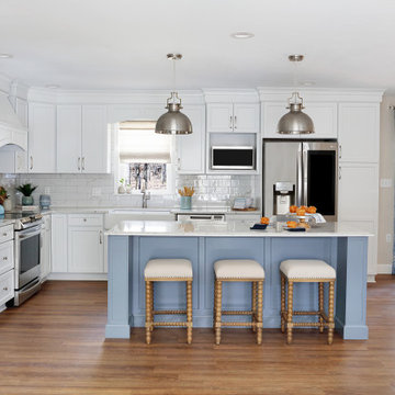
Nestled in the Pocono mountains, the house had been on the market for a while, and no one had any interest in it. Then along comes our lovely client, who was ready to put roots down here, leaving Philadelphia, to live closer to her daughter.
She had a vision of how to make this older small ranch home, work for her. This included images of baking in a beautiful kitchen, lounging in a calming bedroom, and hosting family and friends, toasting to life and traveling! We took that vision, and working closely with our contractors, carpenters, and product specialists, spent 8 months giving this home new life. This included renovating the entire interior, adding an addition for a new spacious master suite, and making improvements to the exterior.
It is now, not only updated and more functional; it is filled with a vibrant mix of country traditional style. We are excited for this new chapter in our client’s life, the memories she will make here, and are thrilled to have been a part of this ranch house Cinderella transformation.
 The Brooklyn Studio
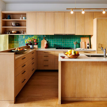
This residence was a complete gut renovation of a 4-story row house in Park Slope, and included a new rear extension and penthouse addition. The owners wished to create a warm, family home using a modern language that would act as a clean canvas to feature rich textiles and items from their world travels. As with most Brooklyn row houses, the existing house suffered from a lack of natural light and connection to exterior spaces, an issue that Principal Brendan Coburn is acutely aware of from his experience re-imagining historic structures in the New York area. The resulting architecture is designed around moments featuring natural light and views to the exterior, of both the private garden and the sky, throughout the house, and a stripped-down language of detailing and finishes allows for the concept of the modern-natural to shine.
Upon entering the home, the kitchen and dining space draw you in with views beyond through the large glazed opening at the rear of the house. An extension was built to allow for a large sunken living room that provides a family gathering space connected to the kitchen and dining room, but remains distinctly separate, with a strong visual connection to the rear garden. The open sculptural stair tower was designed to function like that of a traditional row house stair, but with a smaller footprint. By extending it up past the original roof level into the new penthouse, the stair becomes an atmospheric shaft for the spaces surrounding the core. All types of weather – sunshine, rain, lightning, can be sensed throughout the home through this unifying vertical environment. The stair space also strives to foster family communication, making open living spaces visible between floors. At the upper-most level, a free-form bench sits suspended over the stair, just by the new roof deck, which provides at-ease entertaining. Oak was used throughout the home as a unifying material element. As one travels upwards within the house, the oak finishes are bleached to further degrees as a nod to how light enters the home.
The owners worked with CWB to add their own personality to the project. The meter of a white oak and blackened steel stair screen was designed by the family to read “I love you” in Morse Code, and tile was selected throughout to reference places that hold special significance to the family. To support the owners’ comfort, the architectural design engages passive house technologies to reduce energy use, while increasing air quality within the home – a strategy which aims to respect the environment while providing a refuge from the harsh elements of urban living.
This project was published by Wendy Goodman as her Space of the Week, part of New York Magazine’s Design Hunting on The Cut.
Photography by Kevin Kunstadt
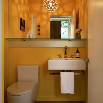 fuse57 llc architecture
Nestled in the treetops overlooking Lake Sarah, this second-story addition was designed as both a retreat and an extension of home. Elevated above the shoreline, the new spaces immerse the homeowners in the beauty of their surroundings while supporting the rhythm of daily life.
The addition introduces a private guest en-suite for visiting family and friends, a quiet office for focused work, a cozy lounge for gathering, a dedicated ceramic studio for making, and an outdoor patio that connects seamlessly to views of the lake and woods.
Every space reflects the homeowners’ lifestyle—places where creativity can flourish, where moments of reflection are possible, and where memories with friends and family can be made. Natural light, framed views, and a strong connection to the outdoors guided the design, ensuring that each room feels both purposeful and restorative.
Outside, durable cement board siding, anodized aluminum Marvin windows, and composite decking ensure lasting performance. Inside, walnut flooring and custom millwork bring warmth and texture, balancing comfort with modern practicality
This project goes beyond adding square footage. It creates a sanctuary—an elevated experience of home where living, creating, and connecting come together in the treetops.
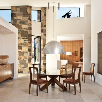 Drewett Works
Designed to embrace an extensive and unique art collection including sculpture, paintings, tapestry, and cultural antiquities, this modernist home located in north Scottsdale’s Estancia is the quintessential gallery home for the spectacular collection within. The primary roof form, “the wing” as the owner enjoys referring to it, opens the home vertically to a view of adjacent Pinnacle peak and changes the aperture to horizontal for the opposing view to the golf course. Deep overhangs and fenestration recesses give the home protection from the elements and provide supporting shade and shadow for what proves to be a desert sculpture. The restrained palette allows the architecture to express itself while permitting each object in the home to make its own place. The home, while certainly modern, expresses both elegance and warmth in its material selections including canterra stone, chopped sandstone, copper, and stucco.
Project Details | Lot 245 Estancia, Scottsdale AZ
Architect: C.P. Drewett, Drewett Works, Scottsdale, AZ
Interiors: Luis Ortega, Luis Ortega Interiors, Hollywood, CA
Publications: luxe. interiors + design. November 2011.
Featured on the world wide web: luxe.daily
Photos by Grey Crawford
Sponsored
Westerville, OH

Custom Home Works
Franklin County's Award-Winning Design, Build and Remodeling Expert
 Thyme & Place Design LLC
When my client had to move from her company office to work at home, she set up in the dining room. Despite her best efforts, this was not the long-term solution she was looking for. My client realized she needed a dedicated space not on the main floor of the home. On one hand, having your office space right next to the kitchen is handy. On the other hand, it made separating work and home life was not that easy.
The house was a ranch. In essence, the basement would run entire length of the home. As we came down the steps, we entered a time capsule. The house was built in the 1950’s. The walls were covered with original knotty pine paneling. There was a wood burning fireplace and considering this was a basement, high ceilings. In addition, there was everything her family could not store at their own homes. As we wound though the space, I though “wow this has potential”, Eventually, after walking through the laundry room we came to a small nicely lit room. This would be the office.
My client looked at me and asked what I thought. Undoubtedly, I said, this can be a great workspace, but do you really want to walk through this basement and laundry to get here? Without reservation, my client said where do we start?
Once the design was in place, we started the renovation. The knotty pine paneling had to go. Specifically, to add some insulation and control the dampness and humidity. The laundry room wall was relocated to create a hallway to the office.
At the far end of the room, we designated a workout zone. Weights, mats, exercise bike and television are at the ready for morning or afternoon workouts. The space can be concealed by a folding screen for party time. Doors to an old closet under the stairs were relocated to the workout area for hidden storage. Now we had nice wall for a beautiful console and mirror for storage and serving during parties.
In order to add architectural details, we covered the old ugly support columns with simple recessed millwork panels. This detail created a visual division between the bar area and the seating area in front of the fireplace. The old red brick on the fireplace surround was replaced with stack stone. A mantle was made from reclaimed wood. Additional reclaimed wood floating shelves left and right of the fireplace provides decorative display while maintaining a rustic element balancing the copper end table and leather swivel rocker.
We found an amazing rug which tied all of the colors together further defining the gathering space. Russet and burnt orange became the accent color unifying each space. With a bit of whimsy, a rather unusual light fixture which looks like roots from a tree growing through the ceiling is a conversation piece.
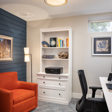
The office space is quite and removed from the main part of the basement. There is a desk large enough for multiple screens, a small bookcase holding office supplies and a comfortable chair for conference calls. Because working from home requires many online meetings, we added a shiplap wall painted in Hale Navy to contrast with the orange fabric on the chair. We finished the décor with a painting from my client’s father. This is the background online visitors will see.
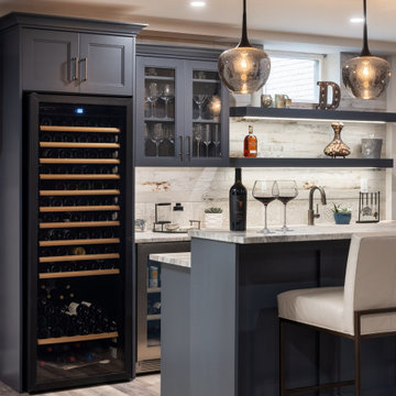
The last and best part of the renovation is the beautiful bar. My client is an avid collector of wine. She already had the EuroCave refrigerator, so I incorporated it into the design. The cabinets are painted Temptation Grey from Benjamin Moore. The counter tops are my favorite hard working quartzite Brown Fantasy. The backsplash is a combination of rustic wood and old tin ceiling like porcelain tiles. Together with the textures of the reclaimed wood and hide poofs balanced against the smooth finish of the cabinets, we created a comfortable luxury for relaxing.
There is ample storage for bottles, cans, glasses, and anything else you can think of for a great party. In addition to the wine storage, we incorporated a beverage refrigerator, an ice maker, and a sink. Floating shelves with integrated lighting illuminate the back bar. The raised height of the front bar provides the perfect wine tasting and paring spot. I especially love the pendant lights which look like wine glasses.
Finally, I selected carpet for the stairs and office. It is perfect for noise reduction. Meanwhile for the overall flooring, I specifically selected a high-performance vinyl plank floor. We often use this product as it is perfect to install on a concrete floor. It is soft to walk on, easy to clean and does not reduce the overall height of the space.
 Drewett Works
WINNER: Silver Award – One-of-a-Kind Custom or Spec 4,001 – 5,000 sq ft, Best in American Living Awards, 2019
Affectionately called The Magnolia, a reference to the architect's Southern upbringing, this project was a grass roots exploration of farmhouse architecture. Located in Phoenix, Arizona’s idyllic Arcadia neighborhood, the home gives a nod to the area’s citrus orchard history.
Echoing the past while embracing current millennial design expectations, this just-complete speculative family home hosts four bedrooms, an office, open living with a separate “dirty kitchen”, and the Stone Bar. Positioned in the Northwestern portion of the site, the Stone Bar provides entertainment for the interior and exterior spaces. With retracting sliding glass doors and windows above the bar, the space opens up to provide a multipurpose playspace for kids and adults alike.
Nearly as eyecatching as the Camelback Mountain view is the stunning use of exposed beams, stone, and mill scale steel in this grass roots exploration of farmhouse architecture. White painted siding, white interior walls, and warm wood floors communicate a harmonious embrace in this soothing, family-friendly abode.
Project Details // The Magnolia House
Architecture: Drewett Works
Developer: Marc Development
Builder: Rafterhouse
Interior Design: Rafterhouse
Landscape Design: Refined Gardens
Photographer: ProVisuals Media
Awards
Silver Award – One-of-a-Kind Custom or Spec 4,001 – 5,000 sq ft, Best in American Living Awards, 2019
Featured In
“The Genteel Charm of Modern Farmhouse Architecture Inspired by Architect C.P. Drewett,” by Elise Glickman for Iconic Life, Nov 13, 2019
 Décor Aid
When an international client moved from Brazil to Stamford, Connecticut, they reached out to Decor Aid, and asked for our help in modernizing a recently purchased suburban home. The client felt that the house was too “cookie-cutter,” and wanted to transform their space into a highly individualized home for their energetic family of four.
In addition to giving the house a more updated and modern feel, the client wanted to use the interior design as an opportunity to segment and demarcate each area of the home. They requested that the downstairs area be transformed into a media room, where the whole family could hang out together. Both of the parents work from home, and so their office spaces had to be sequestered from the rest of the house, but conceived without any disruptive design elements. And as the husband is a photographer, he wanted to put his own artwork on display. So the furniture that we sourced had to balance the more traditional elements of the house, while also feeling cohesive with the husband’s bold, graphic, contemporary style of photography.
The first step in transforming this house was repainting the interior and exterior, which were originally done in outdated beige and taupe colors. To set the tone for a classically modern design scheme, we painted the exterior a charcoal grey, with a white trim, and repainted the door a crimson red. The home offices were placed in a quiet corner of the house, and outfitted with a similar color palette: grey walls, a white trim, and red accents, for a seamless transition between work space and home life.
The house is situated on the edge of a Connecticut forest, with clusters of maple, birch, and hemlock trees lining the property. So we installed white window treatments, to accentuate the natural surroundings, and to highlight the angular architecture of the home.
In the entryway, a bold, graphic print, and a thick-pile sheepskin rug set the tone for this modern, yet comfortable home. While the formal room was conceived with a high-contrast neutral palette and angular, contemporary furniture, the downstairs media area includes a spiral staircase, comfortable furniture, and patterned accent pillows, which creates a more relaxed atmosphere. Equipped with a television, a fully-stocked bar, and a variety of table games, the downstairs media area has something for everyone in this energetic young family.
 Thyme & Place Design LLC
When my client had to move from her company office to work at home, she set up in the dining room. Despite her best efforts, this was not the long-term solution she was looking for. My client realized she needed a dedicated space not on the main floor of the home. On one hand, having your office space right next to the kitchen is handy. On the other hand, it made separating work and home life was not that easy.
The house was a ranch. In essence, the basement would run entire length of the home. As we came down the steps, we entered a time capsule. The house was built in the 1950’s. The walls were covered with original knotty pine paneling. There was a wood burning fireplace and considering this was a basement, high ceilings. In addition, there was everything her family could not store at their own homes. As we wound though the space, I though “wow this has potential”, Eventually, after walking through the laundry room we came to a small nicely lit room. This would be the office.
My client looked at me and asked what I thought. Undoubtedly, I said, this can be a great workspace, but do you really want to walk through this basement and laundry to get here? Without reservation, my client said where do we start?
Once the design was in place, we started the renovation. The knotty pine paneling had to go. Specifically, to add some insulation and control the dampness and humidity. The laundry room wall was relocated to create a hallway to the office.
At the far end of the room, we designated a workout zone. Weights, mats, exercise bike and television are at the ready for morning or afternoon workouts. The space can be concealed by a folding screen for party time. Doors to an old closet under the stairs were relocated to the workout area for hidden storage. Now we had nice wall for a beautiful console and mirror for storage and serving during parties.
In order to add architectural details, we covered the old ugly support columns with simple recessed millwork panels. This detail created a visual division between the bar area and the seating area in front of the fireplace. The old red brick on the fireplace surround was replaced with stack stone. A mantle was made from reclaimed wood. Additional reclaimed wood floating shelves left and right of the fireplace provides decorative display while maintaining a rustic element balancing the copper end table and leather swivel rocker.
We found an amazing rug which tied all of the colors together further defining the gathering space. Russet and burnt orange became the accent color unifying each space. With a bit of whimsy, a rather unusual light fixture which looks like roots from a tree growing through the ceiling is a conversation piece.
The office space is quite and removed from the main part of the basement. There is a desk large enough for multiple screens, a small bookcase holding office supplies and a comfortable chair for conference calls. Because working from home requires many online meetings, we added a shiplap wall painted in Hale Navy to contrast with the orange fabric on the chair. We finished the décor with a painting from my client’s father. This is the background online visitors will see.
The last and best part of the renovation is the beautiful bar. My client is an avid collector of wine. She already had the EuroCave refrigerator, so I incorporated it into the design. The cabinets are painted Temptation Grey from Benjamin Moore. The counter tops are my favorite hard working quartzite Brown Fantasy. The backsplash is a combination of rustic wood and old tin ceiling like porcelain tiles. Together with the textures of the reclaimed wood and hide poofs balanced against the smooth finish of the cabinets, we created a comfortable luxury for relaxing.
There is ample storage for bottles, cans, glasses, and anything else you can think of for a great party. In addition to the wine storage, we incorporated a beverage refrigerator, an ice maker, and a sink. Floating shelves with integrated lighting illuminate the back bar. The raised height of the front bar provides the perfect wine tasting and paring spot. I especially love the pendant lights which look like wine glasses.
Finally, I selected carpet for the stairs and office. It is perfect for noise reduction. Meanwhile for the overall flooring, I specifically selected a high-performance vinyl plank floor. We often use this product as it is perfect to install on a concrete floor. It is soft to walk on, easy to clean and does not reduce the overall height of the space.


 Drewett Works
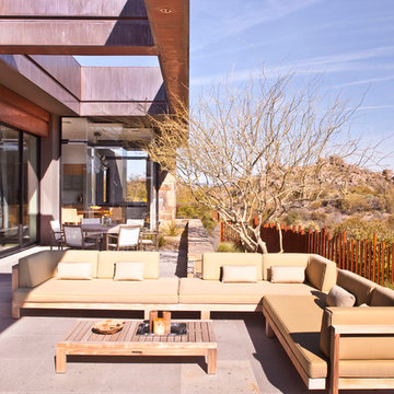
Designed to embrace an extensive and unique art collection including sculpture, paintings, tapestry, and cultural antiquities, this modernist home located in north Scottsdale’s Estancia is the quintessential gallery home for the spectacular collection within. The primary roof form, “the wing” as the owner enjoys referring to it, opens the home vertically to a view of adjacent Pinnacle peak and changes the aperture to horizontal for the opposing view to the golf course. Deep overhangs and fenestration recesses give the home protection from the elements and provide supporting shade and shadow for what proves to be a desert sculpture. The restrained palette allows the architecture to express itself while permitting each object in the home to make its own place. The home, while certainly modern, expresses both elegance and warmth in its material selections including canterra stone, chopped sandstone, copper, and stucco.
Project Details | Lot 245 Estancia, Scottsdale AZ
Architect: C.P. Drewett, Drewett Works, Scottsdale, AZ
Interiors: Luis Ortega, Luis Ortega Interiors, Hollywood, CA
Publications: luxe. interiors + design. November 2011.
Featured on the world wide web: luxe.daily
Photo by Grey Crawford.
 Domus Constructors, LLC.
“Compelling.” That’s how one of our judges characterized this stair, which manages to embody both reassuring solidity and airy weightlessness. Architect Mahdad Saniee specified beefy maple treads—each laminated from two boards, to resist twisting and cupping—and supported them at the wall with hidden steel hangers. “We wanted to make them look like they are floating,” he says, “so they sit away from the wall by about half an inch.” The stainless steel rods that seem to pierce the treads’ opposite ends are, in fact, joined by threaded couplings hidden within the thickness of the wood. The result is an assembly whose stiffness underfoot defies expectation, Saniee says. “It feels very solid, much more solid than average stairs.” With the rods working in tension from above and compression below, “it’s very hard for those pieces of wood to move.”
The interplay of wood and steel makes abstract reference to a Steinway concert grand, Saniee notes. “It’s taking elements of a piano and playing with them.” A gently curved soffit in the ceiling reinforces the visual rhyme. The jury admired the effect but was equally impressed with the technical acumen required to achieve it. “The rhythm established by the vertical rods sets up a rigorous discipline that works with the intricacies of stair dimensions,” observed one judge. “That’s really hard to do.”
 Décor Aid
When an international client moved from Brazil to Stamford, Connecticut, they reached out to Decor Aid, and asked for our help in modernizing a recently purchased suburban home. The client felt that the house was too “cookie-cutter,” and wanted to transform their space into a highly individualized home for their energetic family of four.
In addition to giving the house a more updated and modern feel, the client wanted to use the interior design as an opportunity to segment and demarcate each area of the home. They requested that the downstairs area be transformed into a media room, where the whole family could hang out together. Both of the parents work from home, and so their office spaces had to be sequestered from the rest of the house, but conceived without any disruptive design elements. And as the husband is a photographer, he wanted to put his own artwork on display. So the furniture that we sourced had to balance the more traditional elements of the house, while also feeling cohesive with the husband’s bold, graphic, contemporary style of photography.
The first step in transforming this house was repainting the interior and exterior, which were originally done in outdated beige and taupe colors. To set the tone for a classically modern design scheme, we painted the exterior a charcoal grey, with a white trim, and repainted the door a crimson red. The home offices were placed in a quiet corner of the house, and outfitted with a similar color palette: grey walls, a white trim, and red accents, for a seamless transition between work space and home life.
The house is situated on the edge of a Connecticut forest, with clusters of maple, birch, and hemlock trees lining the property. So we installed white window treatments, to accentuate the natural surroundings, and to highlight the angular architecture of the home.
In the entryway, a bold, graphic print, and a thick-pile sheepskin rug set the tone for this modern, yet comfortable home. While the formal room was conceived with a high-contrast neutral palette and angular, contemporary furniture, the downstairs media area includes a spiral staircase, comfortable furniture, and patterned accent pillows, which creates a more relaxed atmosphere. Equipped with a television, a fully-stocked bar, and a variety of table games, the downstairs media area has something for everyone in this energetic young family.
4