
Search results for "Support work life" in Home Design Ideas
 J Design Group - Interior Designers Miami - Modern
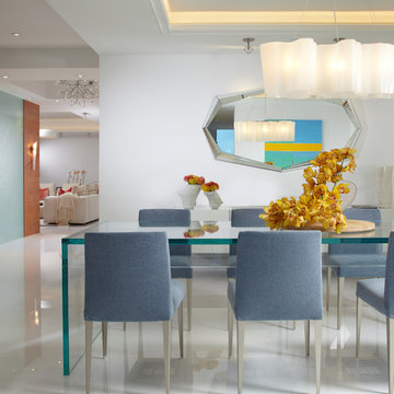
Ocean front, Luxury home in Miami Beach.
Projects by J Design Group, Your friendly Interior designers firm in Miami, FL. at your service.
AVENTURA MAGAZINE selected our client’s luxury 5000 Sf ocean front apartment in Miami Beach, to publish it in their issue and they Said:
Story by Linda Marx, Photography by Daniel Newcomb
Light & Bright
New York snowbirds redesigned their Miami Beach apartment to take advantage of the tropical lifestyle.
New York snowbirds redesigned their Miami Beach apartment to take advantage of the tropical lifestyle.
WHEN INTERIOR DESIGNER JENNIFER CORREDOR was asked to recreate a four-bedroom, six-bath condominium at The Bath Club in Miami Beach, she seized the opportunity to open the rooms and better utilize the vast ocean views.
In five months last year, the designer transformed a dark and closed 5,000-square-foot unit located on a high floor into a series of sweeping waterfront spaces and updated the well located apartment into a light and airy retreat for a sports-loving family of five.
“They come down from New York every other weekend and wanted to make their waterfront home a series of grand open spaces,” says Jennifer Corrredor, of the J. Design Group in Miami, a firm specializing in modern and contemporary interiors. “Since many of the rooms face the ocean, it made sense to open and lighten up the home, taking advantage of the awesome views of the sea and the bay.”
The designer used 40 x 40 all white tile throughout the apartment as a clean base. This way, her sophisticated use of color would stand out and bring the outdoors in.
The close-knit family members—two parents and three boys in college—like to do things together. But there were situations to overcome in the process of modernizing and opening the space. When Jennifer Corredor was briefed on their desires, nothing seemed too daunting. The confident designer was ready to delve in. For example, she fixed an area at the front door
that was curved. “The wood was concave so I straightened it out,” she explains of a request from the clients. “It was an obstacle that I overcame as part of what I do in a redesign. I don’t consider it a difficult challenge. Improving what I see is part of the process.”
She also tackled the kitchen with gusto by demolishing a wall. The kitchen had formerly been enclosed, which was a waste of space and poor use of available waterfront ambience. To create a grand space linking the kitchen to the living room and dining room area, something had to go. Once the wall was yesterday’s news, she relocated the refrigerator and freezer (two separate appliances) to the other side of the room. This change was a natural functionality in the new open space. “By tearing out the wall, the family has a better view of the kitchen from the living and dining rooms,” says Jennifer Corredor, who also made it easier to walk in and out of one area and into the other. “The views of the larger public space and the surrounding water are breathtaking.
Opening it up changed everything.”
They clients can now see the kitchen from the living and dining areas, and at the same time, dwell in an airy and open space instead of feeling stuck in a dark enclosed series of rooms. In fact, the high-top bar stools that Jennifer Corredor selected for the kitchen can be twirled around to use for watching TV in the living room.
In keeping with the theme of moving seamlessly from one room to the other, Corredor designed a subtle wall of glass in the living room along with lots of comfortable seating. This way, all family members feel at ease while relaxing, talking, or watching sporting events on the large flat screen television. “For this room, I wanted more open space, light and a supreme airy feeling,” she says. “With the glass design making a statement, it quickly became the star of the show.”…….
….. To add texture and depth, Jennifer Corredor custom created wood doors here, and in other areas of the home. They provide a nice contrast to the open Florida tropical feel. “I added character to the openness by using exotic cherry wood,” she says. “I repeated this throughout the home and it works well.”
Known for capturing the client’s vision while adding her own innovative twists, Jennifer Corredor lightened the family room, giving it a contemporary and modern edge with colorful art and matching throw pillows on the sofas. She added a large beige leather ottoman as the center coffee table in the room. This round piece was punctuated with a bold-toned flowering plant atop. It effortlessly matches the pillows and colors of the contemporary canvas.
Jennifer Corredor also gutted all of the bathrooms, resulting in a major redesign of the master. She jettisoned the whirlpool and created the dazzling illusion of a floating tub. From an area where there were two toilets, she eliminated one to make a grand rectangular shower, which became an overall showpiece. The master bath went from being just a functional water closet to a sophisticated spa-like space. “The client said I was ‘delicious’ after seeing the change,” laughed Jennifer Corredor, who emphasized that her clients love their part-time life in South Florida more each time they come down. Even when the husband has to work from their Miami Beach digs, he is surrounded by tropical beauty. For instance, there are times when the master bedroom must double as the husband’s home office.
The room had to be large enough to accommodate a working space for this purpose. So Jennifer Corredor placed an appropriate table near the window and across from the king-size bed. “No blocking of the amazing water view was necessary,” she says. “I kept an open space with a lot of white so It functions well and the work space fits right in.” She repeated the bold modern art in the room as well as in the guest bedroom, which also has a workspace for the sons when they are home from school and need to study.
The designer is still happy and glowing with the results of her toil in this apartment. She gets a “spiritual feeling” when she walks inside. “It is so peaceful and serene, with subtle hints of explosive statements,” she says. “The entire space is open, yet anchored by the warmth of the exotic woods.” The client wrote Jennifer Corredor a letter at the end of the project congratulating her on a
job well done. She revealed that owning a Miami Beach home was her husband’s dream 30 years ago. “Now we have a quality perfect yet practical home,” she wrote to the designer. “You solved the challenges, and the end
result far exceeds our expectations. We love it.”
Thanks for your interest in our Contemporary Interior Design projects and if you have any question please do not hesitate to ask us.
http://www.JDesignGroup.com
305.444.4611
Modern Interior designer Miami. Contemporary
Miami
Miami Interior Designers
Miami Interior Designer
Interior Designers Miami
Interior Designer Miami
Modern Interior Designers
Modern Interior Designer
Modern interior decorators
Modern interior decorator
Contemporary Interior Designers
Contemporary Interior Designer
Interior design decorators
Interior design decorator
Interior Decoration and Design
Black Interior Designers
Black Interior Designer
Interior designer
Interior designers
Interior design decorators
Interior design decorator
Home interior designers
Home interior designer
Interior design companies
Interior decorators
Interior decorator
Decorators
Decorator
Miami Decorators
Miami Decorator
Decorators Miami
Decorator Miami
Interior Design Firm
Interior Design Firms
Interior Designer Firm
Interior Designer Firms
Interior design
Interior designs
home decorators
Interior decorating Miami
Best Interior Designers.
225 Malaga Ave.
Coral Gable, FL 33134
http://www.JDesignGroup.com
305.444.4611
 fuse57 llc architecture
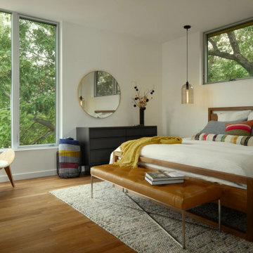
Nestled in the treetops overlooking Lake Sarah, this second-story addition was designed as both a retreat and an extension of home. Elevated above the shoreline, the new spaces immerse the homeowners in the beauty of their surroundings while supporting the rhythm of daily life.
The addition introduces a private guest en-suite for visiting family and friends, a quiet office for focused work, a cozy lounge for gathering, a dedicated ceramic studio for making, and an outdoor patio that connects seamlessly to views of the lake and woods.
Every space reflects the homeowners’ lifestyle—places where creativity can flourish, where moments of reflection are possible, and where memories with friends and family can be made. Natural light, framed views, and a strong connection to the outdoors guided the design, ensuring that each room feels both purposeful and restorative.
Outside, durable cement board siding, anodized aluminum Marvin windows, and composite decking ensure lasting performance. Inside, walnut flooring and custom millwork bring warmth and texture, balancing comfort with modern practicality
This project goes beyond adding square footage. It creates a sanctuary—an elevated experience of home where living, creating, and connecting come together in the treetops.
 Décor Aid
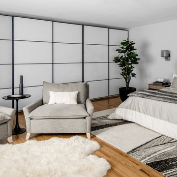
When an international client moved from Brazil to Stamford, Connecticut, they reached out to Decor Aid, and asked for our help in modernizing a recently purchased suburban home. The client felt that the house was too “cookie-cutter,” and wanted to transform their space into a highly individualized home for their energetic family of four.
In addition to giving the house a more updated and modern feel, the client wanted to use the interior design as an opportunity to segment and demarcate each area of the home. They requested that the downstairs area be transformed into a media room, where the whole family could hang out together. Both of the parents work from home, and so their office spaces had to be sequestered from the rest of the house, but conceived without any disruptive design elements. And as the husband is a photographer, he wanted to put his own artwork on display. So the furniture that we sourced had to balance the more traditional elements of the house, while also feeling cohesive with the husband’s bold, graphic, contemporary style of photography.
The first step in transforming this house was repainting the interior and exterior, which were originally done in outdated beige and taupe colors. To set the tone for a classically modern design scheme, we painted the exterior a charcoal grey, with a white trim, and repainted the door a crimson red. The home offices were placed in a quiet corner of the house, and outfitted with a similar color palette: grey walls, a white trim, and red accents, for a seamless transition between work space and home life.
The house is situated on the edge of a Connecticut forest, with clusters of maple, birch, and hemlock trees lining the property. So we installed white window treatments, to accentuate the natural surroundings, and to highlight the angular architecture of the home.
In the entryway, a bold, graphic print, and a thick-pile sheepskin rug set the tone for this modern, yet comfortable home. While the formal room was conceived with a high-contrast neutral palette and angular, contemporary furniture, the downstairs media area includes a spiral staircase, comfortable furniture, and patterned accent pillows, which creates a more relaxed atmosphere. Equipped with a television, a fully-stocked bar, and a variety of table games, the downstairs media area has something for everyone in this energetic young family.
Find the right local pro for your project
 The Brooklyn Studio
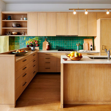
This residence was a complete gut renovation of a 4-story row house in Park Slope, and included a new rear extension and penthouse addition. The owners wished to create a warm, family home using a modern language that would act as a clean canvas to feature rich textiles and items from their world travels. As with most Brooklyn row houses, the existing house suffered from a lack of natural light and connection to exterior spaces, an issue that Principal Brendan Coburn is acutely aware of from his experience re-imagining historic structures in the New York area. The resulting architecture is designed around moments featuring natural light and views to the exterior, of both the private garden and the sky, throughout the house, and a stripped-down language of detailing and finishes allows for the concept of the modern-natural to shine.
Upon entering the home, the kitchen and dining space draw you in with views beyond through the large glazed opening at the rear of the house. An extension was built to allow for a large sunken living room that provides a family gathering space connected to the kitchen and dining room, but remains distinctly separate, with a strong visual connection to the rear garden. The open sculptural stair tower was designed to function like that of a traditional row house stair, but with a smaller footprint. By extending it up past the original roof level into the new penthouse, the stair becomes an atmospheric shaft for the spaces surrounding the core. All types of weather – sunshine, rain, lightning, can be sensed throughout the home through this unifying vertical environment. The stair space also strives to foster family communication, making open living spaces visible between floors. At the upper-most level, a free-form bench sits suspended over the stair, just by the new roof deck, which provides at-ease entertaining. Oak was used throughout the home as a unifying material element. As one travels upwards within the house, the oak finishes are bleached to further degrees as a nod to how light enters the home.
The owners worked with CWB to add their own personality to the project. The meter of a white oak and blackened steel stair screen was designed by the family to read “I love you” in Morse Code, and tile was selected throughout to reference places that hold special significance to the family. To support the owners’ comfort, the architectural design engages passive house technologies to reduce energy use, while increasing air quality within the home – a strategy which aims to respect the environment while providing a refuge from the harsh elements of urban living.
This project was published by Wendy Goodman as her Space of the Week, part of New York Magazine’s Design Hunting on The Cut.
Photography by Kevin Kunstadt

 Klopf Architecture
Set in a quiet neighborhood and framed by mature trees, this residence presented a unique opportunity: to thoughtfully evolve a custom mid-century modern home into a space that supports the everyday rhythms of a growing family. With a deep respect for the home’s original architecture, Klopf Architecture reimagined the house to better meet the needs of its owners—introducing functional improvements while preserving the spirit and character of its mid-century roots.
The clients approached Klopf Architecture with a clear vision: refresh their home while seamlessly integrating new programmatic elements. Key goals included clarifying and enhancing the entry sequence; connecting the detached garage to the main house with a practical yet architecturally intentional intervention; adding functional spaces such as a mudroom and laundry room; expanding and remodeling the primary suite’s bathroom and closet; and creating a more engaging outdoor space that capitalized on the site’s impressive views, featuring a fire pit and outdoor kitchen.
As a couple with distinct yet complementary perspectives—one focused on modern functionality and technology, and the other dedicated to preserving the home’s architectural integrity—their collaboration with Klopf Architecture resulted in a solution that harmonized both ideals. Their shared commitment to improving the livability of their home led to a design dialogue rooted in balance. This dynamic partnership shaped the direction of the renovation, ensuring that every decision honored the spirit of the original home while aligning with the practical needs of their growing family.
Designing within the constraints of the sloped site posed one of the project’s central challenges. The detached garage sat at a higher elevation than the main house, requiring a solution that ensured architectural and geometric compatibility between the two structures. Rather than create a purely utilitarian link, Klopf Architecture introduced an intentional connection that contributes to the overall architectural language. A notable pinch point in the plan—where differing geometries converged—was treated as a hinge point, turning a potentially awkward juncture into an architectural feature. This area now functions as both a transition and a moment of design interest that unifies the overall plan.
The design also addressed the underutilized outdoor area, which was located in a shadowed portion of the site with geometrical limitations. A new connection to the rear deck was created in this same area, making the outdoor space more useful and inviting. Klopf Architecture introduced carefully positioned openings and spatial improvements that forged a strong visual and functional connection between indoor and outdoor spaces. The outdoor area now reads as a deliberate extension of the home, embracing natural light and emphasizing the dramatic views.
Working through multiple design iterations, Klopf Architecture crafted a solution that preserved the architectural language of the original home while supporting the functional needs of modern life. The garage-to-house connection became more than a passage—it evolved into an architectural moment of transition. A new mudroom and laundry space enhanced convenience without compromising the clean lines of the design. The primary suite was expanded to create a private, serene retreat. The reimagined backyard, complete with fire pit and kitchen, now plays a vital role in the family’s daily routine and social life.
Outcomes and Lasting Impact
The result is a home that balances heritage with contemporary design, technical precision with design sensibility. The redesign not only met the clients’ initial goals but also exceeded expectations in its ability to seamlessly blend past and present, function and beauty, making the outdoor kitchen a favorite gathering place.
Beyond aesthetics, the renovation has significantly improved daily life for the family. The newly integrated garage connection has streamlined routines, providing a seamless transition between arriving home, storing belongings, and entering the main living spaces. The expanded primary suite offers a retreat-like atmosphere, creating a private space to unwind at the end of the day. The redesigned outdoor areas have also become an extension of their lifestyle—whether it's casual family dinners around the fire pit, entertaining friends in the outdoor kitchen, or simply enjoying the view from the reimagined backyard.
Through a thoughtful and strategic approach, the house has been successfully evolved into a home that remains true to its mid-century modern roots while enhancing livability, functionality, and the overall quality of life for the modern-day owners.
Klopf Architecture Team: Geoffrey Campen, Fernanda Bernardes
Architectural Interior Design: Klopf Architecture
Structural Engineer: Base Design Inc.
Contractor: Golden Snail Builders
Photography: Mariko Reed
Year Completed:2022
 Thyme & Place Design LLC
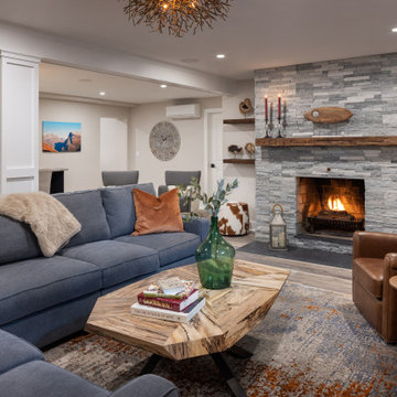
When my client had to move from her company office to work at home, she set up in the dining room. Despite her best efforts, this was not the long-term solution she was looking for. My client realized she needed a dedicated space not on the main floor of the home. On one hand, having your office space right next to the kitchen is handy. On the other hand, it made separating work and home life was not that easy.
The house was a ranch. In essence, the basement would run entire length of the home. As we came down the steps, we entered a time capsule. The house was built in the 1950’s. The walls were covered with original knotty pine paneling. There was a wood burning fireplace and considering this was a basement, high ceilings. In addition, there was everything her family could not store at their own homes. As we wound though the space, I though “wow this has potential”, Eventually, after walking through the laundry room we came to a small nicely lit room. This would be the office.
My client looked at me and asked what I thought. Undoubtedly, I said, this can be a great workspace, but do you really want to walk through this basement and laundry to get here? Without reservation, my client said where do we start?
Once the design was in place, we started the renovation. The knotty pine paneling had to go. Specifically, to add some insulation and control the dampness and humidity. The laundry room wall was relocated to create a hallway to the office.
At the far end of the room, we designated a workout zone. Weights, mats, exercise bike and television are at the ready for morning or afternoon workouts. The space can be concealed by a folding screen for party time. Doors to an old closet under the stairs were relocated to the workout area for hidden storage. Now we had nice wall for a beautiful console and mirror for storage and serving during parties.
In order to add architectural details, we covered the old ugly support columns with simple recessed millwork panels. This detail created a visual division between the bar area and the seating area in front of the fireplace. The old red brick on the fireplace surround was replaced with stack stone. A mantle was made from reclaimed wood. Additional reclaimed wood floating shelves left and right of the fireplace provides decorative display while maintaining a rustic element balancing the copper end table and leather swivel rocker.
We found an amazing rug which tied all of the colors together further defining the gathering space. Russet and burnt orange became the accent color unifying each space. With a bit of whimsy, a rather unusual light fixture which looks like roots from a tree growing through the ceiling is a conversation piece.
The office space is quite and removed from the main part of the basement. There is a desk large enough for multiple screens, a small bookcase holding office supplies and a comfortable chair for conference calls. Because working from home requires many online meetings, we added a shiplap wall painted in Hale Navy to contrast with the orange fabric on the chair. We finished the décor with a painting from my client’s father. This is the background online visitors will see.
The last and best part of the renovation is the beautiful bar. My client is an avid collector of wine. She already had the EuroCave refrigerator, so I incorporated it into the design. The cabinets are painted Temptation Grey from Benjamin Moore. The counter tops are my favorite hard working quartzite Brown Fantasy. The backsplash is a combination of rustic wood and old tin ceiling like porcelain tiles. Together with the textures of the reclaimed wood and hide poofs balanced against the smooth finish of the cabinets, we created a comfortable luxury for relaxing.
There is ample storage for bottles, cans, glasses, and anything else you can think of for a great party. In addition to the wine storage, we incorporated a beverage refrigerator, an ice maker, and a sink. Floating shelves with integrated lighting illuminate the back bar. The raised height of the front bar provides the perfect wine tasting and paring spot. I especially love the pendant lights which look like wine glasses.
Finally, I selected carpet for the stairs and office. It is perfect for noise reduction. Meanwhile for the overall flooring, I specifically selected a high-performance vinyl plank floor. We often use this product as it is perfect to install on a concrete floor. It is soft to walk on, easy to clean and does not reduce the overall height of the space.
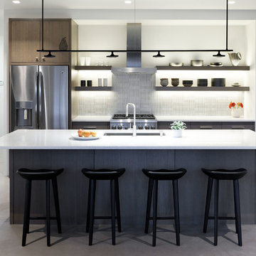
 Jess Pedersen Architecture
PHOTOS: Mountain Home Photo
CONTRACTOR: 3C Construction
Main level living: 1455 sq ft
Upper level Living: 1015 sq ft
Guest Wing / Office: 520 sq ft
Total Living: 2990 sq ft
Studio Space: 1520 sq ft
2 Car Garage : 575 sq ft
General Contractor: 3C Construction: Steve Lee
The client, a sculpture artist, and his wife came to J.P.A. only wanting a studio next to their home. During the design process it grew to having a living space above the studio, which grew to having a small house attached to the studio forming a compound. At this point it became clear to the client; the project was outgrowing the neighborhood. After re-evaluating the project, the live / work compound is currently sited in a natural protected nest with post card views of Mount Sopris & the Roaring Fork Valley. The courtyard compound consist of the central south facing piece being the studio flanked by a simple 2500 sq ft 2 bedroom, 2 story house one the west side, and a multi purpose guest wing /studio on the east side. The evolution of this compound came to include the desire to have the building blend into the surrounding landscape, and at the same time become the backdrop to create and display his sculpture.
“Jess has been our architect on several projects over the past ten years. He is easy to work with, and his designs are interesting and thoughtful. He always carefully listens to our ideas and is able to create a plan that meets our needs both as individuals and as a family. We highly recommend Jess Pedersen Architecture”.
- Client
“As a general contractor, I can highly recommend Jess. His designs are very pleasing with a lot of thought put in to how they are lived in. He is a real team player, adding greatly to collaborative efforts and making the process smoother for all involved. Further, he gets information out on or ahead of schedule. Really been a pleasure working with Jess and hope to do more together in the future!”
Steve Lee - 3C Construction

Sponsored
Columbus, OH

Hope Restoration & General Contracting
Columbus Design-Build, Kitchen & Bath Remodeling, Historic Renovations
 Gallery KBNY
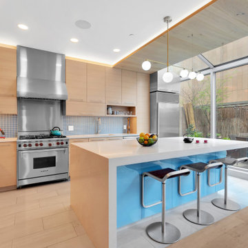
For our full gut renovation of this Manhattan loft penthouse, we partnered with architecture firm Todd Zwigard Architects. Many of our clients know us as experts in the full design-build approach, where we handle every aspect of the project. But in this case, architectural plans were already drawn, the full schedule was finished, and our clients needed a partner to execute on the architectural plans – enter Gallery. Construction management is as vital to a project as the design phase, so we’re happy to offer our expertise in this type of scenario.
A DIFFERENT APPROACH
Construction and design are often the face of most renovations, but the planning and follow-through are naturally just as necessary to make it all come together. The project itself was a fairly straightforward gut renovation of the loft. Everything was included: new floors, a new kitchen, new bathrooms, new lighting. Our task was to manage every aspect of the construction, ensuring that the planning work of Todd Zwigard Architects was executed to the exact vision imagined for this Manhattan loft renovation.
CONTEMPORARY GOES ECLECTIC
Although we didn’t contribute to the aesthetic of the interior design in this project, we did carry out the plans that brought it life. The tone was very modern, with some eclectic touches. The kitchen, featuring an island with a baby blue lacquered finish, blends contemporary clean lines into an industrial-tinged, almost futuristic aesthetic. Reclaimed wooden doors and art pieces collected throughout the years are an ode to the client's travels, an artistic touch from Todd Zwigard Architects.
LET’S TALK
Quality of work is of course important, but there are several components of construction management that are equally vital: communication; processes that make sure you're able to adhere to schedules; protocols with both safety and communication. You might say this is the nerding out of the construction process. It’s not often the face of a project, but it’s absolutely massive in terms of carrying out a successful renovation, whether it’s a penthouse loft in Manhattan, a condo in Prospect Heights, or a kitchen in a Brooklyn brownstone. Quality construction management is probably one of the biggest ways to separate professional contractors from those who aren’t.
ART FROM CHAOS
This was such a large project, so our ability to procure and source all the finishes and fixtures was hugely important to our clients. The sheer number of floors, tiles, and plumbing fixtures alone that need to be ordered, in addition to everything else, plus figuring out lead times, shipments, deliveries, and inspections. It can quickly become chaotic, but there’s an art to the planning and organization, and we’ve mastered it.
The larger a project is, the more likely that havoc will rear its head. The antidote is not only really proper planning and construction management, as we achieved in this Manhattan loft penthouse renovation, but also a great working relationship with everyone else involved in the project: contractors, architect, and clients alike.
GET IN TOUCH
Is a loft renovation in New York in your future? We’re experts in renovating New York homes, from apartment combinations in managed buildings to kitchens and bathrooms in co-ops and condos to gut renovations of historic spaces and landmark renovations.
Contact us to learn more about our approach as a design-and-build firm, where all aspects of your project are handled under the same roof. In addition to construction management, you’ll get our in-house architect in-house and the added renovation benefits of experts in design, material selection, and paperwork.
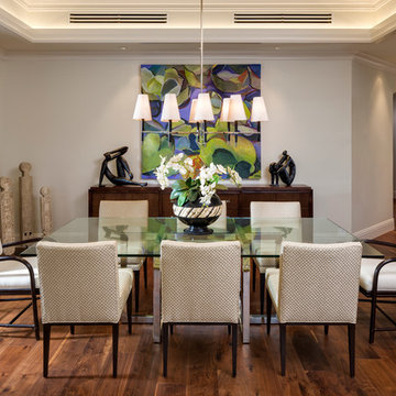
 41 West
Here's what our clients from this project had to say:
We LOVE coming home to our newly remodeled and beautiful 41 West designed and built home! It was such a pleasure working with BJ Barone and especially Paul Widhalm and the entire 41 West team. Everyone in the organization is incredibly professional and extremely responsive. Personal service and strong attention to the client and details are hallmarks of the 41 West construction experience. Paul was with us every step of the way as was Ed Jordon (Gary David Designs), a 41 West highly recommended designer. When we were looking to build our dream home, we needed a builder who listened and understood how to bring our ideas and dreams to life. They succeeded this with the utmost honesty, integrity and quality!
41 West has exceeded our expectations every step of the way, and we have been overwhelmingly impressed in all aspects of the project. It has been an absolute pleasure working with such devoted, conscientious, professionals with expertise in their specific fields. Paul sets the tone for excellence and this level of dedication carries through the project. We so appreciated their commitment to perfection...So much so that we also hired them for two more remodeling projects.
We love our home and would highly recommend 41 West to anyone considering building or remodeling a home.
 Domus Constructors, LLC.
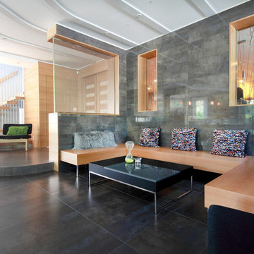
“Compelling.” That’s how one of our judges characterized this stair, which manages to embody both reassuring solidity and airy weightlessness. Architect Mahdad Saniee specified beefy maple treads—each laminated from two boards, to resist twisting and cupping—and supported them at the wall with hidden steel hangers. “We wanted to make them look like they are floating,” he says, “so they sit away from the wall by about half an inch.” The stainless steel rods that seem to pierce the treads’ opposite ends are, in fact, joined by threaded couplings hidden within the thickness of the wood. The result is an assembly whose stiffness underfoot defies expectation, Saniee says. “It feels very solid, much more solid than average stairs.” With the rods working in tension from above and compression below, “it’s very hard for those pieces of wood to move.”
The interplay of wood and steel makes abstract reference to a Steinway concert grand, Saniee notes. “It’s taking elements of a piano and playing with them.” A gently curved soffit in the ceiling reinforces the visual rhyme. The jury admired the effect but was equally impressed with the technical acumen required to achieve it. “The rhythm established by the vertical rods sets up a rigorous discipline that works with the intricacies of stair dimensions,” observed one judge. “That’s really hard to do.”
 Drewett Works
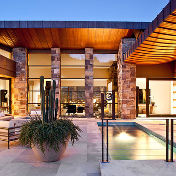
Designed to embrace an extensive and unique art collection including sculpture, paintings, tapestry, and cultural antiquities, this modernist home located in north Scottsdale’s Estancia is the quintessential gallery home for the spectacular collection within. The primary roof form, “the wing” as the owner enjoys referring to it, opens the home vertically to a view of adjacent Pinnacle peak and changes the aperture to horizontal for the opposing view to the golf course. Deep overhangs and fenestration recesses give the home protection from the elements and provide supporting shade and shadow for what proves to be a desert sculpture. The restrained palette allows the architecture to express itself while permitting each object in the home to make its own place. The home, while certainly modern, expresses both elegance and warmth in its material selections including canterra stone, chopped sandstone, copper, and stucco.
Project Details | Lot 245 Estancia, Scottsdale AZ
Architect: C.P. Drewett, Drewett Works, Scottsdale, AZ
Interiors: Luis Ortega, Luis Ortega Interiors, Hollywood, CA
Publications: luxe. interiors + design. November 2011.
Featured on the world wide web: luxe.daily
Photos by Grey Crawford
 Vintage Cellars - Luxury Custom Wine Cellars LA
An existing wine cellar in a La Jolla, San Diego home was expanded to accommodate the growing collection of the owner.
We worked on this project twice. The first installation was completed in 2008. After about 5 years, the client requested us to double the capacity of their wine room, but maintain the contemporary design.
We added new sections to the existing racking to provide additional space for more wines. Stunning Wine Cellar for a Contemporary Home
We completed a wine cellar installation project in La Jolla, an affluent city of San Diego, California, where we had to match the contemporary design of the home. The beautiful residential space was originally built with glass and wood.
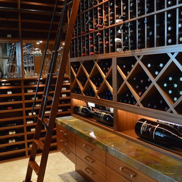
All the woodworking was constructed from Sapele Mahogany, which is common in many parts of the house. The cabinetry and furniture had to be the same tone and material.
We have worked on this project twice. The first time was in 2008 and the second one was in 2013. We needed to expand and double the size of the custom wine cellar.
A very integral part of this homeowner’s life is their wine and the collecting of wine. Our main goal was to create a racking design that consists of various orientations to allow the owner to store different sizes of bottles.
Racking Features of the La Jolla Custom Wine Cellar
The original room was constructed when the home was built. The architect, designing team, and contractor gave us a palette to match the existing cabinetry.
The owners didn’t know what their needs were going to be. When they buy cases of wine, for example, they just put some of the bottles in the diamond bins and some in individual bottle spaces.
In 2013, we tried to make the racking as universal as possible. The original capacity of the wine room was 1,100 bottles. It increased to 1,624 after the expansion of the space and adding more wine racks.
Elevation 1
The first area of the room consists of racking for individual storage at the top section, with a VC-style cover for concealing the evaporator. There are diamond bins in the middle that can store nine bottles in each opening.
We added many slots for large format bottles below the diamond bins because the owners stored bigger bottles in the first room, as big as 9 liters. What we did was to open up a couple of spaces to create a wider wine storage area.
The whole racking in this area has a solid end panel. We took out the vertical supports and put the beam supports across to bear the load.
We incorporated a coved tray feature to allow the owners to get a feel for the beautiful bottles in their collection. The large format bottles are stored in various heights, resulting in a cascading wine display. This style of racking allows for easy visibility of the wine labels. We installed LED lighting above this area to illuminate the space dramatically without emitting too much heat.
Elevation 2
The next racking is labeled Elevation 2, which is the left wall that you will pass by before you go into the other storage area. It consists of horizontal display racks that can store both standard and larger bottles. These display racks, which are 8 ¼” deep, were installed with lighting and mirror at the back.
The middle section has two glass shelves that provide an area for the client’s wine cellar accessories and mini car collection.
Elevation 3
On the 3rd Elevation, the top racking includes slots with twelve coved trays and six solid backs. We added new individual column wine racks, and custom cabinets with scalloped neck supports to the existing cabinetry. Now, the total capacity of the individual bottle racking is 384, and the custom cabinets can accommodate 34 bottles.
There is a double deep Sapele Mahogany tabletop where we installed very large steel supports under it. This will provide structural stability for bearing the weight of this big case storage area. The homeowner buys a lot of wine, so he wanted to have an area where he could stack all the boxes.
He didn’t want the boxes to occupy the area at the front. With this feature, he could just bring the wines directly to this storage area, without affecting the aesthetic appeal of the front entrance of his La Jolla custom wine cellar.
Elevations 4 and 5
The next wall is Elevation 4, which consists of wine racks for 98 magnum bottles. The top most section has a VC-style evaporator cover.
Elevation 5 (in front of elevation 3), had twelve coved trays, 16-bottle custom cabinets with scalloped neck supports, and one hundred eighty individual storage slots.
After adding new sections, we ended up having sixteen coved trays, 26-bottle custom cabinets, and 288 individual bottle racking.
Rolling Ladder for Easy Access of Wines
Another factor that we consider when designing a wine room is the convenience in accessing the bottles. Since the ceiling of this La Jolla custom wine cellar was tall (about 124” height), we added a hook rolling ladder.
A hook ladder has fixtures that allow it to slide along the rail and can be lifted off the rail if you want to transfer it to another section of the racking on a different wall.
Vintage Cellars has built gorgeous custom wine cellars and wine storage rooms across the United States and World for over 25 years. We are your go-to business for anything wine cellar and wine storage related! Whether you're interested in a wine closet, wine racking, custom wine racks, a custom wine cellar door, or a cooling system for your existing space, Vintage Cellars has you covered!
We carry all kinds of wine cellar cooling and refrigeration systems, incuding: Breezaire, CellarCool, WhisperKool, Wine Guardian, CellarPro and Commercial systems.
We also carry many types of Wine Refrigerators, Wine Cabinets, and wine racking types, including La Cache, Marvel, N'Finity, Transtherm, Vinotheque, Vintage Series, Credenza, Walk in wine rooms, Climadiff, Riedel, Fontenay, and VintageView.
Vintage Cellars also does work in many styles, including Contemporary and Modern, Rustic, Farmhouse, Traditional, Craftsman, Industrial, Mediterranean, Mid-Century, Industrial and Eclectic.
Some locations we cover often include: San Diego, Rancho Santa Fe, Corona Del Mar, Del Mar, La Jolla, Newport Beach, Newport Coast, Huntington Beach, Del Mar, Solana Beach, Carlsbad, Orange County, Beverly Hills, Malibu, Pacific Palisades, Santa Monica, Bel Air, Los Angeles, Encinitas, Cardiff, Coronado, Manhattan Beach, Palos Verdes, San Marino, Ladera Heights, Santa Monica, Brentwood, Westwood, Hancock Park, Laguna Beach, Crystal Cove, Laguna Niguel, Torrey Pines, Thousand Oaks, Coto De Caza, Coronado Island, San Francisco, Danville, Walnut Creek, Marin, Tiburon, Hillsborough, Berkeley, Oakland, Napa, Sonoma, Agoura Hills, Hollywood Hills, Laurel Canyon, Sausalito, Mill Valley, San Rafael, Piedmont, Paso Robles, Carmel, Pebble Beach
Contact Vintage Cellars today with any of your Wine Cellar needs!
(800) 876-8789
Vintage Cellars
904 Rancheros Drive
San Marcos, California 92069
(800) 876-8789
 Cummings Architecture + Interiors
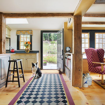
The historic restoration of this First Period Ipswich, Massachusetts home (c. 1686) was an eighteen-month project that combined exterior and interior architectural work to preserve and revitalize this beautiful home. Structurally, work included restoring the summer beam, straightening the timber frame, and adding a lean-to section. The living space was expanded with the addition of a spacious gourmet kitchen featuring countertops made of reclaimed barn wood. As is always the case with our historic renovations, we took special care to maintain the beauty and integrity of the historic elements while bringing in the comfort and convenience of modern amenities. We were even able to uncover and restore much of the original fabric of the house (the chimney, fireplaces, paneling, trim, doors, hinges, etc.), which had been hidden for years under a renovation dating back to 1746.
Winner, 2012 Mary P. Conley Award for historic home restoration and preservation
You can read more about this restoration in the Boston Globe article by Regina Cole, “A First Period home gets a second life.” http://www.bostonglobe.com/magazine/2013/10/26/couple-rebuild-their-century-home-ipswich/r2yXE5yiKWYcamoFGmKVyL/story.html
Photo Credit: Eric Roth

Sponsored
Columbus, OH

Wannemacher Interiors
Customized Award-Winning Interior Design Solutions in Franklin Cnty OH
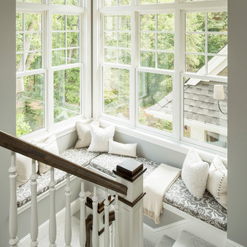
 O’Hara Interiors
Martha O'Hara Interiors, Interior Design | L. Cramer Builders + Remodelers, Builder | Troy Thies, Photography | Shannon Gale, Photo Styling
Please Note: All “related,” “similar,” and “sponsored” products tagged or listed by Houzz are not actual products pictured. They have not been approved by Martha O’Hara Interiors nor any of the professionals credited. For information about our work, please contact design@oharainteriors.com.
 FineLine Kitchens, Inc.
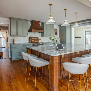
Hi everyone, I'm Sarah and Ogun we are here with fine line kitchens. So we are a couple working together. I do the interior design and remodeling of the space material selection meeting with the clients. And I handled operations outside, you know meaning all the construction work that is taking place the inside. The houses that we work in. I handle all the aspects of the construction, so today's project is very special. We're in Vienna and the client had a very big family. It's a family of seven that lives here. So we had a few aspects that we needed to keep in mind while designing this one. Having everybody be able to sit on the island. So we wanted plenty of seating all the way around. We didn't want anybody standing or anything like that. So what we did is we maximize the space. The center island is the biggest part of the kitchen. We use a natural stone to kind of give it a beautiful texture versus quartz. It's kind of standard white or kind of fabricated, so I wanted something very natural. We did this because I took my inspiration from the outside, so the inspiration if you look at the view right in front of me is there are so many greens there's a lot of brass accents and I wanted to bring this. Into this kitchen while designing it for my clients. She is very warm very. She wanted a very homey, comfy kind of look for the kitchen. So that's what we did today. As you can see, the cabinets are sage green, very light, so I still think it's a neutral, but it's a lighter color that again brings the outside in and we combine that with the oak right behind me so it's a slightly warm oak. It's not very dark. It's not very light. It's a medium brown and the same color went on the island. To kind of tie these two in and the backsplash, my favorite part is where you can see a little bit of design. It is, in my opinion still classic, but includes a pattern so the outside part is as we said in the beginning, is handled by my husband. I'd like him to speak a little bit about that. Thanks, Sarah, I want to talk to you guys a little bit about the construction part of this project. Originally this kitchen was located mostly in this area. They had their stove there sing. It was more of a peninsula layout in Sarah's and the customer vision they wanted. They wanted to get rid of the peninsula and they want to be able to have a huge island that can at least sit seven people because they're familiar with seven. So we wanted to make sure that we can achieve this design and bring it to life so that they can be happy with this layout. Some of the challenges we had, the house, the home being, you know, old home. There were a lot of you know the older electrical and plumbing that had to be replaced. We had to relocate the stove from here to this area. Over here we had put a nice foot fan that we had to relocate all the ductwork and the plumbing. Was being on the peninsula area. We had to relocate it to the center islands. So we achieved all this and kind of like bring it to bring in this kitchen up to date it looks beautiful. That's true, so yes, the old layout did not function for my clients because everything was kind of gathered on one side of the kitchen. So there was like a peninsula right there. So the end of this island kind of continued straight. And that was just the L shape. Kind of where everything was and there used to be another big table here, so they were using only kind of half of the space. So like I said at the beginning, our vision was to kind of feed everybody at the island, create some symmetry. 'cause I love that. So as you can see behind me, this is kind of the focal point symmetrical. Everything is kind of even we wanted to also panel the fridge here so it mimics the pantry and another size. So when you're looking at it, it is bringing again that symmetry back again. I hope you enjoyed this kitchen and this video and I'll see you soon. So how do you think this project turned out? It's nice. I like the color. I think it turned out nice. It's kind of like a little bit different color than what we always do. So I realize. Are you giving me a little bit of credit here that I did something different? Are you proud? I'm so proud of you. Other than that I like it. That they have kind of like a two sink. So if this was our kitchen, if we ever like you can have your own. I can have mine if we ever get into a fight then this can be like my own kitchen. Why are we gonna bring in a fight right now? So I'm cooking anyway. You're grilling most of the time, So what are you even talking about? My kitchen? That's my kitchen. You can just take the small sink. That's fine. It's always good to have your own space right there, so anyways. Thank you guys for watching. We hope to see you soon and if you have any questions please click the link below. It'll lead you to our website, house, YouTube and all of the social media is so nice to have you guys. We'll see you soon. Thanks bye bye-bye.
 Reico Kitchen & Bath
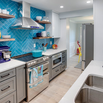
Designed by Akram Aljahmi of Reico Kitchen & Bath in King of Prussia, PA in collaboration with Property Remodeling Group, this transitional inspired kitchen design features white and grey finishes complemented by a bold splash of blue tile.
The kitchen design features Merillat Classic kitchen cabinets in Portrait door style with 5 piece drawer head in 2 finishes. The wall cabinets features a painted white Cotton finish and the base cabinets feature a painted grey Graphite finish. Kitchen countertops are engineered quartz in the color Carrera Marmi from Q by MSI. The kitchen also features a stunning blue herringbone tile back splash with 3x10 tiles.
According to the client, "Akram solved a fundamental function problem that I could not see a solution for. His re-imagining of how the main floor of our home could function was a dramatic shift that I can't wait to experience as part of day-to-day life. Really appreciate his space plan and layout, as well as his support selecting finishes. Akram and team were great to work with!".
Photos courtesy of BTW Images LLC.
 JL Interiors
Builder/Designer/Owner – Masud Sarshar
Photos by – Simon Berlyn, BerlynPhotography
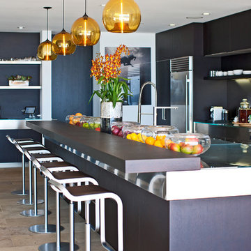
Our main focus in this beautiful beach-front Malibu home was the view. Keeping all interior furnishing at a low profile so that your eye stays focused on the crystal blue Pacific. Adding natural furs and playful colors to the homes neutral palate kept the space warm and cozy. Plants and trees helped complete the space and allowed “life” to flow inside and out. For the exterior furnishings we chose natural teak and neutral colors, but added pops of orange to contrast against the bright blue skyline.
This open floor plan kitchen, living room, dining room, and staircase. Owner wanted a transitional flare with mid century, industrial, contemporary, modern, and masculinity. Perfect place to entertain and dine with friends.
JL Interiors is a LA-based creative/diverse firm that specializes in residential interiors. JL Interiors empowers homeowners to design their dream home that they can be proud of! The design isn’t just about making things beautiful; it’s also about making things work beautifully. Contact us for a free consultation Hello@JLinteriors.design _ 310.390.6849_ www.JLinteriors.design

Sponsored
Delaware, OH

Buckeye Basements, Inc.
Central Ohio's Basement Finishing ExpertsBest Of Houzz '13-'21
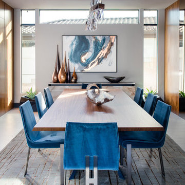
 Cantoni Irvine
Design by Blue Heron in Partnership with Cantoni. Photos By: Stephen Morgan
For many, Las Vegas is a destination that transports you away from reality. The same can be said of the thirty-nine modern homes built in The Bluffs Community by luxury design/build firm, Blue Heron. Perched on a hillside in Southern Highlands, The Bluffs is a private gated community overlooking the Las Vegas Valley with unparalleled views of the mountains and the Las Vegas Strip. Indoor-outdoor living concepts, sustainable designs and distinctive floorplans create a modern lifestyle that makes coming home feel like a getaway.
To give potential residents a sense for what their custom home could look like at The Bluffs, Blue Heron partnered with Cantoni to furnish a model home and create interiors that would complement the Vegas Modern™ architectural style. “We were really trying to introduce something that hadn’t been seen before in our area. Our homes are so innovative, so personal and unique that it takes truly spectacular furnishings to complete their stories as well as speak to the emotions of everyone who visits our homes,” shares Kathy May, director of interior design at Blue Heron. “Cantoni has been the perfect partner in this endeavor in that, like Blue Heron, Cantoni is innovative and pushes boundaries.”
Utilizing Cantoni’s extensive portfolio, the Blue Heron Interior Design team was able to customize nearly every piece in the home to create a thoughtful and curated look for each space. “Having access to so many high-quality and diverse furnishing lines enables us to think outside the box and create unique turnkey designs for our clients with confidence,” says Kathy May, adding that the quality and one-of-a-kind feel of the pieces are unmatched.
rom the perfectly situated sectional in the downstairs family room to the unique blue velvet dining chairs, the home breathes modern elegance. “I particularly love the master bed,” says Kathy. “We had created a concept design of what we wanted it to be and worked with one of Cantoni’s longtime partners, to bring it to life. It turned out amazing and really speaks to the character of the room.”
The combination of Cantoni’s soft contemporary touch and Blue Heron’s distinctive designs are what made this project a unified experience. “The partnership really showcases Cantoni’s capabilities to manage projects like this from presentation to execution,” shares Luca Mazzolani, vice president of sales at Cantoni. “We work directly with the client to produce custom pieces like you see in this home and ensure a seamless and successful result.”
And what a stunning result it is. There was no Las Vegas luck involved in this project, just a sureness of style and service that brought together Blue Heron and Cantoni to create one well-designed home.
To learn more about Blue Heron Design Build, visit www.blueheron.com.
 Thyme & Place Design LLC
When my client had to move from her company office to work at home, she set up in the dining room. Despite her best efforts, this was not the long-term solution she was looking for. My client realized she needed a dedicated space not on the main floor of the home. On one hand, having your office space right next to the kitchen is handy. On the other hand, it made separating work and home life was not that easy.
The house was a ranch. In essence, the basement would run entire length of the home. As we came down the steps, we entered a time capsule. The house was built in the 1950’s. The walls were covered with original knotty pine paneling. There was a wood burning fireplace and considering this was a basement, high ceilings. In addition, there was everything her family could not store at their own homes. As we wound though the space, I though “wow this has potential”, Eventually, after walking through the laundry room we came to a small nicely lit room. This would be the office.
My client looked at me and asked what I thought. Undoubtedly, I said, this can be a great workspace, but do you really want to walk through this basement and laundry to get here? Without reservation, my client said where do we start?
Once the design was in place, we started the renovation. The knotty pine paneling had to go. Specifically, to add some insulation and control the dampness and humidity. The laundry room wall was relocated to create a hallway to the office.
At the far end of the room, we designated a workout zone. Weights, mats, exercise bike and television are at the ready for morning or afternoon workouts. The space can be concealed by a folding screen for party time. Doors to an old closet under the stairs were relocated to the workout area for hidden storage. Now we had nice wall for a beautiful console and mirror for storage and serving during parties.
In order to add architectural details, we covered the old ugly support columns with simple recessed millwork panels. This detail created a visual division between the bar area and the seating area in front of the fireplace. The old red brick on the fireplace surround was replaced with stack stone. A mantle was made from reclaimed wood. Additional reclaimed wood floating shelves left and right of the fireplace provides decorative display while maintaining a rustic element balancing the copper end table and leather swivel rocker.
We found an amazing rug which tied all of the colors together further defining the gathering space. Russet and burnt orange became the accent color unifying each space. With a bit of whimsy, a rather unusual light fixture which looks like roots from a tree growing through the ceiling is a conversation piece.
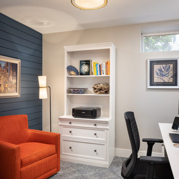
The office space is quite and removed from the main part of the basement. There is a desk large enough for multiple screens, a small bookcase holding office supplies and a comfortable chair for conference calls. Because working from home requires many online meetings, we added a shiplap wall painted in Hale Navy to contrast with the orange fabric on the chair. We finished the décor with a painting from my client’s father. This is the background online visitors will see.
The last and best part of the renovation is the beautiful bar. My client is an avid collector of wine. She already had the EuroCave refrigerator, so I incorporated it into the design. The cabinets are painted Temptation Grey from Benjamin Moore. The counter tops are my favorite hard working quartzite Brown Fantasy. The backsplash is a combination of rustic wood and old tin ceiling like porcelain tiles. Together with the textures of the reclaimed wood and hide poofs balanced against the smooth finish of the cabinets, we created a comfortable luxury for relaxing.
There is ample storage for bottles, cans, glasses, and anything else you can think of for a great party. In addition to the wine storage, we incorporated a beverage refrigerator, an ice maker, and a sink. Floating shelves with integrated lighting illuminate the back bar. The raised height of the front bar provides the perfect wine tasting and paring spot. I especially love the pendant lights which look like wine glasses.
Finally, I selected carpet for the stairs and office. It is perfect for noise reduction. Meanwhile for the overall flooring, I specifically selected a high-performance vinyl plank floor. We often use this product as it is perfect to install on a concrete floor. It is soft to walk on, easy to clean and does not reduce the overall height of the space.
 J Design Group - Interior Designers Miami - Modern
Ocean front, Luxury home in Miami Beach
Projects by J Design Group, Your friendly Interior designers firm in Miami, FL. at your service.
AVENTURA MAGAZINE selected our client’s luxury 5000 Sf ocean front apartment in Miami Beach, to publish it in their issue and they Said:
Story by Linda Marx, Photography by Daniel Newcomb
Light & Bright
New York snowbirds redesigned their Miami Beach apartment to take advantage of the tropical lifestyle.
New York snowbirds redesigned their Miami Beach apartment to take advantage of the tropical lifestyle.
WHEN INTERIOR DESIGNER JENNIFER CORREDOR was asked to recreate a four-bedroom, six-bath condominium at The Bath Club in Miami Beach, she seized the opportunity to open the rooms and better utilize the vast ocean views.
In five months last year, the designer transformed a dark and closed 5,000-square-foot unit located on a high floor into a series of sweeping waterfront spaces and updated the well located apartment into a light and airy retreat for a sports-loving family of five.
“They come down from New York every other weekend and wanted to make their waterfront home a series of grand open spaces,” says Jennifer Corrredor, of the J. Design Group in Miami, a firm specializing in modern and contemporary interiors. “Since many of the rooms face the ocean, it made sense to open and lighten up the home, taking advantage of the awesome views of the sea and the bay.”
The designer used 40 x 40 all white tile throughout the apartment as a clean base. This way, her sophisticated use of color would stand out and bring the outdoors in.
The close-knit family members—two parents and three boys in college—like to do things together. But there were situations to overcome in the process of modernizing and opening the space. When Jennifer Corredor was briefed on their desires, nothing seemed too daunting. The confident designer was ready to delve in. For example, she fixed an area at the front door
that was curved. “The wood was concave so I straightened it out,” she explains of a request from the clients. “It was an obstacle that I overcame as part of what I do in a redesign. I don’t consider it a difficult challenge. Improving what I see is part of the process.”
She also tackled the kitchen with gusto by demolishing a wall. The kitchen had formerly been enclosed, which was a waste of space and poor use of available waterfront ambience. To create a grand space linking the kitchen to the living room and dining room area, something had to go. Once the wall was yesterday’s news, she relocated the refrigerator and freezer (two separate appliances) to the other side of the room. This change was a natural functionality in the new open space. “By tearing out the wall, the family has a better view of the kitchen from the living and dining rooms,” says Jennifer Corredor, who also made it easier to walk in and out of one area and into the other. “The views of the larger public space and the surrounding water are breathtaking.
Opening it up changed everything.”
They clients can now see the kitchen from the living and dining areas, and at the same time, dwell in an airy and open space instead of feeling stuck in a dark enclosed series of rooms. In fact, the high-top bar stools that Jennifer Corredor selected for the kitchen can be twirled around to use for watching TV in the living room.
In keeping with the theme of moving seamlessly from one room to the other, Corredor designed a subtle wall of glass in the living room along with lots of comfortable seating. This way, all family members feel at ease while relaxing, talking, or watching sporting events on the large flat screen television. “For this room, I wanted more open space, light and a supreme airy feeling,” she says. “With the glass design making a statement, it quickly became the star of the show.”…….
….. To add texture and depth, Jennifer Corredor custom created wood doors here, and in other areas of the home. They provide a nice contrast to the open Florida tropical feel. “I added character to the openness by using exotic cherry wood,” she says. “I repeated this throughout the home and it works well.”
Known for capturing the client’s vision while adding her own innovative twists, Jennifer Corredor lightened the family room, giving it a contemporary and modern edge with colorful art and matching throw pillows on the sofas. She added a large beige leather ottoman as the center coffee table in the room. This round piece was punctuated with a bold-toned flowering plant atop. It effortlessly matches the pillows and colors of the contemporary canvas.
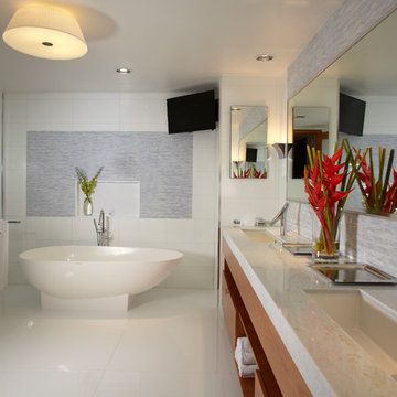
Jennifer Corredor also gutted all of the bathrooms, resulting in a major redesign of the master. She jettisoned the whirlpool and created the dazzling illusion of a floating tub. From an area where there were two toilets, she eliminated one to make a grand rectangular shower, which became an overall showpiece. The master bath went from being just a functional water closet to a sophisticated spa-like space. “The client said I was ‘delicious’ after seeing the change,” laughed Jennifer Corredor, who emphasized that her clients love their part-time life in South Florida more each time they come down. Even when the husband has to work from their Miami Beach digs, he is surrounded by tropical beauty. For instance, there are times when the master bedroom must double as the husband’s home office.
The room had to be large enough to accommodate a working space for this purpose. So Jennifer Corredor placed an appropriate table near the window and across from the king-size bed. “No blocking of the amazing water view was necessary,” she says. “I kept an open space with a lot of white so It functions well and the work space fits right in.” She repeated the bold modern art in the room as well as in the guest bedroom, which also has a workspace for the sons when they are home from school and need to study.
The designer is still happy and glowing with the results of her toil in this apartment. She gets a “spiritual feeling” when she walks inside. “It is so peaceful and serene, with subtle hints of explosive statements,” she says. “The entire space is open, yet anchored by the warmth of the exotic woods.” The client wrote Jennifer Corredor a letter at the end of the project congratulating her on a
job well done. She revealed that owning a Miami Beach home was her husband’s dream 30 years ago. “Now we have a quality perfect yet practical home,” she wrote to the designer. “You solved the challenges, and the end
result far exceeds our expectations. We love it.”
Thanks for your interest in our Contemporary Interior Design projects and if you have any question please do not hesitate to ask us.
http://www.JDesignGroup.com
305.444.4611
Modern Interior designer Miami. Contemporary
Miami
Miami Interior Designers
Miami Interior Designer
Interior Designers Miami
Interior Designer Miami
Modern Interior Designers
Modern Interior Designer
Modern interior decorators
Modern interior decorator
Contemporary Interior Designers
Contemporary Interior Designer
Interior design decorators
Interior design decorator
Interior Decoration and Design
Black Interior Designers
Black Interior Designer
Interior designer
Interior designers
Interior design decorators
Interior design decorator
Home interior designers
Home interior designer
Interior design companies
Interior decorators
Interior decorator
Decorators
Decorator
Miami Decorators
Miami Decorator
Decorators Miami
Decorator Miami
Interior Design Firm
Interior Design Firms
Interior Designer Firm
Interior Designer Firms
Interior design
Interior designs
home decorators
Interior decorating Miami
Best Interior Designers.
225 Malaga Ave.
Coral Gable, FL 33134
http://www.JDesignGroup.com
305.444.4611
5