
Search results for "Surprise list" in Home Design Ideas

 Ferrarini & Co. Kitchens & Interiors
Inspiration for a transitional dark wood floor and brown floor dining room remodel in Philadelphia with white walls

 User
UserPhoto: Ten Ten Creative
Wet bar - transitional single-wall dark wood floor and brown floor wet bar idea in Dallas with shaker cabinets, black cabinets, black backsplash, subway tile backsplash and gray countertops
Wet bar - transitional single-wall dark wood floor and brown floor wet bar idea in Dallas with shaker cabinets, black cabinets, black backsplash, subway tile backsplash and gray countertops

 TKS Design Group
Download our free ebook, Creating the Ideal Kitchen. DOWNLOAD NOW
The homeowners came to us looking to update the kitchen in their historic 1897 home. The home had gone through an extensive renovation several years earlier that added a master bedroom suite and updates to the front façade. The kitchen however was not part of that update and a prior 1990’s update had left much to be desired. The client is an avid cook, and it was just not very functional for the family.
The original kitchen was very choppy and included a large eat in area that took up more than its fair share of the space. On the wish list was a place where the family could comfortably congregate, that was easy and to cook in, that feels lived in and in check with the rest of the home’s décor. They also wanted a space that was not cluttered and dark – a happy, light and airy room. A small powder room off the space also needed some attention so we set out to include that in the remodel as well.
See that arch in the neighboring dining room? The homeowner really wanted to make the opening to the dining room an arch to match, so we incorporated that into the design.
Another unfortunate eyesore was the state of the ceiling and soffits. Turns out it was just a series of shortcuts from the prior renovation, and we were surprised and delighted that we were easily able to flatten out almost the entire ceiling with a couple of little reworks.
Other changes we made were to add new windows that were appropriate to the new design, which included moving the sink window over slightly to give the work zone more breathing room. We also adjusted the height of the windows in what was previously the eat-in area that were too low for a countertop to work. We tried to keep an old island in the plan since it was a well-loved vintage find, but the tradeoff for the function of the new island was not worth it in the end. We hope the old found a new home, perhaps as a potting table.
Designed by: Susan Klimala, CKD, CBD
Photography by: Michael Kaskel
For more information on kitchen and bath design ideas go to: www.kitchenstudio-ge.com
Find the right local pro for your project
 TKS Design Group
Download our free ebook, Creating the Ideal Kitchen. DOWNLOAD NOW
Lakefront property in the northwest suburbs of Chicago is hard to come by, so when we were hired by this young family with exactly that, we were immediately inspired by not just the unusually large footprint of this 1950’s colonial revival but also the lovely views of the manmade lake it was sited on. The large 5-bedroom home was solidly stuck in the 1980’s, but we saw tons of potential. We started out by updating the existing staircase with a fresh coat of paint and adding new herringbone slate to the entry hall.
The powder room off the entryway also got a refresh - new flooring, new cabinets and fixtures. We ran the new slate right through into this space for some consistency. A fun wallpaper and shiplap trim add a welcoming feel and set the tone for the home.
Next, we tackled the kitchen. Located away from the rest of the first floor, the kitchen felt a little isolated, so we immediately began planning for how to better connect it to the rest of the first floor. We landed on removing the wall between the kitchen and dining room and designed a modified galley style space with separate cooking and clean up zones. The cooking zone consists of the refrigerator, prep sink and cooktop, along with a nice long run of prep space at the island. The cleanup side of the kitchen consists of the main sink and dishwasher. Both areas are situated so that the user can view the lake during prep work and cleanup!
One of the home’s main puzzles was how to incorporate the mudroom and area in front of the patio doors at the back of the house. We already had a breakfast table area, so the space by the patio doors was a bit of a no man’s land. We decided to separate the kitchen proper from what became the new mudroom with a large set of barn doors. That way you can quickly hide any mudroom messes but have easy access to the light coming in through the patio doors as well as the outdoor grilling station. We also love the impact the barn doors add to the overall space.
The homeowners’ first words to us were “it’s time to ditch the brown,” so we did! We chose a lovely blue pallet that reflects the home’s location on the lake which is also vibrant yet easy on the eye. Countertops are white quartz, and the natural oak floor works well with the other honey accents. The breakfast table was given a refresh with new chairs, chandelier and window treatments that frame the gorgeous views of the lake out the back.
We coordinated the slate mudroom flooring with that used in the home’s main entrance for a consistent feel. The storage area consists of open and closed storage to allow for some clutter control as needed.
Next on our “to do” list was revamping the dated brown bar area in the neighboring dining room. We eliminated the clutter by adding some closed cabinets and did some easy updates to help the space feel more current. One snag we ran into here was the discovery of a beam above the existing open shelving that had to be modified with a smaller structural beam to allow for our new design to work. This was an unexpected surprise, but in the end we think it was well worth it!
We kept the colors here a bit more muted to blend with the homeowner’s existing furnishings. Open shelving and polished nickel hardware add some simple detail to the new entertainment zone which also looks out onto the lake!
Next we tackled the upstairs starting with the homeowner’s son’s bath. The bath originally had both a tub shower and a separate shower, so we decided to swap out the shower for a new laundry area. This freed up some space downstairs in what used to be the mudroom/laundry room and is much more convenient for daily laundry needs.
We continued the blue palette here with navy cabinetry and the navy tile in the shower. Porcelain floor tile and chrome fixtures keep maintenance to a minimum while matte black mirrors and lighting add some depth the design. A low maintenance runner adds some warmth underfoot and ties the whole space together.
We added a pocket door to the bathroom to minimize interference with the door swings. The left door of the laundry closet is on a 180 degree hinge to allow for easy full access to the machines. Next we tackled the master bath which is an en suite arrangement. The original was typical of the 1980’s with the vanity outside of the bathroom, situated near the master closet. And the brown theme continued here with multiple shades of brown.
Our first move was to segment off the bath and the closet from the master bedroom. We created a short hall from the bedroom to the bathroom with his and hers walk-in closets on the left and right as well as a separate toilet closet outside of the main bathroom for privacy and flexibility.
The original bathroom had a giant soaking tub with steps (dangerous!) as well as a small shower that did not work well for our homeowner who is 6’3”. With other bathtubs in the home, they decided to eliminate the tub and create an oversized shower which takes up the space where the old tub was located. The double vanity is on the opposite wall and a bench is located under the window for morning conversations and a place to set a couple of towels.
The pallet in here is light and airy with a mix of blond wood, creamy porcelain and marble tile, and brass accents. A simple roman shade adds some texture and it’s top-down mechanism allows for light and privacy.
This large whole house remodel gave our homeowners not only the ability to maximize the potential of their home but also created a lovely new frame from which to view their fabulous lake views.
Designed by: Susan Klimala, CKD, CBD
Photography by: Michael Kaskel
For more information on kitchen and bath design ideas go to: www.kitchenstudio-ge.com
 TKS Design Group
Download our free ebook, Creating the Ideal Kitchen. DOWNLOAD NOW
The homeowners came to us looking to update the kitchen in their historic 1897 home. The home had gone through an extensive renovation several years earlier that added a master bedroom suite and updates to the front façade. The kitchen however was not part of that update and a prior 1990’s update had left much to be desired. The client is an avid cook, and it was just not very functional for the family.
The original kitchen was very choppy and included a large eat in area that took up more than its fair share of the space. On the wish list was a place where the family could comfortably congregate, that was easy and to cook in, that feels lived in and in check with the rest of the home’s décor. They also wanted a space that was not cluttered and dark – a happy, light and airy room. A small powder room off the space also needed some attention so we set out to include that in the remodel as well.
See that arch in the neighboring dining room? The homeowner really wanted to make the opening to the dining room an arch to match, so we incorporated that into the design.
Another unfortunate eyesore was the state of the ceiling and soffits. Turns out it was just a series of shortcuts from the prior renovation, and we were surprised and delighted that we were easily able to flatten out almost the entire ceiling with a couple of little reworks.
Other changes we made were to add new windows that were appropriate to the new design, which included moving the sink window over slightly to give the work zone more breathing room. We also adjusted the height of the windows in what was previously the eat-in area that were too low for a countertop to work. We tried to keep an old island in the plan since it was a well-loved vintage find, but the tradeoff for the function of the new island was not worth it in the end. We hope the old found a new home, perhaps as a potting table.
Designed by: Susan Klimala, CKD, CBD
Photography by: Michael Kaskel
For more information on kitchen and bath design ideas go to: www.kitchenstudio-ge.com
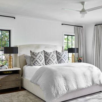
 Elle Du Monde LLC
Example of a transitional medium tone wood floor and brown floor bedroom design in Atlanta with white walls
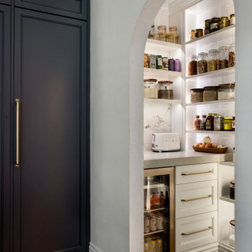

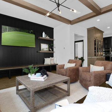
Sponsored
Westerville, OH

The Steele Group
Industry Leading General Contractors in Franklin County, Ohio

 Rikki Snyder
Photo: Rikki Snyder © 2014 Houzz
Cottage chic formal and enclosed living room photo in New York with yellow walls and no tv
Cottage chic formal and enclosed living room photo in New York with yellow walls and no tv


 FormAndField
Example of a small trendy single-wall dark wood floor and brown floor open concept kitchen design in San Francisco with a single-bowl sink, flat-panel cabinets, black backsplash, subway tile backsplash, an island, white countertops, paneled appliances and quartz countertops

 CRE Construction
Professional grade kitchen with all
"wish list' items included in the design.
Custom built cabinetry ensured every dish, utensil and appliance has a home within reach as needed.
Jon Huelskamp, Landmark Photography

 Kathy Kuo Designs Inc
It's easy to get swept away by the room’s gorgeous coloration, from the natural handwoven cane of the Palecek bed to the custom upholstered chair and the celestial Anewall wallpaper.
 TKS Design Group
Download our free ebook, Creating the Ideal Kitchen. DOWNLOAD NOW
The homeowners came to us looking to update the kitchen in their historic 1897 home. The home had gone through an extensive renovation several years earlier that added a master bedroom suite and updates to the front façade. The kitchen however was not part of that update and a prior 1990’s update had left much to be desired. The client is an avid cook, and it was just not very functional for the family.
The original kitchen was very choppy and included a large eat in area that took up more than its fair share of the space. On the wish list was a place where the family could comfortably congregate, that was easy and to cook in, that feels lived in and in check with the rest of the home’s décor. They also wanted a space that was not cluttered and dark – a happy, light and airy room. A small powder room off the space also needed some attention so we set out to include that in the remodel as well.
See that arch in the neighboring dining room? The homeowner really wanted to make the opening to the dining room an arch to match, so we incorporated that into the design.
Another unfortunate eyesore was the state of the ceiling and soffits. Turns out it was just a series of shortcuts from the prior renovation, and we were surprised and delighted that we were easily able to flatten out almost the entire ceiling with a couple of little reworks.
Other changes we made were to add new windows that were appropriate to the new design, which included moving the sink window over slightly to give the work zone more breathing room. We also adjusted the height of the windows in what was previously the eat-in area that were too low for a countertop to work. We tried to keep an old island in the plan since it was a well-loved vintage find, but the tradeoff for the function of the new island was not worth it in the end. We hope the old found a new home, perhaps as a potting table.
Designed by: Susan Klimala, CKD, CBD
Photography by: Michael Kaskel
For more information on kitchen and bath design ideas go to: www.kitchenstudio-ge.com
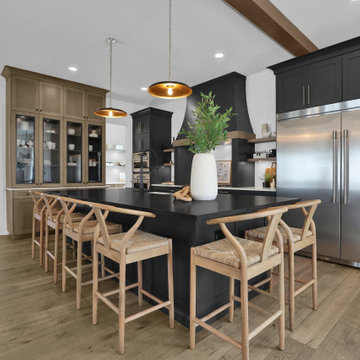
Sponsored
Westerville, OH
The Steele Group
Industry Leading General Contractors in Franklin County, Ohio
 TKS Design Group
Download our free ebook, Creating the Ideal Kitchen. DOWNLOAD NOW
The homeowners came to us looking to update the kitchen in their historic 1897 home. The home had gone through an extensive renovation several years earlier that added a master bedroom suite and updates to the front façade. The kitchen however was not part of that update and a prior 1990’s update had left much to be desired. The client is an avid cook, and it was just not very functional for the family.
The original kitchen was very choppy and included a large eat in area that took up more than its fair share of the space. On the wish list was a place where the family could comfortably congregate, that was easy and to cook in, that feels lived in and in check with the rest of the home’s décor. They also wanted a space that was not cluttered and dark – a happy, light and airy room. A small powder room off the space also needed some attention so we set out to include that in the remodel as well.
See that arch in the neighboring dining room? The homeowner really wanted to make the opening to the dining room an arch to match, so we incorporated that into the design.
Another unfortunate eyesore was the state of the ceiling and soffits. Turns out it was just a series of shortcuts from the prior renovation, and we were surprised and delighted that we were easily able to flatten out almost the entire ceiling with a couple of little reworks.
Other changes we made were to add new windows that were appropriate to the new design, which included moving the sink window over slightly to give the work zone more breathing room. We also adjusted the height of the windows in what was previously the eat-in area that were too low for a countertop to work. We tried to keep an old island in the plan since it was a well-loved vintage find, but the tradeoff for the function of the new island was not worth it in the end. We hope the old found a new home, perhaps as a potting table.
Designed by: Susan Klimala, CKD, CBD
Photography by: Michael Kaskel
For more information on kitchen and bath design ideas go to: www.kitchenstudio-ge.com


 Greathouse
This remarkable accent collection is sure to have the stylish seating you've been searching for at Greathouse Furniture. An assortment of upholstered chairs, chaises, exposed wood arm chairs and chair and ottoman sets have been gathered to create an accent collection designed to bring enhanced style, functionality and livability to nearly every room of your home. Seating is presented in nearly every shape and size, from luxurious chaises that invite you to linger to classic Louis style arm chairs that speak to your traditional side. An array of upholstery options lends a custom look to any space and makes finding a seating selection that suits your San Diego style a surprisingly simple task. Classic shapes, contemporary finishes and even a few retro styles can all be found in this versatile collection.
Listing Includes:
Accent Chair
Available in 3 different fabrics
http://www.greathouse.com/view/1316

 Marc Julien
Constructed in 2014, this mission style home has all the architectural details of a historic home on the outside and the details of a contemporary house on the inside.
The exterior of the house features a front porch with arches, heavy textured stucco, double barrel tile eyebrow roof over the garage, authentic gutter and downspouts and impact single hung windows. Enter the home and experience all the luxuries of today’s contemporary homes. The foyer’s feature wall leads you, past the powder room and stairs, to the great room and the Poggenpohl kitchen with Bosch Appliances. The white quartz tops catch your eye, especially the contrast of the island’s waterfall countertops set against the dark engineered wood floors. The master bath surprises you with a top-lit quartz feature wall that surrounds the shower and the Aquabrass freestanding tub. The white Poggenpohl vanity is framed by a massive mirror that stretches from the vanity to the ceiling.
Retreat from the action of being centrally located in downtown Delray Beach, in your expansive covered patio and spa deck. This space provides plenty of opportunity to host friends for an evening of drinks or simply relax in the infinity edge spa.
412 was under contract within five days of being listed, a true testament to the Marc Julien Homes design and quality and our “Commitment to Perfection”.
Sponsored
Westerville, OH
The Steele Group
Industry Leading General Contractors in Franklin County, Ohio

 The Cultural Landscape Foundation
Saturday August 8, 9:00 to 10:30am | Denver
Cranmer Park Residence by Gretchen Wilson and Laurel Raines of Dig Studio
Perched on a high point of Denver’s Cranmer Park, one of the great park landmarks of the Mile-High City, this designed landscape complements and enhances the architectural aesthetic of the home; a stucco-clad Italianate mansion built in 1917 by renowned architect Jacques Benedict and listed in the National Register of Historic Places. The landscape, designed and constructed in three phases over a twelve-year period from 1998 to 2010, creates a functional outdoor living space that supports the owners’ contemporary lifestyle while remaining sensitive to the original architectural vision and elegance of the home. An Italianate garden, framed by the home’s loggias and a stunning boxwood garden, reinforce the design of the historic property. In contrast, the addition of a pool house and outdoor spa area add a modern touch. A linear lap pool, fountain, patio area, basketball court, and fire pit contrast with elements of the earlier landscape, providing a relaxing private outdoor space with spectacular views of Cranmer Park, and the great Rocky Mountains that dominate the Denver skyline. Photo copyright Williamson Images


 O’Hara Interiors
Martha O'Hara Interiors, Interior Design & Photo Styling | Corey Gaffer, Photography
Please Note: All “related,” “similar,” and “sponsored” products tagged or listed by Houzz are not actual products pictured. They have not been approved by Martha O’Hara Interiors nor any of the professionals credited. For information about our work, please contact design@oharainteriors.com.
4