Search results for "Swapped" in Home Design Ideas
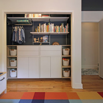
This project is also featured in Home & Design Magazine's Winter 2022 Issue
Example of a mid-sized 1950s l-shaped light wood floor and brown floor eat-in kitchen design in DC Metro with an undermount sink, flat-panel cabinets, dark wood cabinets, quartz countertops, white backsplash, subway tile backsplash, paneled appliances, a peninsula and white countertops

Somewhere in the northeast Shorewood neighborhood of Milwaukee near the University of Wisconsin-Milwaukee, a kitchen was ready for a fresh start. The owners wanted something clean, modern, and white—a space that would actually work with how they cook and live, not against it.
They weren't just swapping out cabinets and calling it done. This was a full transformation: tearing down walls, rewiring the electrical, rerouting plumbing, updating the HVAC. New insulation, fresh drywall, better lighting. The kind of work that happens behind the scenes but changes everything about how a room feels.
Then came the visible magic: crisp white cabinetry that maximized storage, countertops chosen for both beauty and durability, new flooring that tied it all together, and appliances that could keep up with real life. Every permit filed, every material selected with intention, every phase carefully managed.
The result? A kitchen that flows. A space where white isn't boring—it's a backdrop for life, meals, and the kind of everyday moments that make a house feel like home.

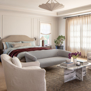
Home of an inveterate collector with a keen eye, the hallmarks of this renovated, 1927 Beaux Arts residence are neutral walls and fabrics that celebrate the treasured artwork, rugs, and architecture within. Eclectic objects and furnishings discovered on world travels, antiquing expeditions, and even those inherited mingle easily in relaxed, strategically un-designed fashion. Intentionally void of superfluous decoration to accept flexible furniture arrangements, the mood of this home can swing in an instant simply by rearranging a chair, or swapping pillows - proving the most personal spaces are also the most versatile.
Find the right local pro for your project

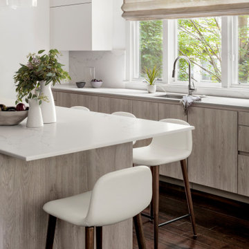
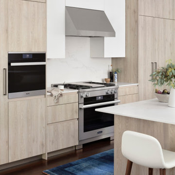
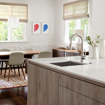
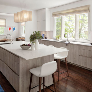
With an original intention of just swapping out countertops, our client opted to completely renovate their kitchen with a goal to brighten and lighten up the space.
To achieve a weightless look, we used our WAY style with the integrated channel and free of applied handles. This style allowed for a cleaner aesthetic while providing a streamlined consistent cabinet line.

This remodel took a dated and cramped bathroom and transformed it into a classy oasis for our Lowry clients. The clients had a limited budget and wanted to leave the space as in-place as possible. However, the large drop in tub ate valuable floor space and a half wall between the shower and tub had become a holding place for random items without a home. The thick frame on the shower glass made the shower feel extremely small, and the dated lighting and fixtures further depressed the space. We proposed a traditional and elegant design that consider the client's budgetary and spatial constraints. We removed the existing drop-in tub and replaced it with a lovely free-standing soaker. The length of this tub is short, but the depth is exaggerated, making it an ideal replacement in this tiny footprint. The shower glass was swapped for framless glass that boldly expands space. We tore out the existing carpet and installed gorgeous wood-look tile that adds depth and warmth to the room. The clients opted to keep their existing vanity to save cost, so a new top was added to bring the aesthetic up to the level of the new additions. The wall paint was taken from a buttery yellow to a soft gray-green, accented by a darker version of this same color on the siding barn door and toilet room door. New vanity lights, faucets, and storage shelves were installed to help our clients organize and keep things off the counter tops. Finally, new custom up-down window shades were curated for the bathroom to add to the final touch. This space is a simple scope with a dramatic transformation that introduces a timeless look for years to come.

For the remodel of the Blackburn’s Houston residence, we removed the typical wooden balusters and installed our PC4/1 single twist balusters, our PC4/4 double twist balusters, our PC6/1 single basket balusters, and our PC6/4 double basket balusters all in Classic Black. This baluster pattern adds the single and double twists to spread out the single and double baskets, for a simple but not overpowering basket presence. If you are looking for a simple but elegant patter, this is an excellent option.

This custom home theater was designed to be the ultimate gathering spot for a large family. The space combines comfort, style, and functionality with thoughtful details that make every movie night feel special. Our clients loved it so much they’ve swapped trips to the cinema for cozy nights in their new theater.

When supported by smart irrigation, Blue Flax will quickly fill the space intended for it. These fluttery periwinkle blooms dance on delightfully delicate stalks making it a great swap for non-native Rock Purslane.

This project took APD to the Oregon Coast for the remodel of two beach house bathrooms! The primary suite was gutted - removing an unused jetted tub in favor of an expansive corner vanity. The shower was opened up by removing an awkwardly located tall cabinet and by swapping a full height wall in favor for a pony wall with glass above. The bathroom is bathed in natural light via the skylight and frosted casement window. A luxurious shower experience was created with ceiling mount rain shower head, wall mount fixed shower head, hand shower on slider bar, and a modern waterfall slab shower bench with integrated niche. A subtle coastal vibe was created with the blue, white, and sandy gray color palette while artistic light fixtures fixtures, clean lined matte black plumbing, and straight stacked tile infuse modernity. In the hall bathroom, a cohesive design was created with added playfulness from the patterned floor tile!

This room had been a dark tan and benefitted from light paint to match the already white tub and toilet. We also swapped out the yellow tuscan inspired glass light covers on the vanity light to a frosted (easy change!) and added a slim framed mirror where a cherry framed mirror once hung. Lastly chose a more neutral shower curtain that ties in the two adjacent rooms. Very simple and effective changes.

To enhance the kitchen’s aesthetic appeal, we prioritized updating these elements. We replaced the laminate countertops with sleek, pristine white quartz countertops and swapped out the backsplash with classic white subway tiles, which perfectly complement the farmhouse style of the home. Additionally, we installed a modern sink and faucet to complete the updated look.
We also refreshed all the kitchen cabinets with a new coat of paint and updated the knobs and pulls. During our discussions about their desired ambiance, the clients preferred a “comfortable and casual” feel. Inspired by a pair of well-worn jeans and a mason jar displayed in the space, we chose a soft, faded navy blue for the cabinets to introduce a striking splash of color.

Mid-sized beach style l-shaped light wood floor eat-in kitchen photo in Seattle with a single-bowl sink, recessed-panel cabinets, blue cabinets, quartzite countertops, white backsplash, subway tile backsplash, paneled appliances, an island and white countertops

The only full bathroom in this 1906 craftsman home needs to function well for a family of four. We swapped out a claw foot tub for a large walk-in shower with a recessed shower curtain track. Two wall-mounted faucets pour into a wide trough sink. A custom-made medicine cabinet with an arched mirror is flanked by two opaque globe sconce lights.

This custom home theater was designed to be the ultimate gathering spot for a large family. The space combines comfort, style, and functionality with thoughtful details that make every movie night feel special. Our clients loved it so much they’ve swapped trips to the cinema for cozy nights in their new theater.

When my client purchased his circa 1980s home several years ago, it came with a bland, dated guest bathroom. He was eager to swap his brass accented shower doors, counter "bridge" spanning the toilet, wall-to-wall mirror, and terra cotta tiled floor for a sleeker, more contemporary looking space.
We gutted the entire space except for the tub which was in perfect condition and replaced the boring, square beige tiles with large format tiles of a subtle, threaded pattern. A decorative, highly textured band of stainless steel, stone, and glass runs through the shower and defines the counter of the new dark vanity which is now in scale with the room. New sconces in matte opal glass are twined with ribbons of forged iron. Walls are in a chic hue called Thunder Grey. The modern sink hardware features a chrome trough spout and stylized square handles. The counter top, with its soft grey and blue-green clouds, is fabricated from a single piece of Sea Pearl quartzite. The shower edges and niche are lined in a polished chrome detail for a clean, minimalist look. And finally, the shower hardware with a bar and hand held shower head echoes the modernist approach to the space.
Photo by Bernardo Grijalva

The dining room of this home was in the location of the original kitchen and the new kitchen was a bedroom. Opening up the wall in between and making the swap allowed for a larger more functional space. The new dining room is now open to both the kitchen and living room.
Photo: Pete Eckert

Maura B McConnell Photography
Example of a mid-sized farmhouse porcelain tile entryway design in Philadelphia with white walls and a white front door

Eat-in kitchen - small u-shaped vinyl floor and multicolored floor eat-in kitchen idea in Cleveland with an undermount sink, recessed-panel cabinets, medium tone wood cabinets, quartz countertops, multicolored backsplash, quartz backsplash, stainless steel appliances, a peninsula and multicolored countertops

The Setup
When Samantha’s clients purchased their new home, they quickly realized the primary bath and adjacent laundry room weren’t just dated — they were dysfunctional. The bathroom featured a hulking decked-in tub, a cramped pass-through layout, and plumbing fixtures that barely worked. Meanwhile, the nearby laundry room felt more like a closet, lacking both natural light and usable storage. As long-time returning Drury Design clients, these veteran remodeling clients came to us with a clear ask: reimagine these two key spaces with long-term comfort, function, and beauty in mind.
Design objectives:
Create a more functional, spacious layout in the primary bath
Modernize the aesthetic while respecting the home’s transitional character
Eliminate awkward bump-outs and toe-stubbing pinch points
Design a large walk-in shower with thoughtful aging-in-place elements
Incorporate a sculptural standalone tub that feels intentional, not crowded
Improve laundry room utility and bring in natural light
Introduce discreet yet effective storage in both rooms
Make both spaces feel cohesive, light-filled, and livable for years to come
The Remodel
Design challenges to be solved:
A bulky built-in tub jutted into the circulation path, creating toe-stubbing hazards
The bathroom layout was awkwardly L-shaped, limiting flow and flexibility
The shower and toilet were squeezed together in an enclosed room with poor use of space
The linen cabinet in the bathroom was large and clunky, crowding the room
The laundry room was undersized, lacked light, and had limited functionality
The home featured transitional details that didn’t align with the clients’ more contemporary style
The clients wanted both spaces to support future aging-in-place needs
The Renewed Space
Design solutions:
Swapped the oversized tub for a freestanding sculptural version placed on an angle, clearing walkways and preserving window symmetry and light
Reworked the footprint to create a rectangular layout that maximized space in both the primary bath and laundry room
Removed the enclosed toilet/shower room and replaced it with a wide, glass-enclosed shower and a tucked-away toilet — all within a visually open and efficient layout
Tucked a slim, full-height linen cabinet just behind the entry door — easily accessible without cluttering the visual field
Retooled layout allowed laundry room to extend over the old shower/toilet space, also winning a window – this brightens the laundry space and the hallway beyond. Also added smart storage, a wide sink, folding counter, and broom cabinet with power.
Balanced contemporary materials with transitional details — including a rich color palette, chrome finishes, mosaic accents, and herringbone tile in a larger scale for traditional flair
Integrated aging-in-place features including a wide walk-in shower, large built-in bench with nearby handheld, and plenty of room for easy movement and accessibility
Final Thoughts:
By designing these two rooms in tandem, Samantha was able to create a smooth and thoughtful flow between everyday tasks and everyday comfort. The bathroom now offers generous circulation space, elegant materials, and features designed for longevity — including a large shower with bench seating and open sightlines that support accessibility. Just steps away, the laundry room is no longer a tucked-away closet but a light-filled, functional hub with room to fold, hang, rinse, and more (ex. recharge vacuum in a closet with power outlets). For these longtime Drury Design clients, it’s a two-room transformation built not just for today – but for the years ahead.
77