Search results for "Swapped" in Home Design Ideas

This proposal is for a new two-story home on the vacant heavily wooded lot with an existing 150-foot-long driveway lined by several beautiful oak trees culminating in a behemoth 43-inch oak tree where the driveway meets the main lot. The far end of the driveway terminates in a grove of three 43/40/43-inch redwoods and at the very center of the vacant lot stands a gargantuan V-twin 59-inch redwood tree paired with a “small” 29-inch redwood tree. The owners want to build a beautiful contemporary-styled home for their family that fully enjoys and embraces the mature trees on their cozy 65-foot by 100-foot lot.
As with all small, constrained lots, this project’s site design started first with meeting the relatively large parking and car maneuvering requirements. Menlo Park’s Department of Transportation typically requires side-facing garages to have 24-feet of backup space. So that they could give the largest feature redwood tree on site an added four feet (50%) of clearance outside of its critical root zone, the owners agreed to install a vehicle turntable at the end of their driveway to eliminate the extra four feet of space needed to back up and turnaround. This allowed them to pull their garage forward an additional four feet towards the front property line on the panhandle side, drastically reducing the rest of the home’s impact on the gargantuan V-Twin paired redwood tree at the center of the lot.
One of the owners has mobility issues, and accordingly, they first sought to design a one-story floor plan that incorporated all their family’s needs including plenty of covered patio and deck space to enjoy our fantastic California weather. But that single-story footprint spread too far into the critical root zones of several of the redwood trees on site, even despite the use of the vehicle turntable. During my interview process with the owners, they made it clear to me that one of their primary concerns is ensuring that the largest trees on site would thrive and become features of their new home after construction is complete. The single-story designs that removed the grove of three huge redwood trees were non-starters, as was the skimpy 5x10 master bath I designed when trying to squeeze the whole house program into an overly compromised single-story design. It was therefore deemed necessary to go with a two-story design despite the owner’s mobility issues. This two-story design has a much more compact ground floor footprint and has no bedrooms downstairs, other than the detached ADU. The owners must give up the floor area and incur the costs to install a residential elevator to access their upstairs master suite.
Our ground floor footprint is smaller due to the two-story design decision, and our foundation is pulled away from the trees thanks to the vehicle turntable. Yet, a tiny portion of the home’s ground floor footprint still encroaches into the critical root zones of the largest 59” redwood tree. Therefore, as outlined in the Arborist Report prepared by Aesculus Arboricultural Consulting, the structural engineers are incorporating an array of drilled piers and shallow-grade beams for the main home’s foundation and deck area nearest the redwood’s critical root zone. This drilled piers and grade beam foundation is a type of “bridging” foundation as outlined in Aesculus’ report to preserve the health of these trees that the property was designed around. The rest of the foundation will be constructed as an insulated slab-on-grade foundation to minimize the number of steps and ramps needed for the owners to enjoy their home and patio areas.
Despite the owner’s desire to keep as many trees as possible on site, and despite the smaller ground floor footprint and the advantage of the vehicle turntable, the need for a 20x20-foot garage and 20x20/25-foot guest parking space on our panhandle lot requires the removal of two heritage trees in the required driveway, a 16” coast redwood, and a 17” coast redwood. An alternate design, such as swapping the garage and guest parking locations north-to-south, still requires the removal of these two trees for vehicle maneuvering but has the added disadvantage of cutting off the home’s sightlines to the behemoth 43” oak tree just outside the currently proposed front patio space and living room. Jim Redman of Elements Landscape is proposing 13 new trees be planted on site to replace the lost value of these two heritage coast redwood trees.
This contemporary architectural design features clean lines, and an abundance of full-height windows and large skylights to best take in the immense trees on site. To blend in with the forest-like setting, the home boasts a mix of rich textures and features a color palette of natural wood tones contrasted with dark blue and black. Once through the new steel gate at the street and down the 150-foot tree-lined driveway, a large covered front patio becomes visible past the neighbor’s detached accessory structure. The covered patio is just across the driveway from the beautiful 43” behemoth coast live oak. The single plane of the covered patio roof is delicately supported by a pair of steel posts in a “V-twin” configuration much like the largest redwood trees that tower over the center of the lot and will still be visible above the new two-story home, even from the front yard. The patio is covered in a dark-colored standing seam roof, with steel C-channel fascias, and tongue-and-groove wood ceiling planks on the underside. Generously sized skylights on the patio roof and inside the living area allow for impressive views of the amazing oak canopy as well as precious natural light.
Supporting the sloped covered patio on the other side is the two-car garage with a secondary bedroom suite stacked above the garage. This two-story volume is to be clad in vertical clear-coated redwood siding, to tie in with the grove of three 43-inch redwood trees just beyond. The garage door, and the bank of windows for Bedroom#2 above feature a steel fascia eyebrow header feature to provide shade and overhang protection, as we are not proposing a large overhang at this “redwood trunk”. The garage and bedroom volume are pulled 16 feet away from the side property line, instead of the minimum required setback of 6’-6”, thus leaving plenty of room for the redwood grove and existing mature pear tree to continue to thrive. This existing mature green screen in this 16-foot-wide side yard is a feature worth soaking in, which is why tall windows with low sill heights are proposed for both the stairs and the upstairs hallway. Though it may be infrequent to approve side-facing 2nd floor windows with sill heights as low as what we’re proposing, we are confident that the mature green screen and the over 16-foot-wide side yard are sufficient to provide for the continued privacy of our neighbor’s rear yard space, especially considering theses windows are in walkway zones.
The covered patio at the front entry is also bound by the 10-foot-tall living room. The great room is clad in a dark blue brick veneer, which wraps around all three sides of the living room. Upon entering the home from the covered patio, you are immediately greeted with one of the most impressive features of the home’s design: a 10-foot-tall by 24-foot-wide set of sliding glass doors. From the entry, this huge opening gives merely an initial glimpse of the massive trunks of the gargantuan V-twin redwoods sitting at the center of the lot. All three sliding glass panels open directly out into the smaller partially covered deck in the rear. This roof overhang element matches the design of the front patio with a steel C-channel fascia and a large skylight. But the rear deck’s roof element is set flat at a ten-foot ceiling height so that the living room’s ceiling seems to float above and out beyond the expanse of full-height sliding doors, thus creating an indoor-outdoor living space that will feel much larger than the home’s actual footprint. This rear covered deck is smaller than the patio in the front and also has a mix of solid and open-slatted roofing to allow for more solar access for the relatively small amount of open sky available.
The downstairs living room is open to the dining and kitchen areas, as well as the stair-and-elevator tower beyond. The stair tower is very open and glassy, and the stairs wind up and around the redwood-clad elevator tower. From certain perspectives in the 16-foot-wide side yard, it will almost seem as if the grove of three redwoods has a fourth tree that the house and the stairs were carefully built around. Other than the 3-foot-wide windows, the exterior walls of the stair tower, downstairs utility spaces, and Bedroom#3 above are finished in cement plaster, painted dark blue and black. The sloped roof over the stair-and-elevator tower continues cleanly over the area of upstairs Bedroom#3. This roof level is set by the side daylight plane and only yields an inside wall height of just under 6 feet in height. The owners are satisfied that the rest of this upstairs room has a nice vaulted ceiling to make up for the one short wall under the daylight plane.
The rest of the ground floor adjacent to the stair tower consists of a small utility wing containing a half-bath, laundry, storage area, and an exterior alcove for the electric heat pump HVAC unit. This short wing also gives more accessible access to the rear yard deck, as well as a backdrop for an outdoor kitchen. The bright white stone backsplash for the outdoor kitchen provides contrast to the otherwise consistent use of cement plaster painted dark blue and black for the two-story wing closest to the detached ADU. Though Bedroom#3 is stacked directly above this small wing, it is relatively short to comply with the side daylight plane of this narrow lot. Still, to further help break up the scale of this wall, another steel fascia eyebrow element is set about 8 feet above the rear deck.
The master suite sits centered above the ten-foot-tall great room. The master bedroom and its balcony, as well as the master bathtub area, have a commanding view of the central redwood trees and their impressive canopy, though the balcony is mostly recessed and should pose no privacy concerns to the neighbor’s rear yards. The master balcony parapet is clad in the same brick veneer continuing up from the living room below. A dark-painted metal rail makes up the rest of the open guardrail height. The entire length of the master balcony is comprised of 9-foot-tall sliding glass doors, but the area above the doors, as well as the area below the master bathroom windows, is accented with more redwood siding. The remainder of the master suite bathroom and walk-in closet is finished in cement plaster painted dark blue. The master bathroom has one side yard-facing window but will be frosted glass for both the owner’s and the neighbor’s privacy.
The 2nd floor is capped under a simple gable roof design with one roof ridge and varying eave and rake overhangs depending on the 2nd-floor layout and solar orientation. Since these roof planes are quite difficult to see in the middle of the heavily wooded panhandle lot, we are proposing a white TPO roofing for these two upper roof planes as a more sustainable choice compared to more dark-colored roofing like the covered patios and detached ADU.
The owners also wish to build a detached 292-square-foot Accessory Dwelling Unit (ADU) as an office and guest suite. For the ADU foundation to be situated outside the central redwood tree’s critical root zone, this relatively tiny structure takes advantage of the narrower 4-foot side and rear setbacks allowed for ADUs smaller than 800 square feet. The small L-shaped detached ADU frames a wonderful quasi-courtyard around the gargantuan V-twin redwoods at the center of the lot. The ADU shares a matching material palette consisting of cement plaster painted blue and black, vertical redwood siding and soffits, and thin brick veneer. The ADU also features large full-height windows. The only difference between the main home and the ADU material palette is that the roofing will be a dark composition shingle roofing since it will be quite visible from the master balcony.

Swap your old tired-looking interior door for a NEW Masonite solid core door. Solid core doors are built to handle life's bumps and bruises while adding style. Make a sound decision and choose solid core interior doors.

A boys bathroom transformed into a rustic, costal space without giving up an upscale look. Marbled tiles create a formal, high-end look to this bathroom, keeping it "adult" even with it's youthful décor, which as the children age, can be swapped out for more mature pieces. A gray vanity is swoon-worthy and complimentary next to a more playful window valance. A clean, modern bathroom for grown ups, dressed up for kids!
Find the right local pro for your project
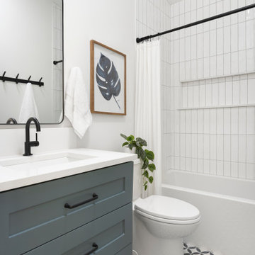
Photo of a mid-sized traditional backyard concrete paver retaining wall landscape in Miami.

We must admit, we’ve got yet another show-stopping transformation! With keeping the cabinetry boxes (though few had to be replaced), swapping out drawer and drawer fronts with new ones, and updating all the finishes – we managed to give this space a renovation that could be confused for a full remodel! The combination of a vibrant new backsplash, a light painted cabinetry finish, and new fixtures, these cosmetic changes really made the kitchen become “brand new”. Want to learn more about this space and see how we went from “drab” to “fab” then keep reading!
Cabinetry
The cabinets boxes that needed to be replaced are from WW Woods Shiloh, Homestead door style, in maple wood. These cabinets were unfinished, as we finished the entire kitchen on-site with the rest of the new drawer and drawer fronts for a seamless look. The cabinet fronts that were replaced were from Woodmont cabinetry, in a paint grade maple, and a recessed panel profile door-style. As a result, the perimeter cabinets were painted in Sherwin Williams Tinsmith, the island in Sherwin Williams Sea Serpent, and a few interiors of the cabinets were painted in a Sherwin Williams Tinsmith.
Countertop
The countertops feature a 3 cm Caesarstone Vivid White quartz
Backsplash
The backsplash installed from countertops to the bottom of the furrdown are from Glazzio in the Oceania Herringbone Series, in Cobalt Sea, and are a 1×2 size. We love how vibrant it is!
Fixtures and Fittings
From Blanco, we have a Meridian semi-professional faucet in Satin Nickel, and a granite composite Precis 1-3/4 bowl sink in a finish of Cinder. The floating shelves are from Danver and are a stainless steel finish.
Flooring
The flooring is a cork material from Harris Cork in the Napa Collection, in a Fawn finish.

The new space looks nothing like it was before. Original kitchen was too small, and adjacent areas had a few other problems.
The front door opened straight into the wall of a long narrow hallway. It created a 90 degree turn to get into the family room.
The door between the kitchen and dining room made the traffic flow awkward for both areas.
Coat closet in the front hallway located right across the stairwell, created potential fall hazard when opening the door.
Solution:
With the rear porch door left in place, the two side windows were swapped and the kitchen was relocated to the opposite wall.
Hallway walls were taken down and the coat closet was relocated away from the stairs.
Door opening between the dining room and former kitchen was restored.
After remodeling, all rooms became bigger and more functional. New beautiful kitchen has a central island and a built-in breakfast nook.
Family room also feels more open. Dining Room has a better traffic flow and holds the potential for a bigger table to seat more guests.

This gorgeous new kitchen used to be just about half the size before we stepped in for renovations. Not only did we open up the space, but we completely changed nearly every design aspect!
The kitchen went from a U-shape to an L-shape, we added an island with seating, swapped laminate counters for quartz and upgraded the backsplash tile. We replaced the old wood-tone cabinets with sleek, painted cabinets - and installed under cabinet lighting and plugs to keep the counters looking bright and clutter-free.

A complete reconfiguration of the primary bath allowed for a larger walk-in shower, a double vanity with personalized storage (including a hamper pull-out), and a built-in linen cabinet. The design swapped the tub and underused shower stall for more efficient and attractive features, including green vertical stacked tile, heated floors, and a skylight that brings natural light into the shower. A pony wall niche and bench add comfort and utility. Brass and chrome fixtures offer a modern, mixed-metal moment, while the warm vanity finish softens the space.

This custom home theater was designed to be the ultimate gathering spot for a large family. The space combines comfort, style, and functionality with thoughtful details that make every movie night feel special. Our clients loved it so much they’ve swapped trips to the cinema for cozy nights in their new theater.

Inspiration for a mid-sized timeless dark wood floor and brown floor enclosed dining room remodel in Houston with gray walls and no fireplace

Some kitchens have old tired drawer glides and drawer boxes. Storage Solutions of Kansas City can swap out your existing drawer boxes and glides with new solid wood dovetail boxes and under mount soft-close glides and reattach your existing drawer fronts.

1930's Mediteranean style home opens up by removing 2 walls. The kitchen and dining room swap places to provide easy access to the double level deck.
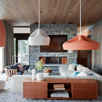
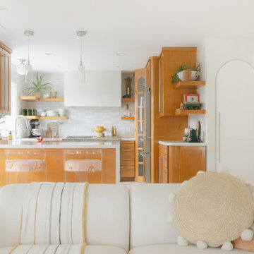
Bright orange and teal furniture complement the kitchen backsplash, and brighten up the space.

Star D Services, LLC
I, Cooper (Owner of Star D Services, LLC) hung each and every one of those mounts and pictures etc. Every few Months or so I go back to take down the smallest ones (or whichever the customer wants) and swap them out for his son's newer bigger mounts. Always adding to the collection. The mounts are not a millimeter off from one mount to the next or from one wall to the next.
I don't have pictures anymore from 2015 but we also helped a Master Carpenter and planed and installed the wood floor as well as much more carpentry work to complete the building.

Our homeowner had worked with us in the past and asked us to design and renovate their 1980’s style master bathroom and closet into a modern oasis with a more functional layout. The original layout was chopped up and an inefficient use of space. Keeping the windows where they were, we simply swapped the vanity and the tub, and created an enclosed stool room. The shower was redesigned utilizing a gorgeous tile accent wall which was also utilized on the tub wall of the bathroom. A beautiful free-standing tub with modern tub filler were used to modernize the space and added a stunning focal point in the room. Two custom tall medicine cabinets were built to match the vanity and the closet cabinets for additional storage in the space with glass doors. The closet space was designed to match the bathroom cabinetry and provide closed storage without feeling narrow or enclosed. The outcome is a striking modern master suite that is not only functional but captures our homeowners’ great style

For this master bathroom remodel, we were tasked to blend in some of the existing finishes of the home to make it modern and desert-inspired. We found this one-of-a-kind marble mosaic that would blend all of the warmer tones with the cooler tones and provide a focal point to the space. We filled in the drop-in bath tub and made it a seamless walk-in shower with a linear drain. The brass plumbing fixtures play off of the warm tile selections and the black bath accessories anchor the space. We were able to match their existing travertine flooring and finish it off with a simple, stacked subway tile on the two adjacent shower walls. We smoothed all of the drywall throughout and made simple changes to the vanity like swapping out the cabinet hardware, faucets and light fixture, for a totally custom feel. The walnut cabinet hardware provides another layer of texture to the space.

This was a big girl room makeover I did for my daughter. She has always been a party animal at bedtime and that includes her climbing out of her crib around 13 months! She’s almost 5 now and once she started showing that she was a bit more responsible at bedtime, we upgraded her space. I opted for a queen size bed with a bed frame that doesn't require a box spring, which opens up for storage underneath. I also wanted the space to speak to her, so I left a small area that was for playing and reading. This space will be good as she gets older and wants to spend time in her room more often. Thinking about how she would use the space for years to come was a big deal. I made sure the larger pieces were transitional and only small items like bedding or lighting would need to be swapped out in the future.
Designed by Sara Barney’s BANDD DESIGN, who are based in Austin, Texas and serving throughout Round Rock, Lake Travis, West Lake Hills, and Tarrytown.
For more about BANDD DESIGN, click here: https://bandddesign.com/
To learn more about this project, click here: https://bandddesign.com/big-girl-room-makeover/

Joanna Fanfa
Inspiration for a large contemporary galley porcelain tile and gray floor open concept kitchen remodel in San Francisco with an undermount sink, shaker cabinets, dark wood cabinets, granite countertops, gray backsplash, cement tile backsplash, stainless steel appliances and an island

In the kitchen, dark outdated cabinets were swapped out for Glacier white cabinets from Grabill Cabinets in their Devonshire door style. A beautiful waterfall walnut countertop from Grothouse pops next to the white ENVI Quartz countertop in Statuario Fiora on the island. A beautiful custom Vent-A-Hood in black and stainless steel creates contrast around the perimeter of the room.

Our approach to the dining room wall was a key decision for the entire project. The wall was load bearing and the homeowners considered only removing half of it. In the end, keeping the overall open concept design was important to the homeowners, therefore we installed a load bearing beam in the ceiling. The beam was finished with drywall to be cohesive so it looked like it was a part of the original design. Now that the kitchen and dining room were open, paint colors were used to designate the spaces and create visual boundaries. This made each area feel like it’s its own space without using any structures.
The original L-shaped kitchen was cut short because of bay windows that overlooked the backyard patio. These windows were lost in the space and not functional; they were replaced with double French doors leading onto the patio. A brick layer was brought in to patch up the window swap and now it looks like the French doors always existed. New crown molding was installed throughout and painted to match the kitchen cabinets.
This window/door replacement allowed for a large pantry cabinet to be installed next to the refrigerator which was not in the old cabinet configuration. The replaced perimeter cabinets host custom storage solutions, like a mixer stand, spice organization, recycling center and functional corner cabinet with pull out shelving. The perimeter kitchen cabinets are painted with a glaze and the island is a cherry stain with glaze to amplify the raised panel door style.
We tripled the size of the kitchen island to expand countertop space. It seats five people and hosts charging stations for the family’s busy lifestyle. It was important that the cooktop in the island had a built in downdraft system because the homeowners did not want a ventilation hood in the center of the kitchen because it would obscure the open concept design.
The countertops are quartz and feature an under mount granite composite kitchen sink with a low divide center. The kitchen faucet, which features hands free and touch technology, and an instant hot water dispenser were added for convenience because of the homeowners’ busy lifestyle. The backsplash is a favorite, with a teal and red glass mosaic basket weave design. It stands out and holds its own among the expansive kitchen cabinets.
All recessed, under cabinet and decorative lights were installed on dimmer switches to allow the homeowners to adjust the lighting in each space of the project. All exterior and interior door hardware, hinges and knobs were replaced in oil rubbed bronze to match the dark stain throughout the space. The entire first floor remodel project uses 12x24 ceramic tile laid in a herringbone pattern. Since tile is typically cold, the flooring was also heated from below. This will also help with the homeowners’ original heating issues.
When accessorizing the kitchen, we used functional, everyday items the homeowners use like cutting boards, canisters for dry goods and place settings on the island. Ultimately, this project transformed their small, outdated kitchen into an expansive and functional workspace.
76