
Search results for "Swapping" in Home Design Ideas
 TKS Design Group
Download our free ebook, Creating the Ideal Kitchen. DOWNLOAD NOW
Lakefront property in the northwest suburbs of Chicago is hard to come by, so when we were hired by this young family with exactly that, we were immediately inspired by not just the unusually large footprint of this 1950’s colonial revival but also the lovely views of the manmade lake it was sited on. The large 5-bedroom home was solidly stuck in the 1980’s, but we saw tons of potential. We started out by updating the existing staircase with a fresh coat of paint and adding new herringbone slate to the entry hall.
The powder room off the entryway also got a refresh - new flooring, new cabinets and fixtures. We ran the new slate right through into this space for some consistency. A fun wallpaper and shiplap trim add a welcoming feel and set the tone for the home.
Next, we tackled the kitchen. Located away from the rest of the first floor, the kitchen felt a little isolated, so we immediately began planning for how to better connect it to the rest of the first floor. We landed on removing the wall between the kitchen and dining room and designed a modified galley style space with separate cooking and clean up zones. The cooking zone consists of the refrigerator, prep sink and cooktop, along with a nice long run of prep space at the island. The cleanup side of the kitchen consists of the main sink and dishwasher. Both areas are situated so that the user can view the lake during prep work and cleanup!
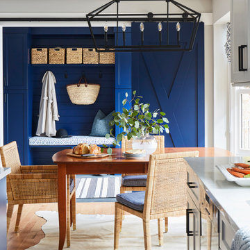
One of the home’s main puzzles was how to incorporate the mudroom and area in front of the patio doors at the back of the house. We already had a breakfast table area, so the space by the patio doors was a bit of a no man’s land. We decided to separate the kitchen proper from what became the new mudroom with a large set of barn doors. That way you can quickly hide any mudroom messes but have easy access to the light coming in through the patio doors as well as the outdoor grilling station. We also love the impact the barn doors add to the overall space.
The homeowners’ first words to us were “it’s time to ditch the brown,” so we did! We chose a lovely blue pallet that reflects the home’s location on the lake which is also vibrant yet easy on the eye. Countertops are white quartz, and the natural oak floor works well with the other honey accents. The breakfast table was given a refresh with new chairs, chandelier and window treatments that frame the gorgeous views of the lake out the back.
We coordinated the slate mudroom flooring with that used in the home’s main entrance for a consistent feel. The storage area consists of open and closed storage to allow for some clutter control as needed.
Next on our “to do” list was revamping the dated brown bar area in the neighboring dining room. We eliminated the clutter by adding some closed cabinets and did some easy updates to help the space feel more current. One snag we ran into here was the discovery of a beam above the existing open shelving that had to be modified with a smaller structural beam to allow for our new design to work. This was an unexpected surprise, but in the end we think it was well worth it!
We kept the colors here a bit more muted to blend with the homeowner’s existing furnishings. Open shelving and polished nickel hardware add some simple detail to the new entertainment zone which also looks out onto the lake!
Next we tackled the upstairs starting with the homeowner’s son’s bath. The bath originally had both a tub shower and a separate shower, so we decided to swap out the shower for a new laundry area. This freed up some space downstairs in what used to be the mudroom/laundry room and is much more convenient for daily laundry needs.
We continued the blue palette here with navy cabinetry and the navy tile in the shower. Porcelain floor tile and chrome fixtures keep maintenance to a minimum while matte black mirrors and lighting add some depth the design. A low maintenance runner adds some warmth underfoot and ties the whole space together.
We added a pocket door to the bathroom to minimize interference with the door swings. The left door of the laundry closet is on a 180 degree hinge to allow for easy full access to the machines. Next we tackled the master bath which is an en suite arrangement. The original was typical of the 1980’s with the vanity outside of the bathroom, situated near the master closet. And the brown theme continued here with multiple shades of brown.
Our first move was to segment off the bath and the closet from the master bedroom. We created a short hall from the bedroom to the bathroom with his and hers walk-in closets on the left and right as well as a separate toilet closet outside of the main bathroom for privacy and flexibility.
The original bathroom had a giant soaking tub with steps (dangerous!) as well as a small shower that did not work well for our homeowner who is 6’3”. With other bathtubs in the home, they decided to eliminate the tub and create an oversized shower which takes up the space where the old tub was located. The double vanity is on the opposite wall and a bench is located under the window for morning conversations and a place to set a couple of towels.
The pallet in here is light and airy with a mix of blond wood, creamy porcelain and marble tile, and brass accents. A simple roman shade adds some texture and it’s top-down mechanism allows for light and privacy.
This large whole house remodel gave our homeowners not only the ability to maximize the potential of their home but also created a lovely new frame from which to view their fabulous lake views.
Designed by: Susan Klimala, CKD, CBD
Photography by: Michael Kaskel
For more information on kitchen and bath design ideas go to: www.kitchenstudio-ge.com

 Benson Homes LLC
This remodeling story is a wonderful example of how removing and shifting walls can have an amazing impact on the functionality and visual appeal of an entire level of a home. When our clients reached out to us, they were looking to create an open concept Kitchen that would allow for easy entertaining. The couple had recently purchased this townhome so his mother could be closer to the family.
The existing floorplan offered first floor living, but the Kitchen was tucked in the back and was separated from the rest of the living space by a full wall with a small pass through into the Dining Room. Our design involved removing the dividing wall between the Dining Room and Kitchen as well as the fake columns and beam that separated the Dining Room and Living Room. The entire space was opened up to allow for easy flow and view throughout the first floor living space. The wall shared by the Kitchen and large Master Bedroom was shifted back just enough to provide a full wall of additional cabinetry including a much-needed large double Pantry cabinet. Now that we had opened up the Kitchen area we could focus on the cabinetry layout and selections.
The existing wood toned cabinets were replaced with white cabinets and crown molding to match the rest of the home. The larger, open space allowed for more cabinetry and the addition of an island with new undermount sink, dishwasher and convenient trash pullout along with seating for the grandchildren. A new range hood was installed and vented to the exterior of the house to replace the old recirculating hood. We were able to repurpose the some of the existing cabinets for use above the washer and dryer in the adjoining Laundry Room and swapped out the existing swinging door for a pocket door to free up traffic flow when doing Laundry and working in the Kitchen. The slate-look ceramic tile was replaced with a pre-engineered hardwood floor that creates a sense of warmth while easy to clean. The new Cambria countertop compliments the slate-look tile found in the Dining Room and Living Room and a natural field tile backsplash offsets the cabinets beautifully.
The single fluorescent ceiling light was outdated and did not provide adequate lighting for the new Kitchen. The new lighting plan was carefully thought out to provide general illumination through well placed recessed lighting; task lighting through pendant lighting over the island and under cabinet lighting; and aesthetic fluidity with an eye-catching chandelier for the Dining Room table. Special details include a touch faucet, under counter microwave and glass front cabinetry for displaying dishes.
By removing and shifting walls, we improved the entire flow of the first floor visually as well as functionally and created a beautiful, light-filled space for cooking and entertaining. Grandma can easily prepare meals in her new Kitchen and still chat with her guests and grandchildren who love to sit at the island as well as in the adjoining Dining Room and Living Room.
The Benson Homes team really enjoyed creating this space for this family and we hope they will enjoy spending time with friends and family for years to come.
 Benson Homes LLC
This remodeling story is a wonderful example of how removing and shifting walls can have an amazing impact on the functionality and visual appeal of an entire level of a home. When our clients reached out to us, they were looking to create an open concept Kitchen that would allow for easy entertaining. The couple had recently purchased this townhome so his mother could be closer to the family.
The existing floorplan offered first floor living, but the Kitchen was tucked in the back and was separated from the rest of the living space by a full wall with a small pass through into the Dining Room. Our design involved removing the dividing wall between the Dining Room and Kitchen as well as the fake columns and beam that separated the Dining Room and Living Room. The entire space was opened up to allow for easy flow and view throughout the first floor living space. The wall shared by the Kitchen and large Master Bedroom was shifted back just enough to provide a full wall of additional cabinetry including a much-needed large double Pantry cabinet. Now that we had opened up the Kitchen area we could focus on the cabinetry layout and selections.
The existing wood toned cabinets were replaced with white cabinets and crown molding to match the rest of the home. The larger, open space allowed for more cabinetry and the addition of an island with new undermount sink, dishwasher and convenient trash pullout along with seating for the grandchildren. A new range hood was installed and vented to the exterior of the house to replace the old recirculating hood. We were able to repurpose the some of the existing cabinets for use above the washer and dryer in the adjoining Laundry Room and swapped out the existing swinging door for a pocket door to free up traffic flow when doing Laundry and working in the Kitchen. The slate-look ceramic tile was replaced with a pre-engineered hardwood floor that creates a sense of warmth while easy to clean. The new Cambria countertop compliments the slate-look tile found in the Dining Room and Living Room and a natural field tile backsplash offsets the cabinets beautifully.
The single fluorescent ceiling light was outdated and did not provide adequate lighting for the new Kitchen. The new lighting plan was carefully thought out to provide general illumination through well placed recessed lighting; task lighting through pendant lighting over the island and under cabinet lighting; and aesthetic fluidity with an eye-catching chandelier for the Dining Room table. Special details include a touch faucet, under counter microwave and glass front cabinetry for displaying dishes.
By removing and shifting walls, we improved the entire flow of the first floor visually as well as functionally and created a beautiful, light-filled space for cooking and entertaining. Grandma can easily prepare meals in her new Kitchen and still chat with her guests and grandchildren who love to sit at the island as well as in the adjoining Dining Room and Living Room.
The Benson Homes team really enjoyed creating this space for this family and we hope they will enjoy spending time with friends and family for years to come.
Find the right local pro for your project
 Benson Homes LLC
This remodeling story is a wonderful example of how removing and shifting walls can have an amazing impact on the functionality and visual appeal of an entire level of a home. When our clients reached out to us, they were looking to create an open concept Kitchen that would allow for easy entertaining. The couple had recently purchased this townhome so his mother could be closer to the family.
The existing floorplan offered first floor living, but the Kitchen was tucked in the back and was separated from the rest of the living space by a full wall with a small pass through into the Dining Room. Our design involved removing the dividing wall between the Dining Room and Kitchen as well as the fake columns and beam that separated the Dining Room and Living Room. The entire space was opened up to allow for easy flow and view throughout the first floor living space. The wall shared by the Kitchen and large Master Bedroom was shifted back just enough to provide a full wall of additional cabinetry including a much-needed large double Pantry cabinet. Now that we had opened up the Kitchen area we could focus on the cabinetry layout and selections.
The existing wood toned cabinets were replaced with white cabinets and crown molding to match the rest of the home. The larger, open space allowed for more cabinetry and the addition of an island with new undermount sink, dishwasher and convenient trash pullout along with seating for the grandchildren. A new range hood was installed and vented to the exterior of the house to replace the old recirculating hood. We were able to repurpose the some of the existing cabinets for use above the washer and dryer in the adjoining Laundry Room and swapped out the existing swinging door for a pocket door to free up traffic flow when doing Laundry and working in the Kitchen. The slate-look ceramic tile was replaced with a pre-engineered hardwood floor that creates a sense of warmth while easy to clean. The new Cambria countertop compliments the slate-look tile found in the Dining Room and Living Room and a natural field tile backsplash offsets the cabinets beautifully.
The single fluorescent ceiling light was outdated and did not provide adequate lighting for the new Kitchen. The new lighting plan was carefully thought out to provide general illumination through well placed recessed lighting; task lighting through pendant lighting over the island and under cabinet lighting; and aesthetic fluidity with an eye-catching chandelier for the Dining Room table. Special details include a touch faucet, under counter microwave and glass front cabinetry for displaying dishes.
By removing and shifting walls, we improved the entire flow of the first floor visually as well as functionally and created a beautiful, light-filled space for cooking and entertaining. Grandma can easily prepare meals in her new Kitchen and still chat with her guests and grandchildren who love to sit at the island as well as in the adjoining Dining Room and Living Room.
The Benson Homes team really enjoyed creating this space for this family and we hope they will enjoy spending time with friends and family for years to come.
 Benson Homes LLC
This remodeling story is a wonderful example of how removing and shifting walls can have an amazing impact on the functionality and visual appeal of an entire level of a home. When our clients reached out to us, they were looking to create an open concept Kitchen that would allow for easy entertaining. The couple had recently purchased this townhome so his mother could be closer to the family.
The existing floorplan offered first floor living, but the Kitchen was tucked in the back and was separated from the rest of the living space by a full wall with a small pass through into the Dining Room. Our design involved removing the dividing wall between the Dining Room and Kitchen as well as the fake columns and beam that separated the Dining Room and Living Room. The entire space was opened up to allow for easy flow and view throughout the first floor living space. The wall shared by the Kitchen and large Master Bedroom was shifted back just enough to provide a full wall of additional cabinetry including a much-needed large double Pantry cabinet. Now that we had opened up the Kitchen area we could focus on the cabinetry layout and selections.
The existing wood toned cabinets were replaced with white cabinets and crown molding to match the rest of the home. The larger, open space allowed for more cabinetry and the addition of an island with new undermount sink, dishwasher and convenient trash pullout along with seating for the grandchildren. A new range hood was installed and vented to the exterior of the house to replace the old recirculating hood. We were able to repurpose the some of the existing cabinets for use above the washer and dryer in the adjoining Laundry Room and swapped out the existing swinging door for a pocket door to free up traffic flow when doing Laundry and working in the Kitchen. The slate-look ceramic tile was replaced with a pre-engineered hardwood floor that creates a sense of warmth while easy to clean. The new Cambria countertop compliments the slate-look tile found in the Dining Room and Living Room and a natural field tile backsplash offsets the cabinets beautifully.
The single fluorescent ceiling light was outdated and did not provide adequate lighting for the new Kitchen. The new lighting plan was carefully thought out to provide general illumination through well placed recessed lighting; task lighting through pendant lighting over the island and under cabinet lighting; and aesthetic fluidity with an eye-catching chandelier for the Dining Room table. Special details include a touch faucet, under counter microwave and glass front cabinetry for displaying dishes.
By removing and shifting walls, we improved the entire flow of the first floor visually as well as functionally and created a beautiful, light-filled space for cooking and entertaining. Grandma can easily prepare meals in her new Kitchen and still chat with her guests and grandchildren who love to sit at the island as well as in the adjoining Dining Room and Living Room.
The Benson Homes team really enjoyed creating this space for this family and we hope they will enjoy spending time with friends and family for years to come.
 DDK Kitchen Design Group
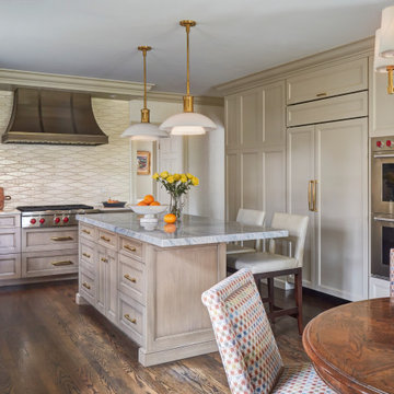
This is sophistication in the kitchen. These are custom made cabinetry from Dutch Made Inc. These are a maple cabinet with a beautiful paint and a glaze on the base cabinets. It is the perfect partner to the chenille upper cabinets. The hood wall steals the show with it's elegance and open space. This is a custom hood that is breathtaking and timeless. Glass doors around the window give depth and elegance to the kitchen that only glass can do. Don't miss the appliance garage on the countertop to provide plenty of storage. Eating and entertaining at the island is perfect with the stools and snack bar area. Last but not least is the incredible wall of ovens, refrigerator and pantry. Elegant and functional for all goodies. Photographs by Michael A. Kaskel
Designed by Lisa Murphy for DDK Kitchen Design Group. Countertops by Tithof Tile and Marble.

 Klopf Architecture
Joseph Eichler developed his moderately priced houses for the mass-market starting in 1949. His homes were designed using affordable materials and simple construction techniques. Nearly 70 years later these homes are in need of updating and remodeling an Eichler home today can become an imposing and costly project if you’re not careful. For this project the clients, who had undergone several previous house renovations, were determined to stick with an established budget from the beginning. Klopf Architecture helped them modernize their Eichler with a premium appearance on a reasonable budget.
The clients challenged the Klopf team to create a design that had a high-end feel and nicely done while adhering to their budget. That meant not all of the initial project scope could be built. Like many other Eichler homes, the original floor plan did not meet the family’s needs leaving them feeling disconnected from one room to another. While an early goal was to expand the house into a carport and create a larger garage, it did not survive the contractor pricing phase of the project.
The goals that did survive through to the end of the project included blurring some of the boundaries and opening up some of the spaces, making them more functional and creating a smoother flow in the house. The Klopf team joined the former separate kitchen and formal living room into one large space and shift the dining room where it is now connected to the kitchen. Klopf swapped the family room to the front alongside the living room, so the spaces feel more cohesive and are now better suited for family activities. The functional layout of the master bathroom was changed to include a large, curbless shower.
Installing a complete IKEA kitchen including cabinets, countertops, appliances, light fixtures, and furnishings was key to staying within budget. Bath fixtures in this house are also exclusively IKEA. Klopf Architecture has designed many homes using IKEA products, which are quite compatible offering an affordable, contemporary take on Eichler homes. The clients saved additional money from the simplicity and availability of IKEA products and by orchestrating the orders and purchases themselves. Following each construction meeting, the clients would make a run to IKEA and purchase items, pick up needed spare parts, and bring them back right away to stay ahead of the contractor’s schedule and minimize the chance of delays and bottlenecks.
Klopf balanced material selections by retaining some of the original woodwork and simply refinishing the mahogany paneling. They were able to retain the original windows and sliding doors which were still in good shape, avoiding some of the most costly replacement expenses. Additionally interior doors were simply refinished and the exterior siding cleaned up and repainted. Formerly dark interiors are now illuminated with new slimmer semi-recessed lighting eliminating the need for costly roof work.
Attention to design details allowed the Klopf team to ensure the house ended up with a high quality feel. Key visual elements were strictly aligned and Klopf worked with the clients to select a unified materials palette throughout the spaces so the house flows seamlessly together. Aligning the tile layout with the trusses and keeping it level with the concrete slab outside allowed them to achieve a level of quality that may otherwise be missed.
The clients were able to keep their budget on track by determining clear goals and making critical decisions upfront, choosing materials and furnishings wisely, working with the right design and construction teams in place and to a large part, their willingness to participate throughout the process. In the end the clients were much happier with their reconfigured Eichler home and Klopf Architecture managed to keep their remodeling costs to about $325/sf – a good amount below the average Bay Area Eichler remodel.
Project Team: John Klopf, Angela Todorova, Sherry Tan
Contractor: Keycon Construction
Structural Engineer: Sezen & Moon
Photography: Sabrina Huang
Year Completed: 2020
 Klopf Architecture
Joseph Eichler developed his moderately priced houses for the mass-market starting in 1949. His homes were designed using affordable materials and simple construction techniques. Nearly 70 years later these homes are in need of updating and remodeling an Eichler home today can become an imposing and costly project if you’re not careful. For this project the clients, who had undergone several previous house renovations, were determined to stick with an established budget from the beginning. Klopf Architecture helped them modernize their Eichler with a premium appearance on a reasonable budget.
The clients challenged the Klopf team to create a design that had a high-end feel and nicely done while adhering to their budget. That meant not all of the initial project scope could be built. Like many other Eichler homes, the original floor plan did not meet the family’s needs leaving them feeling disconnected from one room to another. While an early goal was to expand the house into a carport and create a larger garage, it did not survive the contractor pricing phase of the project.
The goals that did survive through to the end of the project included blurring some of the boundaries and opening up some of the spaces, making them more functional and creating a smoother flow in the house. The Klopf team joined the former separate kitchen and formal living room into one large space and shift the dining room where it is now connected to the kitchen. Klopf swapped the family room to the front alongside the living room, so the spaces feel more cohesive and are now better suited for family activities. The functional layout of the master bathroom was changed to include a large, curbless shower.
Installing a complete IKEA kitchen including cabinets, countertops, appliances, light fixtures, and furnishings was key to staying within budget. Bath fixtures in this house are also exclusively IKEA. Klopf Architecture has designed many homes using IKEA products, which are quite compatible offering an affordable, contemporary take on Eichler homes. The clients saved additional money from the simplicity and availability of IKEA products and by orchestrating the orders and purchases themselves. Following each construction meeting, the clients would make a run to IKEA and purchase items, pick up needed spare parts, and bring them back right away to stay ahead of the contractor’s schedule and minimize the chance of delays and bottlenecks.
Klopf balanced material selections by retaining some of the original woodwork and simply refinishing the mahogany paneling. They were able to retain the original windows and sliding doors which were still in good shape, avoiding some of the most costly replacement expenses. Additionally interior doors were simply refinished and the exterior siding cleaned up and repainted. Formerly dark interiors are now illuminated with new slimmer semi-recessed lighting eliminating the need for costly roof work.
Attention to design details allowed the Klopf team to ensure the house ended up with a high quality feel. Key visual elements were strictly aligned and Klopf worked with the clients to select a unified materials palette throughout the spaces so the house flows seamlessly together. Aligning the tile layout with the trusses and keeping it level with the concrete slab outside allowed them to achieve a level of quality that may otherwise be missed.
The clients were able to keep their budget on track by determining clear goals and making critical decisions upfront, choosing materials and furnishings wisely, working with the right design and construction teams in place and to a large part, their willingness to participate throughout the process. In the end the clients were much happier with their reconfigured Eichler home and Klopf Architecture managed to keep their remodeling costs to about $325/sf – a good amount below the average Bay Area Eichler remodel.
Project Team: John Klopf, Angela Todorova, Sherry Tan
Contractor: Keycon Construction
Structural Engineer: Sezen & Moon
Photography: Sabrina Huang
Year Completed: 2020
 Benson Homes LLC
This remodeling story is a wonderful example of how removing and shifting walls can have an amazing impact on the functionality and visual appeal of an entire level of a home. When our clients reached out to us, they were looking to create an open concept Kitchen that would allow for easy entertaining. The couple had recently purchased this townhome so his mother could be closer to the family.
The existing floorplan offered first floor living, but the Kitchen was tucked in the back and was separated from the rest of the living space by a full wall with a small pass through into the Dining Room. Our design involved removing the dividing wall between the Dining Room and Kitchen as well as the fake columns and beam that separated the Dining Room and Living Room. The entire space was opened up to allow for easy flow and view throughout the first floor living space. The wall shared by the Kitchen and large Master Bedroom was shifted back just enough to provide a full wall of additional cabinetry including a much-needed large double Pantry cabinet. Now that we had opened up the Kitchen area we could focus on the cabinetry layout and selections.
The existing wood toned cabinets were replaced with white cabinets and crown molding to match the rest of the home. The larger, open space allowed for more cabinetry and the addition of an island with new undermount sink, dishwasher and convenient trash pullout along with seating for the grandchildren. A new range hood was installed and vented to the exterior of the house to replace the old recirculating hood. We were able to repurpose the some of the existing cabinets for use above the washer and dryer in the adjoining Laundry Room and swapped out the existing swinging door for a pocket door to free up traffic flow when doing Laundry and working in the Kitchen. The slate-look ceramic tile was replaced with a pre-engineered hardwood floor that creates a sense of warmth while easy to clean. The new Cambria countertop compliments the slate-look tile found in the Dining Room and Living Room and a natural field tile backsplash offsets the cabinets beautifully.
The single fluorescent ceiling light was outdated and did not provide adequate lighting for the new Kitchen. The new lighting plan was carefully thought out to provide general illumination through well placed recessed lighting; task lighting through pendant lighting over the island and under cabinet lighting; and aesthetic fluidity with an eye-catching chandelier for the Dining Room table. Special details include a touch faucet, under counter microwave and glass front cabinetry for displaying dishes.
By removing and shifting walls, we improved the entire flow of the first floor visually as well as functionally and created a beautiful, light-filled space for cooking and entertaining. Grandma can easily prepare meals in her new Kitchen and still chat with her guests and grandchildren who love to sit at the island as well as in the adjoining Dining Room and Living Room.
The Benson Homes team really enjoyed creating this space for this family and we hope they will enjoy spending time with friends and family for years to come.
 Klopf Architecture
Joseph Eichler developed his moderately priced houses for the mass-market starting in 1949. His homes were designed using affordable materials and simple construction techniques. Nearly 70 years later these homes are in need of updating and remodeling an Eichler home today can become an imposing and costly project if you’re not careful. For this project the clients, who had undergone several previous house renovations, were determined to stick with an established budget from the beginning. Klopf Architecture helped them modernize their Eichler with a premium appearance on a reasonable budget.
The clients challenged the Klopf team to create a design that had a high-end feel and nicely done while adhering to their budget. That meant not all of the initial project scope could be built. Like many other Eichler homes, the original floor plan did not meet the family’s needs leaving them feeling disconnected from one room to another. While an early goal was to expand the house into a carport and create a larger garage, it did not survive the contractor pricing phase of the project.
The goals that did survive through to the end of the project included blurring some of the boundaries and opening up some of the spaces, making them more functional and creating a smoother flow in the house. The Klopf team joined the former separate kitchen and formal living room into one large space and shift the dining room where it is now connected to the kitchen. Klopf swapped the family room to the front alongside the living room, so the spaces feel more cohesive and are now better suited for family activities. The functional layout of the master bathroom was changed to include a large, curbless shower.
Installing a complete IKEA kitchen including cabinets, countertops, appliances, light fixtures, and furnishings was key to staying within budget. Bath fixtures in this house are also exclusively IKEA. Klopf Architecture has designed many homes using IKEA products, which are quite compatible offering an affordable, contemporary take on Eichler homes. The clients saved additional money from the simplicity and availability of IKEA products and by orchestrating the orders and purchases themselves. Following each construction meeting, the clients would make a run to IKEA and purchase items, pick up needed spare parts, and bring them back right away to stay ahead of the contractor’s schedule and minimize the chance of delays and bottlenecks.
Klopf balanced material selections by retaining some of the original woodwork and simply refinishing the mahogany paneling. They were able to retain the original windows and sliding doors which were still in good shape, avoiding some of the most costly replacement expenses. Additionally interior doors were simply refinished and the exterior siding cleaned up and repainted. Formerly dark interiors are now illuminated with new slimmer semi-recessed lighting eliminating the need for costly roof work.
Attention to design details allowed the Klopf team to ensure the house ended up with a high quality feel. Key visual elements were strictly aligned and Klopf worked with the clients to select a unified materials palette throughout the spaces so the house flows seamlessly together. Aligning the tile layout with the trusses and keeping it level with the concrete slab outside allowed them to achieve a level of quality that may otherwise be missed.
The clients were able to keep their budget on track by determining clear goals and making critical decisions upfront, choosing materials and furnishings wisely, working with the right design and construction teams in place and to a large part, their willingness to participate throughout the process. In the end the clients were much happier with their reconfigured Eichler home and Klopf Architecture managed to keep their remodeling costs to about $325/sf – a good amount below the average Bay Area Eichler remodel.
Project Team: John Klopf, Angela Todorova, Sherry Tan
Contractor: Keycon Construction
Structural Engineer: Sezen & Moon
Photography: Sabrina Huang
Year Completed: 2020
 Benson Homes LLC
This remodeling story is a wonderful example of how removing and shifting walls can have an amazing impact on the functionality and visual appeal of an entire level of a home. When our clients reached out to us, they were looking to create an open concept Kitchen that would allow for easy entertaining. The couple had recently purchased this townhome so his mother could be closer to the family.
The existing floorplan offered first floor living, but the Kitchen was tucked in the back and was separated from the rest of the living space by a full wall with a small pass through into the Dining Room. Our design involved removing the dividing wall between the Dining Room and Kitchen as well as the fake columns and beam that separated the Dining Room and Living Room. The entire space was opened up to allow for easy flow and view throughout the first floor living space. The wall shared by the Kitchen and large Master Bedroom was shifted back just enough to provide a full wall of additional cabinetry including a much-needed large double Pantry cabinet. Now that we had opened up the Kitchen area we could focus on the cabinetry layout and selections.
The existing wood toned cabinets were replaced with white cabinets and crown molding to match the rest of the home. The larger, open space allowed for more cabinetry and the addition of an island with new undermount sink, dishwasher and convenient trash pullout along with seating for the grandchildren. A new range hood was installed and vented to the exterior of the house to replace the old recirculating hood. We were able to repurpose the some of the existing cabinets for use above the washer and dryer in the adjoining Laundry Room and swapped out the existing swinging door for a pocket door to free up traffic flow when doing Laundry and working in the Kitchen. The slate-look ceramic tile was replaced with a pre-engineered hardwood floor that creates a sense of warmth while easy to clean. The new Cambria countertop compliments the slate-look tile found in the Dining Room and Living Room and a natural field tile backsplash offsets the cabinets beautifully.
The single fluorescent ceiling light was outdated and did not provide adequate lighting for the new Kitchen. The new lighting plan was carefully thought out to provide general illumination through well placed recessed lighting; task lighting through pendant lighting over the island and under cabinet lighting; and aesthetic fluidity with an eye-catching chandelier for the Dining Room table. Special details include a touch faucet, under counter microwave and glass front cabinetry for displaying dishes.
By removing and shifting walls, we improved the entire flow of the first floor visually as well as functionally and created a beautiful, light-filled space for cooking and entertaining. Grandma can easily prepare meals in her new Kitchen and still chat with her guests and grandchildren who love to sit at the island as well as in the adjoining Dining Room and Living Room.
The Benson Homes team really enjoyed creating this space for this family and we hope they will enjoy spending time with friends and family for years to come.
 TKS Design Group
Download our free ebook, Creating the Ideal Kitchen. DOWNLOAD NOW
Lakefront property in the northwest suburbs of Chicago is hard to come by, so when we were hired by this young family with exactly that, we were immediately inspired by not just the unusually large footprint of this 1950’s colonial revival but also the lovely views of the manmade lake it was sited on. The large 5-bedroom home was solidly stuck in the 1980’s, but we saw tons of potential. We started out by updating the existing staircase with a fresh coat of paint and adding new herringbone slate to the entry hall.
The powder room off the entryway also got a refresh - new flooring, new cabinets and fixtures. We ran the new slate right through into this space for some consistency. A fun wallpaper and shiplap trim add a welcoming feel and set the tone for the home.
Next, we tackled the kitchen. Located away from the rest of the first floor, the kitchen felt a little isolated, so we immediately began planning for how to better connect it to the rest of the first floor. We landed on removing the wall between the kitchen and dining room and designed a modified galley style space with separate cooking and clean up zones. The cooking zone consists of the refrigerator, prep sink and cooktop, along with a nice long run of prep space at the island. The cleanup side of the kitchen consists of the main sink and dishwasher. Both areas are situated so that the user can view the lake during prep work and cleanup!
One of the home’s main puzzles was how to incorporate the mudroom and area in front of the patio doors at the back of the house. We already had a breakfast table area, so the space by the patio doors was a bit of a no man’s land. We decided to separate the kitchen proper from what became the new mudroom with a large set of barn doors. That way you can quickly hide any mudroom messes but have easy access to the light coming in through the patio doors as well as the outdoor grilling station. We also love the impact the barn doors add to the overall space.
The homeowners’ first words to us were “it’s time to ditch the brown,” so we did! We chose a lovely blue pallet that reflects the home’s location on the lake which is also vibrant yet easy on the eye. Countertops are white quartz, and the natural oak floor works well with the other honey accents. The breakfast table was given a refresh with new chairs, chandelier and window treatments that frame the gorgeous views of the lake out the back.
We coordinated the slate mudroom flooring with that used in the home’s main entrance for a consistent feel. The storage area consists of open and closed storage to allow for some clutter control as needed.
Next on our “to do” list was revamping the dated brown bar area in the neighboring dining room. We eliminated the clutter by adding some closed cabinets and did some easy updates to help the space feel more current. One snag we ran into here was the discovery of a beam above the existing open shelving that had to be modified with a smaller structural beam to allow for our new design to work. This was an unexpected surprise, but in the end we think it was well worth it!
We kept the colors here a bit more muted to blend with the homeowner’s existing furnishings. Open shelving and polished nickel hardware add some simple detail to the new entertainment zone which also looks out onto the lake!
Next we tackled the upstairs starting with the homeowner’s son’s bath. The bath originally had both a tub shower and a separate shower, so we decided to swap out the shower for a new laundry area. This freed up some space downstairs in what used to be the mudroom/laundry room and is much more convenient for daily laundry needs.
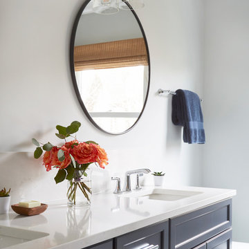
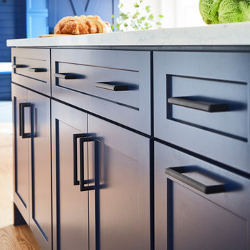
We continued the blue palette here with navy cabinetry and the navy tile in the shower. Porcelain floor tile and chrome fixtures keep maintenance to a minimum while matte black mirrors and lighting add some depth the design. A low maintenance runner adds some warmth underfoot and ties the whole space together.
We added a pocket door to the bathroom to minimize interference with the door swings. The left door of the laundry closet is on a 180 degree hinge to allow for easy full access to the machines. Next we tackled the master bath which is an en suite arrangement. The original was typical of the 1980’s with the vanity outside of the bathroom, situated near the master closet. And the brown theme continued here with multiple shades of brown.
Our first move was to segment off the bath and the closet from the master bedroom. We created a short hall from the bedroom to the bathroom with his and hers walk-in closets on the left and right as well as a separate toilet closet outside of the main bathroom for privacy and flexibility.
The original bathroom had a giant soaking tub with steps (dangerous!) as well as a small shower that did not work well for our homeowner who is 6’3”. With other bathtubs in the home, they decided to eliminate the tub and create an oversized shower which takes up the space where the old tub was located. The double vanity is on the opposite wall and a bench is located under the window for morning conversations and a place to set a couple of towels.
The pallet in here is light and airy with a mix of blond wood, creamy porcelain and marble tile, and brass accents. A simple roman shade adds some texture and it’s top-down mechanism allows for light and privacy.
This large whole house remodel gave our homeowners not only the ability to maximize the potential of their home but also created a lovely new frame from which to view their fabulous lake views.
Designed by: Susan Klimala, CKD, CBD
Photography by: Michael Kaskel
For more information on kitchen and bath design ideas go to: www.kitchenstudio-ge.com
 Benson Homes LLC
This remodeling story is a wonderful example of how removing and shifting walls can have an amazing impact on the functionality and visual appeal of an entire level of a home. When our clients reached out to us, they were looking to create an open concept Kitchen that would allow for easy entertaining. The couple had recently purchased this townhome so his mother could be closer to the family.
The existing floorplan offered first floor living, but the Kitchen was tucked in the back and was separated from the rest of the living space by a full wall with a small pass through into the Dining Room. Our design involved removing the dividing wall between the Dining Room and Kitchen as well as the fake columns and beam that separated the Dining Room and Living Room. The entire space was opened up to allow for easy flow and view throughout the first floor living space. The wall shared by the Kitchen and large Master Bedroom was shifted back just enough to provide a full wall of additional cabinetry including a much-needed large double Pantry cabinet. Now that we had opened up the Kitchen area we could focus on the cabinetry layout and selections.
The existing wood toned cabinets were replaced with white cabinets and crown molding to match the rest of the home. The larger, open space allowed for more cabinetry and the addition of an island with new undermount sink, dishwasher and convenient trash pullout along with seating for the grandchildren. A new range hood was installed and vented to the exterior of the house to replace the old recirculating hood. We were able to repurpose the some of the existing cabinets for use above the washer and dryer in the adjoining Laundry Room and swapped out the existing swinging door for a pocket door to free up traffic flow when doing Laundry and working in the Kitchen. The slate-look ceramic tile was replaced with a pre-engineered hardwood floor that creates a sense of warmth while easy to clean. The new Cambria countertop compliments the slate-look tile found in the Dining Room and Living Room and a natural field tile backsplash offsets the cabinets beautifully.
The single fluorescent ceiling light was outdated and did not provide adequate lighting for the new Kitchen. The new lighting plan was carefully thought out to provide general illumination through well placed recessed lighting; task lighting through pendant lighting over the island and under cabinet lighting; and aesthetic fluidity with an eye-catching chandelier for the Dining Room table. Special details include a touch faucet, under counter microwave and glass front cabinetry for displaying dishes.
By removing and shifting walls, we improved the entire flow of the first floor visually as well as functionally and created a beautiful, light-filled space for cooking and entertaining. Grandma can easily prepare meals in her new Kitchen and still chat with her guests and grandchildren who love to sit at the island as well as in the adjoining Dining Room and Living Room.
The Benson Homes team really enjoyed creating this space for this family and we hope they will enjoy spending time with friends and family for years to come.

 Benson Homes LLC
This remodeling story is a wonderful example of how removing and shifting walls can have an amazing impact on the functionality and visual appeal of an entire level of a home. When our clients reached out to us, they were looking to create an open concept Kitchen that would allow for easy entertaining. The couple had recently purchased this townhome so his mother could be closer to the family.
The existing floorplan offered first floor living, but the Kitchen was tucked in the back and was separated from the rest of the living space by a full wall with a small pass through into the Dining Room. Our design involved removing the dividing wall between the Dining Room and Kitchen as well as the fake columns and beam that separated the Dining Room and Living Room. The entire space was opened up to allow for easy flow and view throughout the first floor living space. The wall shared by the Kitchen and large Master Bedroom was shifted back just enough to provide a full wall of additional cabinetry including a much-needed large double Pantry cabinet. Now that we had opened up the Kitchen area we could focus on the cabinetry layout and selections.
The existing wood toned cabinets were replaced with white cabinets and crown molding to match the rest of the home. The larger, open space allowed for more cabinetry and the addition of an island with new undermount sink, dishwasher and convenient trash pullout along with seating for the grandchildren. A new range hood was installed and vented to the exterior of the house to replace the old recirculating hood. We were able to repurpose the some of the existing cabinets for use above the washer and dryer in the adjoining Laundry Room and swapped out the existing swinging door for a pocket door to free up traffic flow when doing Laundry and working in the Kitchen. The slate-look ceramic tile was replaced with a pre-engineered hardwood floor that creates a sense of warmth while easy to clean. The new Cambria countertop compliments the slate-look tile found in the Dining Room and Living Room and a natural field tile backsplash offsets the cabinets beautifully.
The single fluorescent ceiling light was outdated and did not provide adequate lighting for the new Kitchen. The new lighting plan was carefully thought out to provide general illumination through well placed recessed lighting; task lighting through pendant lighting over the island and under cabinet lighting; and aesthetic fluidity with an eye-catching chandelier for the Dining Room table. Special details include a touch faucet, under counter microwave and glass front cabinetry for displaying dishes.
By removing and shifting walls, we improved the entire flow of the first floor visually as well as functionally and created a beautiful, light-filled space for cooking and entertaining. Grandma can easily prepare meals in her new Kitchen and still chat with her guests and grandchildren who love to sit at the island as well as in the adjoining Dining Room and Living Room.
The Benson Homes team really enjoyed creating this space for this family and we hope they will enjoy spending time with friends and family for years to come.
 Klopf Architecture
Joseph Eichler developed his moderately priced houses for the mass-market starting in 1949. His homes were designed using affordable materials and simple construction techniques. Nearly 70 years later these homes are in need of updating and remodeling an Eichler home today can become an imposing and costly project if you’re not careful. For this project the clients, who had undergone several previous house renovations, were determined to stick with an established budget from the beginning. Klopf Architecture helped them modernize their Eichler with a premium appearance on a reasonable budget.
The clients challenged the Klopf team to create a design that had a high-end feel and nicely done while adhering to their budget. That meant not all of the initial project scope could be built. Like many other Eichler homes, the original floor plan did not meet the family’s needs leaving them feeling disconnected from one room to another. While an early goal was to expand the house into a carport and create a larger garage, it did not survive the contractor pricing phase of the project.
The goals that did survive through to the end of the project included blurring some of the boundaries and opening up some of the spaces, making them more functional and creating a smoother flow in the house. The Klopf team joined the former separate kitchen and formal living room into one large space and shift the dining room where it is now connected to the kitchen. Klopf swapped the family room to the front alongside the living room, so the spaces feel more cohesive and are now better suited for family activities. The functional layout of the master bathroom was changed to include a large, curbless shower.
Installing a complete IKEA kitchen including cabinets, countertops, appliances, light fixtures, and furnishings was key to staying within budget. Bath fixtures in this house are also exclusively IKEA. Klopf Architecture has designed many homes using IKEA products, which are quite compatible offering an affordable, contemporary take on Eichler homes. The clients saved additional money from the simplicity and availability of IKEA products and by orchestrating the orders and purchases themselves. Following each construction meeting, the clients would make a run to IKEA and purchase items, pick up needed spare parts, and bring them back right away to stay ahead of the contractor’s schedule and minimize the chance of delays and bottlenecks.
Klopf balanced material selections by retaining some of the original woodwork and simply refinishing the mahogany paneling. They were able to retain the original windows and sliding doors which were still in good shape, avoiding some of the most costly replacement expenses. Additionally interior doors were simply refinished and the exterior siding cleaned up and repainted. Formerly dark interiors are now illuminated with new slimmer semi-recessed lighting eliminating the need for costly roof work.
Attention to design details allowed the Klopf team to ensure the house ended up with a high quality feel. Key visual elements were strictly aligned and Klopf worked with the clients to select a unified materials palette throughout the spaces so the house flows seamlessly together. Aligning the tile layout with the trusses and keeping it level with the concrete slab outside allowed them to achieve a level of quality that may otherwise be missed.
The clients were able to keep their budget on track by determining clear goals and making critical decisions upfront, choosing materials and furnishings wisely, working with the right design and construction teams in place and to a large part, their willingness to participate throughout the process. In the end the clients were much happier with their reconfigured Eichler home and Klopf Architecture managed to keep their remodeling costs to about $325/sf – a good amount below the average Bay Area Eichler remodel.
Project Team: John Klopf, Angela Todorova, Sherry Tan
Contractor: Keycon Construction
Structural Engineer: Sezen & Moon
Photography: Sabrina Huang
Year Completed: 2020

 Land & Water Design
Our client constructed their new home on five wooded acres in Northern Virginia, and they requested our firm to help them design the ultimate backyard retreat complete with custom natural look pool as the main focal point. The pool was designed into an existing hillside, adding natural boulders and multiple waterfalls, raised spa. Next to the spa is a raised natural wood burning fire pit for those cool evenings or just a fun place for the kids to roast marshmallows.
The extensive Techo-bloc Inca paver pool deck, a large custom pool house complete with bar, kitchen/grill area, lounge area with 60" flat screen TV, full audio throughout the pool house & pool area with a full bath to complete the pool area.
For the back of the house, we included a custom composite waterproof deck with lounge area below, recessed lighting, ceiling fans & small outdoor grille area make this space a great place to hangout. For the man of the house, an avid golfer, a large Southwest synthetic putting green (2000 s.f.) with bunker and tee boxes keeps him on top of his game. A kids playhouse, connecting flagstone walks throughout, extensive non-deer appealing landscaping, outdoor lighting, and full irrigation fulfilled all of the client's design parameters.
 TKS Design Group
Download our free ebook, Creating the Ideal Kitchen. DOWNLOAD NOW
Lakefront property in the northwest suburbs of Chicago is hard to come by, so when we were hired by this young family with exactly that, we were immediately inspired by not just the unusually large footprint of this 1950’s colonial revival but also the lovely views of the manmade lake it was sited on. The large 5-bedroom home was solidly stuck in the 1980’s, but we saw tons of potential. We started out by updating the existing staircase with a fresh coat of paint and adding new herringbone slate to the entry hall.
The powder room off the entryway also got a refresh - new flooring, new cabinets and fixtures. We ran the new slate right through into this space for some consistency. A fun wallpaper and shiplap trim add a welcoming feel and set the tone for the home.
Next, we tackled the kitchen. Located away from the rest of the first floor, the kitchen felt a little isolated, so we immediately began planning for how to better connect it to the rest of the first floor. We landed on removing the wall between the kitchen and dining room and designed a modified galley style space with separate cooking and clean up zones. The cooking zone consists of the refrigerator, prep sink and cooktop, along with a nice long run of prep space at the island. The cleanup side of the kitchen consists of the main sink and dishwasher. Both areas are situated so that the user can view the lake during prep work and cleanup!
One of the home’s main puzzles was how to incorporate the mudroom and area in front of the patio doors at the back of the house. We already had a breakfast table area, so the space by the patio doors was a bit of a no man’s land. We decided to separate the kitchen proper from what became the new mudroom with a large set of barn doors. That way you can quickly hide any mudroom messes but have easy access to the light coming in through the patio doors as well as the outdoor grilling station. We also love the impact the barn doors add to the overall space.
The homeowners’ first words to us were “it’s time to ditch the brown,” so we did! We chose a lovely blue pallet that reflects the home’s location on the lake which is also vibrant yet easy on the eye. Countertops are white quartz, and the natural oak floor works well with the other honey accents. The breakfast table was given a refresh with new chairs, chandelier and window treatments that frame the gorgeous views of the lake out the back.
We coordinated the slate mudroom flooring with that used in the home’s main entrance for a consistent feel. The storage area consists of open and closed storage to allow for some clutter control as needed.
Next on our “to do” list was revamping the dated brown bar area in the neighboring dining room. We eliminated the clutter by adding some closed cabinets and did some easy updates to help the space feel more current. One snag we ran into here was the discovery of a beam above the existing open shelving that had to be modified with a smaller structural beam to allow for our new design to work. This was an unexpected surprise, but in the end we think it was well worth it!
We kept the colors here a bit more muted to blend with the homeowner’s existing furnishings. Open shelving and polished nickel hardware add some simple detail to the new entertainment zone which also looks out onto the lake!
Next we tackled the upstairs starting with the homeowner’s son’s bath. The bath originally had both a tub shower and a separate shower, so we decided to swap out the shower for a new laundry area. This freed up some space downstairs in what used to be the mudroom/laundry room and is much more convenient for daily laundry needs.
We continued the blue palette here with navy cabinetry and the navy tile in the shower. Porcelain floor tile and chrome fixtures keep maintenance to a minimum while matte black mirrors and lighting add some depth the design. A low maintenance runner adds some warmth underfoot and ties the whole space together.
We added a pocket door to the bathroom to minimize interference with the door swings. The left door of the laundry closet is on a 180 degree hinge to allow for easy full access to the machines. Next we tackled the master bath which is an en suite arrangement. The original was typical of the 1980’s with the vanity outside of the bathroom, situated near the master closet. And the brown theme continued here with multiple shades of brown.
Our first move was to segment off the bath and the closet from the master bedroom. We created a short hall from the bedroom to the bathroom with his and hers walk-in closets on the left and right as well as a separate toilet closet outside of the main bathroom for privacy and flexibility.
The original bathroom had a giant soaking tub with steps (dangerous!) as well as a small shower that did not work well for our homeowner who is 6’3”. With other bathtubs in the home, they decided to eliminate the tub and create an oversized shower which takes up the space where the old tub was located. The double vanity is on the opposite wall and a bench is located under the window for morning conversations and a place to set a couple of towels.
The pallet in here is light and airy with a mix of blond wood, creamy porcelain and marble tile, and brass accents. A simple roman shade adds some texture and it’s top-down mechanism allows for light and privacy.
This large whole house remodel gave our homeowners not only the ability to maximize the potential of their home but also created a lovely new frame from which to view their fabulous lake views.
Designed by: Susan Klimala, CKD, CBD
Photography by: Michael Kaskel
For more information on kitchen and bath design ideas go to: www.kitchenstudio-ge.com
 Benson Homes LLC
This remodeling story is a wonderful example of how removing and shifting walls can have an amazing impact on the functionality and visual appeal of an entire level of a home. When our clients reached out to us, they were looking to create an open concept Kitchen that would allow for easy entertaining. The couple had recently purchased this townhome so his mother could be closer to the family.
The existing floorplan offered first floor living, but the Kitchen was tucked in the back and was separated from the rest of the living space by a full wall with a small pass through into the Dining Room. Our design involved removing the dividing wall between the Dining Room and Kitchen as well as the fake columns and beam that separated the Dining Room and Living Room. The entire space was opened up to allow for easy flow and view throughout the first floor living space. The wall shared by the Kitchen and large Master Bedroom was shifted back just enough to provide a full wall of additional cabinetry including a much-needed large double Pantry cabinet. Now that we had opened up the Kitchen area we could focus on the cabinetry layout and selections.
The existing wood toned cabinets were replaced with white cabinets and crown molding to match the rest of the home. The larger, open space allowed for more cabinetry and the addition of an island with new undermount sink, dishwasher and convenient trash pullout along with seating for the grandchildren. A new range hood was installed and vented to the exterior of the house to replace the old recirculating hood. We were able to repurpose the some of the existing cabinets for use above the washer and dryer in the adjoining Laundry Room and swapped out the existing swinging door for a pocket door to free up traffic flow when doing Laundry and working in the Kitchen. The slate-look ceramic tile was replaced with a pre-engineered hardwood floor that creates a sense of warmth while easy to clean. The new Cambria countertop compliments the slate-look tile found in the Dining Room and Living Room and a natural field tile backsplash offsets the cabinets beautifully.
The single fluorescent ceiling light was outdated and did not provide adequate lighting for the new Kitchen. The new lighting plan was carefully thought out to provide general illumination through well placed recessed lighting; task lighting through pendant lighting over the island and under cabinet lighting; and aesthetic fluidity with an eye-catching chandelier for the Dining Room table. Special details include a touch faucet, under counter microwave and glass front cabinetry for displaying dishes.
By removing and shifting walls, we improved the entire flow of the first floor visually as well as functionally and created a beautiful, light-filled space for cooking and entertaining. Grandma can easily prepare meals in her new Kitchen and still chat with her guests and grandchildren who love to sit at the island as well as in the adjoining Dining Room and Living Room.
The Benson Homes team really enjoyed creating this space for this family and we hope they will enjoy spending time with friends and family for years to come.
 User
Exquisite Worktops and High-end Kitchen Guide
Homeowners
The fuel to every person's happiness: food; is stored in a kitchen. We gotta agree that even if life is created in a bedroom, it is certainly lived in a kitchen. Hence, It is undeniable that every homeowner would want to invest mindfully in creating a proper outlook of a place that nourishes the heart of both its family and its guests. While designing a kitchen unlike other spaces of a home one must pay attention to the choice of materials for worktops, floors, sinks, etc that suit the hygiene purposes alongside the aesthetic point of view, which might usually result in a very high budget plan. So this is where practicality hits a common man as no matter what one`s wishlist is, execution ultimately depends on their capability of expenditure.
However, with sufficient guidance on kitchen design planning, one can drastically minimise the expenses without necessarily having to purchase cheap worktops. The choice of the right materials is just as important as the ability to financially invest in the same, if not more. This means if a person has enough knowledge of what they are looking for, they can cleverly create an exquisite look under a much lesser budget-friendly scheme.
Key Points to Consider When on a Mission to Create a High-end Kitchen Under Restrained Pockets
Estimating a Budget Plan:
Setting a realistic budget before the investment is a very important aspect which shouldn't be overlooked. According to NKBA, a proper guide to setting one`s kitchen budget while planning a new one should look like- 29% cabinets and hardware, 17% installation, 14% appliances and ventilation, 10% countertops, 7% flooring, 5% walls and ceilings, 5% lighting, 5% faucets and plumbing, 4% doors and windows, 4% design fees and 1% miscellaneous.
Pick Your Beautiful Stone for Work-top:
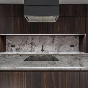
As we all know, beauty is not just conventional, so natural stones, as well as engineered stones, are beautiful in their own way. Engineered countertops are still impressively resistant to scratch and stains. They can almost replicate the intrinsic character and sparkle of granite and marbles. The manufacturing technique of engineered stones has made it so that, wherever they are incorporated, they add a sense of style and class. And with minimal maintenance, they can last for a very long time in a household. One can even go for the mix and matching technique where one can use both expensive and inexpensive buys in such a way that the former occupies the areas on display while the latter covers up for other units.
Being on a budget, though, must not mean hiring inexperienced fabricators to compromise on cost. The short-term result might be tempting but doing so will only increase the future risk thus being more of a loss than an advantage. However, if one is confident enough in their skills, DIY-ing the fittings will drastically reduce the cost of expenditure.
Reusing and Recycling Off Cuts:
While extending or renovating one always has the option to think about how some materials from the previous space can be given a second life. Worktops can be altered to fit a new plan, cupboard doors can be fitted to the kitchen and given a fresh look by repainting, and old appliances can be sold on to help contribute towards pitching in some money for purchasing new ones. The stone remnants and offcuts can always be utilised for smaller projects. Check out these Remnants that are available within your region.
Flooring:
Renovating a floor on a tight budget doesn't necessarily mean that one doesn't care about durability or looks. Ideally, one will still want a decent lifespan and great finish even if it's the most affordable kitchen floor out there. To avail this best possible combination of durability, style, and affordability, consider laminate and vinyl flooring designs. They mimic wood and tile flooring convincingly enough.
Work-top Lights:
Light fixtures are easy and impactful and one of the easiest ways to upgrade a room's look. Impeccable lighting not only makes the room look stunning but also provides effective task lighting to make the space easier and more enjoyable to use. If the plan is to introduce new lighting to an existing kitchen, one can try using battery-operated LED spotlights and strips that don’t need wiring in. Installing them over worktops, under cabinets and inside open or glass-fronted cupboards can create an expensive appearance.
Colour Details:
Choosing the right colour of paint has the potential to drastically change the outlook. For example, just visualise a completely white kitchen worktop. Done? Now similarly, a completely black kitchen. You can't deny that both would bring out completely different aesthetic values. Colour is one of the best ways to inject personality into a space but it's important to get the proportions right. For a guaranteed unregretted approach, you can choose neutral tones for the structural elements that are more costly and difficult to replace, including cabinets, floors, worktops, kitchen countertops, and appliances. Then introduce colour with less-expensive updates to the walls, backsplash, window treatments, lighting, and other accents. With this strategy, you can easily and affordably swap out your colour scheme as your tastes and popular trends change.
Creating Interest:
Worktops
One unique way to enhance the design is by introducing an interesting element to catch the eye and provide a focal point.
Decorating Walls:
Attractive wallpapers add a sense of style to the kitchen. It is a great way to freshen up a room without needing to do a lot of work or spending much money. In a rental property, one can try vinyl wall decals or temporary wallpaper. However, overdoing the work in the hype of excitement will make it worse than doing good.
Open Shelf:
One can utilize an empty wall for open shelves. It adds more storage and creates a display area. Go for a decorative or contrasting shelf to add character. Keeping the shelves clear of clutter and using them as a design piece to show off styled arrangements of recipe books, beautiful objects and interesting pieces is always recommended.
Upgrading Cabinet Doors:
Replacing the cabinet doors is a simple way to give the appearance a brand-new look. As long as the units are standard size and the main framework is in good condition, one can just swap the doors without having to worry about the worktop, splashback, plumbing or electrics. Another simple way to upgrade the units is to replace the handles. Vintage cabinets can be given a modification to look contemporary or vice versa with this simple trick. Similarly, cheap, basic-looking handles can be replaced with beautiful handmade ceramic knobs or adding a stylish leather door pull can upgrade the kitchen’s chic factor.
With all these points and our collection of stones, you will have an exquisite kitchen right in front of you. Our service charges are minimum to make kitchen renovation an achievable dream for all homeowners. Email info@work-tops.com for free quotes and to know about our special offers.
190