
Search results for "Swapping" in Home Design Ideas
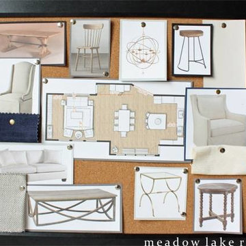
 Design for a Living
Presentation board for a Seattle kitchen and living room remodel. Designed by design coach Chelsea Coryell and new designer Erin Zacharda
Inspiration for a mid-sized transitional home design remodel in Seattle
Inspiration for a mid-sized transitional home design remodel in Seattle
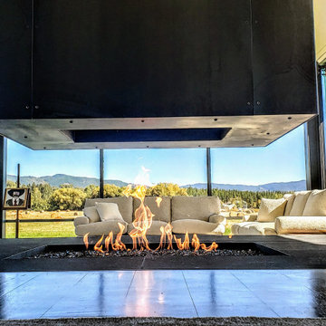
 Acucraft Fireplaces
Not every fireplace project is a piece of cake; sometimes customers seek out Acucraft to fix what was their dream fireplace, which is what happened to the Connor family in Montana. Dan, Contractor at Martel Construction, came to Acucraft hoping we could provide a gas fireplace transformation for these new homeowners; we were happy to help!


Find the right local pro for your project
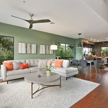


 New Ravenna
Hercule, a natural stone waterjet mosaic shown in Cloud Nine, Thassos and Ming Green, is by Sara Baldwin for New Ravenna Mosaics.
Bathroom - contemporary beige tile bathroom idea with beige walls
Bathroom - contemporary beige tile bathroom idea with beige walls

 Spring Creek Design
This home was a typical Toll Brothers contemporary from the early ‘90’s. The exterior had reached the end of its life, with decayed cedar siding and a deteriorated roof. Greg & Tamara decided to use this opportunity to radically remake their home - to update its modern appeal and set it apart from any other suburban tract house. Spring Creek Design created a new deck, new siding design, entryways and sculptural landscaping for the home.
Design Criteria:
- Replace siding and give the home a bold, modern look.
- Update the home’s landscaping with a spare modernism.
- Add a new deck with an outdoor kitchen.
Special Features:
- Bold new exterior features fiber-cement panels and siding.
-Three different colors are used to clearly define the shapes of the home.
- Cantilevered concrete entryways features “floating” concrete slab landings.
- Azek deck with tempered glass railings.
- Custom wine-bottle light fixtures adorn the outdoor kitchen.
- Massive planting boxes of Cor-Ten steel form the basis of a low-maintenance, dramatic landscape.
- Custom-fabricated square gutters and downspouts compliment the linearity of the home’s design.
 Kowalske Kitchen & Bath
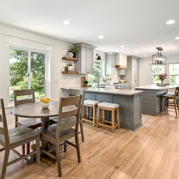
Creating a space to entertain was the top priority in this Mukwonago kitchen remodel. The homeowners wanted seating and counter space for hosting parties and watching sports. By opening the dining room wall, we extended the kitchen area. We added an island and custom designed furniture-style bar cabinet with retractable pocket doors. A new awning window overlooks the backyard and brings in natural light. Many in-cabinet storage features keep this kitchen neat and organized.
Bar Cabinet
The furniture-style bar cabinet has retractable pocket doors and a drop-in quartz counter. The homeowners can entertain in style, leaving the doors open during parties. Guests can grab a glass of wine or make a cocktail right in the cabinet.
Outlet Strips
Outlet strips on the island and peninsula keeps the end panels of the island and peninsula clean. The outlet strips also gives them options for plugging in appliances during parties.
Modern Farmhouse Design
The design of this kitchen is modern farmhouse. The materials, patterns, color and texture define this space. We used shades of golds and grays in the cabinetry, backsplash and hardware. The chevron backsplash and shiplap island adds visual interest.
Custom Cabinetry
This kitchen features frameless custom cabinets with light rail molding. It’s designed to hide the under cabinet lighting and angled plug molding. Putting the outlets under the cabinets keeps the backsplash uninterrupted.
Storage Features
Efficient storage and organization was important to these homeowners.
We opted for deep drawers to allow for easy access to stacks of dishes and bowls.
Under the cooktop, we used custom drawer heights to meet the homeowners’ storage needs.
A third drawer was added next to the spice drawer rollout.
Narrow pullout cabinets on either side of the cooktop for spices and oils.
The pantry rollout by the double oven rotates 90 degrees.
Other Updates
Staircase – We updated the staircase with a barn wood newel post and matte black balusters
Fireplace – We whitewashed the fireplace and added a barn wood mantel and pilasters.

 User
Our approach to the dining room wall was a key decision for the entire project. The wall was load bearing and the homeowners considered only removing half of it. In the end, keeping the overall open concept design was important to the homeowners, therefore we installed a load bearing beam in the ceiling. The beam was finished with drywall to be cohesive so it looked like it was a part of the original design. Now that the kitchen and dining room were open, paint colors were used to designate the spaces and create visual boundaries. This made each area feel like it’s its own space without using any structures.
The original L-shaped kitchen was cut short because of bay windows that overlooked the backyard patio. These windows were lost in the space and not functional; they were replaced with double French doors leading onto the patio. A brick layer was brought in to patch up the window swap and now it looks like the French doors always existed. New crown molding was installed throughout and painted to match the kitchen cabinets.
This window/door replacement allowed for a large pantry cabinet to be installed next to the refrigerator which was not in the old cabinet configuration. The replaced perimeter cabinets host custom storage solutions, like a mixer stand, spice organization, recycling center and functional corner cabinet with pull out shelving. The perimeter kitchen cabinets are painted with a glaze and the island is a cherry stain with glaze to amplify the raised panel door style.
We tripled the size of the kitchen island to expand countertop space. It seats five people and hosts charging stations for the family’s busy lifestyle. It was important that the cooktop in the island had a built in downdraft system because the homeowners did not want a ventilation hood in the center of the kitchen because it would obscure the open concept design.
The countertops are quartz and feature an under mount granite composite kitchen sink with a low divide center. The kitchen faucet, which features hands free and touch technology, and an instant hot water dispenser were added for convenience because of the homeowners’ busy lifestyle. The backsplash is a favorite, with a teal and red glass mosaic basket weave design. It stands out and holds its own among the expansive kitchen cabinets.
All recessed, under cabinet and decorative lights were installed on dimmer switches to allow the homeowners to adjust the lighting in each space of the project. All exterior and interior door hardware, hinges and knobs were replaced in oil rubbed bronze to match the dark stain throughout the space. The entire first floor remodel project uses 12x24 ceramic tile laid in a herringbone pattern. Since tile is typically cold, the flooring was also heated from below. This will also help with the homeowners’ original heating issues.
When accessorizing the kitchen, we used functional, everyday items the homeowners use like cutting boards, canisters for dry goods and place settings on the island. Ultimately, this project transformed their small, outdated kitchen into an expansive and functional workspace.


 Red House Design Build
Newer Homes Need Makeovers Too
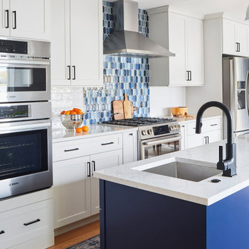
Yes, it’s true. The new home that you purchased not that long ago needs a makeover. It feels like just yesterday that you just moved in and are still settling into your new space. But the fact is, it’s already time to remodel. Homes that were built in the early 2000’s and even later are depreciating in value, aesthetically speaking. Kitchens and Baths are the top two culprits.
When our clients decided to move back to the New England area in 2012, they chose East Greenwich, RI as their destination. A quaint, centered town with an excellent school system that’s just 45 minutes to Boston and 3 hours to Manhattan (or a quick 40min direct flight). The 5-bedroom colonial they purchased was originally built in 1997, which at the time was only 15 years old. But they knew going into it that, eventually, they would have to make necessary updates for a higher return on investment.
In 2017, our clients came to Red House to help them reach their remodeling goals. The two focus areas were the outdated kitchen and a double entry full bathroom located on the second floor. The Red House design team got to work and presented a few design concepts that met our clients’ needs. After a bit of tweaking and refining of details, a fabulous yet functional space was created.
In the kitchen, traditional maple cabinets were replaced with linen white shaker style cabinets, making the space feel open and airy. An extra-large island was designed with added seating at one end, ideal for entertaining while the cooktop was replaced with a range and was relocated to a perimeter wall for ease of use. Complimenting the linen white cabinetry, cherry cabinets were used in bar area creating a nice contrast. Taking advantage of the soaring cathedral ceilings, outdated light fixtures were swapped out with 3 large hanging glass pendants by Kichler giving off more light. Granite countertops in River White were installed throughout and venetian bronze hardware by Baldwin was added to support uniformity and consistency. The wall color used was Sherman Williams Agreeable Gray.
Upstairs, the full bathroom is accessed from two separate entries, similar to that of a Jack and Jill layout. New custom white vanities with Quartz countertops in Calcutta Classique were installed at each of the two entrances. A glass shower was installed with white Carrara marble tile and natural slate floors. Polished nickel fixtures and hardware were used creating a classic look. The wall color used was Benjamin Moore Oyster Shell. Visit our website for more information!
Photo Credit: Aaron Usher Photography
Instagram: @redhousedesignbuild
 TKS Design Group
Download our free ebook, Creating the Ideal Kitchen. DOWNLOAD NOW
Lakefront property in the northwest suburbs of Chicago is hard to come by, so when we were hired by this young family with exactly that, we were immediately inspired by not just the unusually large footprint of this 1950’s colonial revival but also the lovely views of the manmade lake it was sited on. The large 5-bedroom home was solidly stuck in the 1980’s, but we saw tons of potential. We started out by updating the existing staircase with a fresh coat of paint and adding new herringbone slate to the entry hall.
The powder room off the entryway also got a refresh - new flooring, new cabinets and fixtures. We ran the new slate right through into this space for some consistency. A fun wallpaper and shiplap trim add a welcoming feel and set the tone for the home.
Next, we tackled the kitchen. Located away from the rest of the first floor, the kitchen felt a little isolated, so we immediately began planning for how to better connect it to the rest of the first floor. We landed on removing the wall between the kitchen and dining room and designed a modified galley style space with separate cooking and clean up zones. The cooking zone consists of the refrigerator, prep sink and cooktop, along with a nice long run of prep space at the island. The cleanup side of the kitchen consists of the main sink and dishwasher. Both areas are situated so that the user can view the lake during prep work and cleanup!
One of the home’s main puzzles was how to incorporate the mudroom and area in front of the patio doors at the back of the house. We already had a breakfast table area, so the space by the patio doors was a bit of a no man’s land. We decided to separate the kitchen proper from what became the new mudroom with a large set of barn doors. That way you can quickly hide any mudroom messes but have easy access to the light coming in through the patio doors as well as the outdoor grilling station. We also love the impact the barn doors add to the overall space.
The homeowners’ first words to us were “it’s time to ditch the brown,” so we did! We chose a lovely blue pallet that reflects the home’s location on the lake which is also vibrant yet easy on the eye. Countertops are white quartz, and the natural oak floor works well with the other honey accents. The breakfast table was given a refresh with new chairs, chandelier and window treatments that frame the gorgeous views of the lake out the back.
We coordinated the slate mudroom flooring with that used in the home’s main entrance for a consistent feel. The storage area consists of open and closed storage to allow for some clutter control as needed.
Next on our “to do” list was revamping the dated brown bar area in the neighboring dining room. We eliminated the clutter by adding some closed cabinets and did some easy updates to help the space feel more current. One snag we ran into here was the discovery of a beam above the existing open shelving that had to be modified with a smaller structural beam to allow for our new design to work. This was an unexpected surprise, but in the end we think it was well worth it!
We kept the colors here a bit more muted to blend with the homeowner’s existing furnishings. Open shelving and polished nickel hardware add some simple detail to the new entertainment zone which also looks out onto the lake!
Next we tackled the upstairs starting with the homeowner’s son’s bath. The bath originally had both a tub shower and a separate shower, so we decided to swap out the shower for a new laundry area. This freed up some space downstairs in what used to be the mudroom/laundry room and is much more convenient for daily laundry needs.
We continued the blue palette here with navy cabinetry and the navy tile in the shower. Porcelain floor tile and chrome fixtures keep maintenance to a minimum while matte black mirrors and lighting add some depth the design. A low maintenance runner adds some warmth underfoot and ties the whole space together.
We added a pocket door to the bathroom to minimize interference with the door swings. The left door of the laundry closet is on a 180 degree hinge to allow for easy full access to the machines. Next we tackled the master bath which is an en suite arrangement. The original was typical of the 1980’s with the vanity outside of the bathroom, situated near the master closet. And the brown theme continued here with multiple shades of brown.
Our first move was to segment off the bath and the closet from the master bedroom. We created a short hall from the bedroom to the bathroom with his and hers walk-in closets on the left and right as well as a separate toilet closet outside of the main bathroom for privacy and flexibility.
The original bathroom had a giant soaking tub with steps (dangerous!) as well as a small shower that did not work well for our homeowner who is 6’3”. With other bathtubs in the home, they decided to eliminate the tub and create an oversized shower which takes up the space where the old tub was located. The double vanity is on the opposite wall and a bench is located under the window for morning conversations and a place to set a couple of towels.
The pallet in here is light and airy with a mix of blond wood, creamy porcelain and marble tile, and brass accents. A simple roman shade adds some texture and it’s top-down mechanism allows for light and privacy.
This large whole house remodel gave our homeowners not only the ability to maximize the potential of their home but also created a lovely new frame from which to view their fabulous lake views.
Designed by: Susan Klimala, CKD, CBD
Photography by: Michael Kaskel
For more information on kitchen and bath design ideas go to: www.kitchenstudio-ge.com

 Imaging Revolution
Here at Imagingrevolution.Com we aim to do just that; revolutionize the Art & Design fields by taking printing to a new plateau - using a state of the art, SunAmericas Nano Graphic Ink UV/LED 525 printer, that is truly revolutionary in its' capabilities!
Artists, Home or Office, Businesses, Interior/Exterior Designers, Architects, Remodelers, Photographers, Graphic Designers, and DIY...
We can reproduce copies of your original paintings and preserve their integrity and texture. We can give your photographs texture and dimension, bringing a new level of creativity to any medium. We can help you bring out your favorite art/photo/logo... to enhance any space. The possibilities are endless, and Revolutionary.
The printer's micro-head printing system allows for printing on substrates ranging from tiles, wood, cabinet doors, closet doors, glass, windows, marble, ceramic, aluminum, stone, plexi-glass, plastics, paper, canvas, leather parchment, even water and more!
Read more: Imagingrevolution.Com
*(Dimensions of 7.5 inches tall and 5.5 feet wide), length is not an issue !
In addition, to our myriad of printing services, our banner printer is capable of printing up to full building size banners at 1400x1400dpi !
You've gotta see it to believe it! We are located in Los Angeles Ca But we are Ready to service the world! As easy as a click of a mouse, send me your images for a quote and consultation.
*Stock and custom images are also available.
 Innovative Design Build
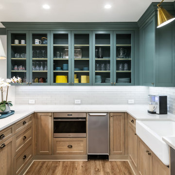
Although this basement was partially finished, it did not function well. Our clients wanted a comfortable space for movie nights and family visits.
Large transitional walk-out vinyl floor and beige floor basement photo in Atlanta with a bar and white walls
Large transitional walk-out vinyl floor and beige floor basement photo in Atlanta with a bar and white walls

 Cheryl Oldershaw
Honey I'm "Honed".... beautiful honed black absolute granite countertops with slab natural maple cabinetry and sleek stainless steel appliances, new usb outlet at desk with fun "Teacher's" Apple Green Accented backsplash

 Lilian H. Weinreich, Architects
Feng Shui dictated the orientation and functional layout of this 2 bed, 3 full bath apartment to harmonize with spiritual forces. The 1,600sf plan creates generous, open, and clutter-free spaces, as small, dark areas restrict the flow of positive energy.
Photographer: © Francis Dzikowski

 Revival House
Classic sophistication is the theme in this stunning North Oaks remodel. Beautiful cherry cabinetry topped with natural stone and Cambria highlight the kitchen, while the laundry and owners’ bathroom feature enameled cabinetry in lighter tones. Highly organized elegance defines the owners’ closet, which features stunning custom cabinetry and stone countertops.
Scott Amundson Photography
Learn more about our showroom and kitchen and bath design: http://www.mingleteam.com

 Fiorito Interior Design
When my client purchased his circa 1980s home several years ago, it came with a bland, dated guest bathroom. He was eager to swap his brass accented shower doors, counter "bridge" spanning the toilet, wall-to-wall mirror, and terra cotta tiled floor for a sleeker, more contemporary looking space.
We gutted the entire space except for the tub which was in perfect condition and replaced the boring, square beige tiles with large format tiles of a subtle, threaded pattern. A decorative, highly textured band of stainless steel, stone, and glass runs through the shower and defines the counter of the new dark vanity which is now in scale with the room. New sconces in matte opal glass are twined with ribbons of forged iron. Walls are in a chic hue called Thunder Grey. The modern sink hardware features a chrome trough spout and stylized square handles. The counter top, with its soft grey and blue-green clouds, is fabricated from a single piece of Sea Pearl quartzite. The shower edges and niche are lined in a polished chrome detail for a clean, minimalist look. And finally, the shower hardware with a bar and hand held shower head echoes the modernist approach to the space.
Photo by Bernardo Grijalva

 GT Kitchen & Bath Design Studio
ELEGANCE
▫️
▫️
Is what is found in this beautiful space !
The mix of tones such as a two toned kitchen with a bold and strong island. So many different textures can be found in this space with the incorporation of metals and natural materials such walnut, marble & quartz . The overall decorative details and touches give this space a graceful style.
#gtkitchenandbath
#custommade
#customkitchen #walnutshelves #transitionaldesign #customcabinetry #elmwoodcabinetry #cabico #quartz #marble #brasshandles #kitchendesign #designingkitchens #kitchenlove #whitekitchen #kitcheninspiration #dreamkitchen
 Amy Pearson Design
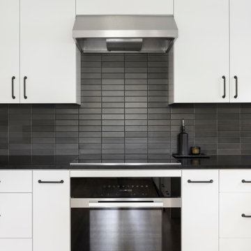
This classic Portland bungalow in the highly desirable Irvington neighborhood was in desperate need of a kitchen update. Aside from tired finishes and cabinets that have seen a full life, the original layout left the family living in a small portion of the kitchen and not taking advantage of the full square footage.
The family desired a design that married both the original architectural details of their bungalow with their preference for clean and modern European design. To accomplish this request, APD brought in sleek flat panel custom frameless cabinets filled with smart and strategic accessories to make the most out of every cabinet box, including full height pantry pull-out, spice and utensil pull-outs flanking the cooking zone, a blind corner pull-0ut to avoid loosing items in the hard-to-reach space, trash & recycling pull-0ut disguised to blend with the adjacent three drawers, and a wall cabinet pull-out sized to fit under the support beam spanning the width of the room. For the traditional - we kept the classic moldings around the windows and doors, continued the homes hardwood floors into the new space, incorporated classic school house light fixtures, and swapped out the slider to the back patio in favor for one with divided lights adding to the architectural detail. Matte black granite countertops with handmade black ceramic tile backsplash bridge the gap between the modern and the traditional thanks to their clean lines, high contrast color palette, and textural and artistic details.
Opting for a few adjustments to the layout created a space plan that took advantage of the full square footage of the room! In the original layout, the refrigerator was squeezed onto the same wall as the cooking, leaving very little counterspace around the hard working cooking zone along with a significant portion of the room (a previous addition) under-utilized. Relocating the refrigerator increased counterspace and storage while creating a “flow” through the entire room.
Luxury Miele and Subzero appliances make this kitchen a chef’s dream! To add to the clean modern look, we opted for an induction cooktop with wall oven directly below … a great alternative to the often used range! Paneling the built-in refrigerator and dishwasher help to calm the overall visual noise of the space, hiding the two hardworking appliances away!
This new family kitchen is at once hardworking, sleek, and timeless!

 Benson Homes LLC
This remodeling story is a wonderful example of how removing and shifting walls can have an amazing impact on the functionality and visual appeal of an entire level of a home. When our clients reached out to us, they were looking to create an open concept Kitchen that would allow for easy entertaining. The couple had recently purchased this townhome so his mother could be closer to the family.
The existing floorplan offered first floor living, but the Kitchen was tucked in the back and was separated from the rest of the living space by a full wall with a small pass through into the Dining Room. Our design involved removing the dividing wall between the Dining Room and Kitchen as well as the fake columns and beam that separated the Dining Room and Living Room. The entire space was opened up to allow for easy flow and view throughout the first floor living space. The wall shared by the Kitchen and large Master Bedroom was shifted back just enough to provide a full wall of additional cabinetry including a much-needed large double Pantry cabinet. Now that we had opened up the Kitchen area we could focus on the cabinetry layout and selections.
The existing wood toned cabinets were replaced with white cabinets and crown molding to match the rest of the home. The larger, open space allowed for more cabinetry and the addition of an island with new undermount sink, dishwasher and convenient trash pullout along with seating for the grandchildren. A new range hood was installed and vented to the exterior of the house to replace the old recirculating hood. We were able to repurpose the some of the existing cabinets for use above the washer and dryer in the adjoining Laundry Room and swapped out the existing swinging door for a pocket door to free up traffic flow when doing Laundry and working in the Kitchen. The slate-look ceramic tile was replaced with a pre-engineered hardwood floor that creates a sense of warmth while easy to clean. The new Cambria countertop compliments the slate-look tile found in the Dining Room and Living Room and a natural field tile backsplash offsets the cabinets beautifully.
The single fluorescent ceiling light was outdated and did not provide adequate lighting for the new Kitchen. The new lighting plan was carefully thought out to provide general illumination through well placed recessed lighting; task lighting through pendant lighting over the island and under cabinet lighting; and aesthetic fluidity with an eye-catching chandelier for the Dining Room table. Special details include a touch faucet, under counter microwave and glass front cabinetry for displaying dishes.
By removing and shifting walls, we improved the entire flow of the first floor visually as well as functionally and created a beautiful, light-filled space for cooking and entertaining. Grandma can easily prepare meals in her new Kitchen and still chat with her guests and grandchildren who love to sit at the island as well as in the adjoining Dining Room and Living Room.
The Benson Homes team really enjoyed creating this space for this family and we hope they will enjoy spending time with friends and family for years to come.
187