
Search results for "Swapping" in Home Design Ideas

 The English Contractor & Remodeling Services
Oak cabinets with arched, raised panel detail have been replaced with custom built cabinetry to maximize the efficiency of this space. The high-gloss white upper cabinetry and hand-detailed, gray textured lower cabinetry from Bench Made are paired with aluminum and glass, creating a space that is filled with light and style, as it plays with contrasting elements of light and dark. The balance of black and white continues with the countertops, with a white solid surface against the wall contrasting with the Absolute Black granite with a honed finish from Sims-Lohman on the island. The cabinetry hardware, by Blum, provides a stainless, linear detail that’s repeated in the appliances and mimicked again on the elongated kitchen sink, from Cincinnati-based Create Good Sinks. The Grohe Essence adds an industrial touch, with a pull down faucet for added flexibility. The faucet really stands out thanks to the backsplash, a custom back-painted glass panel, illuminated by Haefele under-cabinet lighting. The lighting plan for this kitchen was an upgrade, too, with recessed lighting by Halo with Sorra LED bulbs and a pendant light over the island from Axis Lighting. Lighting controls are automated as well, thanks to M Alan Associates Inc.
The brightness isn’t only due to the upgraded lighting, but to the daylight let in through the new Marvin Window. The Marvin Awning window offers the clean lines that a space like this begs for. The top-hinged operation keeps this window, flanked by upper cabinetry, from being awkward. It was the ideal choice since it can easily be opened for a breath of fresh air. With hinges at the top, it even adds additional airflow during a light rain.
You’d expect that a kitchen this spectacular and well-thought-out would have appliances to match and this space does not disappoint. Tisdel Distributing sourced the appliances, including a new Subzero refrigerator. The induction range in the island and built-in microwave are from Wolf. An ice maker from Scotsman rounds out the appliance package. This new space includes appliances that are much larger than what it held before. How is that even possible? That’s the magic touch that an architect can bring to a project like this. It may have seemed like a simple upgrade and appliance swap, but this vision here delivered so much more. The icing on the cake might be the coffee nook, extending the kitchen by repeating the lower cabinetry and white solid surface countertop. It’s highlighted by a chartreuse upper cabinet for a striking splash of color, a jolt of caffeine for the eyes, energizing this entire space through pigment and performance.

 Boerne Kitchens and Baths
This master bath was completely rethought. From split vanities to single vanity with double sinks, lighted mirrors and a bright new blue vanity color. Quartz countertop frameless shower glass and new tile floor brings this bath up to date.

 Chester County Kitchen & Bath
For this traditional kitchen remodel the clients chose Fieldstone cabinets in the Bainbridge door in Cherry wood with Toffee stain. This gave the kitchen a timeless warm look paired with the great new Fusion Max flooring in Chambord. Fusion Max flooring is a great real wood alternative. The flooring has the look and texture of actual wood while providing all the durability of a vinyl floor. This flooring is also more affordable than real wood. It looks fantastic! (Stop in our showroom to see it in person!) The Cambria quartz countertops in Canterbury add a natural stone look with the easy maintenance of quartz. We installed a built in butcher block section to the island countertop to make a great prep station for the cook using the new 36” commercial gas range top. We built a big new walkin pantry and installed plenty of shelving and countertop space for storage.
Find the right local pro for your project

 Mitchell Wall Architecture and Design
The driving factor behind the design was to create a more formal and elegant look to the front of the house, while also creating a more casual yet refined space on the back side of the house where our clients could entertain and gather as a family. It works perfectly.
The focal point of the main living area is the 3 sided fireplace with custom built-in glass wine cooler designed by Mitchell Wall's Greg Garrett. The overall feel of the interior was to be modern with sleek, clean lines.
Project Partners:
1. REA Homes, General Contractor
2. Tamsin Design Group, Interior Design
3. Matthew McFarland, Photography

 Fiorito Interior Design
When my client purchased his circa 1980s home several years ago, it came with a bland, dated guest bathroom. He was eager to swap his brass accented shower doors, counter "bridge" spanning the toilet, wall-to-wall mirror, and terra cotta tiled floor for a sleeker, more contemporary looking space.
We gutted the entire space except for the tub which was in perfect condition and replaced the boring, square beige tiles with large format tiles of a subtle, threaded pattern. A decorative, highly textured band of stainless steel, stone, and glass runs through the shower and defines the counter of the new dark vanity which is now in scale with the room. New sconces in matte opal glass are twined with ribbons of forged iron. Walls are in a chic hue called Thunder Grey. The modern sink hardware features a chrome trough spout and stylized square handles. The counter top, with its soft grey and blue-green clouds, is fabricated from a single piece of Sea Pearl quartzite. The shower edges and niche are lined in a polished chrome detail for a clean, minimalist look. And finally, the shower hardware with a bar and hand held shower head echoes the modernist approach to the space.
Photo by Bernardo Grijalva
 The English Contractor & Remodeling Services
Oak cabinets with arched, raised panel detail have been replaced with custom built cabinetry to maximize the efficiency of this space. The high-gloss white upper cabinetry and hand-detailed, gray textured lower cabinetry from Bench Made are paired with aluminum and glass, creating a space that is filled with light and style, as it plays with contrasting elements of light and dark. The balance of black and white continues with the countertops, with a white solid surface against the wall contrasting with the Absolute Black granite with a honed finish from Sims-Lohman on the island. The cabinetry hardware, by Blum, provides a stainless, linear detail that’s repeated in the appliances and mimicked again on the elongated kitchen sink, from Cincinnati-based Create Good Sinks. The Grohe Essence adds an industrial touch, with a pull down faucet for added flexibility. The faucet really stands out thanks to the backsplash, a custom back-painted glass panel, illuminated by Haefele under-cabinet lighting. The lighting plan for this kitchen was an upgrade, too, with recessed lighting by Halo with Sorra LED bulbs and a pendant light over the island from Axis Lighting. Lighting controls are automated as well, thanks to M Alan Associates Inc.
The brightness isn’t only due to the upgraded lighting, but to the daylight let in through the new Marvin Window. The Marvin Awning window offers the clean lines that a space like this begs for. The top-hinged operation keeps this window, flanked by upper cabinetry, from being awkward. It was the ideal choice since it can easily be opened for a breath of fresh air. With hinges at the top, it even adds additional airflow during a light rain.
You’d expect that a kitchen this spectacular and well-thought-out would have appliances to match and this space does not disappoint. Tisdel Distributing sourced the appliances, including a new Subzero refrigerator. The induction range in the island and built-in microwave are from Wolf. An ice maker from Scotsman rounds out the appliance package. This new space includes appliances that are much larger than what it held before. How is that even possible? That’s the magic touch that an architect can bring to a project like this. It may have seemed like a simple upgrade and appliance swap, but this vision here delivered so much more. The icing on the cake might be the coffee nook, extending the kitchen by repeating the lower cabinetry and white solid surface countertop. It’s highlighted by a chartreuse upper cabinet for a striking splash of color, a jolt of caffeine for the eyes, energizing this entire space through pigment and performance.

 Thompson Remodeling
When dreaming about the perfect master suite remodel, there are two important ingredients that are always in the mix– the closet space and the master bath. Too often, existing homes will have small closets and baths in the master suite leaving homeowners frustrated and ultimately unsatisfied. At Thompson Remodeling, we have seen our share of strange configurations, but that’s part of the fun. We enjoy the challenge of reconfiguring space to make it work better for our clients.
In this recent master suite remodel, the existing floor plan had a small bath with vanities located in the bedroom not the bath, two reach-in closets, and a massive closet with a vaulted ceiling and skylight. Now, who doesn’t love a great big closet? But this one was roughly 11’x 14’ – big enough to be a bedroom!
To start, we decided to get rid of the two reach-in closets to make the main section of the bedroom larger, a gain of 66 square feet. In the massive closet space we designed a spacious bathroom and dressing area. With a window and skylight already in place, there is a ton of natural light. Next, we swapped the original bath space out for a closet.
The flow of this master bedroom is so much better now! Before, you would walk in to the room and be facing a double vanity sink. Now, there’s a small entryway that leads to a much more open and inviting space. The homeowners wanted an organic feel to the space and we used an existing corner fireplace to set the tone. Cream, muted grays and taupes are mixed with natural and weathered woods throughout.
We replaced glass block with a barn door made of reclaimed wood. This creates a beautiful focal point in the room.
In the bathroom, quartz countertops are accented with a stone mosaic backsplash. Maple cabinets with a java finish are a rich offset to the lighter wood vanity mirror and heated ceramic floor.
We think this new master suite remodel is stunning! What a major improvement in the functionality of the entire space.

 Sarah Barnard Design LLC
Locally made antique reproductions pair perfectly with organic linen textiles.
Photo by: Chas Metivier
Inspiration for a small eclectic guest medium tone wood floor and brown floor bedroom remodel in Los Angeles with white walls and no fireplace
Inspiration for a small eclectic guest medium tone wood floor and brown floor bedroom remodel in Los Angeles with white walls and no fireplace
 The English Contractor & Remodeling Services
Oak cabinets with arched, raised panel detail have been replaced with custom built cabinetry to maximize the efficiency of this space. The high-gloss white upper cabinetry and hand-detailed, gray textured lower cabinetry from Bench Made are paired with aluminum and glass, creating a space that is filled with light and style, as it plays with contrasting elements of light and dark. The balance of black and white continues with the countertops, with a white solid surface against the wall contrasting with the Absolute Black granite with a honed finish from Sims-Lohman on the island. The cabinetry hardware, by Blum, provides a stainless, linear detail that’s repeated in the appliances and mimicked again on the elongated kitchen sink, from Cincinnati-based Create Good Sinks. The Grohe Essence adds an industrial touch, with a pull down faucet for added flexibility. The faucet really stands out thanks to the backsplash, a custom back-painted glass panel, illuminated by Haefele under-cabinet lighting. The lighting plan for this kitchen was an upgrade, too, with recessed lighting by Halo with Sorra LED bulbs and a pendant light over the island from Axis Lighting. Lighting controls are automated as well, thanks to M Alan Associates Inc.
The brightness isn’t only due to the upgraded lighting, but to the daylight let in through the new Marvin Window. The Marvin Awning window offers the clean lines that a space like this begs for. The top-hinged operation keeps this window, flanked by upper cabinetry, from being awkward. It was the ideal choice since it can easily be opened for a breath of fresh air. With hinges at the top, it even adds additional airflow during a light rain.
You’d expect that a kitchen this spectacular and well-thought-out would have appliances to match and this space does not disappoint. Tisdel Distributing sourced the appliances, including a new Subzero refrigerator. The induction range in the island and built-in microwave are from Wolf. An ice maker from Scotsman rounds out the appliance package. This new space includes appliances that are much larger than what it held before. How is that even possible? That’s the magic touch that an architect can bring to a project like this. It may have seemed like a simple upgrade and appliance swap, but this vision here delivered so much more. The icing on the cake might be the coffee nook, extending the kitchen by repeating the lower cabinetry and white solid surface countertop. It’s highlighted by a chartreuse upper cabinet for a striking splash of color, a jolt of caffeine for the eyes, energizing this entire space through pigment and performance.

 Classic Cabinets & Design
Three complementary color tones were used in the kitchen to create a warm & welcoming space that has a hint of modern country to it.
Kitchen - large traditional kitchen idea in Denver
Kitchen - large traditional kitchen idea in Denver
 Nar Design Group
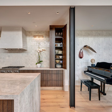
A combination of quarter sawn white oak material with kerf cuts creates harmony between the cabinets and the warm, modern architecture of the home. We mirrored the waterfall of the island to the base cabinets on the range wall. This project was unique because the client wanted the same kitchen layout as their previous home but updated with modern lines to fit the architecture. Floating shelves were swapped out for an open tile wall, and we added a double access countertwall cabinet to the right of the range for additional storage. This cabinet has hidden front access storage using an intentionally placed kerf cut and modern handleless design. The kerf cut material at the knee space of the island is extended to the sides, emphasizing a sense of depth. The palette is neutral with warm woods, dark stain, light surfaces, and the pearlescent tone of the backsplash; giving the client’s art collection a beautiful neutral backdrop to be celebrated.
For the laundry we chose a micro shaker style cabinet door for a clean, transitional design. A folding surface over the washer and dryer as well as an intentional space for a dog bed create a space as functional as it is lovely. The color of the wall picks up on the tones of the beautiful marble tile floor and an art wall finishes out the space.
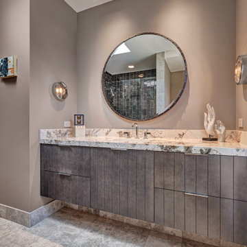
In the master bath warm taupe tones of the wall tile play off the warm tones of the textured laminate cabinets. A tiled base supports the vanity creating a floating feel while also providing accessibility as well as ease of cleaning.
An entry coat closet designed to feel like a furniture piece in the entry flows harmoniously with the warm taupe finishes of the brick on the exterior of the home. We also brought the kerf cut of the kitchen in and used a modern handleless design.
The mudroom provides storage for coats with clothing rods as well as open cubbies for a quick and easy space to drop shoes. Warm taupe was brought in from the entry and paired with the micro shaker of the laundry.
In the guest bath we combined the kerf cut of the kitchen and entry in a stained maple to play off the tones of the shower tile and dynamic Patagonia granite countertops.
 The English Contractor & Remodeling Services
Oak cabinets with arched, raised panel detail have been replaced with custom built cabinetry to maximize the efficiency of this space. The high-gloss white upper cabinetry and hand-detailed, gray textured lower cabinetry from Bench Made are paired with aluminum and glass, creating a space that is filled with light and style, as it plays with contrasting elements of light and dark. The balance of black and white continues with the countertops, with a white solid surface against the wall contrasting with the Absolute Black granite with a honed finish from Sims-Lohman on the island. The cabinetry hardware, by Blum, provides a stainless, linear detail that’s repeated in the appliances and mimicked again on the elongated kitchen sink, from Cincinnati-based Create Good Sinks. The Grohe Essence adds an industrial touch, with a pull down faucet for added flexibility. The faucet really stands out thanks to the backsplash, a custom back-painted glass panel, illuminated by Haefele under-cabinet lighting. The lighting plan for this kitchen was an upgrade, too, with recessed lighting by Halo with Sorra LED bulbs and a pendant light over the island from Axis Lighting. Lighting controls are automated as well, thanks to M Alan Associates Inc.
The brightness isn’t only due to the upgraded lighting, but to the daylight let in through the new Marvin Window. The Marvin Awning window offers the clean lines that a space like this begs for. The top-hinged operation keeps this window, flanked by upper cabinetry, from being awkward. It was the ideal choice since it can easily be opened for a breath of fresh air. With hinges at the top, it even adds additional airflow during a light rain.
You’d expect that a kitchen this spectacular and well-thought-out would have appliances to match and this space does not disappoint. Tisdel Distributing sourced the appliances, including a new Subzero refrigerator. The induction range in the island and built-in microwave are from Wolf. An ice maker from Scotsman rounds out the appliance package. This new space includes appliances that are much larger than what it held before. How is that even possible? That’s the magic touch that an architect can bring to a project like this. It may have seemed like a simple upgrade and appliance swap, but this vision here delivered so much more. The icing on the cake might be the coffee nook, extending the kitchen by repeating the lower cabinetry and white solid surface countertop. It’s highlighted by a chartreuse upper cabinet for a striking splash of color, a jolt of caffeine for the eyes, energizing this entire space through pigment and performance.
 Nar Design Group
A combination of quarter sawn white oak material with kerf cuts creates harmony between the cabinets and the warm, modern architecture of the home. We mirrored the waterfall of the island to the base cabinets on the range wall. This project was unique because the client wanted the same kitchen layout as their previous home but updated with modern lines to fit the architecture. Floating shelves were swapped out for an open tile wall, and we added a double access countertwall cabinet to the right of the range for additional storage. This cabinet has hidden front access storage using an intentionally placed kerf cut and modern handleless design. The kerf cut material at the knee space of the island is extended to the sides, emphasizing a sense of depth. The palette is neutral with warm woods, dark stain, light surfaces, and the pearlescent tone of the backsplash; giving the client’s art collection a beautiful neutral backdrop to be celebrated.
For the laundry we chose a micro shaker style cabinet door for a clean, transitional design. A folding surface over the washer and dryer as well as an intentional space for a dog bed create a space as functional as it is lovely. The color of the wall picks up on the tones of the beautiful marble tile floor and an art wall finishes out the space.
In the master bath warm taupe tones of the wall tile play off the warm tones of the textured laminate cabinets. A tiled base supports the vanity creating a floating feel while also providing accessibility as well as ease of cleaning.
An entry coat closet designed to feel like a furniture piece in the entry flows harmoniously with the warm taupe finishes of the brick on the exterior of the home. We also brought the kerf cut of the kitchen in and used a modern handleless design.
The mudroom provides storage for coats with clothing rods as well as open cubbies for a quick and easy space to drop shoes. Warm taupe was brought in from the entry and paired with the micro shaker of the laundry.
In the guest bath we combined the kerf cut of the kitchen and entry in a stained maple to play off the tones of the shower tile and dynamic Patagonia granite countertops.
 Thompson Remodeling
When dreaming about the perfect master suite remodel, there are two important ingredients that are always in the mix– the closet space and the master bath. Too often, existing homes will have small closets and baths in the master suite leaving homeowners frustrated and ultimately unsatisfied. At Thompson Remodeling, we have seen our share of strange configurations, but that’s part of the fun. We enjoy the challenge of reconfiguring space to make it work better for our clients.
In this recent master suite remodel, the existing floor plan had a small bath with vanities located in the bedroom not the bath, two reach-in closets, and a massive closet with a vaulted ceiling and skylight. Now, who doesn’t love a great big closet? But this one was roughly 11’x 14’ – big enough to be a bedroom!
To start, we decided to get rid of the two reach-in closets to make the main section of the bedroom larger, a gain of 66 square feet. In the massive closet space we designed a spacious bathroom and dressing area. With a window and skylight already in place, there is a ton of natural light. Next, we swapped the original bath space out for a closet.
The flow of this master bedroom is so much better now! Before, you would walk in to the room and be facing a double vanity sink. Now, there’s a small entryway that leads to a much more open and inviting space. The homeowners wanted an organic feel to the space and we used an existing corner fireplace to set the tone. Cream, muted grays and taupes are mixed with natural and weathered woods throughout.
We replaced glass block with a barn door made of reclaimed wood. This creates a beautiful focal point in the room.
In the bathroom, quartz countertops are accented with a stone mosaic backsplash. Maple cabinets with a java finish are a rich offset to the lighter wood vanity mirror and heated ceramic floor.
We think this new master suite remodel is stunning! What a major improvement in the functionality of the entire space.
 The English Contractor & Remodeling Services
Oak cabinets with arched, raised panel detail have been replaced with custom built cabinetry to maximize the efficiency of this space. The high-gloss white upper cabinetry and hand-detailed, gray textured lower cabinetry from Bench Made are paired with aluminum and glass, creating a space that is filled with light and style, as it plays with contrasting elements of light and dark. The balance of black and white continues with the countertops, with a white solid surface against the wall contrasting with the Absolute Black granite with a honed finish from Sims-Lohman on the island. The cabinetry hardware, by Blum, provides a stainless, linear detail that’s repeated in the appliances and mimicked again on the elongated kitchen sink, from Cincinnati-based Create Good Sinks. The Grohe Essence adds an industrial touch, with a pull down faucet for added flexibility. The faucet really stands out thanks to the backsplash, a custom back-painted glass panel, illuminated by Haefele under-cabinet lighting. The lighting plan for this kitchen was an upgrade, too, with recessed lighting by Halo with Sorra LED bulbs and a pendant light over the island from Axis Lighting. Lighting controls are automated as well, thanks to M Alan Associates Inc.
The brightness isn’t only due to the upgraded lighting, but to the daylight let in through the new Marvin Window. The Marvin Awning window offers the clean lines that a space like this begs for. The top-hinged operation keeps this window, flanked by upper cabinetry, from being awkward. It was the ideal choice since it can easily be opened for a breath of fresh air. With hinges at the top, it even adds additional airflow during a light rain.
You’d expect that a kitchen this spectacular and well-thought-out would have appliances to match and this space does not disappoint. Tisdel Distributing sourced the appliances, including a new Subzero refrigerator. The induction range in the island and built-in microwave are from Wolf. An ice maker from Scotsman rounds out the appliance package. This new space includes appliances that are much larger than what it held before. How is that even possible? That’s the magic touch that an architect can bring to a project like this. It may have seemed like a simple upgrade and appliance swap, but this vision here delivered so much more. The icing on the cake might be the coffee nook, extending the kitchen by repeating the lower cabinetry and white solid surface countertop. It’s highlighted by a chartreuse upper cabinet for a striking splash of color, a jolt of caffeine for the eyes, energizing this entire space through pigment and performance.

 Little Crown Interiors
An eclectic, modern, and a little edgy take on a gender neutral nursery. We used a mostly neutral palette with whites and grays to set tone for the space. Then we warmed up the space with a gorgeous dark sage green dresser, copper accents, and burnt orange tones while still maintaining the light and airy feel. The client was an avid art appreciator, so we included some standout pieces by contemporary artists like Murakami and Kaws. Design by Little Crown Interiors, Photo by Full Spectrum Photography.
 Payton Hughes
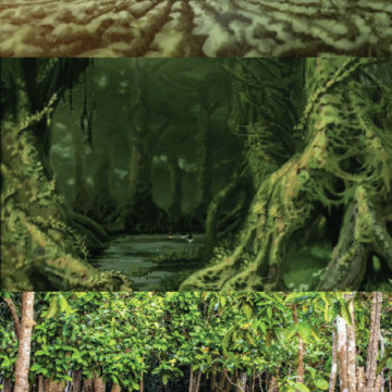
These three images serve as a mood board for our Los Angeles Redesign. Incorporating nature back into Los Angeles was at the fore-front of our redesign.
The top image is from Avatar the Last Airbender, called the Banyan-Grove Tree. This tree drove our figurative narrative concept of "roots" that connect the entire 1x1 mile square we were tasked to redesign. In the show, the banyan tree expands its roots all across the swap to plant more trees.
The last two images serve as a visual aid for the "Routes to Roots" redesign. Lots of trees with expansive roots
Narrative:
Many years ago, a vast tree once enchanted the plains of Los Angeles. Scientists could not track the tree's age, deeming it immortal due to its many deeply ingrained and expansive roots across the city. To this day, scientists are still uncertain about the tree's origin. Its roots and lush branches sprawled anywhere it could, engulfing anything in its path. The tree had unique properties; anyone who touched the tree's foundations could communicate with another person a mile away and, on special occasions, grant auspicious fortunes. The city worshiped this magical tree because it was the center of all life. Or so it was. The discovery of the tree's healing sap quickly drove people mad, and in a frenzy, people began to chop at the tree. The growth of filmmaking and Hollywood attracted many people to LA because of the great weather and diverse landscape. Oil was discovered near the tree shortly after. Finally, oil production was the tipping point, and these three factors led to the demise of the immortal tree.
By 1950, the vast tree had no longer enchanted the city. Nowadays, problems with constant traffic, heavy air pollution, and past effects of redlining have all repelled the potential residents of the territory. Gridding lurks within the city, unconsciously controlling the movement of people. The severe health risks from these problems and the water scarcity and well-being are making researchers rethink the city's future. Due to this, the government tasks architects from all over the country to redesign Los Angeles, but it has to relate to the once immortal tree. At the same time, they are providing solutions to these five issues: redlining, heat severity, accessibility, open spaces, and lastly, preserving essential landmarks and bringing back the city's roots while still housing the population. Years later, a team of architects pitched their 200-year redesign, reimagining the superfuture of Los Angeles. The mission will be titled "From Routes to Roots". Here's what they pitched:

 Baine Contracting, Inc.
Three Season Sunrooms | Patio Enclosure constructed by Baine Contracting and photographed by Osprey Perspectives.
Sunroom - mid-sized contemporary porcelain tile and brown floor sunroom idea in New York with no fireplace and a standard ceiling
Sunroom - mid-sized contemporary porcelain tile and brown floor sunroom idea in New York with no fireplace and a standard ceiling

 Pearl Remodeling
Spanish Kitchen remodeling project in Silver Lake, Ca.
This small (900SF) home featured a very small Spanish looking kitchen where the owners wanted to keep the same style with some contemporary elements
 Nar Design Group
A combination of quarter sawn white oak material with kerf cuts creates harmony between the cabinets and the warm, modern architecture of the home. We mirrored the waterfall of the island to the base cabinets on the range wall. This project was unique because the client wanted the same kitchen layout as their previous home but updated with modern lines to fit the architecture. Floating shelves were swapped out for an open tile wall, and we added a double access countertwall cabinet to the right of the range for additional storage. This cabinet has hidden front access storage using an intentionally placed kerf cut and modern handleless design. The kerf cut material at the knee space of the island is extended to the sides, emphasizing a sense of depth. The palette is neutral with warm woods, dark stain, light surfaces, and the pearlescent tone of the backsplash; giving the client’s art collection a beautiful neutral backdrop to be celebrated.
For the laundry we chose a micro shaker style cabinet door for a clean, transitional design. A folding surface over the washer and dryer as well as an intentional space for a dog bed create a space as functional as it is lovely. The color of the wall picks up on the tones of the beautiful marble tile floor and an art wall finishes out the space.
In the master bath warm taupe tones of the wall tile play off the warm tones of the textured laminate cabinets. A tiled base supports the vanity creating a floating feel while also providing accessibility as well as ease of cleaning.
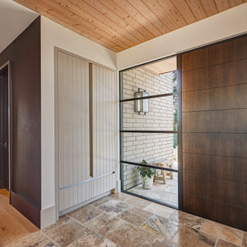
An entry coat closet designed to feel like a furniture piece in the entry flows harmoniously with the warm taupe finishes of the brick on the exterior of the home. We also brought the kerf cut of the kitchen in and used a modern handleless design.
The mudroom provides storage for coats with clothing rods as well as open cubbies for a quick and easy space to drop shoes. Warm taupe was brought in from the entry and paired with the micro shaker of the laundry.
In the guest bath we combined the kerf cut of the kitchen and entry in a stained maple to play off the tones of the shower tile and dynamic Patagonia granite countertops.
186