
Search results for "Tables for small spaces" in Home Design Ideas
 Shannon Lazic
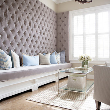
This tufted wall was created as a custom piece for a transitional, complete home design that we worked directly with the clients to make. Although we love innovating in every space we work in, unique accents like these are ones in which we are able to build for clients when they are working with us on redesigning their home - not as single shipped pieces.
Shannon Lazic Photography // www.shannonlazicphotography.com
 FRAME design co.
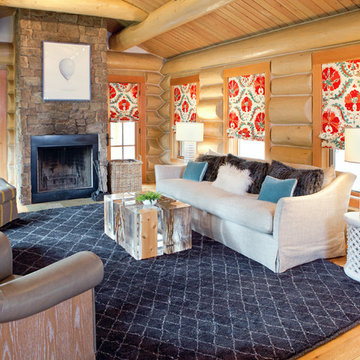
The living room layout allows a couch lounger to chat with someone in the kitchen. We covered the sofa in a casual Pierre Frey fabric and added a few soft faux fur pillows for touchable texture. A graphic David Adler moroccan rug contrasts with red and turquoise Roman shades (one of our favorite color combinations ever). Crisp white side tables, breezy lamps and a modern-meets-rustic wood and acrylic coffee table were picked for ultra-cool “chic cabin” flair.
Design Detail: To break up the long, skinny space and maximize the conversation area, we placed the furniture on opposite walls. Punchy window treatments provide texture and movement for the eye. The gorgeous watercolor titled “Pop” by Peter Haslam-Fox offers a bit of quiet simplicity to an otherwise colorful room. Photographer: Carrie Patterson
Find the right local pro for your project
 Anchor Builders
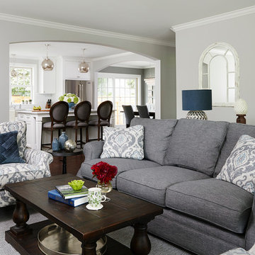
This remodel went from a tiny story-and-a-half Cape Cod, to a charming full two-story home. The open floor plan allows for views from the living room through the kitchen to the dining room.
Space Plans, Building Design, Interior & Exterior Finishes by Anchor Builders. Photography by Alyssa Lee Photography.
 Thompson Custom Homes
photos by Steve Chenn
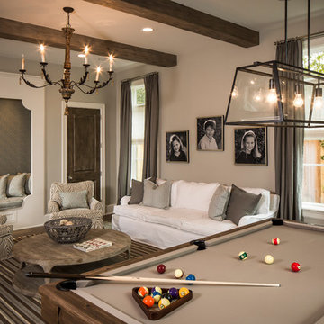
Mid-sized elegant enclosed carpeted and multicolored floor family room photo in Houston with beige walls, no fireplace and no tv
Mid-sized elegant enclosed carpeted and multicolored floor family room photo in Houston with beige walls, no fireplace and no tv
 L Marie Interior Design
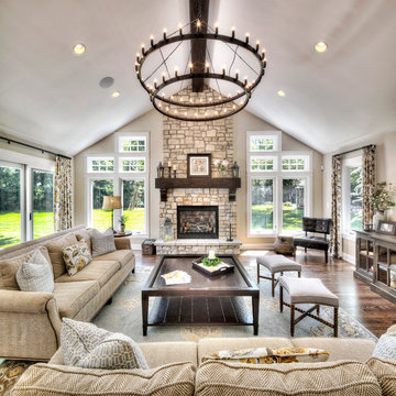
Clients' first home and there forever home with a family of four and in laws close, this home needed to be able to grow with the family. This most recent growth included a few home additions including the kids bathrooms (on suite) added on to the East end, the two original bathrooms were converted into one larger hall bath, the kitchen wall was blown out, entrying into a complete 22'x22' great room addition with a mudroom and half bath leading to the garage and the final addition a third car garage. This space is transitional and classic to last the test of time.
 DesignARC
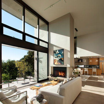
The Tice Residences replace a run-down and aging duplex with two separate, modern, Santa Barbara homes. Although the unique creek-side site (which the client’s original home looked toward across a small ravine) proposed significant challenges, the clients were certain they wanted to live on the lush “Riviera” hillside.
The challenges presented were ultimately overcome through a thorough and careful study of site conditions. With an extremely efficient use of space and strategic placement of windows and decks, privacy is maintained while affording expansive views from each home to the creek, downtown Santa Barbara and Pacific Ocean beyond. Both homes appear to have far more openness than their compact lots afford.
The solution strikes a balance between enclosure and openness. Walls and landscape elements divide and protect two private domains, and are in turn, carefully penetrated to reveal views.
Both homes are variations on one consistent theme: elegant composition of contemporary, “warm” materials; strong roof planes punctuated by vertical masses; and floating decks. The project forms an intimate connection with its setting by using site-excavated stone, terracing landscape planters with native plantings, and utilizing the shade provided by its ancient Riviera Oak trees.
2012 AIA Santa Barbara Chapter Merit Award
Jim Bartsch Photography


 User
UserThis Greek Revival row house in Boerum Hill was previously owned by a local architect who renovated it several times, including the addition of a two-story steel and glass extension at the rear. The new owners came to us seeking to restore the house and its original formality, while adapting it to the modern needs of a family of five. The detailing of the 25 x 36 foot structure had been lost and required some sleuthing into the history of Greek Revival style in historic Brooklyn neighborhoods.
In addition to completely re-framing the interior, the house also required a new south-facing brick façade due to significant deterioration. The modern extension was replaced with a more traditionally detailed wood and copper- clad bay, still open to natural light and the garden view without sacrificing comfort. The kitchen was relocated from the first floor to the garden level with an adjacent formal dining room. Both rooms were enlarged from their previous iterations to accommodate weekly dinners with extended family. The kitchen includes a home office and breakfast nook that doubles as a homework station. The cellar level was further excavated to accommodate finished storage space and a playroom where activity can be monitored from the kitchen workspaces.
The parlor floor is now reserved for entertaining. New pocket doors can be closed to separate the formal front parlor from the more relaxed back portion, where the family plays games or watches TV together. At the end of the hall, a powder room with brass details, and a luxe bar with antique mirrored backsplash and stone tile flooring, leads to the deck and direct garden access. Because of the property width, the house is able to provide ample space for the interior program within a shorter footprint. This allows the garden to remain expansive, with a small lawn for play, an outdoor food preparation area with a cast-in-place concrete bench, and a place for entertaining towards the rear. The newly designed landscaping will continue to develop, further enhancing the yard’s feeling of escape, and filling-in the views from the kitchen and back parlor above. A less visible, but equally as conscious, addition is a rooftop PV solar array that provides nearly 100% of the daily electrical usage, with the exception of the AC system on hot summer days.
The well-appointed interiors connect the traditional backdrop of the home to a youthful take on classic design and functionality. The materials are elegant without being precious, accommodating a young, growing family. Unique colors and patterns provide a feeling of luxury while inviting inhabitants and guests to relax and enjoy this classic Brooklyn brownstone.
This project won runner-up in the architecture category for the 2017 NYC&G Innovation in Design Awards and was featured in The American House: 100 Contemporary Homes.
Photography by Francis Dzikowski / OTTO
 Amazing Spaces
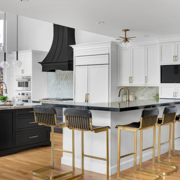
The existing U-shaped kitchen was tucked away in a small corner while the dining table was swimming in a room much too large for its size. The client’s needs and the architecture of the home made it apparent that the perfect design solution for the home was to swap the spaces.
The homeowners entertain frequently and wanted the new layout to accommodate a lot of counter seating, a bar/buffet for serving hors d’oeuvres, an island with prep sink, and all new appliances. They had a strong preference that the hood be a focal point and wanted to go beyond a typical white color scheme even though they wanted white cabinets.
While moving the kitchen to the dining space gave us a generous amount of real estate to work with, two of the exterior walls are occupied with full-height glass creating a challenge how best to fulfill their wish list. We used one available wall for the needed tall appliances, taking advantage of its height to create the hood as a focal point. We opted for both a peninsula and island instead of one large island in order to maximize the seating requirements and create a barrier when entertaining so guests do not flow directly into the work area of the kitchen. This also made it possible to add a second sink as requested. Lastly, the peninsula sets up a well-defined path to the new dining room without feeling like you are walking through the kitchen. We used the remaining fourth wall for the bar/buffet.
Black cabinetry adds strong contrast in several areas of the new kitchen. Wire mesh wall cabinet doors at the bar and gold accents on the hardware, light fixtures, faucets and furniture add further drama to the concept. The focal point is definitely the black hood, looking both dramatic and cohesive at the same time.
 Rachel Oliver Design, LLC
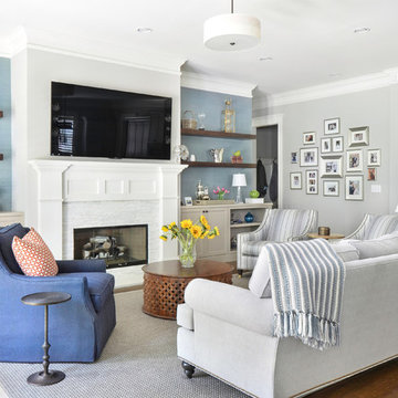
This family room was totally redesigned with new shelving and all new furniture. The blue grasscloth added texture and interest. The fabrics are all kid friendly and the rug is an indoor/outdoor rug by Stark. Photo by: Melodie Hayes
 Magdalena Bogart Interiors
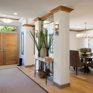
Former Ranch-style home with enclosed spaces was completely gutted, all spaces reconfigured for an open floor plan with interesting exterior and interiors views.
Many windows and raised ceiling make bright light -filled spaces with warm inviting color palette.
Dining room here was former living room , former dining room and small kitchen turned into a generous kitchen.
The concept : "farmhouse with a good dose of glam", lots of good lighting in the evening, custom wall sconces, large dining pendant.
 Nukitchens
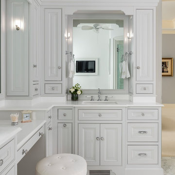
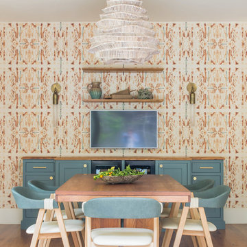
We designed this kitchen using Plain & Fancy custom cabinetry with natural walnut and white pain finishes. The extra large island includes the sink and marble countertops. The matching marble backsplash features hidden spice shelves behind a mobile layer of solid marble. The cabinet style and molding details were selected to feel true to a traditional home in Greenwich, CT. In the adjacent living room, the built-in white cabinetry showcases matching walnut backs to tie in with the kitchen. The pantry encompasses space for a bar and small desk area. The light blue laundry room has a magnetized hanger for hang-drying clothes and a folding station. Downstairs, the bar kitchen is designed in blue Ultracraft cabinetry and creates a space for drinks and entertaining by the pool table. This was a full-house project that touched on all aspects of the ways the homeowners live in the space.
 Regan Baker Design Inc.
Well-traveled. Relaxed. Timeless.
Our well-traveled clients were soon-to-be empty nesters when they approached us for help reimagining their Presidio Heights home. The expansive Spanish-Revival residence originally constructed in 1908 had been substantially renovated 8 year prior, but needed some adaptations to better suit the needs of a family with three college-bound teens. We evolved the space to be a bright, relaxed reflection of the family’s time together, revising the function and layout of the ground-floor rooms and filling them with casual, comfortable furnishings and artifacts collected abroad.
One of the key changes we made to the space plan was to eliminate the formal dining room and transform an area off the kitchen into a casual gathering spot for our clients and their children. The expandable table and coffee/wine bar means the room can handle large dinner parties and small study sessions with similar ease. The family room was relocated from a lower level to be more central part of the main floor, encouraging more quality family time, and freeing up space for a spacious home gym.
In the living room, lounge-worthy upholstery grounds the space, encouraging a relaxed and effortless West Coast vibe. Exposed wood beams recall the original Spanish-influence, but feel updated and fresh in a light wood stain. Throughout the entry and main floor, found artifacts punctate the softer textures — ceramics from New Mexico, religious sculpture from Asia and a quirky wall-mounted phone that belonged to our client’s grandmother.

Sponsored
Sunbury, OH

J.Holderby - Renovations
Franklin County's Leading General Contractors - 2X Best of Houzz!
 OLSON LEWIS + Architects
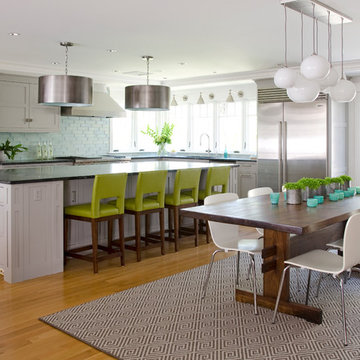
A substantial center island made of soapstone slabs has ample space to accommodate prepping for dinner on one side, and the kids doing their homework on the other.
The pull-out drawers at the end contain extra refrigerator and freezer space.
The glass backsplash tile offers a refreshing luminescence to the area.
A custom designed informal dining table fills the space adjacent to the center island.
BUILDER: Anderson Contracting Service. INTERIOR DESIGNER: Kristina Crestin PHOTOGRAHER: Jamie Salomon.
See photos of other rooms in our project:
Highland Home
 Maven Interiors
Photo Credit: Lincoln Barbour Photo.
Interior Design: Kim Hagstette, Maven Interiors.
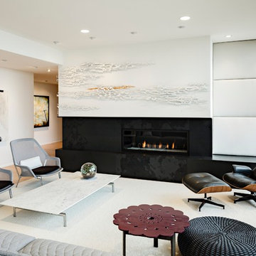
This penthouse living room is sophisticated and inviting. The artwork was created specifically for our space and commissioned through Heidi McBride Gallery.
 TVL Creative Ltd.
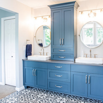
This project is an incredible transformation and the perfect example of successful style mixing! This client, and now a good friend of TVL (as they all become), is a wonderfully eclectic and adventurous one with immense interest in texture play, pops of color, and unique applications. Our scope in this home included a full kitchen renovation, main level powder room renovation, and a master bathroom overhaul. Taking just over a year to complete from the first design phases to final photos, this project was so insanely fun and packs an amazing amount of fun details and lively surprises. The original kitchen was large and fairly functional. However, the cabinetry was dated, the lighting was inefficient and frankly ugly, and the space was lacking personality in general. Our client desired maximized storage and a more personalized aesthetic. The existing cabinets were short and left the nice height of the space under-utilized. We integrated new gray shaker cabinets from Waypoint Living Spaces and ran them to the ceiling to really exaggerate the height of the space and to maximize usable storage as much as possible. The upper cabinets are glass and lit from within, offering display space or functional storage as the client needs. The central feature of this space is the large cobalt blue range from Viking as well as the custom made reclaimed wood range hood floating above. The backsplash along this entire wall is vertical slab of marble look quartz from Pental Surfaces. This matches the expanse of the same countertop that wraps the room. Flanking the range, we installed cobalt blue lantern penny tile from Merola Tile for a playful texture that adds visual interest and class to the entire room. We upgraded the lighting in the ceiling, under the cabinets, and within cabinets--we also installed accent sconces over each window on the sink wall to create cozy and functional illumination. The deep, textured front Whitehaven apron sink is a dramatic nod to the farmhouse aesthetic from KOHLER, and it's paired with the bold and industrial inspired Tournant faucet, also from Kohler. We finalized this space with other gorgeous appliances, a super sexy dining table and chair set from Room & Board, the Paxton dining light from Pottery Barn and a small bar area and pantry on the far end of the space. In the small powder room on the main level, we converted a drab builder-grade space into a super cute, rustic-inspired washroom. We utilized the Bonner vanity from Signature Hardware and paired this with the cute Ashfield faucet from Pfister. The most unique statements in this room include the water-drop light over the vanity from Shades Of Light, the copper-look porcelain floor tile from Pental Surfaces and the gorgeous Cashmere colored Tresham toilet from Kohler. Up in the master bathroom, elegance abounds. Using the same footprint, we upgraded everything in this space to reflect the client's desire for a more bright, patterned and pretty space. Starting at the entry, we installed a custom reclaimed plank barn door with bold large format hardware from Rustica Hardware. In the bathroom, the custom slate blue vanity from Tharp Cabinet Company is an eye catching statement piece. This is paired with gorgeous hardware from Amerock, vessel sinks from Kohler, and Purist faucets also from Kohler. We replaced the old built-in bathtub with a new freestanding soaker from Signature Hardware. The floor tile is a bold, graphic porcelain tile with a classic color scheme. The shower was upgraded with new tile and fixtures throughout: new clear glass, gorgeous distressed subway tile from the Castle line from TileBar, and a sophisticated shower panel from Vigo. We finalized the space with a small crystal chandelier and soft gray paint. This project is a stunning conversion and we are so thrilled that our client can enjoy these personalized spaces for years to come. Special thanks to the amazing Ian Burks of Burks Wurks Construction for bringing this to life!
 Décor Aid
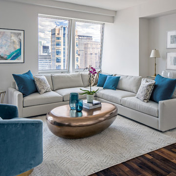
When a family living in Singapore decided to purchase a New York City pied-à-terre, they settled on the historic Langham Place, a 60-floor building along 5th Ave which features a mixture of permanent residencies and 5-star hotel suites. Immediately after purchasing the condo, they reached out to Decor Aid, and tasked us with designing a home that would reflect their jet-setting lifestyle and chic sensibility.
Book Your Free In-Home Consultation
Connecting to the historic Tiffany Building at 404 5th Ave, the exterior of Langham Place is a combination of highly contemporary architecture and 1920’s art deco design. And with this highly unique architecture, came highly angular, outward leaning floor-to-ceiling windows, which would prove to be our biggest design challenge.
One of the apartment’s quirks was negotiating an uneven balance of natural light throughout the space. Parts of the apartment, such one of the kids’ bedrooms, feature floor-to-ceiling windows and an abundance of natural light, while other areas, such as one corner of the living room, receive little natural light.
By sourcing a combination of contemporary, low-profile furniture pieces and metallic accents, we were able to compensate for apartment’s pockets of darkness. A low-profile beige sectional from Room & Board was an obvious choice, which we complemented with a lucite console and a bronze Riverstone coffee table from Mitchell Gold+Bob Williams.
Circular tables were placed throughout the apartment in order to establish a design scheme that would be easy to walk through. A marble tulip table from Sit Down New York provides an opulent dining room space, without crowding the floor plan. The finishing touches include a sumptuous swivel chair from Safavieh, to create a sleek, welcoming vacation home for this international client.
Sponsored
Columbus, OH
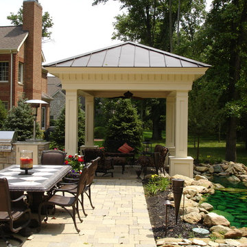
Free consultation for landscape design!

Peabody Landscape Group
Columbus' Reliable Landscape Design & Contracting
 LABLstudio
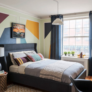
A West Village Bachelor pad bedroom, featuring a hand-painted geometric design that highlights the pre-war features of the space, like the picture moldings. Additionally, because the client wanted both a work space and a place to put his TV (the pre-war wall could not hold a wall mounted tv!), we designed a custom desk/console piece out of reclaimed wood and metal hairpin legs that served both purposes, and fit the space perfectly.
Photos by Matthew Williams
 TVL Creative Ltd.
[Our Clients]
We were so excited to help these new homeowners re-envision their split-level diamond in the rough. There was so much potential in those walls, and we couldn’t wait to delve in and start transforming spaces. Our primary goal was to re-imagine the main level of the home and create an open flow between the space. So, we started by converting the existing single car garage into their living room (complete with a new fireplace) and opening up the kitchen to the rest of the level.
[Kitchen]
The original kitchen had been on the small side and cut-off from the rest of the home, but after we removed the coat closet, this kitchen opened up beautifully. Our plan was to create an open and light filled kitchen with a design that translated well to the other spaces in this home, and a layout that offered plenty of space for multiple cooks. We utilized clean white cabinets around the perimeter of the kitchen and popped the island with a spunky shade of blue. To add a real element of fun, we jazzed it up with the colorful escher tile at the backsplash and brought in accents of brass in the hardware and light fixtures to tie it all together. Through out this home we brought in warm wood accents and the kitchen was no exception, with its custom floating shelves and graceful waterfall butcher block counter at the island.
[Dining Room]
The dining room had once been the home’s living room, but we had other plans in mind. With its dramatic vaulted ceiling and new custom steel railing, this room was just screaming for a dramatic light fixture and a large table to welcome one-and-all.
[Living Room]
We converted the original garage into a lovely little living room with a cozy fireplace. There is plenty of new storage in this space (that ties in with the kitchen finishes), but the real gem is the reading nook with two of the most comfortable armchairs you’ve ever sat in.
[Master Suite]
This home didn’t originally have a master suite, so we decided to convert one of the bedrooms and create a charming suite that you’d never want to leave. The master bathroom aesthetic quickly became all about the textures. With a sultry black hex on the floor and a dimensional geometric tile on the walls we set the stage for a calm space. The warm walnut vanity and touches of brass cozy up the space and relate with the feel of the rest of the home. We continued the warm wood touches into the master bedroom, but went for a rich accent wall that elevated the sophistication level and sets this space apart.
[Hall Bathroom]
The floor tile in this bathroom still makes our hearts skip a beat. We designed the rest of the space to be a clean and bright white, and really let the lovely blue of the floor tile pop. The walnut vanity cabinet (complete with hairpin legs) adds a lovely level of warmth to this bathroom, and the black and brass accents add the sophisticated touch we were looking for.
[Office]
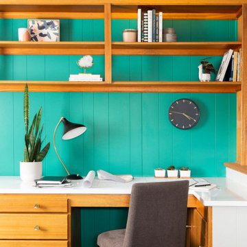
We loved the original built-ins in this space, and knew they needed to always be a part of this house, but these 60-year-old beauties definitely needed a little help. We cleaned up the cabinets and brass hardware, switched out the formica counter for a new quartz top, and painted wall a cheery accent color to liven it up a bit. And voila! We have an office that is the envy of the neighborhood.
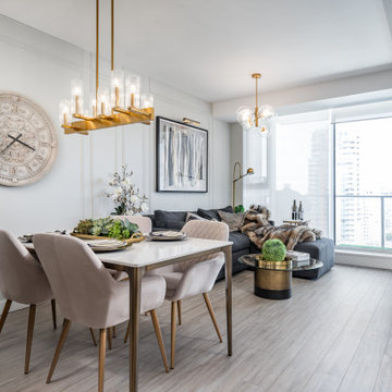
 WW Design Studio
Space planning and careful balancing of scale is crucial for small spaces. Infused with urban glamour this open concept is big on style.
Photo: Caydence Photography
19