
Search results for "Talks continued" in Home Design Ideas
 Windhill+Co.
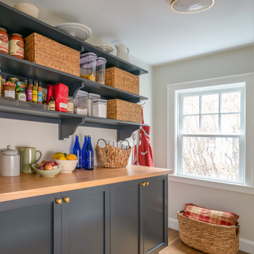
This family’s intention was clear – to create a well-functioning home for their busy family that will continue to be just as well-functioning in the future. With a wish list that included open kitchen and dining spaces, a guest bedroom, and a fresh, modernized master suite, this renovation left the owners delighted. The shifting of the kitchen created a mudroom area resulting in a happy landing space for the family returning from activities. The new mudroom casts a warm glow with an ample black walnut-topped bench. Handsfree entering the kitchen, the large island and coffered ceiling well defines this space. The cook’s Lacanche Saulieu black enamel range is a show-stopper, topped off with a uniquely custom maple hood. A pleasant hideaway, the Benjamin Moore wrought iron painted cabinetry and shelving in the butler’s pantry is both practical and pretty with a quick peek out to the backyard.
The upstairs bedrooms and bathrooms were reenergized with new tile, fixtures, and updated a/v. A Newburyport Blue vanity makes for a cheery children’s bath. A more sophisticated black satin vanity in the master bath compliments the basketweave tile rug created in cool and classy Walker Zanger stone tile. Lit from above, the frameless medicine cabinet mirrors’ simplicity let the gunmetal faucets ‘shine’. Down the hall, the family laundry room’s charming tile and easy function gives hope that every family member will chip in with the chores.
 Guy Ayers, Architect
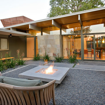
Reverse Shed Eichler
This project is part tear-down, part remodel. The original L-shaped plan allowed the living/ dining/ kitchen wing to be completely re-built while retaining the shell of the bedroom wing virtually intact. The rebuilt entertainment wing was enlarged 50% and covered with a low-slope reverse-shed roof sloping from eleven to thirteen feet. The shed roof floats on a continuous glass clerestory with eight foot transom. Cantilevered steel frames support wood roof beams with eaves of up to ten feet. An interior glass clerestory separates the kitchen and livingroom for sound control. A wall-to-wall skylight illuminates the north wall of the kitchen/family room. New additions at the back of the house add several “sliding” wall planes, where interior walls continue past full-height windows to the exterior, complimenting the typical Eichler indoor-outdoor ceiling and floor planes. The existing bedroom wing has been re-configured on the interior, changing three small bedrooms into two larger ones, and adding a guest suite in part of the original garage. A previous den addition provided the perfect spot for a large master ensuite bath and walk-in closet. Natural materials predominate, with fir ceilings, limestone veneer fireplace walls, anigre veneer cabinets, fir sliding windows and interior doors, bamboo floors, and concrete patios and walks. Landscape design by Bernard Trainor: www.bernardtrainor.com (see “Concrete Jungle” in April 2014 edition of Dwell magazine). Microsoft Media Center installation of the Year, 2008: www.cybermanor.com/ultimate_install.html (automated shades, radiant heating system, and lights, as well as security & sound).
 ZeroEnergy Design
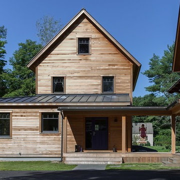
Lincoln Farmhouse
LEED-H Platinum, Net-Positive Energy
OVERVIEW. This LEED Platinum certified modern farmhouse ties into the cultural landscape of Lincoln, Massachusetts - a town known for its rich history, farming traditions, conservation efforts, and visionary architecture. The goal was to design and build a new single family home on 1.8 acres that respects the neighborhood’s agrarian roots, produces more energy than it consumes, and provides the family with flexible spaces to live-play-work-entertain. The resulting 2,800 SF home is proof that families do not need to compromise on style, space or comfort in a highly energy-efficient and healthy home.
CONNECTION TO NATURE. The attached garage is ubiquitous in new construction in New England’s cold climate. This home’s barn-inspired garage is intentionally detached from the main dwelling. A covered walkway connects the two structures, creating an intentional connection with the outdoors between auto and home.
FUNCTIONAL FLEXIBILITY. With a modest footprint, each space must serve a specific use, but also be flexible for atypical scenarios. The Mudroom serves everyday use for the couple and their children, but is also easy to tidy up to receive guests, eliminating the need for two entries found in most homes. A workspace is conveniently located off the mudroom; it looks out on to the back yard to supervise the children and can be closed off with a sliding door when not in use. The Away Room opens up to the Living Room for everyday use; it can be closed off with its oversized pocket door for secondary use as a guest bedroom with en suite bath.
NET POSITIVE ENERGY. The all-electric home consumes 70% less energy than a code-built house, and with measured energy data produces 48% more energy annually than it consumes, making it a 'net positive' home. Thick walls and roofs lack thermal bridging, windows are high performance, triple-glazed, and a continuous air barrier yields minimal leakage (0.27ACH50) making the home among the tightest in the US. Systems include an air source heat pump, an energy recovery ventilator, and a 13.1kW photovoltaic system to offset consumption and support future electric cars.
ACTUAL PERFORMANCE. -6.3 kBtu/sf/yr Energy Use Intensity (Actual monitored project data reported for the firm’s 2016 AIA 2030 Commitment. Average single family home is 52.0 kBtu/sf/yr.)
o 10,900 kwh total consumption (8.5 kbtu/ft2 EUI)
o 16,200 kwh total production
o 5,300 kwh net surplus, equivalent to 15,000-25,000 electric car miles per year. 48% net positive.
WATER EFFICIENCY. Plumbing fixtures and water closets consume a mere 60% of the federal standard, while high efficiency appliances such as the dishwasher and clothes washer also reduce consumption rates.
FOOD PRODUCTION. After clearing all invasive species, apple, pear, peach and cherry trees were planted. Future plans include blueberry, raspberry and strawberry bushes, along with raised beds for vegetable gardening. The house also offers a below ground root cellar, built outside the home's thermal envelope, to gain the passive benefit of long term energy-free food storage.
RESILIENCY. The home's ability to weather unforeseen challenges is predictable - it will fare well. The super-insulated envelope means during a winter storm with power outage, heat loss will be slow - taking days to drop to 60 degrees even with no heat source. During normal conditions, reduced energy consumption plus energy production means shelter from the burden of utility costs. Surplus production can power electric cars & appliances. The home exceeds snow & wind structural requirements, plus far surpasses standard construction for long term durability planning.
ARCHITECT: ZeroEnergy Design http://zeroenergy.com/lincoln-farmhouse
CONTRACTOR: Thoughtforms http://thoughtforms-corp.com/
PHOTOGRAPHER: Chuck Choi http://www.chuckchoi.com/
Find the right local pro for your project
 Kitchen Design Concepts
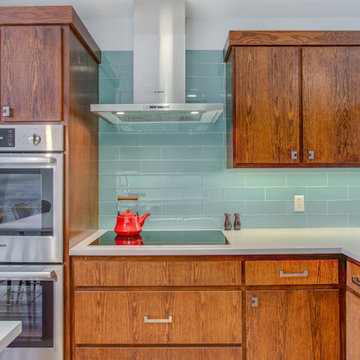
we wanted to preserve the mid-century modern feel (talk about a real flashback!), and boy, do we love the results! This kitchen is another perfect example of a project where we did the “lipstick and make-up” – another term for replacing the more cosmetic features such as countertops, backsplash, and the door and drawer fronts. Even doing so, the resulting kitchen leaves us with a breath of fresh air! To learn more about this space, continue reading below:
Cabinetry
To start, we removed the soffit in the kitchen making the space look taller. Next, we did not rip out the cabinetry boxes, because we were inspired by the finish and look of what existed. Maintaining the finish of the cabinets helped preserve the retro feel and is a good example of repurposing what you already have! As a result, we replaced the door and drawer fronts with a new slab style in a matching medium stain. In addition to the cabinetry fronts, we installed floating shelves – a perfect spot to display!
Countertops
For countertops we wanted something light and bright, and also something that would look good with the other finishes. As a result, we kept it simple with a light and bright surface from Caesarstone in the color “Blizzard”
Backsplash
Now for a little fun and a pop of color, the tile. The tile we selected is fresh, exciting, and also ties everything together giving that mid-century modern feel. In a brick-lay installation, we have a Glazzio Crystile Series, in a 4×12 size, with a finish of Soft Mint.
Fixtures and Fittings
Completing the space, we finished the cabinetry with U-Turn knob’s on the doors, and U-turn pulls on the drawers. Then from Blanco, we have a Quatrus stainless steel sink and a Culina mini faucet in satin nickel.
 Chairma Design Group
Photo by Kolanowski Studio
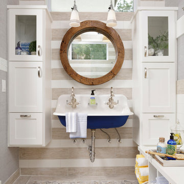
Inspiration for a mid-sized coastal 3/4 beige tile pebble tile floor and beige floor bathroom remodel in Houston with a wall-mount sink, shaker cabinets, white cabinets, gray walls and white countertops
Inspiration for a mid-sized coastal 3/4 beige tile pebble tile floor and beige floor bathroom remodel in Houston with a wall-mount sink, shaker cabinets, white cabinets, gray walls and white countertops
 Advance Design Studio, Ltd.
Jennifer and Dan have lived in their Deer Park Illinois home for 15 years, slowly making minor fixes like painting and decorating; but they had a new plan for their kitchen the entire time. An awkwardly placed garage door, and an island cooktop with a terrible downdraft made a full-scale kitchen remodel an absolute must. Jennifer had many ideas in mind and wanted to work with a company that could provide high-end work, while partnering with a designer that would tailor the kitchen to her ideas.
She was intrigued by the phrase “Common Sense Remodeling” in Advance Design’s feature she discovered while perusing an issue of the community’s Quintessential Barrington Magazine. Doing further research on the company’s website, as she looked through project profiles and read about Advance Design’s “Common Sense Remodeling” philosophy, she promptly scheduled an appointment to see if the people and ideas she read about were truly who they said they were. The more she read, the more she knew that the “Common Sense” approach to remodeling they described was exactly the type of company she was looking for.
The partnership was sealed after an initial consultation with Owner Todd Jurs and Project Designer Michelle Lecinski. They displayed a combination of friendliness, professionalism and respect that was unmatched by any of the other companies Jennifer talked to. She knew that with Advance Design, she would be able to retain the vision that she had in mind with high-quality craftsmanship.
“I reached out to Advance Design because of the ‘Common Sense Remodeling’ tagline,” Jennifer said. “That’s what lingered for me”. “Advance Design was the most respectful- of the house and of my design ideas, and the most professional of the handful of companies that looked at my project”.
Soon after the meeting Jennifer began working with Michelle on the project design. They quickly developed chemistry. Jennifer loved how Michelle researched and located every detail that Jennifer wanted for the kitchen. Between the two of them, every concept and idea was worked through and perfected. “Jennifer had definite ideas about what she wanted the new kitchen to look like, she just didn’t know how to bring it all together. We worked together really well to make her ideas into the practical reality necessary for a well-functioning kitchen, with the look and feel that she had envisioned”, says Michelle.
“Michelle was wonderful in using the CAD system she would show me new drawings every time we changed the layout while working through the design,” Jennifer said. “She was a really wonderful partner in execution, she made sure everything happened quickly and easily.”
The finished design drew out elements of Jennifer’s style and personality. The pair call the look “sophisticated farmhouse” to describe the kitchen renovation to family and friends. The result was a beautifully crafted, authentic-feeling space that satisfied Jennifer’s dreams 15 years in the making. The whole project consisted of a kitchen remodel, mudroom upgrade with powder room, and garage entry relocation. “The projects I personally like the best, are the ones that put the client’s dreams on display,” Project Designer Michelle said. “And this is one of those projects.”
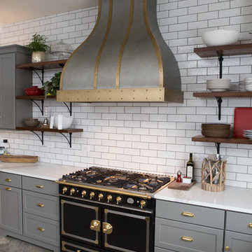
The main focal point of the kitchen is custom zinc and brass ventilation hood with a vintage sheen, which was hand made to order by a small company in Indiana named Vogler Metalworking. “It’s like sculpture, a true work of art”, says Jennifer. Your eye is immediately drawn towards this elegant yet practical hood that eliminated the home’s downdraft problem and added a striking conversation piece at the same time. The carpenters had to use special gloves when transporting and installing it, so they didn’t smudge it with fingerprints. The beautiful hood centers proudly over the stunning black enamel and brass LaCornue Range. “I had a friend who had a LaCornue range and after learning how easy it was to cook perfect meals, I was convinced I wanted to have one”, says Jennifer. This unique, breathtaking combination anchors the entire kitchen and is apparent immediately as you walk into the great room the surrounds the space.
DuraSupreme Crestwood cabinets with a Kendall Panel add function and sophistication. A custom gray paint color paired with a storm blue was developed so that the new kitchen looked like it belonged to the existing space. Unlacquered brass faucets and hardware were important to Jennifer because she wanted the living finishes to age over time. Remarkable brass diamond mesh cabinet door inserts imported from the UK continue to add this one-of-a-kind kitchen renovation; giving it a “you won’t see this everywhere” quality. The use of old railcar flooring for the coffee bar countertop and reclaimed oak for the open shelving gives an authenticity to the space uncommon in kitchens today.
Jennifer and Michelle fell in love with the Limestone Grey Stone while they were investigating unique island countertop ideas. They liked the fact that the limestone as a living finish will age and change over time. Calcutta Miel Quartz countertops made for an excellent pairing around the perimeter, as it’s durable and perfect for cooking preparations. A textured white subway tile backsplash that runs to the ceiling keeps your eye moving towards the open shelving, and to the main focal point of the stunning range hood combination.
“The kitchen functions beautifully, and it’s gorgeous,” beams Jennifer as she gestures with both hands while smiling ear to ear. “The most important thing was I wanted a kitchen that had a wonderful flow, cooked beautiful meals and was a great gathering place for family and friends, and this space does that perfectly! Beauty wise, it turned out exactly how I had envisioned. I felt the function part was the hardest part, and that was nailed”!
Relocating the garage entry to the new mudroom was a huge priority and has finally separated the family’s arriving home functions from their kitchen. Now coats and shoes and bags have their own area for dropping once members arrive home. Matching gray DuraSupreme cabinetry helped create gorgeous, purposeful lockers for the family. A reclaimed vintage sink and custom wall paper were added to the tiny powder room to beautify the once previously only functional space. Advance Design was even able to create a custom space for their dog to sleep while the family is away.
“It was unbelievable that a project of this size was completed in such a short time, and I think that’s because of the large amount of planning and preparation that went into it,” Jennifer marveled, “When we started, we were ready, and everything was prepared”.
When it came to execution, Project Manager Justin Davis and his crew were quick, accessible, and organized. Projects like this kitchen are typically completed in as little as 8-10 weeks. Jennifer’s kitchen however despite the relocation of some challenging HVAC in a soffit and moving of an exterior door was completed remarkably fast in part because the team was working with an existing tile floor that ran throughout the first floor that the client really loved.
“You get to know these people really well because they’re living in your house while you’re living in your house. They were so fast and really good, it didn’t take as long as even planned” reported Jennifer. “I would text Justin and he always responded almost immediately. I got to know all the guys who were working in our house and they were all wonderful people”.
Details in a customized kitchen like this one require skill and care from the people who install it. “All the guys on the job were skilled at what the did. I wanted small details like little feet to look like furniture, that is where their carpentry skill came in to make these all perfect”, said Jennifer. “The tile guys were wonderful. They even let me determine how I wanted the texture with the grout to appear for a salt and pepper look; now that is a very skilled trade person making it custom”.
In Jennifer’s interview, she continued to reference Advance Design’s “Common Sense Remodeling”, so I took a minute to ask her exactly what that phrase meant to her and how it played out in her experience with her project and the Advance Design team. Here is what she said: “I was intrigued about Common Sense Remodeling and in my head that there would be clear costs and prices, great communication between the design team, the execution team and me”, said Jennifer. They did deliver on that, it was so clear about the cost breakdown, what I could expect from everyone who came to my house, and everything that we had ordered. That to me is the Common Sense”!
It’s great to see a client take literally our assertion that a well-planned remodeling project is simply “Common Sense”! She anticipated each step of the way would be clear, concise, and predictable, all the while protecting the outcome due to the careful upfront planning. “Advance Design delivered on their ‘Common Sense Remodeling’ promise,” Jennifer said. “From the design team, to the execution team - everything was straight forward like I imagined. The project turned out exactly how I envisioned, I enjoyed this process and absolutely would recommend Advance Design Studio to anyone.”
 Klopf Architecture
Mariko Reed
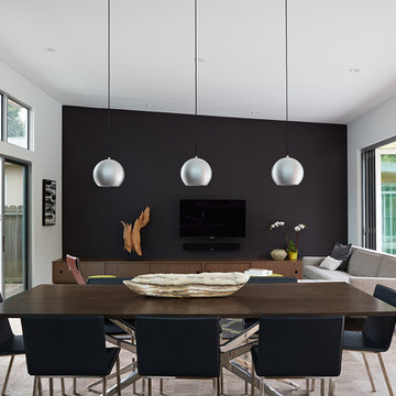
Inspiration for a mid-sized 1960s porcelain tile and beige floor great room remodel in San Francisco with black walls
Inspiration for a mid-sized 1960s porcelain tile and beige floor great room remodel in San Francisco with black walls
 Advance Design Studio, Ltd.
Jennifer and Dan have lived in their Deer Park Illinois home for 15 years, slowly making minor fixes like painting and decorating; but they had a new plan for their kitchen the entire time. An awkwardly placed garage door, and an island cooktop with a terrible downdraft made a full-scale kitchen remodel an absolute must. Jennifer had many ideas in mind and wanted to work with a company that could provide high-end work, while partnering with a designer that would tailor the kitchen to her ideas.
She was intrigued by the phrase “Common Sense Remodeling” in Advance Design’s feature she discovered while perusing an issue of the community’s Quintessential Barrington Magazine. Doing further research on the company’s website, as she looked through project profiles and read about Advance Design’s “Common Sense Remodeling” philosophy, she promptly scheduled an appointment to see if the people and ideas she read about were truly who they said they were. The more she read, the more she knew that the “Common Sense” approach to remodeling they described was exactly the type of company she was looking for.
The partnership was sealed after an initial consultation with Owner Todd Jurs and Project Designer Michelle Lecinski. They displayed a combination of friendliness, professionalism and respect that was unmatched by any of the other companies Jennifer talked to. She knew that with Advance Design, she would be able to retain the vision that she had in mind with high-quality craftsmanship.
“I reached out to Advance Design because of the ‘Common Sense Remodeling’ tagline,” Jennifer said. “That’s what lingered for me”. “Advance Design was the most respectful- of the house and of my design ideas, and the most professional of the handful of companies that looked at my project”.
Soon after the meeting Jennifer began working with Michelle on the project design. They quickly developed chemistry. Jennifer loved how Michelle researched and located every detail that Jennifer wanted for the kitchen. Between the two of them, every concept and idea was worked through and perfected. “Jennifer had definite ideas about what she wanted the new kitchen to look like, she just didn’t know how to bring it all together. We worked together really well to make her ideas into the practical reality necessary for a well-functioning kitchen, with the look and feel that she had envisioned”, says Michelle.
“Michelle was wonderful in using the CAD system she would show me new drawings every time we changed the layout while working through the design,” Jennifer said. “She was a really wonderful partner in execution, she made sure everything happened quickly and easily.”
The finished design drew out elements of Jennifer’s style and personality. The pair call the look “sophisticated farmhouse” to describe the kitchen renovation to family and friends. The result was a beautifully crafted, authentic-feeling space that satisfied Jennifer’s dreams 15 years in the making. The whole project consisted of a kitchen remodel, mudroom upgrade with powder room, and garage entry relocation. “The projects I personally like the best, are the ones that put the client’s dreams on display,” Project Designer Michelle said. “And this is one of those projects.”
The main focal point of the kitchen is custom zinc and brass ventilation hood with a vintage sheen, which was hand made to order by a small company in Indiana named Vogler Metalworking. “It’s like sculpture, a true work of art”, says Jennifer. Your eye is immediately drawn towards this elegant yet practical hood that eliminated the home’s downdraft problem and added a striking conversation piece at the same time. The carpenters had to use special gloves when transporting and installing it, so they didn’t smudge it with fingerprints. The beautiful hood centers proudly over the stunning black enamel and brass LaCornue Range. “I had a friend who had a LaCornue range and after learning how easy it was to cook perfect meals, I was convinced I wanted to have one”, says Jennifer. This unique, breathtaking combination anchors the entire kitchen and is apparent immediately as you walk into the great room the surrounds the space.
DuraSupreme Crestwood cabinets with a Kendall Panel add function and sophistication. A custom gray paint color paired with a storm blue was developed so that the new kitchen looked like it belonged to the existing space. Unlacquered brass faucets and hardware were important to Jennifer because she wanted the living finishes to age over time. Remarkable brass diamond mesh cabinet door inserts imported from the UK continue to add this one-of-a-kind kitchen renovation; giving it a “you won’t see this everywhere” quality. The use of old railcar flooring for the coffee bar countertop and reclaimed oak for the open shelving gives an authenticity to the space uncommon in kitchens today.
Jennifer and Michelle fell in love with the Limestone Grey Stone while they were investigating unique island countertop ideas. They liked the fact that the limestone as a living finish will age and change over time. Calcutta Miel Quartz countertops made for an excellent pairing around the perimeter, as it’s durable and perfect for cooking preparations. A textured white subway tile backsplash that runs to the ceiling keeps your eye moving towards the open shelving, and to the main focal point of the stunning range hood combination.
“The kitchen functions beautifully, and it’s gorgeous,” beams Jennifer as she gestures with both hands while smiling ear to ear. “The most important thing was I wanted a kitchen that had a wonderful flow, cooked beautiful meals and was a great gathering place for family and friends, and this space does that perfectly! Beauty wise, it turned out exactly how I had envisioned. I felt the function part was the hardest part, and that was nailed”!
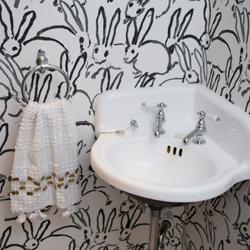
Relocating the garage entry to the new mudroom was a huge priority and has finally separated the family’s arriving home functions from their kitchen. Now coats and shoes and bags have their own area for dropping once members arrive home. Matching gray DuraSupreme cabinetry helped create gorgeous, purposeful lockers for the family. A reclaimed vintage sink and custom wall paper were added to the tiny powder room to beautify the once previously only functional space. Advance Design was even able to create a custom space for their dog to sleep while the family is away.
“It was unbelievable that a project of this size was completed in such a short time, and I think that’s because of the large amount of planning and preparation that went into it,” Jennifer marveled, “When we started, we were ready, and everything was prepared”.
When it came to execution, Project Manager Justin Davis and his crew were quick, accessible, and organized. Projects like this kitchen are typically completed in as little as 8-10 weeks. Jennifer’s kitchen however despite the relocation of some challenging HVAC in a soffit and moving of an exterior door was completed remarkably fast in part because the team was working with an existing tile floor that ran throughout the first floor that the client really loved.
“You get to know these people really well because they’re living in your house while you’re living in your house. They were so fast and really good, it didn’t take as long as even planned” reported Jennifer. “I would text Justin and he always responded almost immediately. I got to know all the guys who were working in our house and they were all wonderful people”.
Details in a customized kitchen like this one require skill and care from the people who install it. “All the guys on the job were skilled at what the did. I wanted small details like little feet to look like furniture, that is where their carpentry skill came in to make these all perfect”, said Jennifer. “The tile guys were wonderful. They even let me determine how I wanted the texture with the grout to appear for a salt and pepper look; now that is a very skilled trade person making it custom”.
In Jennifer’s interview, she continued to reference Advance Design’s “Common Sense Remodeling”, so I took a minute to ask her exactly what that phrase meant to her and how it played out in her experience with her project and the Advance Design team. Here is what she said: “I was intrigued about Common Sense Remodeling and in my head that there would be clear costs and prices, great communication between the design team, the execution team and me”, said Jennifer. They did deliver on that, it was so clear about the cost breakdown, what I could expect from everyone who came to my house, and everything that we had ordered. That to me is the Common Sense”!
It’s great to see a client take literally our assertion that a well-planned remodeling project is simply “Common Sense”! She anticipated each step of the way would be clear, concise, and predictable, all the while protecting the outcome due to the careful upfront planning. “Advance Design delivered on their ‘Common Sense Remodeling’ promise,” Jennifer said. “From the design team, to the execution team - everything was straight forward like I imagined. The project turned out exactly how I envisioned, I enjoyed this process and absolutely would recommend Advance Design Studio to anyone.”
 J Design Group - Interior Designers Miami - Modern
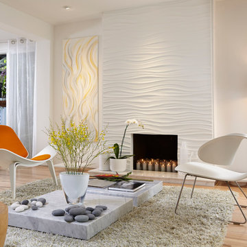
Panels – Wall Paneling - Modern – Contemporary.
Interior paneling is a great way to show off your personality while creating a warm and inviting feeling within your home. Your guests will be talking about your home for months to come.
At J. Design Group, we offer turn-key projects where we incorporate the most modern materials for all types of paneling - from wood to high gloss, and everything in between. We can even create custom interior paneling to make sure the right mood is captured within your home.
Whether you want to add the paneling to enhance your kitchen, bedroom, family room, or dining room, our team of experts will help you choose the right design and color. One of the best ways to bring an entire design together in your home is through the use of panels and with contrasting elements and textures, you can turn your home into the luxurious place you have always wanted it to be.
We welcome you to take a look at some of our past paneling jobs. As you can see, paneling is a great way to decorate the interior of your home or office space. We invite you to give our office a call today to schedule your appointment with one of our design experts. We will work one-on-one with you to ensure that we create the right look in every room throughout your home.
Give J. Design Group a call today to discuss all different options and to receive a free consultation.
Your friendly Interior design firm in Miami at your service.
Contemporary - Modern Interior designs.
Top Interior Design Firm in Miami – Coral Gables.
Panel,
Panels,
Paneling,
Wall Panels,
Wall Paneling,
Wood Panels,
Glass Panels,
Bedroom,
Bedrooms,
Bed,
Queen bed,
King Bed,
Single bed,
House Interior Designer,
House Interior Designers,
Home Interior Designer,
Home Interior Designers,
Residential Interior Designer,
Residential Interior Designers,
Modern Interior Designers,
Miami Beach Designers,
Best Miami Interior Designers,
Miami Beach Interiors,
Luxurious Design in Miami,
Top designers,
Deco Miami,
Luxury interiors,
Miami modern,
Interior Designer Miami,
Contemporary Interior Designers,
Coco Plum Interior Designers,
Miami Interior Designer,
Sunny Isles Interior Designers,
Pinecrest Interior Designers,
Interior Designers Miami,
J Design Group interiors,
South Florida designers,
Best Miami Designers,
Miami interiors,
Miami décor,
Miami Beach Luxury Interiors,
Miami Interior Design,
Miami Interior Design Firms,
Beach front,
Top Interior Designers,
top décor,
Top Miami Decorators,
Miami luxury condos,
Top Miami Interior Decorators,
Top Miami Interior Designers,
Modern Designers in Miami,
modern interiors,
Modern,
Pent house design,
white interiors,
Miami, South Miami, Miami Beach, South Beach, Williams Island, Sunny Isles, Surfside, Fisher Island, Aventura, Brickell, Brickell Key, Key Biscayne, Coral Gables, CocoPlum, Coconut Grove, Pinecrest, Miami Design District, Golden Beach, Downtown Miami, Miami Interior Designers, Miami Interior Designer, Interior Designers Miami, Modern Interior Designers, Modern Interior Designer, Modern interior decorators, Contemporary Interior Designers, Interior decorators, Interior decorator, Interior designer, Interior designers, Luxury, modern, best, unique, real estate, decor
J Design Group – Miami Interior Design Firm – Modern – Contemporary
Contact us: (305) 444-4611
www.JDesignGroup.com

 FineLine Kitchens, Inc.
Hi everyone, I'm Sarah and Ogun we are here with fine line kitchens. So we are a couple working together. I do the interior design and remodeling of the space material selection meeting with the clients. And I handled operations outside, you know meaning all the construction work that is taking place the inside. The houses that we work in. I handle all the aspects of the construction, so today's project is very special. We're in Vienna and the client had a very big family. It's a family of seven that lives here. So we had a few aspects that we needed to keep in mind while designing this one. Having everybody be able to sit on the island. So we wanted plenty of seating all the way around. We didn't want anybody standing or anything like that. So what we did is we maximize the space. The center island is the biggest part of the kitchen. We use a natural stone to kind of give it a beautiful texture versus quartz. It's kind of standard white or kind of fabricated, so I wanted something very natural. We did this because I took my inspiration from the outside, so the inspiration if you look at the view right in front of me is there are so many greens there's a lot of brass accents and I wanted to bring this. Into this kitchen while designing it for my clients. She is very warm very. She wanted a very homey, comfy kind of look for the kitchen. So that's what we did today. As you can see, the cabinets are sage green, very light, so I still think it's a neutral, but it's a lighter color that again brings the outside in and we combine that with the oak right behind me so it's a slightly warm oak. It's not very dark. It's not very light. It's a medium brown and the same color went on the island. To kind of tie these two in and the backsplash, my favorite part is where you can see a little bit of design. It is, in my opinion still classic, but includes a pattern so the outside part is as we said in the beginning, is handled by my husband. I'd like him to speak a little bit about that. Thanks, Sarah, I want to talk to you guys a little bit about the construction part of this project. Originally this kitchen was located mostly in this area. They had their stove there sing. It was more of a peninsula layout in Sarah's and the customer vision they wanted. They wanted to get rid of the peninsula and they want to be able to have a huge island that can at least sit seven people because they're familiar with seven. So we wanted to make sure that we can achieve this design and bring it to life so that they can be happy with this layout. Some of the challenges we had, the house, the home being, you know, old home. There were a lot of you know the older electrical and plumbing that had to be replaced. We had to relocate the stove from here to this area. Over here we had put a nice foot fan that we had to relocate all the ductwork and the plumbing. Was being on the peninsula area. We had to relocate it to the center islands. So we achieved all this and kind of like bring it to bring in this kitchen up to date it looks beautiful. That's true, so yes, the old layout did not function for my clients because everything was kind of gathered on one side of the kitchen. So there was like a peninsula right there. So the end of this island kind of continued straight. And that was just the L shape. Kind of where everything was and there used to be another big table here, so they were using only kind of half of the space. So like I said at the beginning, our vision was to kind of feed everybody at the island, create some symmetry. 'cause I love that. So as you can see behind me, this is kind of the focal point symmetrical. Everything is kind of even we wanted to also panel the fridge here so it mimics the pantry and another size. So when you're looking at it, it is bringing again that symmetry back again. I hope you enjoyed this kitchen and this video and I'll see you soon. So how do you think this project turned out? It's nice. I like the color. I think it turned out nice. It's kind of like a little bit different color than what we always do. So I realize. Are you giving me a little bit of credit here that I did something different? Are you proud? I'm so proud of you. Other than that I like it. That they have kind of like a two sink. So if this was our kitchen, if we ever like you can have your own. I can have mine if we ever get into a fight then this can be like my own kitchen. Why are we gonna bring in a fight right now? So I'm cooking anyway. You're grilling most of the time, So what are you even talking about? My kitchen? That's my kitchen. You can just take the small sink. That's fine. It's always good to have your own space right there, so anyways. Thank you guys for watching. We hope to see you soon and if you have any questions please click the link below. It'll lead you to our website, house, YouTube and all of the social media is so nice to have you guys. We'll see you soon. Thanks bye bye-bye.
 FineLine Kitchens, Inc.
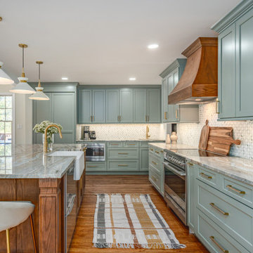
Hi everyone, I'm Sarah and Ogun we are here with fine line kitchens. So we are a couple working together. I do the interior design and remodeling of the space material selection meeting with the clients. And I handled operations outside, you know meaning all the construction work that is taking place the inside. The houses that we work in. I handle all the aspects of the construction, so today's project is very special. We're in Vienna and the client had a very big family. It's a family of seven that lives here. So we had a few aspects that we needed to keep in mind while designing this one. Having everybody be able to sit on the island. So we wanted plenty of seating all the way around. We didn't want anybody standing or anything like that. So what we did is we maximize the space. The center island is the biggest part of the kitchen. We use a natural stone to kind of give it a beautiful texture versus quartz. It's kind of standard white or kind of fabricated, so I wanted something very natural. We did this because I took my inspiration from the outside, so the inspiration if you look at the view right in front of me is there are so many greens there's a lot of brass accents and I wanted to bring this. Into this kitchen while designing it for my clients. She is very warm very. She wanted a very homey, comfy kind of look for the kitchen. So that's what we did today. As you can see, the cabinets are sage green, very light, so I still think it's a neutral, but it's a lighter color that again brings the outside in and we combine that with the oak right behind me so it's a slightly warm oak. It's not very dark. It's not very light. It's a medium brown and the same color went on the island. To kind of tie these two in and the backsplash, my favorite part is where you can see a little bit of design. It is, in my opinion still classic, but includes a pattern so the outside part is as we said in the beginning, is handled by my husband. I'd like him to speak a little bit about that. Thanks, Sarah, I want to talk to you guys a little bit about the construction part of this project. Originally this kitchen was located mostly in this area. They had their stove there sing. It was more of a peninsula layout in Sarah's and the customer vision they wanted. They wanted to get rid of the peninsula and they want to be able to have a huge island that can at least sit seven people because they're familiar with seven. So we wanted to make sure that we can achieve this design and bring it to life so that they can be happy with this layout. Some of the challenges we had, the house, the home being, you know, old home. There were a lot of you know the older electrical and plumbing that had to be replaced. We had to relocate the stove from here to this area. Over here we had put a nice foot fan that we had to relocate all the ductwork and the plumbing. Was being on the peninsula area. We had to relocate it to the center islands. So we achieved all this and kind of like bring it to bring in this kitchen up to date it looks beautiful. That's true, so yes, the old layout did not function for my clients because everything was kind of gathered on one side of the kitchen. So there was like a peninsula right there. So the end of this island kind of continued straight. And that was just the L shape. Kind of where everything was and there used to be another big table here, so they were using only kind of half of the space. So like I said at the beginning, our vision was to kind of feed everybody at the island, create some symmetry. 'cause I love that. So as you can see behind me, this is kind of the focal point symmetrical. Everything is kind of even we wanted to also panel the fridge here so it mimics the pantry and another size. So when you're looking at it, it is bringing again that symmetry back again. I hope you enjoyed this kitchen and this video and I'll see you soon. So how do you think this project turned out? It's nice. I like the color. I think it turned out nice. It's kind of like a little bit different color than what we always do. So I realize. Are you giving me a little bit of credit here that I did something different? Are you proud? I'm so proud of you. Other than that I like it. That they have kind of like a two sink. So if this was our kitchen, if we ever like you can have your own. I can have mine if we ever get into a fight then this can be like my own kitchen. Why are we gonna bring in a fight right now? So I'm cooking anyway. You're grilling most of the time, So what are you even talking about? My kitchen? That's my kitchen. You can just take the small sink. That's fine. It's always good to have your own space right there, so anyways. Thank you guys for watching. We hope to see you soon and if you have any questions please click the link below. It'll lead you to our website, house, YouTube and all of the social media is so nice to have you guys. We'll see you soon. Thanks bye bye-bye.
 BBA Architects
Situated along the perimeter of the property, this unique home creates a continuous street wall, both preserving plenty of open yard space and maintaining privacy from the prominent street corner. A one-story mudroom connects the garage to the house at the rear of the lot which required a local zoning variance. The resulting L-shaped plan and the central location of a glass-enclosed stair allow natural light to enter the home from multiple sides of nearly every room. The Arts & Crafts inspired detailing creates a familiar yet unique facade that is sympathetic to the character and scale of the neighborhood. A chevron pattern is a key design element on the window bays and doors and continues inside throughout the interior of the home.
2022 NAHB Platinum Best in American Living Award
View more of this home through #BBAModernCraftsman on Instagram.
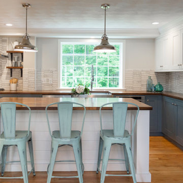
 Refined Renovations & Refined Home
This farmhouse-chic kitchen is a combination of white and blue cabinets with wood countertops. These materials, paired with metal stools and lighting, clean backsplash tiles and a chalkboard wall give the kitchen an updated farmhouse feel.
 Advance Design Studio, Ltd.
Jennifer and Dan have lived in their Deer Park Illinois home for 15 years, slowly making minor fixes like painting and decorating; but they had a new plan for their kitchen the entire time. An awkwardly placed garage door, and an island cooktop with a terrible downdraft made a full-scale kitchen remodel an absolute must. Jennifer had many ideas in mind and wanted to work with a company that could provide high-end work, while partnering with a designer that would tailor the kitchen to her ideas.
She was intrigued by the phrase “Common Sense Remodeling” in Advance Design’s feature she discovered while perusing an issue of the community’s Quintessential Barrington Magazine. Doing further research on the company’s website, as she looked through project profiles and read about Advance Design’s “Common Sense Remodeling” philosophy, she promptly scheduled an appointment to see if the people and ideas she read about were truly who they said they were. The more she read, the more she knew that the “Common Sense” approach to remodeling they described was exactly the type of company she was looking for.
The partnership was sealed after an initial consultation with Owner Todd Jurs and Project Designer Michelle Lecinski. They displayed a combination of friendliness, professionalism and respect that was unmatched by any of the other companies Jennifer talked to. She knew that with Advance Design, she would be able to retain the vision that she had in mind with high-quality craftsmanship.
“I reached out to Advance Design because of the ‘Common Sense Remodeling’ tagline,” Jennifer said. “That’s what lingered for me”. “Advance Design was the most respectful- of the house and of my design ideas, and the most professional of the handful of companies that looked at my project”.
Soon after the meeting Jennifer began working with Michelle on the project design. They quickly developed chemistry. Jennifer loved how Michelle researched and located every detail that Jennifer wanted for the kitchen. Between the two of them, every concept and idea was worked through and perfected. “Jennifer had definite ideas about what she wanted the new kitchen to look like, she just didn’t know how to bring it all together. We worked together really well to make her ideas into the practical reality necessary for a well-functioning kitchen, with the look and feel that she had envisioned”, says Michelle.
“Michelle was wonderful in using the CAD system she would show me new drawings every time we changed the layout while working through the design,” Jennifer said. “She was a really wonderful partner in execution, she made sure everything happened quickly and easily.”
The finished design drew out elements of Jennifer’s style and personality. The pair call the look “sophisticated farmhouse” to describe the kitchen renovation to family and friends. The result was a beautifully crafted, authentic-feeling space that satisfied Jennifer’s dreams 15 years in the making. The whole project consisted of a kitchen remodel, mudroom upgrade with powder room, and garage entry relocation. “The projects I personally like the best, are the ones that put the client’s dreams on display,” Project Designer Michelle said. “And this is one of those projects.”
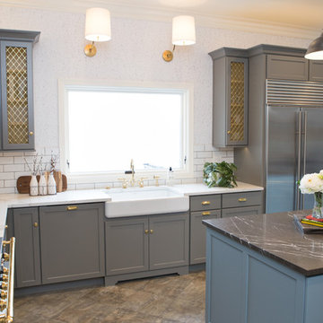
The main focal point of the kitchen is custom zinc and brass ventilation hood with a vintage sheen, which was hand made to order by a small company in Indiana named Vogler Metalworking. “It’s like sculpture, a true work of art”, says Jennifer. Your eye is immediately drawn towards this elegant yet practical hood that eliminated the home’s downdraft problem and added a striking conversation piece at the same time. The carpenters had to use special gloves when transporting and installing it, so they didn’t smudge it with fingerprints. The beautiful hood centers proudly over the stunning black enamel and brass LaCornue Range. “I had a friend who had a LaCornue range and after learning how easy it was to cook perfect meals, I was convinced I wanted to have one”, says Jennifer. This unique, breathtaking combination anchors the entire kitchen and is apparent immediately as you walk into the great room the surrounds the space.
DuraSupreme Crestwood cabinets with a Kendall Panel add function and sophistication. A custom gray paint color paired with a storm blue was developed so that the new kitchen looked like it belonged to the existing space. Unlacquered brass faucets and hardware were important to Jennifer because she wanted the living finishes to age over time. Remarkable brass diamond mesh cabinet door inserts imported from the UK continue to add this one-of-a-kind kitchen renovation; giving it a “you won’t see this everywhere” quality. The use of old railcar flooring for the coffee bar countertop and reclaimed oak for the open shelving gives an authenticity to the space uncommon in kitchens today.
Jennifer and Michelle fell in love with the Limestone Grey Stone while they were investigating unique island countertop ideas. They liked the fact that the limestone as a living finish will age and change over time. Calcutta Miel Quartz countertops made for an excellent pairing around the perimeter, as it’s durable and perfect for cooking preparations. A textured white subway tile backsplash that runs to the ceiling keeps your eye moving towards the open shelving, and to the main focal point of the stunning range hood combination.
“The kitchen functions beautifully, and it’s gorgeous,” beams Jennifer as she gestures with both hands while smiling ear to ear. “The most important thing was I wanted a kitchen that had a wonderful flow, cooked beautiful meals and was a great gathering place for family and friends, and this space does that perfectly! Beauty wise, it turned out exactly how I had envisioned. I felt the function part was the hardest part, and that was nailed”!
Relocating the garage entry to the new mudroom was a huge priority and has finally separated the family’s arriving home functions from their kitchen. Now coats and shoes and bags have their own area for dropping once members arrive home. Matching gray DuraSupreme cabinetry helped create gorgeous, purposeful lockers for the family. A reclaimed vintage sink and custom wall paper were added to the tiny powder room to beautify the once previously only functional space. Advance Design was even able to create a custom space for their dog to sleep while the family is away.
“It was unbelievable that a project of this size was completed in such a short time, and I think that’s because of the large amount of planning and preparation that went into it,” Jennifer marveled, “When we started, we were ready, and everything was prepared”.
When it came to execution, Project Manager Justin Davis and his crew were quick, accessible, and organized. Projects like this kitchen are typically completed in as little as 8-10 weeks. Jennifer’s kitchen however despite the relocation of some challenging HVAC in a soffit and moving of an exterior door was completed remarkably fast in part because the team was working with an existing tile floor that ran throughout the first floor that the client really loved.
“You get to know these people really well because they’re living in your house while you’re living in your house. They were so fast and really good, it didn’t take as long as even planned” reported Jennifer. “I would text Justin and he always responded almost immediately. I got to know all the guys who were working in our house and they were all wonderful people”.
Details in a customized kitchen like this one require skill and care from the people who install it. “All the guys on the job were skilled at what the did. I wanted small details like little feet to look like furniture, that is where their carpentry skill came in to make these all perfect”, said Jennifer. “The tile guys were wonderful. They even let me determine how I wanted the texture with the grout to appear for a salt and pepper look; now that is a very skilled trade person making it custom”.
In Jennifer’s interview, she continued to reference Advance Design’s “Common Sense Remodeling”, so I took a minute to ask her exactly what that phrase meant to her and how it played out in her experience with her project and the Advance Design team. Here is what she said: “I was intrigued about Common Sense Remodeling and in my head that there would be clear costs and prices, great communication between the design team, the execution team and me”, said Jennifer. They did deliver on that, it was so clear about the cost breakdown, what I could expect from everyone who came to my house, and everything that we had ordered. That to me is the Common Sense”!
It’s great to see a client take literally our assertion that a well-planned remodeling project is simply “Common Sense”! She anticipated each step of the way would be clear, concise, and predictable, all the while protecting the outcome due to the careful upfront planning. “Advance Design delivered on their ‘Common Sense Remodeling’ promise,” Jennifer said. “From the design team, to the execution team - everything was straight forward like I imagined. The project turned out exactly how I envisioned, I enjoyed this process and absolutely would recommend Advance Design Studio to anyone.”
 Klopf Architecture
Klopf Architecture, Arterra Landscape Architects and Henry Calvert of Calvert Ventures Designed and built a new warm, modern, Eichler-inspired, open, indoor-outdoor home on a deeper-than-usual San Mateo Highlands property where an original Eichler house had burned to the ground.
The owners wanted multi-generational living and larger spaces than the original home offered, but all parties agreed that the house should respect the neighborhood and blend in stylistically with the other Eichlers. At first the Klopf team considered re-using what little was left of the original home and expanding on it. But after discussions with the owner and builder, all parties agreed that the last few remaining elements of the house were not practical to re-use, so Klopf Architecture designed a new home that pushes the Eichler approach in new directions.
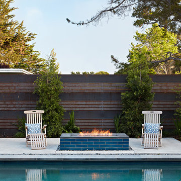
One disadvantage of Eichler production homes is that the house designs were not optimized for each specific lot. A new custom home offered the team a chance to start over. In this case, a longer house that opens up sideways to the south fit the lot better than the original square-ish house that used to open to the rear (west). Accordingly, the Klopf team designed an L-shaped “bar” house with a large glass wall with large sliding glass doors that faces sideways instead of to the rear like a typical Eichler. This glass wall opens to a pool and landscaped yard designed by Arterra Landscape Architects.
Driving by the house, one might assume at first glance it is an Eichler because of the horizontality, the overhanging flat roof eaves, the dark gray vertical siding, and orange solid panel front door, but the house is designed for the 21st Century and is not meant to be a “Likeler.” You won't see any posts and beams in this home. Instead, the ceiling decking is a western red cedar that covers over all the beams. Like Eichlers, this cedar runs continuously from inside to out, enhancing the indoor / outdoor feeling of the house, but unlike Eichlers it conceals a cavity for lighting, wiring, and insulation. Ceilings are higher, rooms are larger and more open, the master bathroom is light-filled and more generous, with a separate tub and shower and a separate toilet compartment, and there is plenty of storage. The garage even easily fits two of today's vehicles with room to spare.
A massive 49-foot by 12-foot wall of glass and the continuity of materials from inside to outside enhance the inside-outside living concept, so the owners and their guests can flow freely from house to pool deck to BBQ to pool and back.
During construction in the rough framing stage, Klopf thought the front of the house appeared too tall even though the house had looked right in the design renderings (probably because the house is uphill from the street). So Klopf Architecture paid the framer to change the roofline from how we had designed it to be lower along the front, allowing the home to blend in better with the neighborhood. One project goal was for people driving up the street to pass the home without immediately noticing there is an "imposter" on this lot, and making that change was essential to achieve that goal.
This 2,606 square foot, 3 bedroom, 3 bathroom Eichler-inspired new house is located in San Mateo in the heart of the Silicon Valley.
Klopf Architecture Project Team: John Klopf, AIA, Klara Kevane
Landscape Architect: Arterra Landscape Architects
Contractor: Henry Calvert of Calvert Ventures
Photography ©2016 Mariko Reed
Location: San Mateo, CA
Year completed: 2016
 kelly mcguill home
Photographer: Eric Roth; Stylist: Tracey Parkinson
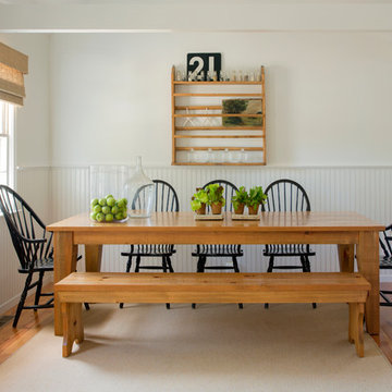
Mid-sized beach style light wood floor dining room photo in Boston with white walls and no fireplace
Mid-sized beach style light wood floor dining room photo in Boston with white walls and no fireplace
 Melinamade - Residential Design + Interiors
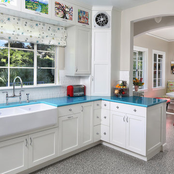
A remodeled retro kitchen mixed with a few original architectural elements of this Spanish home. Highlights here are aqua glazed lava stone counter tops, custom designed hand silk-screened fabrics, and children's art inside the upper cabinet panels. To know more about this makeover, please read the "Houzz Tour" feature article here: http://www.houzz.com/ideabooks/32975037/list/houzz-tour-midcentury-meets-mediterranean-in-california
Bernard Andre photography.
 Dessa Lea Productions
Photo by Kelly M. Shea
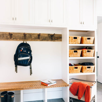
Mid-sized cottage ceramic tile and gray floor entryway photo in Other with white walls and a black front door
Mid-sized cottage ceramic tile and gray floor entryway photo in Other with white walls and a black front door
 FineLine Kitchens, Inc.
Hi everyone, I'm Sarah and Ogun we are here with fine line kitchens. So we are a couple working together. I do the interior design and remodeling of the space material selection meeting with the clients. And I handled operations outside, you know meaning all the construction work that is taking place the inside. The houses that we work in. I handle all the aspects of the construction, so today's project is very special. We're in Vienna and the client had a very big family. It's a family of seven that lives here. So we had a few aspects that we needed to keep in mind while designing this one. Having everybody be able to sit on the island. So we wanted plenty of seating all the way around. We didn't want anybody standing or anything like that. So what we did is we maximize the space. The center island is the biggest part of the kitchen. We use a natural stone to kind of give it a beautiful texture versus quartz. It's kind of standard white or kind of fabricated, so I wanted something very natural. We did this because I took my inspiration from the outside, so the inspiration if you look at the view right in front of me is there are so many greens there's a lot of brass accents and I wanted to bring this. Into this kitchen while designing it for my clients. She is very warm very. She wanted a very homey, comfy kind of look for the kitchen. So that's what we did today. As you can see, the cabinets are sage green, very light, so I still think it's a neutral, but it's a lighter color that again brings the outside in and we combine that with the oak right behind me so it's a slightly warm oak. It's not very dark. It's not very light. It's a medium brown and the same color went on the island. To kind of tie these two in and the backsplash, my favorite part is where you can see a little bit of design. It is, in my opinion still classic, but includes a pattern so the outside part is as we said in the beginning, is handled by my husband. I'd like him to speak a little bit about that. Thanks, Sarah, I want to talk to you guys a little bit about the construction part of this project. Originally this kitchen was located mostly in this area. They had their stove there sing. It was more of a peninsula layout in Sarah's and the customer vision they wanted. They wanted to get rid of the peninsula and they want to be able to have a huge island that can at least sit seven people because they're familiar with seven. So we wanted to make sure that we can achieve this design and bring it to life so that they can be happy with this layout. Some of the challenges we had, the house, the home being, you know, old home. There were a lot of you know the older electrical and plumbing that had to be replaced. We had to relocate the stove from here to this area. Over here we had put a nice foot fan that we had to relocate all the ductwork and the plumbing. Was being on the peninsula area. We had to relocate it to the center islands. So we achieved all this and kind of like bring it to bring in this kitchen up to date it looks beautiful. That's true, so yes, the old layout did not function for my clients because everything was kind of gathered on one side of the kitchen. So there was like a peninsula right there. So the end of this island kind of continued straight. And that was just the L shape. Kind of where everything was and there used to be another big table here, so they were using only kind of half of the space. So like I said at the beginning, our vision was to kind of feed everybody at the island, create some symmetry. 'cause I love that. So as you can see behind me, this is kind of the focal point symmetrical. Everything is kind of even we wanted to also panel the fridge here so it mimics the pantry and another size. So when you're looking at it, it is bringing again that symmetry back again. I hope you enjoyed this kitchen and this video and I'll see you soon. So how do you think this project turned out? It's nice. I like the color. I think it turned out nice. It's kind of like a little bit different color than what we always do. So I realize. Are you giving me a little bit of credit here that I did something different? Are you proud? I'm so proud of you. Other than that I like it. That they have kind of like a two sink. So if this was our kitchen, if we ever like you can have your own. I can have mine if we ever get into a fight then this can be like my own kitchen. Why are we gonna bring in a fight right now? So I'm cooking anyway. You're grilling most of the time, So what are you even talking about? My kitchen? That's my kitchen. You can just take the small sink. That's fine. It's always good to have your own space right there, so anyways. Thank you guys for watching. We hope to see you soon and if you have any questions please click the link below. It'll lead you to our website, house, YouTube and all of the social media is so nice to have you guys. We'll see you soon. Thanks bye bye-bye.
3