
Search results for "Tall most" in Home Design Ideas

 Missouri Botanical Garden
Courtesy Missouri Botanical Garden PlantFinder
Goldenrod / Solidago riddellii
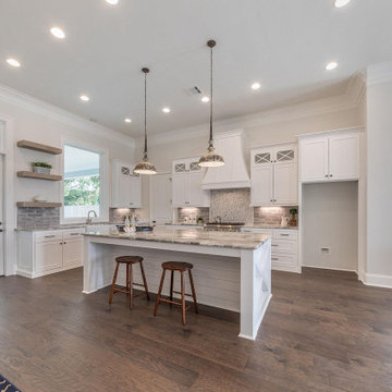
 Bowman Remodeling
Bowman kitchen and bath remodelers in Los Altos offers specialized services for bathroom and kitchen remodeling in Los Altos. We have more than a decade of experience in bathroom and kitchen design and remodeling in Los Altos and neighboring cities. We love our clients and that is why we never upsell anything or push you to get anything that you don’t need. Our company is committed to 100% customer satisfaction, and the fact that we are amongst the most preferred bathroom and kitchen remodelers in Los Altos is testimony to that.
Bathroom and Kitchen Remodeling Contractors in Los Altos, CA - http://www.bowmanremodeling.com/

 Saikley Architects
This beautiful 1881 Alameda Victorian cottage, wonderfully embodying the Transitional Gothic-Eastlake era, had most of its original features intact. Our clients, one of whom is a painter, wanted to preserve the beauty of the historic home while modernizing its flow and function.
From several small rooms, we created a bright, open artist’s studio. We dug out the basement for a large workshop, extending a new run of stair in keeping with the existing original staircase. While keeping the bones of the house intact, we combined small spaces into large rooms, closed off doorways that were in awkward places, removed unused chimneys, changed the circulation through the house for ease and good sightlines, and made new high doorways that work gracefully with the eleven foot high ceilings. We removed inconsistent picture railings to give wall space for the clients’ art collection and to enhance the height of the rooms. From a poorly laid out kitchen and adjunct utility rooms, we made a large kitchen and family room with nine-foot-high glass doors to a new large deck. A tall wood screen at one end of the deck, fire pit, and seating give the sense of an outdoor room, overlooking the owners’ intensively planted garden. A previous mismatched addition at the side of the house was removed and a cozy outdoor living space made where morning light is received. The original house was segmented into small spaces; the new open design lends itself to the clients’ lifestyle of entertaining groups of people, working from home, and enjoying indoor-outdoor living.
Photography by Kurt Manley.
https://saikleyarchitects.com/portfolio/artists-victorian/
Find the right local pro for your project

 Visbeen Architects
Builder: J. Peterson Homes
Interior Designer: Francesca Owens
Photographers: Ashley Avila Photography, Bill Hebert, & FulView
Capped by a picturesque double chimney and distinguished by its distinctive roof lines and patterned brick, stone and siding, Rookwood draws inspiration from Tudor and Shingle styles, two of the world’s most enduring architectural forms. Popular from about 1890 through 1940, Tudor is characterized by steeply pitched roofs, massive chimneys, tall narrow casement windows and decorative half-timbering. Shingle’s hallmarks include shingled walls, an asymmetrical façade, intersecting cross gables and extensive porches. A masterpiece of wood and stone, there is nothing ordinary about Rookwood, which combines the best of both worlds.
Once inside the foyer, the 3,500-square foot main level opens with a 27-foot central living room with natural fireplace. Nearby is a large kitchen featuring an extended island, hearth room and butler’s pantry with an adjacent formal dining space near the front of the house. Also featured is a sun room and spacious study, both perfect for relaxing, as well as two nearby garages that add up to almost 1,500 square foot of space. A large master suite with bath and walk-in closet which dominates the 2,700-square foot second level which also includes three additional family bedrooms, a convenient laundry and a flexible 580-square-foot bonus space. Downstairs, the lower level boasts approximately 1,000 more square feet of finished space, including a recreation room, guest suite and additional storage.

 Bilotta Kitchen & Home
Designed by Bilotta’s Fabrice Garson, this expansive traditional kitchen features our private Bilotta Collection Cabinetry in white paint with double stacked wall cabinets leading up to the coffered ceiling. The massive island houses multiple appliances, including a warming drawer, microwave and dishwasher next to the main sink, as well as large drawers for ample storage. Island seating allows for less formal dining or a place for the children to do their homework while mom prepares dinner. Two wall ovens flanking the 48” Wolf range top create a perfect cooking “nook” and the side-by-side fully integrated 36” Sub-Zero refrigerator and freezer allow for plenty of food storage. On either side of the refrigeration are two tall pull-out pantries concealing snacks, spices, baking supplies and more. Every drawer in the space has its individual purpose, whether it be to house cutlery or fine china. The coffered ceiling, a trademark of many of Fabrice’s designs, really open up the space and intertwine it with the adjacent rooms for an overall open feeling – very bright and inviting. The wall on the other side of the island from the cooking wall features a secondary prep sink with a second dishwasher and a under counter beverage center, again, with plenty of storage in both the base and wall cabinets. The backsplash is mostly wood paneling except for the wall behind the range top where there is a custom designed marble mosaic pattern. The countertops are Vermont Super White quartzite with a double ogee edge.
Photographer – Peter Krupenye

 Jarrett Design
Entertaining friends and family doesn't work well when rooms are small and closed off. So when our clients decided to remodel, they knew they wanted to open up the space to accommodate large gatherings. Also important were ample storage and quality appliances that would hold up to the demands of cooking creative meals several nights a week.
As is sometimes the case with remodeling, solving one problem can create another. Opening up the space involved removing a wall, which sacrificed critical square footage for cabinetry and appliances. We knew the wall needed to come down so we were challenged with making sure every available cabinet space in the kitchen was being utilized as thoughtfully and creatively as possible. A tall pantry was added next to the refrigerator to allow for storage of pots and pans, as well as food, while another pantry in the adjacent dining room housed all dishes and silverware. A small bar area was created in an unused section in the back of the home to store coffee and tea accessories and drinkware. Finally, a small island in the center of the kitchen offered the ideal location for the microwave and most-used pots and pans.
With the expanded space, smart use of storage options and top-notch appliances, our clients are enjoying working in their new kitchen and have already hosted a ravioli-making class!
Matt Villano Photography
 Bilotta Kitchen & Home
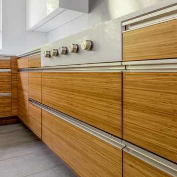
A convergence of sleek contemporary style and organic elements culminate in this elevated esthetic. High gloss white contrasts with sustainable bamboo veneers, run horizontally, and stained a warm matte caramel color. The showpiece is the 3” bamboo framing around the tall units, engineered in strips that perfectly align with the breaks in the surrounding cabinetry. So as not to clutter the clean lines of the flat panel doors, the white cabinets open with touch latches, most of which have lift-up mechanisms. Base cabinets have integrated channel hardware in stainless steel, echoing the appliances. Storage abounds, with such conveniences as tray partitions, corner swing-out lazy susans, and assorted dividers and inserts for the profusion of large drawers.
Pure white quartz countertops terminate in a waterfall end at the peninsula, where there’s room for three comfortable stools under the overhang. A unique feature is the execution of the cooktop: it’s set flush into the countertop, with a fascia of quartz below it; the cooktop’s knobs are set into that fascia. To assure a clean look throughout, the quartz is continued onto the backsplashes, punctuated by a sheet of stainless steel behind the rangetop and hood. Serenity and style in a hardworking space.
This project was designed in collaboration with Taylor Viazzo Architects.
Photography by Jason Taylor, R.A., AIA.
Written by Paulette Gambacorta, adapted for Houzz
Bilotta Designer: Danielle Florie
Architect: Taylor Viazzo Architects
Photographer: Jason Taylor, R.A., AIA
Sponsored
Columbus, OH

Hope Restoration & General Contracting
Columbus Design-Build, Kitchen & Bath Remodeling, Historic Renovations

 TKS Design Group
Free ebook, Creating the Ideal Kitchen. DOWNLOAD NOW
One of my very favorite parts of the design process is space planning and considering all the possible floor plan solutions at the beginning stages of the project. What works for one person as a solution may not be the best solution for the next. What you think you want going into the process, may change once all the space planning options are considered. This was exactly the case for this family. They thought they really wanted an island configuration.
Once we figured out the flow of the work triangle and saw how great a large peninsula would work for the family, we proceeded along those lines. The peninsula not only works great for food prep, it also allows more of a traditional table seating versus an island with everyone lined up in a row — not so great for daily dinner conversation.
To the right of that is a counter depth fridge and a speed oven which gives some flexibility with cooking and reheating smaller meals instead of having to heat the entire oven. An induction cooktop with its easy to clean surface keeps the space looking clean and tidy. Induction heats very quickly to high temperatures so is also wonderful to cook on. To the right of cooktop is a long stretch of countertop perfect for prep space.
Storage was very important to the homeowners. We took our time discussing where spice pull outs and tray dividers would be located, how the corner storage would be addressed and the location of the other items such as trash and recycling cans. We worked as many drawers as possible into the space, as I always recommend drawers over doors and/or roll outs as they offer the most flexibility and ease of use. Customizing these details is time well spent as having a place for everything and everything in its place, just like Mom said, really is the key to a functional and professionally designed kitchen.
The talls and wall cabinets are white acrylic which combined with the white marble look quartz countertops and full height backsplash keep the room feeling light, bright and airy. The wood toned base cabinets are made of a textured laminate that has the look of wood but is a very easy to maintain product. Brushed gold metal on the hardware, faucet and chandelier add a warm touch and ties into the blond maple flooring. The neighboring breakfast room was also remodeled as part of the project and houses a small coffee station.
Designed by: Susan Klimala, CKBD
Photography by: Kari Firak
For more information on kitchen and bath design ideas go to: www.kitchenstudio-ge.com

 Randy Angell Designs
The subtle changes begin as soon as you walk out the back door of the house. The existing decking had a lot of what we call "tweeners"; areas that are overly generous walkways, yet not large enough to house furniture. The awkwardly small bluestone patio was expanded to accommodate a generous seating area. This was done by pushing the step-down closer to the pool.
Our talented stone mason carefully married the new bluestone into the existing portion of the patio, resulting in an imperceptible difference between the two.
As you descend the new bluestone steps to the pool level, your bare feet will be thankful for the new smooth-finished, limestone-colored concrete, with a hand cut pattern carefully etched into it's surface.
The old red brick decking was so hot that the owners could not walk around the pool with their bare feet. The brick coping was also replaced with an eased edge, Pennsylvania Premier Stone which matches the new step treads throughout the project.
Between the house and the pool, a large raised planter was reconfigured, giving additional space to the pool deck for a shaded lounge chair area. Across the pool, a bank of rather tall painted brick retaining walls were cut down, shortened and moved. This lessened the visual impact of the walls (which were overwhelming in the space) and also opened up a new seating area, nestled under the arms of the massive Pecan tree at the back of the property.
Rather than continuing solid decking around the entire pool, the area near these walls has been transformed to large stone stepper pads set in a sea of beautiful St. Augustine lawn. This creates a visually softened area that is still suited to setting tables and chairs when the guest list calls for additional seating.
The spa area is possibly the most dramatic change on this project. Yet more raised planter walls divided this area into awkward spaces, unsuited for proper furniture placement. The planters were removed, new stone decks added, and once again expertly married into the existing decks, opening the area to house a large dining table and a newly built-in BBQ area.
The spa itself was re-imagined with the bluestone coping and painted brick veneer. The most impressive addition though is the new handmade glazed tiles that surround the existing cast stone water feature. This water feature was almost unnoticeable against the painted brick wall, but now the dramatic arch and pop of color draw the eye to this quaint little corner of the property.
Originally designed by one of the most notable landscape architects in town, this once impressive project had faltered in recent years. The pool and spa still functioned well, and the client wanted to keep it intact. In addition, they wanted to keep as much of the existing landscape as possible. But, the surrounding decks, walls and steps were fair game.
At first glance, one might think that our changes were simple material changes. However, upon closer inspection, one can see the subtle-yet-transformative changes that came together to update this classic pool in a tasteful, timeless manner, as well as to improve the flow and usability of the deck areas, while softening the feel of this massive hardscape.

 Maraya Interior Design
Old world Spanish Villa with deep, thick plaster walls and groin vaults. Arches are plentiful, along with views of the Thousand Oaks and Westlake valley. This comfortable home is designed for a wonderful, fun family with two children. The place of many gatherings of friends and family, it radiates a warmth and love of good times with great friends. Deep rich blues, aqua and terra cotta colors throughout this home, with travertine versaille patterned floors.
Deep loggia and patios all around the home take advantage of all the mountain and valley views, while keeping the family and friends warm in cooler times. The entire sprawling villa is wrapped around an inside patio with a fountain and hand made Malibu Tile pots. All furniture is hand made, from distressed and rustic tables to custom upholstery in jewel tones. A built in bar for entertaining in the great room, a very large family room with deep blue fabric wrap around sofa, hand knotted rugs in the living room, master bedroom and family room. A master suite with light creamy white walls, a plaster fireplace and a metal poster bed looks through a sitting room with turquoise accents. The home has 6 fireplaces, of which three are outside, some carved in limestone, others in spanish plaster.
Designed by Maraya Interior Design. From their beautiful resort town of Ojai, they serve clients in Montecito, Hope Ranch, Malibu, Westlake and Calabasas, across the tri-county areas of Santa Barbara, Ventura and Los Angeles, south to Hidden Hills- north through Solvang and more. Patrick Price photography
 Amazing Spaces
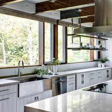
The existing kitchen was separated from the family room by a 17’ long bookcase. It was the first thing you saw upon entering and it hid much of the light and views to the backyard making the space feel claustrophobic. The laundry room was part of the kitchen space without any attempt to conceal the washer and dryer. Removing the long bookcase opened the opportunity to add counter stools in the kitchen and decided to align a target wall opposite the front door to help maintain some division within the main space while creating a space for the refrigerator. This also allowed us to create an open laundry room concept that would be hidden from view from all other areas.
We kept the industrial feel of the exposed building materials, which we complimented with textured melamine slab doors for the new kitchen cabinets. We maintained the galley set up but defined the kitchen from the utility area by changing both thickness and color of the countertop materials. Because the back of the house is mainly windows, there was very little wall space for upper cabinets and everyday dish storage. We designed a custom ceiling hung shelf system that floats in front of the windows, and is mostly out of view from the sitting area. Tall cabinets are installed along the only available wall to support both kitchen and laundry room functions. We used cable lighting threaded through the beams which really punctuates the industrial aesthetic.
 Visbeen Architects
Builder: J. Peterson Homes
Interior Designer: Francesca Owens
Photographers: Ashley Avila Photography, Bill Hebert, & FulView
Capped by a picturesque double chimney and distinguished by its distinctive roof lines and patterned brick, stone and siding, Rookwood draws inspiration from Tudor and Shingle styles, two of the world’s most enduring architectural forms. Popular from about 1890 through 1940, Tudor is characterized by steeply pitched roofs, massive chimneys, tall narrow casement windows and decorative half-timbering. Shingle’s hallmarks include shingled walls, an asymmetrical façade, intersecting cross gables and extensive porches. A masterpiece of wood and stone, there is nothing ordinary about Rookwood, which combines the best of both worlds.
Once inside the foyer, the 3,500-square foot main level opens with a 27-foot central living room with natural fireplace. Nearby is a large kitchen featuring an extended island, hearth room and butler’s pantry with an adjacent formal dining space near the front of the house. Also featured is a sun room and spacious study, both perfect for relaxing, as well as two nearby garages that add up to almost 1,500 square foot of space. A large master suite with bath and walk-in closet which dominates the 2,700-square foot second level which also includes three additional family bedrooms, a convenient laundry and a flexible 580-square-foot bonus space. Downstairs, the lower level boasts approximately 1,000 more square feet of finished space, including a recreation room, guest suite and additional storage.
 Visbeen Architects
Builder: J. Peterson Homes
Interior Designer: Francesca Owens
Photographers: Ashley Avila Photography, Bill Hebert, & FulView
Capped by a picturesque double chimney and distinguished by its distinctive roof lines and patterned brick, stone and siding, Rookwood draws inspiration from Tudor and Shingle styles, two of the world’s most enduring architectural forms. Popular from about 1890 through 1940, Tudor is characterized by steeply pitched roofs, massive chimneys, tall narrow casement windows and decorative half-timbering. Shingle’s hallmarks include shingled walls, an asymmetrical façade, intersecting cross gables and extensive porches. A masterpiece of wood and stone, there is nothing ordinary about Rookwood, which combines the best of both worlds.
Once inside the foyer, the 3,500-square foot main level opens with a 27-foot central living room with natural fireplace. Nearby is a large kitchen featuring an extended island, hearth room and butler’s pantry with an adjacent formal dining space near the front of the house. Also featured is a sun room and spacious study, both perfect for relaxing, as well as two nearby garages that add up to almost 1,500 square foot of space. A large master suite with bath and walk-in closet which dominates the 2,700-square foot second level which also includes three additional family bedrooms, a convenient laundry and a flexible 580-square-foot bonus space. Downstairs, the lower level boasts approximately 1,000 more square feet of finished space, including a recreation room, guest suite and additional storage.
Sponsored
Columbus, OH
Hope Restoration & General Contracting
Columbus Design-Build, Kitchen & Bath Remodeling, Historic Renovations

 Treeland Nursery
Beautiful grouping of three Natchez Crape Myrtles in our clients raised bed. The Natchez Crape Myrtle was one of the first hybrids released and is certainly the most popular. The Natchez Crape Myrtle produces long lasting clusters of white flowers. Trees planted and provide by Treeland Nursery.
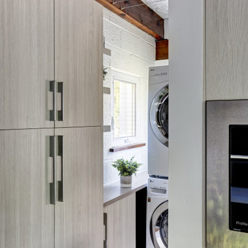 Amazing Spaces
The existing kitchen was separated from the family room by a 17’ long bookcase. It was the first thing you saw upon entering and it hid much of the light and views to the backyard making the space feel claustrophobic. The laundry room was part of the kitchen space without any attempt to conceal the washer and dryer. Removing the long bookcase opened the opportunity to add counter stools in the kitchen and decided to align a target wall opposite the front door to help maintain some division within the main space while creating a space for the refrigerator. This also allowed us to create an open laundry room concept that would be hidden from view from all other areas.
We kept the industrial feel of the exposed building materials, which we complimented with textured melamine slab doors for the new kitchen cabinets. We maintained the galley set up but defined the kitchen from the utility area by changing both thickness and color of the countertop materials. Because the back of the house is mainly windows, there was very little wall space for upper cabinets and everyday dish storage. We designed a custom ceiling hung shelf system that floats in front of the windows, and is mostly out of view from the sitting area. Tall cabinets are installed along the only available wall to support both kitchen and laundry room functions. We used cable lighting threaded through the beams which really punctuates the industrial aesthetic.

 InnovationLand
In this beautiful Houston remodel, we took on the exterior AND interior - with a new outdoor kitchen, patio cover and balcony outside and a Mid-Century Modern redesign on the inside:
"This project was really unique, not only in the extensive scope of it, but in the number of different elements needing to be coordinated with each other," says Outdoor Homescapes of Houston owner Wayne Franks. "Our entire team really rose to the challenge."
OUTSIDE
The new outdoor living space includes a 14 x 20-foot patio addition with an outdoor kitchen and balcony.
We also extended the roof over the patio between the house and the breezeway (the new section is 26 x 14 feet).
On the patio and balcony, we laid about 1,100-square foot of new hardscaping in the place of pea gravel. The new material is a gorgeous, honed-and-filled Nysa travertine tile in a Versailles pattern. We used the same tile for the new pool coping, too.
We also added French doors leading to the patio and balcony from a lower bedroom and upper game room, respectively:
The outdoor kitchen above features Southern Cream cobblestone facing and a Titanium granite countertop and raised bar.
The 8 x 12-foot, L-shaped kitchen island houses an RCS 27-inch grill, plus an RCS ice maker, lowered power burner, fridge and sink.
The outdoor ceiling is tongue-and-groove pine boards, done in the Minwax stain "Jacobean."
INSIDE
Inside, we repainted the entire house from top to bottom, including baseboards, doors, crown molding and cabinets. We also updated the lighting throughout.
"Their style before was really non-existent," says Lisha Maxey, senior designer with Outdoor Homescapes and owner of LGH Design Services in Houston.
"They did what most families do - got items when they needed them, worrying less about creating a unified style for the home."
Other than a new travertine tile floor the client had put in 6 months earlier, the space had never been updated. The drapery had been there for 15 years. And the living room had an enormous leather sectional couch that virtually filled the entire room.
In its place, we put all new, Mid-Century Modern furniture from World Market. The drapery fabric and chandelier came from High Fashion Home.
All the other new sconces and chandeliers throughout the house came from Pottery Barn and all décor accents from World Market.
The couple and their two teenaged sons got bedroom makeovers as well.
One of the sons, for instance, started with childish bunk beds and piles of books everywhere.
"We gave him a grown-up space he could enjoy well into his high school years," says Lisha.
The new bed is also from World Market.
We also updated the kitchen by removing all the old wallpaper and window blinds and adding new paint and knobs and pulls for the cabinets. (The family plans to update the backsplash later.)
The top handrail on the stairs got a coat of black paint, and we added a console table (from Kirkland's) in the downstairs hallway.
In the dining room, we painted the cabinet and mirror frames black and added new drapes, but kept the existing furniture and flooring.
"I'm just so pleased with how it turned out - especially Lisha's coordination of all the materials and finishes," says Wayne. "But as a full-service outdoor design team, this is what we do, and our all our great reviews are telling us we're doing it well."
 Visbeen Architects
This beautiful, three-story, updated shingle-style cottage is perched atop a bluff on the shores of Lake Michigan, and was designed to make the most of its towering vistas. The proportions of the home are made even more pleasing by the combination of stone, shingles and metal roofing. Deep balconies and wrap-around porches emphasize outdoor living, white tapered columns, an arched dormer, and stone porticos give the cottage nautical quaintness, tastefully balancing the grandeur of the design.
The interior space is dominated by vast panoramas of the water below. High ceilings are found throughout, giving the home an airy ambiance, while enabling large windows to display the natural beauty of the lakeshore. The open floor plan allows living areas to act as one sizeable space, convenient for entertaining. The diagonally situated kitchen is adjacent to a sunroom, dining area and sitting room. Dining and lounging areas can be found on the spacious deck, along with an outdoor fireplace. The main floor master suite includes a sitting area, vaulted ceiling, a private bath, balcony access, and a walk-through closet with a back entrance to the home’s laundry. A private study area at the front of the house is lined with built-in bookshelves and entertainment cabinets, creating a small haven for homeowners.
The upper level boasts four guest or children’s bedrooms, two with their own private bathrooms. Also upstairs is a built-in office space, loft sitting area, ample storage space, and access to a third floor deck. The walkout lower level was designed for entertainment. Billiards, a bar, sitting areas, screened-in and covered porches make large groups easy to handle. Also downstairs is an exercise room, a large full bath, and access to an outdoor shower for beach-goers.
Photographer: Bill Hebert
Builder: David C. Bos Homes
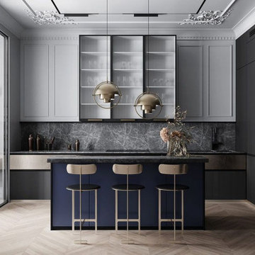

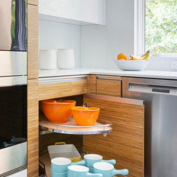 Bilotta Kitchen & Home
A convergence of sleek contemporary style and organic elements culminate in this elevated esthetic. High gloss white contrasts with sustainable bamboo veneers, run horizontally, and stained a warm matte caramel color. The showpiece is the 3” bamboo framing around the tall units, engineered in strips that perfectly align with the breaks in the surrounding cabinetry. So as not to clutter the clean lines of the flat panel doors, the white cabinets open with touch latches, most of which have lift-up mechanisms. Base cabinets have integrated channel hardware in stainless steel, echoing the appliances. Storage abounds, with such conveniences as tray partitions, corner swing-out lazy susans, and assorted dividers and inserts for the profusion of large drawers.
Pure white quartz countertops terminate in a waterfall end at the peninsula, where there’s room for three comfortable stools under the overhang. A unique feature is the execution of the cooktop: it’s set flush into the countertop, with a fascia of quartz below it; the cooktop’s knobs are set into that fascia. To assure a clean look throughout, the quartz is continued onto the backsplashes, punctuated by a sheet of stainless steel behind the rangetop and hood. Serenity and style in a hardworking space.
This project was designed in collaboration with Taylor Viazzo Architects.
Photography by Jason Taylor, R.A., AIA.
Written by Paulette Gambacorta, adapted for Houzz
Bilotta Designer: Danielle Florie
Architect: Taylor Viazzo Architects
Photographer: Jason Taylor, R.A., AIA

 Hillcrest Builders
Hillcrest is very proud to present this custom country estate. Our journey to provide this home for our customer started with our Realty division searching for land for them. After we found the gorgeous countryside site with an old pond, wetland and pastures we managed complex re-zoning and permitting. Because every direction offers distinct views, we spent a lot of time with our customers to place the home and create a layout that maximizes views from every living space. Our design department created a two story main dwelling with an open concept, modern country style custom kitchen, dining area with two sided fireplace, and abutting three season porch. With the kitchen being the hub, it accesses the office, front hall foyer, stairs to the second floor, and the breezeway to the auxiliary part of the home. The living room is semi-open of the dinette, and has chauffeured ceilings. The second floor contains the master suite with a very luxurious bathroom and stunning views. The other two bedrooms also provide great, far flung views. The auxiliary part of the home is perhaps the most unique part of this estate. It offers a long hallway with glass to the south overlooking a large patio with a hot tub. The other side of the hallway has a large laundry with a dumbwaiter to return the laundry upstairs, a shower and powder room for direct access from the hot tub and swimming pond, and a large mudroom. It terminates in the rear foyer with access to the garage and the crown jewel, the sports bar. The customer wanted a brew pub to make and serve his home made beer. The brew pub contains heated, stained concrete floors, concrete counters, and very tall vaulted ceilings. The walls and ceilings are clad with wire brushed grey stained pine and lots of windows overlook the hot tub patio and 270 degree views. The customer also wanted a barn, as both he and she grew up on a farm and shared the love of barns with Hillcrest’s owner. We designed the “perfect gentleman’s barn”, of course red with white trim and with a covered porch which extends on one side into a small greenhouse. Hillcrest also designed and built extensive landscaping features including a winding plank walk to a large swimming pond in the woods. Because of the ample ground water, we created a second swimming pond next to the house which is stays crystal clear and ended up functioning as an outdoor pool.

 Lori Jolin Design, LLC.
2014 CotY Award - Whole House Remodel $250,000-$500,000
Sutter Photographers
- Like most homes that have raised rambunctious teenagers, the old Oak staircase and banister had quite a wobble to it! We really wanted to create the feeling of Elegance when you opened the front door. It is the first impression when you walk into the home.
- The staircase was custom designed to what we were looking for. It was made and stained locally. We chose a stained wood tread with painted risers that would compliment the painted white custom spindles and the magnificent Brazilian cherry newel and handrail. The result is grand and spectacular!
-The 2 tiered iron and glass chandelier was just the right choice for the space and can be dimmed for ambient lighting
- Elegant commercial wallpaper was installed in the entryway, and the tall white crown molding enhances the open stairwell in the foyer.
- Beautiful cherry interior doors with a soft curved top and oiled rubbed bronze hardware would replace all the worn out oak paneled doors with brass door handles (middle back left).
- All of the flooring was removed from every room in the home, and 3 1/2” Brazilian cherry flooring was installed throughout. It gives the home nice continuity with the banister, the front entry door, and the new interior doors.
- A palette of 5 colors was used throughout the home to create a peaceful and tranquil feeling.
191